In this addvert we see a grey box that takes up the top 3rd of the poster. This is done so it is easy to view. The font used for The weeknd is the same font used to display his name on all his album artwork and also on his website and videos. It also features the record label they both represent in the corner which is done so people recognize it straight away. Drakes name is in a larger font as it is to represent it as his tour that features The weeknd.
The advert features the rapper drake on it in the remaining two thirds of the advert, this layout fits in with the rule of thirds. The artist is giving a direct address in order to connect with his audience this is mainly done as he is promoting himself. The artist is lit up on a black background in black costume to bring out his face as the focal point. The image also has an effect applied on top of it giving it a pixelated look indicating you may be able to view live.
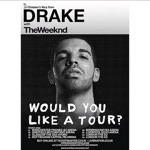
The artist’s body language portrays confidence indicating that he knows the tour will be good making consumers feel the same. The hand written font used on the main writing is very informal, the title is a rhetorical question as the artist knows that certain fans know the answer to this. The whole poster fits in with this theme of black and white used across the genre. The words ‘Would you like a tour’ are the largest on the advert indicating the importance of this.
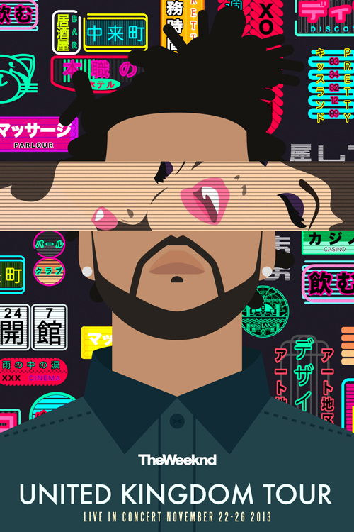
This advert is for The weeknds UK tour. The font used to display the weeknds name is the same as it is on all other platforms. The poster features few words which is a common theme through a lot of his advertising, he likes to be very straight to the point.
The artist is positioned straight on and the technique of symmetry has been used in his positioning and appearance. This was done because he is presented in a graphic form instead of a photograph. The cartoon effect is very similar to those in things like anime linking to china as a theme. The background features lots of Chinese symbols which is a common theme through his videos and digipaks also this makes it recognisable to people and then they know that the tour will be based upon that specific album. There is also some graphics of two women being affectionate towards one and another placed across his eye line this creates the idea that he sees women as sex objects. This may imply there will be women at his tour and maybe this is who he is targeting.
The Chinese symbols are very vibrant and stand out a lot with in the poster. These symbols are featured in most of the videos of songs from the album kiss land which also has a booklet featuring them in the digipak. Creating this theme is something he has done well as it makes this poster instantly recognisable as a featuring product of his album, this is why I feel he has written little on here as it is visually recognisable and with a few words written on it the information he wanted to give has been given. The symbols also feature some English words one of linking to a song in the album so this helps back up what the tour is on, it also features the CD and his record label XO all embedded into this vibrant background. This being a visually impressive poster makes you feel as if the tour will be also which is why it is how it is.
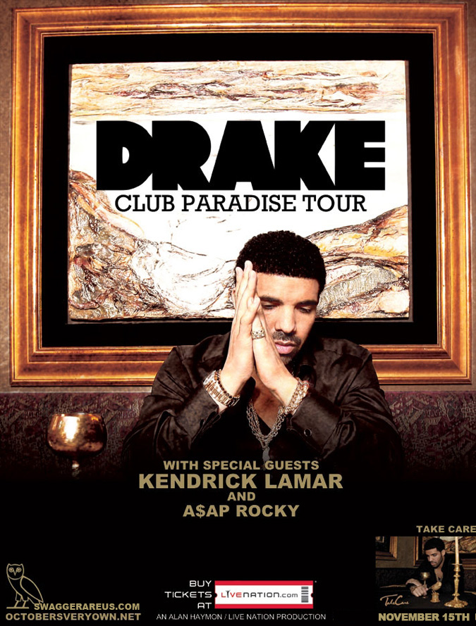
This advert for Drake’s tour features his name printed in a font used for his first two studio albums so this is something he has done to attract consumers as they should recognise it. There are other bits of writing indicating some key information about the tour this is in the same colour used in the logo of his record label which is also displayed in the bottom left this is all done to display a recognisable theme throughout his work.
The picture on the poster is shot in the same setting as the picture on his album cover, it features all the colours and props also this makes it very recognisable and similar to the weeknds poster we now know what the tour is going to be based upon. The subject is placed in the central third of the photograph giving emphasis on his body language, it is similar again to his album cover but he is just gazing in a different direction this makes us feel as if he is relaxed about how the tour is going to go giving us faith in attending it. The setting also features a lot of gold props which is a representation of wealth and success once again implying this idea that the promotion will be successful.
There is a slight fade at the bottom of the poster that then blends in with the image. This has been done in order to display key information without them being on a busy background, they have displayed the record label, ticket website and promotion for his new album. Having the album cover presented on here also reinforces what may be played on this tour. The heavy use of gold also links back to the word paradise which is used to describe the tour as this word is usually associated with someone’s perfect situation and this portrays how the artist is feeling about himself and his success.
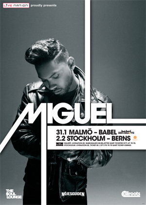
The poster is to present a show that the artist is to be doing. It features a large font displaying the artist’s name, the use of lines leading out of the letters to the edge of the frame he does in other posters I have seen so this is a trademark of his. There is a white box which fits in nicely with this format and displays key information.
The subject is positioned slightly to the left which is also the same with his name so it is as if they are aligned. He is not looking at the camera he is looking away not giving us a direct address this shows feelings of sadness or as noticed in other posters it can give a relaxed look to the poster. The costume is all black and in keeping with this black and white theme which is common across the genre. The picture is very simple and does not give too much away about the tour apart from it may be a more relaxed small show instead of you could tell that from the weeknds poster it was going to feature a lot of bright colours and certain songs. The layout is very simple and straight to the point I think this whole feel is something he incorporates into his work so people are aware of this when they see it.
There are several logos placed around the poster, these are to point people in the direction of more information. The lack of writing is supplemented by these logos as you can see where it is and how to buy tickets. The lack of writing is very informal and suggests that the show might be a small one, we also understand this from the lack of locations listed upon the advertisement. Black is the dominant colour with in the photograph putting emphasis on his costume but the writing in white is of equal dominance with in the poster, black and white can connote power and purity.