How effective is the combination of your main product and ancillary texts?
My Video
Digipack
Magazine Advert

-
When creating my music video, magazine advert, and digipack, I made sure that there were links between them, so that my target audience can identify them and they will be immediately recognisable to them.
-
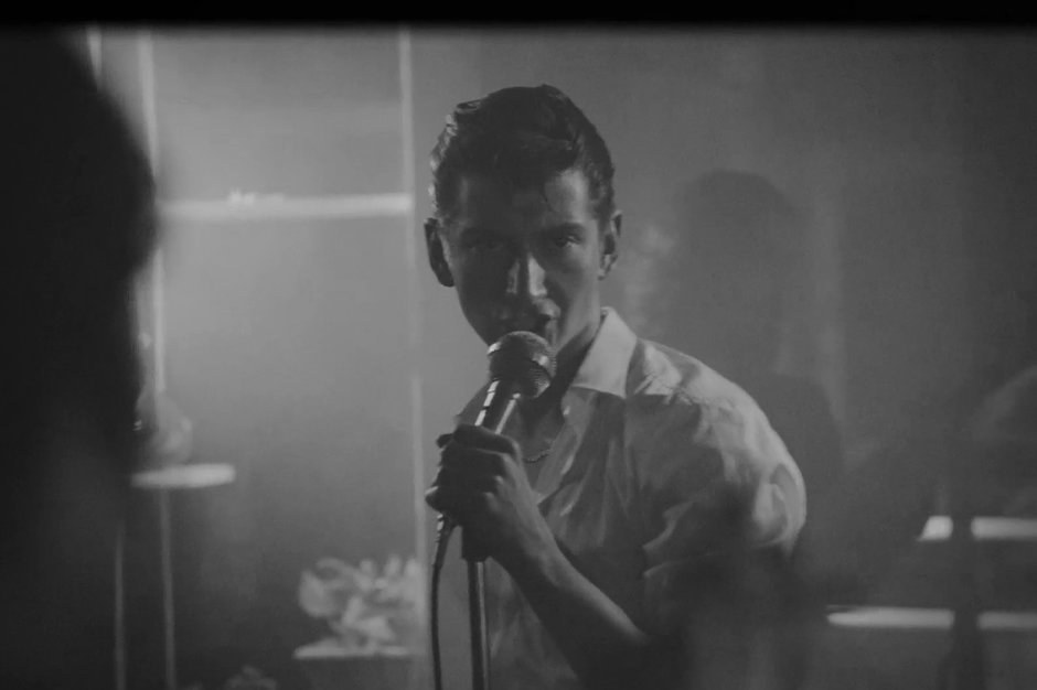
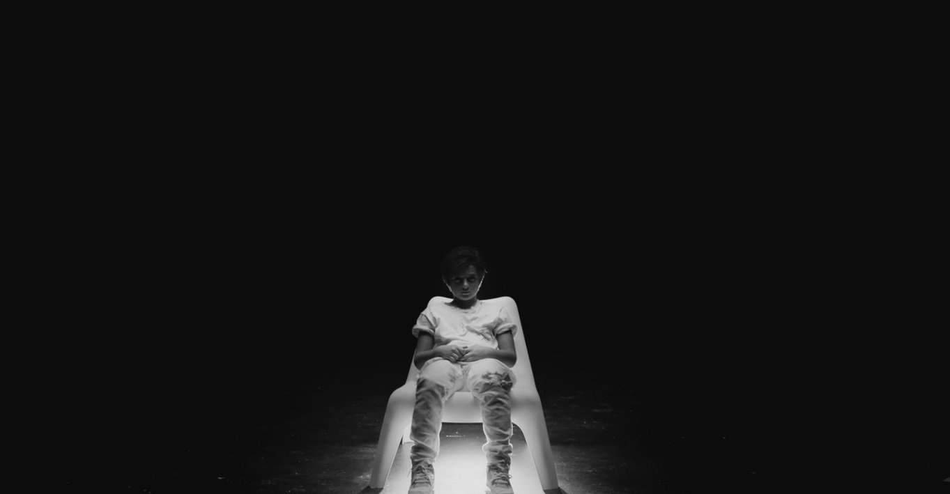
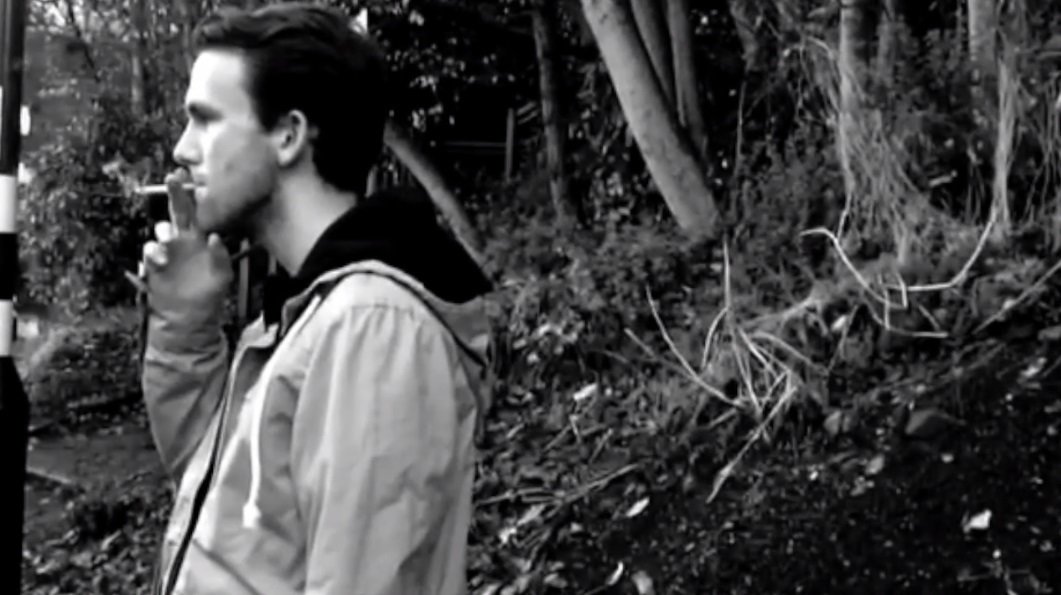
I looked to other artists such as Arctic Monkeys and The Neighbourhood for inspiration
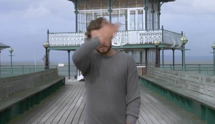
This was one of the main inspirations for my music video. I loved the way the video shows clips of the band alongside clips of passing scenery and some shots that aren't really relevant to the song; it is where I got my inspiration for the beach clips in my video.
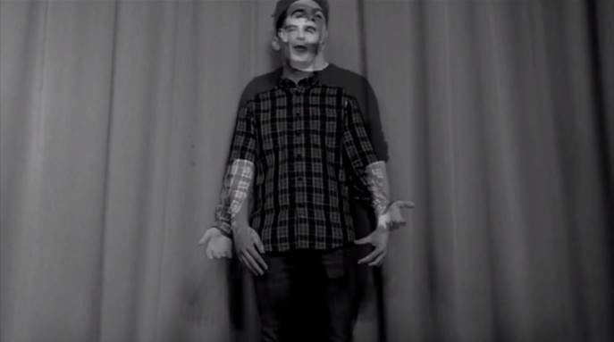
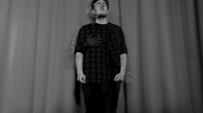
Another video which inspired my video was 'You & I' by One Direction. The transitions between each band member was the reason I decided to use a similar transition in mine.

One of the main inspirations for my Digipack was Drake's 'Nothing Was The Same'.
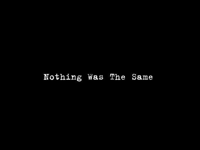

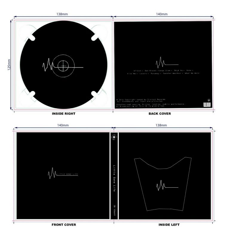
Drake’s album cover is so simple; a black background, and white text in the centre of the page. The typography is kept consistent throughout the digipak, and everything is kept similar to this cover.
For my album cover, I wanted to keep it as simple as possible. I used Drake's album cover as inspiration when designing my Digipack because of its minimalistic design, but also because it fits perfectly with what I was aiming for.
Just like the front cover, the track list of Drake's album features the same typography, and has the same simple design; a black background and white writing in the middle of the page.
The only thing on the page are the song titles, so it draws your eyes towards them, highlighting their importance, and this is something I wanted to achieve when I created my track list page.


When researching magazine adverts for albums by bands in the same/similar genre to mine, I found that all of them had these common features:
- Same picture as album
- Release date of album
- Same typography as album
- Artist's name and name of album are focus of advert
- Record label and/or management's in the bottom corner
- Often name a few singles from the album
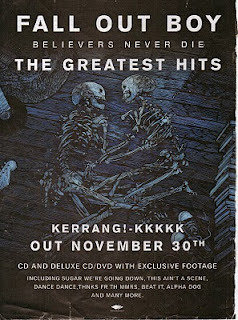
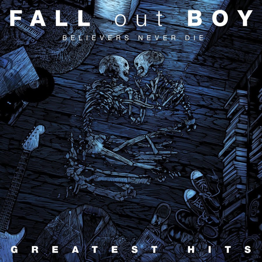
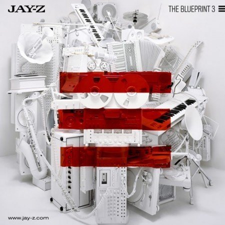
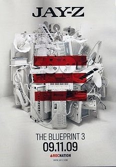
The image on the advert is exactly the same as that on the album, which makes it instantly recognizable to fans of Jay-Z. The font is the same on both print products, only the size of the artist's name and album title has been made bigger so it will stand out more. Jay-Z released 2 different magazine adverts, and the other one had the long date written at the bottom, with two of his biggest singles from the album named underneath. The image in the background of the advert and the album cover is made up of all of the objects seen in the music video for 'D.O.A', which is one of the singles named on the other version of the album; it helps people identify and link the music video to the album cover and the magazine advert, which is what I aimed to do with my print products.
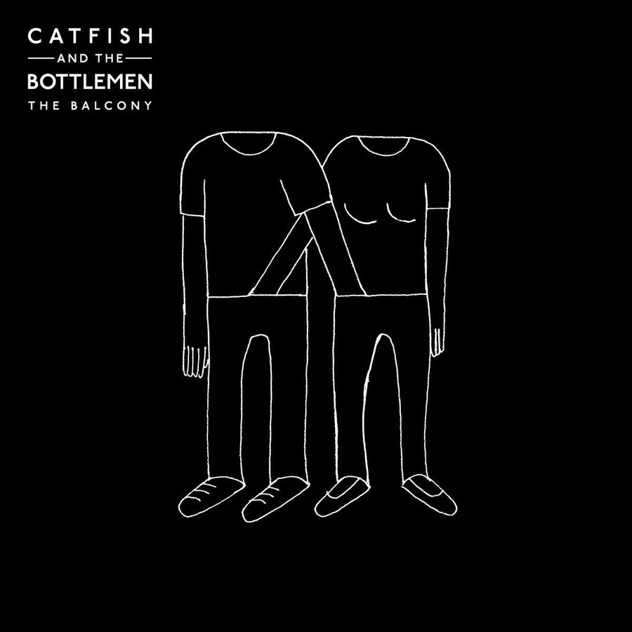
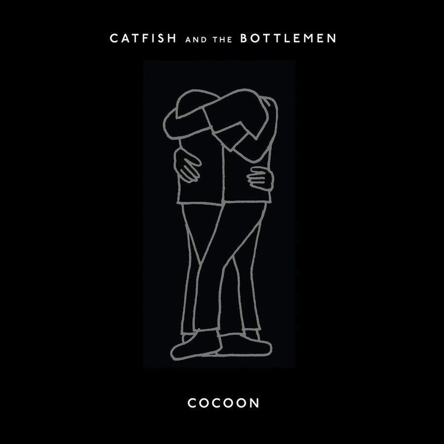
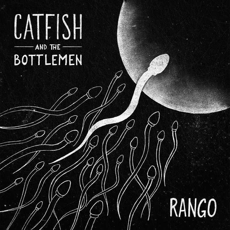
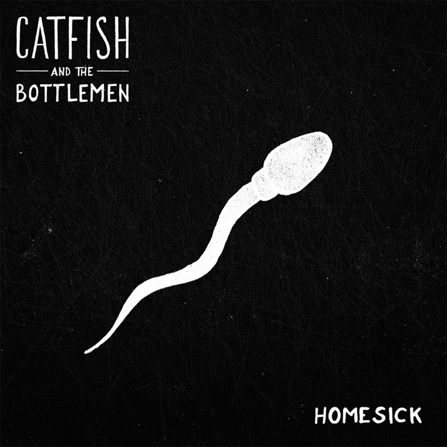
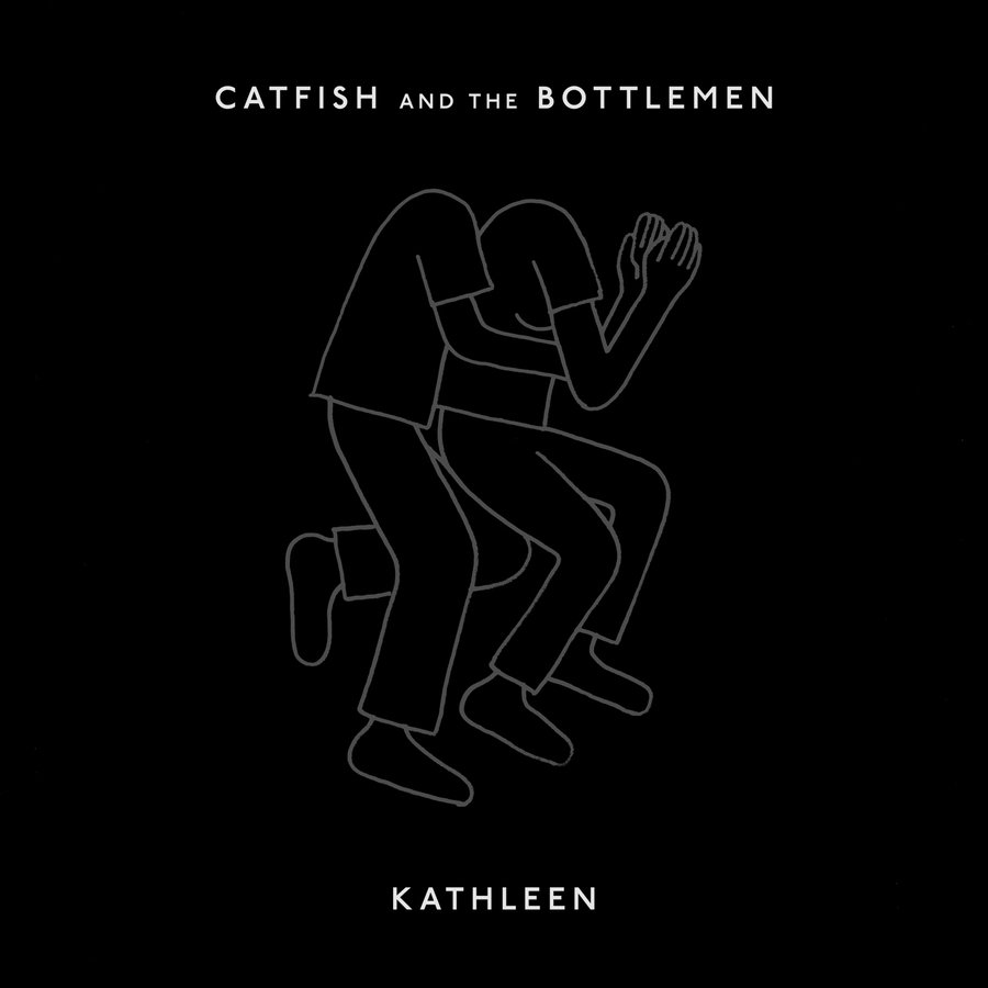
I also took a lot of inspiration from Catfish and the Bottlemen when it came to my print products. Their album cover links to the covers of their singles, as they're all cartoons which tell the story of a couple, just the song titles on my album.
They also never use their music to promote themselves, only the music and the band itself, which is something I aimed to do with my band.
Just like Drake's album 'Nothing Was The Same', I wanted to design an album booklet, rather than just a Digipack, as I had a lot more ideas than I could fit on my Digipack.
I took inspiration for the design of the album booklet, again, from Drake's album booklet, but also from a few others.
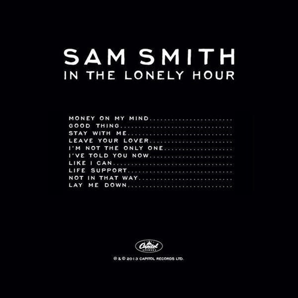
I instantly liked the back cover of Sam Smith's album because it is so simple yet so effective. It follows a black and white colour scheme, and the songs are the main focus of the back cover, as they are placed in the centre; this shows the importance of them to the artist. I used it as inspiration for one of the pages inside my album booklet - the track listing page.

One of the links between all three of my products is the band's logo.


I used the band's logo on all three products so that it would become familiar to my target audience, and they would be able to instantly recognise it if they saw it out of context, and without the band's name next to it.
This has been achieved by bands such as:
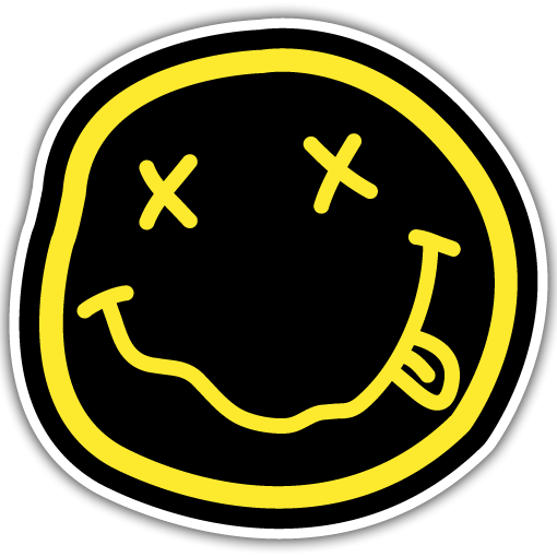
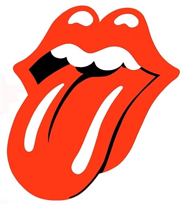


I also linked my products together with the font I used; I used the same font for every piece of text in all three products, as I wanted it to become almost a recognizable convention of my band.


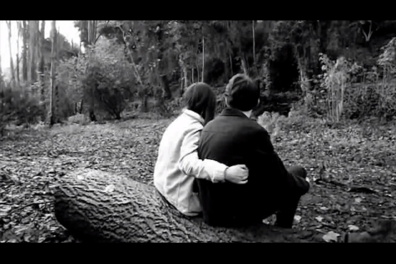
I kept everything from all three products in black and white to stick with the minimalistic design, and to also keep synergy between my products.


When it came to adding my band logo to my three products, I decided to make one design and simply 'cut and paste' the image rather than recreating it for each product, in order to make sure that it is exactly the same image on each product.


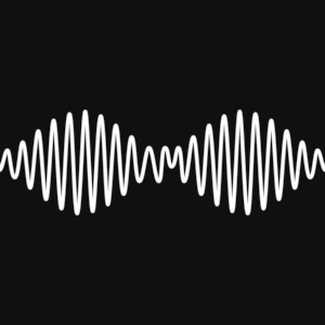
The Arctic Monkeys have developed their style over the years, but have kept to the same sort of design.
When researching band identity (brandity), I found that the Arctic Monkeys are one of the most established artists in my genre. I looked at their website, new and old, and album covers past and present.
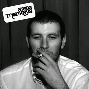
This was the first studio album released by the band, in 2006. The model on the cover is 19 year old Chris McClure who was a friend of the Arctic Monkeys; the band gave him, his cousin, and a best friend money to spend on drinking and a night out, and the picture was taken that night. There was some controversy surrounding the cover art after the album release — a Scotland health official said the photo “reinforces the idea that smoking is OK.” However, Johnny Bradshaw, the band’s product manager, responded to criticism by saying, “you can see from the image smoking is not doing him the world of good.” The album cover shows that, from their first album, they had a specific target audience in mind, and the theme of smoking, alcohol, and drugs carried on.
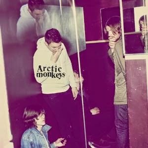
This was the 3rd album released by the band, in 2009, and is the first album cover which features the band. It was the first real time that the fans got to see and hear the band since their huge success in America, and this was the start of the Arctic Monkeys' 'rockier' sound. The idea of the band being on the front of the cover is unusual for their genre of music, because it's usually either an artistic image, or just a simple logo with a plain-ish background. The colours of the album are very different than their other artwork, mainly because it's not in black and white or full of dark colours. Even though at first glance the cover just looks like the band have been caught off-guard when they were standing around talking, a closer look will reveal implications of drug use; for example, the fact that Alex Turner is rubbing his nose, implying that he's just taken cocaine possibly. Also, the image of Alex has been duplicated above him, suggesting a sort of 'trip' caused by the drugs.
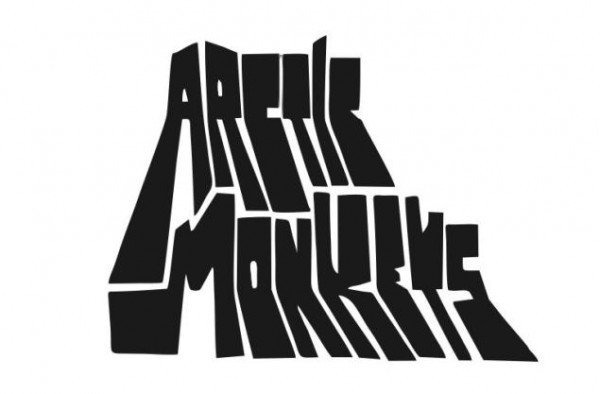
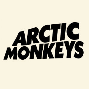
In terms of their logo, it has always been the band name in a recognisable typography. However, the typography of their name changed as their sound and image changed, and it has seen development over the years.

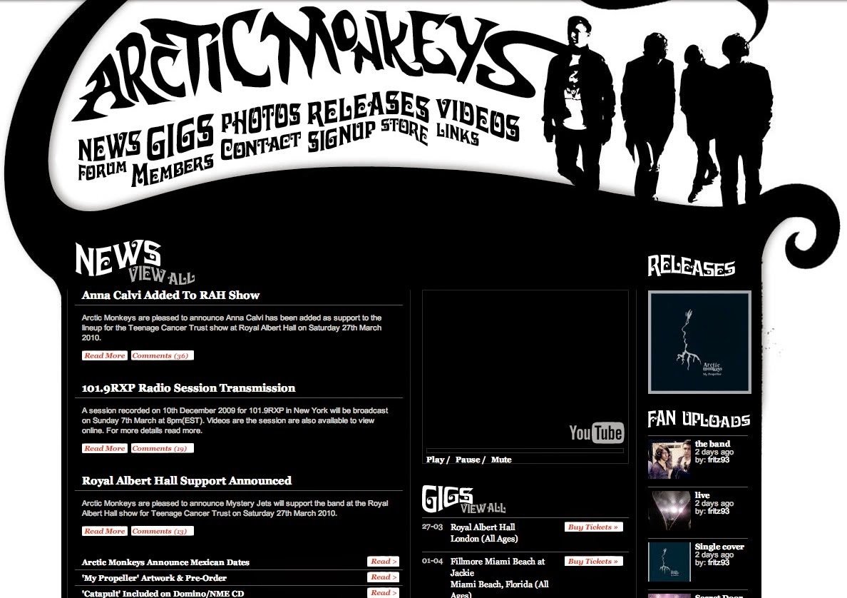
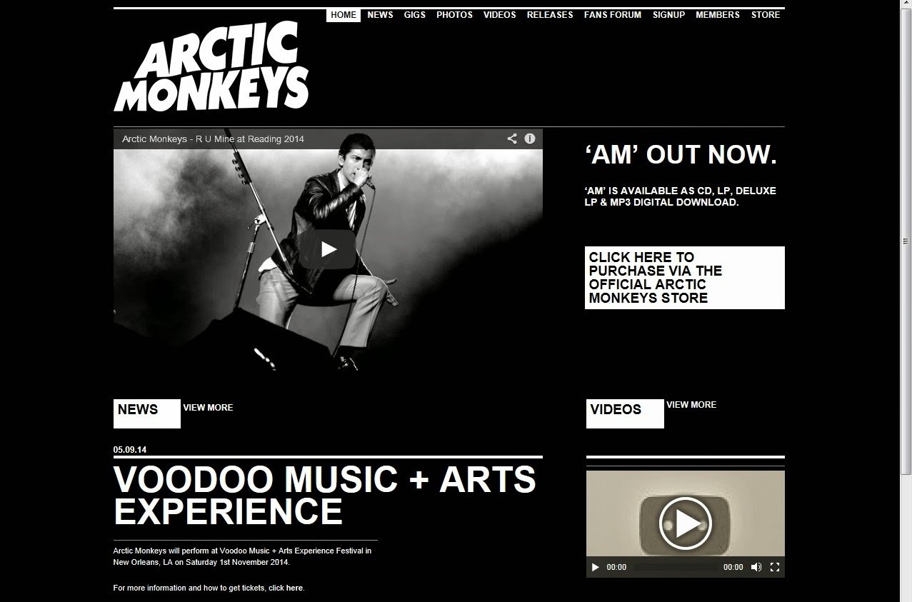
Just like their logo, their website also changed when their music did. On the left is how it used to look, and on the right is how it looks now. It is significant, however, that their website has always stayed in black and white.
One feature of the band that I don't want to use with my band is the idea of there being a 'lead singer'. After the band returned from their break, they seemed to have a new image, where the lead singer, Alex Turner, was the 'face' of the band. I don't like this about a band because it then becomes about selling the band rather than the music, and new fans start to focus on the physical attraction of the band members rather than their musical talent.
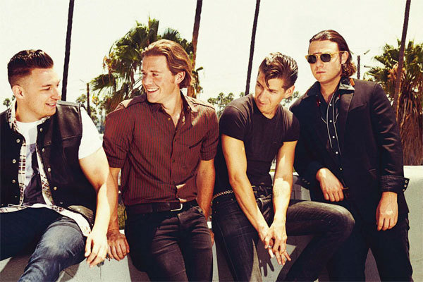
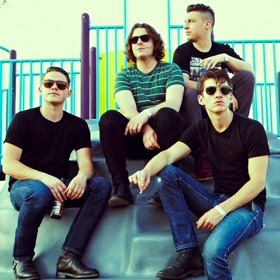
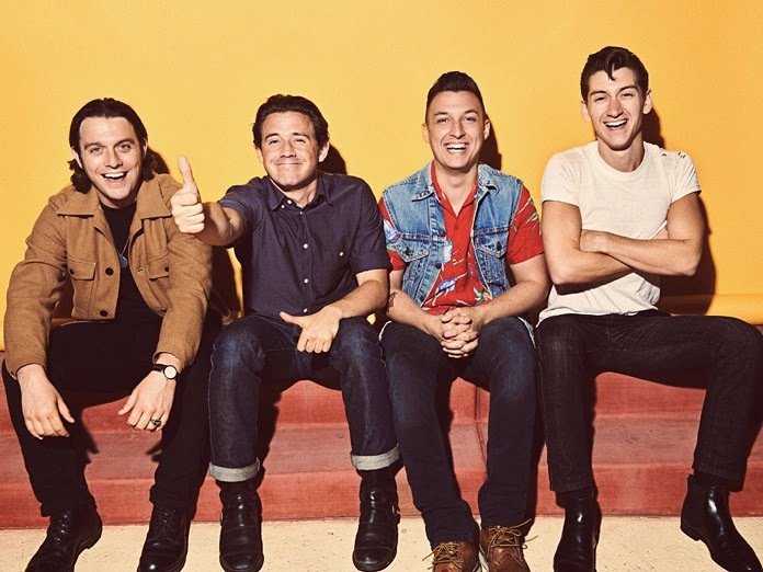
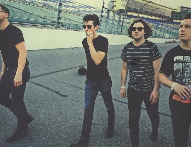
However, these are some photoshoots after their return...
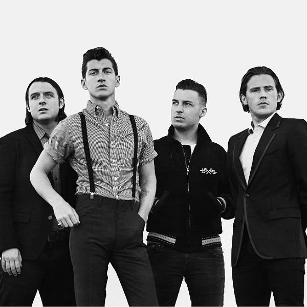
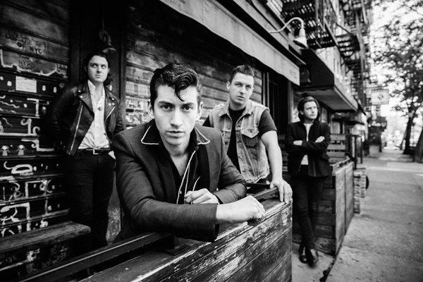
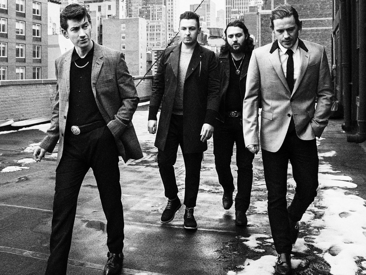
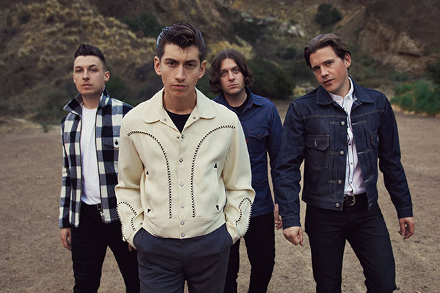
It's not always the lead singer which is the 'face' of the band, however.
The lead singer of Fall Out Boy is Patrick Stump, but people who aren't fans of the band seem to know the band's bassist, Pete Wentz, more than they know the main vocalist.
Whether it was intended for him to be the main focus of the band's images or not, subtle stances etc. at photoshoots seem to make Pete Wentz the main focus of the image.
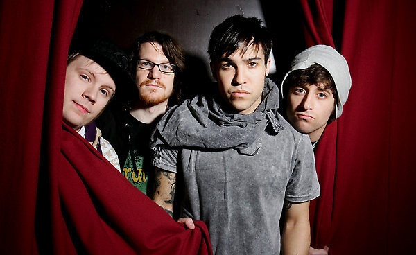
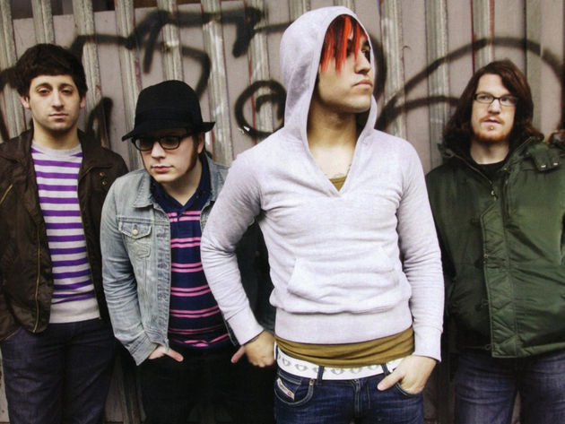
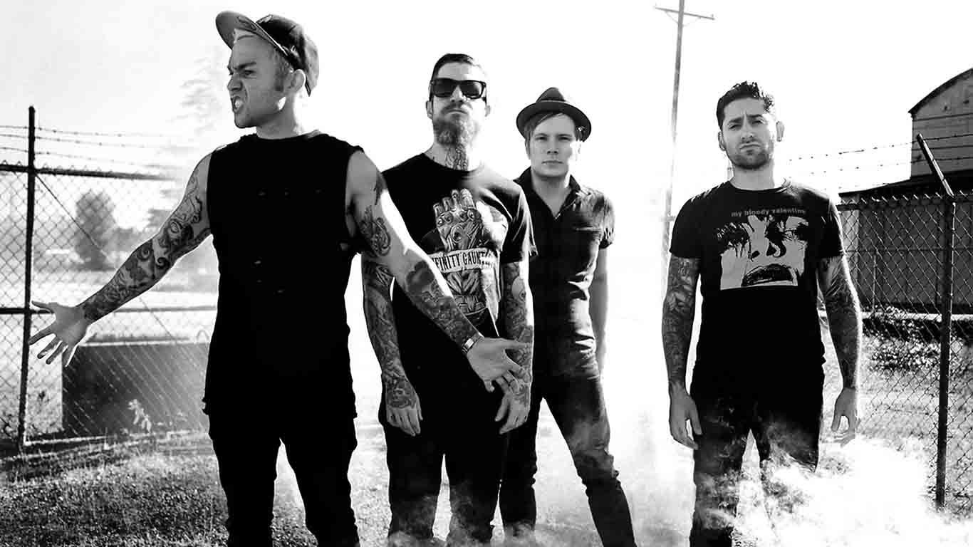
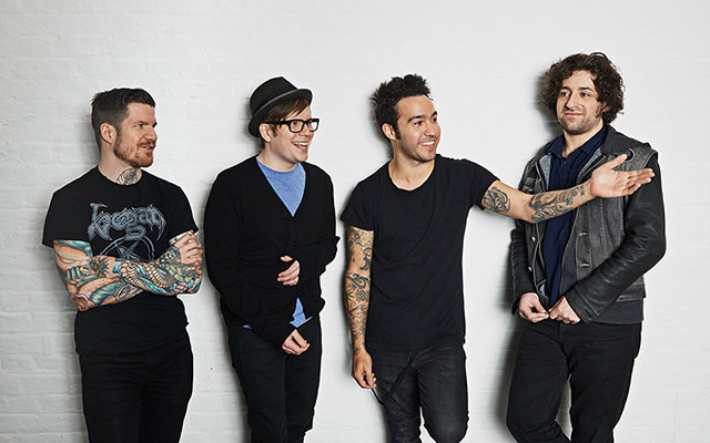
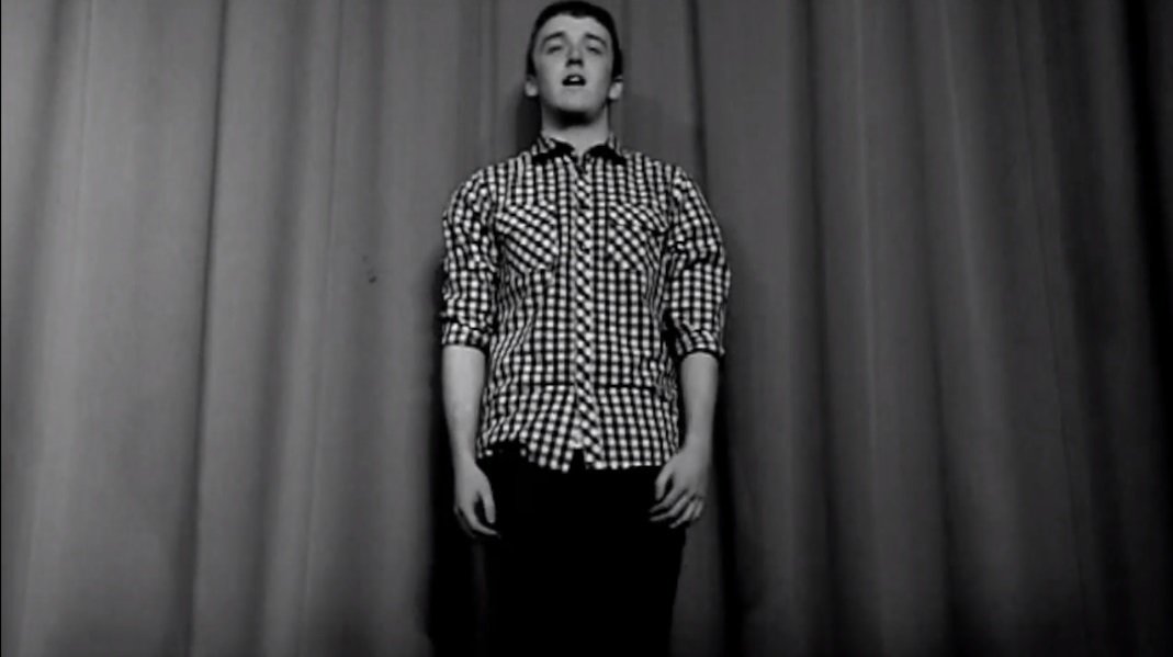
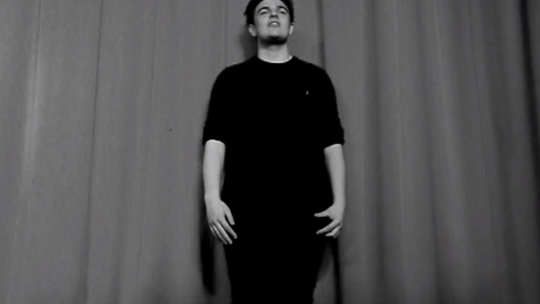
I didn't want any of my band members to appear the focus more than others, which is why I included the same shots for each member, and made sure they stood in the same place during the video. Also, in my genre, bands don't tend to promote themselves as much as they do their music, which is why I didn't include any pictures of them throughout the Digipack, album booklet, or magazine advert, and just used them in the music video as I wanted to stick with the convention of my genre by adding performance footage to my video.
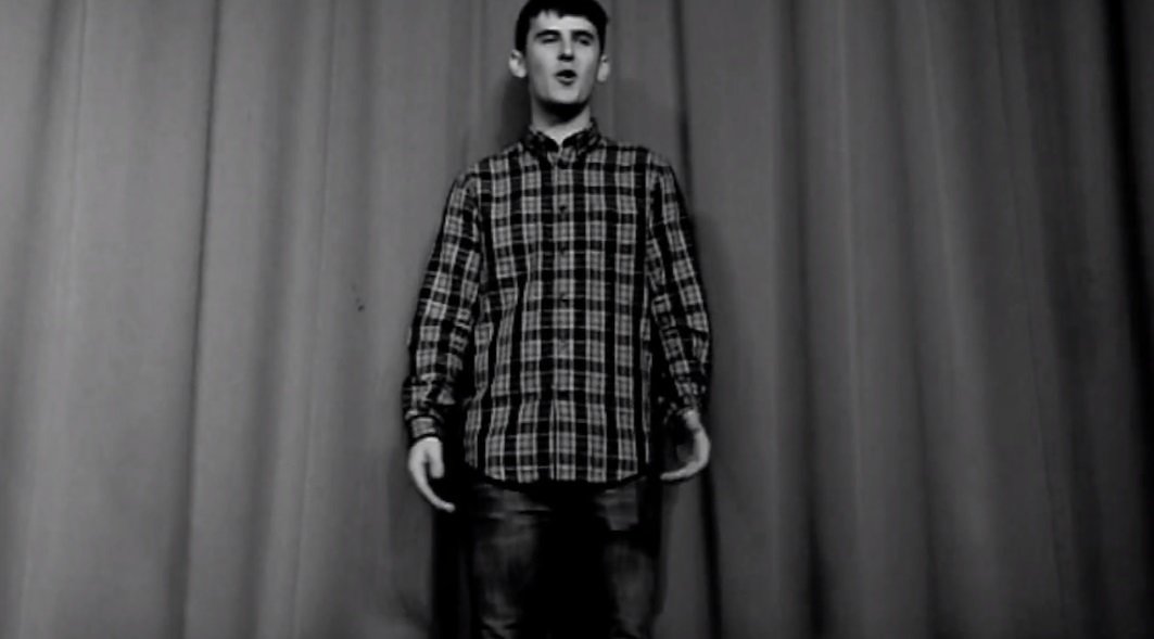
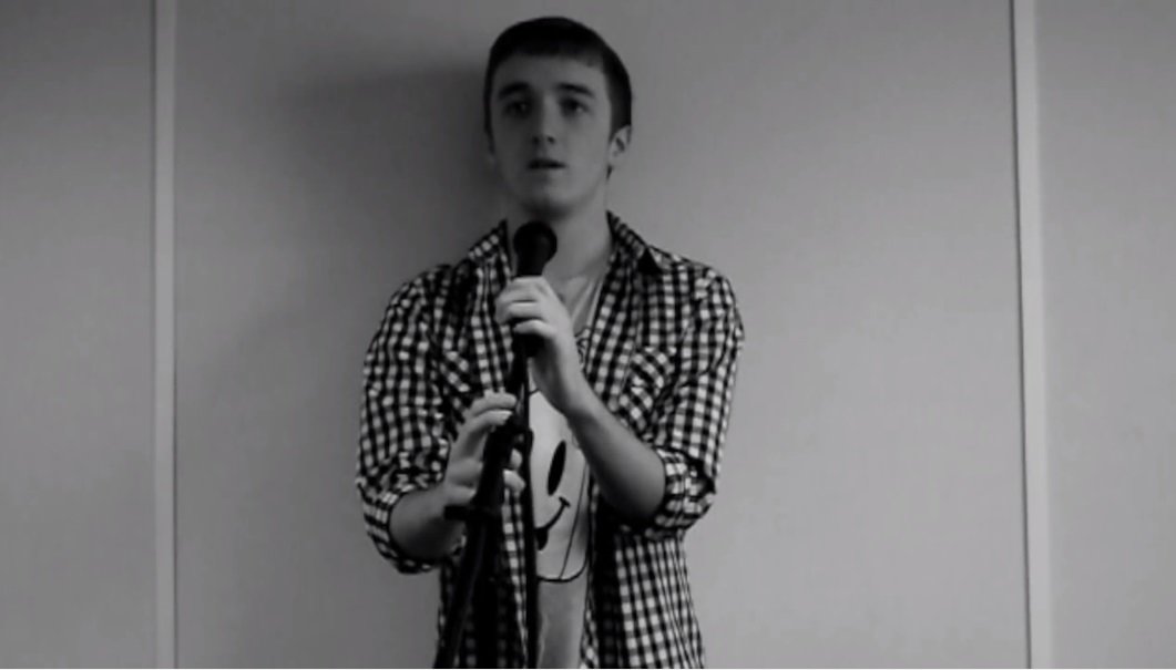

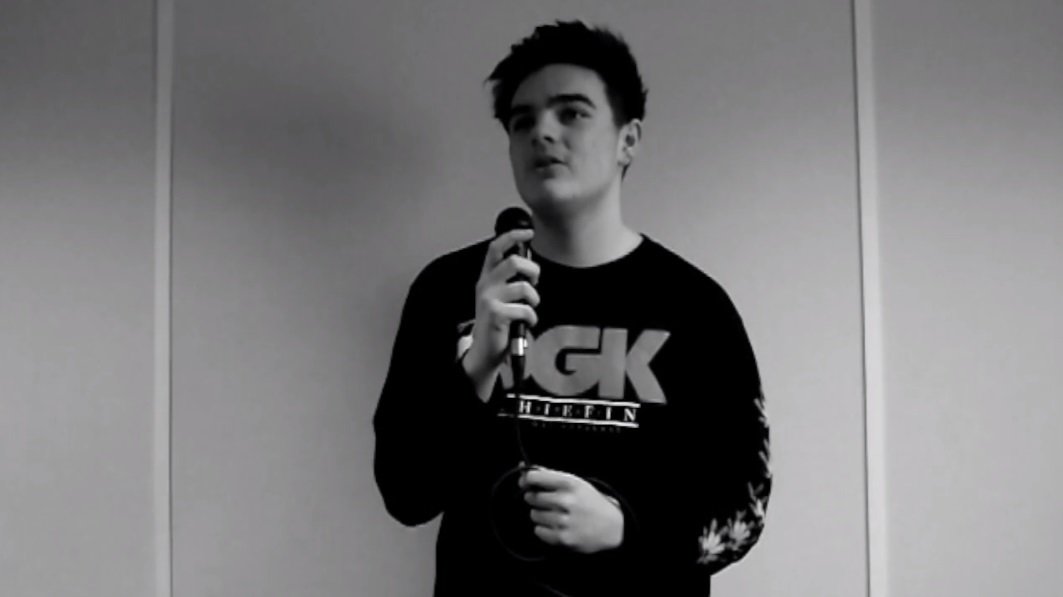
The colour-scheme of my products is something which links them together.
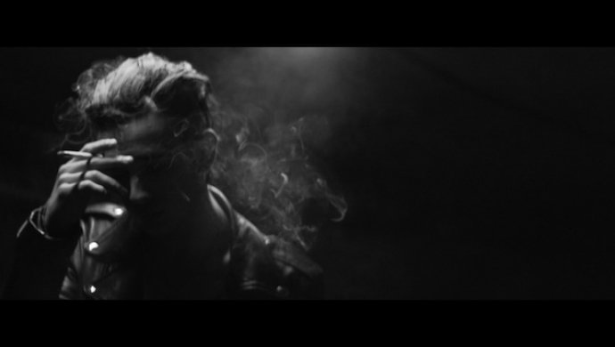
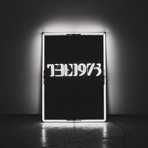
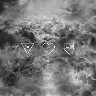
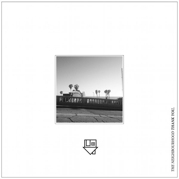
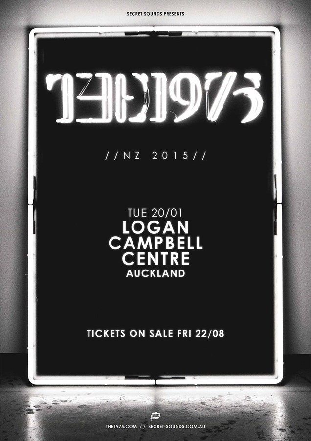
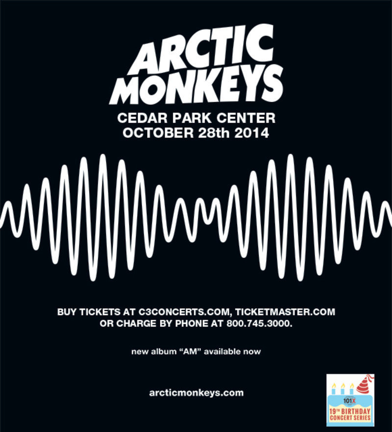
I chose a black and white colour-scheme because it fits with the conventions of my genre. Also, I liked the minimalistic style it has when you look at all of the products together. I got the inspiration for the black and white colours from Arctic Monkeys, The Neighbourhood, and The 1975. They're all part of the indie-rock genre, and go for the minimalistic look in all of their products.
Music Videos
Album Cover

Magazine Advert
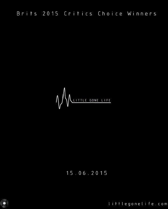
Before I came up with a final design for my magazine advert, I created a few different adverts and asked my audience which they preferred.
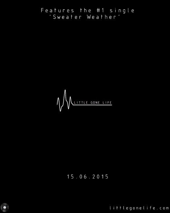
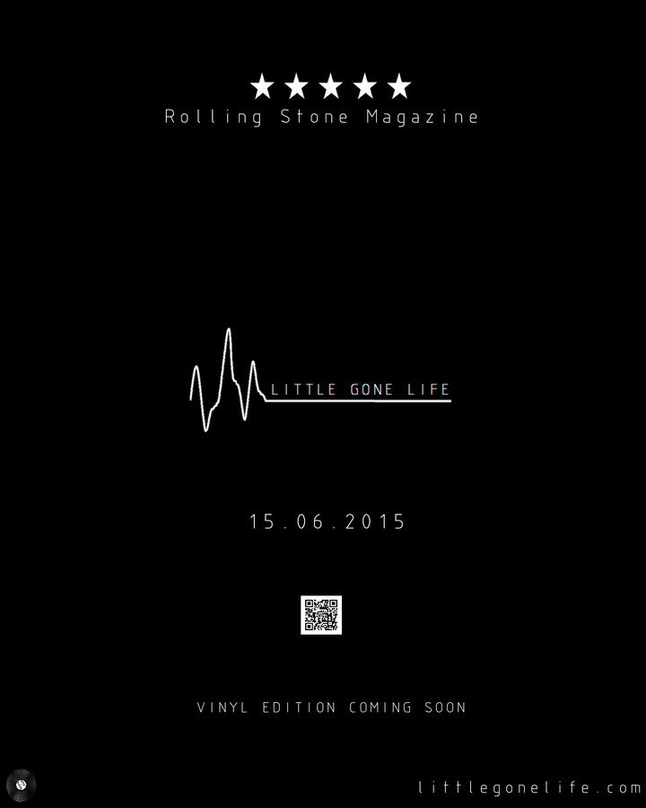
I added a QR Code to my advert, along with information about the upcoming Vinyl edition of the album.

I decided that this advert was better for my band because it fit better with the Digipack I was designing. Also, this design was the only one I thought looked proportionate to my album booklet in terms of the typography used.
My audience feedback told me that this was the preferred design, and most of the adverts from my research featured a rating from a magazine or critic, which is another factor as to why I chose this design over the others.
I kept the writing and information to a minimum, because it kept synergy with my album booklet and Digipack, especially the front and back covers. Also, it makes the advert more interesting and intriguing, as people are more likely to research the band and scan the QR code if they don't know where it leads to.
I have used the name of my band on all of my products in order to promote it a bit more. If someone who doesn't know the band sees the name and logo in a magazine advert, they may recognise it if they see the music video or the album in a shop or online, and they will therefore be more likely to consider buying or listening to it. Also, by promoting the band's name and not their members, I am sticking to the conventions of my genre, whilst also keeping synergy with my other products.


For my products, I created my own record label, so that I could use it on the Digipack, album booklet, magazine advert, and music video. I named it 'Divinyl Records' as short for 'digital vinyl records' - I am releasing a digital and a vinyl version of the album, so this is why I named it 'Divinyl Records'.

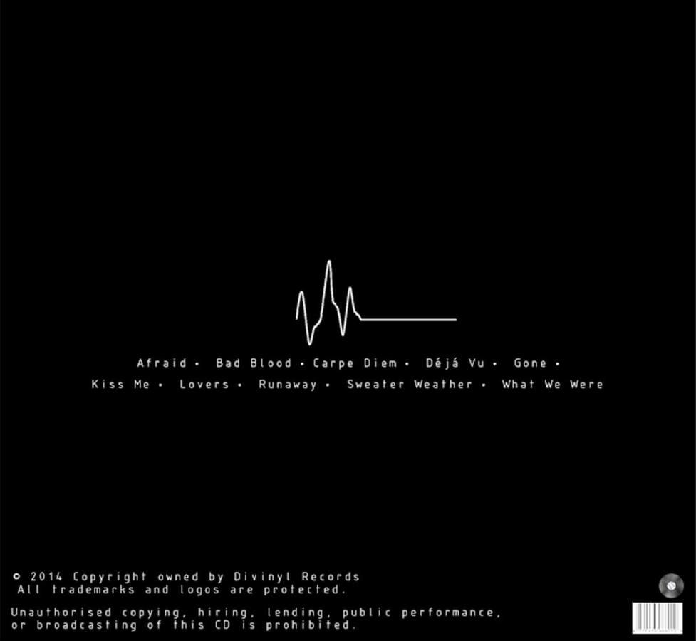
I created a survey on 'Typeform' and asked people from my target audience if they thought my three products fit together well.
Below are some of the answers given:
"There is a clear link between the colour themes and fonts, that keep the theme running throughout each product. for example the black and white and the logo."
"The colour links them all together, and also the album booklet has lyrics that link, all about love and being together wit someone and all of the times you have shared, which the video also does because it shows you and your boyfriend together sharing magical moments with each other."
Overall, I feel as though my three products have great synergy between them.
My audience feedback has proved that my target audience notice the links between my magazine advert, music video, and Digipack, and they all agreed that they fit together.
I am extremely happy with my products and the synergy between them