Analysing Other Artist's Work
Analysing Other Artist Work
As part of my research for my digipack, I looked at other established artist of the same genre as Yasmin Ally and use the rules of codes and conventions that a digipack required to compare their digipacks.
The Weeknd
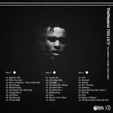
The weeknd's album Trilogy, is The Weeknd's first compilation album.
The album is very sleek and polished, the main colours used are black and white and there is a minimum of two fonts.
You can see that The Weeknd is a male artist this is because he is positioned in the middle of the, also there is a woman positioned along with him but she is blurred our whereas he isn't. What different about The Weeknd's digipack is that even though he is the main artist he isn't facing the audience and giving them a direct mode of address, in fact he is facing away from the camera and looking down. This shows unconventional type of album.
The back part of the digipack is very similar to the first, again the colour scheme of black and white is used, also the same type of font. We see a picture of him again, this time he facing towards the camera more but again there isn't a connection made with the audience as his eyes has been blacked out. The initial layout for the digipack is very simple, it clearly shows all of the tracks that the album will contain. There isn't a major focus apart from the faint image of The Weeknd himself.


Jhene Aiko
Sail Out is Jhene Aiko's album. As you can see from the cover this album has a background applied to it unlike The Weeknd, which was just plain black. She also has has used a minimum of two text styles and two colours, black and white.
Her album also shows an unconventional type as she isn't even isn't giving direct mode of address. We actually don't see her at all, this targets her fans who have followed her from the very beginning of her career whereas to all her new audience they would have to probably do a little more research about her.
The synergy between her album cover and the album is that she has linked the obvious together, which is her album title is called 'Sail Out' and the background image for the album is a ship.


Ellie Goulding
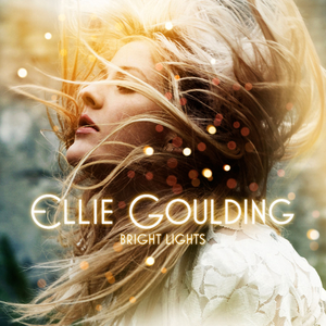
Lastly I will look at is Ellie Goulding's debut digipak 'Bright Lights'. When this album first came out, she wasn't as established as she is now. Similarly to 'Jhene Aiko' and 'The Weeknd', Ellie is also not giving a direct mode of address to her audience. This shows that the album followed a unconventional plan, the image itself still allows the audience to get a slight glimpse of Ellie Goulding.
There is a obvious synergy between the album title and elements within the album. As the album is called 'Bright Lights', are speckles of scattered lights place miscellaneously around the album front and back cover.
She has stuck to two font types as well as two colour themes, the layout for the tracklist is very simple, she's kept the song in the middles of the page.

