Class binding
Let's us bind data to manipulate an element's class list
Could be solved with v-bind
<div :class="classes"></div>

//...
computed: {
  classes() {
    let classes = ''

    if(this.isActive) {
      classes += 'active '
    }

    if(this.hasError) {
      classes += 'text-error'
    }

    return classes
  }
}
Vue provides special enhancements when v-bind is used with class attributes
<div :class="{ active: isActive }"></div>CSS Class
Expression
Object Syntax
<div class="active"></div>Output
<div :class="{ active: isActive, 'text-red': hasError }"></div>Multiple classes
data() {
  return {
    active: true,
    hasError: true
  }
}
<div class="active text-red"></div>Template
Data
Output
Class bindings are reactive
Extract complex class lists
<div class="classObject"></div>data() {
return {
active: true,
hasError: false,
error: {}
}
},
computed: {
classObject() {
return {
active: this.isActive && !this.hasError,
'text-danger': this.hasError && this.error.type === 'fatal'
}
}
}Array Syntax
<div :class="['active', 'text-danger']"></div>Mix Array and Object Syntax
<div :class="[{ active: true }, { 'text-danger': false }]"></div>Array Syntax
<div :class="[isActive ? activeClass : '', errorClass]"></div>Applied when isActive is truthy
Style binding
💅
Same syntax as with class binding
Array and Object Syntax
<div :style="{ color: activeColor, fontSize: fontSize + 'px' }"></div>Style binding example
<div :style="styleObject"></div>computed: {
styleObject: {
color: this.font.color,
fontSize: this.font.size + 'px'
}
}E.g. to computed or data
Styles can also be extracted
Questions?
Assignment # 6
👩💻👨🏽💻
⏰ 25 mins
Lunch Break
🍔
⏰ 30 mins
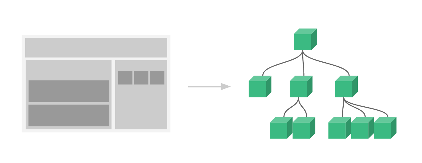
Components
So far, we worked with a single Vue app instance
So far, we worked with a single Vue app instance
Vue.createApp({
  data() {},
  computed: {},
  methods: {}
}).mount('#app')
Big Applications
Single Instance is not enough
Well organised Vue applications
Components
===
Components
name
+
Vue.createApp({
  data() {},
  computed: {},
  methods: {}
}).mount('#app')
Like little Vue application instances with a name
Components
// CounterButton.vue
<script>
export default {
  data() {},
  computed: {},
  methods: {}
}
</script>
Like little Vue application instances with a name
Single File Component
(SFC)
Single File Components
// CounterButton.vue
<script>
export default {
  // the logic for your component
}
</script>

<template>
<!-- The HTML for your component -->
</template>

<style>
/* The styles for your component */
</style>
A special Vue file format optimized for writing components
will require additional setup (more on this in a few)
Single File Components
// CounterButton.vue
<script>
export default {
  data() {
    return {
      count: 0,
    };
  },
};
</script>

<template>
<button @click="count++">{{ count }}</button>
</template>
CounterButton.vue Example
Single File Components
// CounterButton.vue
<script>
export default {
  data() {
    return {
      count: 0,
    };
  },
};
</script>

<template>
<button @click="count++">{{ count }}</button>
</template>
CounterButton.vue Example
// App.vue
<script>
import CounterButton from "@/CounterButton.vue"
</script>

<template>
<CounterButton></CounterButton>
</template>
Single File Components
CounterButton.vue Example
Components
are like
custom HTML elements
Components
are reusable
// App.vue
<script>
import CounterButton from "@/CounterButton.vue"
export default{
  components: { CounterButton }
}
</script>

<template>
<CounterButton></CounterButton>
<CounterButton></CounterButton>
<CounterButton></CounterButton>
<CounterButton></CounterButton>
</template>
Components
are reusable
Components
allow us to break our applications into small pieces and organise it
Components
can be big - like a complex form component
can be small - like a toggle switch
It's possible to define components without Single File Components
but it's very uncommon and not nearly as developer friendly
How to Support Single File Components
- The browser doesn't know what a .vue file is
- It knows CSS, HTML, JavaScript but not .vue
- We need a way to transform (or COMPILE) .vue files to regular HTML, CSS, and JavaScript

Vite is a build tool that can compile .vue files (among other things)
How to Start a Vue Project with Vite
npm init vue@3Demo Time!
SFC Support for VS Code
How to Start a Vue Project with Vite
(in a StackBlitz Playground)
https://vite.new/vueDemo Time!
This is how you'll build most of your applications
but everything we've discussed so far works the same in this context
Questions?
Assignment # 7
👩💻👨🏽💻
⏰ 25 mins
Communication
between
Components
Components are not aware of their surroundings
Product Card
// ProductCard.vue
<template>
<div>
  <a :href="link">
    <img :src="image" :alt="title">
  </a>
  <p>{{ title }}</p>
  <p>{{ price }} kr</p>
</div>
</template>
What title? What price?
Product Card
in order to know the product details we need a way to pass it the data
we do that using an option, called props
Component Props
props allow us to pass data to a component
// ProductCard.vue
<script>
export default{
  props: ['title', 'price', 'link', 'image']
}
</script>

<template>
<div>
  <a :href="link">
    <img :src="image" :alt="title">
  </a>
  <p>{{ title }}</p>
  <p>{{ price }} kr</p>
</div>
</template>
Component Props
props are used the same way
as data and computed
// ProductCard.vue
<script>
export default{
  props: ['title', 'price', 'link', 'image']
}
</script>

<template>
<div>
  <a :href="link">
    <img :src="image" :alt="title">
  </a>
  <p>{{ title }}</p>
  <p>{{ price }} kr</p>
</div>
</template>
Component Props
are given values as HTML attributes
// App.vue
<script>
import ProductCard from "@/components/ProductCard.vue"
export default {
  components: ProductCard,
  data() {
    return {
      items: [
        { title: 'Socks', price: 3, link: 'comfysocks.com', image: 'socks.jpg' },
        { title: 'Shoes', price: 118, link: 'comfyshoes.com', image: 'shoes.jpg' },
        { title: 'Shirt', price: 19, link: 'comfyshirts.com', image: 'shirt.jpg' }
      ]
    }
  }
}
</script>
<template>

<ProductCard
  v-for="item in items"
  :title="item.title"
  :price="item.price"
  :link="item.link"
  :image="item.image"
></ProductCard>

</template>
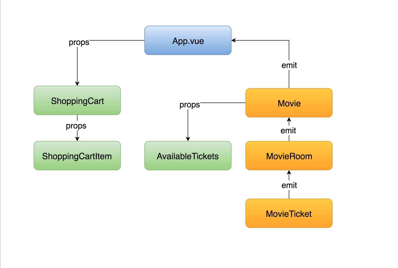
pass data from top to bottom
// ProductCard.vue
<script>
import ProductCardImage from "@/components/ProductCardImage.vue"
export default{
  components: ProductCardImage
  //...
}
</script>

<template>
  <div>
    <ProductCardImage :image="image"></ProductCardImage>
    <p>{{ title }}</p>
    <p>{{ price }} kr</p>
  </div>
</template>Props flow down
From Vuejs.org
Props are reactive
if the parent data changes, it will flow down and automatically update the nested components
Component props examples
<div id="app">
  <UserCard :user="user"></UserCard>
  <NotificationMessage type="success"></NotificationMessage>
  <NavbarItem text="home" url="/"></NavbarItem>
</div>
Component props tips
Components should not change the value of props
// ProductCard.vue
<script>
export default{
  props: ['title', 'price', 'link', 'image'],
  methods:{
    doThing(){
    	this.title = "something else" // ❌ Big no, no!
    }
  }
}
</script>

<template>
...
</template>
Use object syntax to validate props
app.component('product-card', {
  template: '#product-card-template',
  props: {
    title: {
      type: String,
      required: true
    },
    price: {
      type: Number
    }
  }
})
Support props types
- String
You can create custom prop validation rules 💪
for example validUrl
Questions?
Assignment # 8
👩💻👨🏽💻
⏰ 20 mins
Child -> Parent Communication
Communication takes place via events
Child component emits an event
Parent component catches the event and takes action
Child component emits an event
// ClickCounter.vue
<script>
export default{
  data () {
    return {
      count: 0
    }
  },
  methods: {
    increase () {
      this.count++
      this.$emit('increased', this.count)
    }
  }
}
</script>

<template>
  <button v-on:click="count++">hit me {{ count }}</button>
</template>
event name
payload
Parent listens for the event
// App.vue

<script>
export default{
   data() {
      return {
        counter: null
      }
    },
    methods: {
      setCounter (count) {
        this.counter = count
      }
    }
}
</script>

<template>
	<ClickCounter @increased="setCounter"></ClickCounter>
</template>
event name
event handler
event payload
Parent listens for the event
// App.vue

<script>
export default{
   data() {
      return {
        counter: null
      }
    },
}
</script>

<template>
	<ClickCounter @increased="counter = $event"></ClickCounter>
</template>
inline handler
event payload
Custom Events do not propagate
Like ordinary HTML events do
Custom Events do not propagate
<ProductCardImage><ProductCard><ProductList>Custom Events do not propagate
<ProductCardImage><ProductCard><ProductList>$emit('image-broken')
✅
Custom Events do not propagate
<ProductCardImage><ProductCard><ProductList>$emit('image-broken')
$emit('image-broken')
✅
You can catch and emit upwards
You can catch and emit upwards
Just don't do it too much!
(Might need Pinia for global state management)
💡Data goes to child via props
💡Data goes to parent via events
Component Communication Recap
💡Data goes to child via props
💡Data goes to parent via events
Component Communication Recap
If you need to do that for many levels use a state management pattern
emits option
🆕
// ClickCounter.vue
<script>
  export default{
    emits: ['increased'],
    data () {
      return {
        count: 0
      }
    },
    methods: {
      increase () {
        this.count++
        this.$emit('increased', this.count)
      }
    }
  }
</script>

<template> ....</template>
Declare emitted events
app.component('click-counter', {
  template: '<button v-on:click="increased">hit me {{ count }}</button>',
  emits: ['increased'],
  props: ['initialCount'],
  data () {
    return {
      count: this.initialCount ?? 0
    }
  },
  methods: {
    increase () {
      this.count++
      this.$emit('increased', this.count)
    }
  }
})
Syntax like props
export default {
  emits: {
    // no validation
    click: null,

    // with validation
    submit: payload => {
      if (payload.email && payload.message) {
        return true
      } else {
        console.warn(`Invalid submit event payload!`)
        return false
      }
    }
  }
}
Object syntax
Highly recommended to document emitted events
- Great for documentation
- Prevents edge-case issues when re-emitting native events such as click
- Gives info to your IDE to better autocomplete events
Vue DevTools 🤟
Events are logged in devtools
Questions?
Assignment # 9
👩💻👨🏽💻
⏰ 20 mins
Lifecycle Hooks
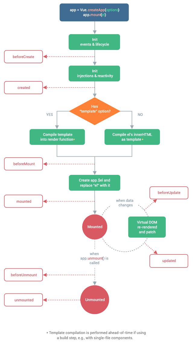
Each vue instance goes through a set of initialisation steps
In each step, you can run code ⚡️
using lifecycle hooks
Lifecycle hooks
- created - instance is ready - not mounted yet
- mounted - instance is mounted to the DOM
- unmounted - instance is removed from the DOM
{
  props: ['id'],
  data () {
    return {
      blogPost: null
    }
  },
  created () {
    axios.get('api/posts/' + this.id).then(response => {
      this.blogPost = response.data
    })
  }
}
Lifecycle hooks
created - often used to fetch data from API
Example
Lifecycle hooks
created - fetch data from an API while component is added to the DOM
mounted - define global event listeners
beforeUnmounted - remove any event listeners we have defined globally
Use Cases
Lifecycle hooks
https://vuejs.org/guide/essentials/lifecycle.html
Questions?
Assignment # 10
👩💻👨🏽💻
⏰ 20 mins
2. Vue 3 Fundamentals Workshop - Components (⚠️Options API)
By Daniel Kelly


