FLIPping Awesome Animations

David Khourshid
@davidkpiano
Functional animation is subtle animation that has a clear, logical purpose. It reduces cognitive load, prevents change blindness and establish a better recall in spatial relationships.
But there is one more thing.
Animation brings user interface to life.
Transitions are about relationships.


-
Quick: efficient, yet meaningful
-
Clear: simple, coherent
- Cohesive: unified by speed, responsiveness, intention


Shared Element Activity Transitions
Android

- Elements common to many activities
- Uses common transition names
- Natural, simple movement
- Built-in transition API:
- changeBounds
- changeClipBounds
- changeTransform
- changeImageTransform
- guides.codepath.com/android/Shared-Element-Activity-Transition
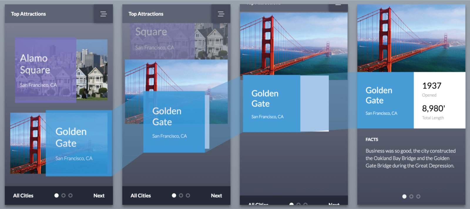
First Last Invert Play
First Last Invert Play
node.getBoundingClientRect()
ClientRect {
  top: 150,
  bottom: 688,
  left: 0,
  right: 820,
  width: 650,
  height: 450
}
ClientRect {
top: 10,
left: 10
}ClientRect {
top: 200,
left: 300
}Δy: 200 - 10 = 190(px)
Δx: 300 - 10 = 290(px)
Normal Transition
ClientRect {
  top: 10,
  left: 10
}
ClientRect {
top: 200,
left: 300
}Δy: 10 - 200 = -190(px)
Δx: 10 - 300 = -290(px)
FLIP Transition
.box {
transform:
translateX(-290px)
translateY(-190px);
}FLIP Transition
.box {
transform:
translateX(0)
translateY(0);
}ClientRect {
top: 10,
left: 10
}FIRST: Get the initial position/size
ClientRect {
  top: 200,
  left: 300
}LAST: Get the final position/size
INVERT: Transform the final node to the first position/size
.final-box {
  transform:
    translateX(-290px)
    translateY(-190px);
}
This happens before the browser renders the final node at its resting position.
PLAY: Animate the final node to its resting position
.final-box {
  transform:
    translateX(0)
    translateY(0);
}
Use your favorite animation library to do this!
- GreenSock Animation Platform
- VelocityJS
- AnimeJS
- MoJS
- Web Animations API
-
Vanilla CSS😔
Dynamic animations better suited for JS
Don't know positions ahead of time
// FIRST
const firstNode = document.querySelector(...);

const firstRect = firstNode.getBoundingClientRect();
FIRST
// FIRST
const firstNode = document.querySelector(...);

const firstRect = firstNode.getBoundingClientRect();

// Execute change that
// introduces new view
doSomething();

// LAST
const lastNode = document.querySelector(...);

const lastRect = lastNode.getBoundingClientRect();
LAST
// FIRST
const firstNode = document.querySelector(...);

const firstRect = firstNode.getBoundingClientRect();

// Execute change that
// introduces new view
doSomething();

// LAST
const lastNode = document.querySelector(...);

const lastRect = lastNode.getBoundingClientRect();

// INVERT
const deltaX = firstRect.left - lastRect.left;
const deltaY = firstRect.top - lastRect.top;
INVERT
// FIRST
// ...

// LAST
// ...

// INVERT
const deltaX = firstRect.left - lastRect.left;
const deltaY = firstRect.top - lastRect.top;

// PLAY
lastRect.animate([
  {
    transform: `
      translateX(${deltaX}px)
      translateY(${deltaY}px)
    `
  },
  {
    transform: `
      translateX(0)
      translateY(0)
    `
  }
], {
  duration: 300, // milliseconds
  easing: 'ease-in-out',
  fill: 'both'
});
PLAY!
inverted position
initial position
-
position: rect.top, rect.left
-
scale: rect.width, rect.height
-
color: getComputedStyle()
-
rotation: have fun
-
size: 😐
Sliding Layers:
First and last
Must be nested inside a <div>
Sliding Layers:
Invert inner
.final-box {
  transform: translateY(100px);
}
Δy: lastRect.height - firstRect.height
Δy
Sliding Layers:
Invert outer
.final-box {
  transform: translateY(100px);
}

.outer-box {
  transform: translateY(-100px);
}
-Δy
Sliding Layers:
Clip
.final-box {
  transform: translateY(100px);
}

.outer-box {
  transform: translateY(-100px);
  overflow: hidden;
}
.final-box {
transform: translateY(0);
}
.outer-box {
transform: translateY(0);
overflow: hidden;
}Sliding Layers:
Play
Sliding Layers Demo
Natural Motion Curves
TIPS:
- Experiment with multiple easings!
- ease-in: accelerate
- ease-out: decelerate
- linear: actually useful!
STRATEGY:
- Split translateX and translateY
- Give one parameter to container
- Give other parameter to inner
- Animate both simultaneously
Natural Motion Curves
// INVERT
const deltaX = firstRect.left - lastRect.left;
const deltaY = firstRect.top - lastRect.top;

// PLAY
innerRect.animate([
  {
    transform: `translateX(${deltaX}px)`
  },
  {
    transform: `translateX(0)`
  }
], {
  duration: 300, // milliseconds
  easing: 'ease-in',
  fill: 'both'
});

outerRect.animate([
  {
    transform: `translateY(${deltaY}px)`
  },
  {
    transform: `translateY(0)`
  }
], {
  duration: 300, // milliseconds
  easing: 'linear',
  fill: 'both'
});
FLIP.js

let flip = new FLIP({
  element: target,
  duration: 2000
});

// First position & opacity.
flip.first();

// Apply the 'end' class and
// snapshot the last position & opacity.
flip.last('end');

// Move and fade the element
// back to the original position.
flip.invert();

// Play it forwards.
flip.play();
- Uses rAF or GSAP
- Doesn't work with shared elements
- Made by Paul Lewis himself
React Flip Move
import FlipMove from 'react-flip-move';

class TopArticles extends Component {
  renderTopArticles() {
    return this.props.articles
      .map(article =>
        <Article
          {...article}
          key={article.id}
        />
      );
  }

  render() {
    return (
      <div className="top-articles">
        <FlipMove easing="...">
          { this.renderTopArticles() }
        </FlipMove>
      </div>
    );
  }
}- React only
- Uses inline transitions
- Highly configurable
- Built-in animations
BarbaJS


Why are we OK with the user feeling like they are being teleported every time the page changes?
- Can be used with FLIP technique
- Transitions between pages
- Can reduce HTTP requests
- Can use any JS animation library
- Can use CSS animations
Resources
- Animating the Unanimaetable - Joshua Comeau
- FLIP your Animations - Paul Lewis
- Pixels are Expensive - Paul Lewis
- Improving User Flow Through Page Transitions
- Luigi de Rosa - Smart Transitions in User Experience Design
- Adrian Zumbrunnen - What Makes a Good Transition?
- Nick Babich - Motion Guidelines in Google's Material Design
Thank you!
Inspiration Resources:

Flipping Awesome Animations
By David Khourshid


