How did you attract/address your audience?
Attracting the right audience
Wilderness's audience includes people who are interested in music, fashion and live music events. My target audience shows that the average reader is 16-22 years old and most have creative jobs and interests. When I created my first target audience profile I chose this age range because at this age most people have developed their own identity and good self awareness.

Lifestyle
My audience's lifestyle was important for the indie rock theme so I took into account what other interests they have. I went to popular places like Shoreditch to take pictures for my research so I could incorporate design elements into Wilderness.

I used a record shop to take my photos as most indie music is often sold in vinyl copy too. I used a pub called The Lion for my photo shoot and featured clothing brands on my contents page for fashion purposes.


Other musicians
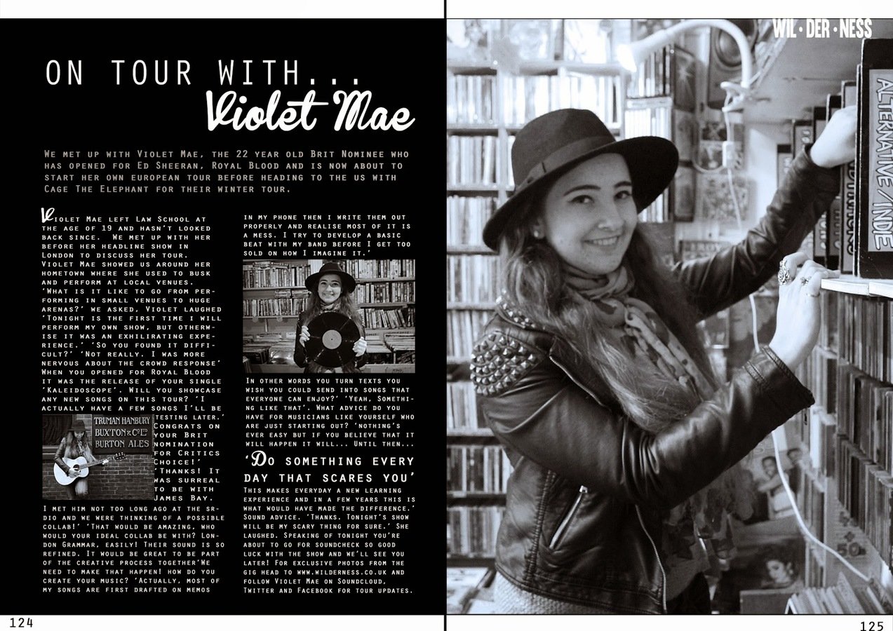
The article in my double page spread used other musicians and this was to reinforce that Wilderness is a music magazine. When I researched other music magazine articles they often wrote about if the musician was touring or if they had been working on other projects. In my article I chose to write an article about Violet Mae's summer tour and this was aimed at the readers who regularly attend live music events. I also mentioned other musicians to develop the Violet Mae persona and appeal to fans of the other artists as well.


uSE OF COLOurs
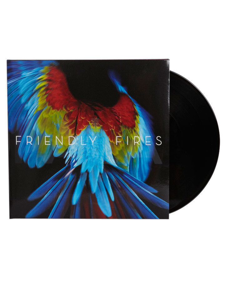
One of the challenges of creating an indie rock magazine was creating something that would appeal to a broad age group. The original magazine cover for Wilderness was a black and white background with the 3D effect in black and white to honour the rock aspect. I used the 3D effect in colour to appeal to the younger audience and represent the genre better. Using colour also made my magazine more conventional. I used the spotlight effect because it challenged the traditional use of boxes, and I chose not to heavily edit the background as I wanted it to have an underground look.

Music fans
I used basic colour schemes and minimal text to keep my magazine looking refined. This reflected the indie look and a lot of indie musicians album art. This created an underground theme and this made sure Wilderness appealed to the right target audience.
'20 free tickets' and 'sound of 2015' were my only sell lines and this was to target the readers who are interested in music.
My double page spread also targeted music fans as the images and articles were central to the music theme. The interview included the music making process and was in black and white to avoid the reader being distracted by the background.
Music and lifestyle
Similar to Dazed and Confused Magazine, one of the principles of Wilderness is to 'combine music and lifestyle'. Under the Wilderness masthead there's a cover line saying that. The decision to add it was to balance the masthead, as there are three letters in 'Wil' der' then four in 'ness' so it looked unbalanced without the line below it.


Layout
I have organised the layout of the cover so the position of the features guide the reader in the best way to view the magazine (shown by the arrows).
I wanted the House style to be very neat and contemporary because some of my audience are designers themselves. Trends are important for the indie rock genre so I had to make sure Wilderness reflected this. This is why the colour palette is quite understated in my magazine and the masthead is quite simple and contemporary.
I also arranged my pages so that they have conventional layouts but the content is quite unusual.
