Maus
by Art Spiegelmann
People are trapped in history and history is trapped in them.
- James Baldwin
The comic is about Spiegelman's father's experiences in the Holocaust. More specifically, about his own efforts to work through the implications of his father's experiences now.
Maus is obsessed with correspondence between the past and the present. Spiegelman works out this theme through his text, narrative, and structure.
How does he do this?
This argument draws heavily from Nerdwriter's vlog "How to Design a Comic Book Page"
Maus
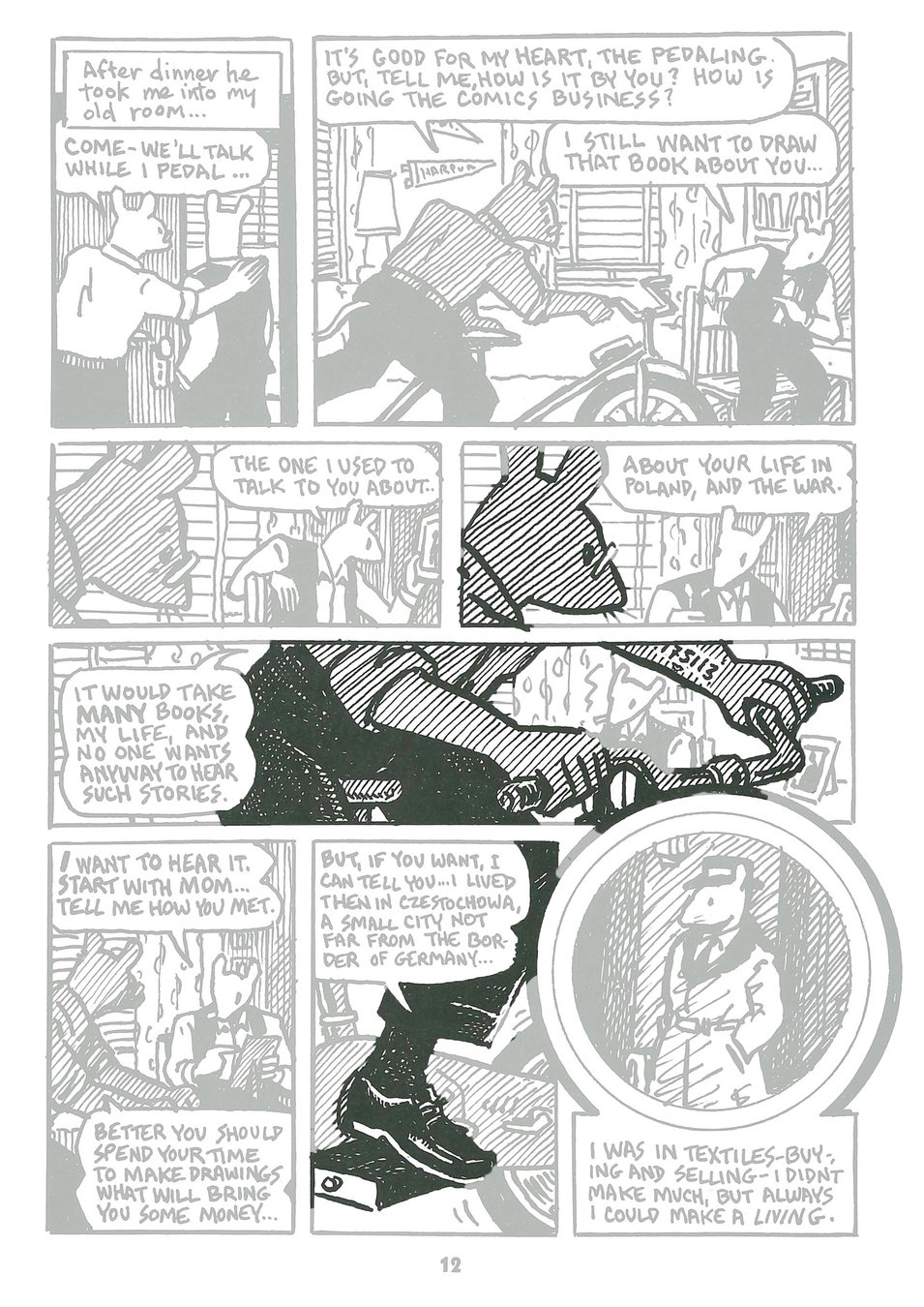
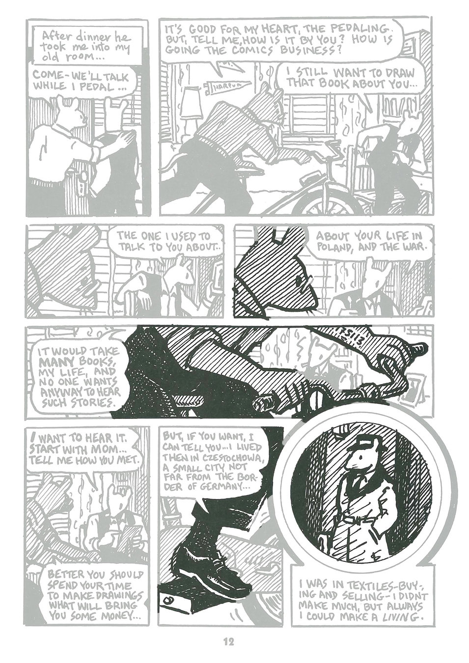
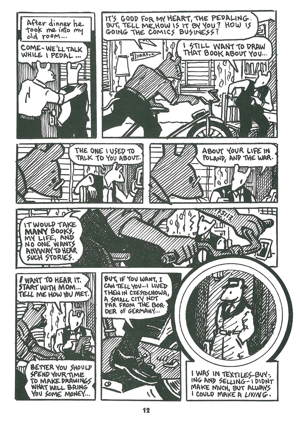
Second page of the first chapter
4 rows, 8 panels
First Panel
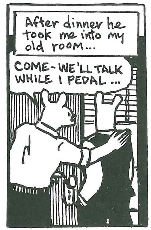
Spiegelman's father Vladek takes him up to his old bedroom to do some exercises while they talk.
Already, the past is signaled
Second Panel
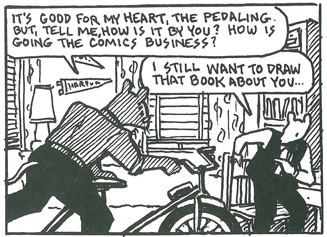
Closer look at that room...
More remnants of the past like old college pennant
First glimpse of the exercise bicycle.
This is where Art first broaches the subject of this book that we're reading now.
Second Panel

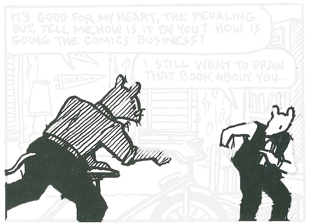
Third Panel
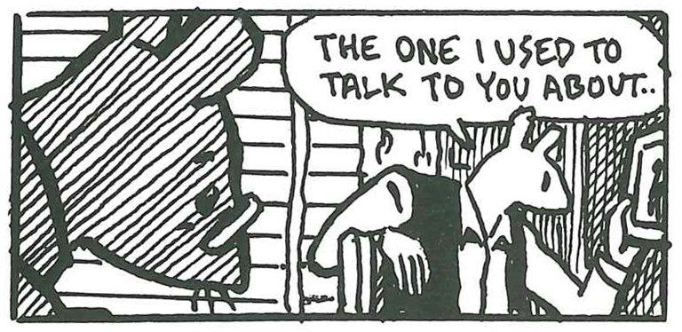
Art's looking at a picture, but we won't learn what it is until a few panels down.
Fourth Panel
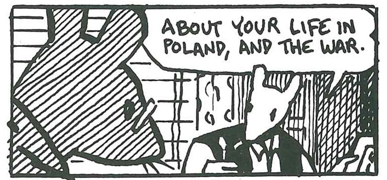
Fifth Panel

Stretches across the entire width of the page
Three key signifiers:
- Picture
- Identification tattoo from Auschwitz
- Speech bubble
Fifth Panel

It's as if the past -- articulated (spoken), inscribed (tattooed), documented (photographed) -- were flanking both men, closing in on them
- Hillary Chute
Sixth Panel
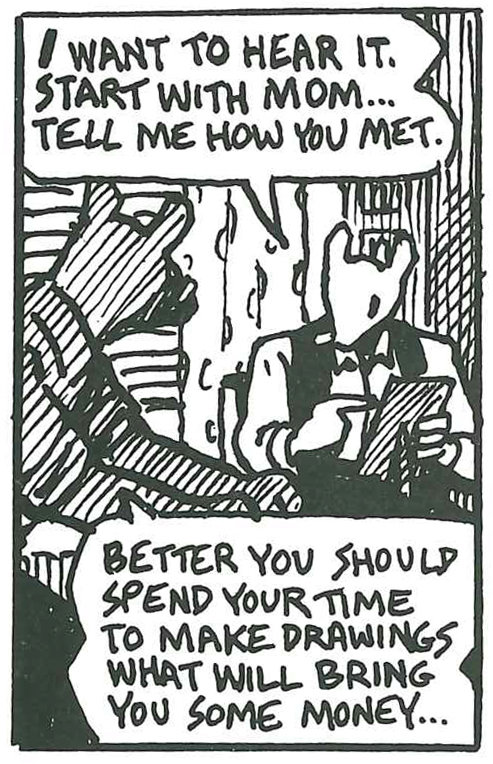
We learn that the photograph is of Artie's mother, Anja
Seventh Panel
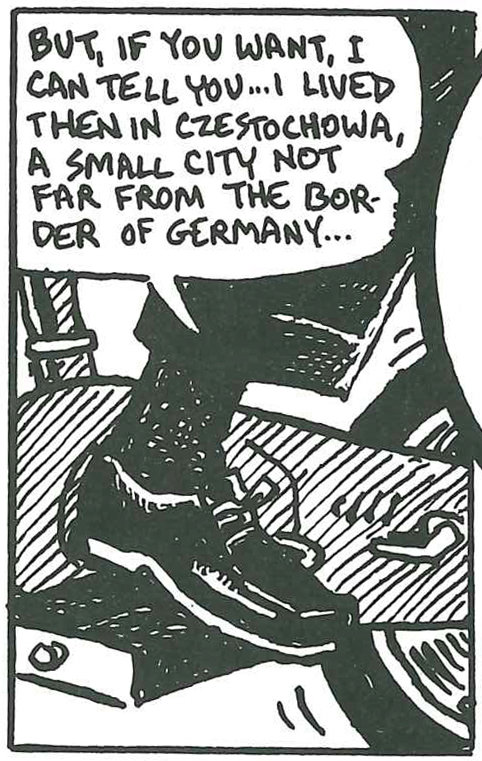
We see Vladek's shoe pedaling with effort on the bike, but going nowhere.
Eighth Panel
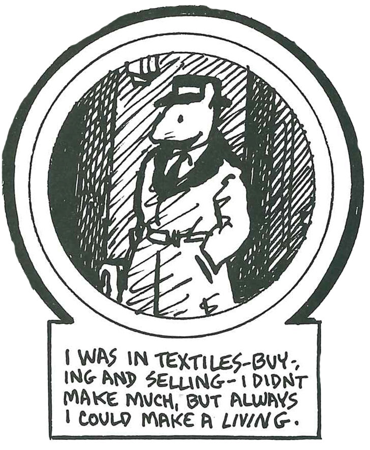
Final, circular panel
First window into the past, into the story within a story that will consume the book.
In a comic you have various panels. Those panels are each units of time. You see them simultaneously, so you have various moments in time simultaneously made present.
And that’s what Maus is about, it’s about the past and present intertwining irrevocably and permanently
- Art Spiegelman
"The Holocaust Through the Eyes of a Maus"
For Spiegelman the basic
unit of comics is not the panel but the page.

In a way that is unique to comics, time is made spatial, spread out across a surface, so that you can see not only how the past affects the future but vice versa.

Comics is less a combination of prose and illustration than it is a combination of poetry and graphic design.


Take a closer look. What do you see in this design?
