How my magazine attracts young indie rock fans...
image
Layout
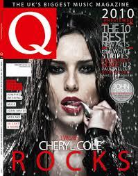
My magazines use of mise-en-scene represents this particular social group as the text is positioned in similar places to those of Q and NME, which are typically read by this target audience. I have also included a fair amount of writing on the front cover explaining some of the contents inside the magazine this is due to a lacking attention span amongst young people, it means that they can then glance at the front cover and know instantly if this issue is suited to their interests.
The contents page has a very obvious structure to it, this is for a similar reason to the front cover, it enable my target audience to find the article or page that they are looking for quickly and effectively.
Title
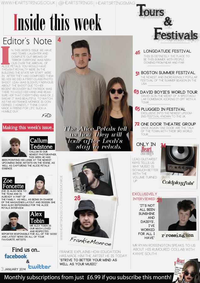 I have included red lines to separate the different articles. This makes them easy to differentiate between. (The lines are red to fit in with the magazines house colours).
Props and costume
Location
I have no particular location for the central image as I took the photo in a studio set up, however I did this to show professionalism and modernisation which strongly reflects the young, modern and technologically savvy generation that this magazine is intended for.
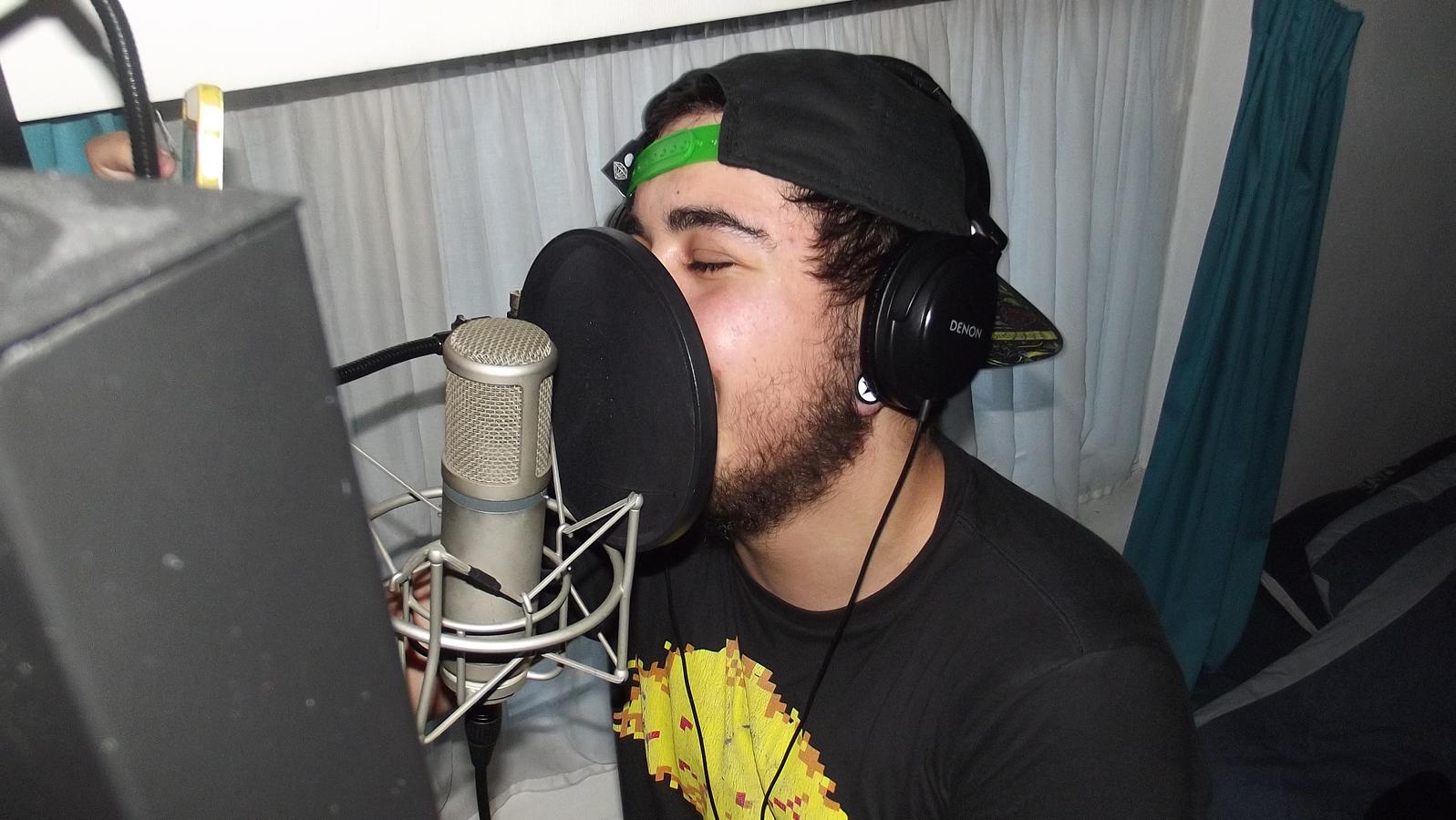
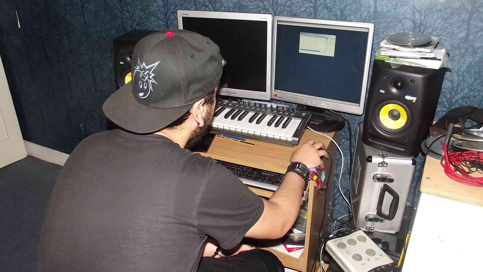
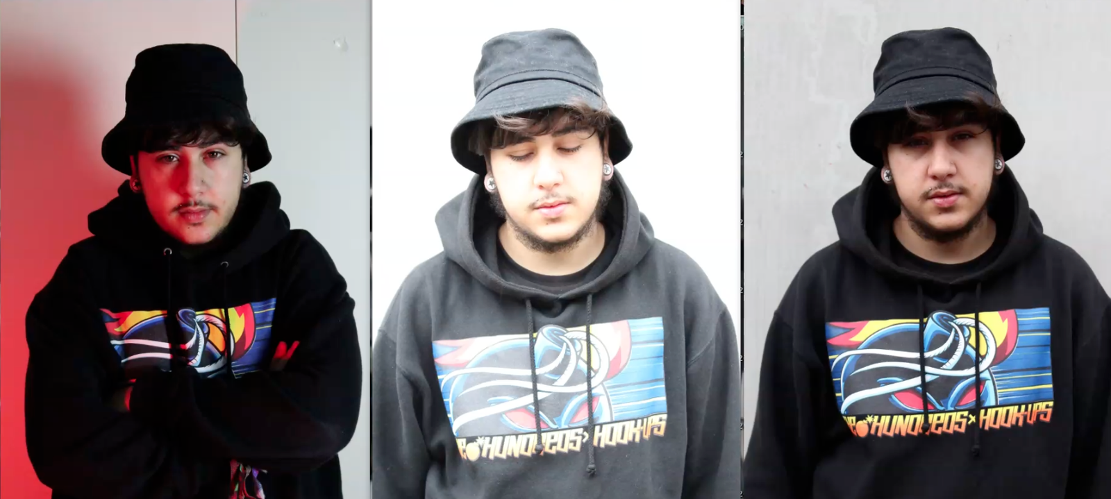
Although this was not the case for all the images as I chose to capture the essence of young upcoming artists, I therefore took an image in a studio bedroom set up. this represents how young people are becoming more creative and determined to fulfil a career in the music industry. It also represents their 'budgeting'.
lighting
The lighting set up of my magazine represents the younger generation as, although the images mostly have a grey back drop, the lighting itself is still quite light.
Young people are recently beginning to en delve in making their images more 'photographer' like, meaning more exposure, more filters and less 'camera phone' ish.
I have therefore tried to use filters and bright lighting to attract my audience as I believe they would be interested in taking inspiration from the images in the magazine.
body language
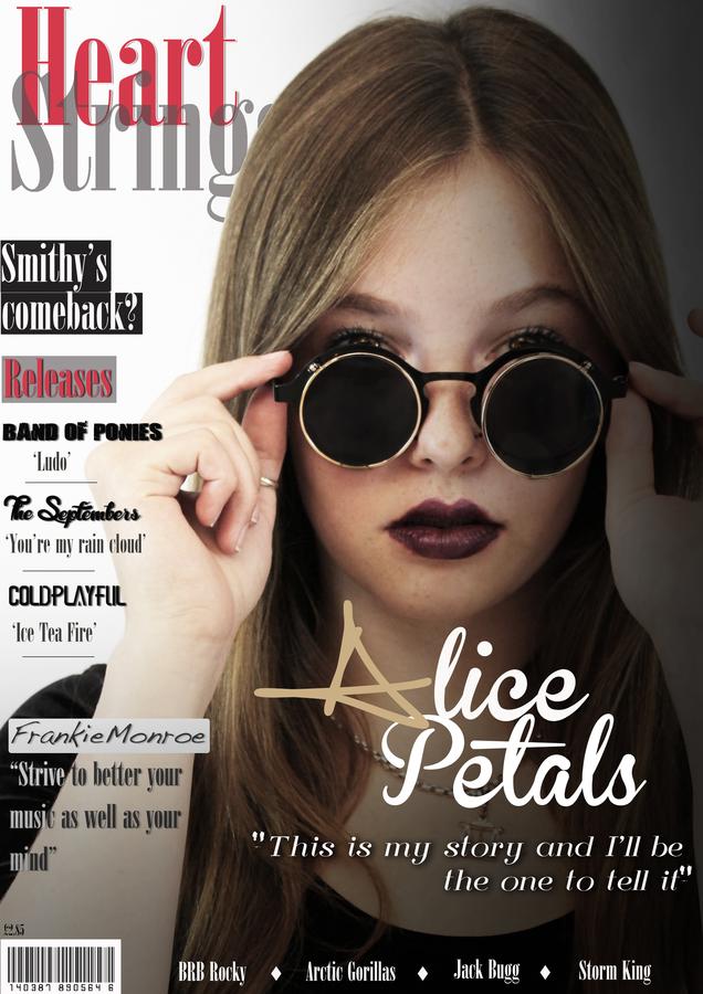
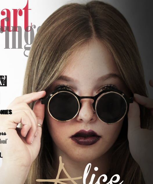
The central image on the front cover shows 'Leah' holding her sunglasses on both sides, as if she were taking them off. This is supposed to represent her revealing her story, this heavily relates to the teenagers specifically as they stereotypically find it hard to express themselves and tend to keep things hidden. They can then look at this front cover and relate to the emotions in which the model is portraying, which would therefore encourage them to read about her.
This also falls under 'mode of address', as pulling her glasses off slightly, Leah is making eye contact with the person reading the magazine, whereas throughout the rest of the magazine her eyes are covered fully by the glasses.
Language
I have chosen to use a formal style of writing throughout the magazine, especially in the DPS interview. This was due to research that I had previously done over social networking sites. Unlike a few years ago when abbreviations such as 'brb' and 'lmao' were frequently being used by the young generation, correct grammar has recently become a trend and the likes of 'lol' have been deemed 'uncool'. For this reason I chose to eliminate a lot of 'slang' terms from the article as I feel formality best fitted the young people of today.
attitudes...
Taking the central image into consideration, it reflects confidence from the artist, this both conforms to stereotypes perceived about indie rock artists about being brave, confident and 'out there'. However it also introduces a countertype for the genre as a sense of 'shyness' is also portrayed from the image, as she uses the sunglasses as a shield to remain slightly hidden from the world.
The image of 'Ryan Rossington' on the contents page conforms to the stereotype as he grips his hair in a 'model' like pose, oozing confidence and self indulgence.