UX Summit 2015
Inspiring Innovation
by Matt Magain
May 29, 2015| Green Sun Hotel

Prepared by Gian Faye Paguirigan
5 skills of a good ux designer
- Sketching
- Story telling
- Presenting
- Critiquing
- Facilitating
activities!
Sketching tools
- The visual alphabet
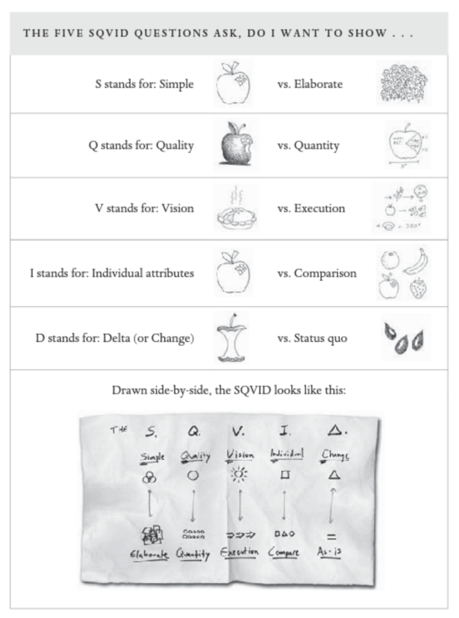
- The SQVID framework
design games
- F.A.B.I. grid
- Design the box
- Empathy map
- Visual stimulus
- Design the homepage
the visual alphabet
sketching tools
basic sketching
You can sketch just about anything by combining one or more of the letters in the visual alphabet.

the sqvid framework
sketching tools
S.Q.V.I.D. framework
The SQVID framework is a simple tool for looking at a problem from multiple viewpoints.
f.a.b.i. grid
design games
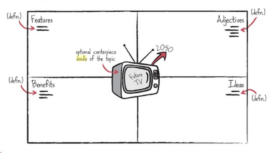
The F.A.B.I. grid is a collaborative note-taking exercise, useful for capturing and displaying information that the group can analyze and use in later activities.
Summary
- Objective: capture & display elements of the presentation for later use
- Number of people: everyone
- Duration: 30 minutes
- Setup: large sheet of paper, post-its and markers
execution
Arm each member of the group with a pad of post-its and a marker. Divide a large sheet of paper or whiteboard into four quadrants, and draw a representation of the topic in the centre (e.g. the future of conferences).
During the presentation, members of the group should capture Features, Adjectives, Benefits, and Ideas that occur to them listening to the topic.
- Features: characteristics of the technology, industry or trend being described
- Adjectives: descriptors that you hear or think of during the presentation
- Benefits: value-based contributions of the topic being discussed
- Ideas: initial thoughts that come to mind
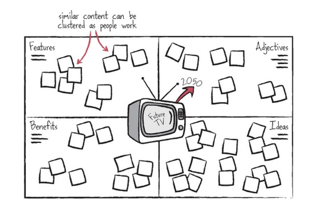
FABI-lous note-taking!
At the end of the presentation, thank the presenter, allow the participants to reflect on the notes made, find groupings or natural patterns, and encourage conversation to explore any new ideas that may have been sparked. : )
design the box
design games
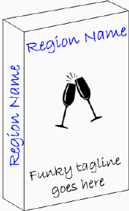
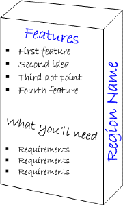
Design the box is a group activity to help elicit features, benefits and selling points of a product, service or organisation.
Summary
- Objective: identify key features and selling points for a product or service
- Number of people: 3-5
- Duration: 1 hour
- Setup: cereal boxes, paper, coloured markers, glossy magazines, scissors and glue or sticky tape
execution
Ask participants to design the box for a product. On the front of the box, they should include:
- The name of the product
- A tagline describing the product
On the back of the box, they should include:
- Key features (3-5 features only)
- Constraints or requirements (again, just a short list)
The game should be played with a physical box, post-it notes and thick markers (thick so people don’t go into a lot of detail).
Start by explaining what the aims of the activity are – to come up with ideas and features for a product and succinctly describe them. Explain the product or service idea. You may want to provide a lot of background, so participants focus on their ideas in some detail.
Or you may want to provide only very sketchy background so participants focus on generating high level ideas.
Get people into teams (teams of 3-5 work well).
Allow enough time for the teams to discuss the idea, focus on what they would like to present, and prepare their box.
This may take anywhere between 15 minutes and an hour, depending on the complexity of the topic.
When everyone has prepared their box, ask each team to explain what they have created and some of their rationale.
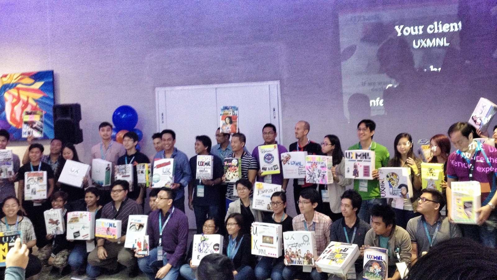
Attendees showing off their boxes!
empathy map
design games
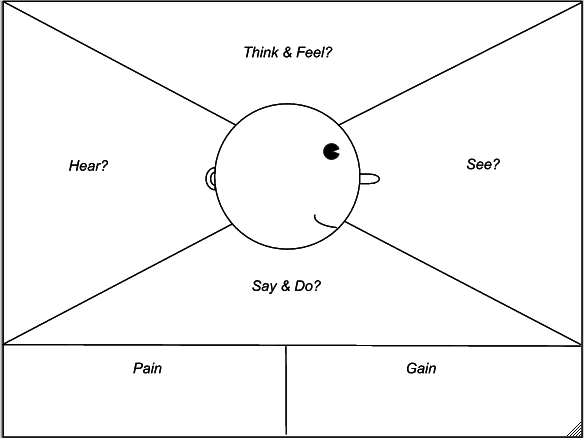
Empathy map is a collaborative activity to quickly create a customer or user profile. While not based on user research. It fulfils the goal of encouraging team mates to exercise more empathy for the user, while revealing insights and potential opportunities for innovation.
Summary
- Objective: quickly develop a customer or user profile
- Number of people: 3-10
- Duration: up to 30 minutes
- Setup: large sheet of paper, post-its and markers
- Draw an Empathy Map on a large whiteboard or poster.
- Draw the profile of a head with physical features such as eyes, ears, a mouth, and a nose. This will help players identify with the character and project themselves into it to form more accurate ideas.
- Divide the map into four sections, portraying what the targeted persona sees, thinks/feels, hears, gains, and is challenged by.
execution
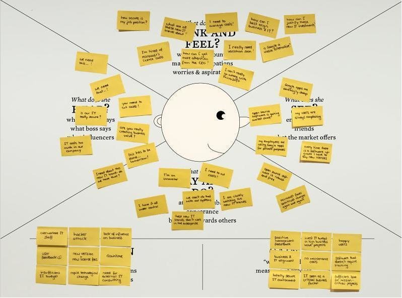
Throughout the game, have your players write their ideas about the character's experiences on sticky notes, which they will then stick onto the respective section of the empathy map!
visual stimulus
design games
Visual stimulus is an activity that presents structured series of imagery to elicit ideas together.
Summary
- Objective: elicit a range of ideas in response to a structured series of images
- Number of people: 3-6
- Duration: 1 hour
- Setup: a range of categorized images, large sheet of paper, markers, posts-its, sticky coloured dots
This activity requires a considerable amount of preparation.
execution
1. Identify opportunity areas. This could be done by surveying participants ahead of the day, or by performing user research that uncovers insights about the behavior of the organization's users or customers.
2. Prepare a range of imagery for participants to respond to. This could be printed onto A4 sheets. The imagery should be grouped into the following categories. There should be at least 5 images in each category. Keep the images well organized and together in their categories.
categories:
- In-category: how do similar organizations, both global and local, solve their problems in the opportunity area?
- Alternate worlds: how do other industries solve similar problems?
- Observing trends: what trends are occurring in the world that we may be able to glean ideas from
- Creative excursions: what are the personality traits of a range of celebrities -- how would they solve this problem?
- Abstract images: a range of completely unrelated images that may spark ideas by making unexpected connections.
3. The facilitator should act as timekeeper. Allow 5 minutes for each category. Once the click is ticking, participants should write down ideas in response to the imagery.
4. Determine ideas worth pursuing. When all categories have been explored, teams should perform an affinity mapping exercise to arrange their ideas, and perform dot-voting to determine the ones worth pursuing.
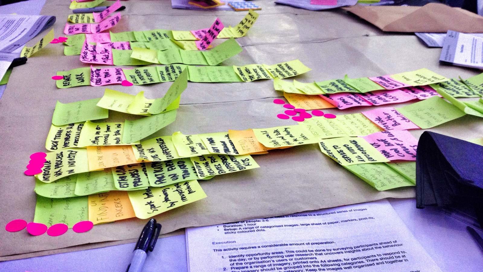
Our team's 1 hour worth of brainstorming *phew*
Design the home page
design games
In Design the home page, participants design the home page for a website, intranet, or application. By doing so, they identify key features and content ideas (and become more supportive of the change, as they have had the opportunity to contribute to the end result).
Summary
- Objective: gain ideas and buy-in for changes to an organization's home page
- Number of people: 3-10
- Duration: 1 hour
- Setup: A4 paper, markers, blu-tak, sticky dots
1. Start by explaining what the aims of the activity are – to come up with ideas and features for a website, intranet or application and sketch (or list) them.
2. Ask participants to sketch their idea for a new home page, either individually or in teams.
3. Allow enough time for participants to discuss the idea, focus on what they would like to present, and prepare their home page.
execution
4. When everyone has prepared their home page, ask each to explain what they have created and some of their rationale.
5. If time permits, include a second iteration, where people dot-vote on each other's sketches, and prepare a second version that feeds in what they learned from the sketches.
6. Variation: Prepare a range of screenshots from other sites, both in the same industry and outside. Participants may perform dot-voting on these screenshots to indicate which aspects they do or don't like.
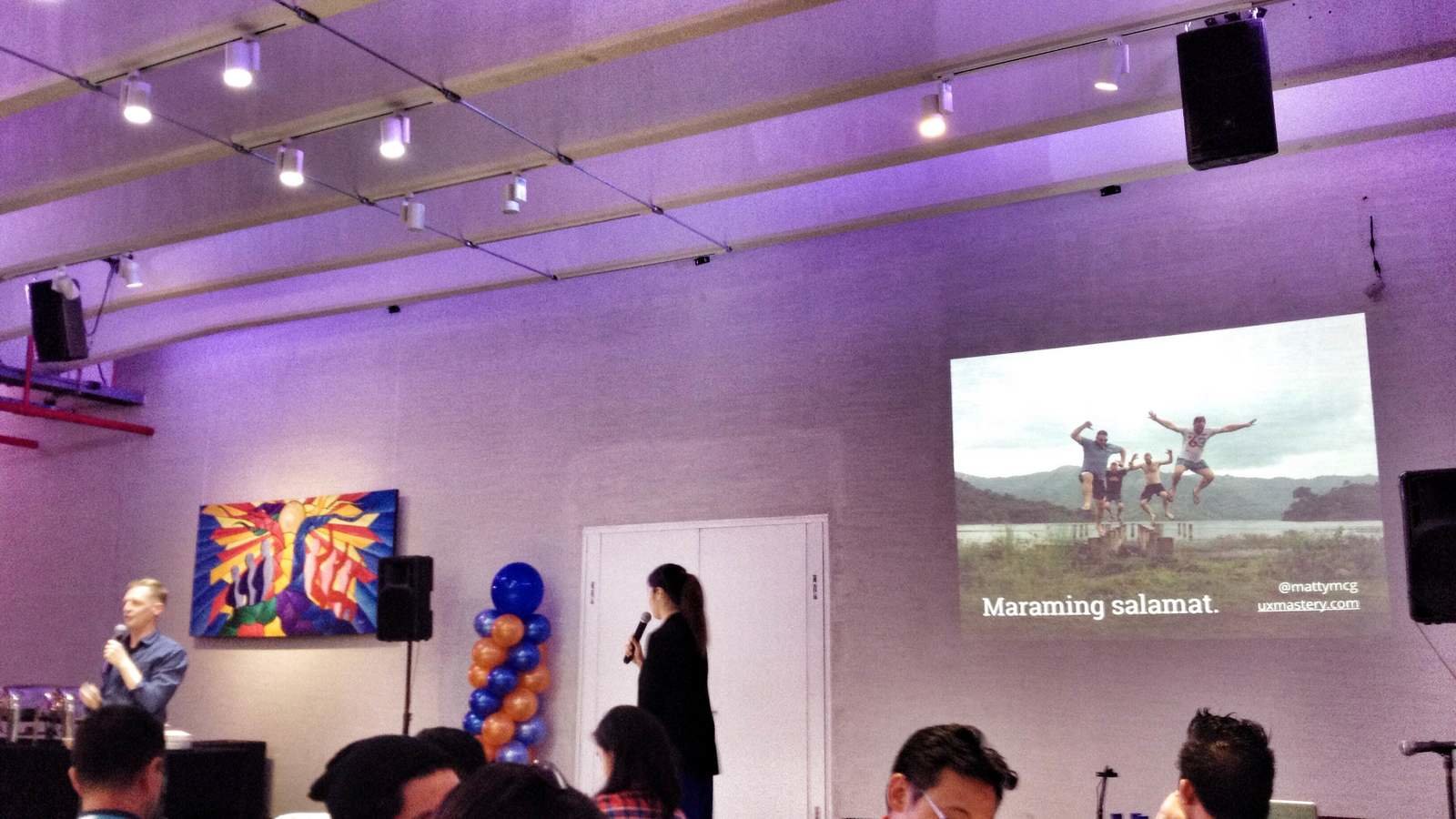
That's it! Thank you for viewing through the slides and I hope that you learned and can apply these activities. These are not just limited to User Experience design but also applicable to HR, decision making process, project management, and the list goes on.