Bootstrap for Quick Web Development
Jamie Klenetsky Fay
GoWProNJ, September 19 2014
CSS Frameworks
- Pre-built CSS grid systems to make development easier and faster
- Have layout and often typography classes pre-defined
- Many frameworks exist for a specific developer's needs
- The most popular: Bootstrap and Foundation
Welcome to Bootstrap

Why Use Bootstrap?
- Easy to use
- Built-in grid system
- Faster web development
- Built-in styles for HTML elements
- Pre-styled components (dropdowns, alerts, etc)
- Bundled Javascript components (modals, tooltips)
- Great documentation and community support
- Easy to integrate into your existing CMS
http://www.webdesignerdepot.com/2014/10/the-ultimate-guide-to-bootstrap
Pros
Accounts for everything you might need, from responsive menus to warning buttons.
Easy to create beautiful, modern, responsive designs
Can be used for everything - prototyping and final design.
Cons
Without a good amount of customization, Bootstrap sites look very similar.
The Bootstrap framework (minimized) is 106KB, not including fonts or JS.
Many, many divs
Let's Get Started!
There are multiple development environments, pick what's best for you:
Hosted CDN
Download basic distribution files
LESS/SASS
Grunt workflow
Our first page
<!DOCTYPE html>
<html lang="en">
  <head>
    <meta charset="utf-8">
    <meta http-equiv="X-UA-Compatible" content="IE=edge">
    <meta name="viewport" content="width=device-width, initial-scale=1">
    <title>Bootstrap 101 Template</title>

    <!-- Bootstrap -->
    <link rel="stylesheet" href="http://maxcdn.bootstrapcdn.com/bootstrap/3.2.0/css/bootstrap.min.css">
<!-- Optional theme -->
<link rel="stylesheet" href="http://maxcdn.bootstrapcdn.com/bootstrap/3.2.0/css/bootstrap-theme.min.css">
    <!-- HTML5 Shim and Respond.js IE8 support of HTML5 elements and media queries -->
    <!-- WARNING: Respond.js doesn't work if you view the page via file:// -->
    <!--[if lt IE 9]>
      <script src="https://oss.maxcdn.com/html5shiv/3.7.2/html5shiv.min.js"></script>
      <script src="https://oss.maxcdn.com/respond/1.4.2/respond.min.js"></script>
    <![endif]-->
  </head>
  <body>

    <div class="container">
    all of our content
    </div>

    <!-- jQuery (necessary for Bootstrap's JavaScript plugins) -->
    <script src="https://ajax.googleapis.com/ajax/libs/jquery/1.11.1/jquery.min.js"></script>
    <!-- Include all compiled plugins (below), or include individual files as needed -->
    <script src="http://maxcdn.bootstrapcdn.com/bootstrap/3.2.0/js/bootstrap.min.js"></script>
  </body>
</html>
Render on mobile
Minimized CSS
Work on older browsers
Jquery and bootstrap JS

Making a sample home page
- title
- top navigation
- hero image
- text
- footer
Our page will include:
Key concepts:
-
Grid system
-
Classes
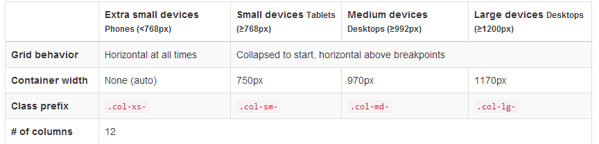
The Grid System
This is the core of Bootstrap - how the page's layout is created. Bootstrap uses a grid system. Unlike many other grid systems,
you can define the number of columns to be shown by viewport size.
How does this work in practice?
<div class="row">
  <div class="col-xs-12 col-sm-6 col-md-8">Column spans 12 columns on the smallest devices,
  6 on small devices, and 8 on medium and large devices.</div>
  <div class="col-xs-6 col-md-4">Column spans 6 on XS and S devices,
  4 on M and L devices.</div>
</div>
col-md-8
col-md-4
col-sm-6
col-sm-6
col-sm-6
col-xs-12
desktop
tablet
mobile
You can also nest columns and change the order in which they display. Full details:
http://getbootstrap.com/css/#grid
Grid system in use:
Text columns
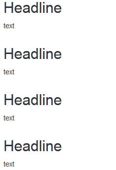
For our home page, I'll set up a welcome message that is one full column,
then four columns of text below.
On tablets, there will be two sets of two columns.
On mobile, each column will span full width.
<div class="row">
  <div class="col-xs-12">Welcome to the site!</div>
</div>

<div class="row">
  <div class="col-xs-12 col-sm-6 col-md-3">
    <h2>Headline 1</h2>
    <p>text</p>
  </div>
  <div class="col-xs-12 col-sm-6 col-md-3">
    <h2>Headline 2</h2>
    <p>text</p>
  </div>
  <div class="col-xs-12 col-sm-6 col-md-3">
    <h2>Headline 3</h2>
    <p>text</p>
  </div>
  <div class="col-xs-12 col-sm-6 col-md-3">
    <h2>Headline 4</h2>
    <p>text</p>
  </div>
</div>

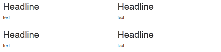
Desktop
Tablet
Mobile
Classes
Classes in Bootstrap are organized in the following way,
for example, with buttons:
.btn --- style this element as a button
.btn-lg --- make it a large button
.btn-btn-default --- give it the default button style
.btn-btn-warning --- give it the "warning" style
This is similar for tables, forms, and other page elements.
For more info on buttons, visit
Header and Navigation
On the top of our home page, we need a header and navigation. There are many ways to achieve this in Bootstrap, but the best is to use the navbar class.
By using navbar, you can ensure that the navigation is responsive. It collapses into a "hamburger" menu on smaller devices.

How does navbar work?
Navbar combines CSS and simple Javascript (don't worry, no coding necessary!) to make a responsive menu.
First, we define our navigation to be a navbar.
<nav class="navbar navbar-default" role="navigation">
  <div class="container-fluid">
Then, we create the "toggle" - the button that the user taps to trigger the menu on mobile devices. We also can add the title of our website as navbar-brand.
<div class="navbar-header">
      <button type="button" class="navbar-toggle"
      data-toggle="collapse" data-target="#navbar-collapse">
        <span class="sr-only">Toggle navigation</span>
        <span class="icon-bar"></span>
        <span class="icon-bar"></span>
        <span class="icon-bar"></span>
      </button>
      <a class="navbar-brand" href="#">Name of Our Website</a>
    </div>
Finally, we add our navigation list. It is wrapped in a div with the classes collapse navbar-collapse so that it will shrink down on mobile devices.
We can also add a search bar and submit button on the right side of the navbar.
 <div class="collapse navbar-collapse" id="navbar-collapse">

     <ul class="nav navbar-nav">
        <li class="active"><a href="#">Link</a></li>
        <li><a href="#">Link</a></li>
        <li><a href="#">Another link</a></li>
      </ul>

      <form class="navbar-form navbar-right" role="search">
        <div class="form-group">
          <input type="text" class="form-control" placeholder="Search">
        </div>
        <button type="submit" class="btn btn-default">Submit</button>
      </form>

    </div>
Our final product:
<nav class="navbar navbar-default" role="navigation">
  <div class="container-fluid">
    <!-- Brand and toggle get grouped for better mobile display -->
    <div class="navbar-header">
      <button type="button" class="navbar-toggle"
      data-toggle="collapse" data-target="#navbar-collapse">
        <span class="sr-only">Toggle navigation</span>
        <span class="icon-bar"></span>
        <span class="icon-bar"></span>
        <span class="icon-bar"></span>
      </button>
      <a class="navbar-brand" href="#">Name of Our Website</a>
    </div>
    <!-- Collect the nav links, forms, and other content for toggling -->
    <div class="collapse navbar-collapse" id="navbar-collapse">
      <ul class="nav navbar-nav">
        <li class="active"><a href="#">Link</a></li>
        <li><a href="#">Link</a></li>
        <li><a href="#">Another link</a></li>
      </ul>
      <form class="navbar-form navbar-right" role="search">
        <div class="form-group">
          <input type="text" class="form-control" placeholder="Search">
        </div>
        <button type="submit" class="btn btn-default">Submit</button>
      </form>
    </div><!-- /.navbar-collapse -->
  </div><!-- /.container-fluid -->
</nav>
There are many navbar options in Bootstrap.
Please use this for reference:
http://getbootstrap.com/components/#navbar
Navbar is only used for main navigation.
If you have sub navigation, in a sidebar for example,
use this instead:
Hero Image ("Jumbotron")
<div class="jumbotron">
        <h1>Welcome</h1>
        <p>This is where you would put a big image.</p>
        <p>
          <a class="btn btn-lg btn-primary" href="#" role="button">A call to action button.</a>
        </p>
      </div>
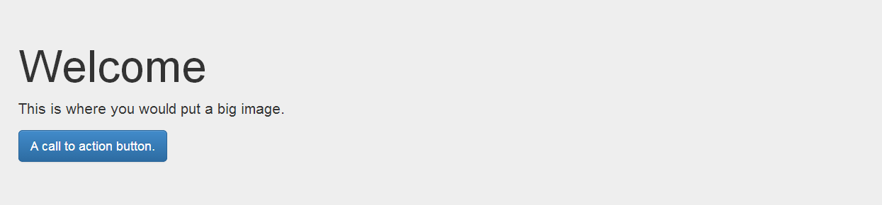
Fortunately, adding our "jumbotron" is simple, and is similar to adding a button, table, or other component to our page.
Footer
There's no special code for your footer - it's a usual row with columns.
Style your footer to make it stand out!
<footer style="background:black;color:white;">
<div class="container">
<div class="row">
  <div class="col-xs-12 col-sm-6 col-md-3">
    <h4>Hours</h4>
    <p>text</p>
  </div>
  <div class="col-xs-12 col-sm-6 col-md-3">
    <h4>Address</h4>
    <p>text</p>
  </div>
  <div class="col-xs-12 col-sm-6 col-md-3">
    <h4>Find Us Online</h4>
    <p>text</p>
  </div>
  <div class="col-xs-12 col-sm-6 col-md-3">
    <h4>Contact Us</h4>
    <p>text</p>
  </div>
</div>
</div>
</footer>
Our Final Product
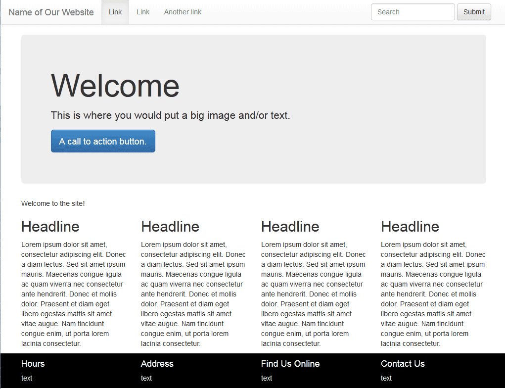
How am I supposed to remember all of this?
Thankfully, you don't have to!
Use the Bootstrap website to find instrutions and examples.
<!DOCTYPE html>
<html lang="en">
<head>
<meta charset="utf-8">
<meta http-equiv="X-UA-Compatible" content="IE=edge">
<meta name="viewport" content="width=device-width, initial-scale=1">
<title>Bootstrap 101 Template</title>

<!-- Bootstrap -->
<link rel="stylesheet" href="http://maxcdn.bootstrapcdn.com/bootstrap/3.2.0/css/bootstrap.min.css">
<!-- Optional theme -->
<link rel="stylesheet" href="http://maxcdn.bootstrapcdn.com/bootstrap/3.2.0/css/bootstrap-theme.min.css">
<!-- HTML5 Shim and Respond.js IE8 support of HTML5 elements and media queries -->
<!-- WARNING: Respond.js doesn't work if you view the page via file:// -->
<!--[if lt IE 9]>
      <script src="https://oss.maxcdn.com/html5shiv/3.7.2/html5shiv.min.js"></script>
      <script src="https://oss.maxcdn.com/respond/1.4.2/respond.min.js"></script>
    <![endif]-->
</head>
<body>


<nav class="navbar navbar-default" role="navigation">
  <div class="container-fluid">
    <!-- Brand and toggle get grouped for better mobile display -->
    <div class="navbar-header">
      <button type="button" class="navbar-toggle" data-toggle="collapse" data-target="#navbar-collapse">
        <span class="sr-only">Toggle navigation</span>
        <span class="icon-bar"></span>
        <span class="icon-bar"></span>
        <span class="icon-bar"></span>
      </button>
      <a class="navbar-brand" href="#">Name of Our Website</a>
    </div>

    <!-- Collect the nav links, forms, and other content for toggling -->
    <div class="collapse navbar-collapse" id="navbar-collapse">
      <ul class="nav navbar-nav">
        <li class="active"><a href="#">Link</a></li>
        <li><a href="#">Link</a></li>
        <li><a href="#">Another link</a></li>

      </ul>
      <form class="navbar-form navbar-right" role="search">
        <div class="form-group">
          <input type="text" class="form-control" placeholder="Search">
        </div>
        <button type="submit" class="btn btn-default">Submit</button>
      </form>

    </div><!-- /.navbar-collapse -->
  </div><!-- /.container-fluid -->
</nav>

<div class="container">

<div class="jumbotron">
  <h1>Welcome</h1>
  <p>This is where you would put a big image and/or text.</p>
  <p> <a class="btn btn-lg btn-primary" href="#" role="button">A call to action button.</a> </p>
</div>


<div class="row">
  <div class="col-xs-12">Welcome to the site!</div>
</div>
<div class="row">
  <div class="col-xs-12 col-sm-6 col-md-3">
    <h2>Headline</h2>
    <p>Lorem ipsum dolor sit amet, consectetur adipiscing elit. Donec a diam lectus. Sed sit amet ipsum mauris. Maecenas congue ligula ac quam viverra nec consectetur ante hendrerit. Donec et mollis dolor. Praesent et diam eget libero egestas mattis sit amet vitae augue. Nam tincidunt congue enim, ut porta lorem lacinia consectetur.</p>
  </div>
</div>
</div>
<footer style="background:black;color:white;">
<div class="container">
<div class="row">
  <div class="col-xs-12 col-sm-6 col-md-3">
    <h4>Hours</h4>
    <p>text</p>
  </div>
  <div class="col-xs-12 col-sm-6 col-md-3">
    <h4>Address</h4>
    <p>text</p>
  </div>
  <div class="col-xs-12 col-sm-6 col-md-3">
    <h4>Find Us Online</h4>
    <p>text</p>
  </div>
  <div class="col-xs-12 col-sm-6 col-md-3">
    <h4>Contact Us</h4>
    <p>text</p>
  </div>
</div>
</div>
</footer>


<!-- jQuery (necessary for Bootstrap's JavaScript plugins) -->
<script src="https://ajax.googleapis.com/ajax/libs/jquery/1.11.1/jquery.min.js"></script>
<!-- Include all compiled plugins (below), or include individual files as needed -->
<script src="http://maxcdn.bootstrapcdn.com/bootstrap/3.2.0/js/bootstrap.min.js"></script>
</body>
</html>
But wait, there's more!
Bootstrap has a lot more built in than basic CSS. You can use:
carousels
modal boxes
font icons
dropdowns
tooltips
and much more.
http://getbootstrap.com/javascript/
I don't want to code this.
If you aren't a developer, or don't want to reinvent the wheel:
Use a pre-made template from Bootstrap
http://getbootstrap.com/getting-started/#examples
Grab some community-submitted code snippets
Use a drag-and-drop editor
Download (or buy) a professionally designed theme!
https://wrapbootstrap.com/ (among many others)
Is Bootstrap accessible?
Somewhat, but not entirely.
Fortunately, the Bootstrap team came up with fixes:
https://github.com/paypal/bootstrap-accessibility-plugin
There is also an accessible theme for Bootstrap.
I hope you now have a better understanding of Bootstrap.
Thank you for watching!
Jamie Klenetsky Fay