Question 5: How did you attract/address your audience?
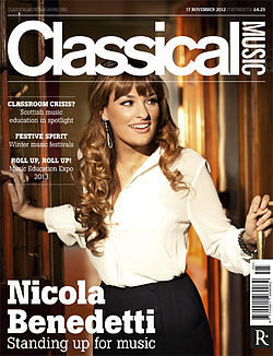
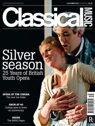
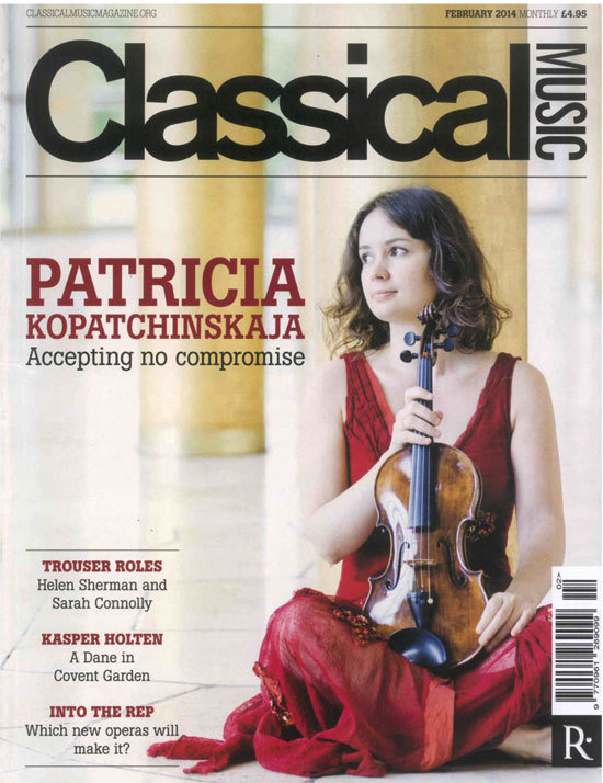
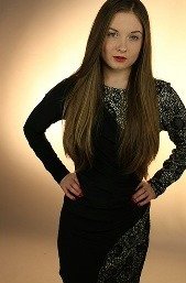
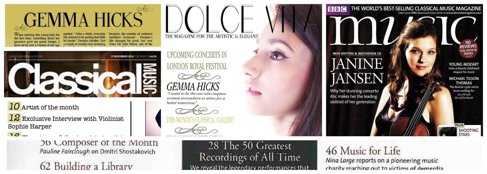
Professional Magazines
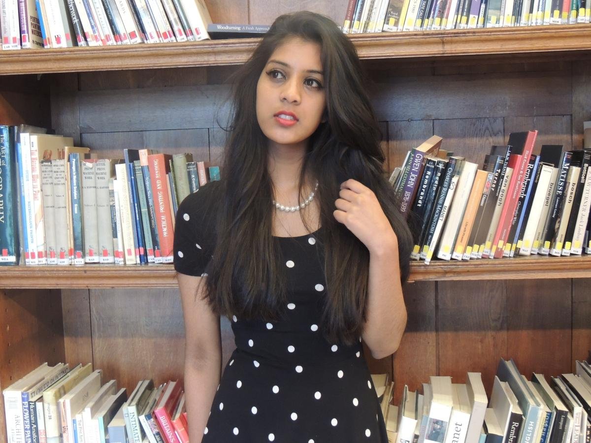
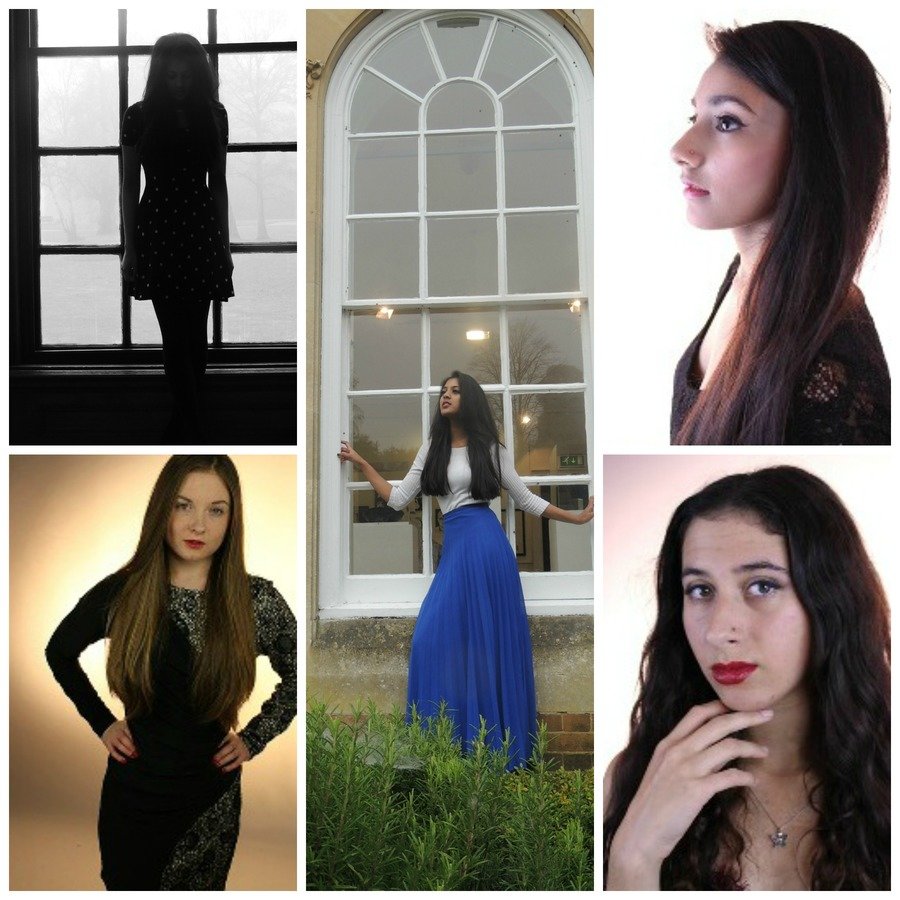
My Magazine
Similarities
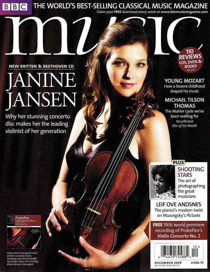
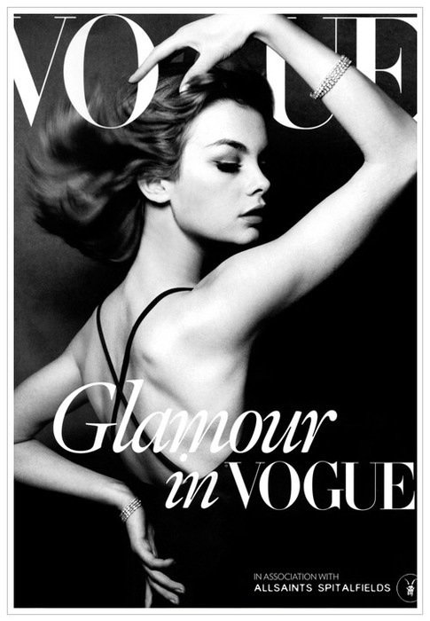
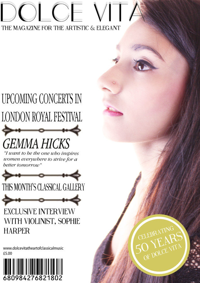
Bold and Statement Masthead is used on the top of each magazine. This automatically attracts readers to the magazine as this is the first thing they will see
Plugs are on the left hand side of the page in a column. This results in a clean & clear structure making it easier for readers to look what is featured in the magazine
Cover Artist's name is featured at the bottom of the page to give clear indication to readers and make the artist the focal point
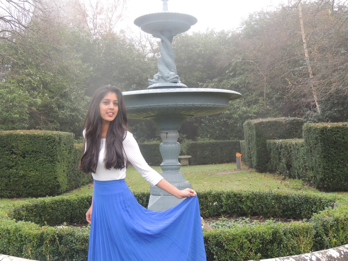
Central Image of a female artist who is smartly dressed and has a good & strong posture
What have you done that’s similar in order to have audience appeal? (colours, poses, costume, fonts).
In many Classical Music Magazines, the colour scheme used is normally more darker and bold standing colours e.g. colours such navy blues, blacks and burgundies. Most Classical Music Magazines primarily include a lot of black and gold. I decided to use this colour scheme throughout my magazine as well because it helps my target audience instantly understand the genre of my magazine as these are colours stereotypical used in Classical magazine. Gold appeals to my target audience because it is a grand colour and is often associated with the rich and loyal (which links to the stereotypes of classical music). Furthermore I have used black because it is a dramatic colour and is easy for my audience to read.
Colours
Poses
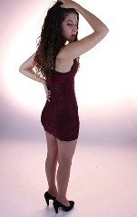
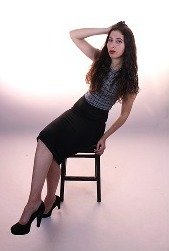
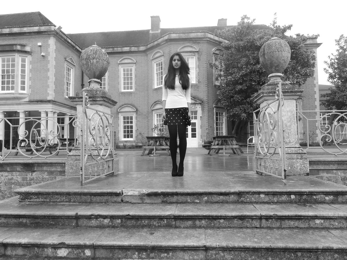
Regarding poses, many stereotypical classical magazines use simple poses, such as the artist holding their instruments and looking straight at the camera. However some do use poses where the model does not give eye contact, making the models seem more mysterious but are still illustrating through their body language a strong and powerful image. I recreated these kind of simple poses and used a lack of props because some of the magazines I researched focused on the artist themselves rather than the props they had. My theme was minimalistic and I felt that simple make up, costumes would help to focus the attention on the model. I wanted the model to express themselves through their facial expressions and eye contact. I have used a variety of poses, some where the model does look away from the camera and others where the model looks straight into the camera showing that the determination which is shown in stereotypical Classical magazines
Artists here are not giving eye contact to the audience however still maintain a strong posture
Artists here are giving eye-contact to the audience and also have a strong and powerful posture showing they are passionate
Costume
All the costumes my models wore were formal and classical looking. In many existing classical music magazines the model is wearing a long skirt and a blouse or a dress. Therefore I used a variety of different costumes, some of my models wore dresses and some more a skirt and top. These outfit choices will appeal to my audience because my audience prefer more conservative style and take pride in their appearance so prefer more formal styles of clothing. The colours of my costumes also help to make a appeal to my audience, all costumes used are darker colours such as blacks, blues and burgundies. I also used certain jewellery pieces to further enhance the classical look, for example one of my models Myesha wore a pearl necklaces and pearls are associated with the rich as they are expensive. Furthermore all my models wore high heels, as this is also associated with the classical music genre, all the models in stereotypical classical music magazines wear heels to make them feel powerful and feel strong
Fonts
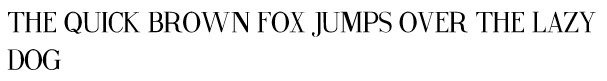
Stereotypical classical magazines used formal fonts that are simple and easily readable. I have used a lot of standard fonts just like the ones in stereotypical Classical Music Magazine that include the stereotypical font aspects such as flicks at the end of each letter and are also quite thin. I have used the font fine style throughout my magazine and this font looks very similar to the one used in the BBC Classical Music Magazine. Furthermore I have also used italics to give my magazine variety but also because italics were also used in existing classical music magazines. All the fonts I have chosen are statement fonts that help to make my magazine look dramatic just like classical music itself.
what stylistic decisions did you make in light of your initial primary audience research (did you challenge any of the professional texts in order to make your product appeal to its intended audience?)
Use of language/mode of address
In Classical Music Magazines the language used is formal and colloquial language/slang is not used. Furthermore vast amount of text is included in this genre of magazine because it is stereotypical for a older audience, therefore they are likely to read more. In my magazine I have used formal language however language that is still appealing for my slightly younger audience, I have updated some of my language with terms my target audience will understand better and this makes them more attracted to my magazine. Also I have used language that is welcoming towards the reader.
Mode of Address:
My magazines pursues a welcoming tone throughout. The artists in are magazine are represented as genuine and kind hearted people and through their use of poses and stories included they make the target audience more attracted to it. Language used is non-threatening however stays professional with the reader as it does not use pronouns such as 'You' to create a relationship with the reader
Use of font


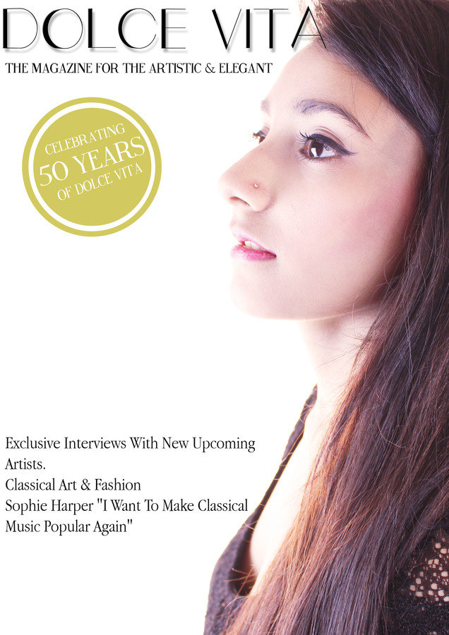
In stereotypical Classical Music Magazines the fonts used for the masthead are quite thick and bold. I decided to challenge this and use a slimmer font, that looked a bit more artistic and feminine however still easily readable. This masthead font was inspired from Vogue and has a very elegant feel to it, so fits in my magazine perfectly
Body Copy
Masthead
The stereotypical body copy fonts used in classical music magazines in New Roman Times so I also decided to challenge this stereotype to make my magazine look more complementary (which would suit my audience better). I still chose a font that looked classical and formal however simple and well structured. This font puts a new twist on the old stereotypical font however it still helps to convey the classical music genre
Subtitle
I used the Fine Style font throughout my magazine because it is bold and makes a statement about the headlines. Furthermore it has a very formal style to it and looks like a font found in something like Vogue. The serifs on each letter helps to make the font more classical yet again resulting in this font helping to illustrate my genre clearly
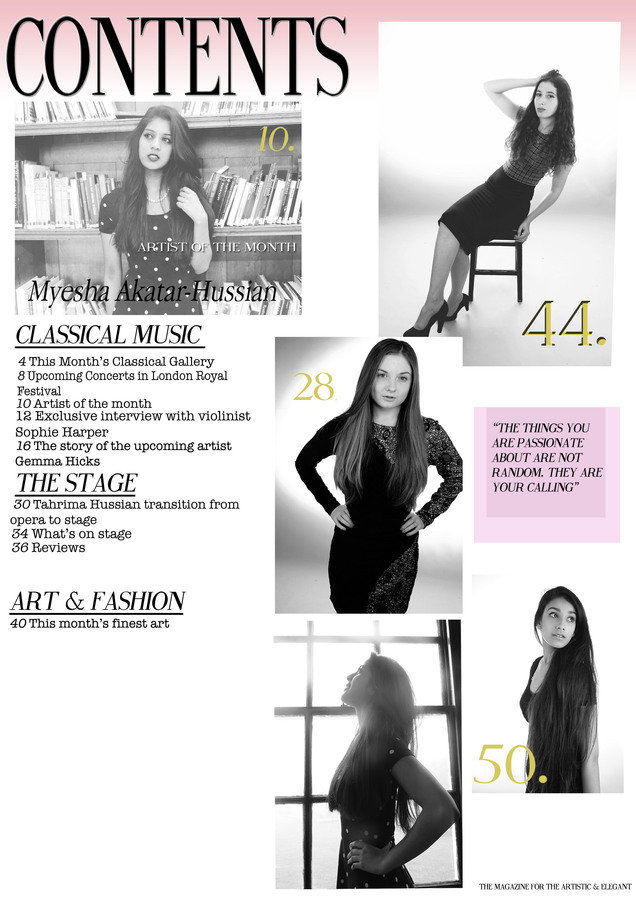
Contents (ref to bands/exclusives)
My magazine is filled with content that will attract my target audience. I have made sure articles/stories that are included are aimed for my target audience and provide information that will interest them
- Classical Music- the main sector of my magazine, includes articles about upcoming and new artists into the classical music world and furthermore what's popular and is inspirational to other young females
Contents Include:
- The Stage- this is the secondary music focus in my magazine. My target audience enjoy going to the theatre so want to hear the latest news. Furthermore a lot of classical music stars change to the musical theatre world
- Art & Fashion- two other features that my target audience are passionate about, by including this they will be able to see the latest classical fashion trends and will find similarities to magazines such as Vogue
I have also included exclusive interviews with the most popular musicians in the industry
Included Dolce Vita' official website where they can get a discounted subscription
Images
In addition to this, some of the images I used in my magazine clearly show locations that are posh and classical looking. This appeals to my target audience because this makes them more interested to see where their favourite artists are and where they are being photographed.
-
Beauty Shot Images
I have included a variety of beauty shots of my musicians as this meant the reader could see a close up of the musician's true emotions and also examine in depth, their latest make up styles. This is essential for my readers to see as they always want to be on trend and know the latest styles from their favourite artists
-
Outfit Shots
Images that show clearly what the artists are wearing have been included. This is also crucial as my potential buyers are passionate about lovers and enjoy the classical style. Since these artists' style will influence them and their fashion, they will be more likely to buy 'Dolce Vita' to see the latest styles as well as music
Masthead
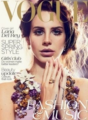
My masthead was inspired by the 'Vogue' masthead. I really wanted a masthead like Vogue because it stands out and makes a statement about the magazine and automatically draws attention to their magazine. Vogue is such an established brand and if my masthead looked similar to the one off Vogue, potential readers are more likely look at my magazine instead of others. Furthermore, my target audience are loyal readers to Vogue so would be interested to see a music magazine like it. My masthead suits my target audience better than ones used in a stereotypical magazine because it is more stylised and tighter together making it look more neat and structure and better suited for my fashion loving audience base. My font is easy to read and I wanted to keep it simple because my magazine has a running theme of simplicity, in my magazine 'less is more'.
Highlight how you made changes to your rough cut in light of audience feedback (include images of your rough cuts and compare to your final products, clearly signalling where the changes took place and why).
Front Cover Progress
1.
2.
3.
In my first attempt I laid out my text differently. I placed it all at the bottom and used a my simple body copy font. I had this change this design as my page looked too empty and looked too much like a poster instead of a front cover for a music magazine
In the second attempt my text positioning has changed and is all aligned on the left in columns, this helps to bring my structure and to fill up more space. However the masthead here is still too small. Furthermore I need to find something that would break up my columns and this shape used looks too out of place
By the final version the articles are split up nicely by a swirly pattern which suits my genre perfectly and does not look so bulky. Furthermore I have added more colour and kept the black & gold colour scheme consistent. I have also moved the plugs up so I could include my cover artist's name. In addition I have made my masthead bolder so it attracts my audience more than it did before
Contents Page Progress
1.
2.
In my first attempt, I edited my photos so they were black and white. I wanted to do this because all the classical photos I looked at were in black & white. However when I tried this the photos looked out of place with the pink gradient, this needed to be changed. Furthermore there are too many images on this page so the photos look too squashed making my magazine look unrealistic. Finally, the subtitle is too big and is too bold which doesn't fit with the elegant theme
By my final attempt, I have put my articles into columns to help make my contents page more structured. Furthermore I edited my photos back into a pinky tone so it fits into my colour scheme better. Additionally, I have made my subtitle font smaller and kept the same patterns as I used on my front cover. I have deleted a photo to make my contents page look less crowded and more realistic. I have also included a quote that will inspire my female readers.
Double Page Spread Progress: Photo editing
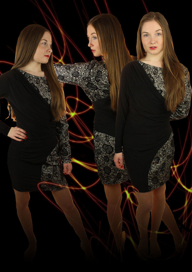
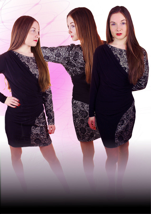
I manipulated my model Gemma's image, after doing this I wanted to add an background effect to make the photo look more effective. I tried a tutorial to create these neon background lines. Even though I liked the end result it looked too dramatic and did not fit into my simple and elegant theme. It was too dark whereas the rest of my magazine has used a pastel colour scheme. However I took this idea but experimented with different colours.
I experimented with colours such as light blue and blush pink however the blush pink made my magazine look more like a pop magazine than a classical music magazine
1.
2.
3.
By the last attempt, I realised that using gold for the background lines may be the best option. I edited my photo with the gold lines and a white gradient at the bottom of her feet. This helped to convey a much softer feel to the magazine and help make it look more elegant and classical. I added a gold gradient on the right side of the page as well to keep the them consistant
how your initial (and continued) audience research impact on your decisions on how to target your audience? How did you modify your product in order to meet target audience needs more effectively?
My initial research showed me that I should attract my audience through the articles featured, free gifts such as downloadable tracks and discounted subscriptions to the magazine. I decided to use the feature of the discounted subscriptions and included that in my contents page and I also included a website for Dolce Vita that my readers could visit for my exclusive information
As I continued my research I realised how important image was for my target audience as they are interested in fashion photography magazines such as Vogue. This inspired me to take a number of beauty, location and outfit shots which would attract the reader. The fashion element alongside the music element of my magazine help to attract this young female audience as my magazine features a number of different things that these women are passionate about
Furthermore, I included such competitions such as winning tickets to the opera in London to attract my target audience. I got this inspiration from existing magazines. I have considered throughout my magazines my target audience's interests and have only included articles which will appeal to them.
I modified my product to meet my target audience's needs better by considering in depth what outfits I put my artists in and where I shot my photos. I made sure that what they were wearing were currently fashionable and trendy. I concentrated more on the model's appearance than the instruments themselves (as they do with stereotypical classical magazines). I wanted them to show their emotions through body language and expression. This meant I had to be careful when constructing my magazine to make sure that my genre was still clear.
Furthermore, I changed the colour scheme of my magazine to light pink, gold and black. The pink attracts my female audience and also helps to contrast massively with existing magazines and make mine stand out more. I still kept the gold and the black which are stereotypical colours used in classical magazines, I needed to use these to help enhance my genre and also because they are very statement colours
Finally, I included a array of articles (not just ones about music). This would more likely appeal to my target audience as they want to know about lots of different things such as fashion and art. I have made sure the features I have included such as fashion do link with classical music