Responsive Bootstrap
Joel Ross
LIS 549
In this video...
-
Responsive Design (preview)
-
Bootstrap Responsive Utilities
-
Bootstrap Grid System
Responsive Design
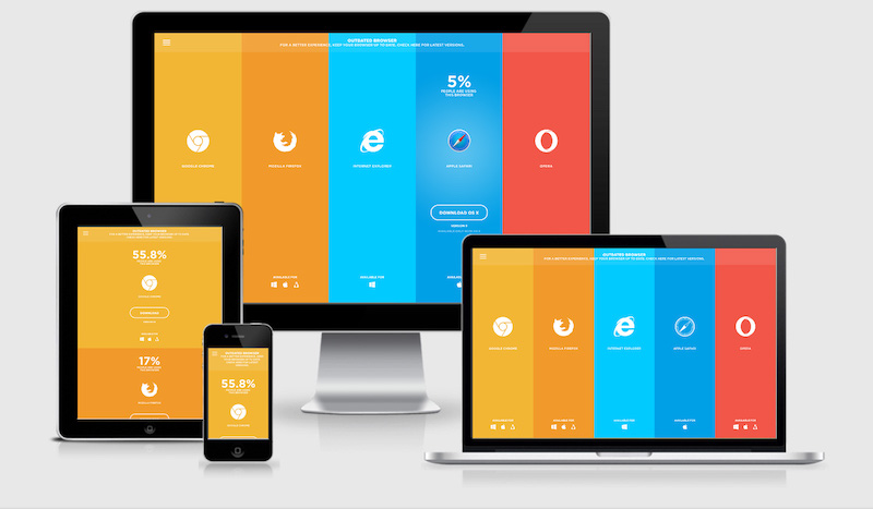
A responsive webpage is one whose appearance changes to better support different devices (e.g., phones vs. computers).
Viewport <meta>
Include the viewport <meta> element to allow your code to control responsive appearances (rather than the browser).
<head>
  <meta charset="utf-8"> <!-- always need this -->
  <meta name="viewport" content="width=device-width, initial-scale=1, shrink-to-fit=no">

  <!-- more head elements, including <link> ... -->
</head>
Responsive Utilities
Bootstrap has responsive versions of most utility classes. These class names include a infix indicating at which size (or larger) the styling should apply.

Bootstrap Grids

row
row
column
column
column
Grid Columns
There are 12 columns in the grid
Elements can take up many columns
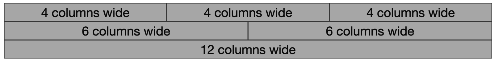
Row 1:

Row 2:
Row 3:
Specify columns based on screen-size

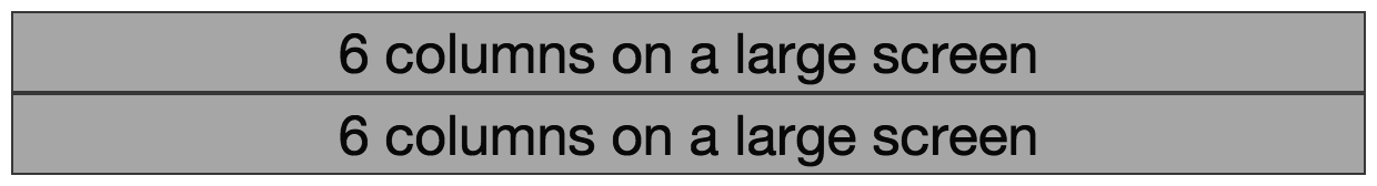
Smaller screen display
A Row: