Evaluation: question 2
How effective is the combination of your main product and ancillary texts?
presentation by Kris Kirova
Introduction
In this presentation you will see the following points explained in detail:
- Does our music video have clear visual links to my ancillary products?
- Research stages of synergy
- Planning stages of synergy
- Aspects of the music video that link to my ancillary products
Research stage
Synergy is the cooperation of two or more media texts working together to produce a combined effect greater than the sum of their separate effects. In other words, creating promotional packages.
During our planning stages we managed to do a lot of research on real media products. We identified that there were a lot of similarities and visual links between the artist's music video and their digipaks and advertisements.
What really stood out to me was the similar themes used across all products therefore, I came to the conclusion that it is quite important that the artist has a consistent and obvious visual link throughout it's music video and ancillary products so that the audience can easily identify them and create their own link.
Examples of clear visual links
Music Video & Digipak


- An example of clear visual links and synergy is 'Teenage Dream' by Katy Perry including her music video 'California Gurls'.
- At first glance we can see that the music video is very 'bubble gum pop', it's quirky and fun which makes us think what the album cover will be like. Well, as the audience we can see a clear visual link between her music video and her digipak by the use of colours, fonts, cover image and overall theme.
- The theme is 'bubble pop', so we see a lot of clouds and 'sweets' themed fonts and colours. Looking at the digipak we can clearly see that Katy Perry has stuck to the conventional 3 colours and 3 fonts. The texts and images are bold, therefore the inside of the digipak includes mid and an extreme close up of her face including a lyric book which looks similar to the album art work.
- The pink cloud and sweets theme is continued throughout all of her ancillary products and the synergy.
female artist research

Image of Dita Von Teese
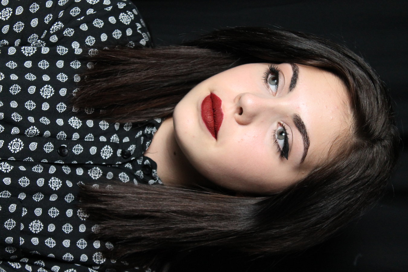
The idea behind our artists bold red lips, smoked out makeup and black winged eyeliner, were found during our research stage.
As a group we looked at a number of current pop artists, and we stumbled upon Charlie XCX and Rita Ora. They were also sporting winged eyeliner and red lips, in fact, a lot of female artists were from different genres as well.
So, knowing Kayla'O is an upcoming artist, we wanted to follow the pop genre conventions and stick with the same makeup look across all of our promotional packages and music video, so that our audience can easily identify a clear visual link.
Planning stage
During our planning stage we were going back and forth with what we wanted Kayla'O to be recognised with. We knew that we will have the whole 60's pinup girl makeup, however we weren't sure whether she should have blue or brown eyes. At one point we were thinking of one blue and brown eye however, that's overdoing everything, so we decided to stick with the blue eyes, bold lips and winger liner.
If we wanted her to be recognised with that look, then we had to keep everything the exact same during our music video and ancillary products.
How successful do you think your main and ancillary texts are?
Seeing as how stressful it is to research, plan and shoot a music video, I think we did a very good with the final outcome. Our music video definitely followed a lot of the pop genre conventions, in terms of the monochrome costume theme (which seems to be popular), the change between day and night locations, the artist's performance and the overall beat of the music video. As producers, directors and editors of our video we made sure to edit to the beat, have fast shot changes which builds up the overall tempo and energy of the music video.
I'm proud of both our music video and my ancillary texts because, I put in my blood, sweat and tears into making the best and most professional outcome I could. I've followed all of the pop conventions, by making visual links with the ancillary and the music video. I have added dates, barcodes, titles, record companies, images, lyrics and anything and everything you can think of that can go on a album cover.
Do you think your target audience will be attracted to them?
Once we finished editing our video and exported our file, we asked our friends what they thought of our video. We received a lot of positive feedback, and our audience was really attracted to the fast paced editing which matched our song and the performance of the artist. They loved how confident the artist was in front of the camera and how that matched the conventions of a professional pop music video.
In terms of my ancillary texts, I also received positive feedback on the fact that my digipak looked very professional. They were attracted to the simple colour scheme and how they matched the artist's makeup and music video (synergy). Another thing they were really attracted to were the borders on the back cover of my album. Also, the 'V' logo on the back cover, CD and Advertisement.
Overall, I think the even wider audience will be attracted to the simplicity and visual links across all products.