Our Promotional Campaign
Similar to the campaign for 'I remember', for our campaign we tried to create a synergistic link between the various look. This is so they were easily recognisable and appealing to the target audience.
Music Videos
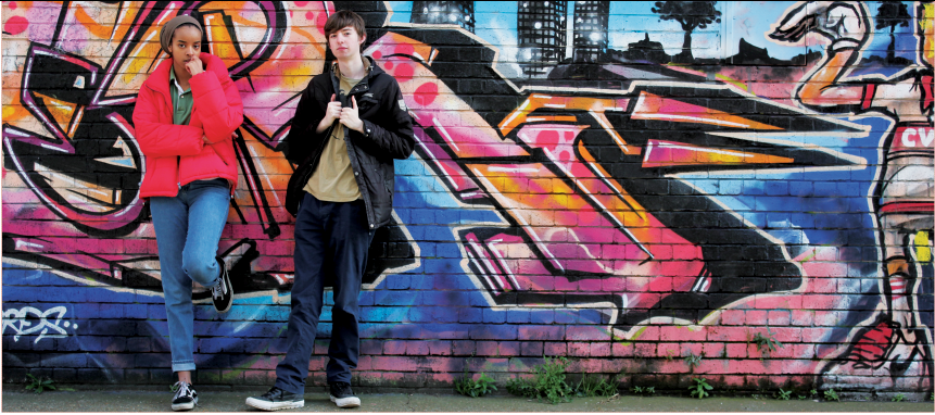
Our music video fits the urban and colourful style that we were going for. This aesthetic is also consistent over the various media products, this includes the costume, locations and choice of lighting.
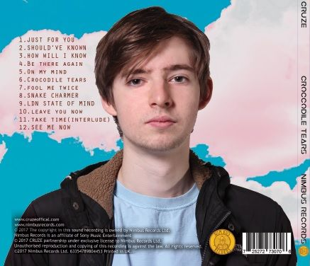
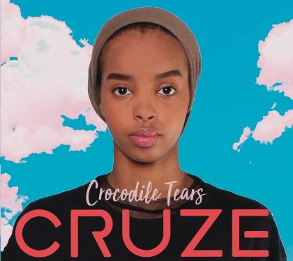
The album cover
For our album cover we decided to go with a cloudy background that other artists have used in the genre. The colours that we used for this are consistent with the colours used in the music video and on the website. The inside cover is a picture of the artists standing by a graffiti wall that is consistent with the style of the video and website, it is also featured in the video.
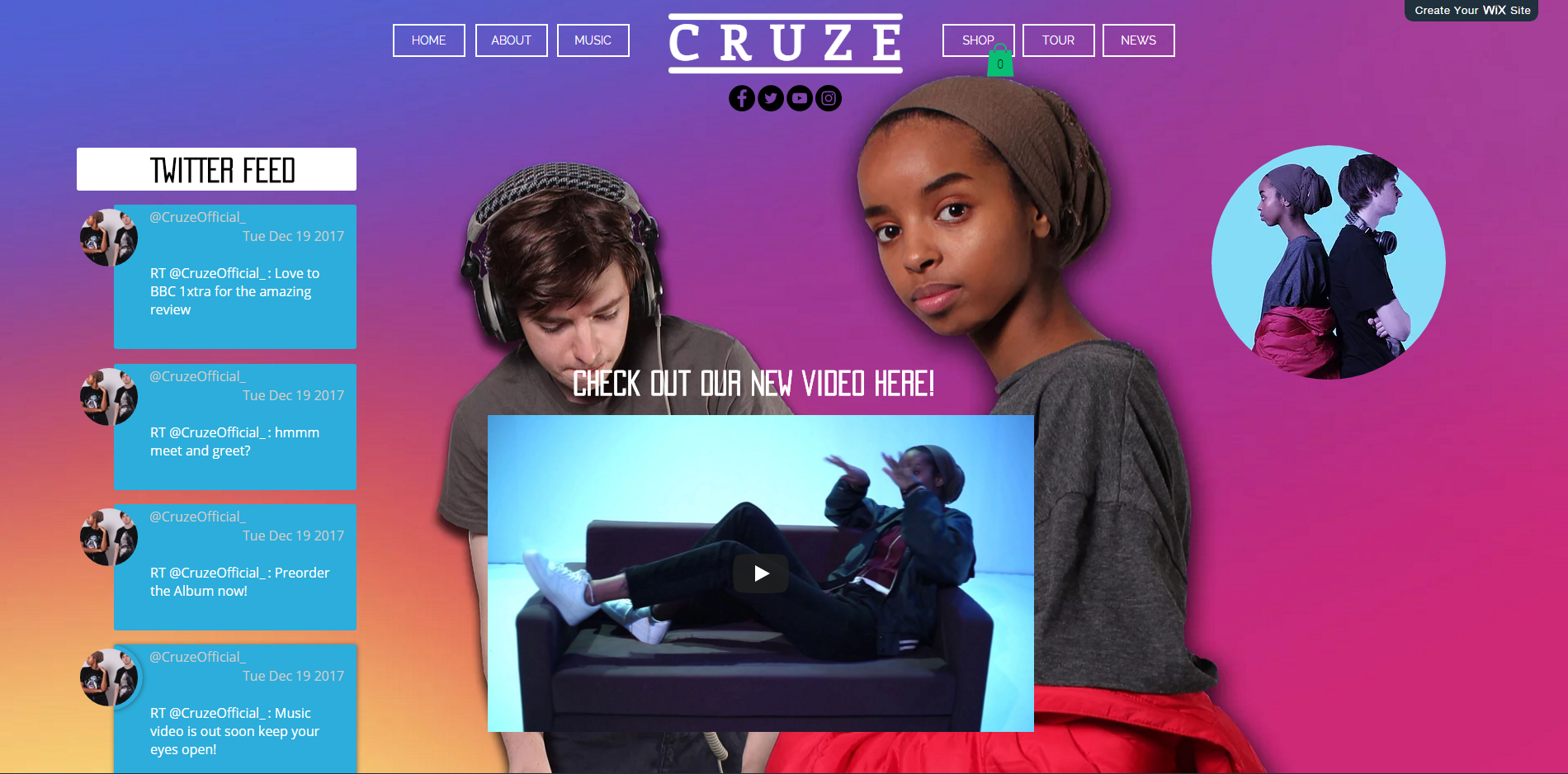
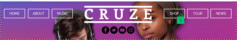
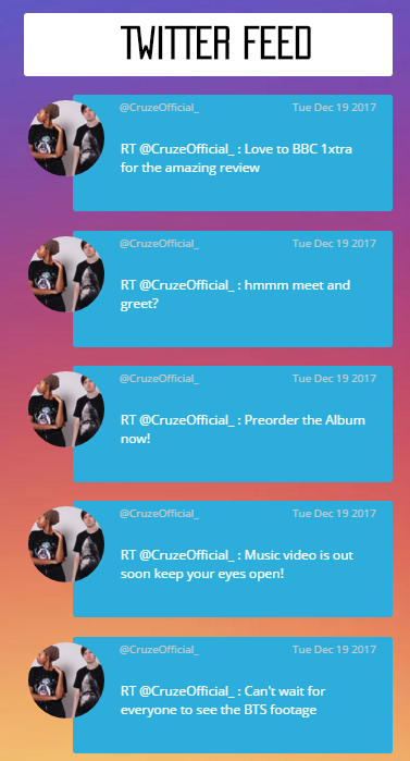
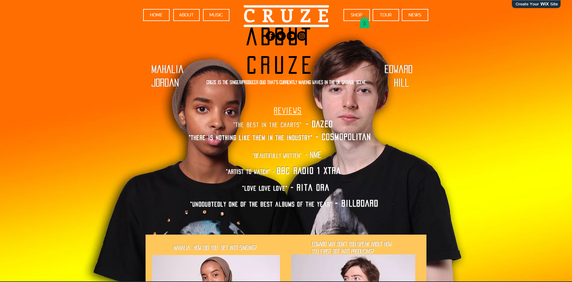
The Website
Our website has a consistent style over the various pages, this is useful as it looks more professional. There is a heavy synergistic link between the website as it acts as a hub serving the entire campaign, and it is also used to promote the record label, tour ticket company, merchandising retailers and related media platforms.
Overall
Working in synergy gives the main products and ancillary products a sense of purpose as they work together like a realistic production that was intended to work together rather than something that had been made simply for the purpose of a school assignment. I am pleased with how we managed to make sure the products all work together and look professional and easily distinguishable.