Introduction to OOCSS and BEM

What is OOCSS?
⇒ OOCSS is Object Oriented CSS
⇒ It is based on 2 main principles...
1 Separate
structure & skin
⇒ only use classes
⇒ identify repeatable styles
⇒ work with components (objects)
But what is a component?
⇒ components are like reusable user widgets that you can "drag and drop" anywhere on the website.

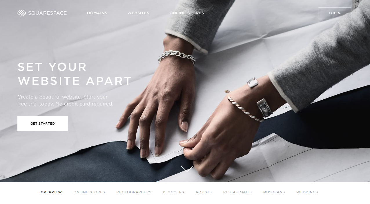
⇒ Below we have 3 highlighted components: header, hero and clients logo section
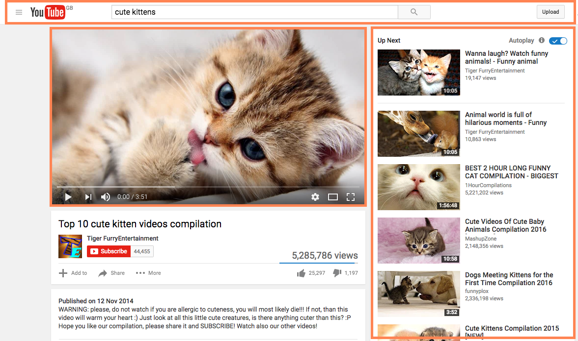
⇒ Below we have 2 highlighted components: search and video sidebar
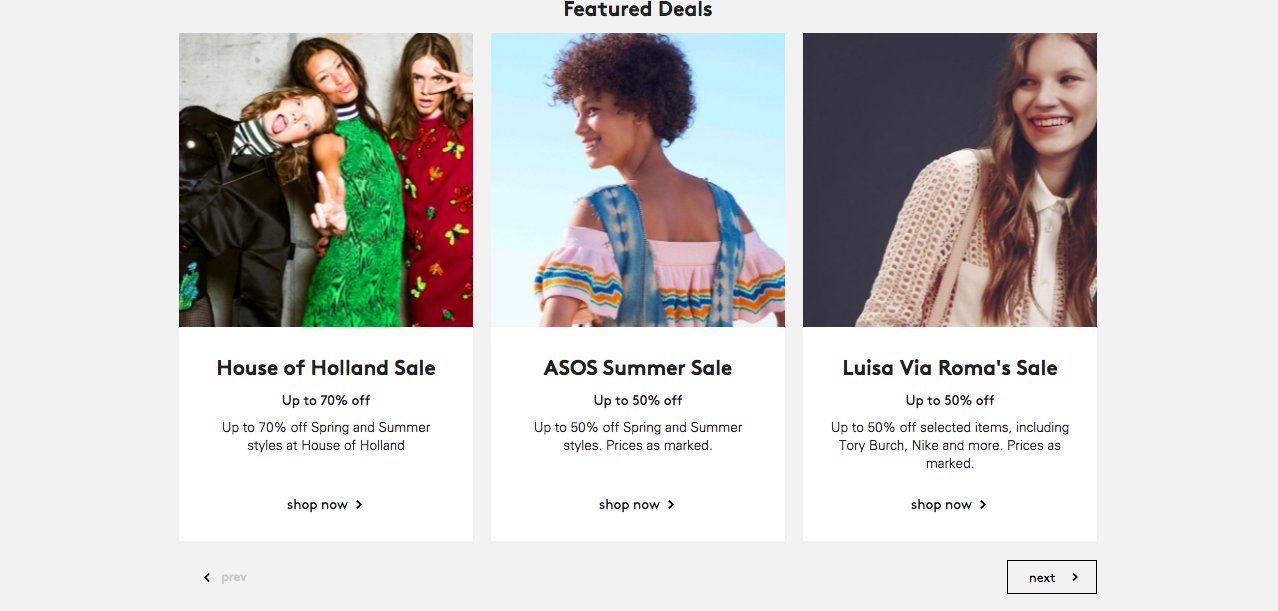

⇒ Below we have 3 of the same component next to each other!
2 Separate
wrapper & content
⇒ location should not matter
⇒ avoid styling HTML tags
⇒ styles should not rely on the containing element
EXAMPLE
nav ul {
  margin: 0;
  list-style: none;
}

nav li {
  display: inline-block;
}

nav {
  background: #fff;
}
<nav>
<ul>
<li>
<a href="/about.html">About</a>
</li>
<li>
<a href="/contact.html">Contact</a>
</li>
</ul>
</nav>HTML
CSS
⇒ Let's imagine this is our HTML & CSS, what is wrong with that?
What if we have a secondary navigation?

⇒ For example here on the page we have a navigation at the top, but we also have a secondary navigation at the bottom.
<nav>
  <ul>
    <li>
      <a href="/about.html">About</a>
    </li>
    <li>
      <a href="/contact.html">Contact</a>
    </li>
  </ul>
</nav>
<nav>
<ul>
<li>
<a href="/category/photography.html">Photography</a>
</li>
<li>
<a href="/category/weddings.html">Weddings</a>
</li>
</ul>
</nav>⇒ So how would we style the two navigations using the OOCSS principles? Here is the markup for the two navigations
<nav class="navigation">
  <h1 class="col-lg-4">
    <a href="/">
      <span class="visuallyhidden">Squarespace</span>
      <img src="/logo.svg">
    </a>
  </h1>
  <ul>
    <li class="col-lg-4>
      <a href="/about.html" class="uppercase">About</a>
    </li>
    <li class="col-lg-4>
      <a href="/contact.html" class="uppercase">Contact</a>
    </li>
  </ul>
  <a href="/login" class="button uppercase no-bg">Login</a>
</nav>
<nav class="navigation">
  <ul>
    <li class="col-lg-4>
      <a href="/category/photography.html" class="uppercase active-link">Overview</a>
    </li>
    <li class="col-lg-4>
      <a href="/category/photography.html" class="uppercase">Photography</a>
    </li>
    <li>
      <a href="/category/weddings.html" class="uppercase">Weddings</a>
    </li>
  </ul>
</nav>
⇒ And this is what it might look like if use the OOCSS principles and apply classes for variation between the two navigations.
⇒ The two navigations were very similar with some slight differences like link colours.
⇒ So we could actually use the code for both of the navigations under the .navigation class and then apply some classes to account for the variations.
⇒ For example see the button has a .no-bg class applied to indicate this button has no background, so we set it to transparent while the button on the hero has a white background and that may be the standard look for a button
What is BEM?
Block Element Modifier
BEM
Naming things is hard :(
WHY?
Block
Element
block
.navigation__link--active
element
modifier
examples:
⇒ .navigation__list
⇒ .footer__link
⇒ .footer__link--active
BLOCK
⇒ the same as a component
⇒ logically and functionally independent
⇒ example: navigation, footer, carousel
ELEMENT
⇒ a child item of a Block
⇒ for example: list item, list link, toggle
⇒ elements make sense in the context of the Block
MODIFIER
⇒ variations to the elements in the Block
⇒ example: button without a background, active link, collapsed element
<nav class="navigation">
  <h1 class="navigation__heading col-lg-2">
    <a href="/">
      <span class="visuallyhidden">Squarespace</span>
      <img class="navigation__logo" src="/logo.svg">
    </a>
  </h1>
  <ul class="navigation__list">
    <li class="navigation_item">
      <a href="/about.html" class="navigation__link color-white uppercase">About</a>
    </li>
    <li class="navigation_item">
      <a href="/contact.html" class="navigation__link color-white uppercase">Contact</a>
    </li>
  </ul>
  <a href="/login" class="button uppercase">Login</a>
</nav>
⇒ Let's have a look what our navigation classes might look like if we were to use the BEM naming guidelines.
.navigation {

  background-color: #fff;

  .navigation__heading {
      color: #fff;
  }

  .navigation__logo {
      max-width: 100px;
  }

  .navigation__list {
      list-style: none;
  }

  .navigation__item {
      display: inline-block;
  }

  .navigation__link {
      color: #fff;
      text-decoration: none;
  }
}