CSS Transitions
& what I learnt about them this year.
By Lindsay Jopson
@lindsay_jopson
What am i talking about?
- CSS Transitions
- Not Animations...
- even though transitions..animate.
Transitions
Animations
.box {
  background: #2db34a;
  transition-property: background;
  transition-duration: 1s;
  transition-timing-function: linear;
}
.box:hover {
  background: #ff7b29;
}
@keyframes slide {
0% {
left: 0;
top: 0;
}
50% {
left: 244px;
top: 100px;
}
100% {
left: 488px;
top: 0;
}
}
.stage {
background: #eaeaed;
border-radius: 6px;
height: 150px;
position: relative;
min-width: 538px;
}
.stage:hover .ball {
animation: slide 2s linear;
}
.ball {
background: #2db34a;
border-radius: 50%;
height: 50px;
position: absolute;
width: 50px;
}Why am i talking about this?
After a trend was appearing on the internet regarding 'off canvas' style website navigation we decided to implement on our latest website development.
I was assigned to develop the website so I had a look around in how they were done and figured 'a hah! this is easy!' so off I went....
Why am i talking about this?..
My days were good! I had all my files structured out how I liked them.
I had the navigation well on track and all was looking smooth and sexy.... until...
Dat new project smell
the site was put into testing

This is using an iPhone 6...
my..my.. beautiful..
Clearly this was a bit of a disappointment. I wasn't really all the wise with browsers and their processing power and what does what. So I figured must be a slow phone... pfft looks good on my desktop.
After a while I started to come across articles & seeing how other navigation were smooth and why wasn't mine.
The reason came down to how I was preforming the transition. I was using an 'expensive' way of transitioning.
.main__navigation{
	position: absolute;
	left: -250px;
	&.is-expanded{
		left: 0;
	}
}
The Main Thread
- Running your JavaScript.
- Calculating your HTML elements’ CSS styles.
- Laying out your page.
- Painting your elements into one or more bitmaps.
- Handing these bitmaps over to the compositor thread.
Can be busy doing calculations and becomes unresponsive to a user.
The compositor thread
- Drawing bitmaps to the screen via the GPU.
- Asking the main thread to update bitmaps for visible or soon-to-be-visible parts of the page.
- Figuring out which parts of the page are visible.
- Figuring out which parts are soon-to-be-visible when you’re scrolling.
- Moving parts of the page when you scroll.
Stays responsive to the user. If the main thread cant keep up, it runs off with whats its got.
Browser Structure
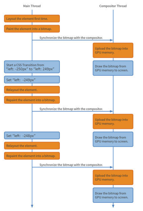
When we animate an element, the browser has to re-evaluate the page frame by frame. It does this to determine if and how the element has affected elements close by and the overall page.
This process is called 'reflow'.
Reflows can be expensive which make our transitions appear jumpy.
Reflow
.main__navigation{
	position: absolute;
	left: -250px;
	&.is-expanded{
		left: 0;
	}
}
.main__navigation{
	position: absolute;
	left: 0;
	@include transform(translateX(-250px));
	&.is-expanded {
		@include transform(translateX(0px));
	}
}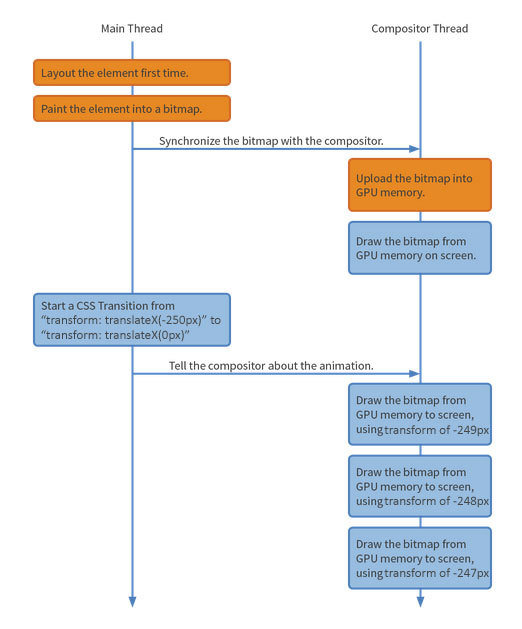
Its. Beautiful!

//non sass
.main__navigation{
-webkit-transform: translateX(-250px);
transform: translateX(-250px);
}
.main__navigation.is-expanded{
-webkit-transform: translateX(0px);
transform: translateX(0px);
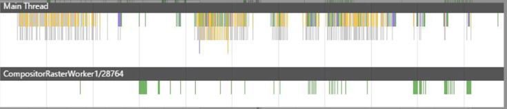
}How can i test this?
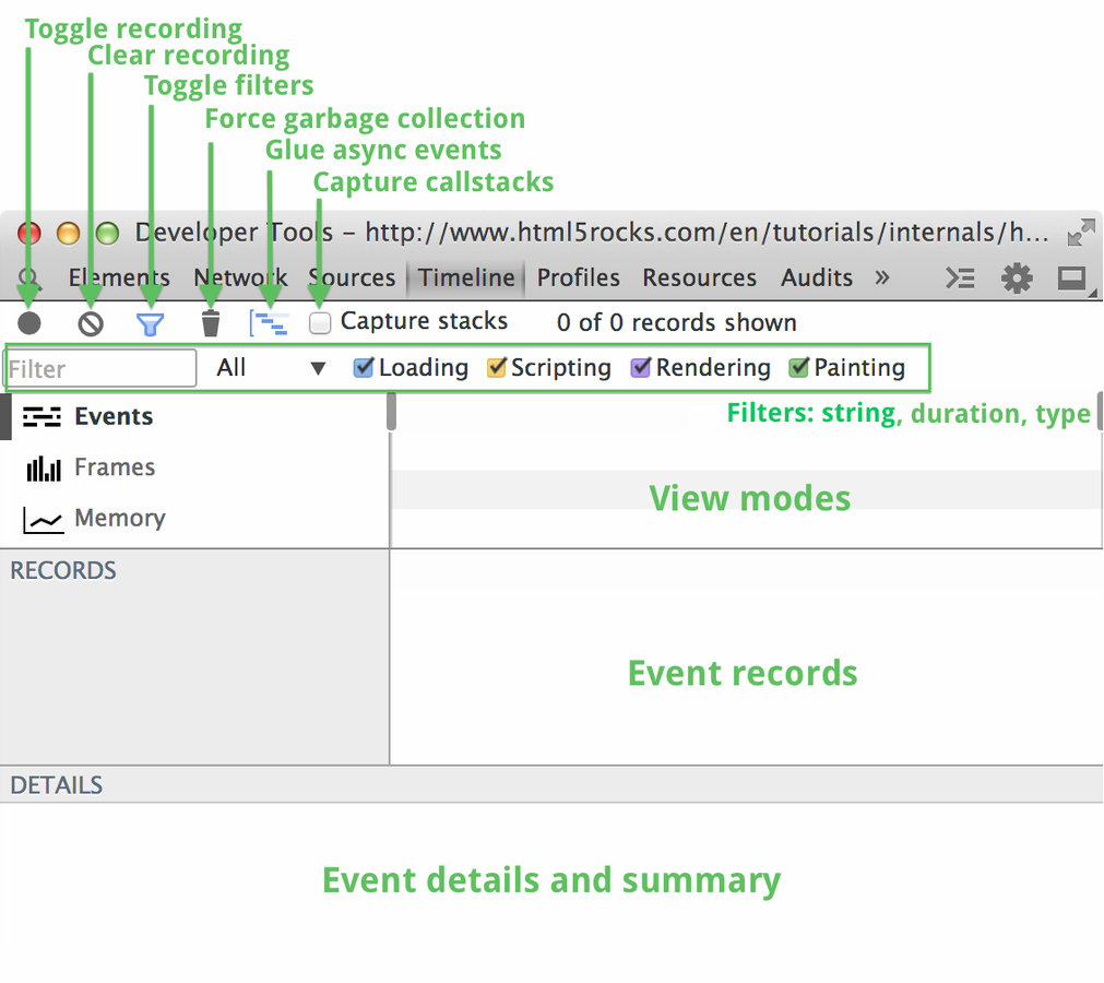
Google Chrome Performance Profiling
Keep that fps close to 60fps
my navigation's reflow
Before:
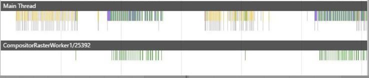
After:
Painting
Rendering
Fast things to animate.. (transition)
- CSS Transforms (as shown)
- Opacity Changes
- CSS Filters
- blur()
- greyscale()
- invert() etc etc
Slow things to animate..
- elements with box-shadow
- elements with border-radius
- heaps of gradient images with while being responsive
- Old browsers... dont spend an age making them work. They were never made to handle such things so put graceful fallbacks in its place.
Why not use jquery?
So this is a good question.. its been around for ages and works.
Ultimately I would say this is dependent on the task at hand.
If it is a simple transition that can be handled by all your necessary browsers out of the box, roll it with.
If you need to do some wizardry & you are comfy in Javascript... you would be silly not to.
Dont go nuts...
As transitions & animations become widely accepted and supported across the browsersphere, they should be used to enhance the User Experience and not detract from the pleasure of a snappy, well crafted website.
If something doesn't need to transition... Dont.
Thats me...
@lindsay_jopson