Colour Scheme
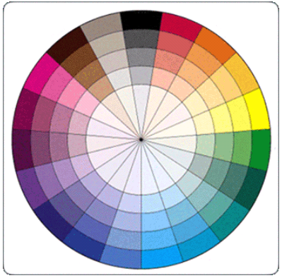
For my colour scheme I have chosen to work with yellow, grey and white. I have chosen this colour scheme as I have looked at existing products and it is common to use a bright colour along with some neutral colours. My yellow expresses the bubbly, fun youth of which my magazine will be aimed to. Yellow will allow easily distinguishing my magazine from others and giving a bold look for my audience. I intend on keeping this consistent throughout my magazine to create consistency and a form of order. This colour scheme may change as the production continues but as for now, I am happy with my chosen colours and I have asked for peer assessment and other s who will fit my target audience have also agreed that my colour scheme will work well. I think that the most important or best features will be in yellow to exaggerate their meaning and to draw attention to the main features of my magazine to enable higher consume rates and allow my audience to feel as though there is a lot to offer in my magazine. Yellow although is a non-typical colour to use for an R&B magazine I think it’ll create a nice flare and unique vibe.