Generating living styleguides with KSS
What is a styleguide?
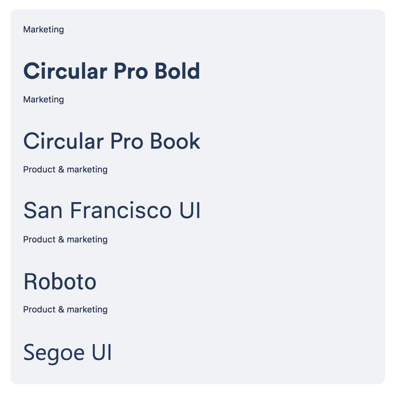
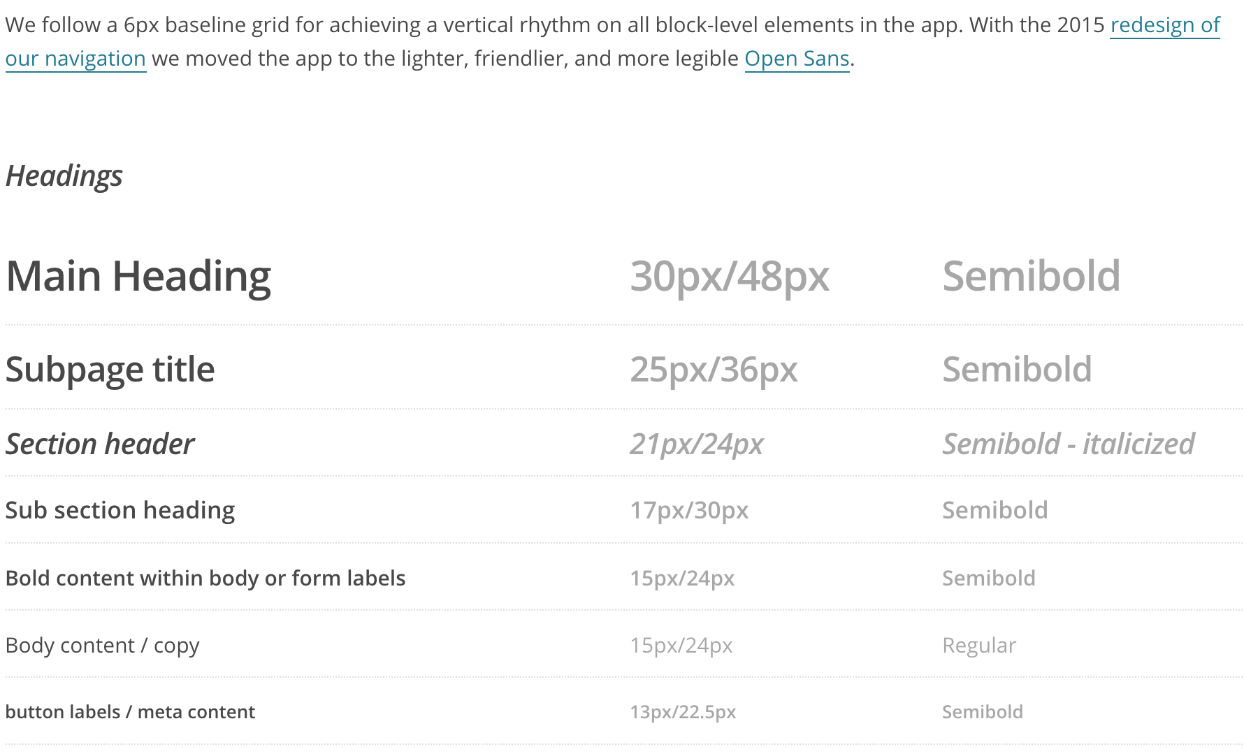
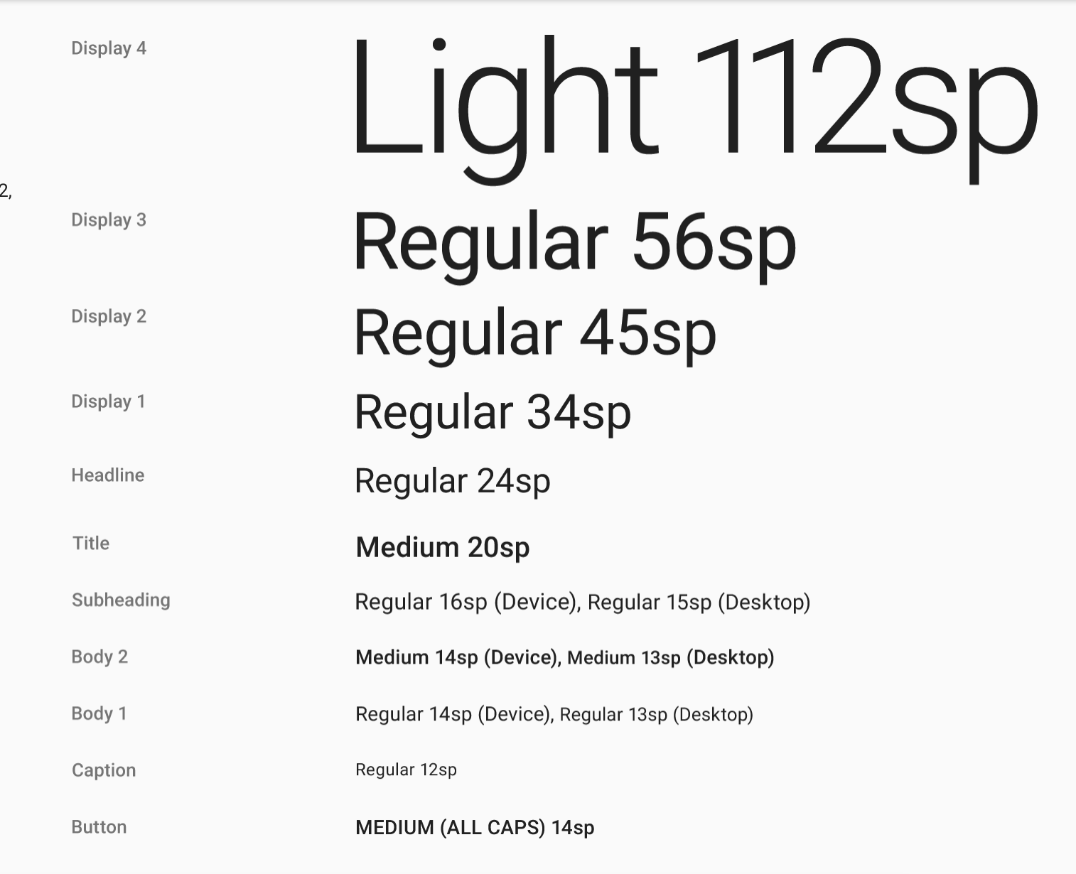
Typography
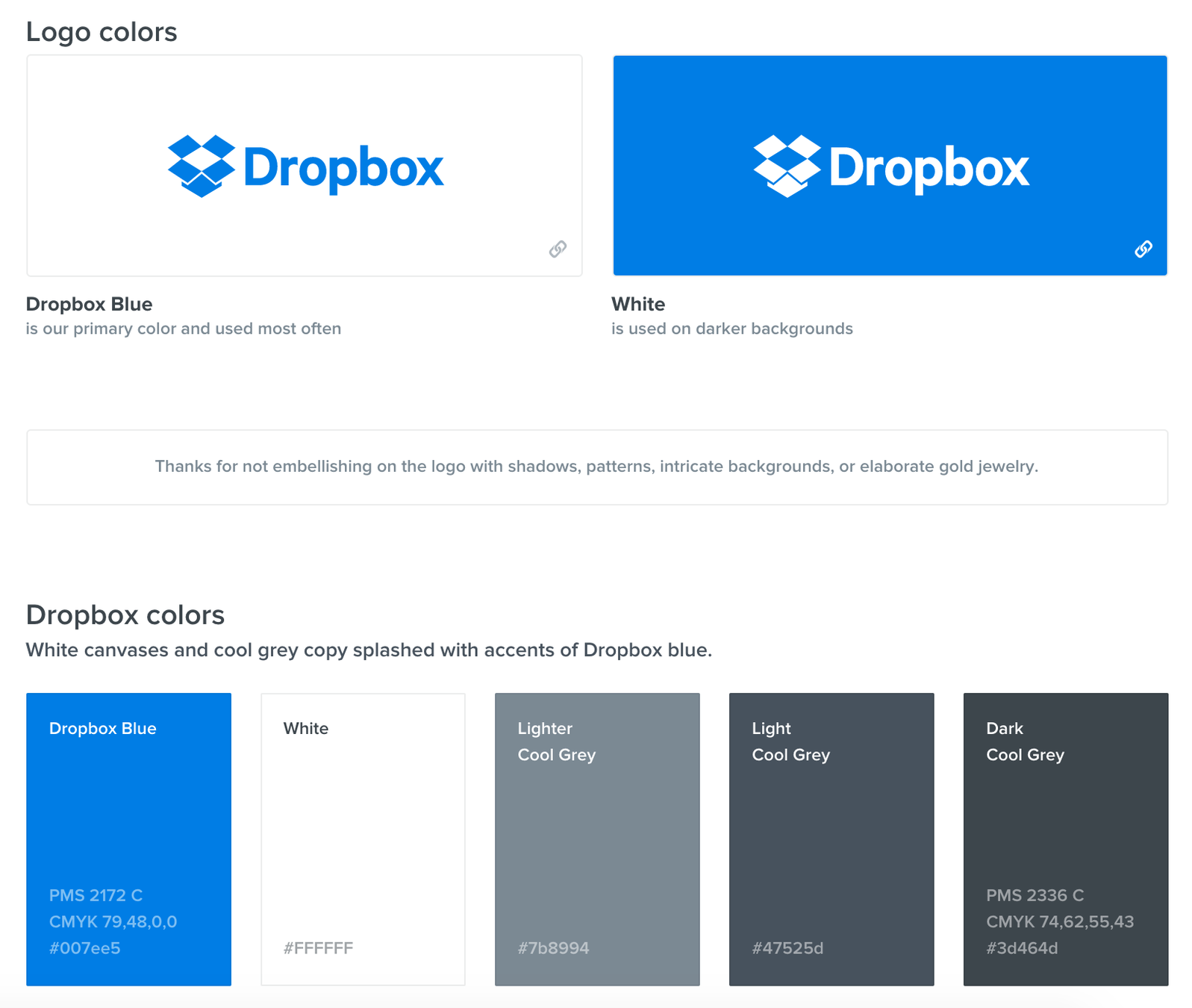
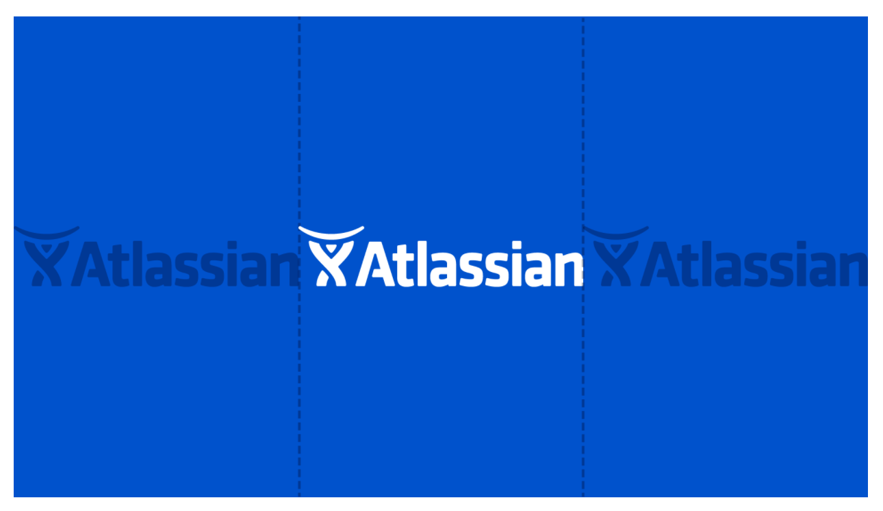
Brand

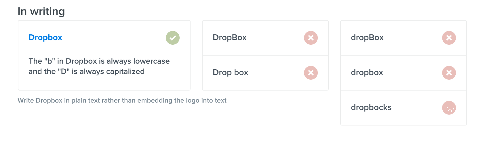
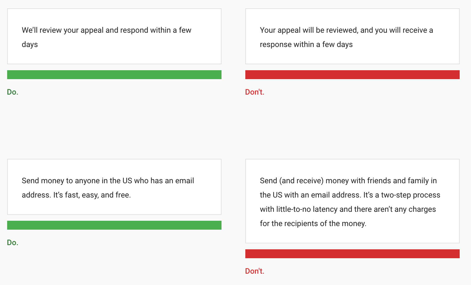
Writing
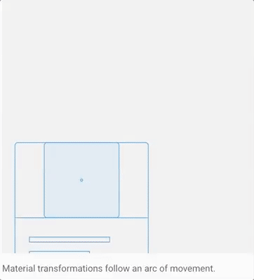
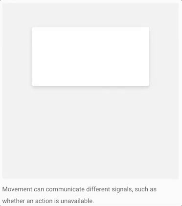
Motion

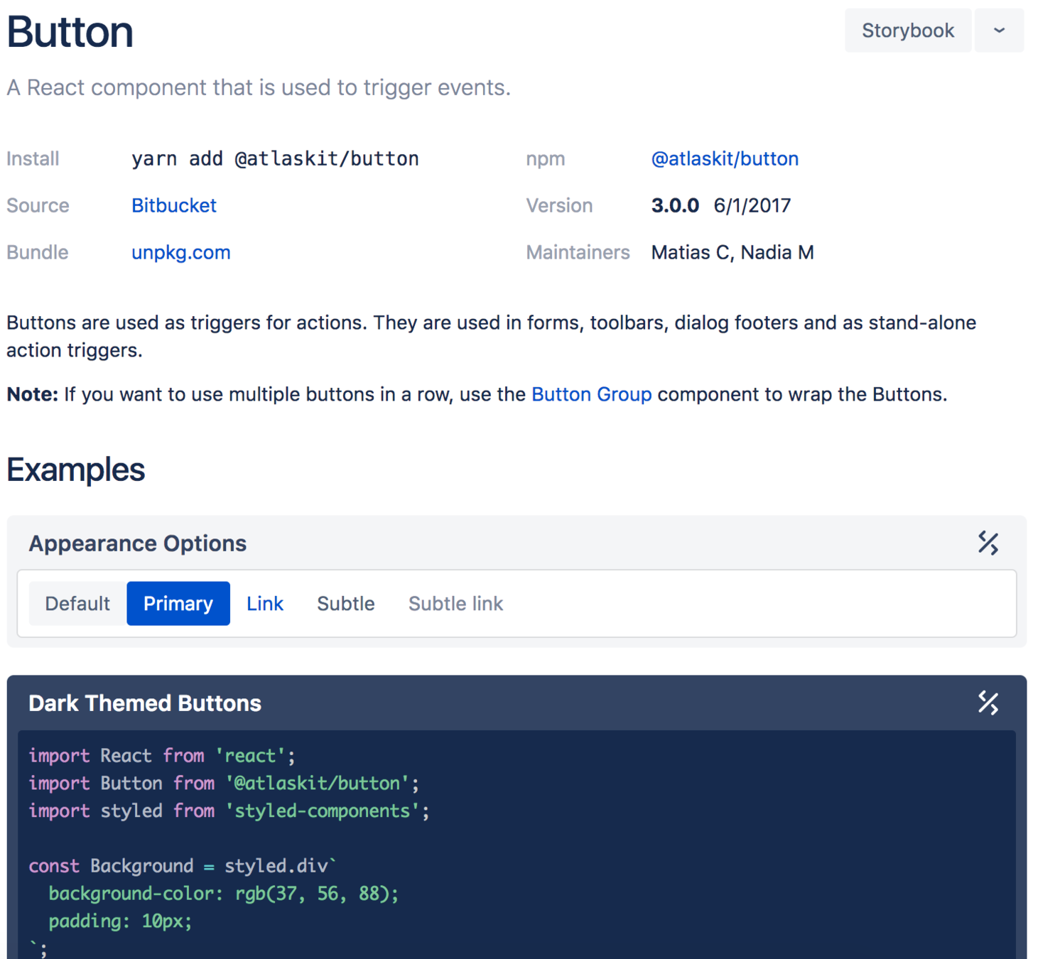
Code
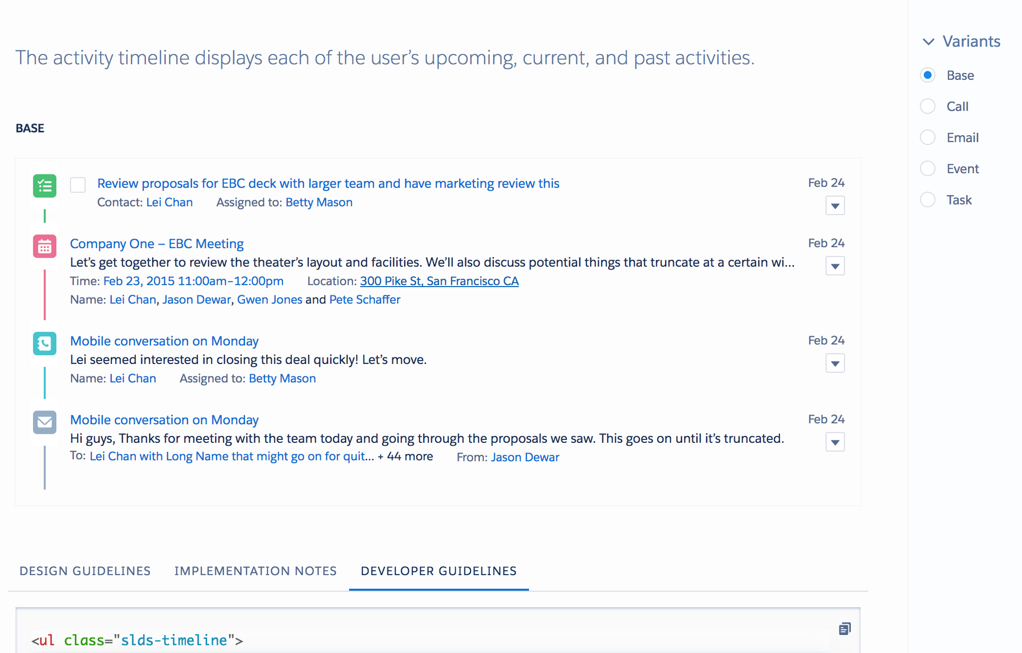
Components
https://k15t.github.io/k15t-website-styleguide/

How does our styleguide help?
- Develop a common design language
"that green rectangle with that button" vs "a primary card" - Single source of truth
"Was it #dede3b green or #bad954 green?" - Developers: See how to use components and how they work
- Designers: Look what existing components to use for new designs and how to extend it.
- How do they look and work in isolation?
Knyle Style Sheets
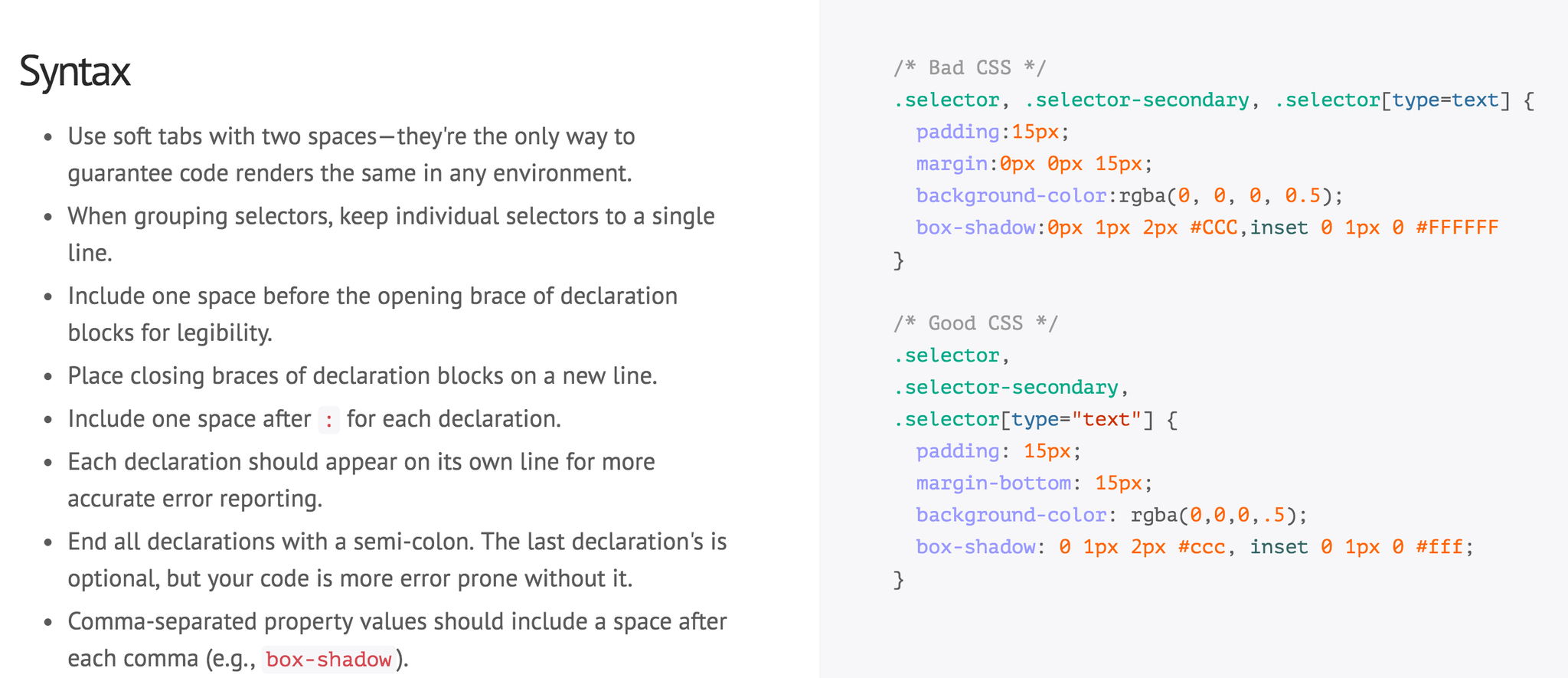
Syntax
- Language agnostic documentation language
Works with CSS/SASS/LESS/STYLUS - Can be rendered while developing
(available as Node module) - Documentation in markdown
- Document looks, html, usage & description
How do I create one?
/*
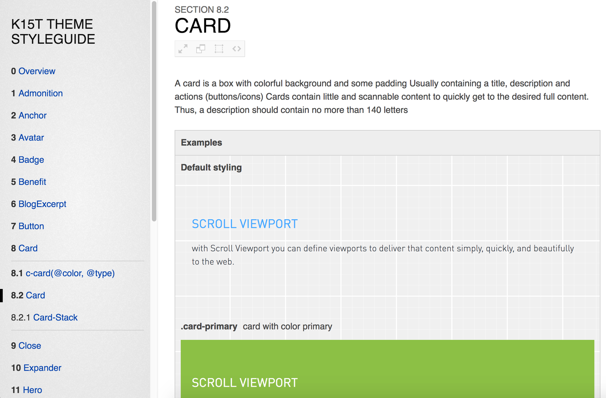
Card
A card is a box with a solid colored background and some padding
Usually containing a title, description and actions (buttons/icons)
Cards contain little and scannable content to quickly get to the desired full content.
Thus, a description should contain no more than 140 letters
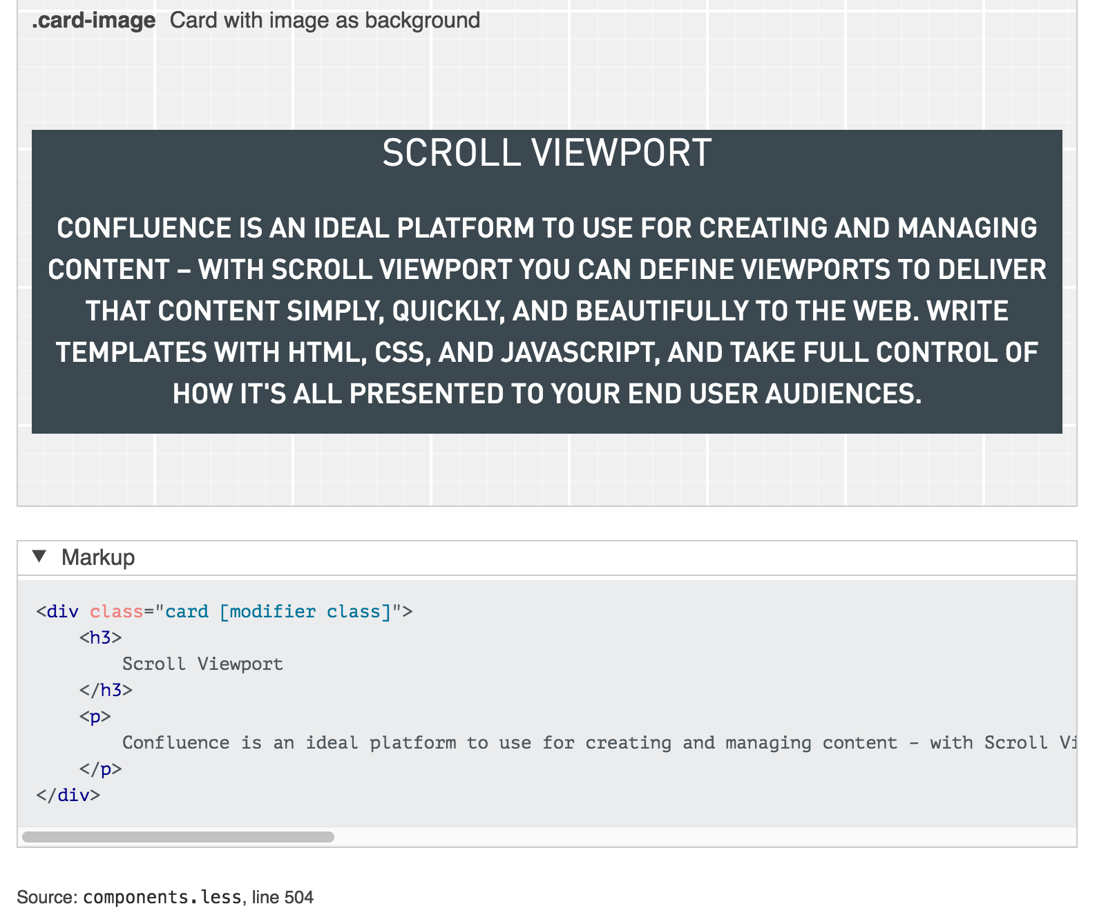
Markup:
<div class="card {{modifier_class}}">
<h3>
Scroll Viewport
</h3>
<p>
Write templates with HTML, CSS, and JavaScript,
and take full control of how it's all presented to your end user audiences.
</p>
</div>
.card-primary - card with color primary
.card-secondary - card with color secondary
.card-light - card with color light
.card-dark - card with color dark
.card-aside - card with color aside
.card-small - small card
.card-medium - medium card
.card-large - large card
.card-image - Card with image as background
Styleguide Card - UI
*/
DEMO TIME
http://styleguides.io/
https://github.com/kss-node/kss-node
https://github.com/SC5/sc5-styleguide
Resources
Thank you
Presentation carefully prepared by
Martin Muzatko
@martinmuzatko
More about front-end dev by Martin?
Looking for an awesome company to work with?