Question 1
Front Cover Conventions
When creating a front cover the key conventions are
- Bright Bold Title so readers can remember
- Barcode So you can buy it
- Date/Issue Number so readers know the latest issue
- Price so readers know it clearly
- Pug so readers know the exciting news in a circle
- House Style usually 2-3 colours
- Large image that has eye contact
My front cover has supported the conventions of...
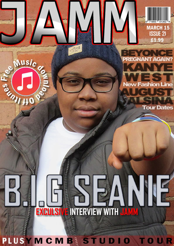
The masthead, my masthead ‘JAMM’ is White and red which are contrasting colours that stand out against the Brick background. The bright pink makes the masthead memorable as the colour sticks in your mind. My masthead also goes nearly across the whole page which engages the reader as it is large and unmissable.
My main image is a mid-shot which takes up the whole of the page. This image engages the reader as it makes eye contact.
The pug that I have used supports the convention of a front cover because it has something that would be most exciting to the customer which for example in my case is a free download, this is as a pug as it emphasis's the text so it grabs your attention and gives you another reason to buy the magazine.
My front cover challenges the conventions of...
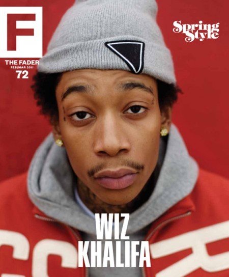
The house style, usually music magazines have a two colour house style such as the music magazine 'Fader' with red and black however I have introduced a third and fourth colour being a grey in my magazine to reduce emphasis and separate different cover lines from the main headline which is white and red. The price and bar code is small yet effective because it is easily seen and informative to customers. The issue date/number is also here as they are all associated with each other. Usually on magazines this is at the bottom of the page and is the last thing you look at whereas mine is near the top right of the page .
Contents Page Conventions
- Cover lines- least important to most important
- Columns/sections –making it look more organised
- Various images – associating with the cover lines
- Emphasis – showing importance
- Editors letter –from the person who produced the magazine
- House style – following from front cover
- Captions/blurb – insight to what the cover line is about
- Subscriptions - promoting the music magazine
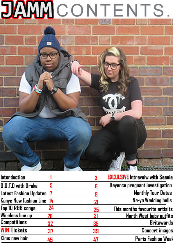
The page numbers are emphasized by being bold, being a brighter colour. This is so the reader can be easily be navigated to each page. Each number is the same size within the columns. The cover lines are ranked in least important to most important, this is done so that the least important may be read to get to the most popular cover lines. The cover lines have more emphasis over the captions as these are more important as i have done them in red text. The four colour house style black, red,grey and white have followed through from the front cover on to the contents page helping separate articles and emphasise certain texts.
Subscriptions, music magazines usually have large subscriptions to promote their magazine so they can make more money and have a wider audience through different media forms. However on my contents page the subscriptions are at the bottom of page instead of standing out near the top of the page.
Contents develops the conventions
Editors letter, many magazine have single contents pages which do not contain editors letters as there is not enough space. Therefore because of this reason I have not included one in my magazine. Also i have challenged the layout of the contents page to follow up on the 'fader' magazine layout .
Contents page challenges conventions
- Pull quotes – which have an importance
- Large dominating image - engaging
- Smaller images - variation
- Page number – so the reader can navigate
- Columns – organised layout
- Headline – what the article is about
- Subheadings/questions – organised/planned
Double Page Spread Conventions
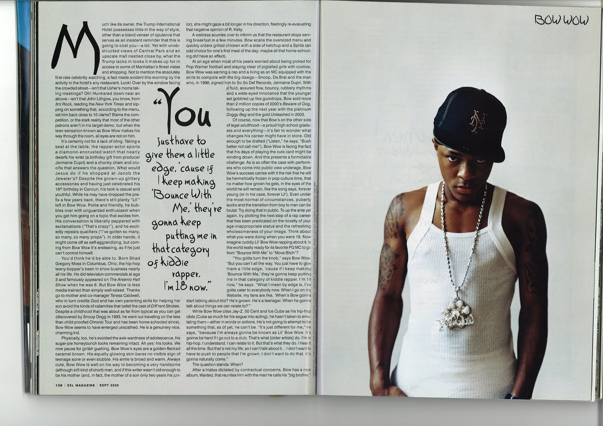

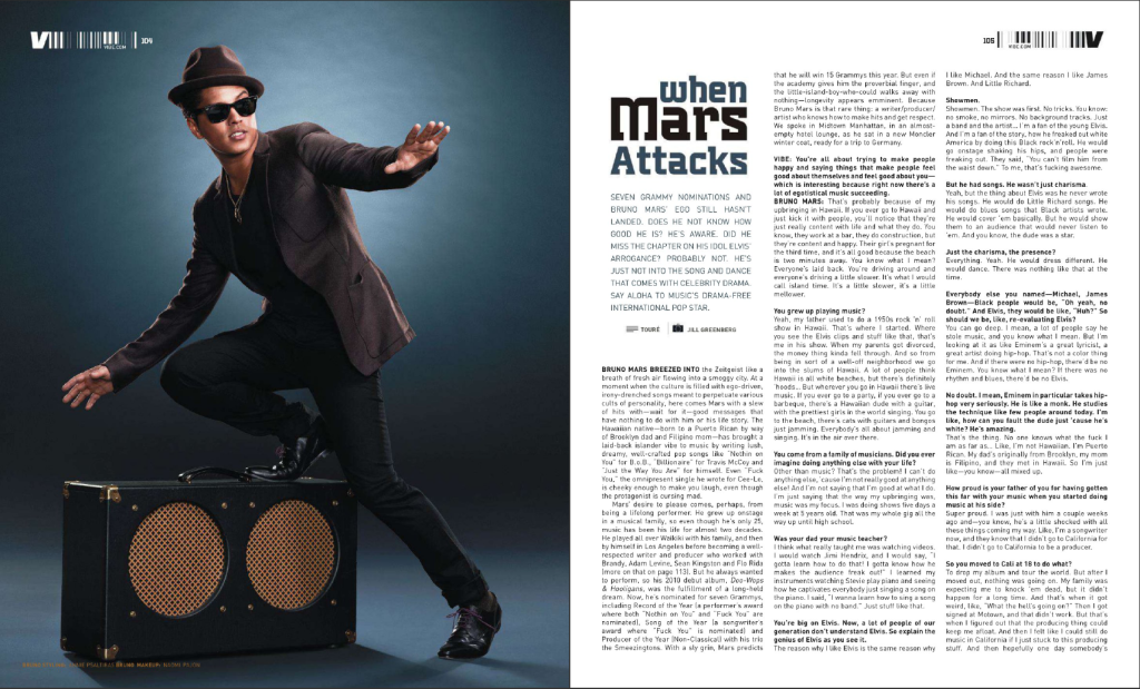
Double Page Spreads
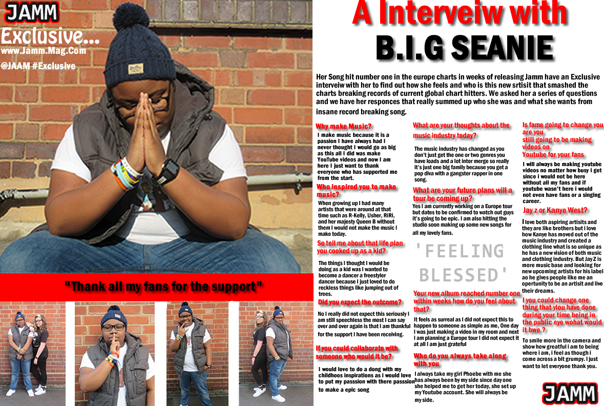
My Double Page Spread has supported the conventions of...
A large dominating image. The images on a Double page spread engage the reader through contact or doing an action. For my Double Page Spread all images are engaging as the one makes eye contact attracting you. Then the other image is an extreme close up again directing you where to start with the pull quote. My DPS spread is set into three columns, this makes the layout look more organised and professional. The three columns signal where to be read and does not interfere with the image. The head line is bold and is isolated on the second page, this makes it stand out as it is the most important as it summaries what the Double Page Spread is about. The white backed with a drop shadow also emphasizes the head line so it is easily seen. Subheadings/questions are more emphasized by a different colour and a bolder text, this helps navigate around the page and organizes the layout. As it is a question and answer formation this shows that the interview was planned and professional.
Pull quotes, usually Double Page Spread have several pull quotes throughout the text as well as a main one which is more emphasized. However in my Double Page Spread I have only included two main pull quote as I felt this was the most important and most associated with the interview. It develops the convention as there is only two which is empahsised rather than a one.
My double page spread develops the conventions of...
Two dominating images. instead i have used a variation of different smaller images as these are more effective and fit the layout better with text as well as not looking unorganised
My double page spread challenges the conventions of...