Following through
with animation
@opherv / dec 2016

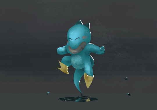
Blizzard


Art by DarrenGeers
Hi! I'm Opher

I'm a creative developer at Interlude Eko
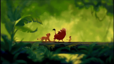
The Lion King (1994)


01 Squash and Stretch
02 Anticipation
03 Staging
04 Straight Ahead Action and Pose to Pose
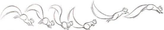
05 Follow Through and Overlapping Action
06 Slow In and Slow Out
07 Arc
08 Secondary Action
09 Timing
12 Appeal
10 Exaggeration
11 Solid drawing
05 Follow Through and Overlapping Action
art by thecommaspace

art by thecommaspace


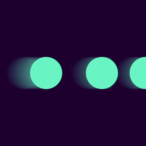
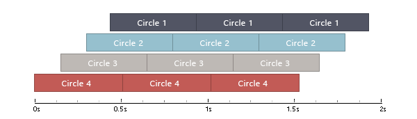
What are we making?
Animation specs:
Four circles
Total Iteration time: 1 second
Circle moment time: 0.5 seconds
Circle stagger time: 0.15 seconds
Our tools

* Web animation API
Implementation 1
Pros
Good performance across devices (GPU accelerated *)
Defined using CSS
Cons
Limited features /
complex animations are tricky
No dynamic animations
Hard to debug
CSS Animation - quick recap
@keyframes move {
  0%   { transform: translateX(0); }
  25% { transform: translateX(100px); }
  100% { transform: translateX(400px); }
}

span{
    animation: move 2s infinite;
}
Let's add animation-delay
hmm... what just happened?
animation-delay affects only the start delay. It doesn't affect animation repeats!
Making sense of it all
0s = 0%
0.3s = 0.3 / 1s * 100 =  30%
0.8s = (0.3 + 0.5) / 1s * 100 = 80%
1s = 100%
@keyframes circle3{
0%{ transform: translateX(0); }
???% { transform: translateX(0); }
???% { transform: translateX(60px); }
100% { transform: translateX(60px); }
}

The solution
@mixin createCircleAnimation($i, $animTime, $totalTime, $delay){
      @include keyframes(circle#{$i}){
         0%{
            @include transform(translateX(0));
          }
          #{($i * $delay)/$totalTime * 100}% {
            @include transform(translateX(0));
          }
          #{($i * $delay + $animTime)/$totalTime * 100}% {
            @include transform(translateX(60px));
          }
          100% {
            @include transform(translateX(60px));
          }
        }
}

$animTime: 0.5s;
$totalTime: 1s;
$staggerTime: 0.15s;

@for $i from 0 through 3 {
 @include createCircleAnimation($i, $animTime, $totalTime, $staggerTime);
 span:nth-child(#{($i + 1)}){
 animation: circle#{(3 - $i)} $totalTime infinite;
 left: #{$i * 60 - 60 }px;
 }
}
mixin
@mixin createCircleAnimation($i, $animTime, $totalTime, $delay){
      @include keyframes(circle#{$i}){
         0%{
            @include transform(translateX(0));
          }
          #{($i * $delay)/$totalTime * 100}% {
            @include transform(translateX(0));
          }
          #{($i * $delay + $animTime)/$totalTime * 100}% {
            @include transform(translateX(60px));
          }
          100% {
            @include transform(translateX(60px));
          }
        }
}
usage
$animTime: 0.5s;
$totalTime: 1s;
$staggerTime: 0.15s;

@for $i from 0 through 3 {
 @include createCircleAnimation($i, $animTime, $totalTime, $staggerTime);

  span:nth-child(#{($i + 1)}){
      animation: circle#{(3 - $i)} $totalTime infinite;
      left: #{$i * 60 - 60 }px;
 }
}
by Will Stone
Implementation 2
Pros
Great, robust API
Dynamic animations
Handles browser inconsistencies
Cons
JS is implementation-sensitive
no display/logic seperation
Thanks!
@OpherV
opherv.com
opherv@gmail.com

github.com/opherv