Creating effective visualizations
Rebecca Barter
rebeccabarter@berkeley.edu
April 2018
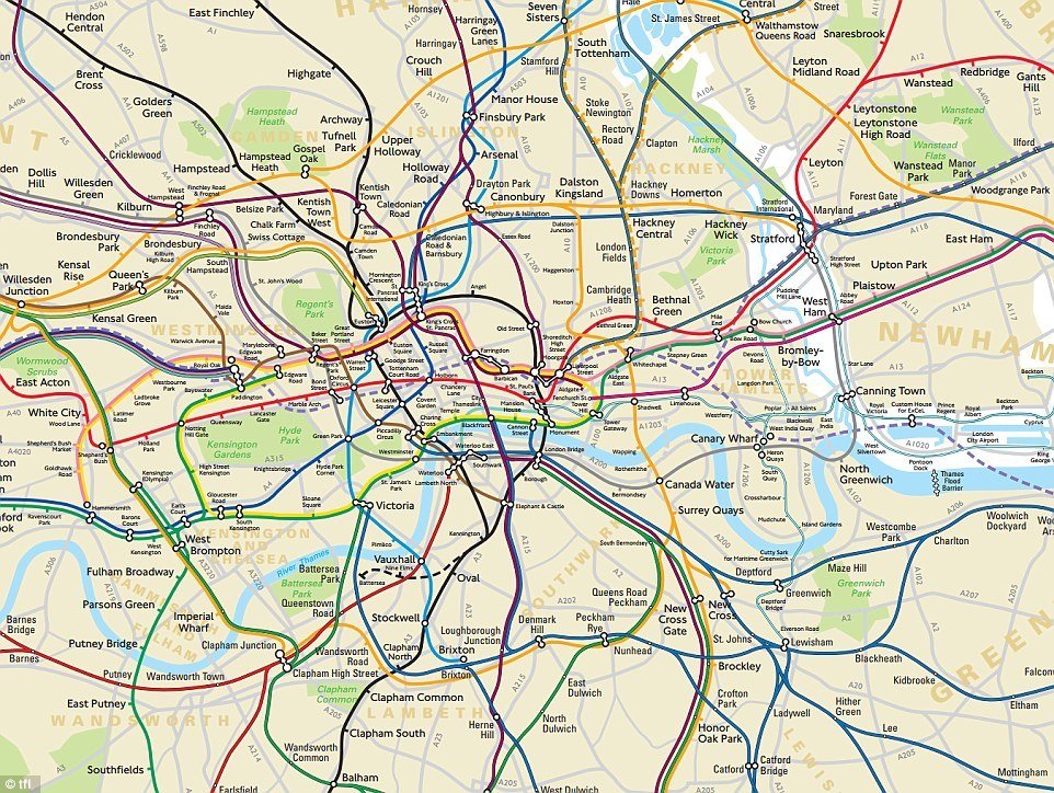
We visualize to simplify

We visualize to explain
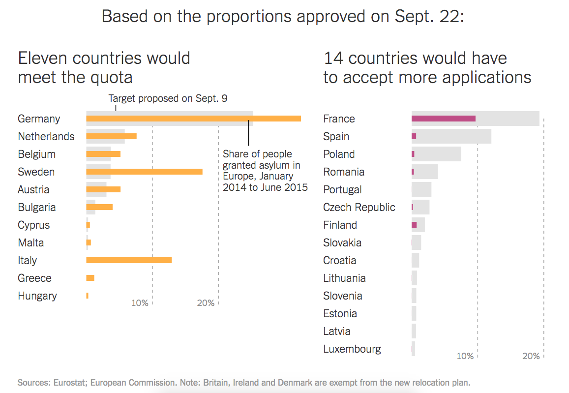
https://www.nytimes.com/interactive/2015/09/04/world/europe/europe-refugee-distribution.html
Visualization is a creative art
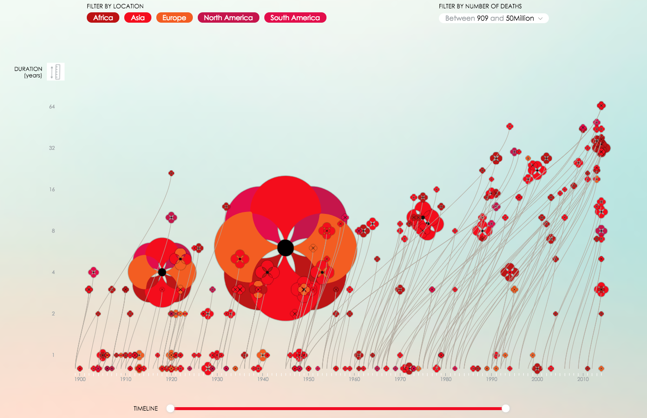
http://www.poppyfield.org/
Lower the barrier
Use packages that create common visualization types (e.g. ggplot2)
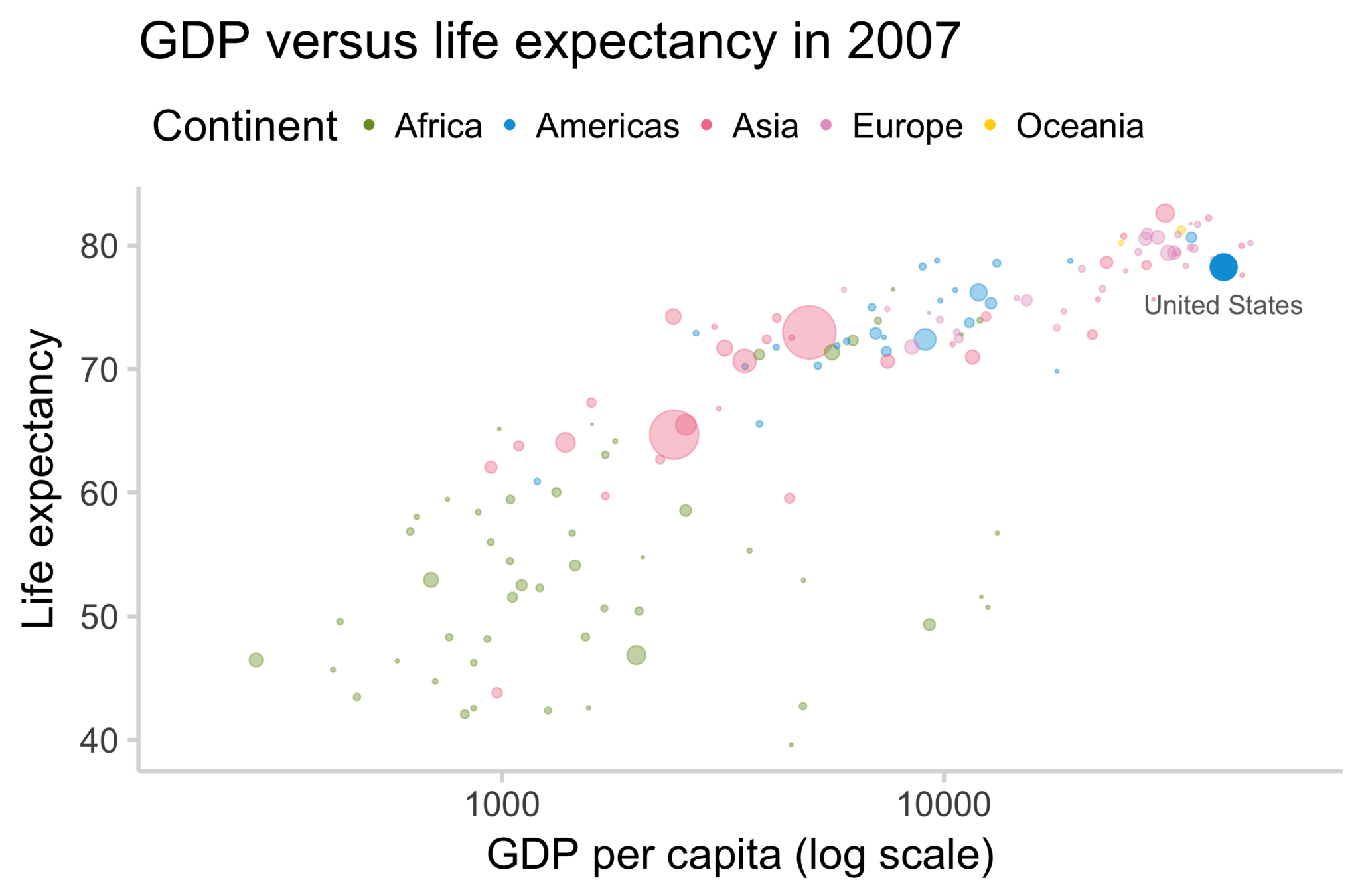
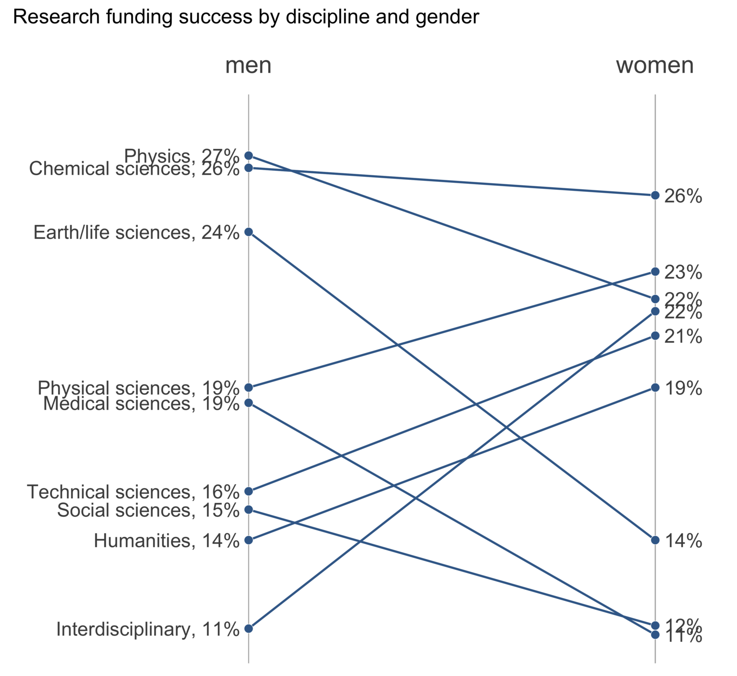
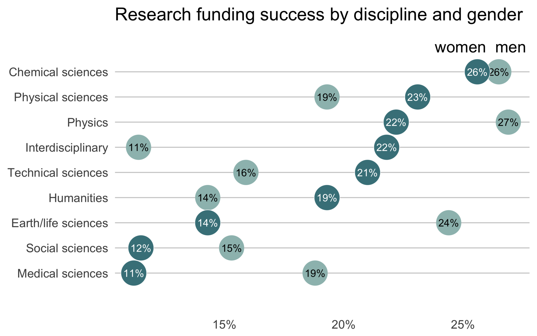
Data source: gapminder data
General principles
How to be the best data visualizer you can be (using ggplot2)!
Think before you plot
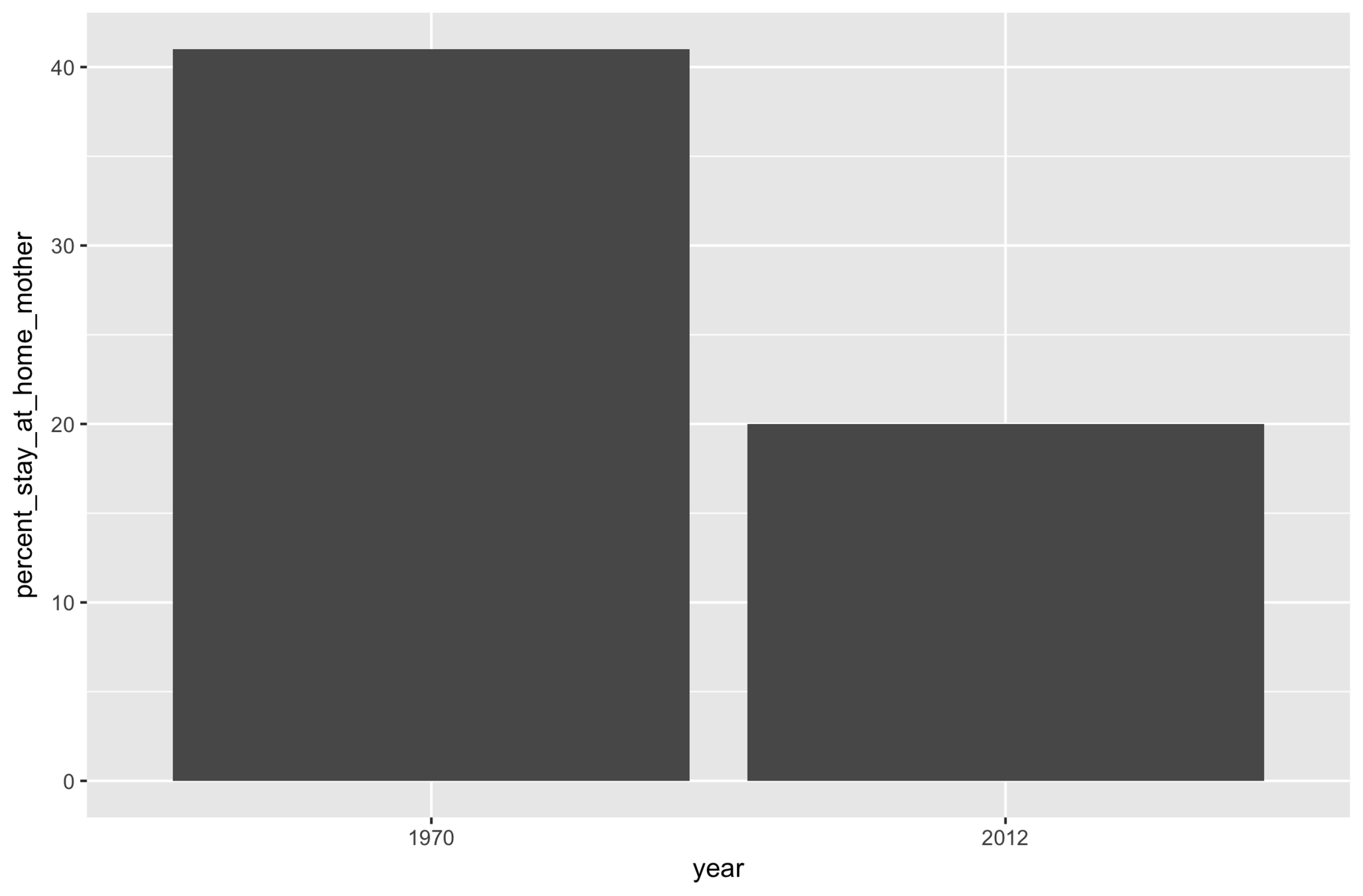
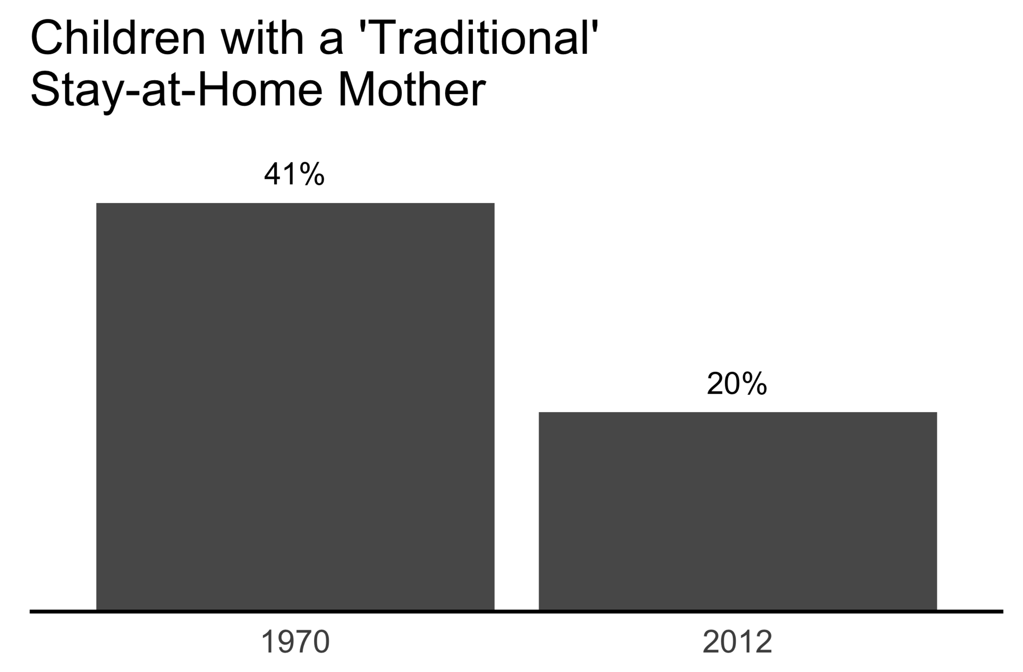
20%
of children had a
traditional stay-at-home mom
in 2012, compared to 41% in 1970
Example source: Storytelling with data, Cole Knafflic
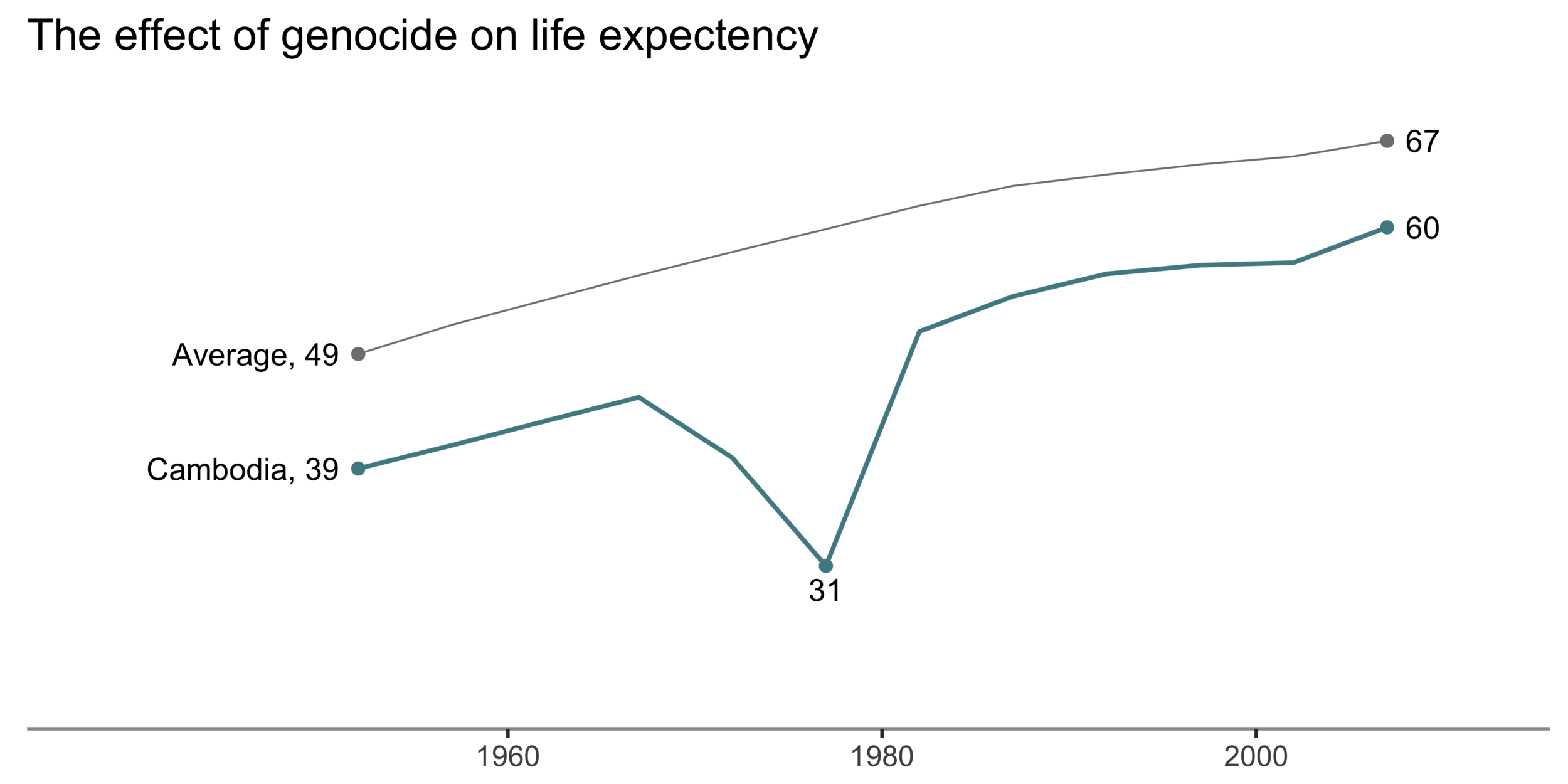
Every plot should have a message

Data source: gapminder data
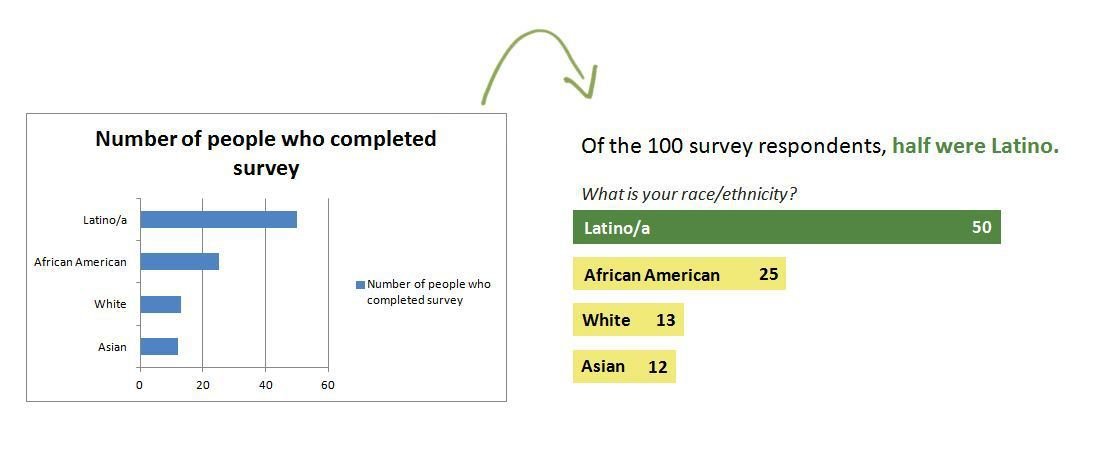
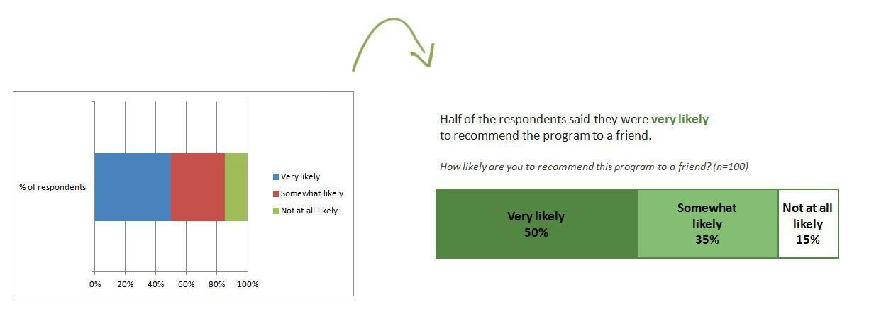
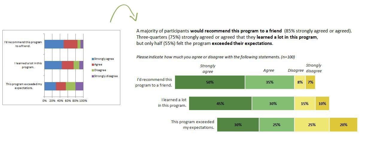
Avoid the defaults & remove clutter

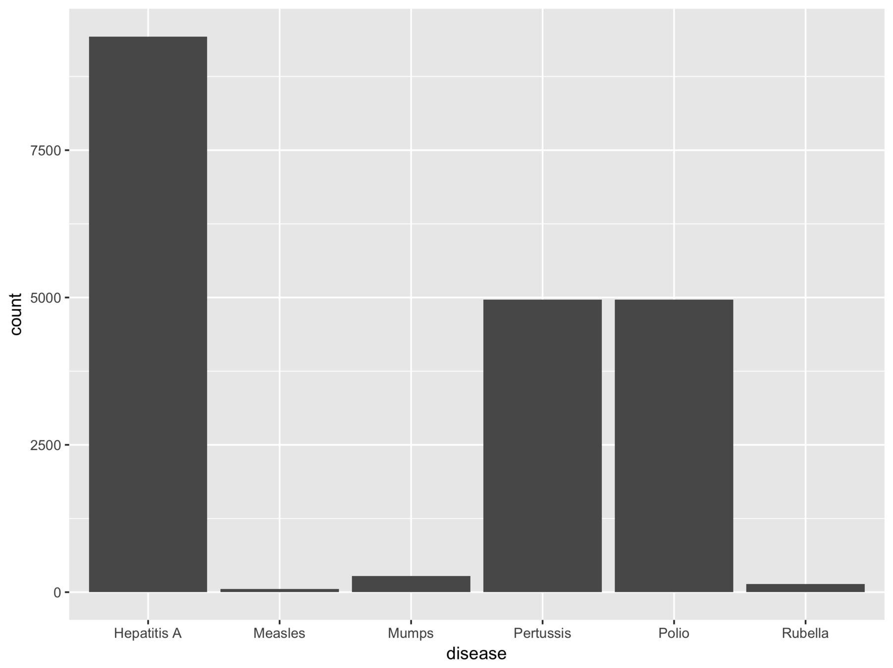
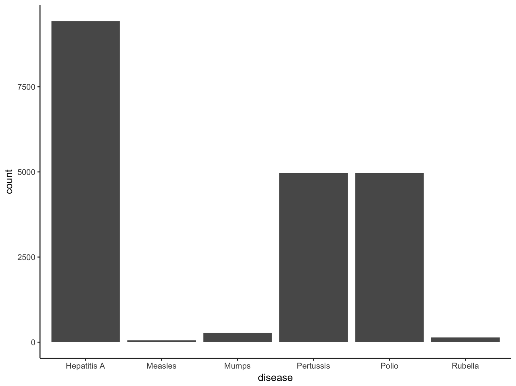
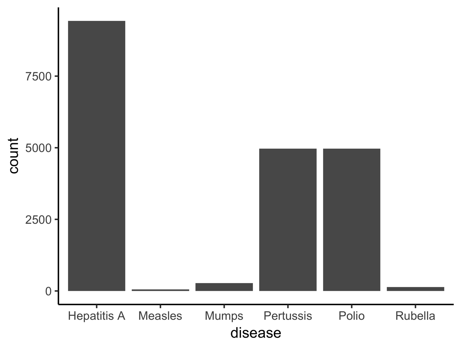
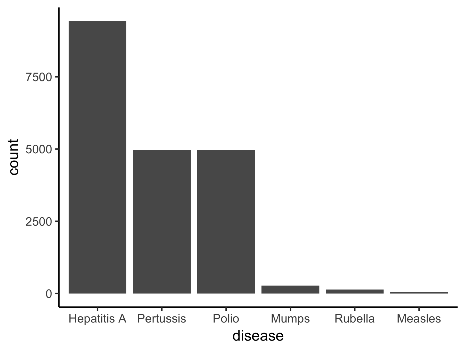
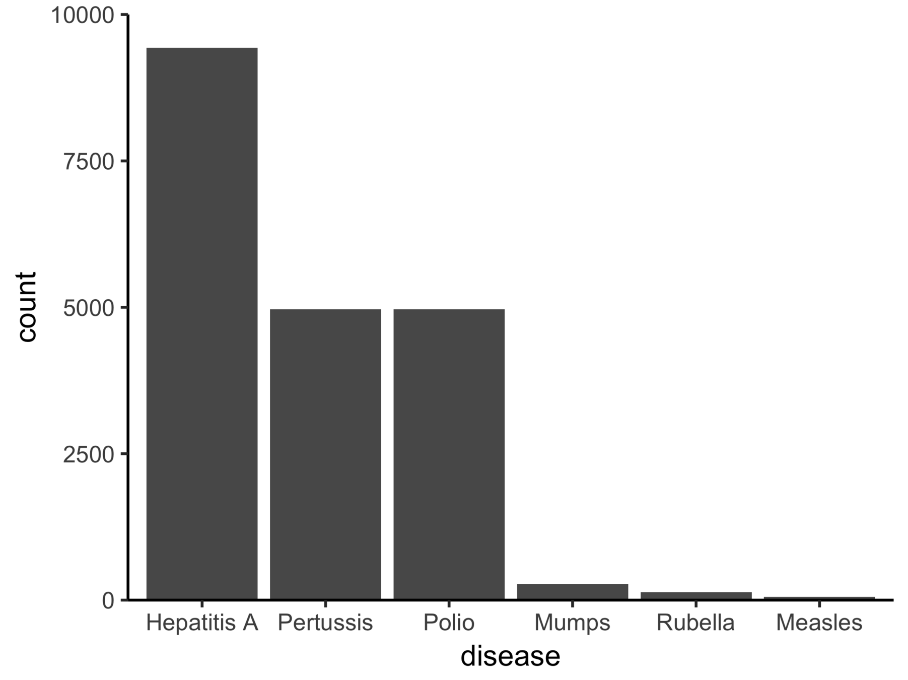
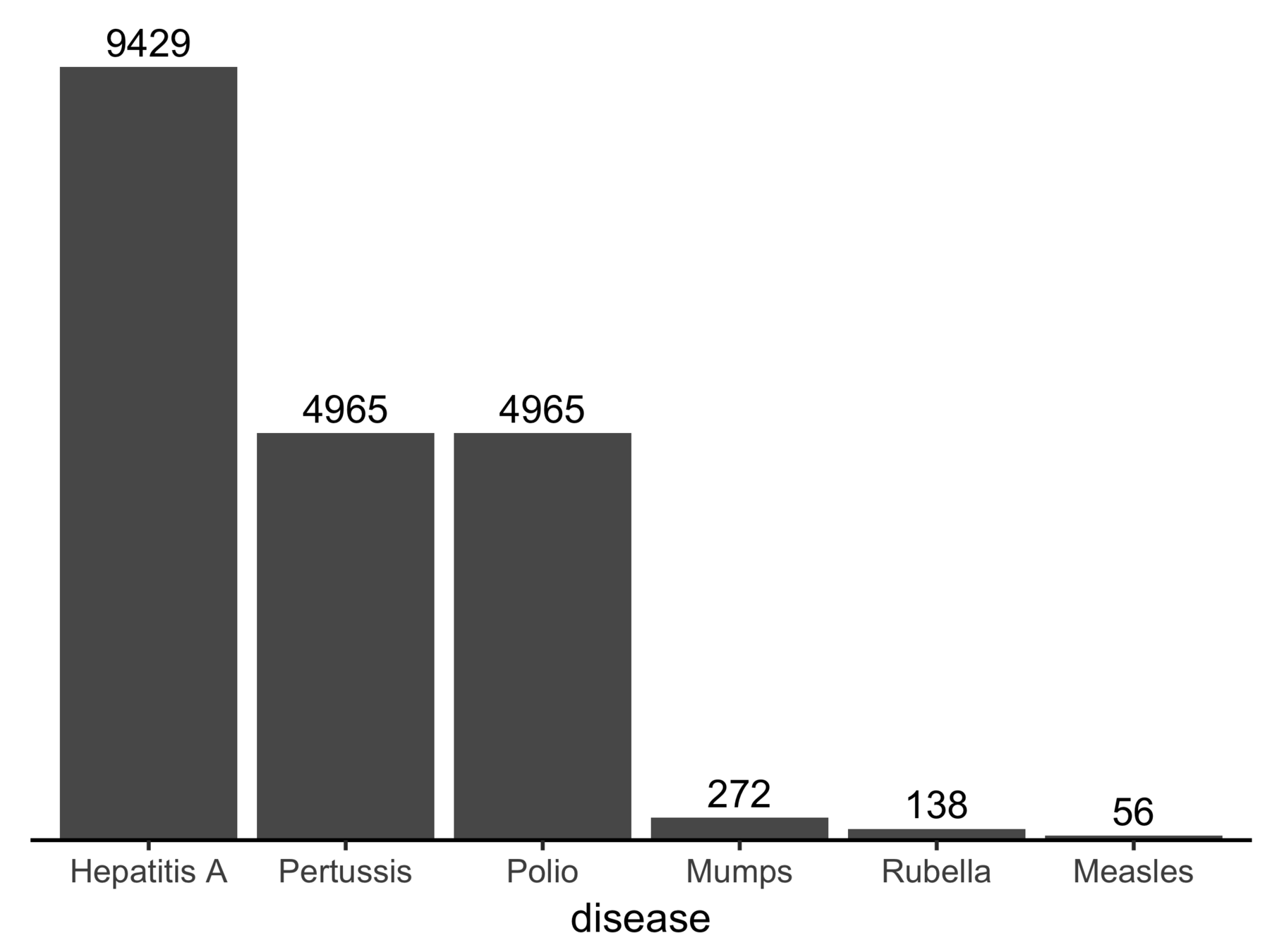
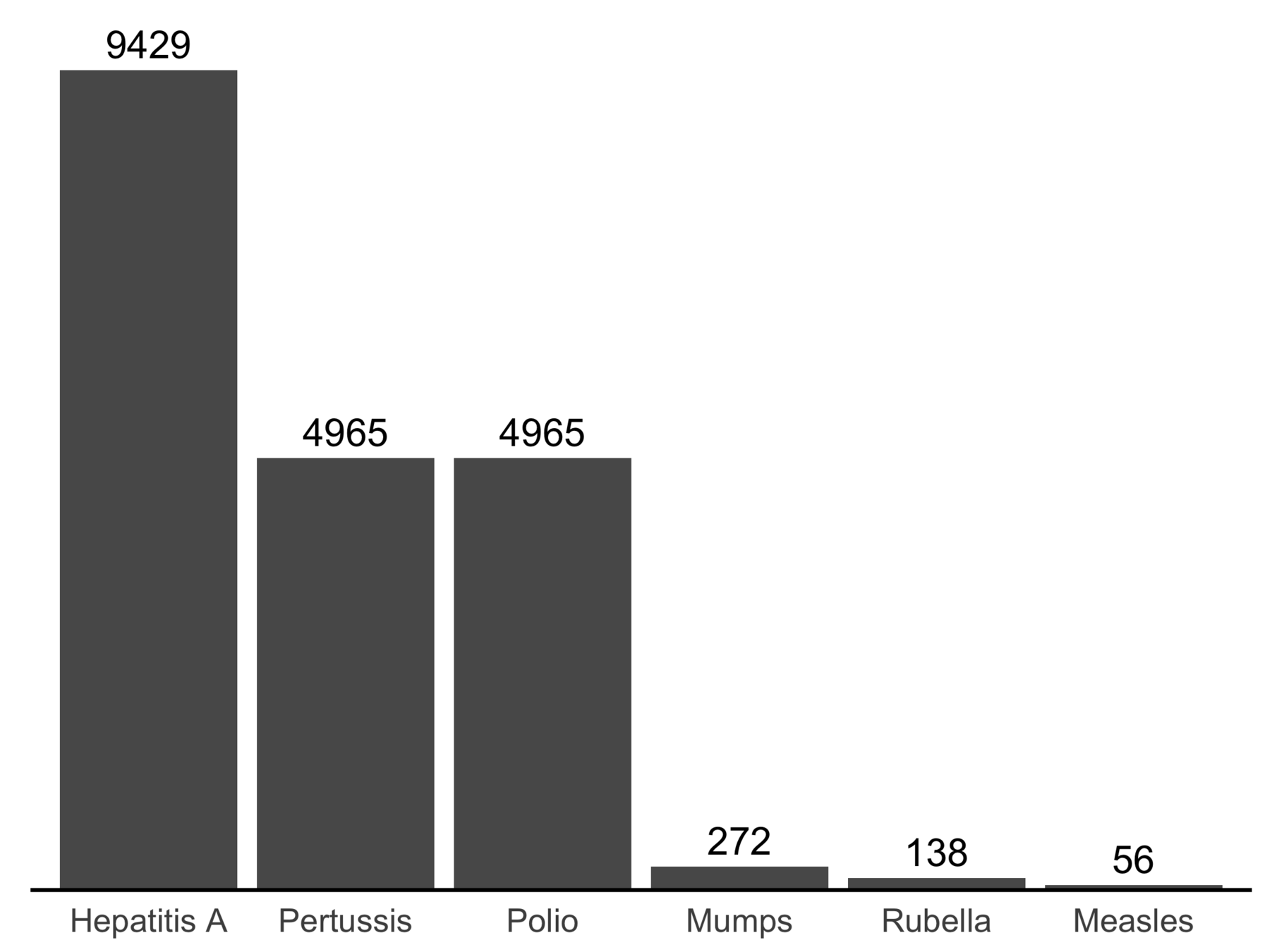
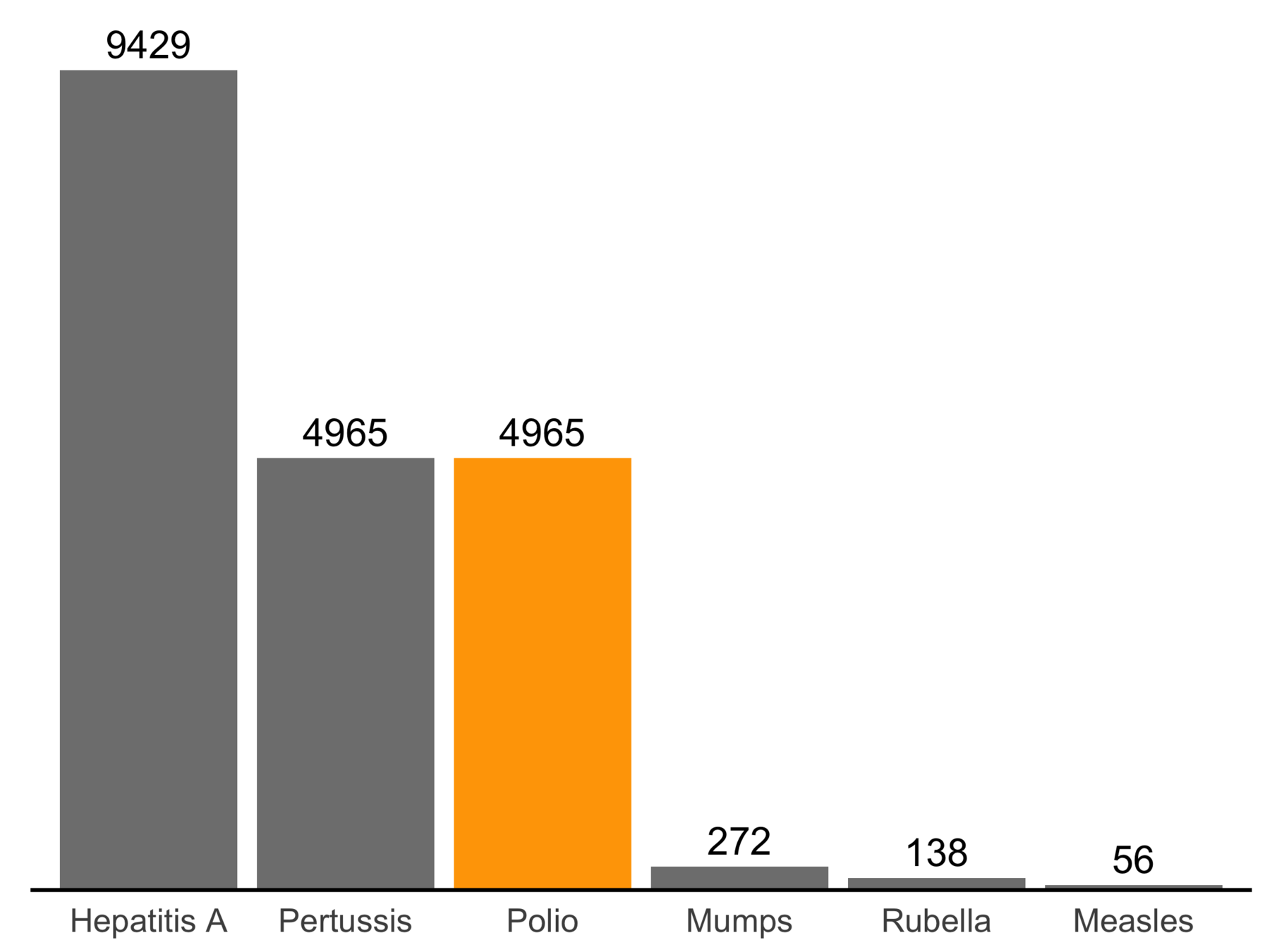
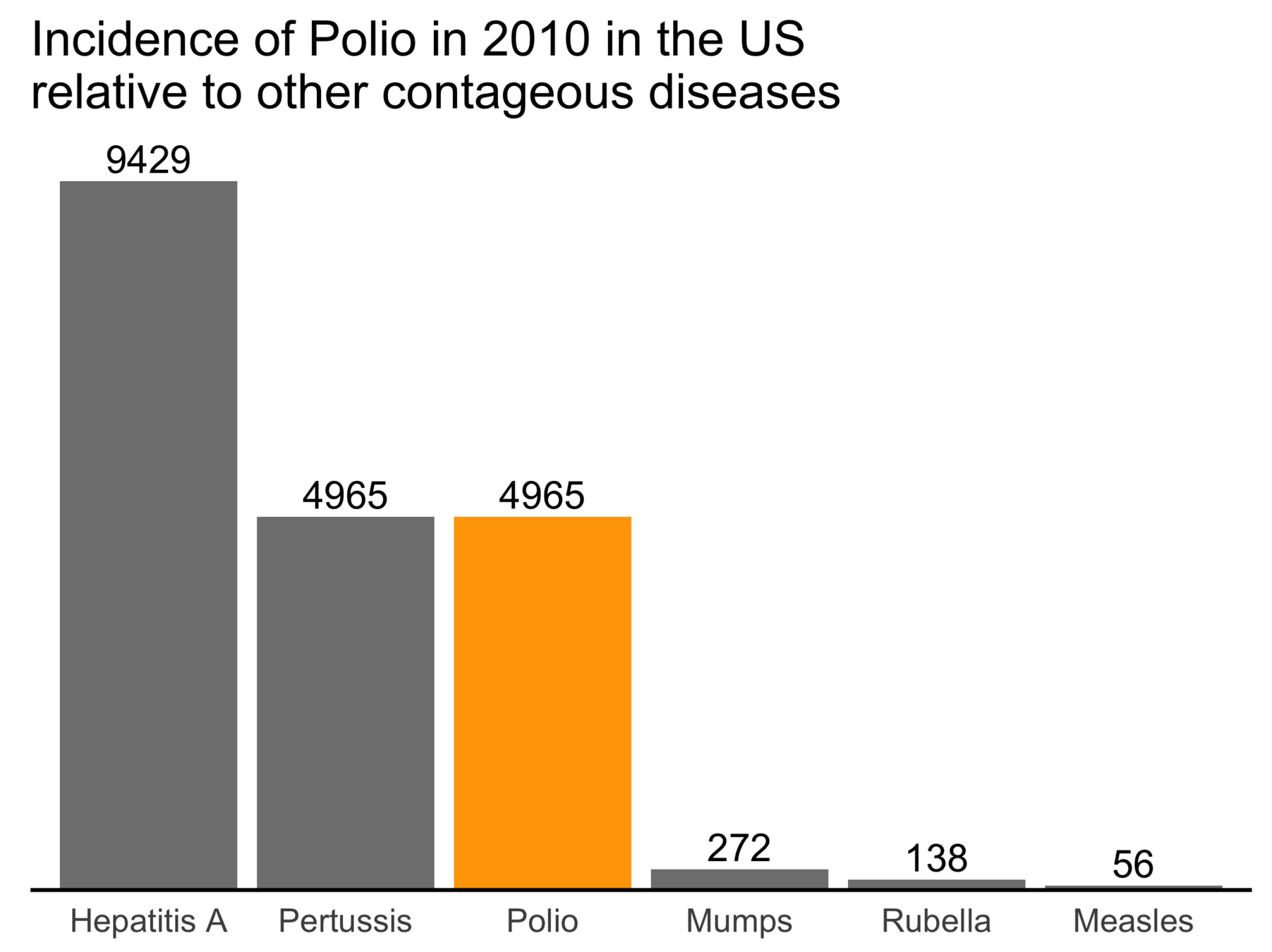
Remove redundant color
Remove background grid
Increase font size
Arrange in decreasing order
Remove y-axis gap
Replace y-axis with text
Remove x-label
Highlight Polio
Add title
Choose color wisely
(examples from Ann K Emery: http://annkemery.com/chart-colors/)
The fewer colors the better: avoid redundancy &
Choose similar colors for similar things and different colors for different things
Use different shades to indicate magnitude
Lighter colors imply less importance than darker colors
Example source: http://annkemery.com/chart-colors/
Color resources
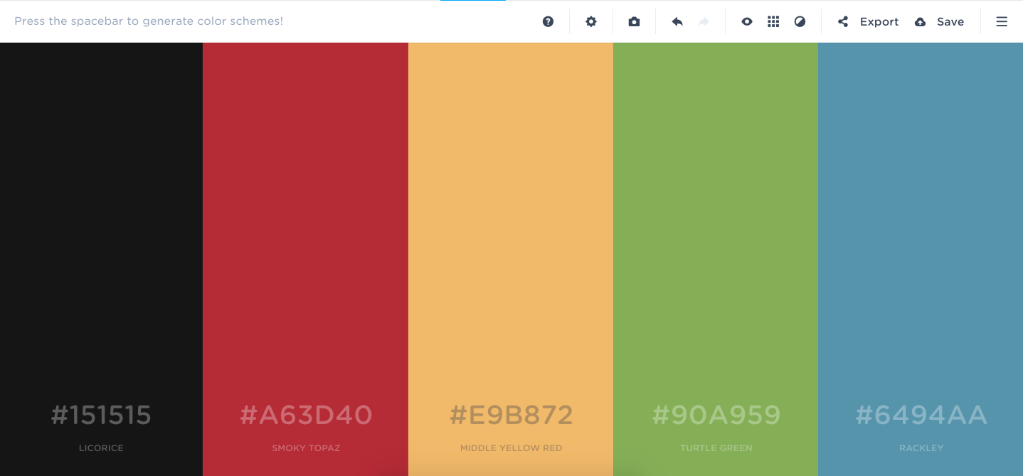
Coolors: https://coolors.co/app
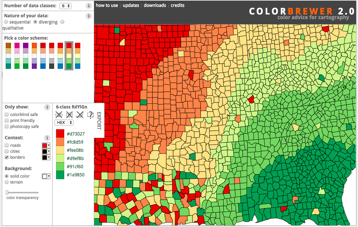
ColorBrewer: http://colorbrewer2.org/
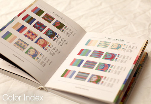
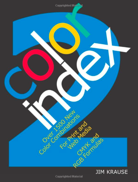
The color index book by Jim Krause
Moving away from standard plot types
A nice post by Ann K. Emery:
http://annkemery.com/clustered-bar-chart/
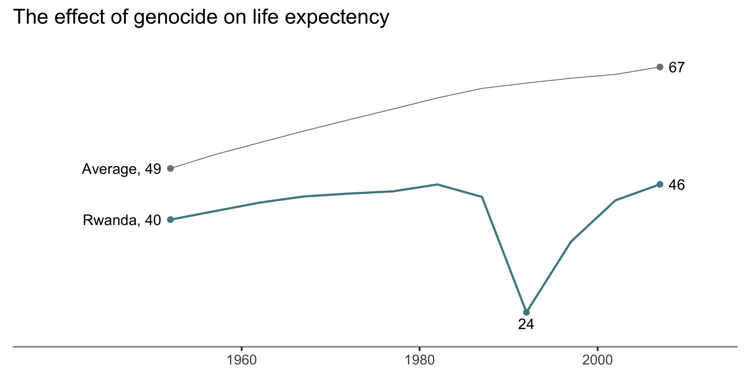
Slope plot
Dot plot
All figures made using ggplot2
General principles: a summary
Think before you plot
Every plot should have a message (use color, text & size to highlight it)
Avoid the defaults and remove clutter
Choose color wisely
Be brave enough to move away from the standard plotting types: be creative!
Think before you plot
Every plot should have a message (use color, text & size to highlight it)
Avoid the defaults and remove clutter
Choose color wisely
Be brave enough to move away from the standard plotting types: be creative!
Less is more: prioritize simpliticy
Can we improve the following plots?
Lines
Showing changes over time
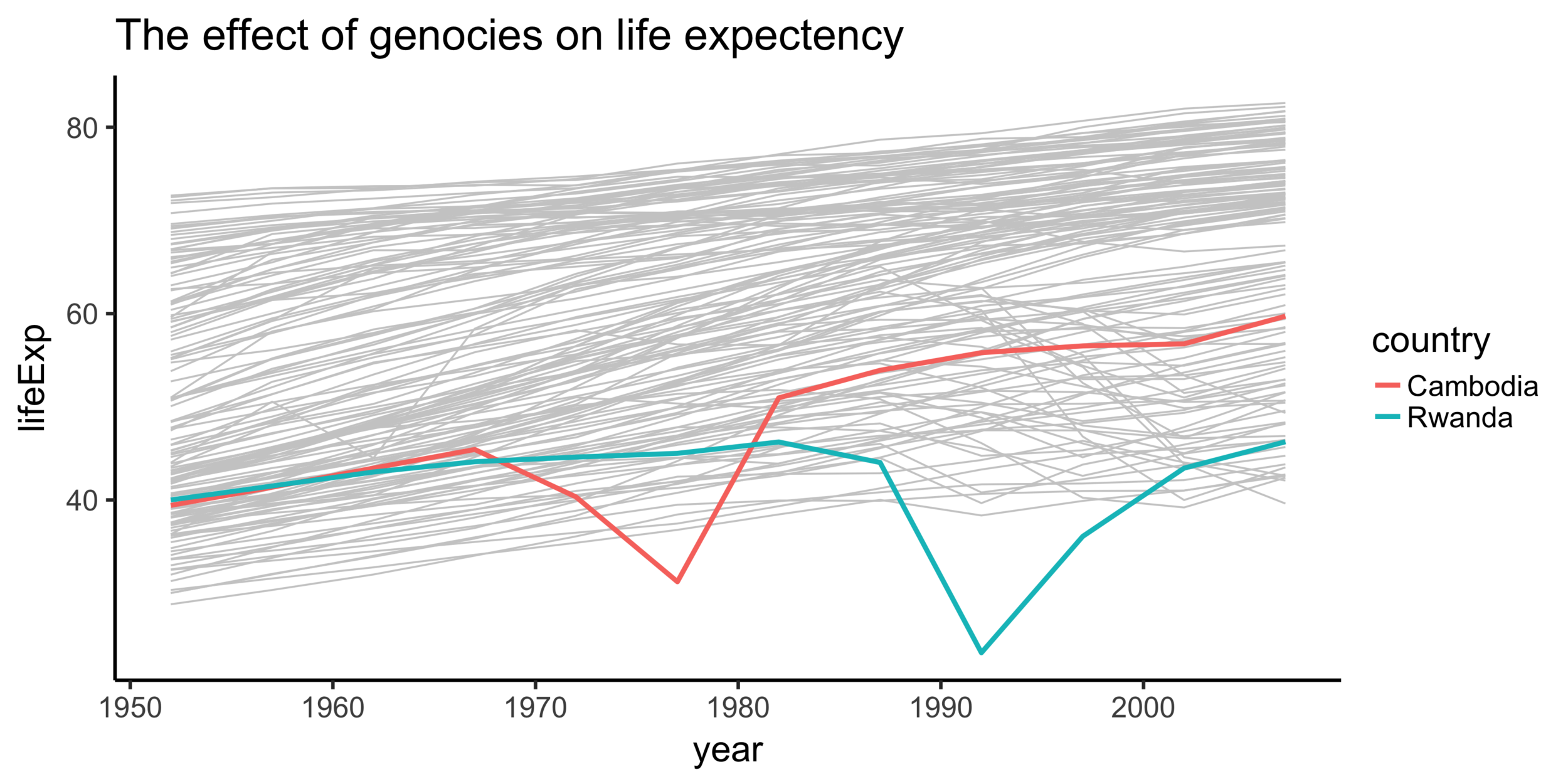
Data source: gapminder data
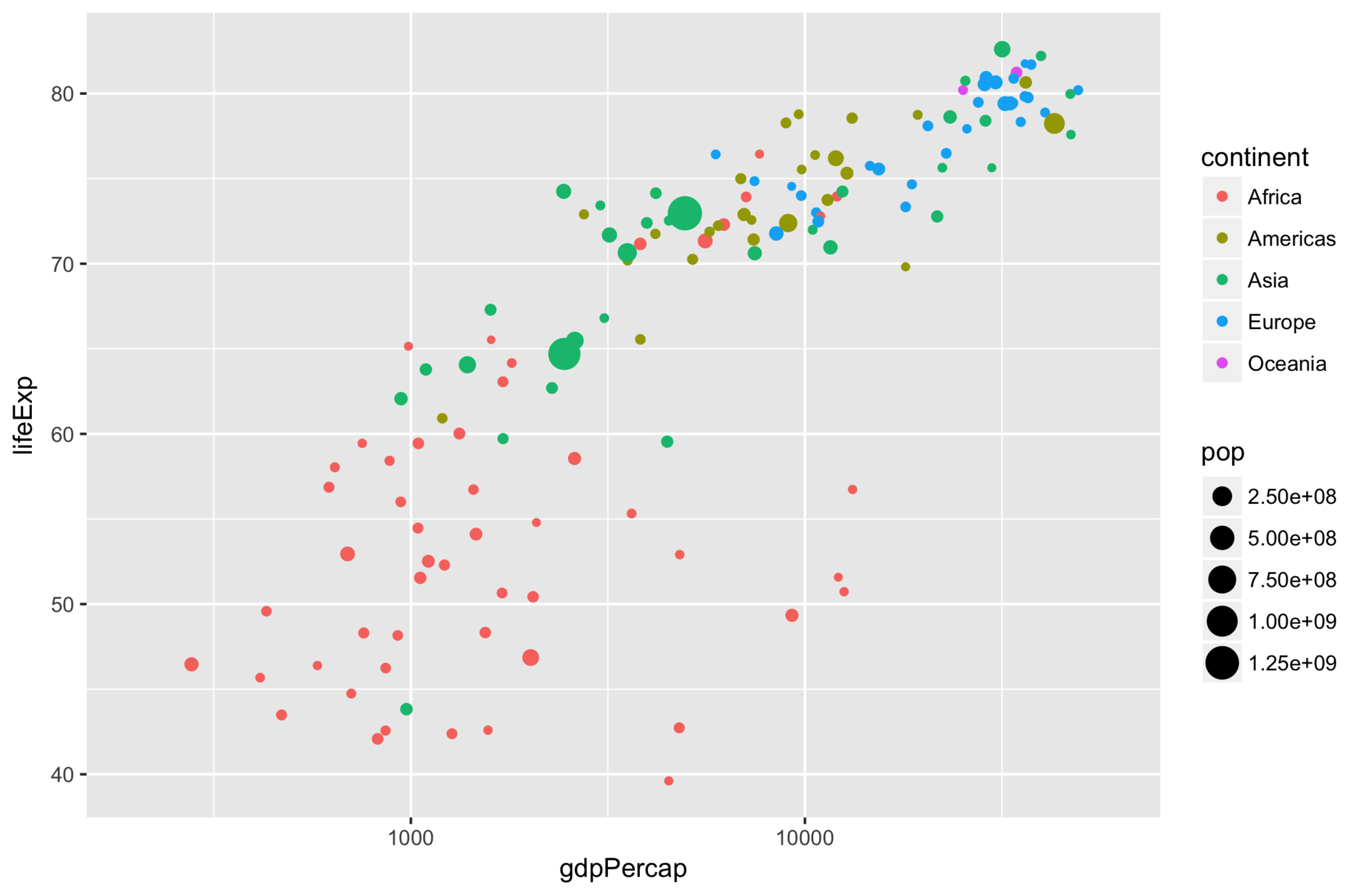
Points
comparing two continuous values
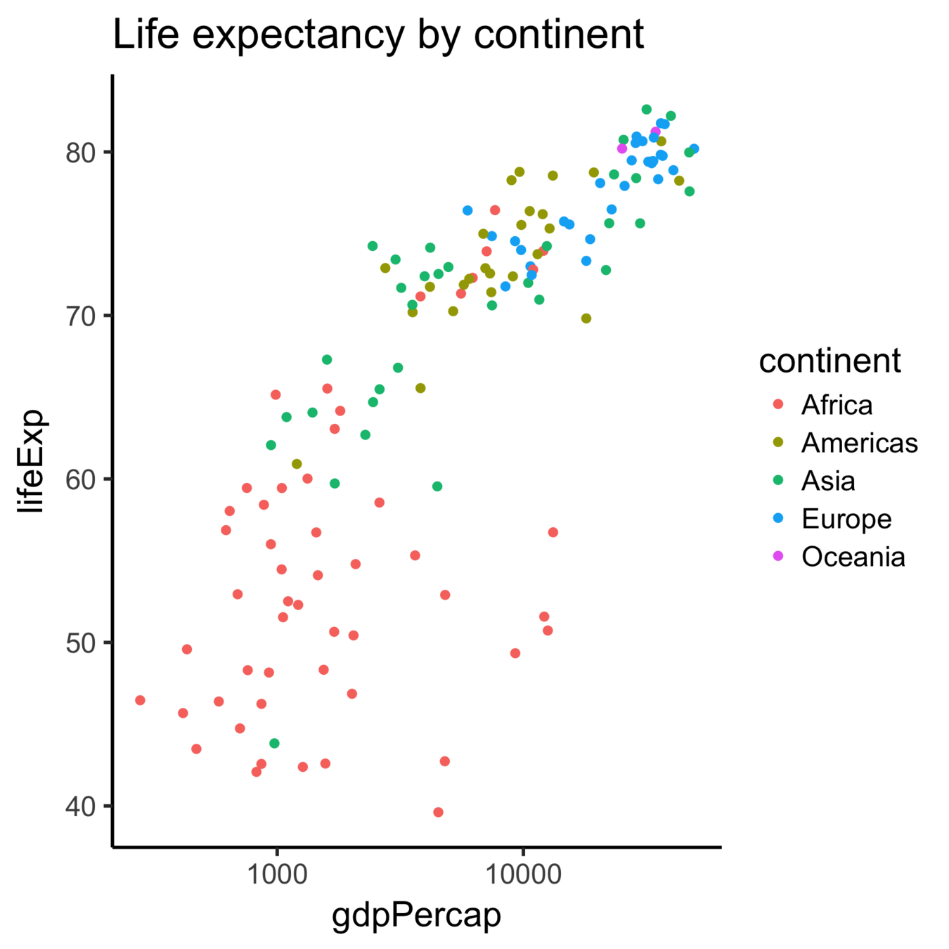
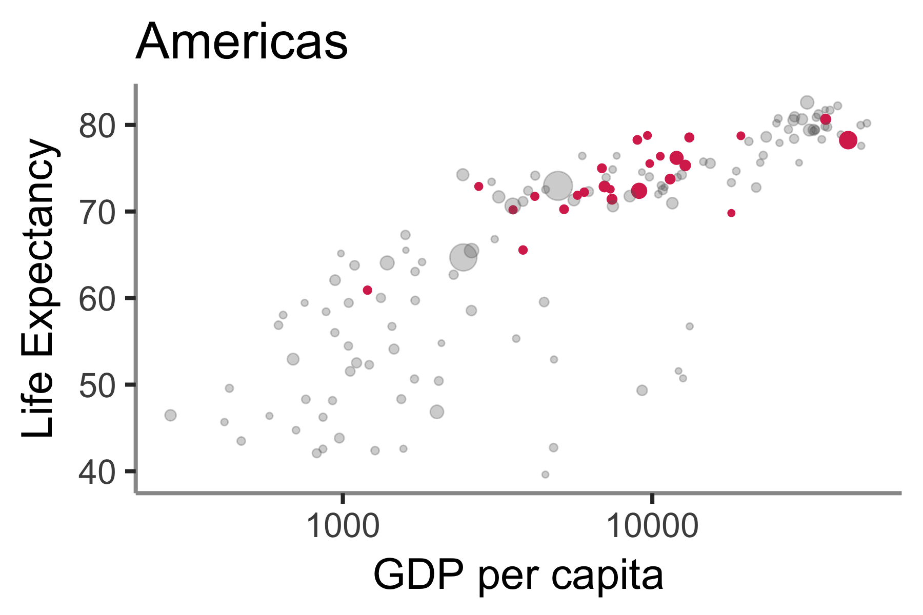
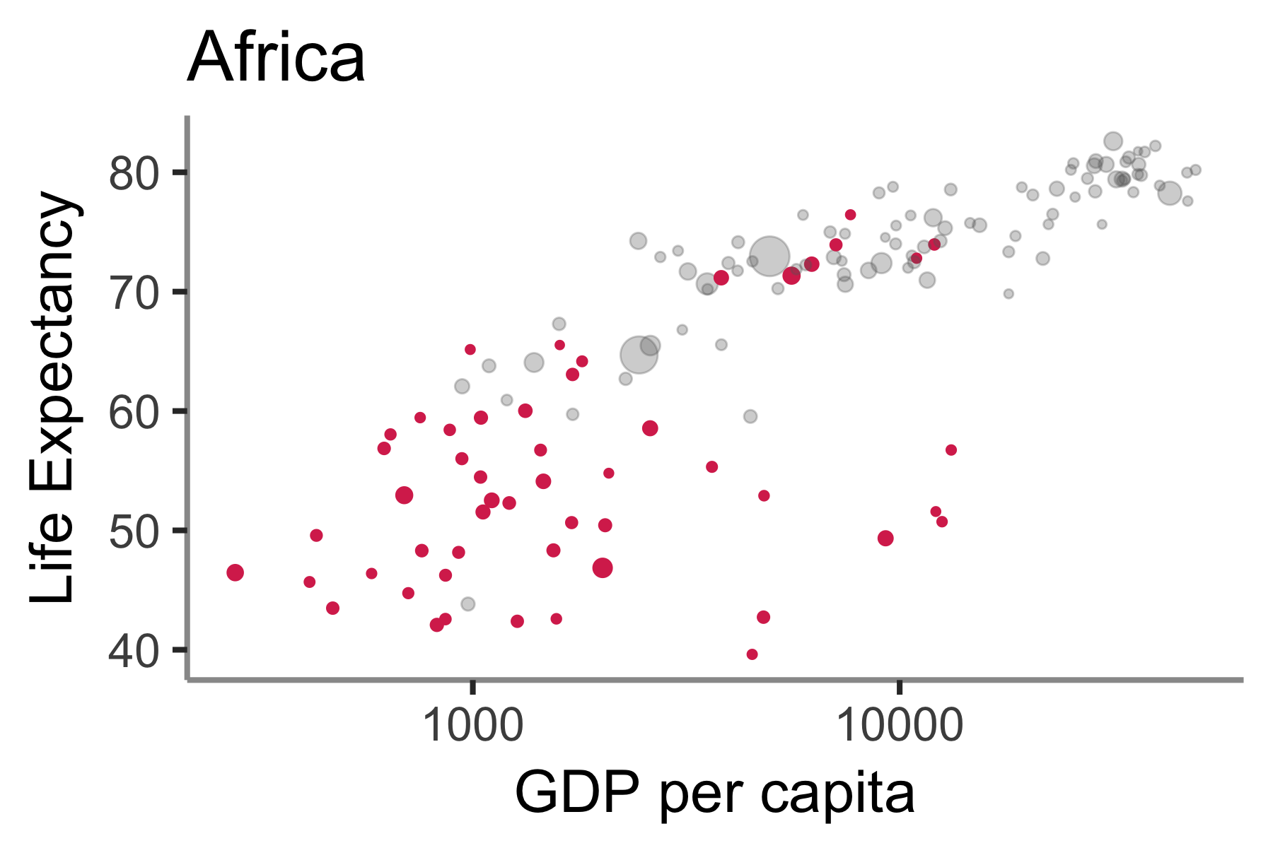
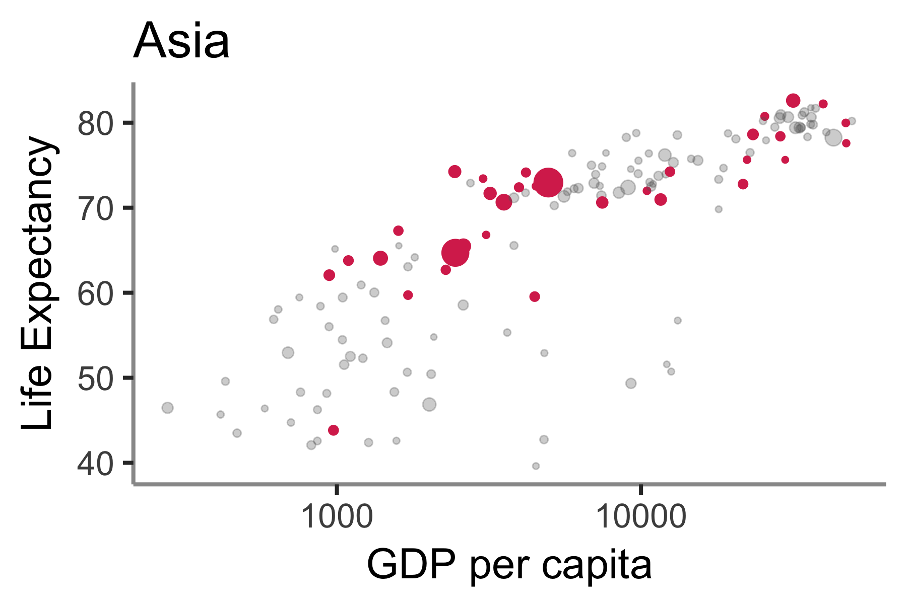
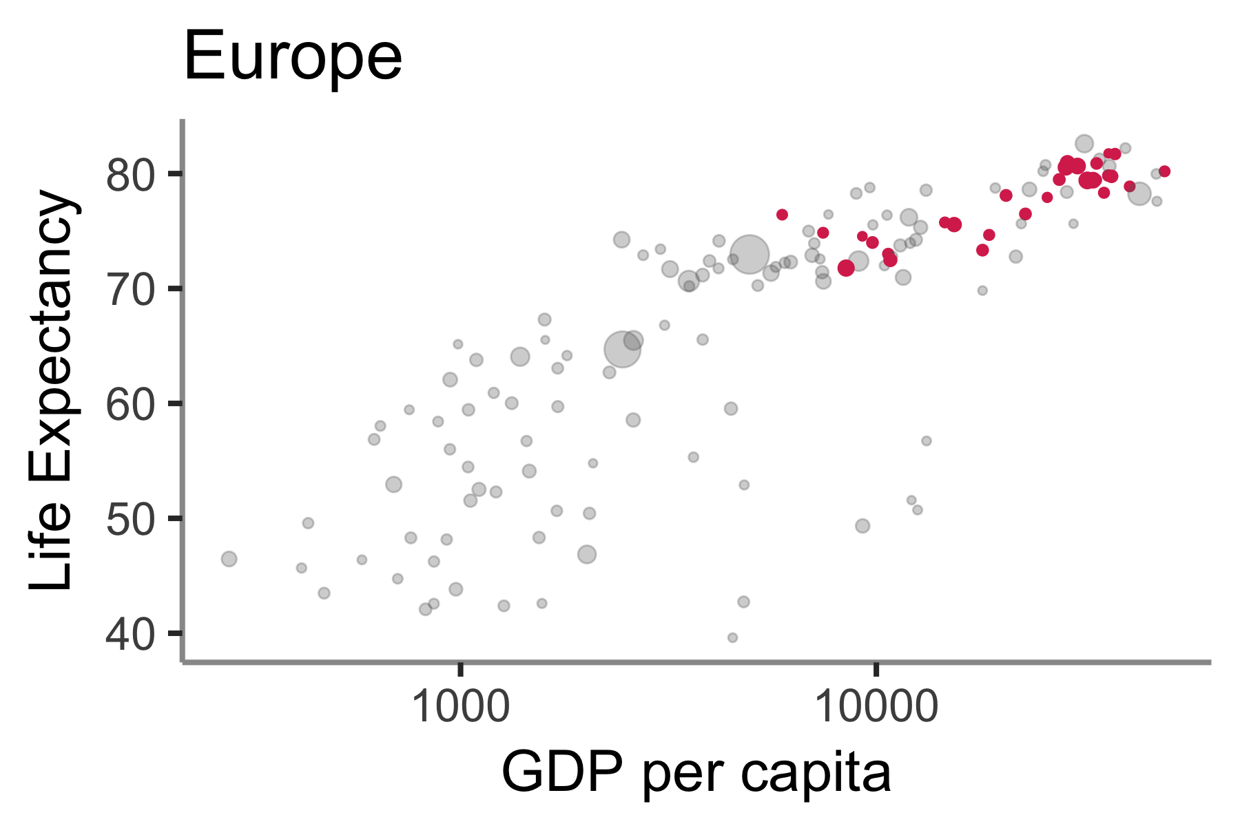
Data source: gapminder data
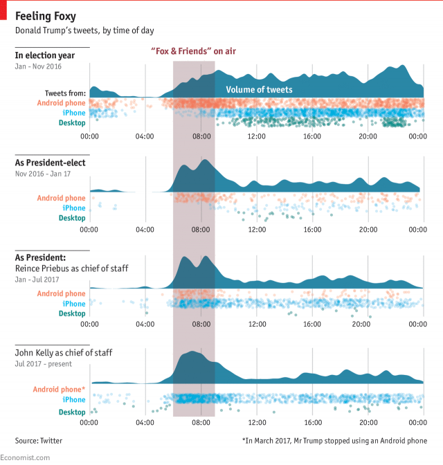
Examples of effective plots
what makes them so effective? What could be improved?
All the presidents tweets
@ The Economist
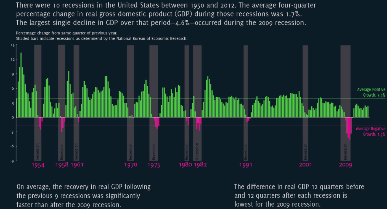
Economic Recovery after the Great Recession
by Jonathan Schwabish
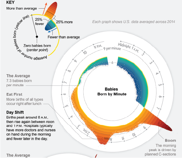
Why are so many babies born around 8:00 A.M?
by Nadieh Bremer, Zan Armstrong, Scientific American
Advice for specific plot types
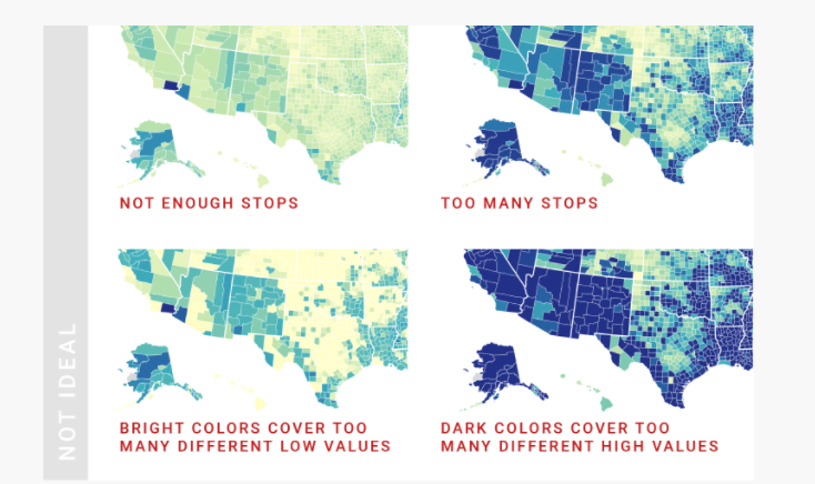
Chloropleth maps

https://blog.datawrapper.de/choroplethmaps/
Interactive transitions
https://beta.observablehq.com/@anbnyc/the-space-between
General tips
http://flowingdata.com/2015/08/11/real-chart-rules-to-follow/
slides:
http://slides.com/rebeccabarter/creating-effective-visualizations/fullscreen
code for ggplot figures:
https://github.com/rlbarter/visualization-examples