Angular
UX Mastery
with
Flex-Layout
Presented by:
Thomas Burleson

Thomas Burleson
@ThomasBurleson

http://linkedin.com/in/ThomasBurleson

ThomasBurleson@gmail.com

Team Lead, AngularJS Material
AngularJS Material
~3400 Forks
~15.5K Stars
~1K Watches
Thanks to Brad Green, Naomi Black, and Google.
Angular-Master-Class Trainer + Angular Consultant


40+ articles on blog.thoughtram.io
Angular
Flex-Layout
v2.0.0-beta.8
~1K Stars

Angular Flex-Layout ?

Before What...
Let's first talk Why...
HTML Layout ?
- Position elements in a HTML page
- Adjust element position & size
- relative to parent container
- relative to sibling elements
HTML Layout ?
sample layout

Layout Techniques
- Table
- Float, Position, Clear
- Grids
- FlexBox CSS
- Constraint CSS
Why FlexBox CSS
Box model optimized for user interfaces
Why FlexBox CSS
-
Grids are for 2-D Layouts
-
FlexBox is for 1-D Flows
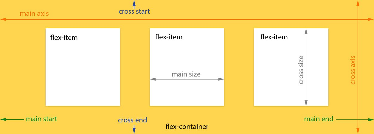
Think about container FLOW
How to Think about FlexBox ?
Think about child SIZE
-
Flows = horizontal or vertical
-
Sizes = fixed or ratios

Why FlexBox CSS
FlexBox === Containers + Children
- Containers define flow direction
- Child define size, offsets, order
- Containers can be nested
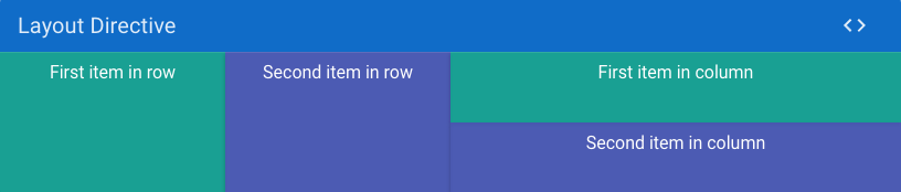
FlexBox Layout Flows ?
FlexBox Layout Flows !
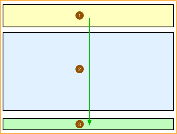
... start outside containers to inside.
FlexBox Layout Flows !
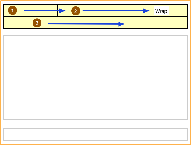
FlexBox Layout Flows !

FlexBox Layout Flows !
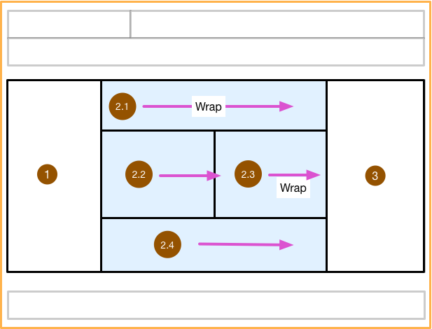
FlexBox Layout Flows !
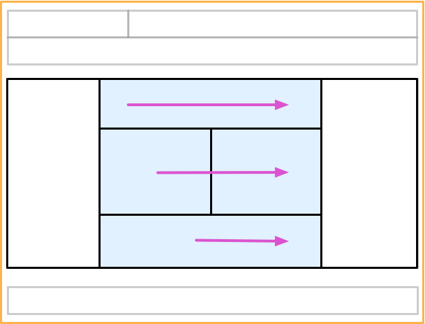
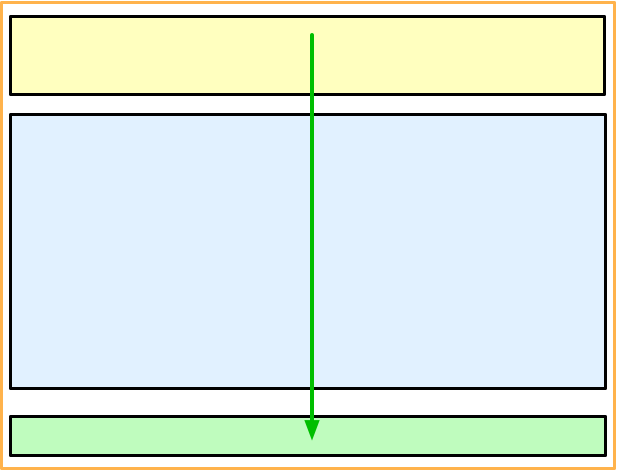

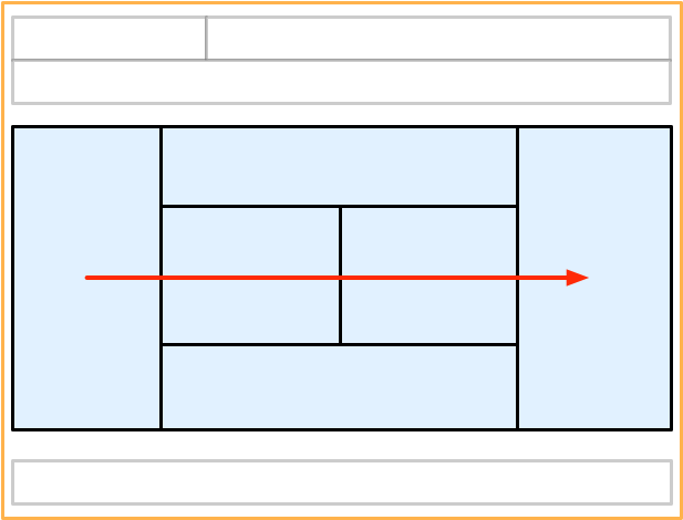
... consider flows as outside - in
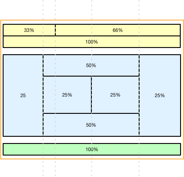
FlexBox Child Sizes
Layout Techniques

-
<table>
-
FlexBox CSS
-
Layout CSS
retrospective
Using HTML Tables
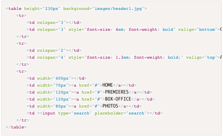
- Verbose markup
- Nesting is complicated
- Maintenance nightmare
Using FlexBox CSS
Using FlexBox CSS
- Manually define CSS
- Requires In-Depth Knowledge
- Requires Experience for Browser Bugs
- Requires Prefixing
- Not Angular-Native
Using AngularJS Material
Layout CSS
- Embedded FlexBox CSS
- Directive assign classnames
- CSS > 250K
- CSS Specificity Issue
- Slightly Fragile
Using AngularJS Material
Layout CSS
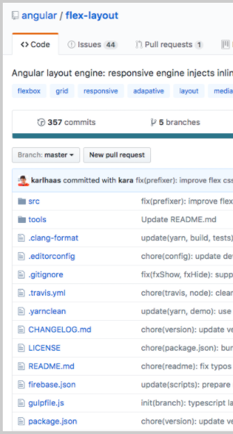
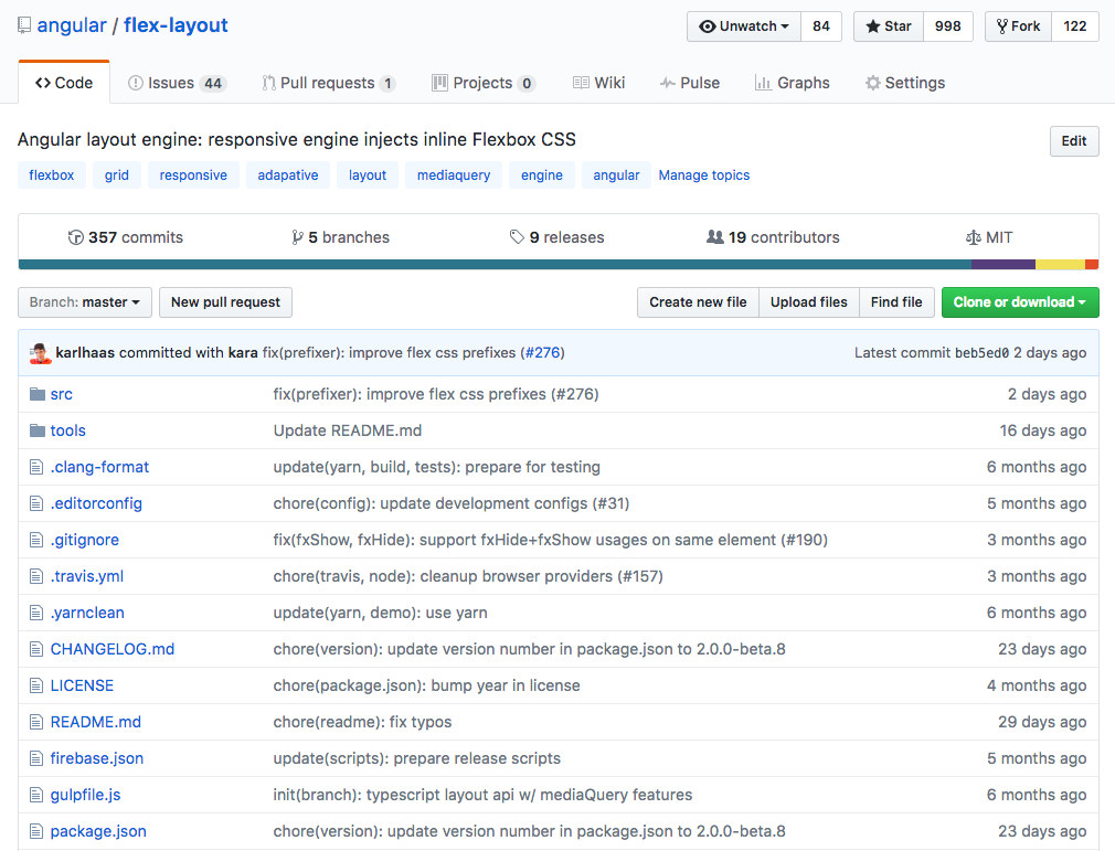
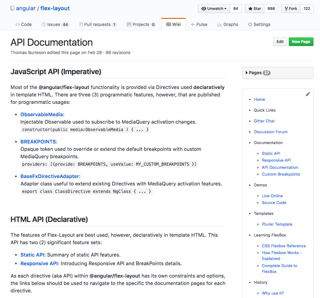
www.github.com/angular/flex-layout
- Stand-alone Library
- No CSS Stylesheet
- Typescript Implementation
- Inline CSS, Dynamically Injected
- Static API
- Responsive API
- Independent of Angular Material
- Angular CLI Integration
Using
Angular Flex-Layout
Browser Support

http://caniuse.com/#feat=flexbox
npm install --save @angular/flex-layout@latestimport { FlexLayoutModule }
from '@angular/flex-layout';
...
@NgModule({
imports: [FlexLayoutModule],
...
})
export class AppModule { }Import Angular Flex-Layout NgModule
Install Angular Flex-Layout components
v2.0.0-beta.14
- Directives used in HTML
- Declarative
- Supports Data-Binding
- Builds CSS - Dynamic Injected Inline
- Supports Change Detection
- Includes fxHide and fxShow features
- Performant
@angular/flex-layout
Static API
| fxLayout |
|
|---|---|
|
fxLayoutWrap |
|
|
fxLayoutGap |
|
|
fxLayoutAlign |
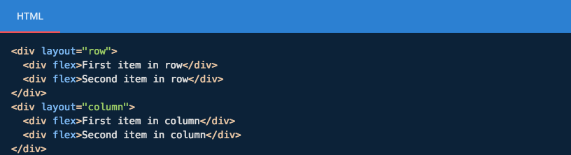
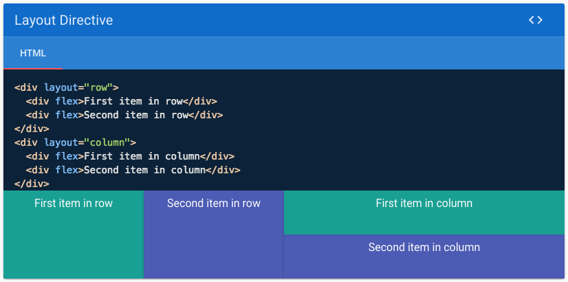
<div fxLayout="row"
    fxLayout.xs="column"> </div>
<div fxLayoutWrap> </div>
<div fxLayoutGap="10px"> </div>
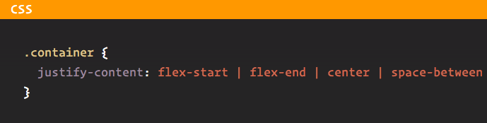
<div fxLayoutAlign="start stretch">
</div>
@angular/flex-layout
Static API
API for DOM Containers
@angular/flex-layout
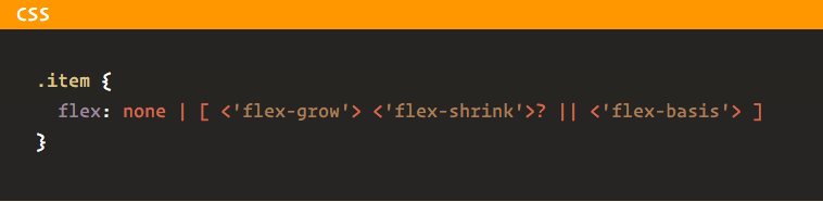
Static API
API for container children
| fxFlex |
|
|---|---|
|
fxFlexOrder |
|
|
fxFlexOffset |
|
|
fxFlexAlign |
|
|
fxFlexFill |
<div fxFlex="1 2
calc(15em + 20px)"></div>
<div fxFlexOrder="2"></div>
<div fxFlexOffset="20px"></div>
<div fxFlexAlign="center"></div>
<div fxFlexFill></div>
Demo
+
Source
This is nice ...
@angular/flex-layout
Static API
But is it reaally that special !?
Responsive UX
What do modern web apps need?
Responsive UX
Containers & elements adjust sizes & positions based on changes in window sizes
Containers & elements adapt sizes & positions based on device display sizes
UX adapts to device viewports.
Assertions for
Responsive UX

Desktop Layout
Mobile Layout
Sample
"You don't just make a Responsive UX !
You will need..."

Flexbox CSS + MediaQuery
FlexBox + MediaQueries
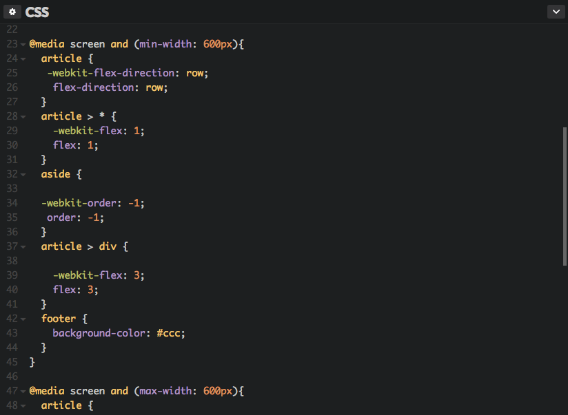
Sample

" Please tell me there is a better way! "
Responsive API
We can easily build Adaptive Applications!
@angular/flex-layout
- using Flexbox CSS under-the-hood
- using responsive resizing and repositioning
- using markup in the HTML layer
- without worrying about MediaQueries
Responsive API
@angular/flex-layout
- Uses Material Design: BreakPoint specifications
- Use MediaQuery range definitions
Material Design
Published industry specs for ranges of viewport sizes. The transition between ranges are a known as BreakPoints.
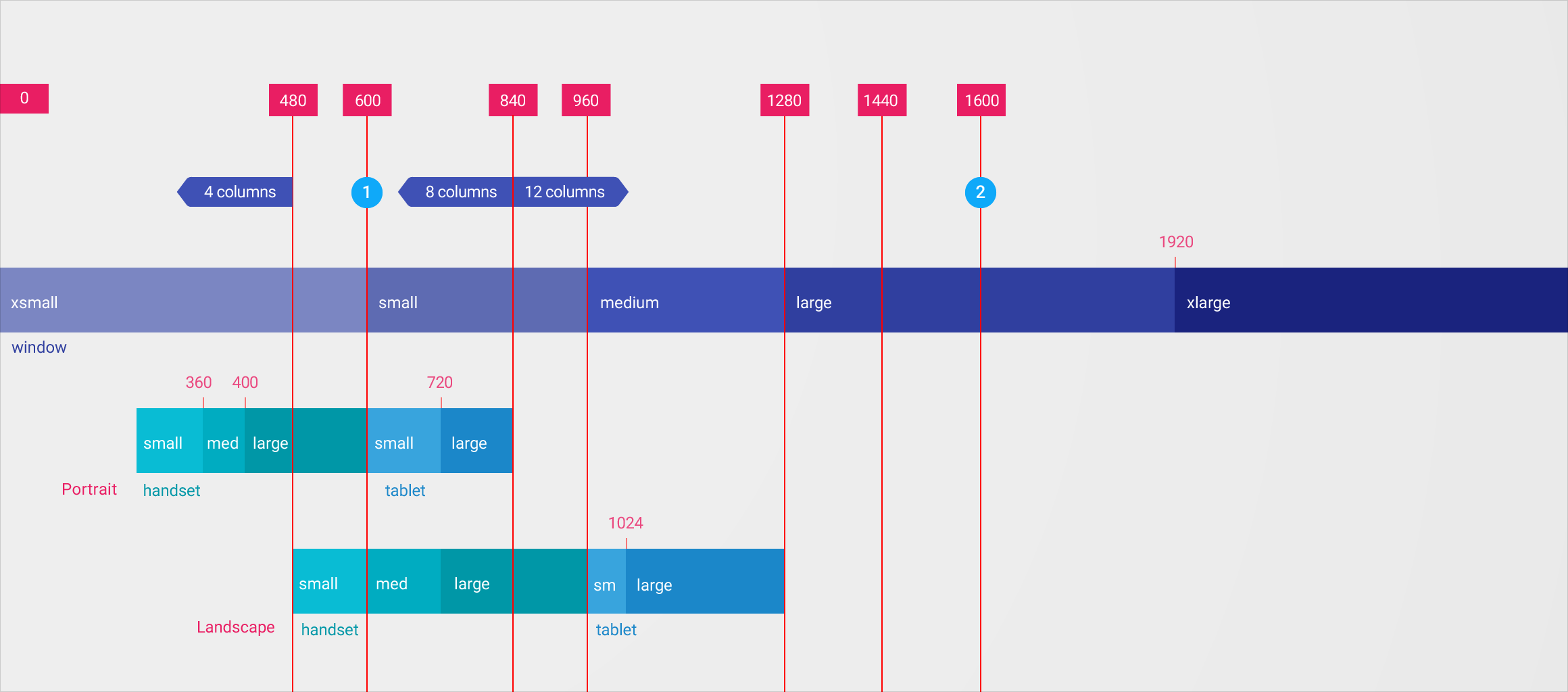
Media Queries + Aliases
| Breakpoint Alias | mediaQuery |
|---|
| xs | 'screen and (max-width: 599px)' |
|---|---|
| sm | 'screen and (min-width: 600px) and (max-width: 959px)' |
| md | 'screen and (min-width: 960px) and (max-width: 1279px)' |
| lg | 'screen and (min-width: 1280px) and (max-width: 1919px)' |
| xl | 'screen and (min-width: 1920px) and (max-width: 5000px)' |
Media Queries + Aliases
| Breakpoint Alias | mediaQuery |
|---|
| lt-sm | 'screen and (max-width: 599px)' |
|---|---|
| lt-md | 'screen and (max-width: 959px)' |
| lt-lg | 'screen and (max-width: 1279px)' |
| lt-xl | 'screen and (max-width: 1919px)' |
| gt-xs | 'screen and (min-width: 600px)' |
|---|---|
| gt-sm | 'screen and (min-width: 960px)' |
| gt-md | 'screen and (min-width: 1280px)' |
| gt-lg | 'screen and (min-width: 1920px)' |
| xs | 'screen and (max-width: 599px)' |
|---|---|
| sm | 'screen and (min-width: 600px) and (max-width: 959px)' |
| md | 'screen and (min-width: 960px) and (max-width: 1279px)' |
| lg | 'screen and (min-width: 1280px) and (max-width: 1919px)' |
| xl | 'screen and (min-width: 1920px) and (max-width: 5000px)' |
Responsive UX
Using MediaQuery + Alias, we can easily create Adaptive UX Layout ....
@angular/flex-layout
Responsive HTML API
with the
Responsive HTML API
@angular/flex-layout
Simply append the mediaQuery alias to the API:
fxLayout.sm = "..."
fxLayoutAlign.md = "..."
fxHide.gt-sm = "..."
Called a Declarative API since this is used in the HTML
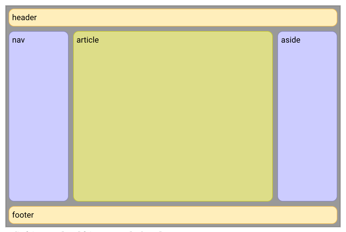
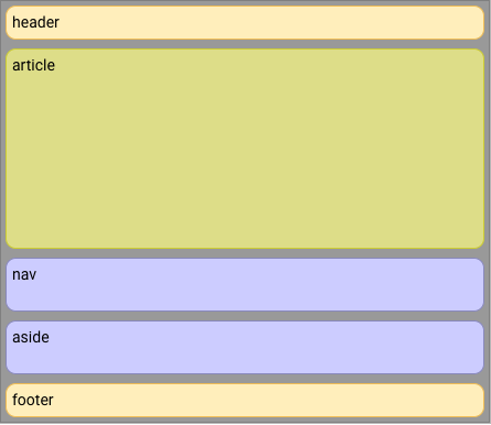
To build this desktop Adaptive Layout:
1
<div>
  <header>header</header>
  <div>

    <nav>nav</nav>

    <article>article</article>

    <aside>aside</aside>

  </div>
  <footer>footer</footer>
</div>
We start with boring HTML:
2
<div fxLayout="column" >

  <header>header</header>

  <div fxLayout="row" fxFlex >

    <nav fxFlex="1 6 20%" >nav</nav>

    <article fxFlex="3 1 60%" >article</article>

    <aside fxFlex="1 6 20%" >aside</aside>

  </div>
  <footer>footer</footer>
</div>
Spice it up with
Flex-Layout, Declarative Static API
3
To get this mobile adaptive layout:
4
<div fxLayout="column">
  <header>header</header>
  <div fxLayout="row" fxLayout.xs="column" fxFlex>

    <nav fxFlex="1 6 20%" fxFlexOrder
        fxFlexOrder.xs="2" >nav</nav>

    <article fxFlex="3 1 60%" fxFlexOrder
        fxFlexOrder.xs="1" >article</article>

    <aside fxFlex="1 6 20%" fxFlexOrder
        fxFlexOrder.xs="3" >aside</aside>

  </div>
  <footer>footer</footer>
</div>
created by Katerine Orlova
Make it sizzle with Flex-Layout Responsive API
5
Responsive HTML API
@angular/flex-layout

@angular/flex-layout
Responsive HTML API
- Declarative, intuitive HTML API
- No fussing with MediaQueries
- No fussing with Breakpoints
- No programmatic work
Responsive HTML API
@angular/flex-layout

bit.ly/angular-flex-layout
... more Declarative API
<div fxShow fxHide.xs="false" fxHide.lg="true"></div>
- xl, then fallback to the default fxShow; so the div is shown
- lg, then the div is hidden (since the value === 'true')
- md, then fallback to the default fxShow; so the div is shown
- sm, then fallback to the default fxShow; so the div is shown
- xs, then the div is shown (since the value === 'false')
Visibility example
<div fxFlex="50%" fxFlex.gt-sm="100%"></div>
- xl, then fallback to 'gt-sm' so the div sizing is 100%
- lg, then fallback to 'gt-sm' so the div sizing is 100%
- md, then fallback to 'gt-sm' so the div sizing is 100%
- sm, then fallback to the default fxFlex="50%"; so the div is 50%
- xs, then fallback to the default fxFlex="50%"; so the div is 50%
Special Responsive Features
| fxShow |
|
|---|---|
|
fxHide |
|
|
ngClass |
|
|
ngStyle |
<div fxShow
    [fxShow.xs]="isVisibleOnMobile()"></div>
<div fxHide
    [fxHide.gt-sm]="isVisibleOnDesktop()"></div>
<div
    [ngClass.sm]="{'fxClass-sm': hasStyle}"></div>
<div
    [ngStyle.xs]="{color: 'blue'}"></div>
Javascript Imperative API
| ObservableMedia |
|
|---|---|
|
BREAKPOINTS |
|
|
BaseFxDirectiveAdapter |
constructor(public
    media:ObservableMedia ) {}
providers: [{provide: BREAKPOINTS,
    useValue: MY_CUSTOM_BREAKPOINTS }]
export class ClassDirective
    extends NgClass {}
Subscribe to mediaQuery Activations
import {Subscription} from "rxjs/Subscription";
import {MediaChange, ObservableMedia} from "@angular/flex-layout";

constructor(media: ObservableMedia) {
  this.watcher = media.subscribe( (change: MediaChange) => {

    if ( change.mqAlias == 'xs') {
      this.loadMobileContent();
    }

  });
}
Resources
Angular Flex-Layout
github.com/angular/flex-layout
Visual guide to Flex
http://cssreference.io/flexbox/
bit.ly/demo-flex-layout-responsive
Thanks
Katrine Orlova
github.com/
twitter.com/
@cheerypick
- slide contributions and speaker -
http://bit.ly/thoughtram_houston
- Observables
- Component Architecture
- Routing
- Forms
- redux + ngrx
- Advanced Testing
Go to:
Note: the 3-day training may not include all these topics. Additional days may be required.