Responsive Layouts
with
@angular/flex-layout
Presented by:
Thomas Burleson
Ekaterina Orlova

Thomas Burleson
@ThomasBurleson

http://linkedin.com/in/ThomasBurleson

ThomasBurleson@gmail.com

Developer
AngularJS Material
~3400 Forks
~15.5K Stars
~1K Watches
Thanks to Brad Green, Naomi Black, and Google.
Angular-Master-Class Trainer + Angular Consultant


40+ articles on blog.thoughtram.io
Ekaterina Orlova
@cheerypick
katrineorlova@gmail.com
Frontend developer,
Accenture Norway


Pay attention and win a hoodie!

We'll play!
(or download an app)
Angular
Flex-Layout
v2.0.0-beta.10
~1,7K Stars

Angular Flex-Layout ?

Before What...
Let's first talk Why...
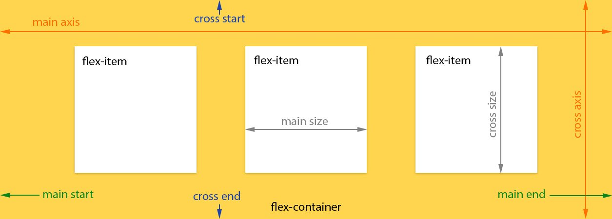
HTML Layout ?
- Position elements in a HTML page
- Adjust element position & size
- relative to parent container
- relative to sibling elements
HTML Layout ?
sample layout

Layout Techniques
- Table
- Float, Position, Clear
- CSS Grids
- FlexBox CSS

Why FlexBox CSS
Box model optimized for user interfaces
Why FlexBox CSS
-
Grids are for 2-D Layouts
-
FlexBox is for 1-D Flows
Think about container FLOW
How to Think about FlexBox ?
Think about child SIZE
-
Flows = horizontal or vertical
-
Sizes = fixed or ratios

Why FlexBox CSS
FlexBox === Containers + Children
- Containers define flow direction
- Child define size, offsets, order
- Containers can be nested

FlexBox Layout Flows ?
FlexBox Layout Flows !
... start outside containers to inside.
FlexBox Layout Flows !
FlexBox Layout Flows !

FlexBox Layout Flows !
FlexBox Layout Flows !

... consider flows as outside - in
FlexBox Child Sizes
Layout Techniques

-
<table>
-
FlexBox CSS
-
Layout API
retrospective
Using HTML Tables
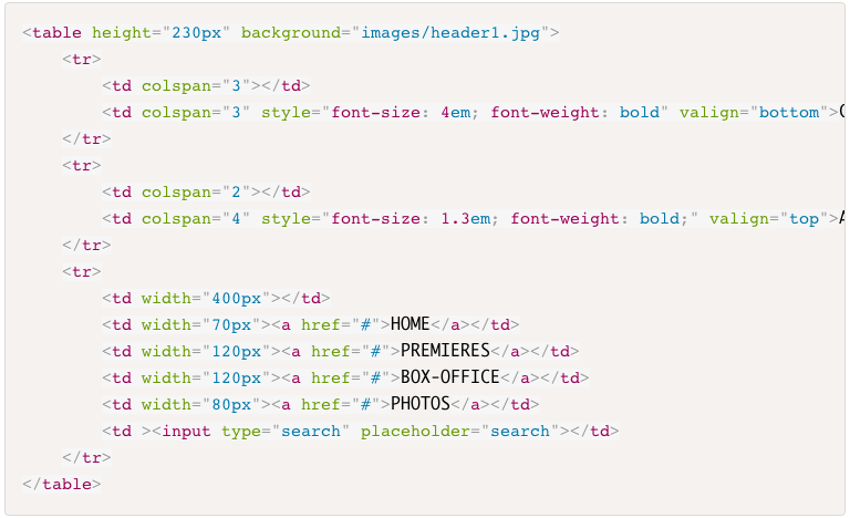
- Verbose markup
- Nesting is complicated
- Maintenance nightmare
Using FlexBox CSS
Using FlexBox CSS
- Manually define CSS
- Requires In-Depth Knowledge
- Requires Experience with Browser Bugs
- Requires Prefixing
- Not Angular-Native
Using AngularJS Material
Layout CSS
- Embedded FlexBox CSS
- Directive assign
classnames - CSS > 250K
- CSS Specificity Issue
- Slightly Fragile
Using AngularJS Material
Layout CSS
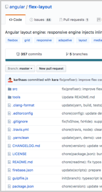
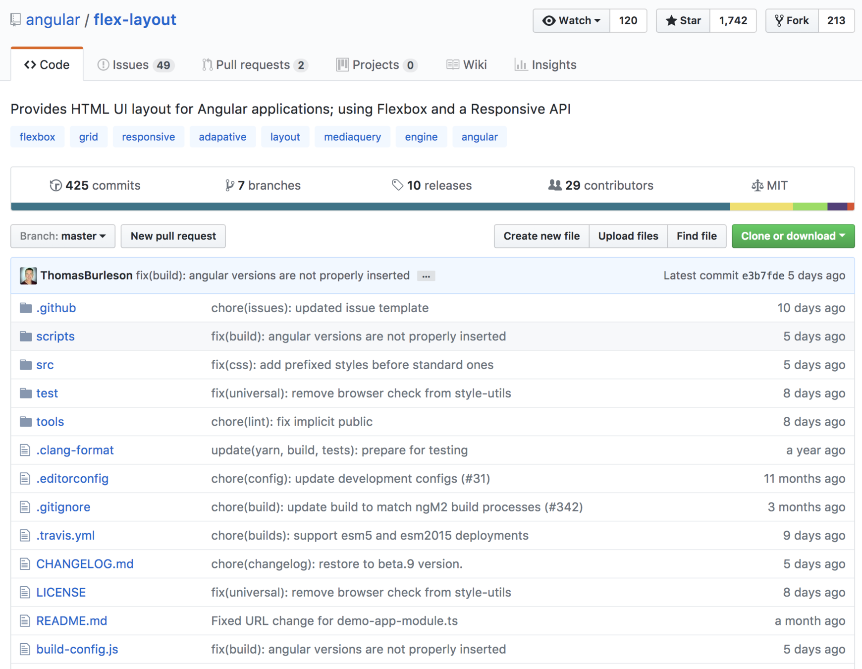
www.github.com/angular/flex-layout
- Stand-alone Library
- No CSS Stylesheet
- Typescript Implementation
- Inline CSS, Dynamically Injected
- Static API
- Responsive API
- Independent of Angular Material
- Angular CLI Integration
Using
@angular/flex-layout
Browser Support

http://caniuse.com/#feat=flexbox
npm install --save @angular/flex-layoutimport { FlexLayoutModule }
from '@angular/flex-layout';
...
@NgModule({
imports: [FlexLayoutModule],
...
})
export class AppModule { }Import Angular Flex-Layout NgModule
Install Angular Flex-Layout components
v2.0.0-beta.10
- Directives used in HTML
- Declarative
- Supports Data-Binding
- Builds CSS - Dynamic Injected Inline
- Supports Change Detection
- Includes fxHide and fxShow features
- Performant
@angular/flex-layout
Static API
| fxLayout |
|
|---|---|
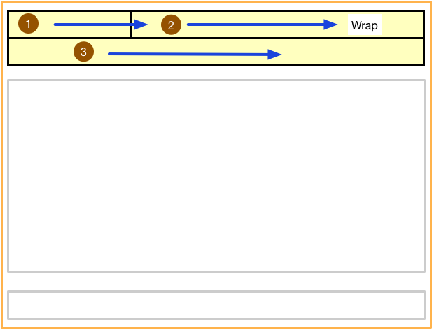
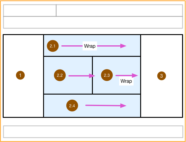
|
fxLayoutWrap |
|
|
fxLayoutGap |
|
|
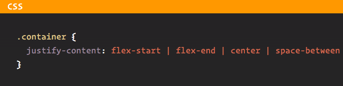
fxLayoutAlign |
<div fxLayout="row"
    fxLayout.xs="column"> </div>
<div fxLayoutWrap> </div>
<div fxLayoutGap="10px"> </div>
<div fxLayoutAlign="start stretch">
</div>
@angular/flex-layout
Static API
API for DOM Containers
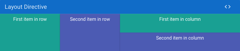
fxLayout API

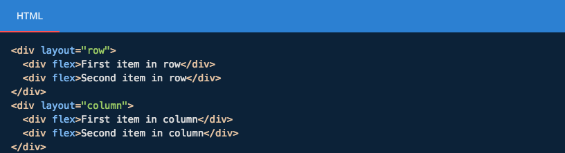
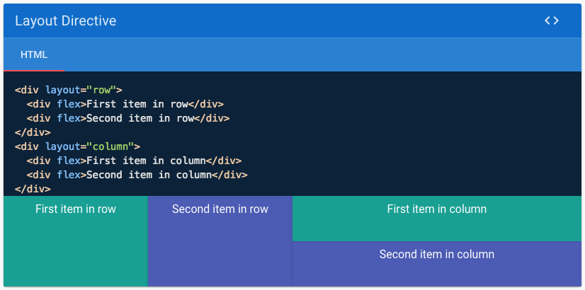
<div fxLayout="row">
<div>One</div>
<div>Two</div>
<div>Three</div>
<div>Four</div>
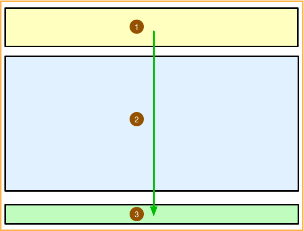
</div><div fxLayout="column">
<div>One</div>
<div>Two</div>
<div>Three</div>
<div>Four</div>
</div>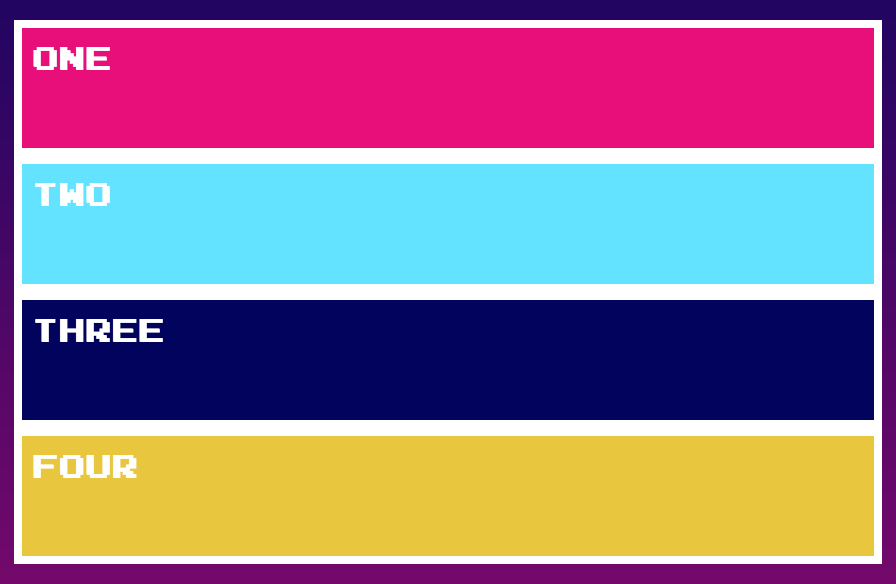
fxLayout options
| Value | Equivalent CSS |
|---|---|
| default | {flex-direction: row} |
| row | {flex-direction: row} |
| row-reverse | {flex-direction: row-reverse} |
| column | {flex-direction: column} |
| column-reverse | {flex-direction: column-reverse} |
<div fxLayout="row-reverse">
...
</div>
@angular/flex-layout
Static API
API for container children
| fxFlex |
|
|---|---|
|
fxFlexOrder |
|
|
fxFlexOffset |
|
|
fxFlexAlign |
|
|
fxFlexFill |
<div fxFlex="1 2
calc(15em + 20px)"></div>
<div fxFlexOrder="2"></div>
<div fxFlexOffset="20px"></div>
<div fxFlexAlign="center"></div>
<div fxFlexFill></div>
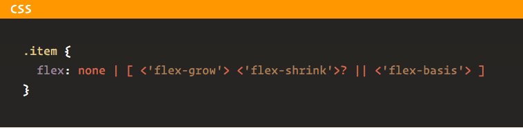
fxFlex API
fxFlex="<flex-grow> <flex-shrink> <flex-basis>"fxFlex="<flex-basis>"flex-grow
Defines how much a flexbox item should grow ( proportional to the others) if there's space available.

flex-shrink
defines how much a flexbox item should shrink if there is not enough space available.

flex-basis
controls the default size of the element

fxFlex
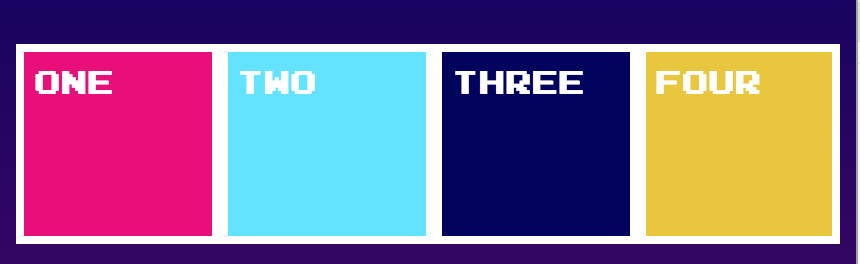
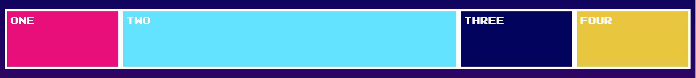
<div fxLayout="row" fxLayoutAlign="center">
  <div fxFlex="1 1 auto">One</div>
  <div fxFlex="5 1 auto">Two</div>
  <div fxFlex="1 1 auto">Three</div>
  <div fxFlex="1 1 auto">Four</div>
</div>

fxFlex options
- fxFlex
- fxFlex="2 2 calc(10em + 10px)"
- fxFlex="102px"
- fxFlex="auto"
The flex-basis values can be pixels, percentages, calcs, em, vw, vh, or known aliases.
| alias | Equivalent CSS |
|---|---|
| grow | {flex: 1 1 100%} |
| initial | {flex: 0 1 auto} |
| auto | {flex: <grow> <shrink> 100%} |
| none | {flex: 0 0 auto} |
| nogrow | {flex: 0 1 auto} |
| noshrink | {flex: 1 0 auto} |
Demo
+
Source
Text

Join at kahoot.it
This is nice ...
@angular/flex-layout
Static API
But is it reaally that special !?
Responsive UX
What do modern web apps need?
Responsive UX
Containers & elements adjust sizes & positions based on changes in window sizes
Containers & elements adapt sizes & positions based on device display sizes
UX adapts to device viewports.
Assertions for
Responsive UX

Desktop Layout
Mobile Layout
Sample
"You don't just make an Adaptive UX!
You will need..."

Flexbox CSS + MediaQuery
FlexBox + MediaQueries
Sample

" Please tell me there is a better way! "
Responsive API
We can easily build Adaptive Applications!
@angular/flex-layout
- using Flexbox CSS under-the-hood
- using responsive resizing and repositioning
- using markup in the HTML layer
- without worrying about MediaQueries
Responsive API
@angular/flex-layout
- Uses Material Design: BreakPoint specifications
- Use MediaQuery range definitions
Material Design
Published industry specs for ranges of viewport sizes.
The transition between ranges is known as BreakPoints.
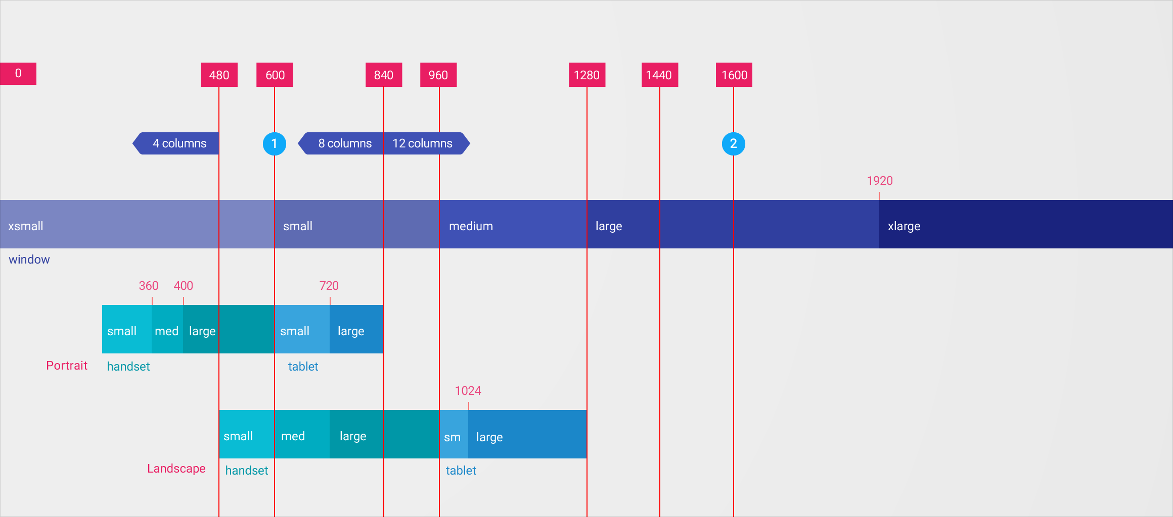
Media Queries + Aliases
| Breakpoint Alias | mediaQuery |
|---|
| xs | 'screen and (max-width: 599px)' |
|---|---|
| sm | 'screen and (min-width: 600px) and (max-width: 959px)' |
| md | 'screen and (min-width: 960px) and (max-width: 1279px)' |
| lg | 'screen and (min-width: 1280px) and (max-width: 1919px)' |
| xl | 'screen and (min-width: 1920px) and (max-width: 5000px)' |
Media Queries + Aliases
| Breakpoint Alias | mediaQuery |
|---|
| lt-sm | 'screen and (max-width: 599px)' |
|---|---|
| lt-md | 'screen and (max-width: 959px)' |
| lt-lg | 'screen and (max-width: 1279px)' |
| lt-xl | 'screen and (max-width: 1919px)' |
| gt-xs | 'screen and (min-width: 600px)' |
|---|---|
| gt-sm | 'screen and (min-width: 960px)' |
| gt-md | 'screen and (min-width: 1280px)' |
| gt-lg | 'screen and (min-width: 1920px)' |
| xs | 'screen and (max-width: 599px)' |
|---|---|
| sm | 'screen and (min-width: 600px) and (max-width: 959px)' |
| md | 'screen and (min-width: 960px) and (max-width: 1279px)' |
| lg | 'screen and (min-width: 1280px) and (max-width: 1919px)' |
| xl | 'screen and (min-width: 1920px) and (max-width: 5000px)' |
Responsive UX
Using MediaQuery + Alias, we can easily create Adaptive UX Layout ....
@angular/flex-layout
Responsive HTML API
with the
Responsive HTML API
@angular/flex-layout
Simply append the mediaQuery alias to the API:
fxLayout.sm = "..."
fxLayoutAlign.md = "..."
fxHide.gt-sm = "..."
Called a Declarative API since this is used in the HTML
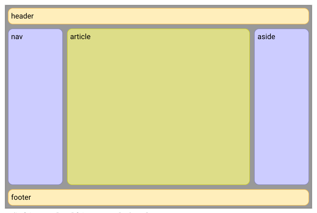
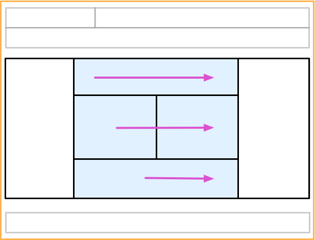
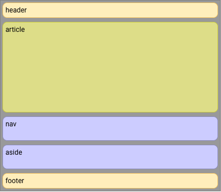
To build this desktop Adaptive Layout:
1
<div>
  <header>header</header>
  <div>

    <nav>nav</nav>

    <article>article</article>

    <aside>aside</aside>

  </div>
  <footer>footer</footer>
</div>
We start with boring HTML:
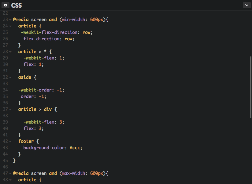
2
<div fxLayout="column" >

  <header>header</header>

  <div fxLayout="row" fxFlex >

    <nav fxFlex="1 6 20%" >nav</nav>

    <article fxFlex="3 1 60%" >article</article>

    <aside fxFlex="1 6 20%" >aside</aside>

  </div>
  <footer>footer</footer>
</div>
Spice it up with
Flex-Layout, Declarative Static API
3
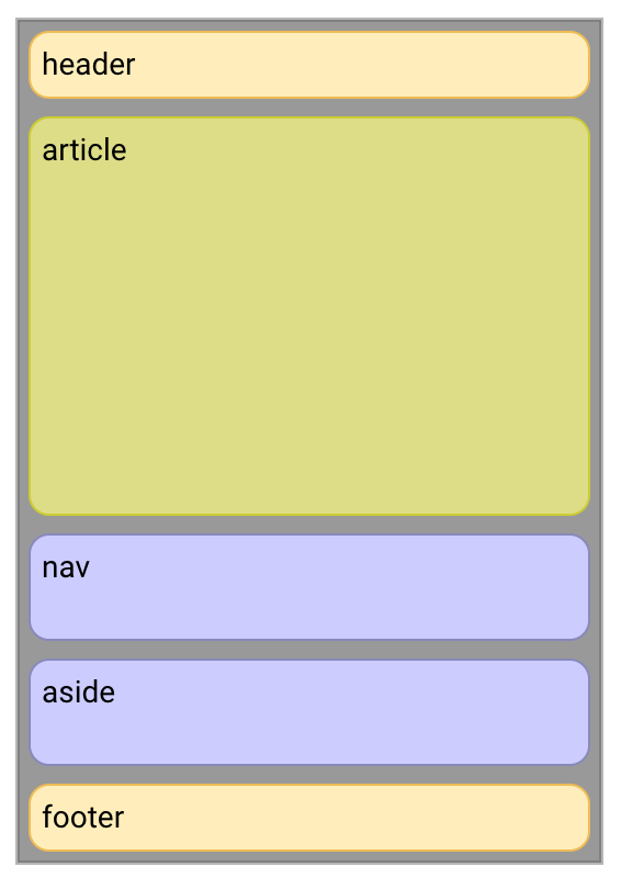
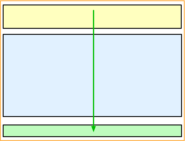
To get this mobile adaptive layout:
4
<div fxLayout="column">
  <header>header</header>
  <div fxLayout="row" fxLayout.xs="column" fxFlex>

    <nav fxFlex="1 6 20%" fxFlexOrder
        fxFlexOrder.xs="2" >nav</nav>

    <article fxFlex="3 1 60%" fxFlexOrder
        fxFlexOrder.xs="1" >article</article>

    <aside fxFlex="1 6 20%" fxFlexOrder
        fxFlexOrder.xs="3" >aside</aside>

  </div>
  <footer>footer</footer>
</div>
Make it sizzle with Flex-Layout Responsive API
5
Responsive HTML API
@angular/flex-layout

@angular/flex-layout
Responsive HTML API
- Declarative, intuitive HTML API
- No fussing with MediaQueries
- No fussing with Breakpoints
- No programmatic work
Responsive HTML API
@angular/flex-layout

bit.ly/angular-flex-layout
... more Declarative API
<div fxShow fxHide.xs="false" fxHide.lg="true"></div>
- xl, then fallback to the default fxShow; so the div is shown
- lg, then the div is hidden (since the value === 'true')
- md, then fallback to the default fxShow; so the div is shown
- sm, then fallback to the default fxShow; so the div is shown
- xs, then the div is shown (since the value === 'false')
Visibility example
<div fxFlex="50%" fxFlex.gt-sm="100%"></div>
- xl, then fallback to 'gt-sm' so the div sizing is 100%
- lg, then fallback to 'gt-sm' so the div sizing is 100%
- md, then fallback to 'gt-sm' so the div sizing is 100%
- sm, then fallback to the default fxFlex="50%"; so the div is 50%
- xs, then fallback to the default fxFlex="50%"; so the div is 50%
Special Responsive Features
| fxShow |
|
|---|---|
|
fxHide |
|
|
ngClass |
|
|
ngStyle |
<div fxShow
    [fxShow.xs]="isVisibleOnMobile()"></div>
<div fxHide
    [fxHide.gt-sm]="isVisibleOnDesktop()"></div>
<div
    [ngClass.sm]="{'fxClass-sm': hasStyle}"></div>
<div
    [ngStyle.xs]="{color: 'blue'}"></div>
Javascript Imperative API
| ObservableMedia |
|
|---|---|
|
BREAKPOINTS |
|
|
BaseFxDirectiveAdapter |
constructor(public
    media:ObservableMedia ) {}
providers: [{provide: BREAKPOINTS,
    useValue: MY_CUSTOM_BREAKPOINTS }]
export class ClassDirective
    extends NgClass {}
Subscribe to mediaQuery Activations
import {Subscription} from "rxjs/Subscription";
import {MediaChange, ObservableMedia} from "@angular/flex-layout";

constructor(media: ObservableMedia) {
  this.watcher = media.subscribe( (change: MediaChange) => {

    if ( change.mqAlias == 'xs') {
      this.loadMobileContent();
    }

  });
}
Text
Join at kahoot.it