Ignite UI for Angular Theming
About me
- 桐生 達嗣(きりゅう たつし)
- Technical Consulting Engineer
- Front End Engineer
- Social

Agenda
- Concept
- Architecture
- How to use
Concept
Concept
- Palette
- Theme
- Typography
Palette
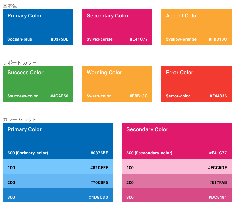
igx-palette() により74色もの色を生成
Theme
- Palette は Theme を作るために使用される
- Palette を Theme 用の Mixin に渡すことで Ignite UI for Angular 全体の Theme を生成することができる
- Theme はコンポーネント個別にカスタマイズすることも可能
Typography
デフォルトフォント:Titillium Web
igx-typography() により変更可能
Architecture
Architecture
- Similarity to Angular Material
- Composition over Inheritance
- One global stylesheet
- OOCSS, ITCSS, BEM
- Support for CSS Variables
Similarity to Angular Material
- テーマを作成するための API は Angular Material に
似ているあえて似せている - Angular Material に慣れた人にも受け入れやすくするため
- ただし似ている点はこれだけ
- あとは設計上大きく異なる
Similarity to Angular Material
@import '~@angular/material/theming';

@include mat-core();

$candy-app-primary: mat-palette($mat-indigo);
$candy-app-accent:  mat-palette($mat-pink, A200, A100, A400);

$candy-app-theme: mat-light-theme($candy-app-primary, $candy-app-accent);

@include angular-material-theme($candy-app-theme);
@import "~igniteui-angular/lib/core/styles/themes/index";
$primary: #731963 !default;
$secondary: #ce5712 !default;
$app-palette: igx-palette($primary, $secondary);
@include igx-core();
@include igx-theme($app-palette);Composition over Inheritance
- 各コンポーネントは自身のテーマを持つ
- 各コンポーネントのテーマを組み合わせて(Composition)全体のテーマとなる
@mixin igx-theme($palette, $exclude: (), $legacy-support: true) {
    // 中略

    @if not(index($exclude, 'igx-ripple')) {
        @include igx-ripple($theme: igx-ripple-theme());
    }

    @if not(index($exclude, 'igx-avatar')) {
        @include igx-avatar($theme: igx-avatar-theme());
    }

...Composition over Inheritance
// Create a theme.
@mixin angular-material-theme($theme) {
  @include mat-core-theme($theme);
  @include mat-autocomplete-theme($theme);
  @include mat-badge-theme($theme);
  @include mat-bottom-sheet-theme($theme);
  @include mat-button-theme($theme);
  @include mat-chips-theme($theme);
  @include mat-table-theme($theme);

...- Angular Material の場合は、基となる全体のテーマがあり、各コンポーネントはこれを使って自身のテーマを作成する
One global stylesheet
- コンポーネントスタイルはない
-> *.component.ts の styleUrls で読み込むスタイルはない - 全てグローバルスタイル
One global stylesheet
- Angular Material はコンポーネントスタイルはある
- が、ViewEncapsulation.None にしているので結果的にグローバルスタイル
@Component({
  moduleId: module.id,
  selector: 'mat-button-toggle',
  templateUrl: 'button-toggle.html',
  styleUrls: ['button-toggle.css'],
  encapsulation: ViewEncapsulation.None,
  ...
})
export class MatButtonToggle extends _MatButtonToggleMixinBase implements OnInit,One global stylesheet
- 当初は Angular Material と似たアプローチを採っていた。
- ただし、結局 ViewEncapsulation.None にするのであればコンポーネントスタイルにするメリットがない
- 一方で、厳密にコンポーネントスタイルでカプセル化しようとすると、各コンポーネントに大量のグローバルスタイルを持たせることになり、DRYに反し、ファイルサイズの増加につながる
- 以上より、1つのグローバルスタイルとした
OOCSS, BEM, ITCSS
- CSS アーキテクチャはとても OOCSS 的
- かつ BEM に強く依存
- ITCSS の "Tools" レイヤーに該当する機能群を提供
Structure と Skin の分離
- *.component.scss
- BEM を使って Structure を記述
- *.component.theme.scss
- OOCSS 的に Skin を含む実際のスタイル記述
- 全て placeholder selector で記述
- Structure に関しては *.component.scss に追い出すことでネストの複雑さを低減
- BEMの Structure を記述
- テーマファイルで記述している placeholder selector を extend しているだけ
- OOCSS のマルチクラスを束ねる役割を果たしている
// .igx-button-group
@include b(igx-button-group) {
    $this: bem--selector-to-string(&);
    @include register-component(str-slice($this, 2, -1));

    @extend %igx-group-display !optional;

    // .igx-button-group__item
    @include e(item) {
        @extend %igx-group-item !optional;
    }

    // .igx-button-group__item--selected
    @include e(item, $m: selected) {
        @extend %igx-group-item !optional;
        @extend %igx-group-item-selected !optional;
    }

    // .igx-button-group__item-content
    @include e(item-content) {
        @extend %igx-group-item-content !optional;
    }

    // .igx-button-group--vertical
    @include m(vertical) {

        @extend %igx-group-display !optional;
        @extend %igx-group-vertical !optional;

        // .igx-button-group__item
        @include e(item) {
            @extend %igx-group-item !optional;
            @extend %igx-group-item-vertical !optional;
        }

        // .igx-button-group__item--selected
        @include e(item, $m: selected) {
            @extend %igx-group-item !optional;
            @extend %igx-group-item-selected !optional;
        }
    }
}
- OOCSS 的に Skin を含む実際のスタイルを記述
- ここでも Structure(基本構造) と Skin(見た目)を分離
- さらに Container(コンテナ) とContents(内容) の分離
- 全て placeholder selector で記述
@mixin igx-button-group($theme) {
    // 中略
    %igx-group-display {
        display: flex;
        flex-flow: row nowrap;
        ...

        %igx-button--disabled {
            color: --var($theme, 'disabled-text-color') !important;
            background-color: --var($theme, 'disabled-background-color') !important;
        }
    }

    %igx-group-vertical {
        flex-flow: column nowrap;
    }

    %igx-group-item {
        box-sizing: content-box;
        flex-grow: 1;
        flex-basis: 0;
        ...
    }

    %igx-group-item-vertical {
        border-left: 0;
        border-right: 0;
        ...
    }

    %igx-group-item-selected {
        color: --var($theme, 'item-selected-text-color');
        background-color: --var($theme, 'item-selected-background');
        ...
    }

    %igx-group-item-content {
        display: flex;
        flex-flow: row nowrap;
        justify-content: center;
        ...
    }
Many Tools
- BEM composition functions
- Palette generators
- Color getters
- Mixins for animations, keyframes, ellipsis, CSS variables
- etc...
Support for CSS Variables
- デフォルト OFF
- $legacy-support: false で CSS Variables を使うようにできる
@include igx-core();
@include igx-theme($app-palette, $legacy-support: false);
How to use
How to use
- デフォルトテーマ
- テーマのカスタマイズ
- テーマの切り替え
- 個別コンポーネントのカスタムテーマ
- カスタムコンポーネントにテーマ適用
- フォントのカスタマイズ
デフォルトテーマ
// styles.scss

@import "~igniteui-angular/lib/core/styles/themes/index";

@include igx-core();
// デフォルトパレットからのテーマ生成
// $default-palette はデフォルトで使用可能なパレット
@include igx-theme($default-palette, $legacy-support: true);
テーマのカスタマイズ
// styles.scss

@import "~igniteui-angular/lib/core/styles/themes/index";

@include igx-core();

// カスタムパレットを生成し、テーマを生成
$primary: #731963;
$secondary: #2ab759;
$custom-palette: igx-palette($primary, $secondary);

@include igx-theme($custom-palette, $legacy-support: true);
テーマの切り替え
// styles.scss

@import "~igniteui-angular/lib/core/styles/themes/index";

@include igx-core();

// デフォルトテーマ
@include igx-theme($default-palette, $legacy-support: true);

// カスタムテーマ
.custom {
  $primary: #731963;
  $secondary: #2ab759;
  $custom-palette: igx-palette($primary, $secondary);

  @include igx-theme($custom-palette, $legacy-support: true);
}
個別コンポーネントのカスタムテーマ
// styles.scss

@import "~igniteui-angular/lib/core/styles/themes/index";

@include igx-core();

// デフォルトテーマ
// カスタムテーマを使用するコンポーネントを除外
@include igx-theme($default-palette, $exclude: (igx-navbar), $legacy-support: true);

// 個別コンポーネントのカスタムテーマ
$nav-primary: #f96a88;
$nav-secondary: #f96a88;
$custom-nav-palette: igx-palette($nav-primary, $nav-secondary);

@include igx-navbar($theme: igx-navbar-theme($custom-nav-palette));
カスタムコンポーネントにテーマ適用
// styles.scss

@import "~igniteui-angular/lib/core/styles/themes/index";
@import "custom-palette";

@include igx-core();

// デフォルトテーマ
@include igx-theme($default-palette, $legacy-support: true);

// カスタムテーマ
.custom {
  @include igx-theme($custom-palette, $legacy-support: true);
}
// _custom-palette.scss

@import "~igniteui-angular/lib/core/styles/themes/utilities";

$primary: #731963;
$secondary: #2ab759;
$custom-palette: igx-palette($primary, $secondary);
// *.component.scss

@import "path/to/custom-palette";

:host {
  background-color: igx-color($custom-palette, "warn");
}
フォントのカスタマイズ
// styles.scss

@import "~igniteui-angular/lib/core/styles/themes/index";
@import "custom-palette";

@include igx-core();

// デフォルトテーマ
@include igx-theme($default-palette, $legacy-support: true);

// カスタムテーマ
.custom {
  @include igx-theme($custom-palette, $legacy-support: true);
}

// フォントのカスタマイズ
@include igx-typography($config: (font-family: fantasy));