The Web in Motion
@Maker Series
A WORKSHOP WITH VAL HEAD
Today's goal
Try out animating with CSS, JS and SVG.
Get an idea of where and how your work can benefit from UI animation.
Have fun and try out some new things!
Today's plan
10:00 -11:00 UX in Motion
11:30 - 11:45 Break
11:45 - 1:00 Essentials of CSS animation
1:00 - 2:00 Lunch
2:00 - 3:30 Basics of TweenMax & TimelineMax
3:30 - 3:45 Break
3:45 - 5:00 SVG animation
Introductions!
-
Your name
-
Your animation experience
-
What are you hoping to get out of today's workshop?
UX in Motion
CSS Transforms
CSS Transforms
-
The "yoga" of CSS
-
Allow you to modify the coordinate space of the CSS visual formatting model
(aka, change the way DOM objects look)
CSS Transforms
translate(), translateX(), translateY(), translateZ(), translate3d()
rotate(), rotateX(), rotateY(), rotateZ(), rotate3d()
scale(), scaleX(), scaleY(), scaleZ(), scale3d()
skew(), skewX(), skewY()
matrix(), matrix3d()

perspective()
CSS Transforms
These properties/methods can come in handy when working with transforms too:
CSS Transforms
Transforms usually look something like this:
.box {
    transform: translate(50px, 100px);
}

.box {
    transform: scale(1.5) skew(20deg) rotate(45deg);
}CSS Transforms
matrix() or matrix3D() for combined transform effects and animations.
Two helpful tools:
CSS Transitions
CSS Transitions
The minimum you need for a transition:
- Point A and a point B
- A duration (in second or milliseconds)
CSS Transitions
Your point A and point B might look like this:
.box {
    transition: 1s;
}

.box:hover {
     transform: scale(2);
}
CSS Transitions
A duration and property specification add detail:
.box {
    transition: background-color 1s ease-in-out;
}

.box:hover {
     transform: scale(2);
}
CSS Transitions
Multiple transitions are possible too.
Comma separate the different transitions for more complex effects:
.box {
    transition: background-color 1s ease-in-out,
    transform .5s ease-out;
}

.box:hover {
     transform: scale(2);
     background-color: blue;
}
CSS Transitions
Other transition related properties to help refine your transitions:
Exercise: menu transitions
Use this Pen as your starting point and use CSS Transforms and Transitions to:
- Transition the menu from off-screen to on-screen when the icon is clicked
Bonus: transition the menu items into view with some overlapping action
And here’s one possible solution if you’d like to compare notes
CSS Keyframe
Animations
CSS Keyframe Animations
The minimum you need for an animation:
- A named set of keyframes to assign
- The animation name
- A duration
CSS Keyframe Animations
An example keyframe animation:
.box {
    animation: myAnim 1s;
}

@keyframes myAnim {
    from {opacity: 0;}
    to {opacity:1;}
}CSS Keyframe Animations
CSS Animation properties:
CSS Keyframe Animations
Useful properties you might not know you can change within keyframes:
- z-index
- transform-origin
- animation-timing-function
Animatable CSS Properies
There are a few lists of all the properties you can transition or apply animations to.
Bookmark the one(s) you like best!
- MDN’s list of CSS animated properties
- CSS animatable properties by type
- Lea Verou’s animatable (not exhaustive, but still fun)
Exercise: robot dance
Use this Pen as your starting point and:
- Create keyframe animations
- Apply them to Bob's limbs to make him dance
Bonus: Use as Sass variable for the "beat" to coordinate the timing of your animations
CSS Variables
CSS Variables
AKA Custom Properties
:root {
  --main-color: #06c;
}

#foo h1 {
  color: var(--main-color);
}
CSS Variables

CSS Variables
Why they’re a big deal:
- They follow the CSS cascade(custom properties)
- You can easily modify values with JavaScript
CSS Variables & JS
CSS:
li {
  --hue:270;
  background: hsl(var(--hue), 80%, 60%);
  border-radius: 5%;
}
JavaScript:
li.style.setProperty('--hue', Math.floor(Math.random() * hDiff * 2) + hStart);CSS Variables & JS
CSS Variables & keyframes
@keyframes thing {
 100% {transform: scale(calc(var(--scale) * 1)) rotate(var(--deg));}
}

li {
...
  animation: thing calc(var(--dur) * 1s) linear var(--repeat) alternate;
}
li:nth-of-type(1) {
  --scale:.8;
  --deg:67deg;
}

li:nth-of-type(2) {
  --scale:.9;
  --deg:-30deg;
}
CSS Variables & keframes
CSS Variables & media queries
CSS Variables

CSS Variables Reading
https://una.im/local-css-vars/# 💁
https://vgpena.github.io/winning-with-css-variables/
https://developers.google.com/web/updates/2016/02/css-variables-why-should-you-care
http://danielcwilson.com/blog/2017/02/individual-transforms/
Two CodePen collections of examples:
Exercise: CSS Variables
Add a CSS variables to one of your CSS Pens.
OR
Modify one of the CSS Variables example Pens to use variables differently that it does now.
SVG Workflow for Animation
What’s In SVG
- Rectangles (rect)
- Circles (circle)
- Ellipse (ellipse)
- Line (line)
- Polylines (polyline)
- Polygons (polygon)
- Paths (path)
Preparing SVG Assets
- Simple, discrete, layered shapes work best
- Pathfinder merged shapes don't leave you much to work with
Our SVG file
Four discrete shapes:
Optimizing SVG
Two SVG optimizers:
jakearchibald.github.io/svgomg/
petercollingridge.appspot.com/svg-editor/
(maybe not so much anymore)
Exporting SVG from Illustrator
Animating SVG
Animating SVG
We have some choices!
- SMIL
- CSS
- JavaScript
(use the eye icon to see the less mathy compiled CSS)
Animating SVG with SMIL
- Tag-based animation defined within SVG DOM
- No IE support (No Edge either)
- Being depricated in Chrome
- (paused, but not reversed)
Animating SVG with CSS
- CSS transitions & keyframe animations can be applied to elements within SVG as well
-
Only a limited number of SVG presentation attributes are accessible as CSS properties
(This will change in the future with SVG 2) - CSS transforms are not supported on SVG elements in IE or Edge
Animating SVG with CSS
- Great for adding a little life to SVG icons or
other small graphics - fill and transforms can get you far
(even without that pesky IE support)
Animating SVG with CSS
Animating SVG with CSS
Animating SVG with JS
- JavaScript can access native SVG properties
- Better browser support than CSS, but cross-browser issues can be interesting
- SVG-specific libraries can often be useful
- A more detailed comparison (with benchmarks) of the various SVG animation options
GSAP
- Greensock Animation Platform
- "All-purpose" JS animation tool that works equally well on DOM elements and SVG
- Approachable syntax
- Powerful timeline capabilities
- Goes waaaay back with IE support (IE 8!)
Helpful SVG Resources
GSAP Basics
Why GSAP?
- Makes chaining animations and adjusting animations easier than editing keyframes
- Allows you to manipulate multiple transform properties separately
- Backward browser compatibility (back to IE6!)
- Smoothes some browser inconsistencies
Some things people make with GSAP:
Greensock's showcase page: https://greensock.com/examples-showcases
Lots of CodePens are made with Greensock too: https://codepen.io/search/pens?q=GSAP&limit=all&type=type-pens
GSAP Performance
GSAP Performance
More on GSAP
- It's not the only JavaScript library out there for animation, but it's very widely used
- It does require loading additional resources (as all JS libraries do)
- Some plug-ins or licensing requires a fee
- Do you own benchmarks for most useful results
GSAP Workflow Features
- Simple syntax
- Timelines (even nested ones)
- Easy staggers
- Helpful plug-ins:
- Draggable
- DrawSVG
- MorphSVG
GSAP Syntax Basics
TweenMax.to(object, seconds, {property: amount, property:amount, ease});
TweenMax.to("div", 2, {
            scaleY:0.75,
            scaleX:1.25,
            y:300,
            opacity:0.75,
            ease: Bounce.easeOut
            });
GSAP Syntax Basics
Other options:
TweenMax.to
TweenMax.from
TweenMax.fromTo
TweenMax.fromTo("div", 2,
{scaleY:1, scaleX:1.5, y:0, opacity:1},
{scaleY:0.75, scaleX:1.25, y:300, opacity:0.75, ease: Bounce.easeOut});GSAP Syntax Basics
Staggers are also useful. (And less code than with CSS!)
TweenMax.staggerTo(gboxes, 2,
  {
  backgroundColor: "#FFCD41",
  rotation: 90,
  delay: 1,
  ease: Sine.easeOut},
  0.3
);GSAP Resources
Some people find this cheat sheet helpful: https://ihatetomatoes.net/wp-content/uploads/2015/08/GreenSock-Cheatsheet-2.pdf
Everyone loves the ease visualizer, it's fun:
https://greensock.com/ease-visualizer
Three other helpful things that answer common questions:
GSAP plugins for CodePen

GSAP Timeline
The GSAP Timeline
A timeline groups individual animations together and gives us control over how they play out.
We can use TimelineLite or TimelineMax
tl = new TimelineMax({repeat: -1, delay: 1,yoyo:true});
The GSAP Timeline
Once you have the timeline created, you can add animations to it:
tl = new TimelineMax({repeat: -1, delay: 1,yoyo:true});

tl.staggerTo(drops, 2,
  {
  y:90,
  ease: Sine.easeOut},
  .75
);
The GSAP Timeline
Position parameters give you even more control to make animations overlap or create gaps between animations:
Understanding position parameters
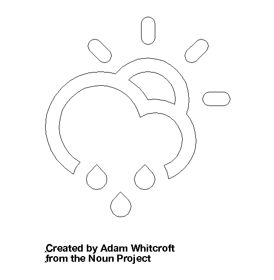
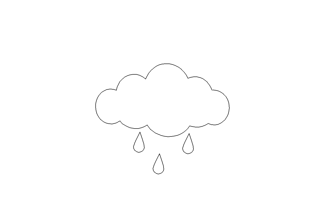
The Weather Again
What if we made our weather icon animate with a GSAP timeline instead?
Timeline Labels
GASP Timelines
GSAP + SVG exercise
Animate our weather icon (or this SVG Pen) using GSAP
hamburger: https://codepen.io/valhead/pen/KgQWmZ?editors=0010
weather: https://codepen.io/valhead/pen/gmdBRr/
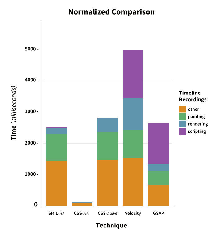
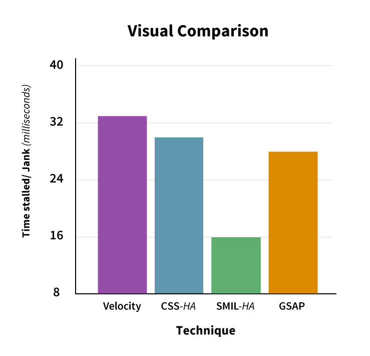
Web Animation Performance
Browsers can very efficiently transition
- size - transform: scale()
- position - transform: translate()
- rotation - transform: rotate()
- opacity
Browser Rendering Steps


Browser Rendering Steps
JavaScript - sorting data, adding elements, causing change
Style - figuring out which CSS rules apply to which elements
Layout - calculate the size changes of styles
Paint - filling in the pixels
Composite - putting everything in the correct layer order
Browser Rendering Steps
Text
- Changing a layout property like width or height means browser must go through all the steps
- Changing a "paint only" property, like text colour, means the layout step can be skipped
- Changing a compositor only property, like transforms and opacity, skips both the layout and paint steps. YAY!
- http://csstriggers.com/
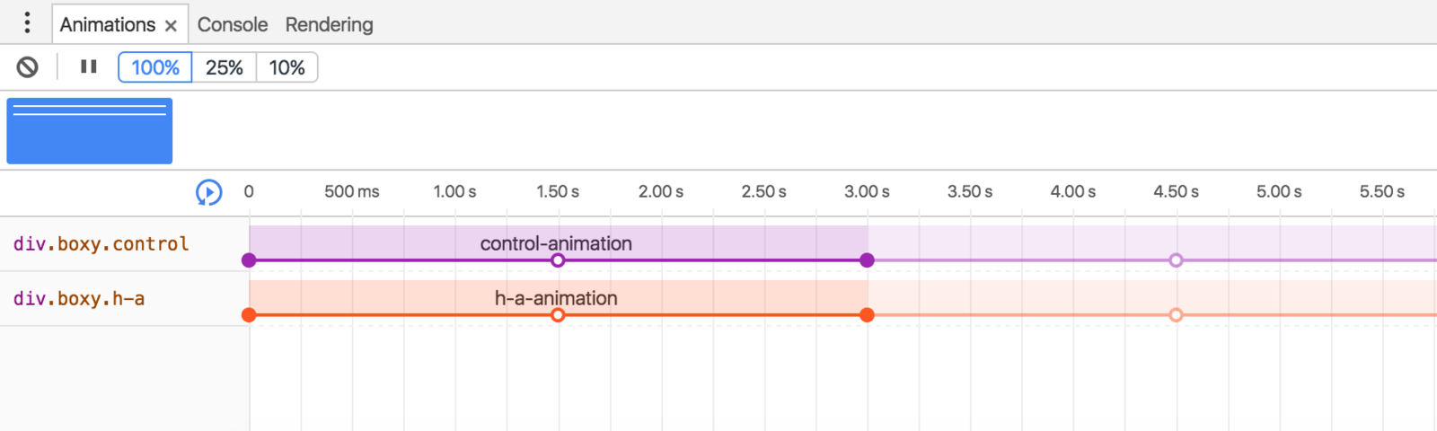
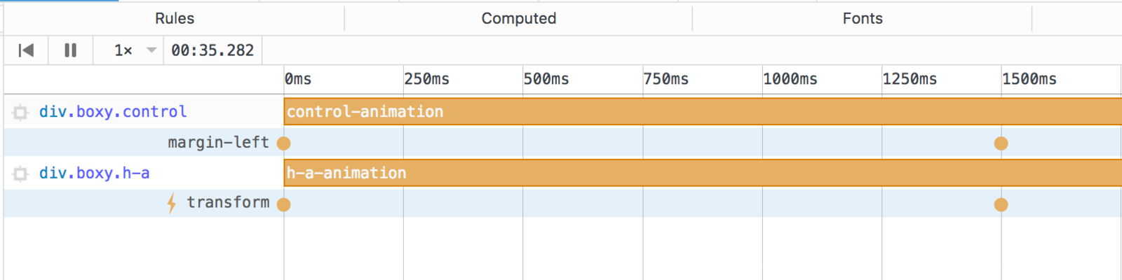
Comparing HA Animation
Text
PROMOTE ALL THE THINGS!!!!
Text

Digging Deeper Into GPU
- Factors beyond transforms can cause new composite layers to be created
- Too many layers can impact performance (especially on those device things).
An in-depth look at GPU animation
On translate-3d and layer creation hacks
CSS vs JS
- CSS is declarative
(whole animation is known ahead of time) - JS is imperative
(browser only really aware of the current frame) - CSS animations with transform & opacity won’t be impacted by the main thread.
- But logic!
HA on SVG
- Not currently implemented everywhere
- Good performance in general when using transforms
- Ask for it if you want it!
The will-change property

Performance Resources
Handy Browser Tools
Firefox and Chrome both have great animation panels in their dev tools!
Maker Series Web Animation Workshop
By vlh
Private
