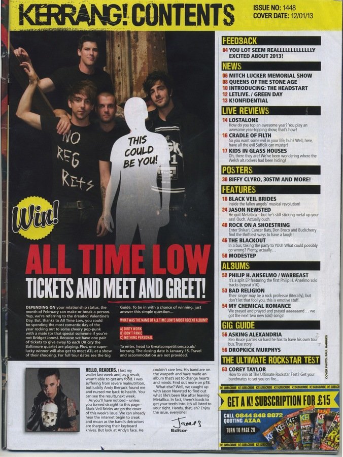
Yellow accent colour drags eye across the page
to important details
in this case ads.
Title text set on contrast colour to make it stand out to reader
Language style the young audience can relate to
Storylines so the audience knows what's in the issue
Yellow, black and
white house style
maintained throughout
Magazine logo featured in large in masthead to maintain strong brand recognition
Page numbers stand out because of contrasting red, helps audience see at a glance where to find that story
Contents sections clearly separated with black title bars, this is a common convention and helps visually split info so the reader can read it more easily, it also adds more visual interest than just a list
Writer addresses the audience directly in an informal way, this is a common convention as the informal style makes it more friendly and comfortable so more people would read it, there's a sense of connection
Large photo of featured artist means reader can see at a glance what the feature is about, the huge contrasting title also does this
Large poof is a common convention it draws the readers eye to important info
This feature directly involves the reader and the word choice makes it sound like anyone could be a winner but you have to enter, its persuasive and gets people to read on.
The magazine wants you to notice
and take advantage of these ads so
they get profit, this is mainly how
they make their money
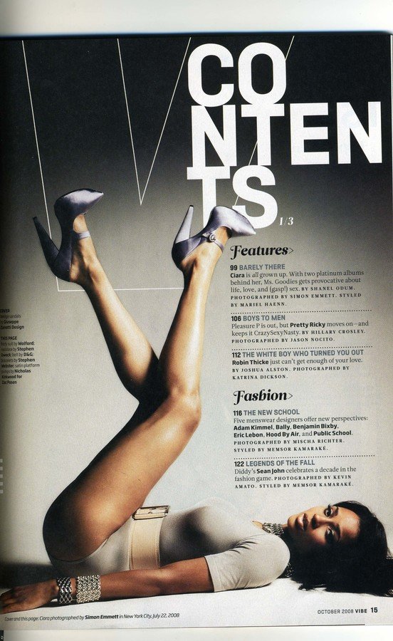
The womans skin is the mostsaturated aspect of the page which draws the readers eye to her. She is presented in an attractive and seductive way to tantalise reader, perhaps appealing to male or gay female demographic?
she Takes up most of the page which tells the reader she is the focus of the issue without the use of text, this lack of description makes the reader want to read on to find out who she is, she is intriguing
Title text set on contrast colour to make it stand out to reader, they know what page this is
Storylines so the audience knows what's in the issue
Black and white used as main colours, this gives a professional clean look- common convention
very subtle branding for magazine name 'vibe' to maintain strong brand recognition behind photo so not to distract, visually pleasing
feature titles stand out because of slightly contrasting blue, helps audience read it easier
Contents sections clearly separated with contrasting black titles in a different font splits info so the reader can read it more easily
individual features also separated by dotted line which distinguishes them and makes it easy to read
date and page number are important
info and so are contrasting in black
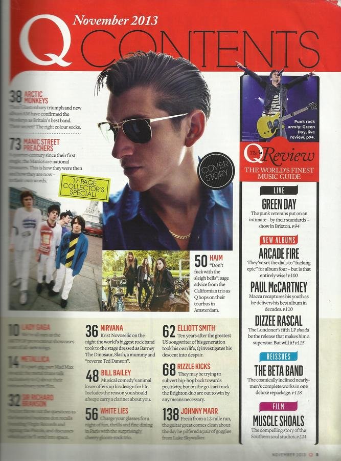
Red accent colour drags eye across the page to important details like feature titles
Title text set on contrast colour to make it stand out to reader, you know what mage this is
Storylines so the audience knows what's in the issue
Magazine logo featured in large in masthead to maintain strong brand recognition, this is helped by use again further down
Page numbers stand out because of contrasting black and they are in a huge font size, helps audience see at a glance where to find that story
Contents sections clearly separated with coloured title bars, visually splits info so the reader can read it more easily
Writer addresses the audience directly in an informal way, this is a common convention as the informal style makes it more friendly and comfortable so more people would read it, there's a sense of connection
Large photo of featured artist means reader can see at a glance what the feature is about
Large poof is a common convention it draws the readers eye to important info that would make the reader read on