Wilson Mendes
@willmendesneto
Google Developer Expert Web technologies

Angular modules
Let’s have #ngFun!
So, let's start?
HI, IT'S ME


<webapps/> are evolving
or moving from AngularJS to Angular
Share components is ❤️
<ItemsList />
<About />
<Gallery />
...
<page1>
</page1>
<component1 />
<component2>
</component2>
<component3 />
bundle
test
publish
lint
Opinions ?
reporter
dev server
types
coverage
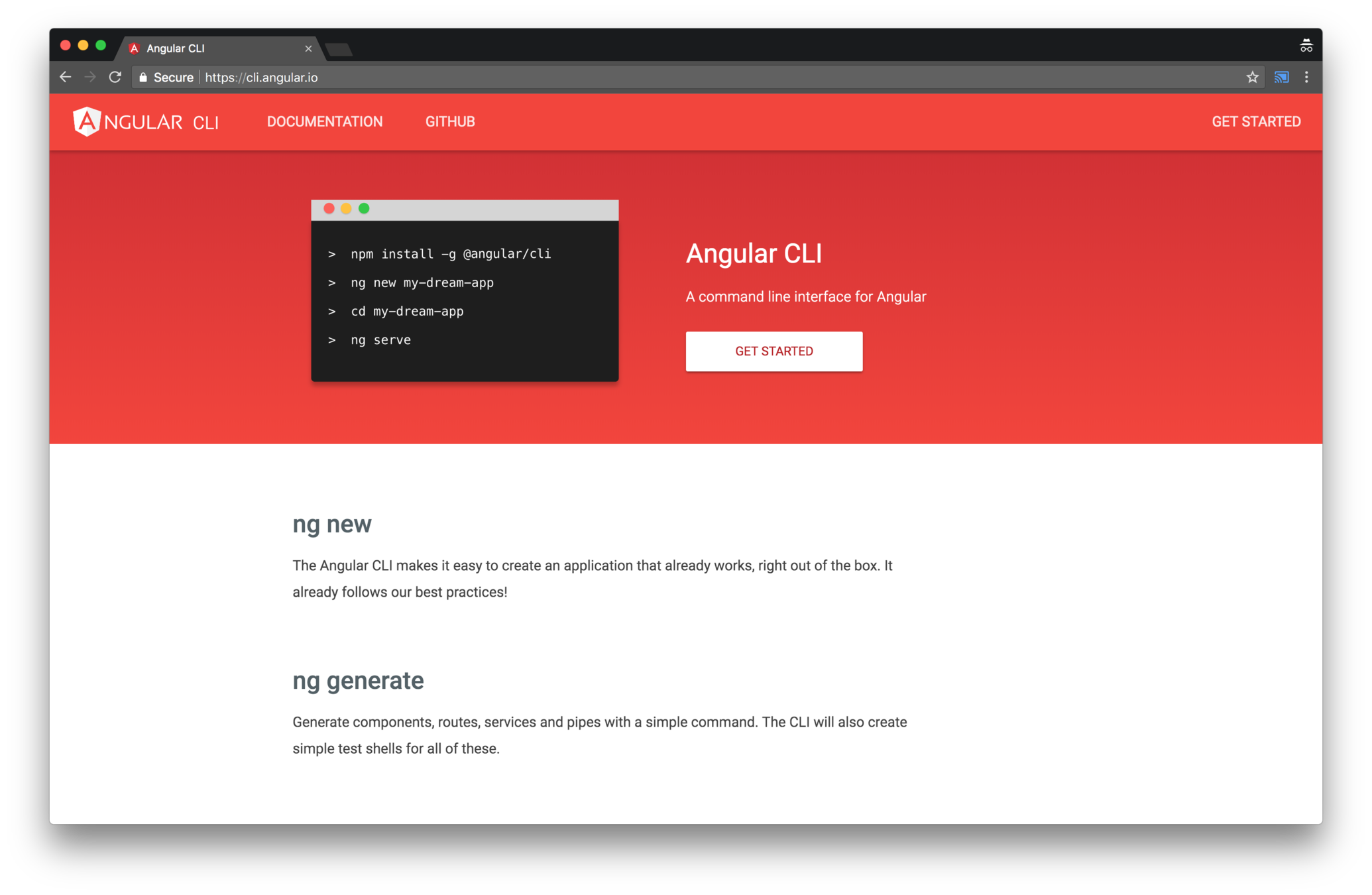
npm install -g @angular/cli
// Installing Angular CLI
ng new my-app
// Creating a new Angular App
ng serve// Starting local server


We have several options
What if the app
doesn't need
all of that?

structure of a page
<page1>
</page1>
<component1 />
<component2>
</component2>
<component3 />
<page1>
</page1>
<component1 />
<component2>
</component2>
<component3 />
small scope
boundaries
plug-and-play
Everything is a component
Integration in your module
Easy to maintain
Refactor across teams
Why small packages
Let's start the #ngFun
Let's start a project!
🎉🎉🎉🎉🎉🎉🎉🎉🎉
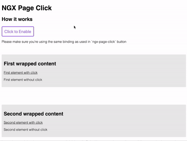
#1 - NGX Page Click
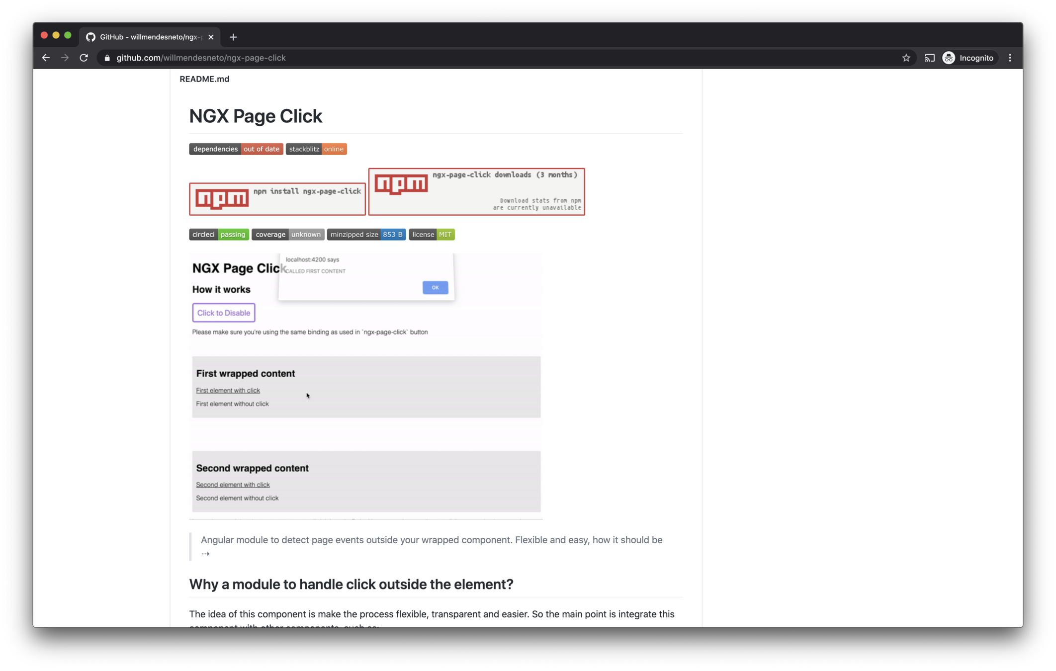
Avoid bubbling
Declarative API
Component
Easy to integrate
Small package
Decoupled
#NG Why?
...
import {
  NgxPageClickModule
} from 'ngx-page-click';
...

@NgModule({
  ...
  imports: [NgxPageClickModule],
  ...
})

export class AppModule { }
<ngx-page-click
[disabled]="disabled"
[outsideClickHandler]="outsideClickHandler"
[listenTo]="on"
>
<div><p>Content goes here</p></div>
</ngx-page-click>
#2 - NGX Feature Toggle
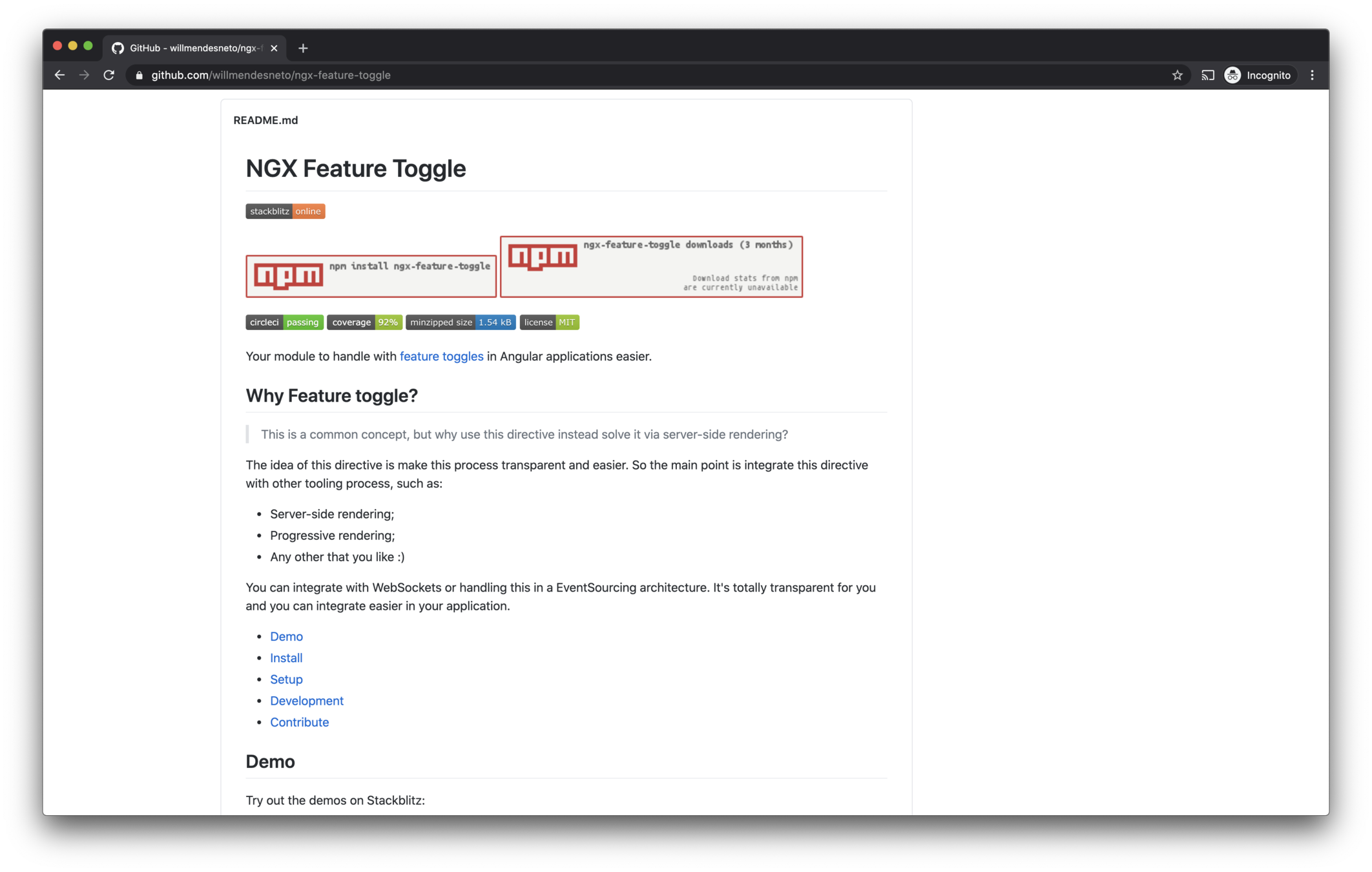
Feature config
Routing Guards
Component
Third-parties
SSR Ready
Directive
#NG Why?
...
import {
  FeatureToggleModule
} from 'ngx-feature-toggle';
...

@NgModule({
  ...
  imports: [FeatureToggleModule],
  ...
})

export class AppModule { }
<!--
const features = {
enableDescription: true
}
-->
<feature-toggle-provider [features]="features">
<div *featureToggle="'enableDescription'">
<p>condition is `true`</p>
<p>this content will be displayed.</p>
</div>
<div *featureToggle="'!enableDescription'">
<p>condition is `false`</p>
<p>this content will be displayed.</p>
</div>
</feature-toggle-provider>import {
Routes, RouterModule
} from '@angular/router';
import {
FeatureToggleModule,
NgxFeatureToggleCanLoadGuard,
} from 'ngx-feature-toggle';
...
// Using route guards in application
const routes: Routes = [
{
path: 'playground',
component: PlaygroundComponent,
canLoad: [NgxFeatureToggleCanLoadGuard],
data: {
featureToggle: ['enablePlayground'],
}
},
];
But this is "simple", let's build something really cool!

#3 - NGX Skeleton Loader
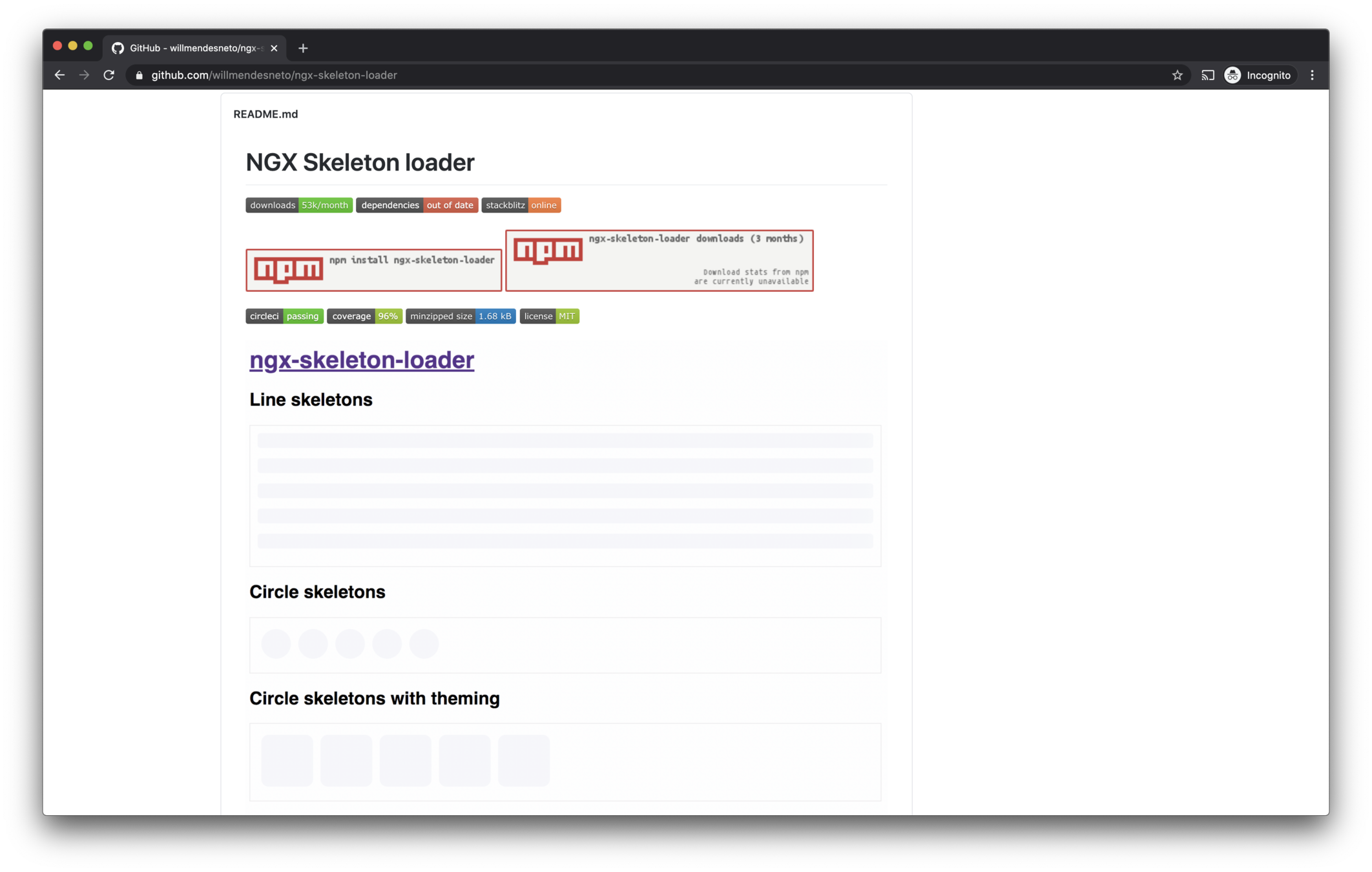
UX Improve
Declarative API
Plug-and-play
Accessibility
Animations
Themes
#NG Why?
...
import {
  NgxSkeletonLoaderModule
} from 'ngx-skeleton-loader';
...

@NgModule({
  ...
  imports: [NgxSkeletonLoaderModule],
  ...
})

export class AppModule { }
<ngx-skeleton-loader
  count="5"
  [theme]="{
    'border-radius': '5px',
     height: '50px'
  }"
>
</ngx-skeleton-loader>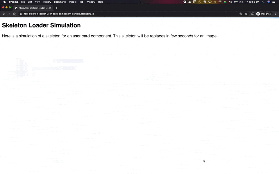
How to integrate accessibility in a Skeleton?
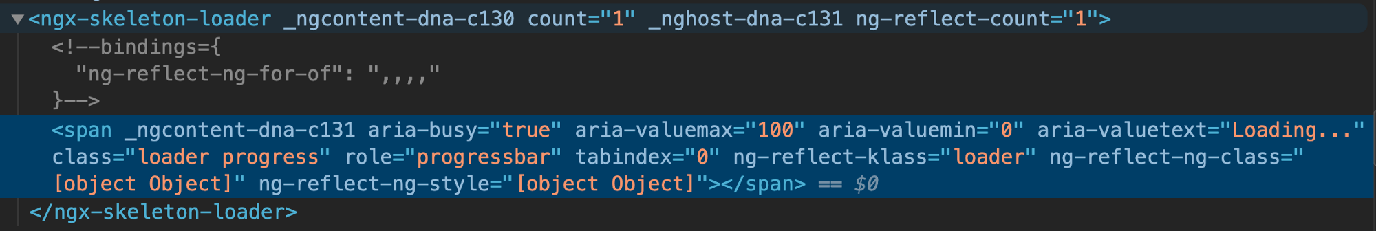
Web ARIA Attributes
...
aria-valuemax="100"
aria-valuemin="0"
aria-valuetext="Loading..."
role="progressbar"
...
Web ARIA Attributes
attributes for assistive tech
Combine states and a11y
Available in the package
Web ARIA Attributes
...
.skeleton-loader {
  &.progress {
    /* ...css animation for progress */
  }

  @media (prefers-reduced-motion: reduce) {
    /* ...removing css animation */
    &.progress {
      background-image: none;
    }
  }
}
prefers-reduced-motion
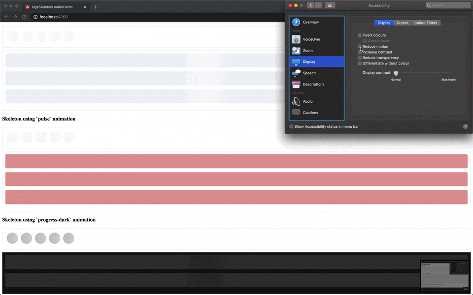
What about dark mode ?
<!-- Uses `progress-dark` as animation -->
<ngx-skeleton-loader
  animation="progress-dark"
  count="3"
>
</ngx-skeleton-loader>
Dark-mode usage
What if I need to create a new theme for skeletons in my app?
  <ngx-skeleton-loader
    count="5"
    [theme]="{
      'border-radius': '5px',
      height: '50px',
      'background-color': '#992929',
      border: '1px solid white'
    }"
  ></ngx-skeleton-loader>
Theme via @Input()
/*
 * You can find more details about `:host`
 * at Angular Component Style Docs
 * https://angular.io/guide/component-styles#host
 */
:host >>> ngx-skeleton-loader .skeleton-loader {
  border-radius: 5px;
  height: 50px;
  background-color: #992929;
  border: 1px solid white;
}
Theme via css
<ngx-recap/>
Have fun and learn with it
Start with small components
Make a plan, keep working on it
Web platform is in your favour
Sharing is caring. OSS ❤️
Thank you 👋
Wilson Mendes
@willmendesneto
Google Developer Expert Web technologies