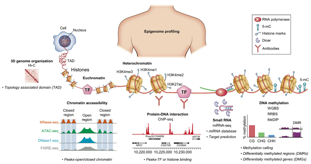
Epigenetics data association
Aleksandra Galitsyna
“Analysis of omics data” course
Skoltech Term 4
30 April 2020

This presentation can be found at https://slides.com/agalicina/epigenetics-practice5-2020
Sequencing for epigenetics
Problem: I've collected multiple epigenomics datasets, what should I do with that?
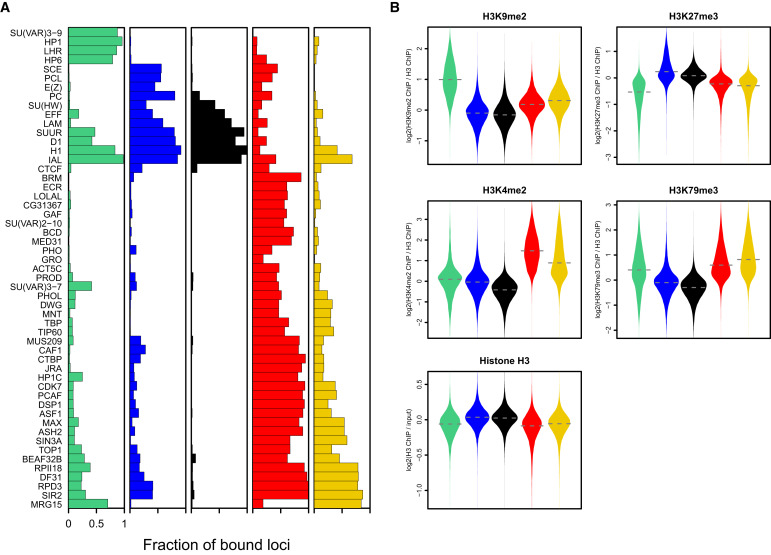
Multiple assays - same cell type
Filion et al. Cell 2010
Let's say we have 53 ChIP-Seq datasets for the same cell line of Drosophila:
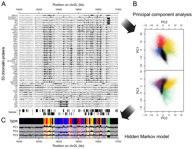
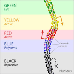
Chromatin colors (states)
Filion et al. Cell 2010
Perform dimensionality reduction with PCA. Each dot is one genomic region:
Chromatin colors (states)
Filion et al. Cell 2010
And then we can train some machine learning algorithm to obtain the groups by similarity:
Chromatin colors (states)
Filion et al. Cell 2010
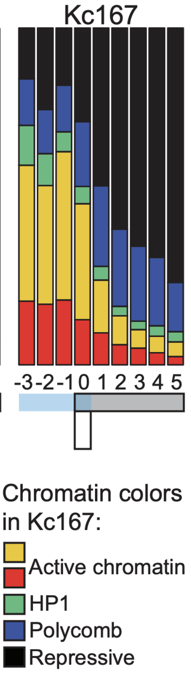
Then we can do annotation of these groups and derive the functions of these genomic regions (chromatin states, or colors):
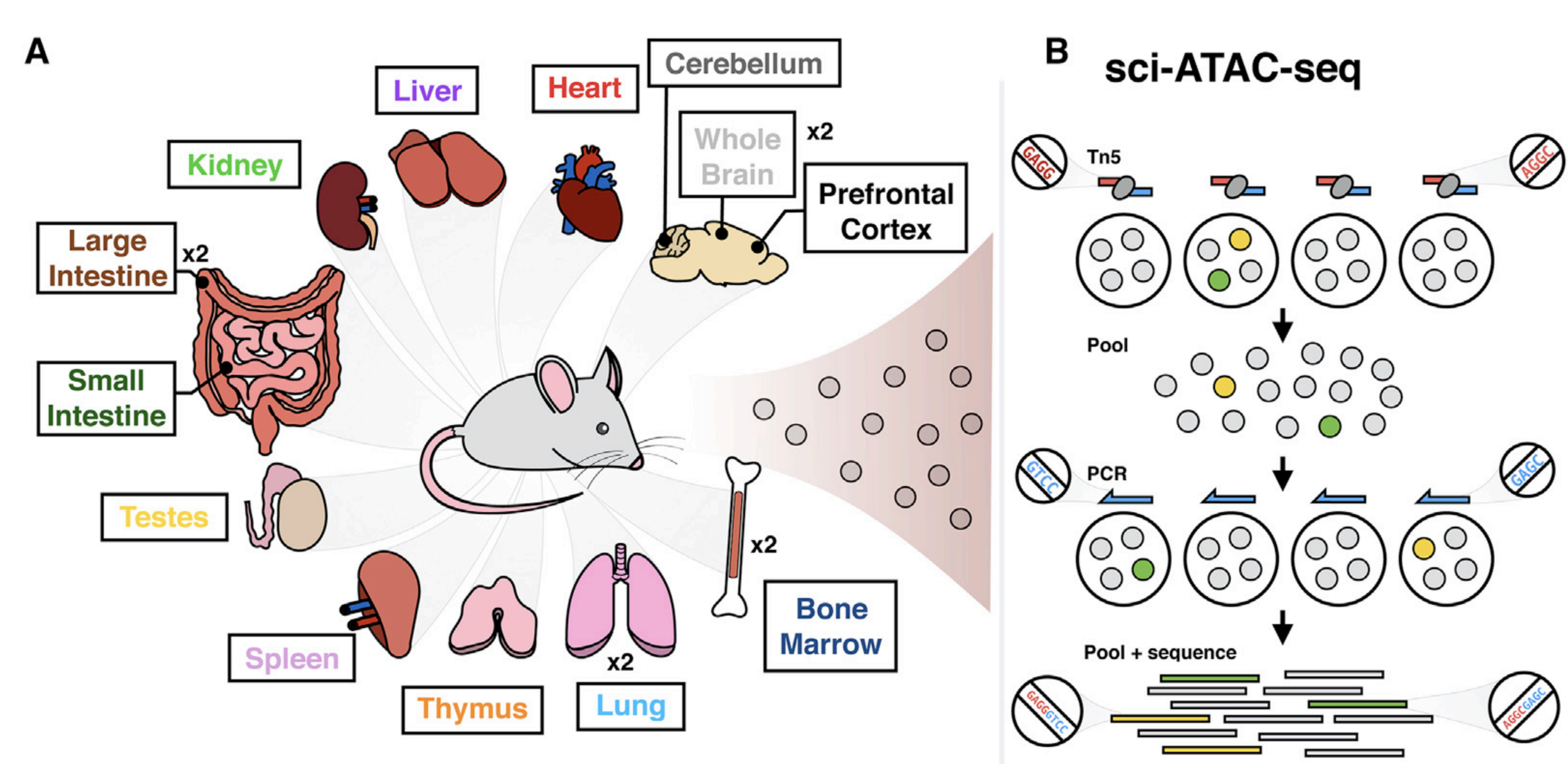
Same assay - multiple cell types
Cusanovich et al. Cell 2018
Let's say we have chromatin openness for datasets for multiple cell types (different tissues):
Genomics tracks association
DNase-Seq coverage for ∼350-kb region:
Thurman et al. Nature 2012
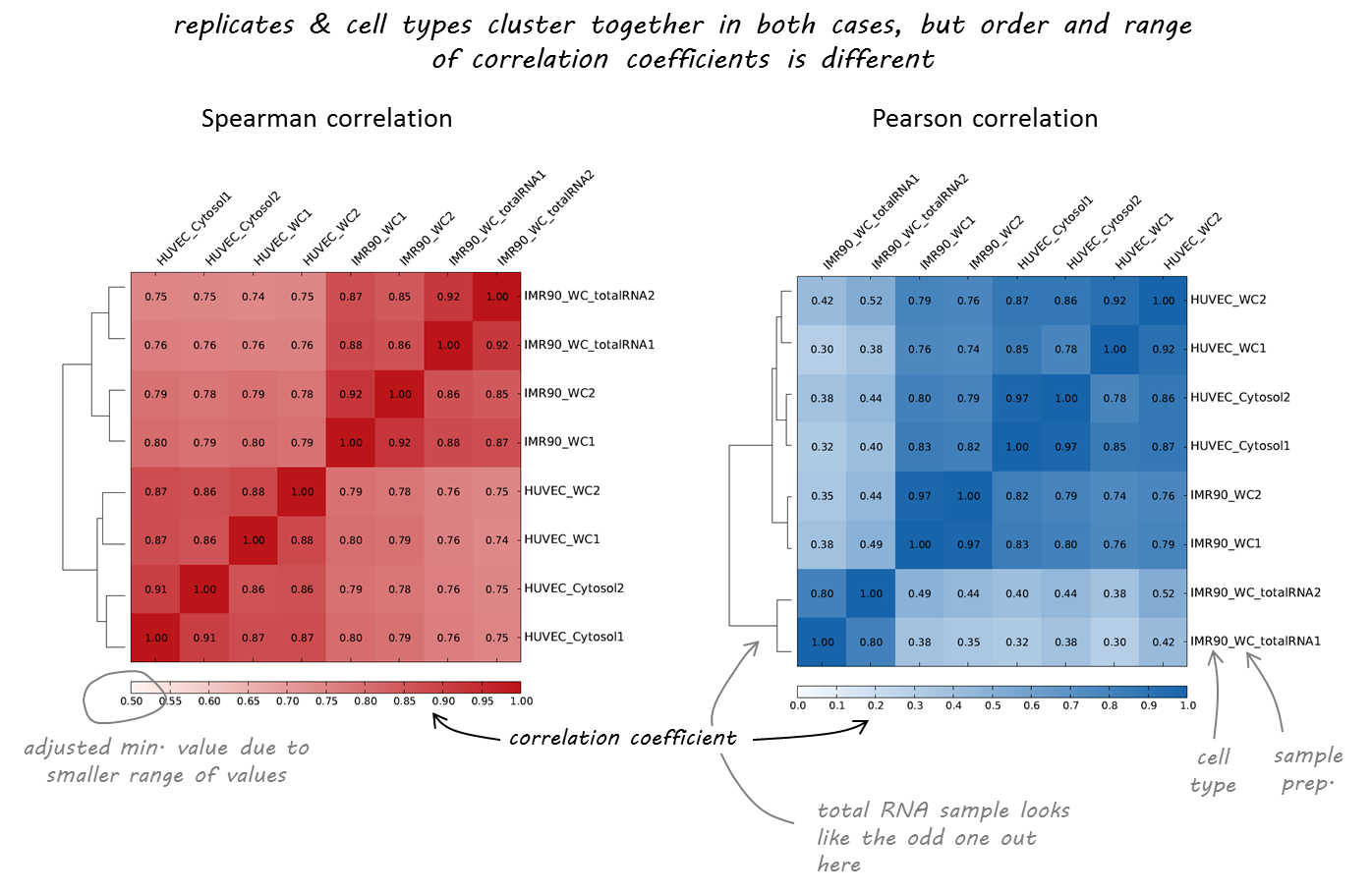
Different cell types
Clustering of samples
Cusanovich et al. Cell 2018
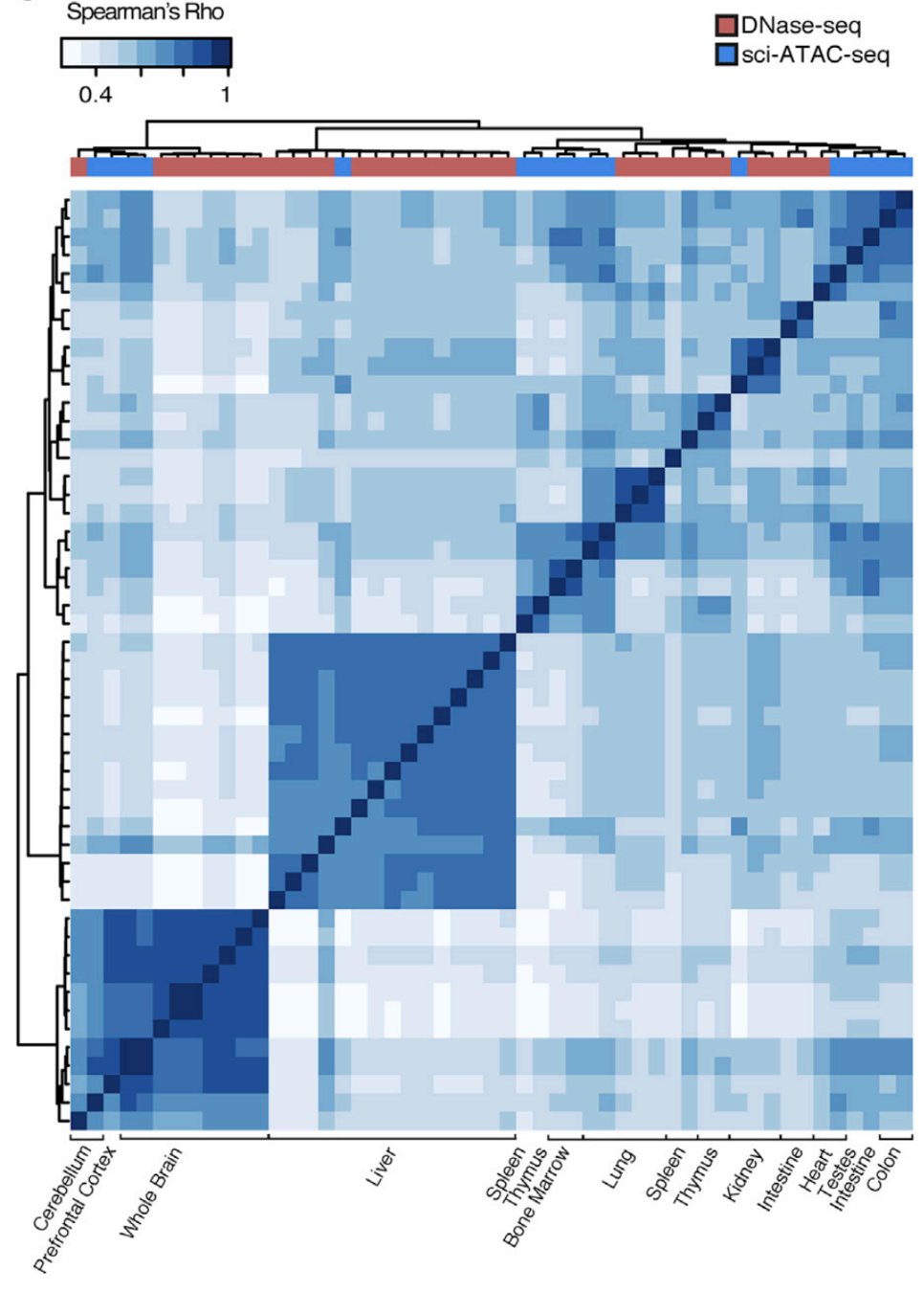
Let's check the similarity of pooled tissue samples with DNase-seq from known tissues. For that, let's plot bi-clustered heatmap of Spearman correlation coefficients:
Result of clustering,
the tree reflecting the similarity between samples
Clustering of samples
Cusanovich et al. Cell 2018
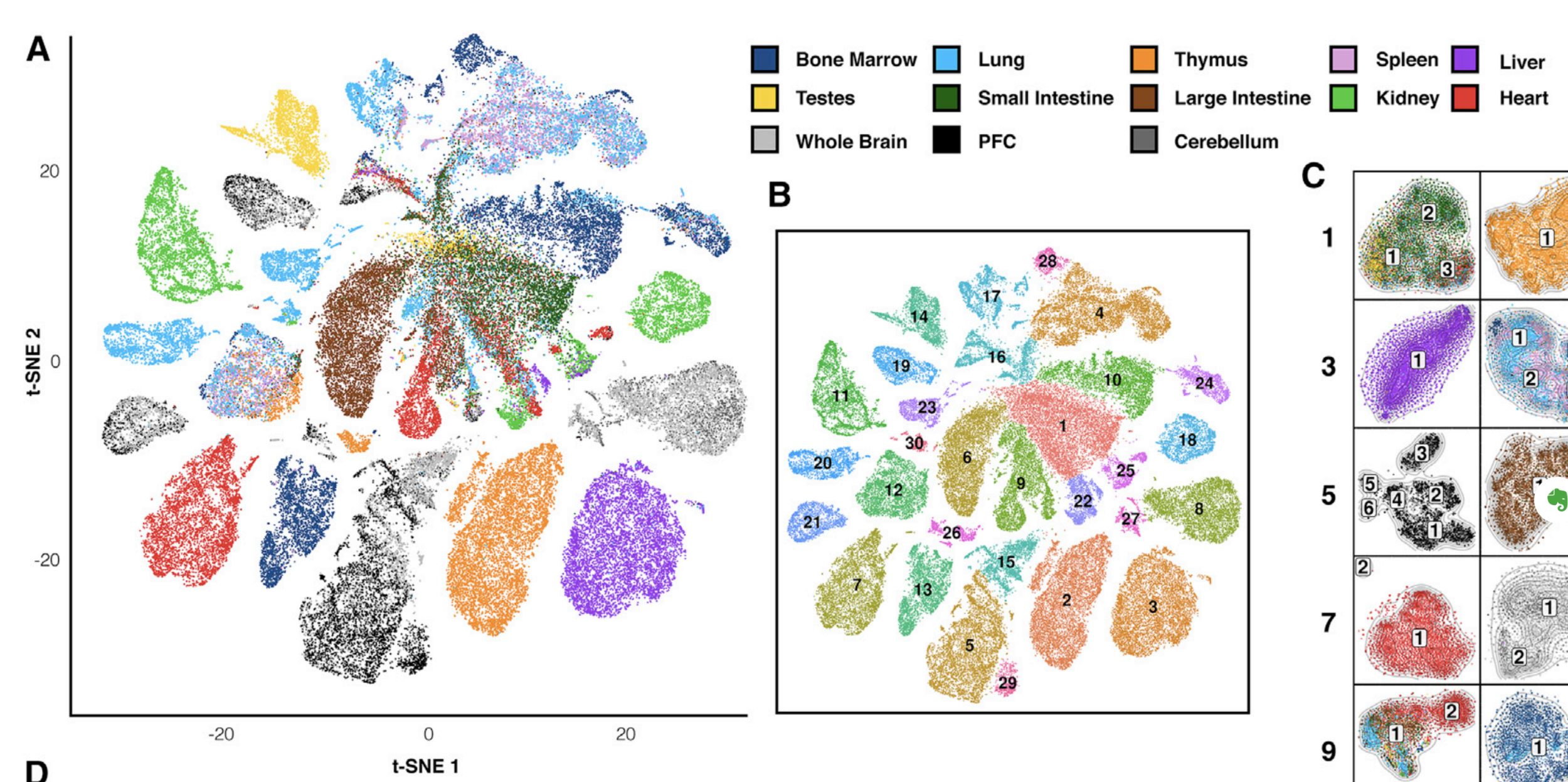
Finally, let's do dimensionality reduction, where each dot is a single sample.
Here is an example with t-SNE, although PCA (Principal Component Analysis) and MDS (Multidimensional scaling) are other popular techniques:
Practical Part: Samples Comparison
We will use deeptools commands multiBigwigSummary and plotCorrelation to compare the DNase-Seq experiments that we've obtained during EpiPact1. We will construct bi-clustered heatmaps of correlations:
Text
Samples comparison
Task 1 (1 point): Provide the final set of commands that you've used and briefly justify the parameters.
Task 2 (1 point): Report the final scatteplot for 100 Kb. Describe your observations.
Task 3 (*1 point): Repeat the procedure for 10 Kb and 1 Kb and report the changes in observations. At what resolution you might observe the differential DNase I signal?
- Collect at least 4 DNase I results for your chromosome in bigWig format. One of them should be yours, the others you may take from /home/shared/EpiPract1/. you may use conda environment "hic" (see instructions on activation can be found in EpiPract3).
- Use multiBigwigSummary to create a summary file. Use bins mode, bin size 100 Kb:
- Plot correlations obtained from your file as a scatterplot:
- Try to adjust the parameters of the plot to improve the analysis. Try plotting in log-scale (--log1p). If you get the warning about the outliers, try to fix it: use --removeOutliers and --corMethod spearman. Which method worked?
- * Repeat the procedure for 10 Kb and 1 Kb. You may want to create another intermediary summary file for that. Inspect the changes.
multiBigwigSummary bins --binSize 100000 -b ${file1.bw} ${file2.bw} ${file3.bw} ${file4.bw} -o ${summary.npz}plotCorrelation -in ${summary.npz} --corMethod pearson --skipZeros --whatToPlot scatterplot -o ${scatterplot.png}Experiments comparison
6. Plot correlations for 100 Kb as a heatmap. Use the parameters that you found to be representative for the scatterplots. For example:
7. Inspect and describe your observations. Adjust the visualization, if needed.
plotCorrelation -in ${summary.npz} --corMethod pearson --skipZeros --whatToPlot heatmap --colorMap RdYlBu --plotNumbers -o ${heatmap.png}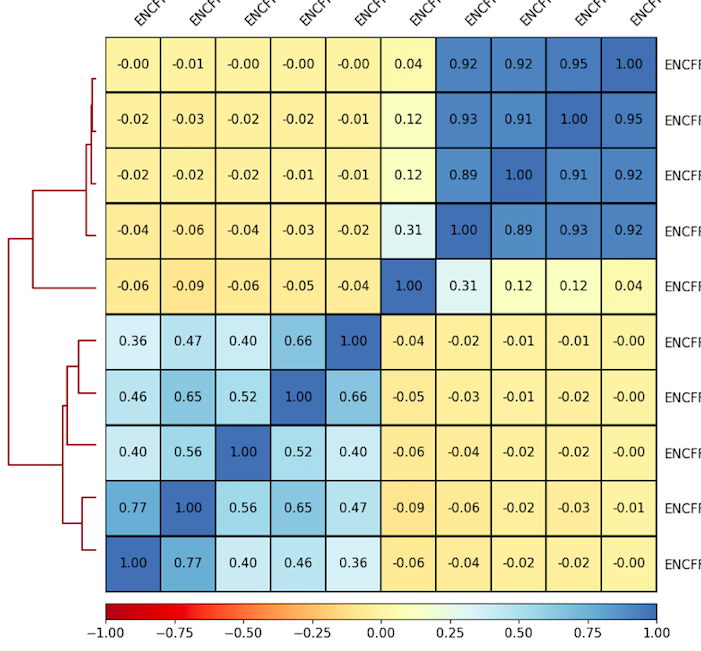
Result of clustering
Correlation coefficient
Labels are not representative
(correct if needed)
Experiments comparison
Task 4 (2 points): Provide the resulting heatmap and PCA plot with your report. What are the similar cell lines by DNase signal in your experiment? Can you explain it? Look up the literature on these cell lines and check the scatterplots in T.2, if needed.
Task 5 (*1 point): Repeat these steps at 10 Kb and 1 Kb. Do you observe the same clustering? Why?
6. Plot correlations for 100 Kb as a heatmap. Use the parameters that you found to be representative for the scatterplots. For example:
7. Inspect and describe your observations. Adjust the visualization, if needed.
8. Plot the PCA plot of your experiments:
plotCorrelation -in ${summary.npz} --corMethod pearson --skipZeros --whatToPlot heatmap --colorMap RdYlBu --plotNumbers -o ${heatmap.png}plotPCA --corData ${summary.npz} --plotFile ${pca.png}Detection of enrichment
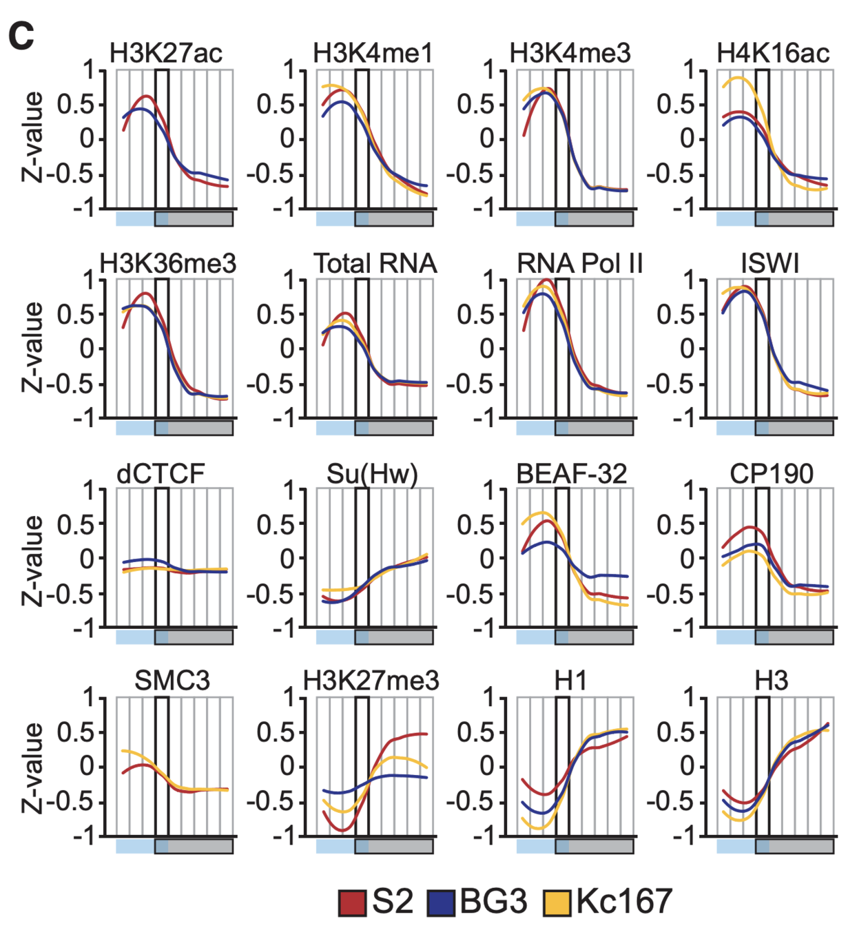
Ulyanov, Khrameeva et al. Genome Research 2016
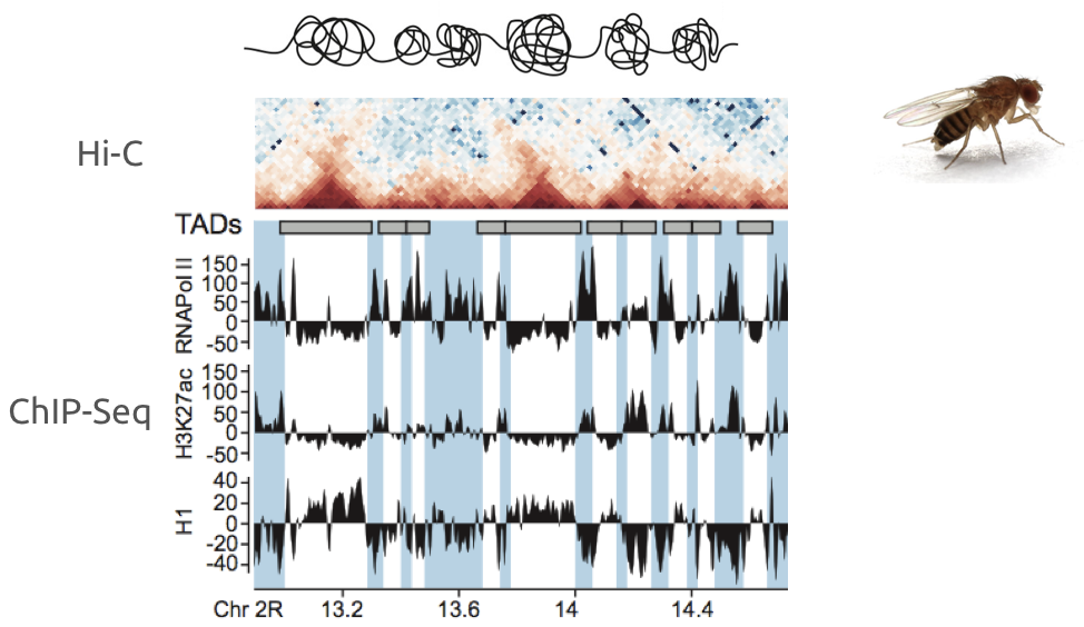
Example of association of more complex datasets:
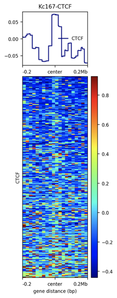
Detection of enrichment
Ulyanov, Khrameeva et al. Genome Research 2016
Plotting the profiles of enrichment around TAD boundaries (ChIP-Seq):
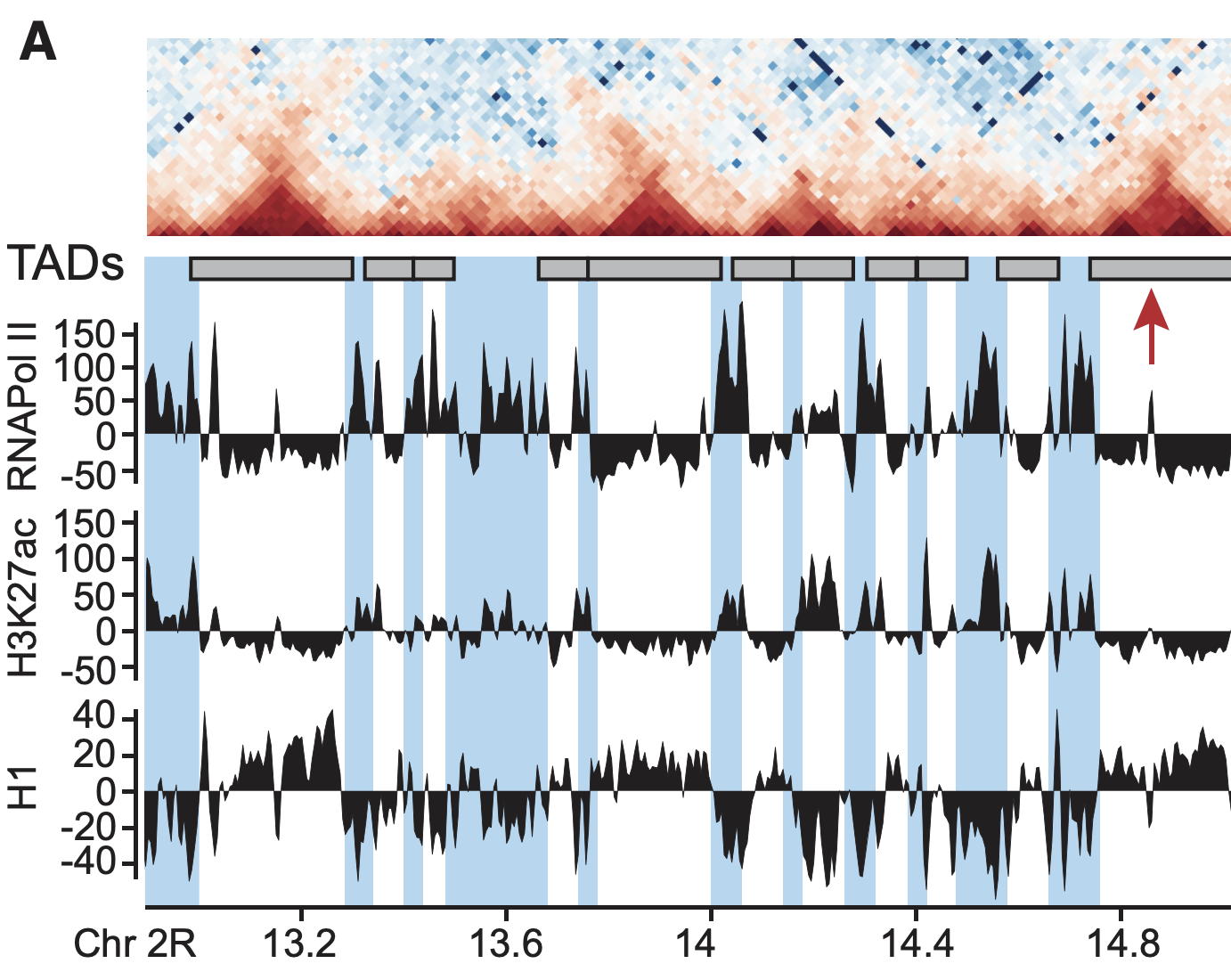
Detection of enrichment
Ulyanov, Khrameeva et al. Genome Research 2016
Plotting the profiles of enrichment around TAD boundaries (chromatin colors):
Single-cell Hi-C
work in preparation
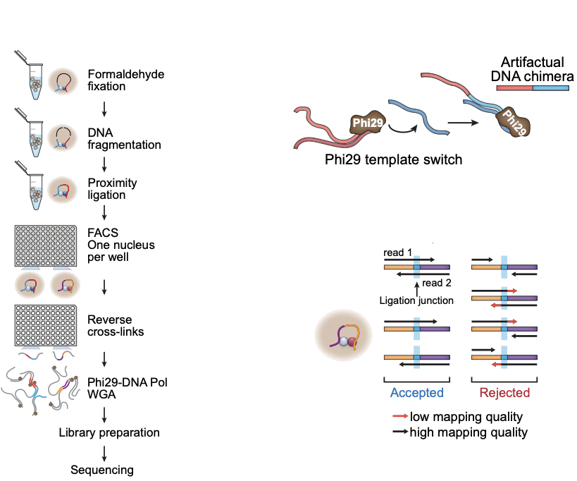
- Wet lab protocol:
- Polymerase creates erroneous contacts:
- Rigorous data filtration protocol
One Read-Based Interactions Annotation (ORBITA):

Single-cell Hi-C: data processing
-
Resulting Hi-C datasets for Drosophila melanogaster
work in preparation
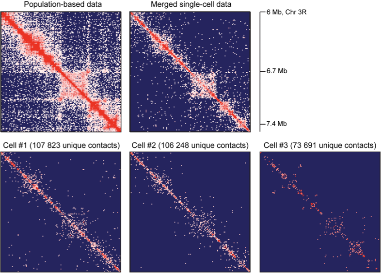
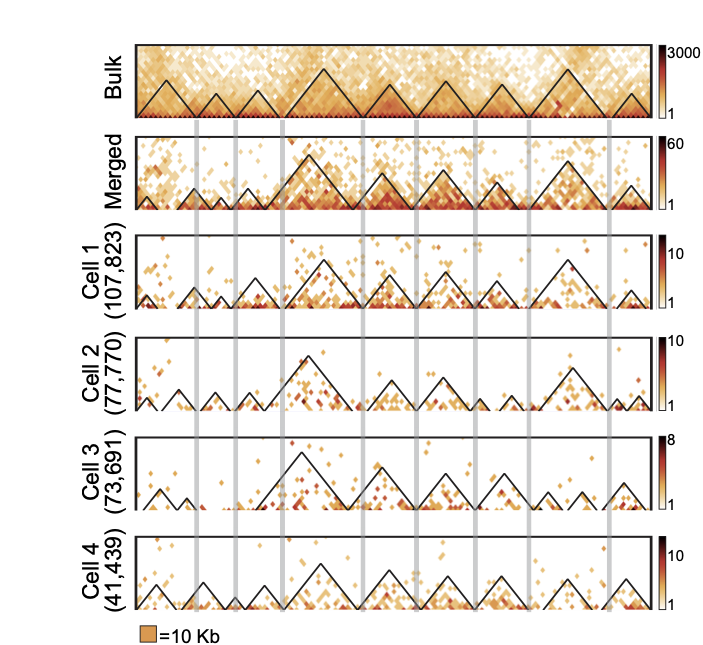
TADs are stable units of single-cell chromatin
-
Resulting maps and TADs for Drosophila:
work in preparation
Enrichment heatmaps
work in preparation
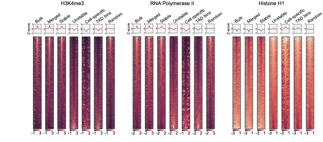
-
Groups of boundaries based on the presence in single cells:
Enrichment heatmaps
work in preparation
-
Groups of boundaries based on the presence in single cells:
Practical Part: Enrichment Profiles
We will:
- Call TADs in S2 cell line (Wang et al. 2017),
- Plot the enrichment profiles for multiple factors.
We'll need conda environment "hic" (see instructions on activation can be found in EpiPract3).
TADs calling
We will work with 20 Kb resolution and use HiCExplorer HiCFindTADs functionality.
1. Call TADs with parameters that you can find in the table:
Task 6 (1 points): What were the generated files? How many TADs and boundaries you were able to find in your final version of code?
hicFindTADs --matrix ${file.mcool}::/resolutions/20000 --outPrefix ${tmp.tads} \
  --minDepth ${minDepth} --maxDepth ${maxDepth} --step 20000 \
  --correctForMultipleTesting fdr --thresholdComparisons ${Threshold} --delta ${Delta} \
--numberOfProcessors 2| Name | minDepth | maxDepth | Threshold | Delta | ChIP-Seq (from /home/galitsyna/EpiPract5/Drosophila_chipseq/ ) |
|---|---|---|---|---|---|
| Anastasia Pivnyuk | 60000 | 1000000 | 0.05 | 0.01 | S2-Chriz.bw |
| Nikita Sharaev | 60000 | 1000000 | 0.05 | 0.01 | S2-CTCF.bw |
| Artemy Shumskiy | 60000 | 1000000 | 0.05 | 0.01 | S2-H3K4me3.bw |
| Dmitrii Kriukov | 60000 | 1000000 | 0.05 | 0.01 | S2-JIL1.bw |
| Pletenev Ilya | 60000 | 1000000 | 0.05 | 0.01 | S2-RNAPolII.bw |
| Konstantin Chernyshov | 60000 | 1000000 | 0.05 | 0.01 | S2-SuHw.bw |
| Ivan Kuznetsov | 60000 | 1000000 | 0.05 | 0.01 | S2-WDS.bw |
| Anna Kalinina | 60000 | 500000 | 0.01 | 0.01 | S2-Chriz.bw |
| Sofya Kasatskaya | 60000 | 500000 | 0.01 | 0.01 | S2-CTCF.bw |
| Julia Bocharkina | 60000 | 500000 | 0.01 | 0.01 | S2-H3K4me3.bw |
| Vasily Borodin | 60000 | 500000 | 0.01 | 0.01 | S2-JIL1.bw |
| Sofia Kamalyan | 60000 | 500000 | 0.01 | 0.01 | S2-RNAPolII.bw |
| Anna Krasivskaya | 60000 | 500000 | 0.01 | 0.01 | S2-SuHw.bw |
| Aleksandra Ozerova | 60000 | 500000 | 0.01 | 0.01 | S2-WDS.bw |
| Victoria Kobets | 60000 | 200000 | 0.05 | 0.01 | S2-Chriz.bw |
| Slesareva Anastasiia | 60000 | 200000 | 0.05 | 0.01 | S2-CTCF.bw |
| Mikhail Moldovan | 60000 | 200000 | 0.05 | 0.01 | S2-H3K4me3.bw |
| Viktor Mamontov | 60000 | 200000 | 0.05 | 0.01 | S2-JIL1.bw |
| Evgeniia Alekseeva | 60000 | 200000 | 0.05 | 0.01 | S2-RNAPolII.bw |
| Trofimova Anna | 60000 | 200000 | 0.05 | 0.01 | S2-SuHw.bw |
TADs calling
We will use HiCExplorer HiCFindTADs functionality.
1. Call TADs:
2. Convert cool format to h5:
3. Create tracks.ini file (see two slides below) with Hi-C map, TADs segmentation and your factor profile. Use vim on nano.
4. Run plotting step:
Task 7 (2 points): Report the resulting plot and describe your observations. Is your factor enriched relative to TAD boundaries or TAD bodies? Is this plot enough to draw this conclusion?
$ hicPlotTADs --tracks tracks.ini -o {tads.png} --region chr2L:0-1000000$ hicConvertFormat --matrices ${file.mcool}::/resolutions/20000 -o ${converted.file.h5} --inputFormat cool --outputFormat h5hicFindTADs --matrix ${file.mcool}::/resolutions/20000 --outPrefix ${tmp.tads} \
--minDepth ${minDepth} --maxDepth ${maxDepth} --step 20000 \
--correctForMultipleTesting fdr --thresholdComparisons ${Threshold} --delta ${Delta} \
--numberOfProcessors 2TADs visualization with HiCExplorer
-
TADs visualisation with HiCExplorer required tracks.ini file with plot description. It allows to adjust the very detail of your plot, add multiple tracks, see the documentation.
-
The minimal working version of tracks.ini file is placed below. It might be improved, if you try to change parameters in the file and produce the better vizualisation of TADs and heatmap features:
[x-axis]
where = top

[hic matrix]
file = ${converted.file.h5}
title = Hi-C data
depth = 300000
transform = log1p
file_type = hic_matrix

[tads]
file = ${tads.file.domains.bed}
file_type = domains
border_color = black
color = none
overlay_previous = share-y
tracks.ini
TADs visualization with HiCExplorer
- You can also add visualization of your track below the TAD segmentation, add this piece to the end of your tracks.ini file:
- Find your ChIP-Seq track here: /home/galitsyna/EpiPract5/Drosophila_chipseq/
[bigwig]
file = ${YourFactor.bw}
title = ${Put Your Factor Name Here}
color = black
min_value = 0
max_value = auto
nans to zeros = True
Index build and mapping
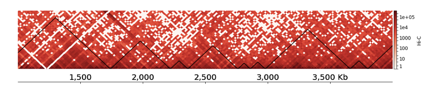
Let's compare TADs boundaries with ChIP-Seq profiles using plotHeatmap (see Examples).
Task 8 (2 points): Provide the resulting enrichment profile. Describe your observations. Is your factor enriched at TADs boundaries? Is this number of boundaries enough to draw conclusions?
Task 9 (*2 points): Repeat the same with TAD bodies. Do you observe the opposite effect?
computeMatrix reference-point -S ${factor.bw} -R ${boundaries.bed} --referencePoint center -a 200000 -b 200000 -bs 20000 -out ${enrichment.tab.gz}plotHeatmap -m ${enrichment.tab.gz} --outFileName ${enrichment.png} --heatmapHeight 15 --colorMap jet --sortRegions ascend --regionsLabel 'Put Your Factor Name here'