SCHEMES
USED IN HORROR POSTERS
COLOUR
INTRODUCTION
The colours used in horror posters very much reflect the genre, they are dark, sinister and mysterious. In this presentation we will be exploring various colour schemes used in horror posters and why they are used, therefore gaining influence for our poster.
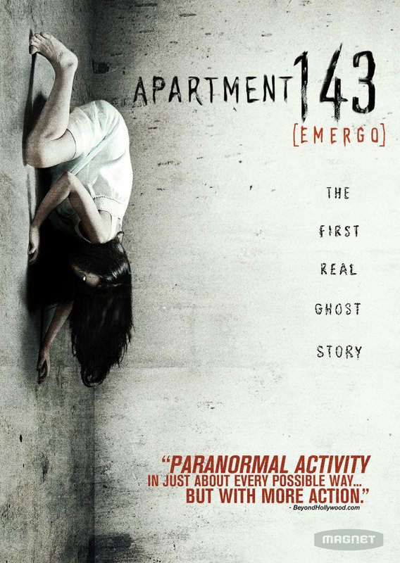
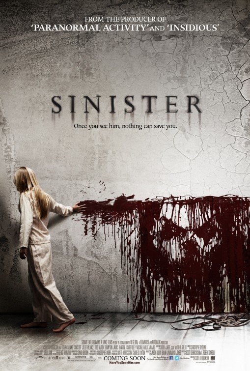
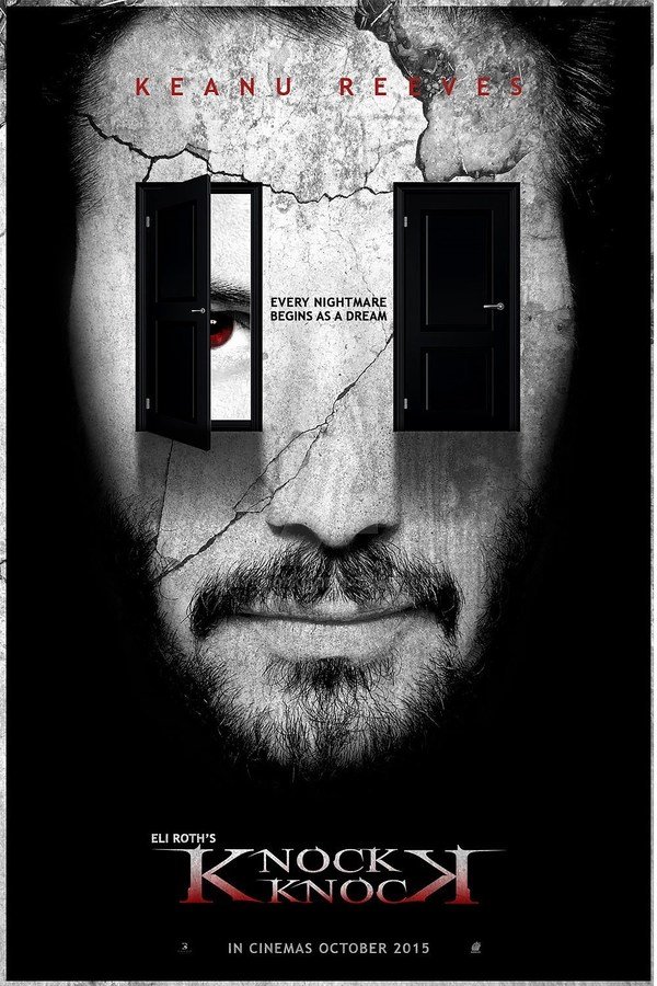
COLOUR SCHEME 1
The colour scheme for these posters, Knock Knock, Sinister and Apartment 143 are very similar. They all feature a dirty white colour, in the last two posters it is seen on the walls and on the Knock Knock poster it is seen on the characters face. This suggests innocence and purity (white) being violated by a deeper, darker presence.
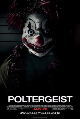
COLOUR SCHEME 2
These colour schemes are all very similar too with the darkness and shadows used extensively to suggest the themes of the film. The black connotes death, fear of the unknown and mystery and the red that is used in Poltergeist and Annabelle connotes blood and danger, indicating what will be seen in the film.

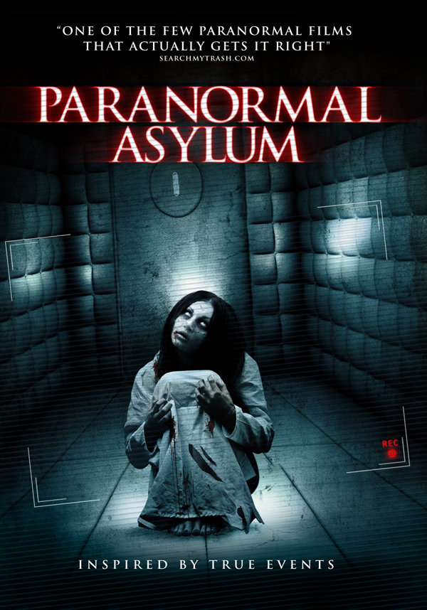
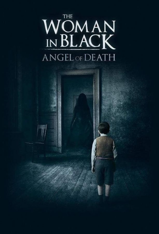
COLOUR SCHEME 3
This colour scheme uses blue to connote the coldness you feel from paranormal activity and the isolation it puts you through; you are isolated from the rest of the world when you watch these films. The chilling blue colour is typical for paranormal horror films, becoming a convention.
DECISION
For our poster, we will adopt colour scheme two as darkness and fear of the unknown is main theme in our film Wiccan. We also want to feature red in our poster to connote danger and blood so we will have the title of the film in a red to stand out against the rest of the text.