Self-Assessment Print Work
Introduction
In this self-assessment I will be critically evaluating my print work for Wiccan - the poster and the film magazine.
Awareness of Conventions of Layout and Page Design
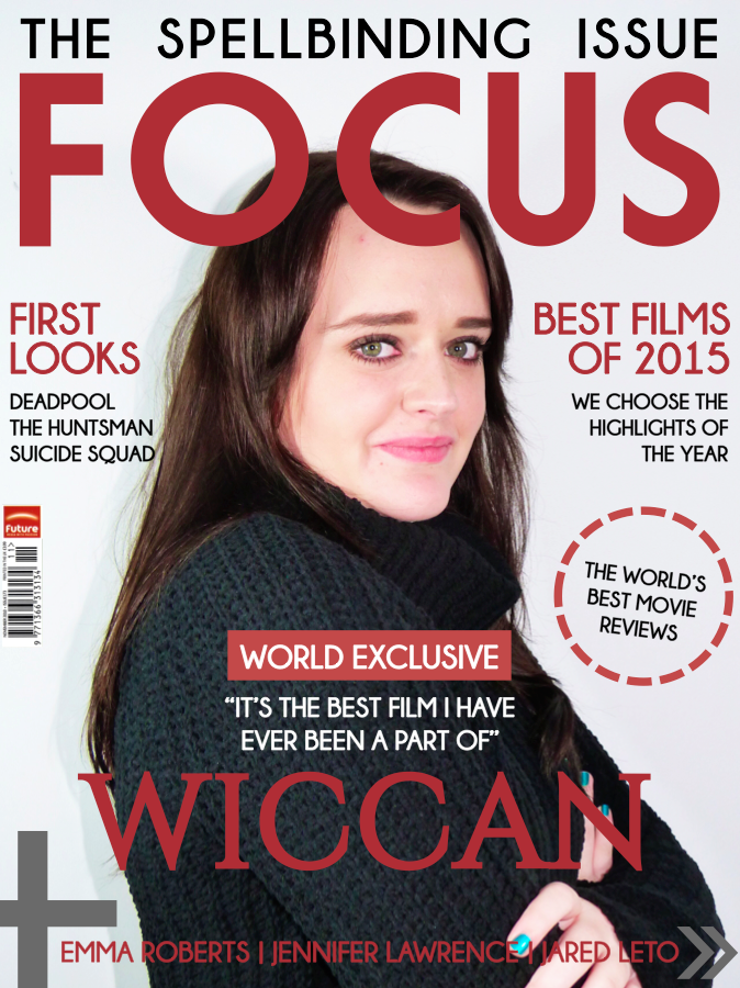
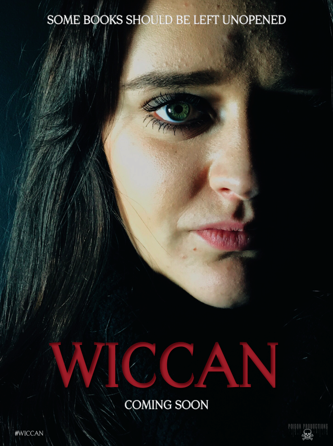
Tagline - allows audience to understand film in few words
Title of Film - displayed in large font to stand out as most important part of poster (conventionally in lower third)
Coming Soon - creating anticipation for audience
#Wiccan - encourages audience to tweet about the film (word of mouth)
Production Company - audiences may recognise this and want to watch film
Image - spread across whole poster and positioned around text
Cover Story Lines / Promotional Puff - entice audience with other stories in magazine
Plus - ther actors and actresses featured in the magazine to entice wider audience
World Exclusive - quote and title of film is main story and the biggest font
Skyline - links to Wiccan and interests the audience
Masthead - placed conventionally in upper third and the largest font
Barcode - typical convention placed on the corner
Awareness of the Need for a Variety of Fonts and Text Sizes
When creating both print works, I was very aware of the importance of the variety of fonts and text sizes. In the poster we wanted to use a serif font as many supernatural horror posters used this to suggest tradition and formality. The same font is used for the title of the film on the magazine (synergy) as well as 'Market Deco' for the masthead and cover story lines. The Masthead is the largest font followed by the film title and then the skyline. The story lines are in the smallest font.
Accurate Use of Language and Register
The poster uses a formal language register with the slogan "some books should be left unopened" - this is formal and to the point which is exactly what is needed for a tagline. In the magazine a casual register has been utilised as this is the norm for many film magazines and the language is personal and persuasive so the consumers will relate to it and buy it - the language used is how magazine companies make a profit. "World Exclusive" for example, will entice them in as they will think they will know important information about film that others may not.
Appropriate Integration of Image and Text
In the poster, we appropriately integrated the text and the image - we used an image of the main protagonist against the title of the film 'Wiccan' as these two link together, she is a part of the Wicca community. In the image she is covered by darkness and in shadows linking to the mysterious tagline of the poster. The magazine does the same, we have featured the main protagonist with the title of the film.
Framing a Shot
We wanted an extreme close up of Violet on our poster as she is the main protagonist. The close up nature of Violet made it personal suggesting something has happened to her personally - the narrative is all centred her, everything that happens affects her directly (the possession, for example). On the magazine we shot a mid-shot as this was the convention for many actors and actresses on film magazines. We framed her centrally to fit in the centre of the masthead, storylines etc - the issue is all about the film and the actress.
Shooting Material Appropriate to Task
In both photoshoots, we considered the mise-en-scene, she wears what she is seen in throughout the majority of the trailer (and film) - the black clothes suggest darkness and fear of the unknown. We used artificial lighting to create a professional photo as they were being used for big promotional purposes - a poster and magazine. In the poster the light was projecting on her face creating shadows and darkness around her suggesting she was in the centre of darkness. This was done behind a black background to match the dark colour scheme. In the magazine a white background was used to give the magazine a fresh, new look as many professional photoshoots are shot with a white background.
The Manipulation of Photographs
For the image on the poster, we used the crop tool so less of the background would be visible and more of the poster was Violet's face which added to the horror vibe and could really catch the eyes of consumers. We also cropped the magazine photo to fit perfectly in the centre of the text. We added a filter to both images on the VSCO Cam app which allowed the image to adopt a darker and sharper feel. When saving, we ensured the image was saved in the highest quality for the print works.