FONTS
USED IN HORROR POSTERS
INTRODUCTION
In this short presentation I will be researching various font options for our poster for Wiccan, a paranormal horror film about witchcraft by looking at existing paranormal horror posters for inspiration.
POSSIBLE FONTS
In this presentation I will be researching various font options for our poster for Wiccan, a paranormal horror film about witchcraft by looking at existing horror posters for inspiration. We had a few fonts that we liked the look of it and fitted in with the codes and conventions of horror posters, which is what we wanted to accomplish.
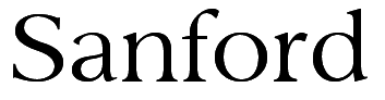


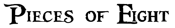
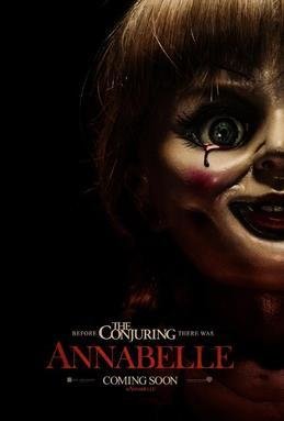
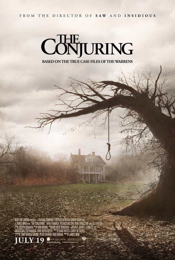
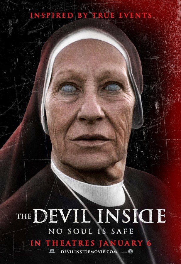
SERIF FONTS
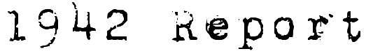
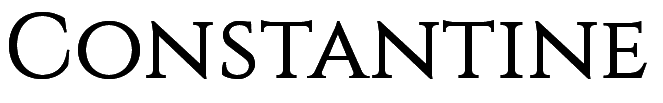
Although they are all slightly different in style, these three serif fonts offered formality and a professional appearance. The majority of paranormal horror posters use a serif font. This could be to indicate the true events the films are based on; this is a formal decision if the film is done in accordance with convention. Formal fonts usually indicate true events due to news reports written in this style of font. The fonts also have a traditional and old look about them linking to the ancient old spirit that causes disruption in the film. Annabelle, The Conjuring and The Devil Inside all use serif fonts.
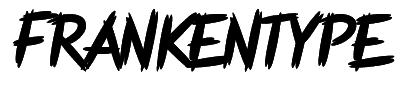
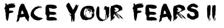
HORROR FONTS
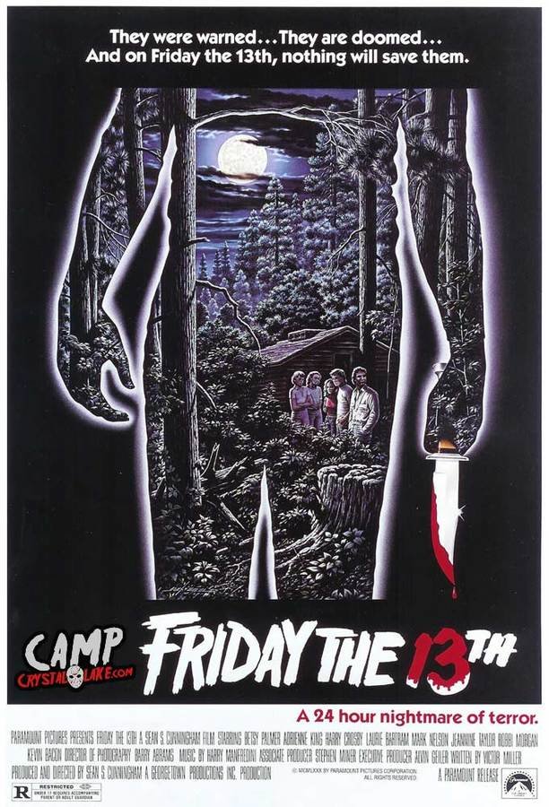
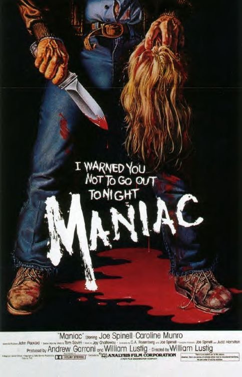
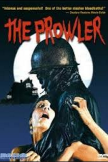
These fonts are very typical of the genre, however is more of a convention for slasher horror films due to the harsh "slashed" style of the font; it looks as if it has been written with blood if edited in a red colour. However blood is featured in our trailer so it would make sense to chose a font like one of the three above. Straight away the audience will identify these fonts with the horror genre. Films that adopt this style of fonts on their posters are Friday the 13th, Maniac and The Prowler.
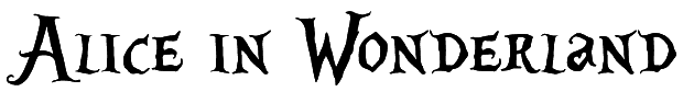
GOTHIC FONTS
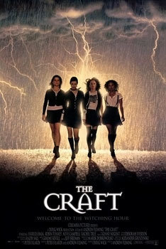
These gothic fonts suggest the theme of Wiccan, it is very gothic and enchanting as the fonts indicate due to the witchcraft and spells that are featured extensively throughout. Many films with the theme of witches use this style of font, such as The Blair Witch Project, The Craft and The Witches of Eastwick.
DECISION
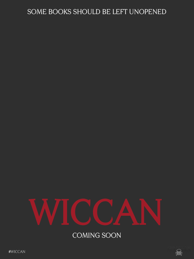
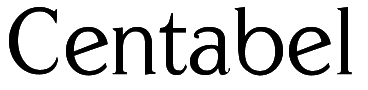
For our poster we have decided to go for the serif font, Centabel as this style of font seems to be a main convention for paranormal horror films that feature an ancient demon like ours. By doing this audiences will be able to recognise the font from previous posters with a paranormal film therefore generating a buzz, which is what we hope to do with our promotional poster. We have decided to not only feature the name of the film on the poster, but the tagline and release information too. Furthermore in very small print we will feature a hashtag for Twitter users to use to spread the film even further and the production company logo. We will feature the tagline at the top and the other information below; the title being the largest font as this is the most important convention on a film poster.