Evaluation Question 1:
In what ways does your media product use, develop or challenge forms and conventions of real media texts?
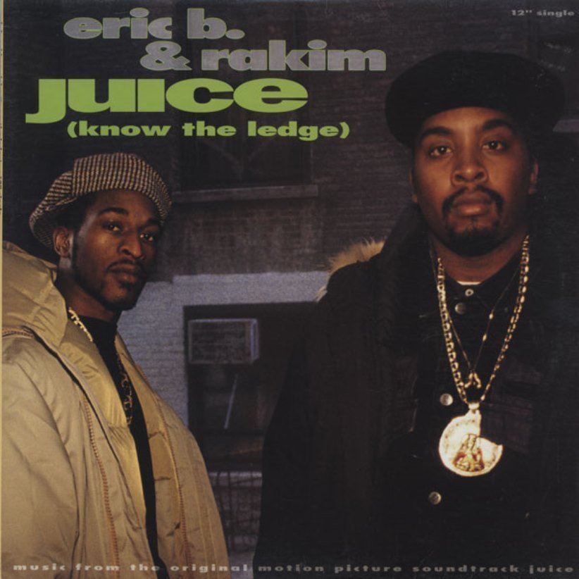
Throughout the stages of research and planning I used a variety of existing products of my chosen genre to analyse and deconstruct the existing forms and conventions. I used these as inspiration to construct my own products making sure that they contained the typical conventions of a rap digipak, music advert and music video. I decided to conform to the costume code of the rap genre by wearing a large hooded coat whilst wearing jewellery underneath. The main inspiration of my costume was Rakim, who is the artist whose song I'm using and I done this as a way to resemble his style more.
The majority of teenagers between 13-19 who listen to this genre of music regularly tend to follow the fashion quite seriously, often dressing up in vintage clothing, sports clothing such as tracksuits and trainers and often do wear black with clothes such coats and jeans. I was still able to conform to these conventions by following the dark colour scheme and also by following the same trends that they do meaning that my target audience would feel fulfilled and I would be meeting their expectations for an artist of this genre.
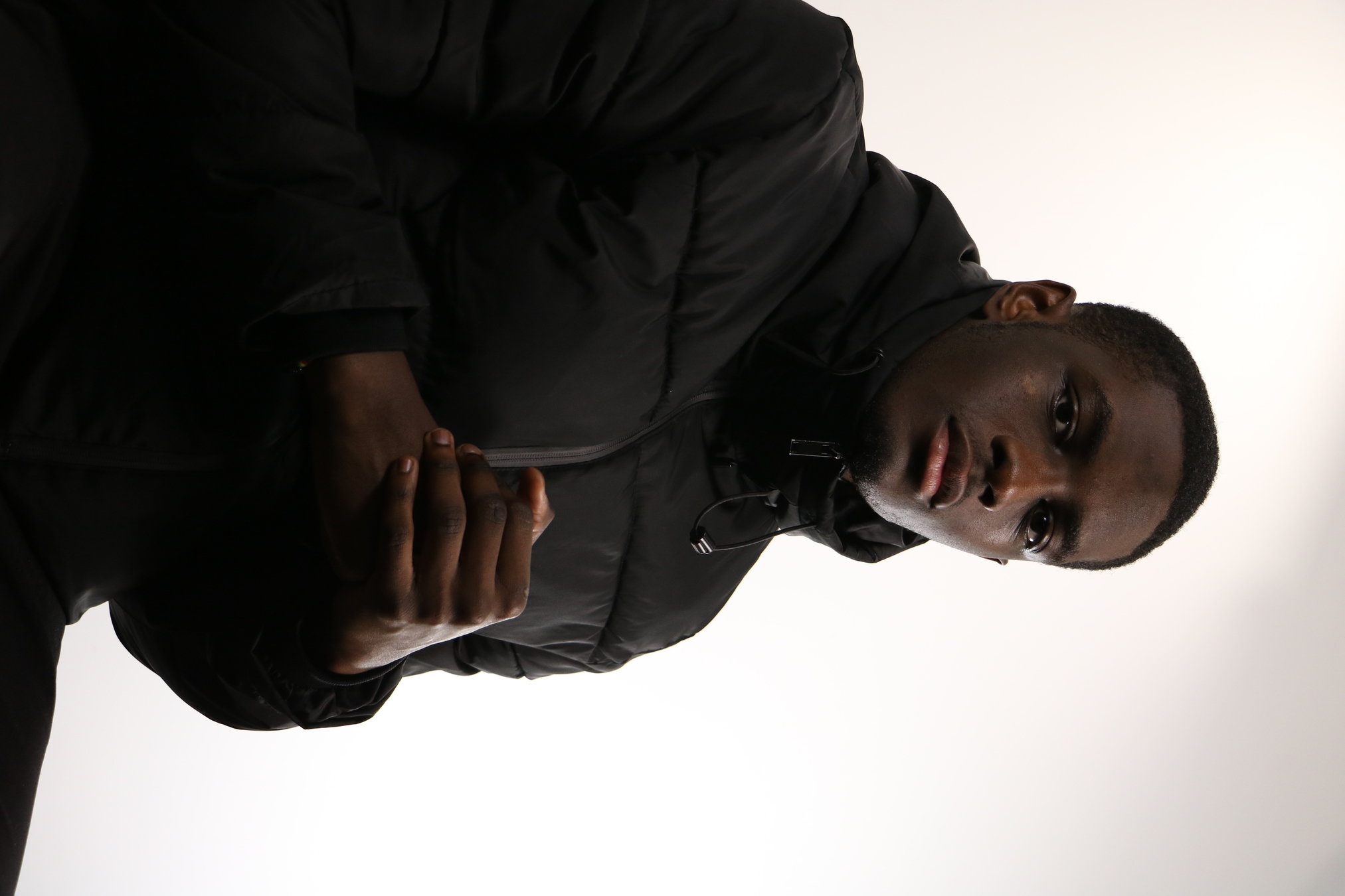
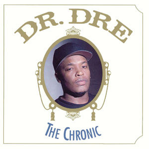
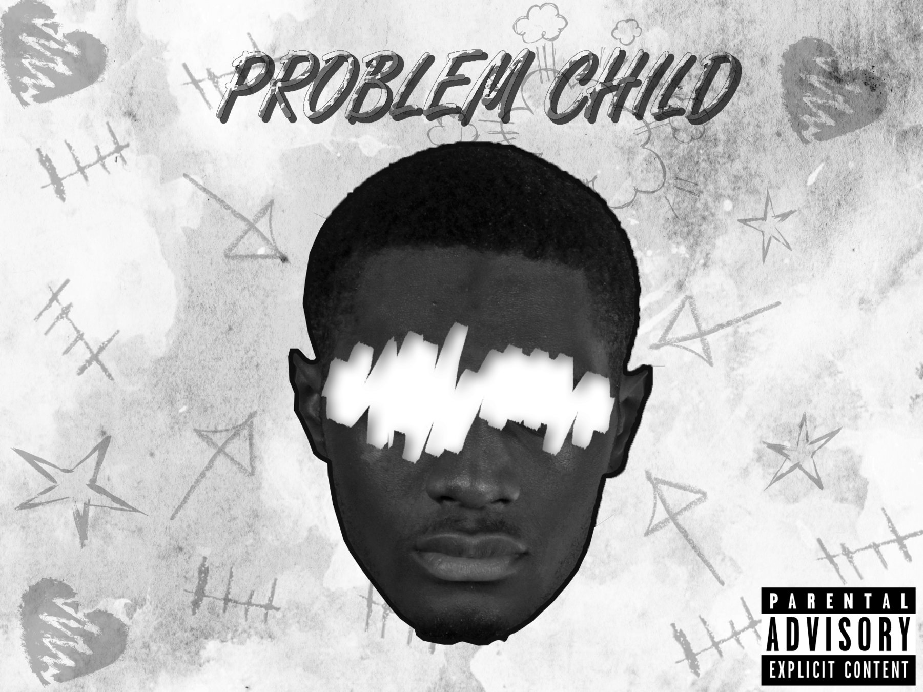
This album cover was inspired by Dr Dre's "The Chronic" album as I adopted the layout by positioning the artist right in the middle of the cover with the album name also in the centre. Visually, my album cover has a lot more on it in terms of graphics and its theme however it still follows the colour scheme conventions of rap music in terms of its grimey and grunge background as the cover lacks a lot of colour. It was also essential that I included the "Parental Advisory" sticker in the bottom right of my cover and this is crucial as it establishes the fact that there will be violent and explicit themes in the album which also conforms to conventions of the genre, a genre known for its outrageous and outspoken lyrical themes. However, I challenge album cover conventions as most rap albums that feature the artist on the cover show the artist with a very stern and serious face however on mine the eyes have been scratched out.
Conventions of a magazine advert include
The artist/ album name
Main image of artist with a clear relation to the Digipak
Release date of the album
Reviews from high end magazines and music critics
Social Media links
Consistent font and colour scheme
My product includes all of these conventions, as I have included various reviews by naming the name of the music organisations and highlighting their positive praise of the album and the artist. I also conformed to the conventions of a magazine advert by using a different image to my digipak cover but the same grayscale colour scheme has been used and the pose of the artist is much more upfront and masculine. I included social media convergence, allowing my existing and potential audience to follow me and to keep up with me on social media and I've also included where the song is available and how it can be retrieved on external applications. This will be successful with my youthful target audience because of how much social media controls most of the youth's generation.

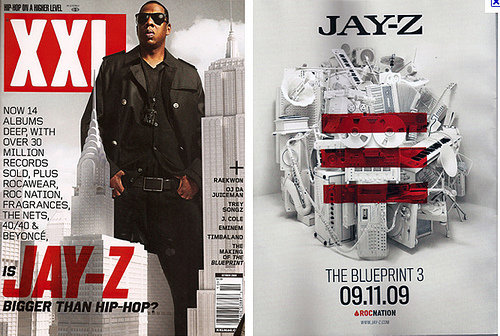
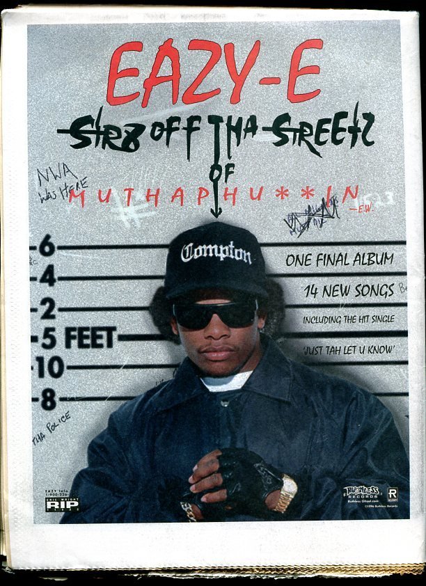
My product was inspired by magazine adverts featuring two famous rappers, Jay-Z and Eazy E, both of which are in the centre of the magazine advert cover with the name of the album and their own name in large bold writing to attract immediate attention. I also used a low angle shot in order to reinforce my artists star persona making her superior over his fans and also conformed to stereotypical rap attitudes and personalities at the same time, as a rappers are seen as very brash and cocky.
I challenged the layout by making the name of the album bigger than the name of the artist and this was mainly to place more attention on how the name of the album links to the pose of the artist and how the audience receive that link and how they can decode that meaning, creating their own perception of the theme of the album "Problem Child".