Possible Record Label name/logo
Research
To get an idea as to the company we might make to produce our video I think its best to research into other record companies and there logos to get inspiration.
Top Ten labels (top 3)...
Warner Bros.
The Label has been around since 1958 and signs artists from all genres of music. Its logo is very simple and clearly states the initial of the company in a shield like shape, there are only two colours being black and white creating a great contrast and a very classic look.
Island Records
The label has been around since 1959 and also signs artists from all genres of music. There logo is very simple but effective, the letter A incorporates a palm tree, something you would typically associate with an island suiting the name.
Aftermath
Aftermath was first established in 1996 and most commonly signs hip hop artists. The logo doesn't seem to reflect the name, although like every other label it follows the black and white theme that seems to be a common trend.
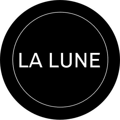
Our Name and Logo
Here we have created a range of different logos for our record named La Lune - music that's out of this world. Its a label that signs a range of different artists from all different genres of music. We choose to stick with the classic Black and White theme for the colours as it helps to create a more professional look. I made all of them using logomakr.com
I think that my favourite logo overall is the name with the moon as the A. I think this because it clearly states the name and but also the moon to show what it is.