FOXES GLORIOUS
Digipak Analysis
Digipak
Digipak- style packaging is often used for CD singles or special editions of CD albums. The front of the digipak will have some aspect of what the artist represents and what their genre is. The digipak will most likely embody and theme and a message about the artist image. This increases the artists brand image and popularity. It also tells us about their artistic and creative approach is taking throughout their music.
Digipak benefits the artist and their music as its promotional aspect of the music industry which helps bring awareness to the artist thus selling the artist and encouraging consumers to buy and listen to the music. People argue that buying the digipak establishes your loyalty to the artist.
HAIR
One of Foxes trademarks includes her hair this is shown throughout her videos and her singles as they all have close ups of her with her hair being the main focused. Its in the audiences face which becomes her trademark as her hair becomes distinguishable.


SIMPLICITY
Foxes is known for her simplicity, within her videos and her covers. The simplicity within her digipak is simple but effective. Its a simple close up picture of her with a simple font. The font size is large which makes it stands out. This will grab the audience attention when passing through stores such as HMV which increases sales.

Delux Edition
Original Edition
FULL DIGIPAK (Brief)
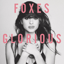
From the digipak we can see she has incorporated her trademarks : simplicity with the use of images and layout including font plus the significance of her hair.
We can see that the inside of her album is filled with childhood pictures again with the simplicity its no photo shoots with designer brands. This shows her creative direction towards her music.
The font is used both on the CD and the track-listing. Again referring to the building of a brand and it being one of her trademarks.
FRONT COVER
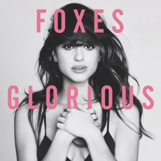
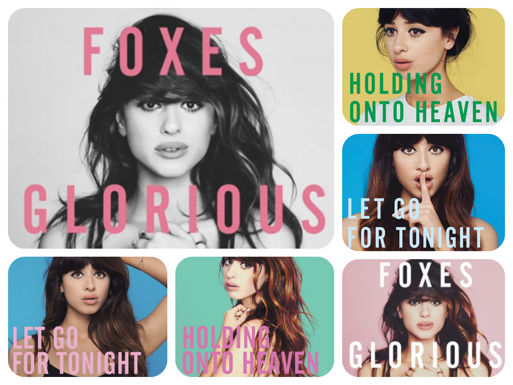
foxes is an artist who focuses on sythpop. Her album glorious came out May 12th 2014. Although foxes is not mainstream her audience ranges from indie lovers to mainstream lovers.
The front cover displays a simple close up of her face and outfit. by having a close up frame it shows foxes beauty and features. This is common within sythpop as it creates an image for the artist. The simplicity of the design allows us as the audience to focus on foxes simple layed back style seen through her hair, makeup and costume. The use of the flowing hair, wide eyes and pouted lips are common throughout her album. It allows her audience to recognize her for her layed back style and attitude image.
FRONT COVER
The background image is plain white which shows she is all about the music and want her audience to see her for who she is as she has no gimmicks. A filter has been used so that the image is black and white whereas the writing is bright pink resembling her target audience.
A simple styled font has been used to display foxes title. The style is commonly seen throughout foxes albums and adverts which allows her to create a visual style and allows her title to be easily recognized within her target audience. The simplicity of the styled font relates to the simplicity of her music.
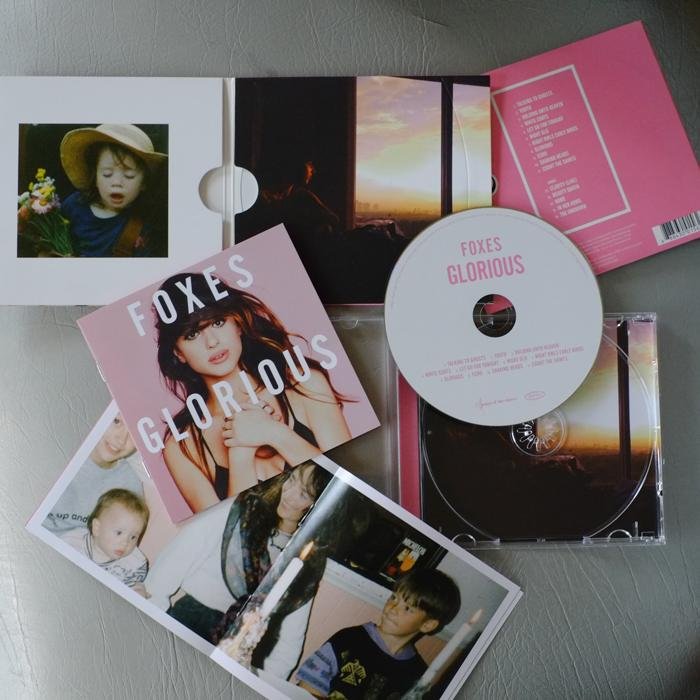
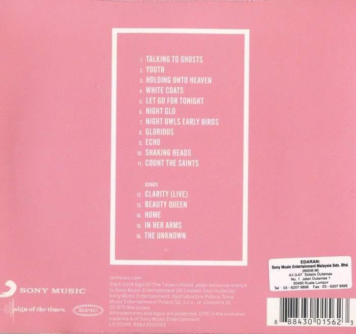
TRACK-LISTING
At the back of the digipak it displaces elements such as the track-listing . The same simple styled font has been used for the track listing which again creates a visual image. Again the simplicity of the album is in relation to the simplicity of the album. Other features such as the bar code and copyright issues and record label are also seen at the bottom.
The colour scheme is relatively the same with the pink however its all colour and no black and white, this can directly connote the soft touch within her music,
The simplicity of the design relates to the album. unlike most album track listings this one has no pictures at the back just a boarder going around as if it was framed which can be linked to the pictures in the inside. The creative approach towards the album may be like a montage. However the use of no picture may be because she wants her audience to focus on the track-listing and find the meanings behind the song titles.
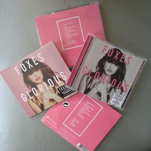
CD
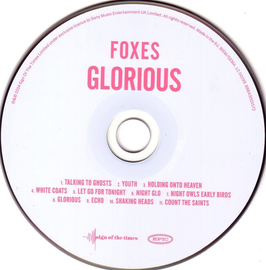
The use of the white background allows the songs and the title to become more prominent. which is an important theme throughout. the use of the pink corresponds with the rest of the album the soft touch or maybe even love as her singles can be interpreted as love songs. By having a white background and pink being the main theme it could show the innocence of love the artist has encountered on. This can also be seen through the visual image of the front cover with the big eyes the innocent expression on her face and her positioning of her hands on her heart as if its her first love.
As foxes is a new artist her name is everywhere along the digipak to remind people if they loose the rest of the digipak, just not to forget her.