Accessibility in the Age of Components
Ayesha Mazumdar
UX Engineer @ Optimizely
@AyeshaKMaz
Scaling
^

Hi, I'm Ayesha 👋
UX Engineer @ Optimizely

🐶
Dog-mom to Pepper
🎭
Proud Musical Theater Geek
Design Systems @ Salesforce
UX Engineer @ Optimizely
- Component Library
- Design System
- Prototyping
- Frontend UI/UX
Accessibility
📋 Today's Agenda
Just a placeholder
Label
Create...
Button Icon
Select Dropdown
Input
Visuals
Keyboard Navigation
Screen Readers
Component
Accessibility Win
What is Accessibility?
ac·ces·si·bil·i·ty
alias: A11Y
Ensuring everyone,
no matter their ability,
can "perceive, understand, navigate, contribute to, and interact with" an application
noun
Component Libraries
Every change made to a component permeates throughout the entire ecosystem to all consumers
🎉
The Good
Component Libraries
Every change made to a component permeates throughout the entire ecosystem to all consumers
😳
With great power comes great responsibility...
The Bad
... and endless opportunity to make the web a more accessible place!
With great power comes great responsibility...
Visuals
Is the interface visually legible and understandable for all users?
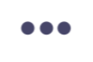
🧩 Button Icons
Key Problem Areas:
- Focus + Hover States
- Contrast
- Titles
Visuals
🧩 Button Icons
Visuals
Text
button {
  outline: none;
}
Focus + Hover States
Focus + Hover States
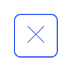

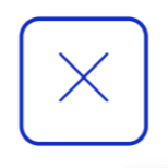
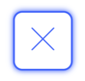
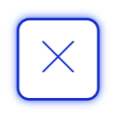
Neutral
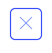
Hover
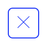
Focus
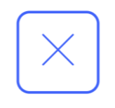
Focus + Hover
🧩 Button Icons
.oui-button-icon:focus {
  box-shadow: 0px 0px 3px $brand-blue-dark;
}
Visuals
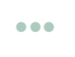
Contrast
<ButtonIcon iconName="ellipsis"/><ButtonIcon iconName="ellipsis" iconFill="#abcabc"/>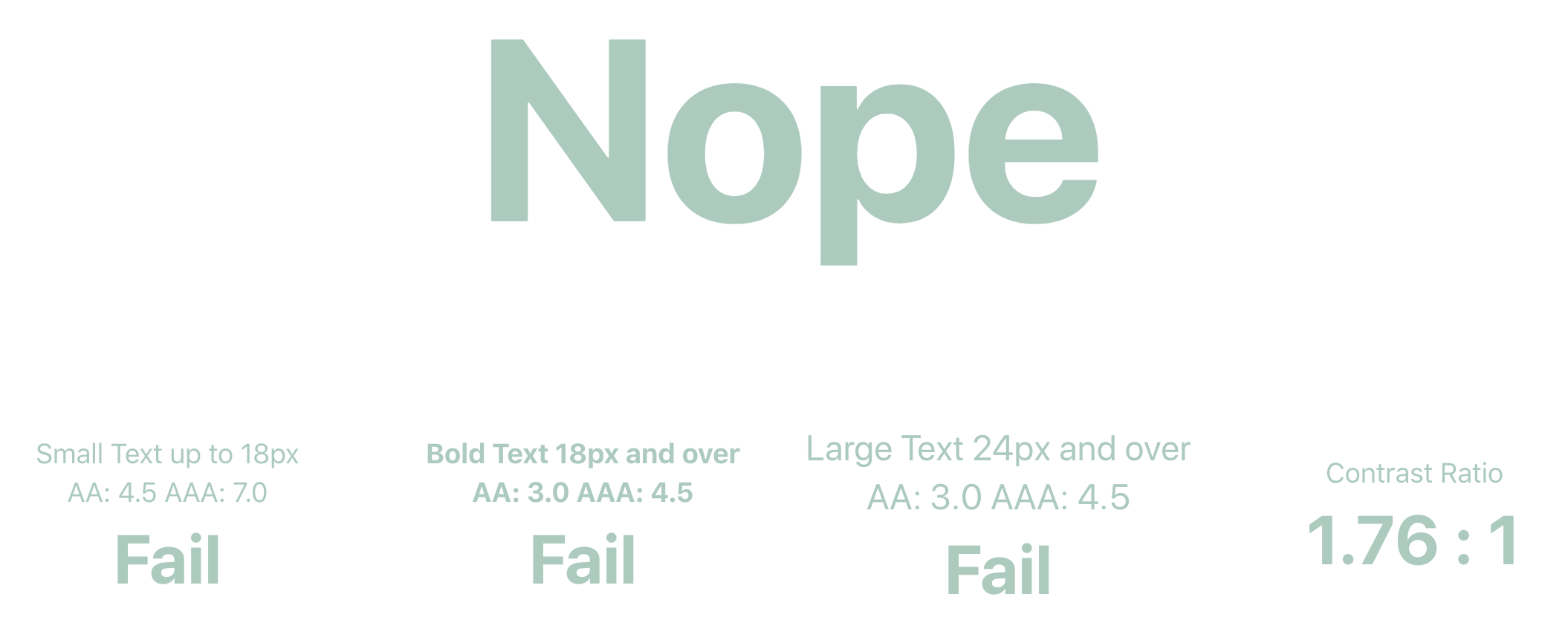
🧩 Button Icons
Visuals
Contrast
import {
  amberBase,
  aquaBase,
  brandBlueDark,
  greenBase,
  orangeBase,
  pinkBase,
  redBase,
  magentaBase,
  greyBase,
} from '../../tokens/forimport/index.es';

// map fillColorName prop values to OUI color tokens
export const FILL_COLOR_MAP = {
  aqua: aquaBase,
  amber: amberBase,
  default: brandBlueDark,
  green: greenBase,
  orange: orangeBase,
  pink: pinkBase,
  red: redBase,
  magenta: magentaBase,
  grey: greyBase,
};

export default {
  FILL_COLOR_MAP,
};
ButtonIcon.propTypes = {
/** Custom color for icon inside button **/
iconFillName: PropTypes.oneOf(Object.keys(FILL_COLOR_MAP)),
{...}
}🧩 Button Icons
Visuals
Titles
return (
    <button
      {...}
      title={ props.title }>
      <Icon name={ props.iconName } size={ props.size } />
    </button>
);
🧩 Button Icons
ButtonIcon.propTypes = {
  // Name of the icon to use
  iconName: PropTypes.string.isRequired,
  {...}
  /** Title of the button used for hover and screen readers
   *  Describe the button's action, not the icon itself
   */
  title: PropTypes.string.isRequired,
};
Visuals
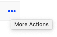
Even Better - aria-label
return (
    <button
      {...}
      aria-label={ props.title }
      title={ props.title }>
      <Icon name={ props.iconName } size={ props.size } />
    </button>
);
🧩 Button Icons
ButtonIcon.propTypes = {
  // Name of the icon to use
  iconName: PropTypes.string.isRequired,
  {...}
  /** Title of the button used for hover and screen readers
   *  Describe the button's action, not the icon itself
   */
  title: PropTypes.string.isRequired,
};
Visuals
* Bonus slide added after React Boston
Given unpredictable support for the title attribute, adding aria-label can help provide consistent support for screen readers. There is no single perfect solution though, Sara Soueidan has a great article on the subject
Screen Readers
Can users easily interact with the content on the screen without seeing it?
🧩 Inputs
Screen Readers
🧩 Inputs
<li>
  <Label>API Call</Label>
  <p>
    To track this event, add the following code to your page.
    <Link href={url}>
      Learn more
    </Link>
  </p>
  <Attention>
    { this.renderApiCallText() }
  </Attention>
</li>
Label is used for its style, not its semantic meaning
Screen Readers
But, where's the input?
🧩 Inputs
<Input type="text"/>
Screen Readers
🧩 Inputs
<Input type="text"/>if (props.label) {
return (
<Label>{...}</Label>
<input>{...}</input>
);
}/components/input/index.js
Screen Readers
🧩 Inputs
<Input
  id="input-01"
  label="Experiment Name"
  type="text"
/>
<div>
<Label inputId={ id }>
{ label }
</Label>
{ this.renderInput() }
</div>/components/input/index.js
*Required Prop
*
*
Screen Readers
🧩 Inputs
export { default as Input } from './components/Input';
export { default as Label } from './components/Label';
Plus...
becomes...
export { default as Input } from './components/Input';Screen Readers
Keyboard Navigation
Anything you can do with a mouse, I can do with the keyboard
🧩 Dropdowns
Create...
aria-expanded="true|false"
role="combobox"
role="menuitem | placeholder"
tabindex="-1"
Keyboard Navigation
aria-haspopup="true"
🧩 Dropdowns
Keyboard Navigation
let currentFocusedIndex = this.state.currentFocusedIndex;
if (keyCode === ESC) {
  toggleOpen()
} else if (keyCode === ENTER || keyCode === SPACE) {
  handleItemSelect(currentFocusedIndex)
} else if(keyCode === DOWN) {
  currentFocusedIndex ++;
} else if(keyCode === UP) {
  currentFocusedIndex --;
}
// reset state
{...}
Example Psuedocode:
That was a lot to cover
Let us review
Start with your most used components
🥡 Take Away # 1
Just a placeholder
Label
Create...
Make it easier to do the right thing
🥡 Take Away # 2
ButtonIcon.propTypes = {
  iconFillName: PropTypes.oneOf(Object.keys(FILL_COLOR_MAP)),
  title: PropTypes.string.isRequired,
  {...}
}
Some things shouldn't be flexible
🥡 Take Away # 3
Inputs != 🧘♀️
Good things take time and effort
🥡 Take Away # 4
Effort
Impact
-
Fable and Access Works
-
Usability testing with people with disabilities
-
-
-
Covers AA and AAA criterion
-
-
Other Design Systems and Component Libraries
-
Don't reinvent the wheel
-
📸 Resources
-
Come say hi 👋 during the breaks
-
Reach out on Twitter: @AyeshaKMaz
-
Connect on LinkedIn: /ayeshakmaz
🤔 Want to chat more?
Thank
You