Q7. Looking back at your preliminary task, what do you feel you have learnt in the progression from it to the full product?
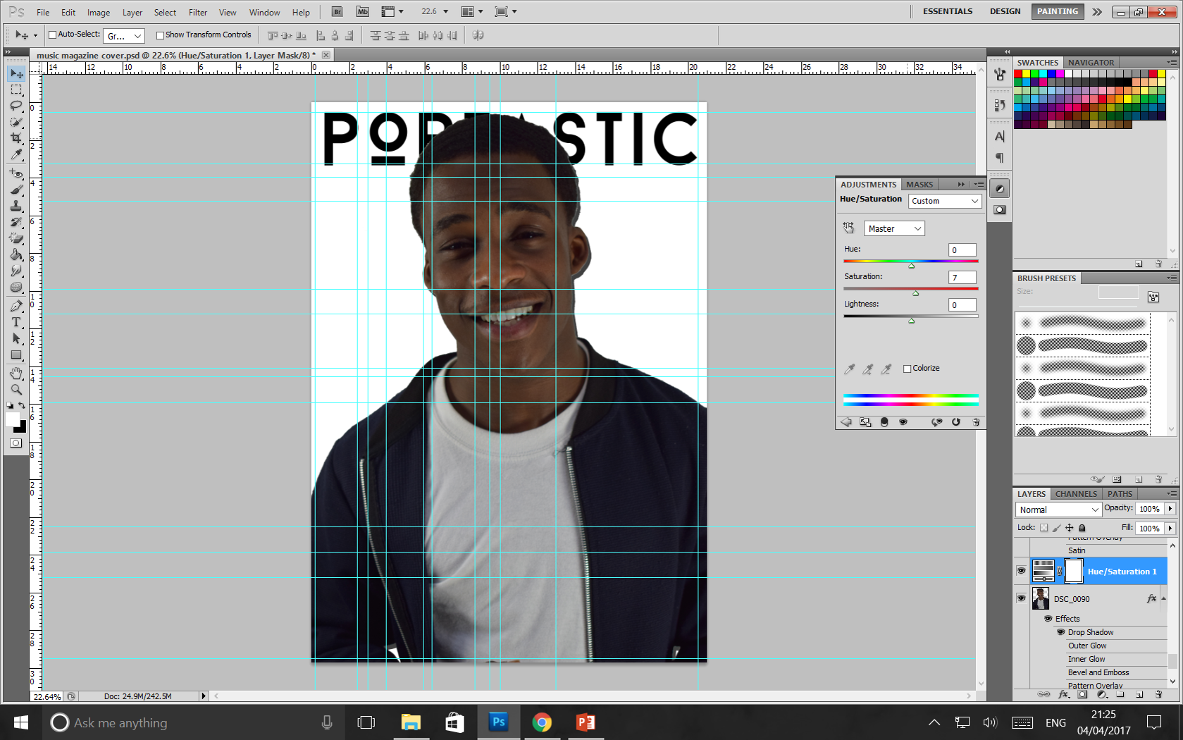
When I constructed my college magazine I had less confidence approaching the task because I did not have experience manipulating images and text which prevented me from producing a magazine with intricate details. In contrast, the construction of my music magazine demonstrated my ability to use a variety of different fonts and tools to edit the images for my magazine which I did not do for my college magazine so this allowed to me to develop my skills of Photoshop along the construction process.
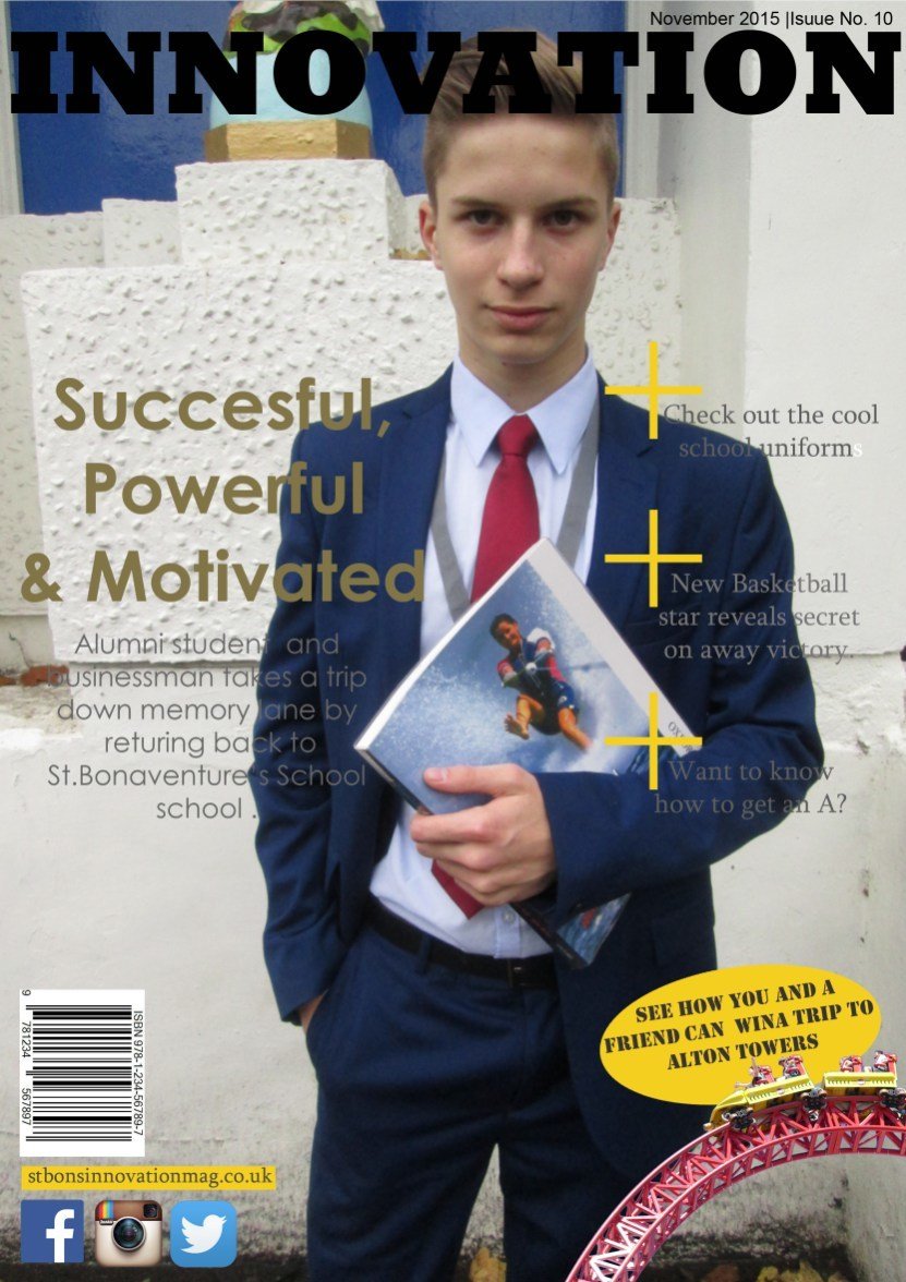

Even though my college magazine was not as complicated as my music magazine. The task taught me the importance of conventions of magazines such as the masthead, bar-code, sell lines and images as these help to connote the genre of the product. I used a basic serif font on my college magazine cover and contents page that were already preset in Photoshop. However, for my music magazine I was able to download various fonts from dafont.com to adhere to the visual aspects of pop magazines which use capitalised, serif fonts to attract the audience. Additionally, I learned how to layer text and images correctly so that the masthead falls behind the model's head. I did not know how to superimpose text in the beginning but now I can.
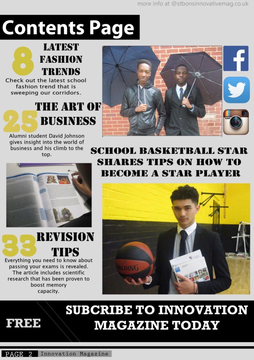
Looking back at my preliminary task I learnt the importance of composition. By this mean the ratio between the text and the images. My college magazine had a lot of empty space space on the sides and the text was randomly positioned on the page so more could have been done to improve the layout of my college magazine.
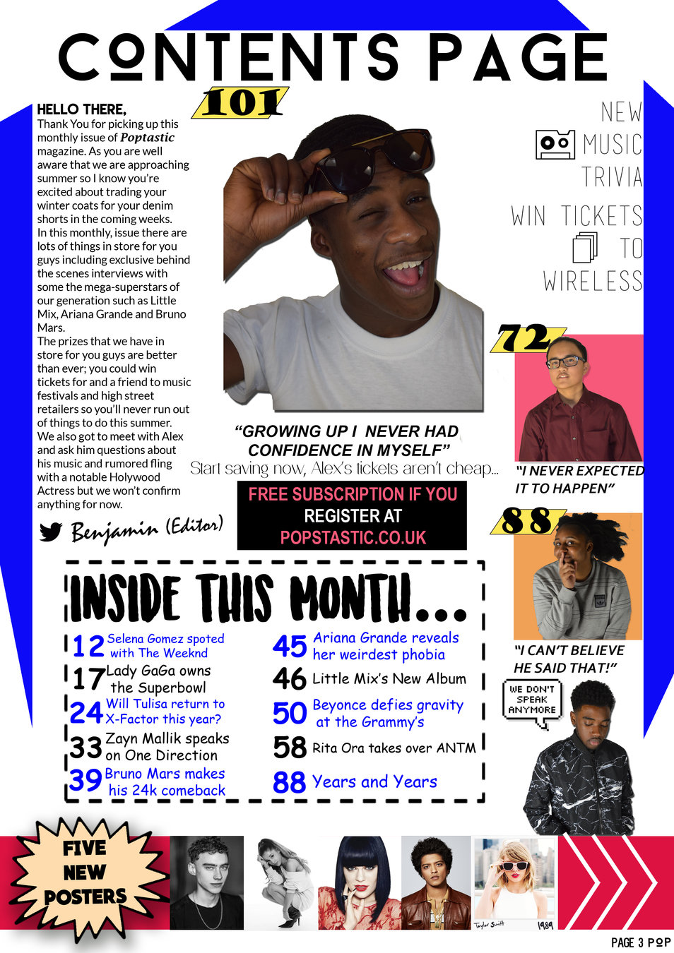
This meant that when I was able to utilise the entire page for my Pop magazine by enlarging text, using eligible fonts and aligning the sell lines in order to give the magazine a professional, aesthetically pleasing layout.
Furthermore, the progression of my college magazine and contents page taught me the importance of using a house-style that is appropriate for the target audience because the colour schemes, language devices and images selected might convey a different meaning to the target audience from the original message that I attempted to put forward. The images I selected for my college magazine were untouched and dull so this would have conveyed a negative, darker message about the academic environment whereas the pictures for my magazine were planned prior to the photoshoot so I had time to create a studio set up and obtain lights to take brightly lit photos of my cover artist and the other secondary images.
In conclusion, the preliminary task and final task made me more conscious of the decisions and the amount of detail and effort that goes into constructing a magazine. I now know how important verbal and non-verbal codes such as colour schemes and house-styles and text help to construct meanings for the target audience of a magazine. The completion of this course has taught to think more strategically of the ways and methods of communicating to the teenage consumer groups and how print media texts need to adhere to the needs and interests of their target audience in order to thrive in the competitive, digital age.