Evaluation Q1
In what way does your media product use, develop or challenge forms and conventions of real media products?

In the production of my magazine, I chose rather to stick with the conventions and forms of real music magazines than go against them. This is because the idea was not to challenge the conventions and try and make my magazines as professional and well presented just like an iconic hip hop/rnb magazine. Therefore I stuck with the conventions and forms effectively and intelligently.
My magazine (mentioned earlier) is a hip hop/rnb magazine which was coherent to other similar magazines. The name of my magazine is called ‘Urban Flow’ (logo on the top right hand corner). This term urban flow, can be easily explained, the urban meaning young, youthful, and black hip hop/rnb culture which was the general message of my magazine. The flow is a common slang that is used especially in hip hop and rappers usually use the term to talk about how prolific their rhyming skills are. All these adjectives describe how I have conformed to the conventions of a hip hop magazine.
My masthead is a good example of how I stuck to the conventions of a hip hop/rnb magazine. Most magazines have their masthead in big font at the top centre of the magazine which is what I did. My masthead was in big, capital letters which is what is seen on ‘the source’ magazine. I also used an orange colour for my masthead which followed the conventions of the vibe magazine.
In the following part of my evaluation I will be discussing how I have stuck to the conventions of my front cover, double page spread and also my contents page.

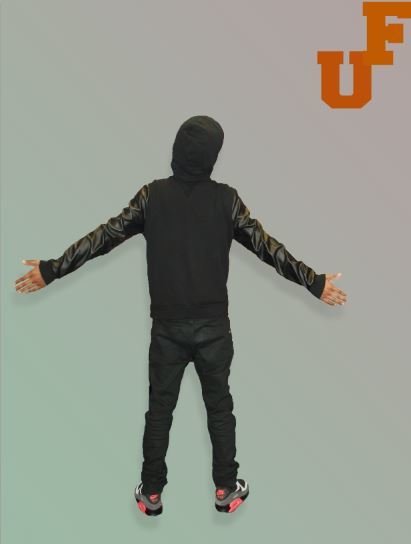
A common convention that is seen in most hip hop magazine is the model which is positioned in the centre of the magazine. As you can see I have positioned my model in the centre; he is also covering two letters of the masthead. This is done in a way to show his dominance in the image also he is looking away from the camera which is sometime seen in magazine which connotes that he is in deep thought and he isn’t connecting with the audience. This you can say has challenged the conventions of a music magazine as I have made my model to almost be disconnected with the audience so as to get a deeper insight to what it is that he is thinking about and what goes on within him. I think this idea is used by publishers sometimes so that the audience would be curious as to why a model isn’t looking directly into the camera, in order for them to want to read more, and buy the magazine. My front cover image therefore can be said to challenge the conventions of a typical hip hop/rnb magazine front cover image.
My front cover image was taken as a medium close up shot in order to grab the attentions of the potential readers. I used a male model also as this again is a conventional feature in most music magazine in the hip hop/rnb industry. For my props, I used a silver crucifix chain, a diamond earring stud and a beanie hat with a grey jumper. The chain and earring is a convention as you see most rapper idealises jewellery, symbolising power, money and inferiority. As you can see he is not smiling and has sort of a mug shot face which is a convention to the magazine I conform to as rappers are usually represented as being hard and tough.


In addition, the text surrounding the magazine has been segregated from the main image which is done on other magazines. I have clearly created a colour scheme with the use of three main colours: orange, white and grey; this is also a conventional feature as usually magazines tend to keep a similar colour pattern on the front cover. My main cover lines are centred in the magazine and I kept in mind that the font size could not exceed that of the masthead. These are all magazine conventions you would see on Vibe magazine for example.
At first glance I would say that magazine would attract a masculine audience due to the font and the fact that there is a male on the cover, this is evident in most hip hop magazines.
Another key convention I stuck with was the use of a barcode; this is seen on every magazine on either the bottom left or right hand corner. My barcode is towards the bottom left which is seen on popular magazine like Vibe and XXL.


For my contents page, I kept a particular style similar to the contents page on a Vibe magazine issue, so that the readers can easily recognise the genre of music they are reading.
A typical feature you would see on a contents page is the title contents, which is usually in very big font at the top of the page. This is a convention I stuck to and makes it easy to know what it is. I have got the first initials of my magazine name and put it as a memorable logo in the top right hand corner which most hip hop/rnb magazine do, in this way their magazine becomes recognisable anytime a new issue is released.
The contents page numbers as you can see are under one another, this again is a conventional feature as it created organisation and makes it comprehensible and readers can easily navigate their way around the magazine like this.
I have a male artist in the centre of my contents page with his body faced backwards. To an extent I think I have challenged the conventions as usually in a contents page there are various pictures whereas in mine, there only one main image with his face turned against the audience. This connotes mystery and entices the readers to want to read more into it.


Besides the main image is the number 64 with text below it. This is a common feature seen in magazines as you see an arrow pointing towards the artist meaning that this particular page number is about him and makes it clear that it is a must read article.
Lastly, the background as you can see is a blend between a grey colour and a greenish colour I used the brush and blend tool in this and this is also a challenge in conventions of a hip hop magazine as they usually tend to keep it basic with a white background or a plain black with text all over the page.

For my double page spread, I have kept to the typical conventions of a hip hop/rnb magazine. However, it’s slightly less conventional in the sense that the layout such as the article itself is different, the way the image is laid out too is slightly different what you may see on a normal double page spread.
The image as you can see if positioned in the left hand side of the page but will still be slightly split between the two pages. I’ve done this in a way so that the audience can get a connection with the image as it is a close up shot on his face. Again he is not looking towards the camera lenses which were in some sense a convention to some hip hop magazine.
The main headlines as you can see is the biggest text in the double page spread as it tells the audience what the subject of the article is all about. This again is a convention to magazines. Furthermore, as seen in the article there is a pull quote in the top right hand corner in bold writing, a conventional method of not just hip hop magazine but all types of magazines done so that readers can get a further glimpse of what they are reading.
I also added a drop capital at the stand of my article; again this is seen on most double page spreads because it makes the article more enticing to read. On the top left hand corner there is a little introduction as to what this page is going to be about. This is not always used on magazines therefore I challenged a hip hop magazine. The background as you can see is a bit unexplainable and is infused with many different patterns, almost to create an illusion but done in a way to make the image the main focus. This type of background is not a convention as hip hop magazine like to use normally plain backgrounds.
Lastly, at the very bottom of the page is the page number and again the use of the initials logo, this makes the magazine more presentable and is a convention I stick to. It also has a website where readers can get more information bout this article.
