Join the CSS Future with
CSS Grid
Bryan Robinson
Founder, Code Contemporary
Formerly:
VP, Design and Development
UX Strategist
Front-end Developer

https://codecontemporary.com
https://bryanlrobinson.com
A Look at the Past

A normal homepage banner
Client Feedback
"That looks amazing, we really really like it... but we need to promo FOUR things at the very top of our homepage"
- Almost every client EVER

😩 I guess we could... make it a rotator? 😩
ShouldIUseACarousel.com
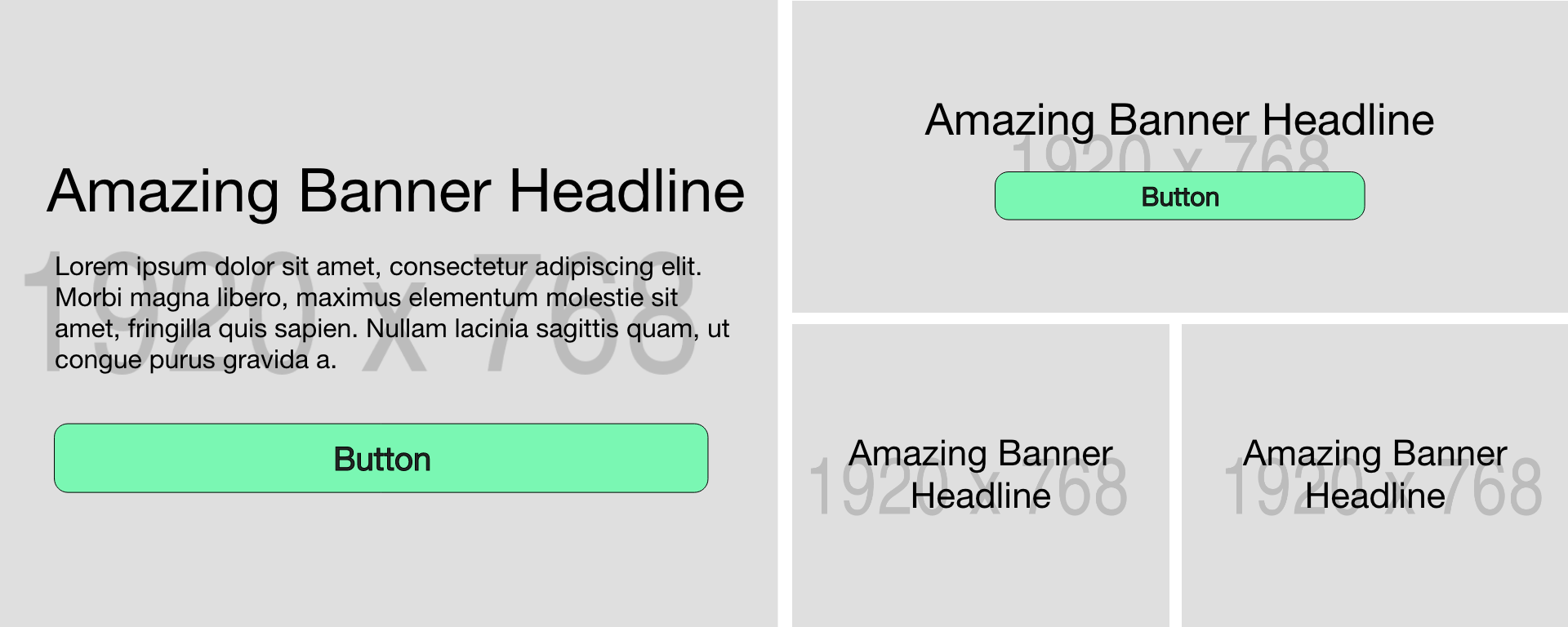
5 minutes in Photoshop
How are we going to build this?
3 nested layers of HTML deep
Lots of HTML
<div class="promos">
    <div class="left-column column">
        <a href="#" class="promo">Promo Space 1</a>
    </div>
    <div class="right-column column">
        <a href="#" class="promo">Promo Space 2</a>

        <div class="columns">
            <a href="#" class="promo">Promo space 3</a>
            <a href="#" class="promo">Promo space 4</a>
        </div>
    </div>
</div>
Lots of CSS
.promos {
    display: flex;
    justify-content: space-between;
}
.column {
    width: calc(50vw - .5rem);
    display: flex;
    flex-direction: column;
}
.columns {
    display: flex;
    justify-content: space-between;
}
.columns > .promo {
    flex: 1;
}
.columns > .promo:first-child {
margin-right: 1rem;
}
.right-column > .promo {
margin-bottom: 1rem;
}
.promo {
display: flex;
justify-content: center;
align-items: center;
min-height: 30vh;
}
.left-column .promo {
height: 100%;
}Let's Take This Code
To The Future
Flexbox vs. Grid
"Working from the content out vs. working from the Grid definition in"
- Rachel Andrew
Same layout, different thought process
HTML and CSS on ONE slide!
<div class="promos">
    <a href="#" class="promo">Promo Space 1</a>
    <a href="#" class="promo">Promo Space 2</a>
    <a href="#" class="promo">Promo space 3</a>
    <a href="#" class="promo">Promo space 4</a>
</div>
.promos {
display: grid;
grid-template-columns: 2fr 1fr 1fr;
grid-template-rows: minmax(30vh, 1fr) minmax(30vh, 1fr);
grid-gap: 1rem;
}
.promo:first-child {
grid-column: 1 / 2;
grid-row: 1 / 3;
}
.promo:nth-child(2) {
grid-column: 2 / 4;
grid-row: 1 / 2;
}
.promo:nth-child(3) {
grid-column: 2 / 3;
grid-row: 2 / 3;
}
.promo:nth-child(4) {
grid-column: 3 / 4;
grid-row: 2 / 3;
}
Closer look at the CSS
.promos {
    display: grid;
    grid-template-columns: 2fr 1fr 1fr;
    grid-template-rows: minmax(30vh, 1fr) minmax(30vh, 1fr);
    grid-gap: 1rem;
}
.promo:first-child {
    grid-column: 1 / 2;
    grid-row: 1 / 3;
}
.promo:nth-child(2) {
    grid-column: 2 / 4;
    grid-row: 1 / 2;
}
.promo:nth-child(3) {
    grid-column: 2 / 3;
    grid-row: 2 / 3;
}
.promo:nth-child(4) {
    grid-column: 3 / 4;
    grid-row: 2 / 3;
}
Are the line numbers confusing?
.promos {
    display: grid;
    grid-template-columns: 2fr 1fr 1fr;
    grid-template-rows: minmax(30vh, 1fr) minmax(30vh, 1fr);
    grid-gap: 1rem;
    grid-template-areas: "main second second"
                         "main third  fourth";
}
.promo:first-child {
    grid-area: main;
}
.promo:nth-child(2) {
    grid-area: second;
}
.promo:nth-child(3) {
    grid-area: third;
}
.promo:nth-child(4) {
    grid-area: fourth;
}
main
second
third
fourth
What IS Grid, though?
Grid Container
When you define display: grid on an item, it becomes a Grid Container.
Grid Item
When an element is the child of a Grid Container, it is a Grid Item.
Grid Line
Grid Track
Images from the excellent Primer on CSS-Tricks:


Grid Cell
Grid Area


Explicit vs. Implicit

Explicit vs. Implicit

When do you use Grid?
Layout In
If you want your layout to fully control where the content is. If you want your content to fully line up with rows and columns.
2-Dimensional
When you want to place or size content across TWO dimensions. Rows AND Columns.
Setting Widths on Flex
The minute you start adding widths to flex items, you've probably strayed into Grid territory. ESPECIALLY if you use a calc() method in that width.
When you SHOULDN'T use Grid
Content Sizing
You still want to use flex for items that you want the intrinsic width of your content to size your layout. Use Flex.
Text Wraps
When you want your content to flow around an item. Best case: a photo with text wrapping around it in an article.
Micro-moves
When you want to move an item a few pixels from its initial placement. Use position: relative with top/right/bottom/left.
Flow removal
When you want to remove an item from the flow of the page. Use position: absolute.
Content flowing between columns use multi-column
Floats&
Flex&
Positions&
Multi-Col&
Grid.
CSS Layout in 2019
The Future
Let your designers off the leash
Experiment with new layouts

https://labs.jensimmons.com
https://jensimmons.com

https://redonion.se/cssgrid/


This Talk is a Lie
Grid is the Present
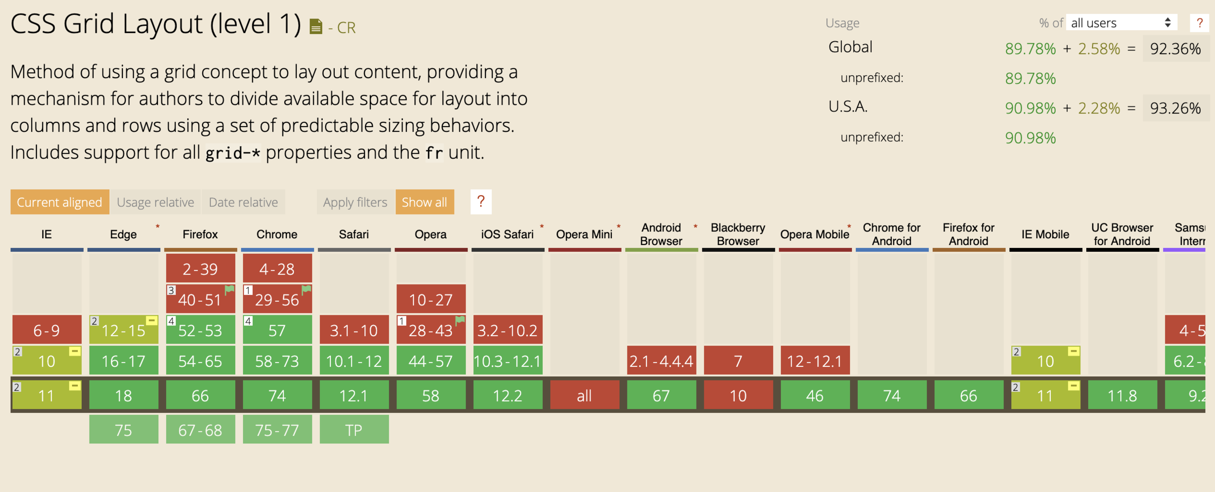
Supporting Grid
Support table from caniuse.com
as of 5/10/2019
Do websites need to look exactly the same in every browser?
.com
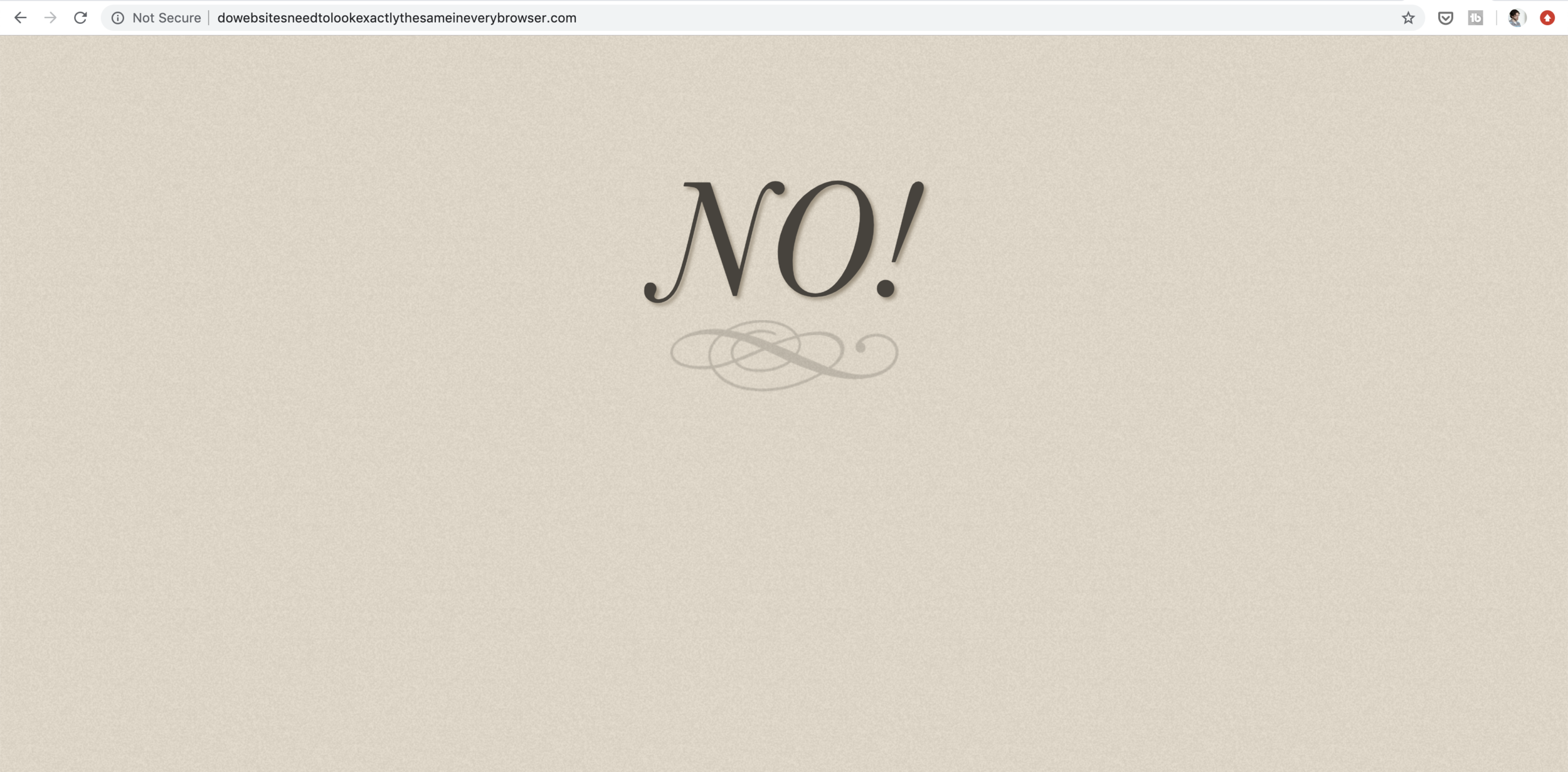
They SHOULD be:
Functional
Navigable
Useful
Quick
Content-equal
How can we support Grid?
CSS Feature Queries

.promos {
    display: flex;
    justify-content: space-between;
    flex-wrap: wrap;
}
.promo {
    width: calc(50% - .5rem);
    min-height: 30vh;
    margin-bottom: 1rem;
}
.promos {
display: flex;
justify-content: space-between;
flex-wrap: wrap;
}
.promo {
width: calc(50% - .5rem);
min-height: 30vh;
margin-bottom: 1rem;
}@supports (display: grid) {
.promo {
width: 100%; // overrides
margin: 0; // overrides
min-height: auto; // overrides
}
.promos {
display: grid;
grid-template-columns: 2fr 1fr 1fr;
grid-template-rows: minmax(30vh, 1fr) minmax(30vh, 1fr);
grid-gap: 1rem;
grid-template-areas: "main second second"
"main third fourth";
}
... etc ...
}
The Future &
The Present &
Powerful &
Liberating &
Grid Is ...
Creative &
Who to follow
- Jen Simmons (@jensimmons)
- Rachel Andrew (@rachelandrew)
- Mina Markham (@minamarkham)
- Michelle Barker (@michebarks)
Additional Education
- https://developer.mozilla.org
- https://cssgrid.io/
- https://gridbyexample.com
- https://jensimmons.com/

@brob
BryanLRobinson.com
CodeContemporary.com


Questions?
Don't like asking in front of people? Hit me up on Twitter (@brob) or after