Magazine Advert (ancillary text)
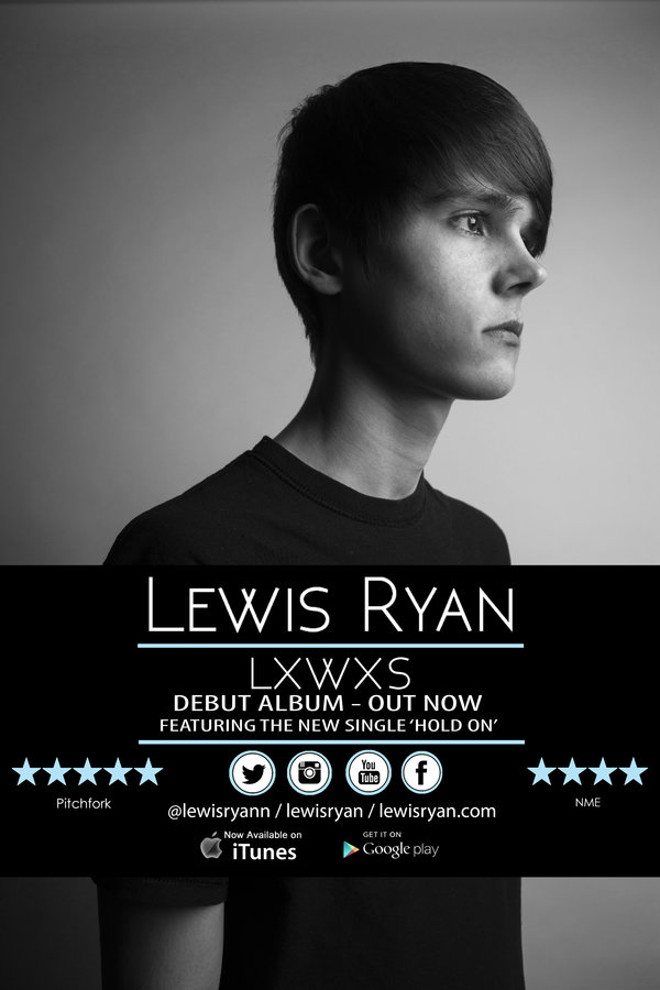
Before production
Prior to creating my magazine advert, I did some initial research on existing products that I found online. I looked at a range of different adverts from different genres some that advertised new music and I also looked at some that advertised tours. I felt that looking at both of these types allowed me to be confident in knowing the conventions needed for making a realistic product. From doing this research, I saw that the main image, album name/artist name, promotional logos (iTunes etc), release date and reviews from institutions were vital in making a conventional product that was as realistic as possible. On the following slides, I am going to talk about the adverts I looked at that influenced my final magazine advert.
Existing products
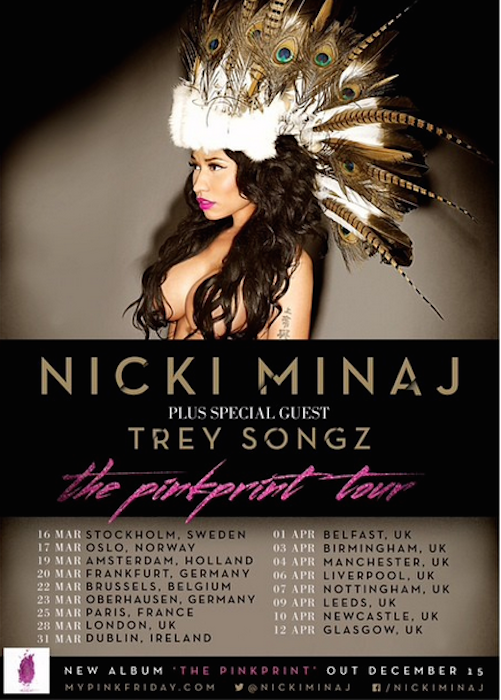

This is my magazine advert up against 2 existing products that I looked at when researching. Although these are tour posters, I felt as though tour posters and magazine adverts are set out very similar so all I had to do is follow the conventions from a magazine advert to appear on mine, to follow these conventions, I looked at some existing products like Jessie J's album advertisement. I have followed the style of Hobbie's by using a black and white image because I felt this looked really professional and also it fit in with the colour theme of my digipak. I used a black box which I put all my text in as I felt it would be more visible this way, much like how Nicki has done on hers. I did this to highlight the information because otherwise without it, the text wouldn't be as visible. Also as you can see, each individual advert has the artists name in a slightly bigger font than the rest of the text. I also followed this convention because I felt like having the artists name in a bigger font would draw the audiences attention in.
Existing products part 2

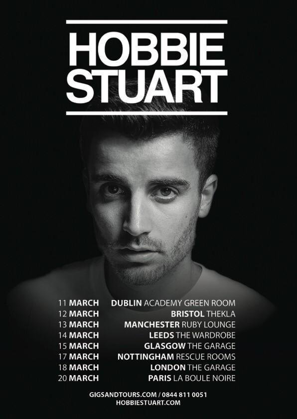
The main influence for my own product was Hobbie's advertisement. I liked how on Hobbie's poster he had outlines around his name. I followed this in a way as I have outlined the album name, release date and the featured hit with lines. I felt like this was a good addition to the poster and I felt like it drew your attention to that bit, hence why I followed the design. I also really liked how his was in black and white because I felt like it was quite striking and stood out a lot, especially with the dark lighting behind which made the focus in the centre, where his picture was placed. Highlighting him brings your attention to the artist, making them recognisable to the audience.

cONVENTIONS I FOLLOWED
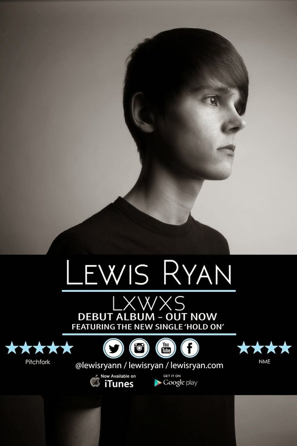
When making my final product, I did the research I needed to do and I followed these conventions on my magazine advert:
-Artist Name
-Album Name
-Release Date
-Social Media Links
-Rating from existing institutions
-Purchase Promotion Plugs (iTunes/Google Play)
I also featured the text saying 'Featuring the new single 'Hold On' because this is the song I made the music video to. This makes it a lot more appealing to the audience because if they've heard of the song and they like it, they may want to look at the rest of the artists music.
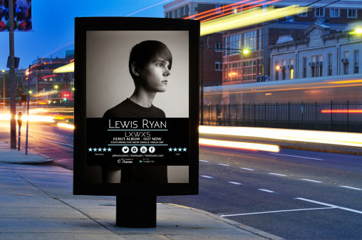
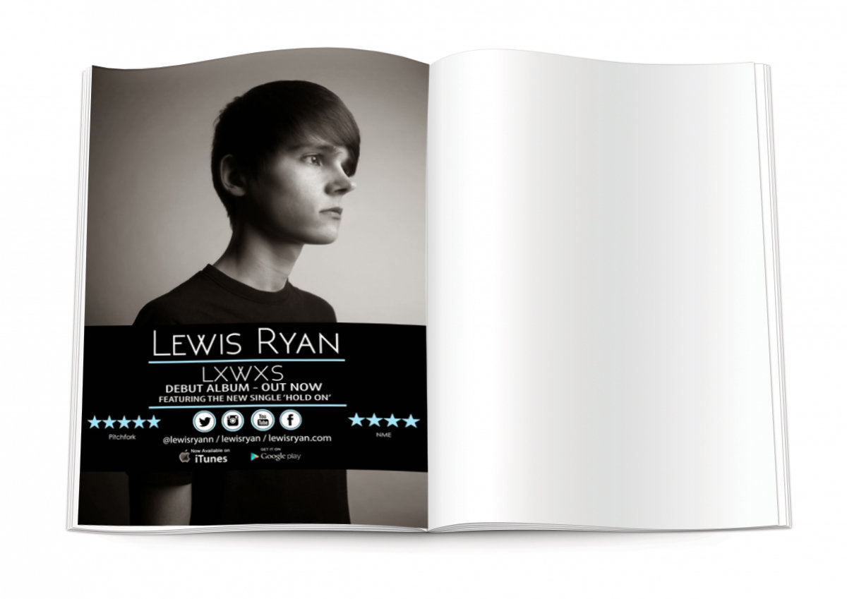
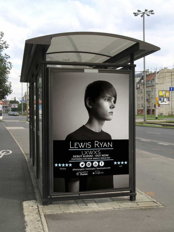
To see how realistic and effective my product looks, I decided to Photoshop my advert into existing adverts on bus stops, billboards, in a magazine etc. These are the results:
cONCLUSION
Overall, after putting my advert in places of existing adverts, I can see that my product works really well and looks how I imagine a real product to look. The only criticism I will give myself is that I think with it being a dark picture, I don't think it stands out as much as it would if it was in colour but because the theme of my ancillary texts is mainly black and white, there is not much I could do about this because this would defeat the object of having continuity. Also, I don't think it would look as good and professional if it was in colour. From doing this I can now see how it would look if my product was really advertised in the public.