Find a Doctor web app
Helping users easily find care options while mobile.
UX Designer | Aug 2008 - Dec 2008

How to navigate
Or use the navigator in the bottom right corner of the screen
Next Topic
(or right arrow on keyboard)
Backwards
(or left or up arrow on keyboard)
Dive Deeper in topic, when available
(or down arrow on keyboard)

Press
to advance through main topic slides
Press
to advance deeper into a topic or use case, when available
( look for a down arrow in the navigator for deeper topic slides )
Press
to advance through all slides (including deeper topics)
Overview
While it's quite an old project now, especially given how far mobile design has progressed and moved to native apps, it was such a pivotal project for me and my way of viewing the design process that I still enjoy showcasing it.
Notes
Not long after the iPhone revolutionized the way we browsed the web, Catholic Healthcare West was seeking a mobile web presence as a market differentiator in this new smart phone era.
Challenges
My Role
- Product Strategy
- workshop facilitation
- User Research
- Comparative Analysis
- Paper Prototypes
- Storyboards
- Wireframes
- Lo-fi and Hi-fi Design
- Mobile HTML / CSS Creation
- Mobile Javascript Testing
- Multiple Device Testing
Front-End Developer
User Experience Designer
- Touch screen UI mental models were fresh and best practices were still being defined. Requiring additional insight gathering and testing.
- Stakeholders (marketing & branding ) didn’t have a clear vision of what they wanted, they just wanted a "innovative" presence out there. (In hindsight this was a glorious opportunity to accurately define the problem and the solution.)
- No in-house personnel with expertise in designing, developing or researching in this field.
- No comparative analysis on any healthcare site could be found for mobile specific web experiences, leaving little understanding of expectations or mental models from users.

User Interviews
Comparative analysis
Quantitative analysis
To get a better understanding of what users needed from a mobile hospital website I conducted informal interviews with select users with smart phones.
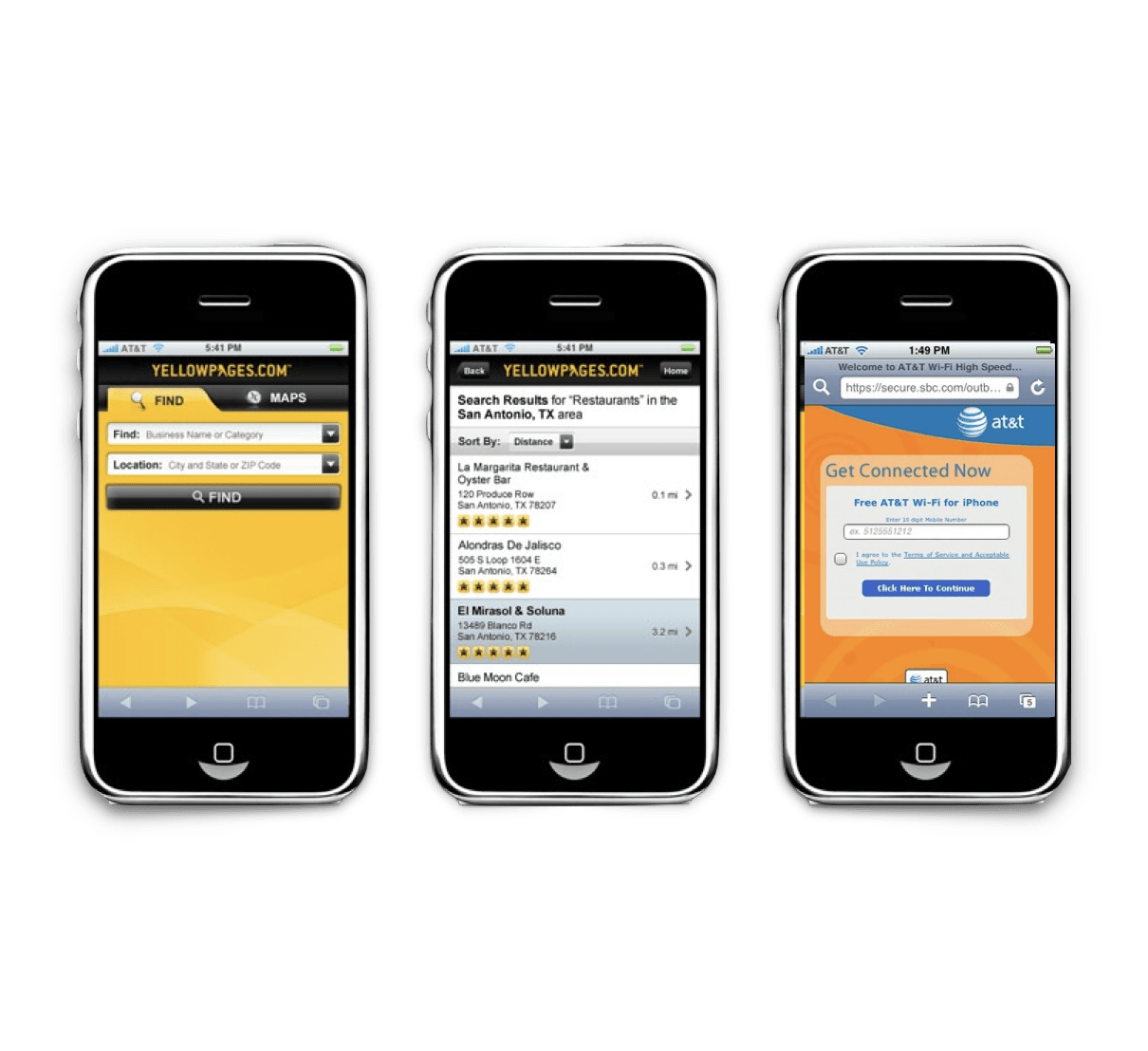
To help with concept and design I performed a comparison of simular mobile views to determine trends or patterns to test with our users.
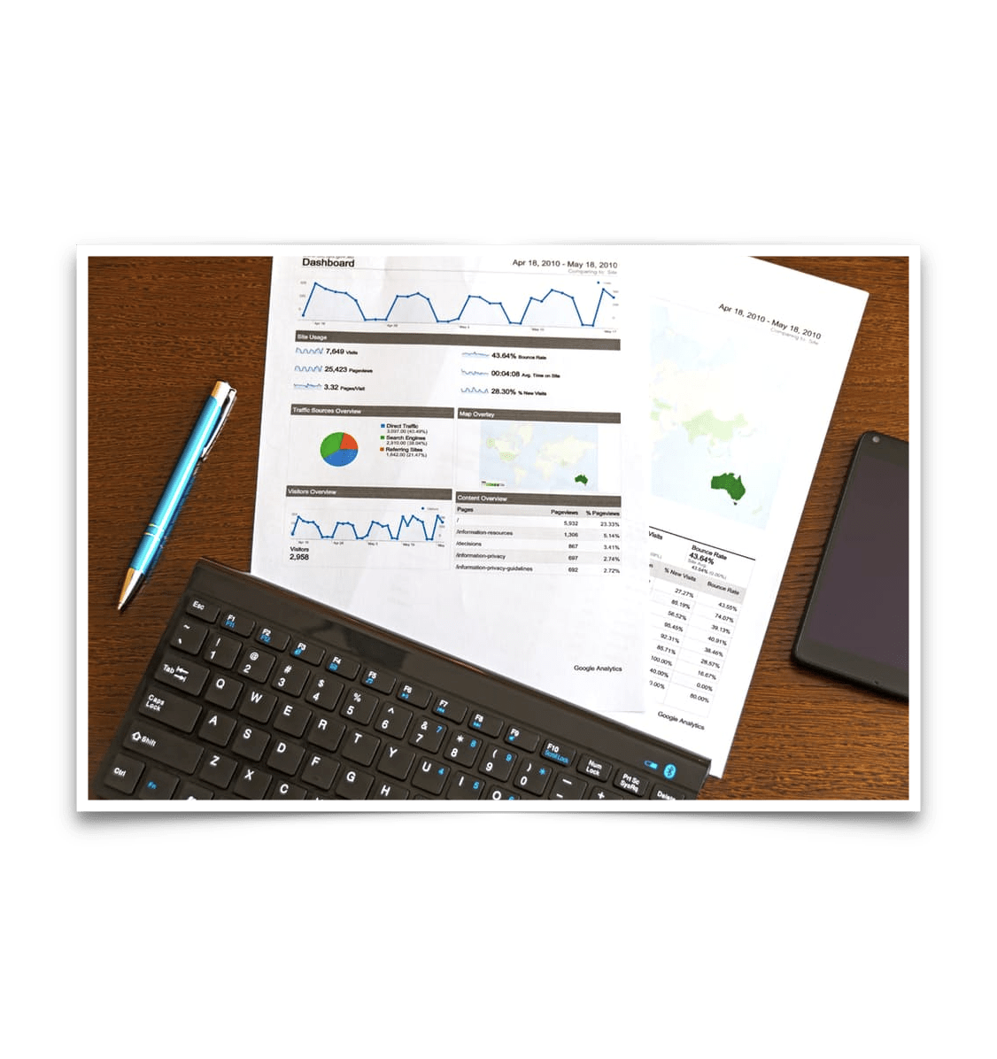
Pulled analytics and monitoring data on the client's website to better understand all demographic trends, where users were going, and the context they were visiting (mobile vs desktop)
Trends emerged around the desire to find a doctor based on various factors beyond just the doctors name, like specialty or location.
Most users stated that in the mobile context, all they needed was contact, directions and visiting information served quickly and mobile-friendly.
Healthcare mobile-specific views comparisons were hard to come by given smart phones with large touch screens were still fairly new.
I spend most of the time looking at shopping, restaurant searching/listing sites to view trends of UI patterns to come up with some idea of users' mental models on expected experiences, click identifiers, how lists and details should operate and the importance of animation in providing context to the user.
Data here was a challege to gather and analyze. The software used to monitor clients' servers was old and wasn't tracking basic analytics in general let alone new iPhone usage.
What data we did find started aligning to patterns with user interviews, like heavy use in doctor pages, directions and visiting information and contact pages. .
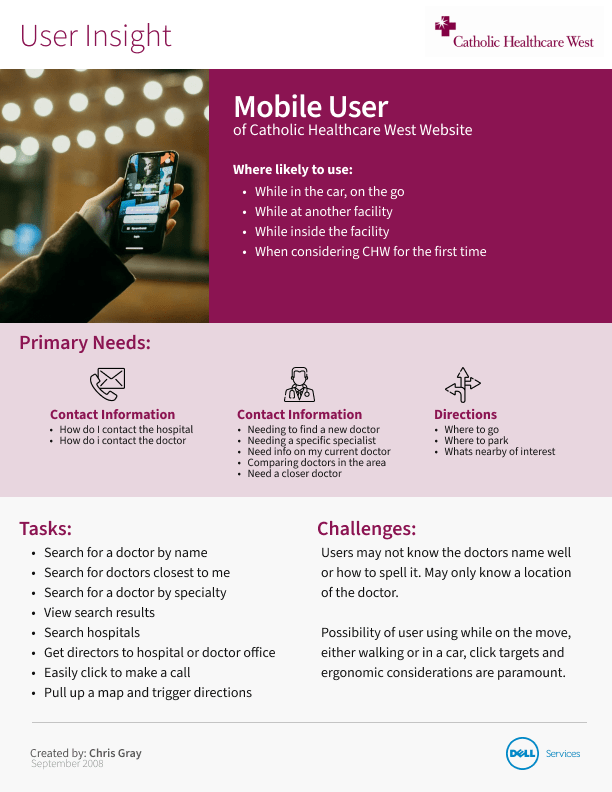
I created a simple User Insight document that summarized the findings in discovery to center the next round of work in design.
Nothing fancy here, just a simple sharable document to summarize what might be obvious to most, but serves as a baseline to bare minimal interactions and tasks needed for the work.
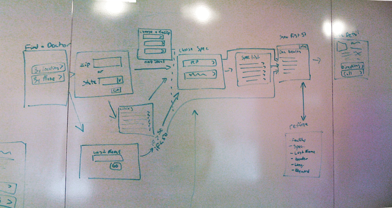
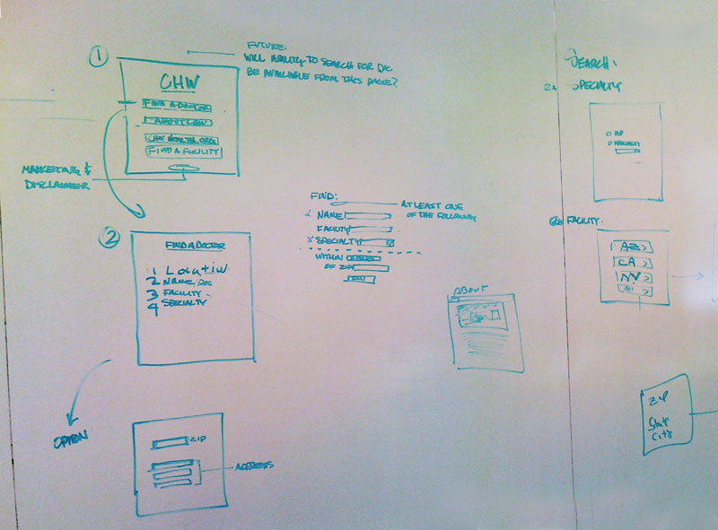
Stakeholder collaboration sessions explore various experience possibilities
I facilitated collaboration sessions with stakeholders, doing rapid sketching on whiteboards to explore various experiences. We were able to bring in work peers to run through experiences for feedback
Lo-fi wireframing enable faster diverge and coverging
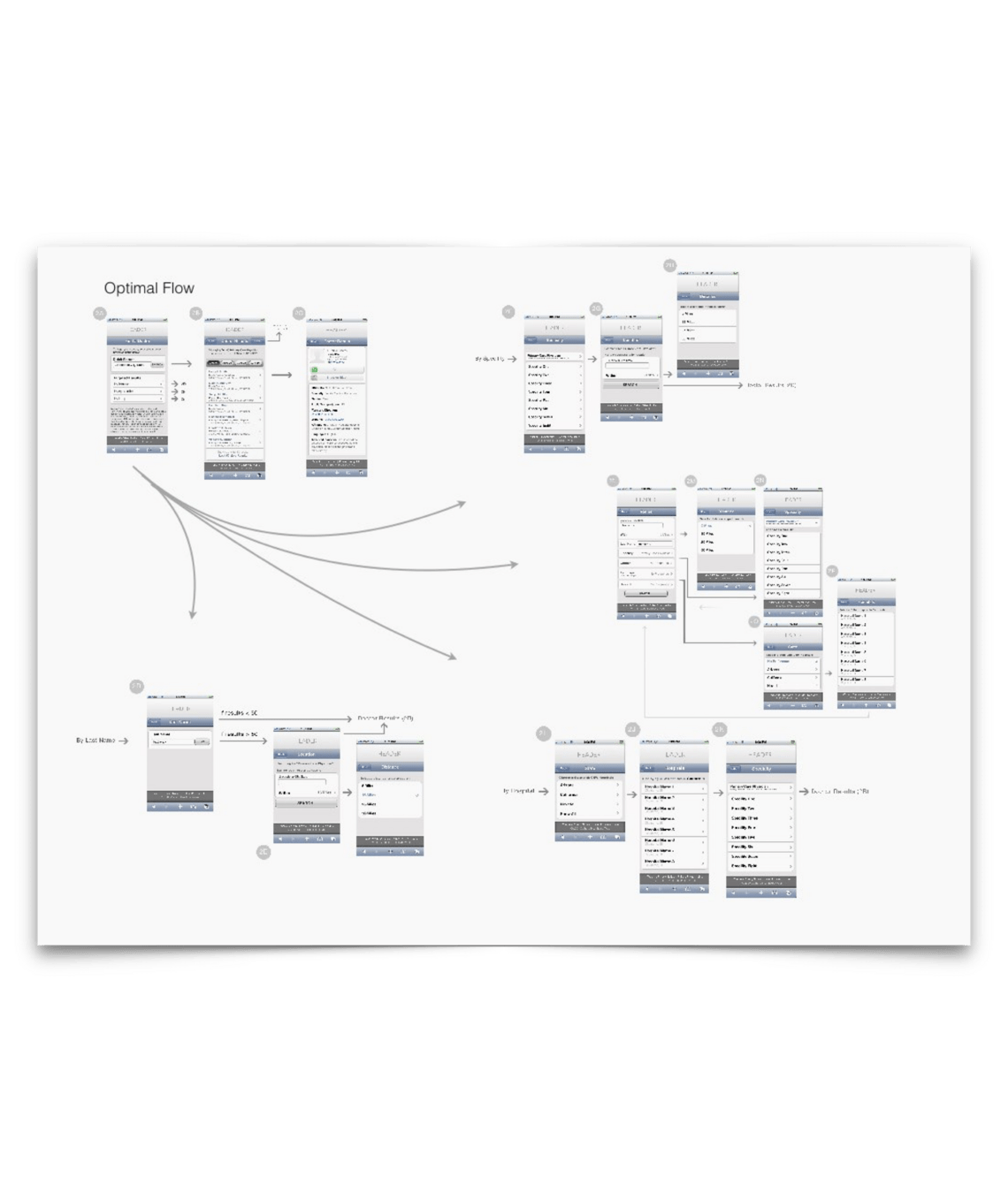
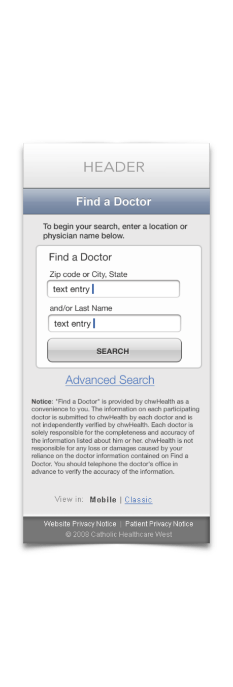


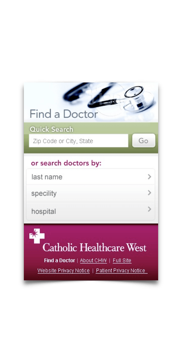
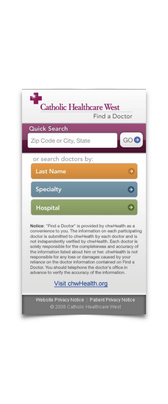
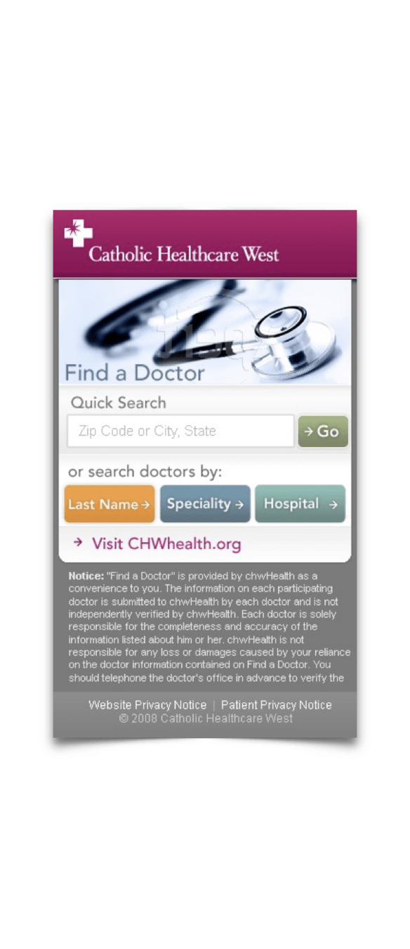
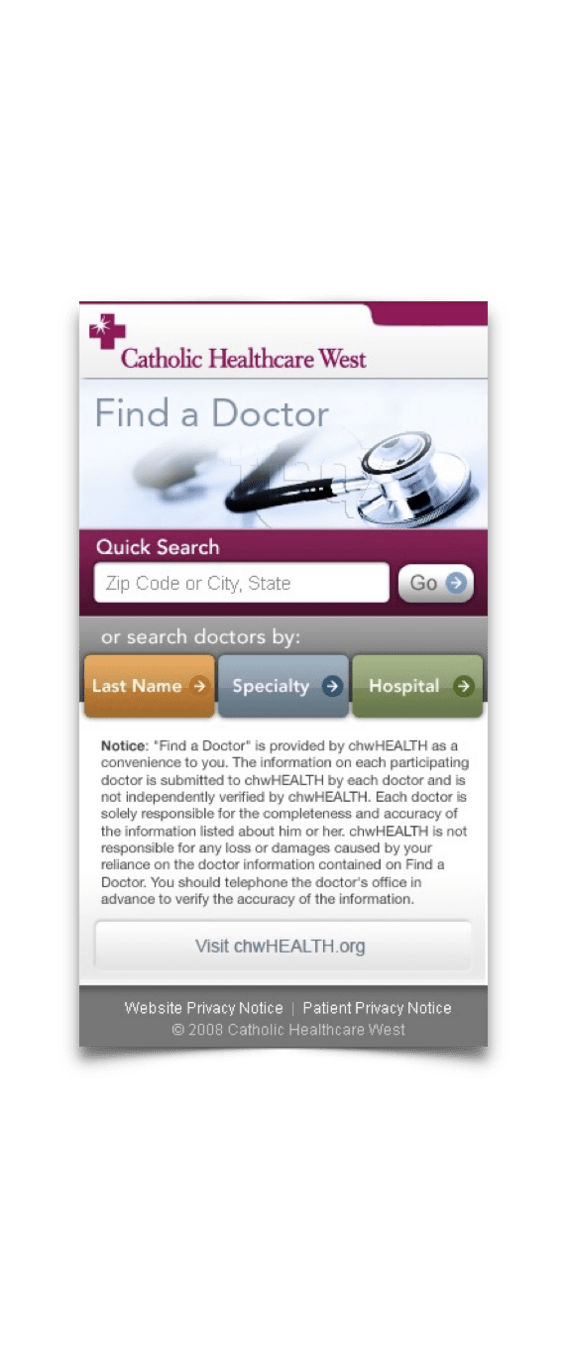
Various visual designs and setups were created, and tested with various users in guerilla-style user testing. One key stakeholder in the project was the brand director of CHW, so end site had to fit within brand standards and direction.
Visual design explorations
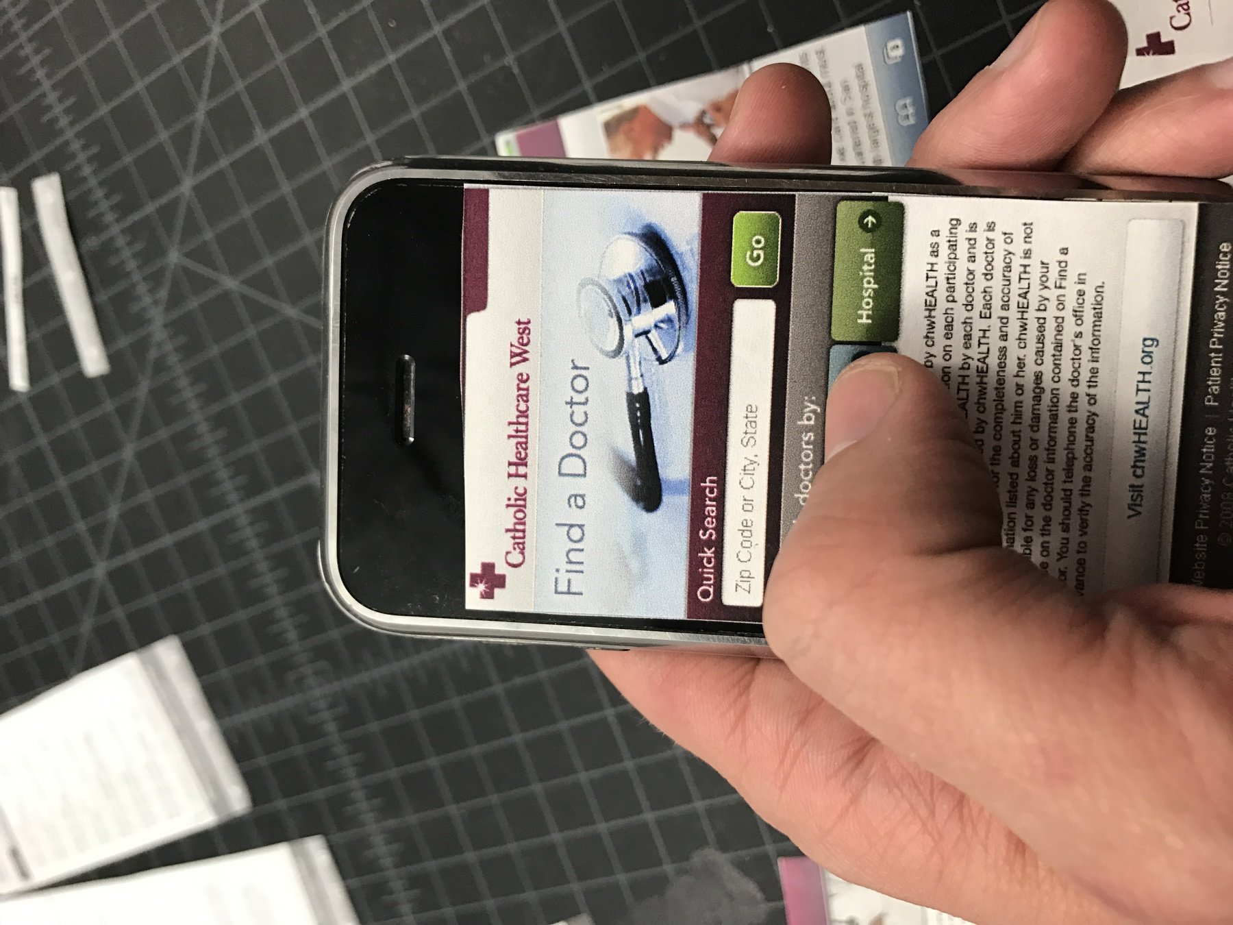
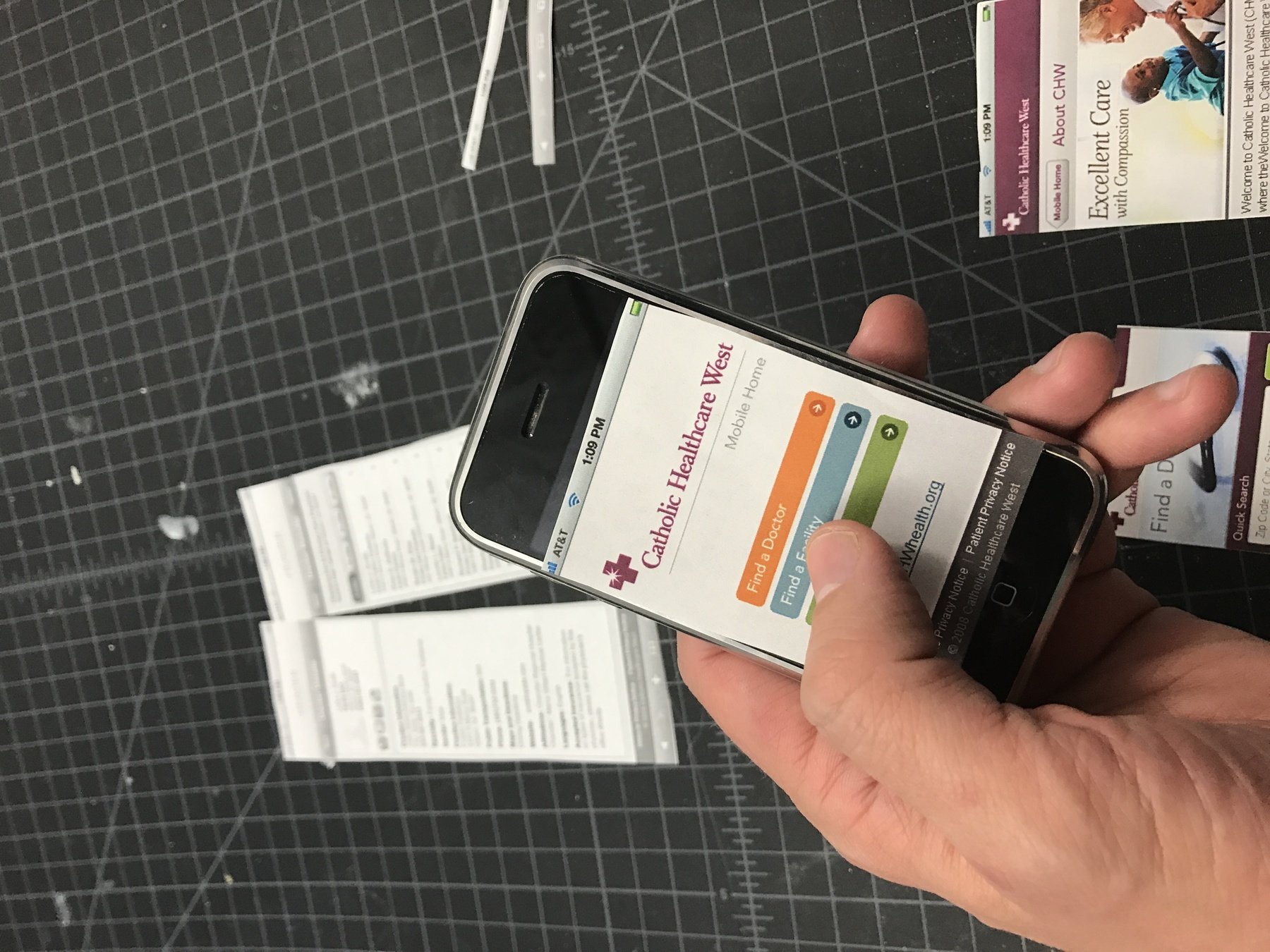
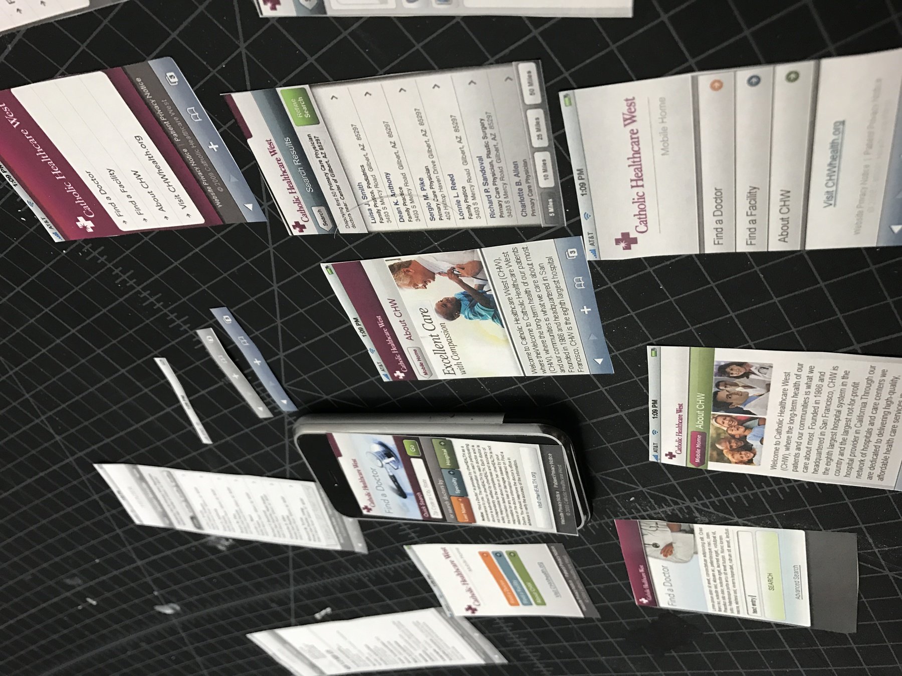
Given touch screen UIs were still fairly new, the patterns on click target sizes and placement had to be tested. The fastest way at this early stage of mobile development was to design in 1:1 so screens could be printed out, cut out, and laid right onto the screen to test thumb reach and click target sizes.
This continued well into the visual design phase (seen here) where the interfaces of various designs were tested in various contexts. For example, we tested UIs walking around, inside a car, sitting down on seats commonly found inside waiting rooms or medical facilities, etc.
Paper Prototyping : Testing UI ergonomics
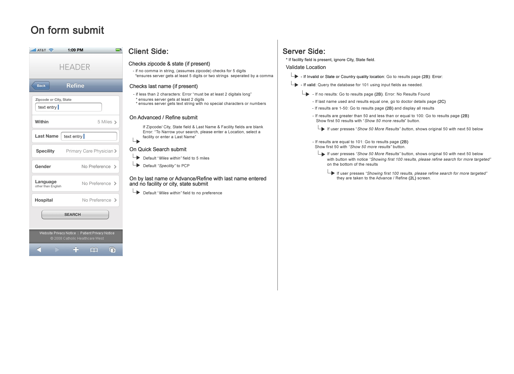
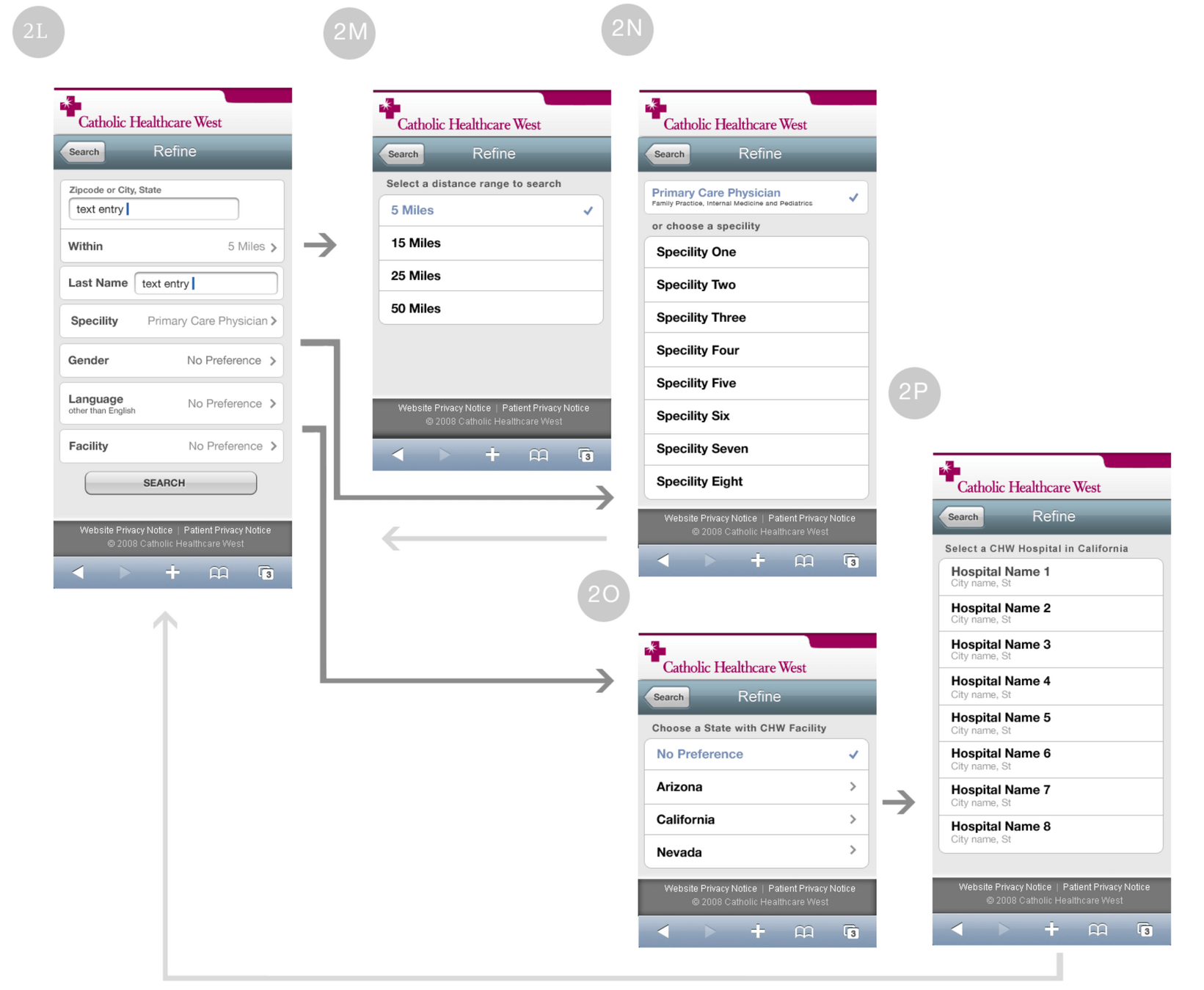
As various elements were finalized and approved. I created rapid and low-key spec documents to hand off to developers.
These documented both client side and server-side actions, conditions, page flows, etc.
Specs for development
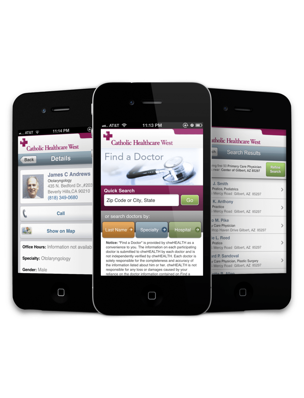
CHW received an iPhone-optimized web app specifically targeted at the needs of the user on the go.
Through research and user validation, I was able to articulate the ROI for mobile-specific views which set the tone of all future website and web applications going forward.
Results
Measurable Results
“Soft” Results
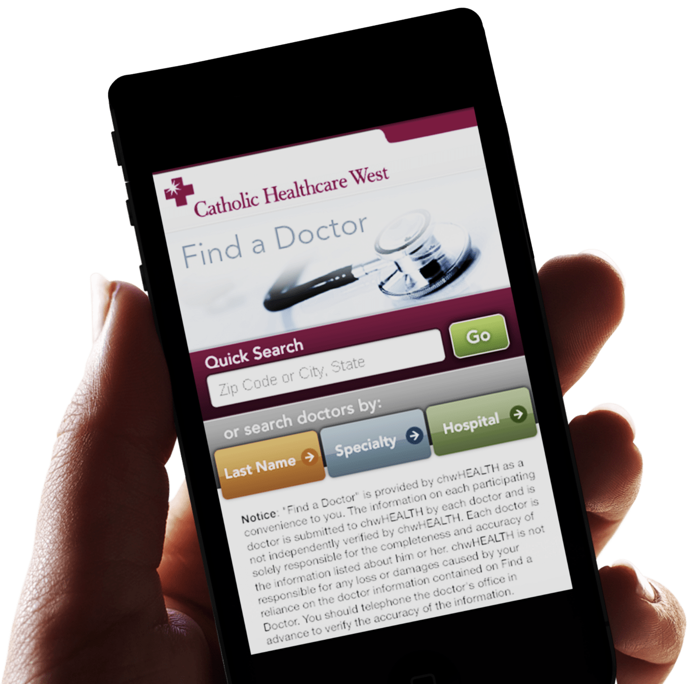
- Optimized mobile-coded pages and content loaded 300% faster than its equivalent desktop content in the same mobile browser.
- Task completion times were reduced by 40% compared the Find a Doctor website on desktops and 2.5 times faster vs when using the desktop website on the mobile browser.
- The abandonment rate dropped my 25%
CHW lead the market with a specialized web page catered directly to the users needs, not just a sloppy attempt at a responsive page, giving them a huge market differentiator and reinforcing their position as an innovative. technology-forward company
Increased customer satisfaction by providing the features they needed without increasing cognitive load or stress

Modern Exploration
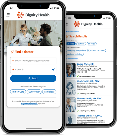
Recently I wanted to explore how this web app, given the same exact requirements, would look today given modern mental models, UI styles, etc.
Key updates
CHW is now Dignity Health, a new name, brand and visual aesthetics, all of which I reflected.
The search was simplified to include integrating the doctor's name and specialty into one single input field offloading that burden to the back-end instead of the user. In the real world, I would want to test this extensively to ensure the tradeoff works and the back-end logic can consistently detect users intent or the results page can easily present the user with simular options
Lets Chat
cgray24@gmail.com
972-265-9474