Design System Crafter & Leader
Chris Gray
Blueprint Design System Case Study
About this case study
Design systems are vast and complex, and my involvement has been extensive, spanning both strategic and hands-on roles. I’ve created this case study to showcase my ability to build, manage, and lead a comprehensive design system program.
To view more about product leadership, UX process or skills checkout my general portfolio at www.chrisagray.com
How to navigate
Or use the navigator in the bottom right corner of the screen

Press
to advance through all slides (including deeper topics)
Next Topic
(or right arrow on keyboard)
Backwards
(or left or up arrow on keyboard)
Dive Deeper in topic, when available
(or down arrow on keyboard)

Press
to advance through main topic slides



Press
( look for a down arrow in the navigator for deeper topic slides )
to advance deeper into a topic or use case, when available

Hello I'm Chris Gray
UX Designer + UX Leader + UX Technologist
As a strong UX generalist with a strong technical mindset, I have a broad background ranging from visual & interaction design to front-end development, I can understand and navigate the end-to-end product development process.
I think and work in frameworks, integrated systems, scalable components and services architecture
Ericsson Design System
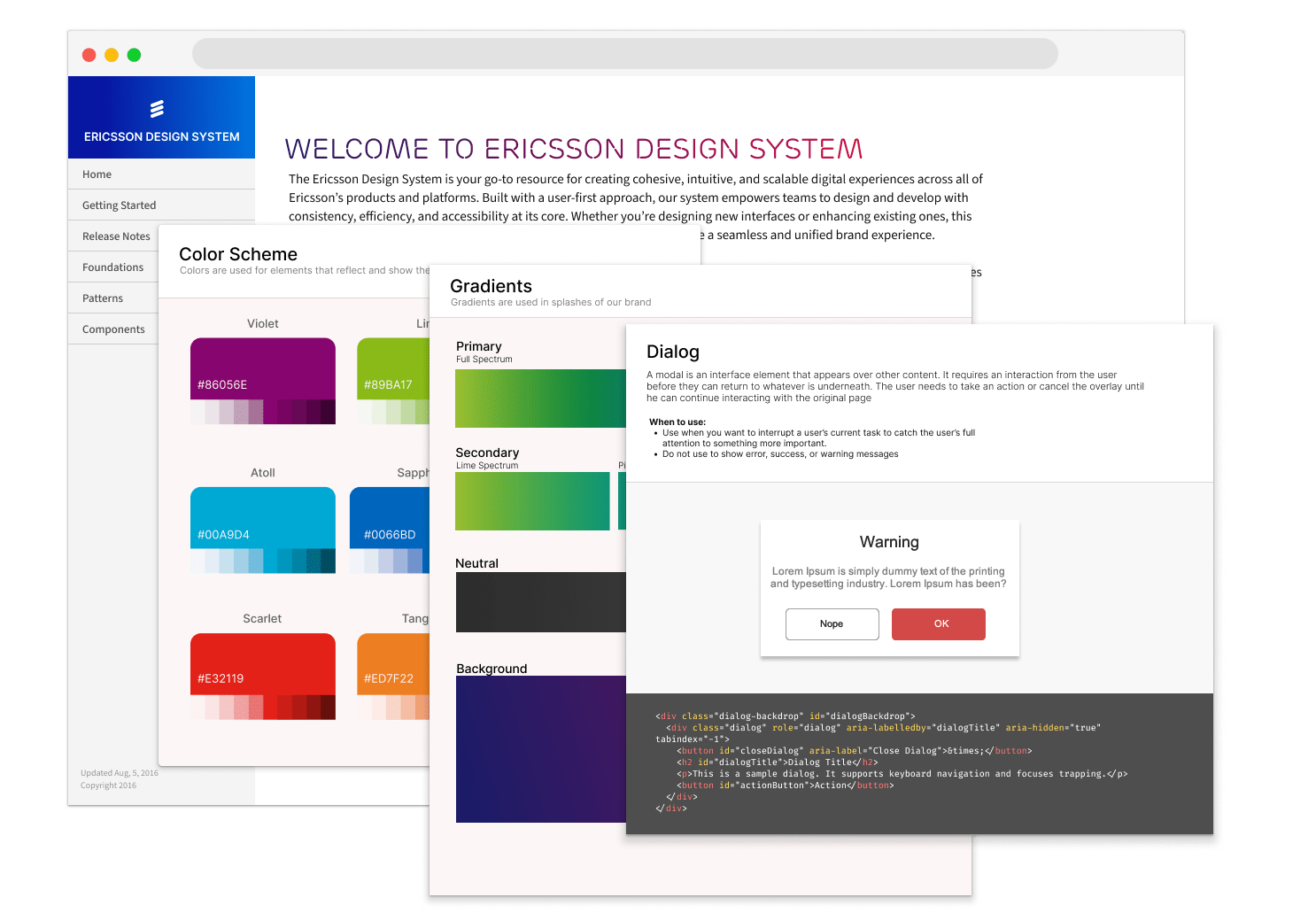
My first deep dive into "Design System" came at Ericsson (North America), creating a simple design system consisting of foundational elements and simple CSS components.
Included:
- Simple Color System
- SASS variables for colors, sizing and spacing
- Foundational CSS components
- Flat file (JAMStack) rendered documentation
Aug 2016 - Jan 2017
Deeper drive to see more
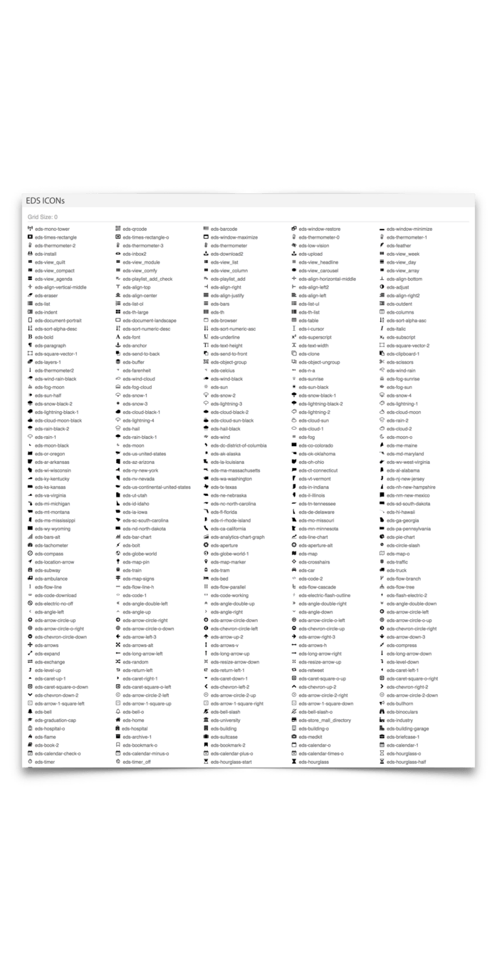
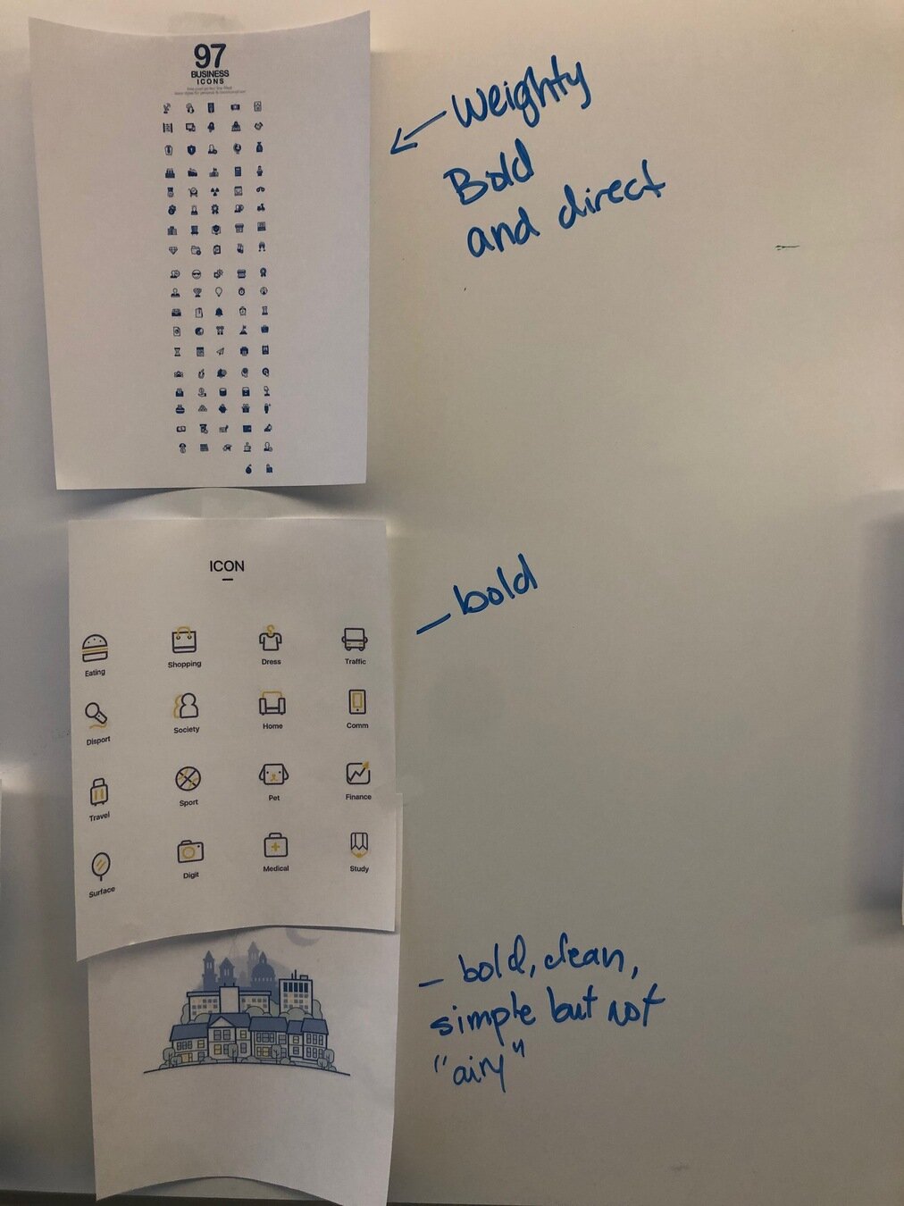
I create an extensive library to simplify utilitarian icons. These were made available as SVGs and integrated into an icon font.
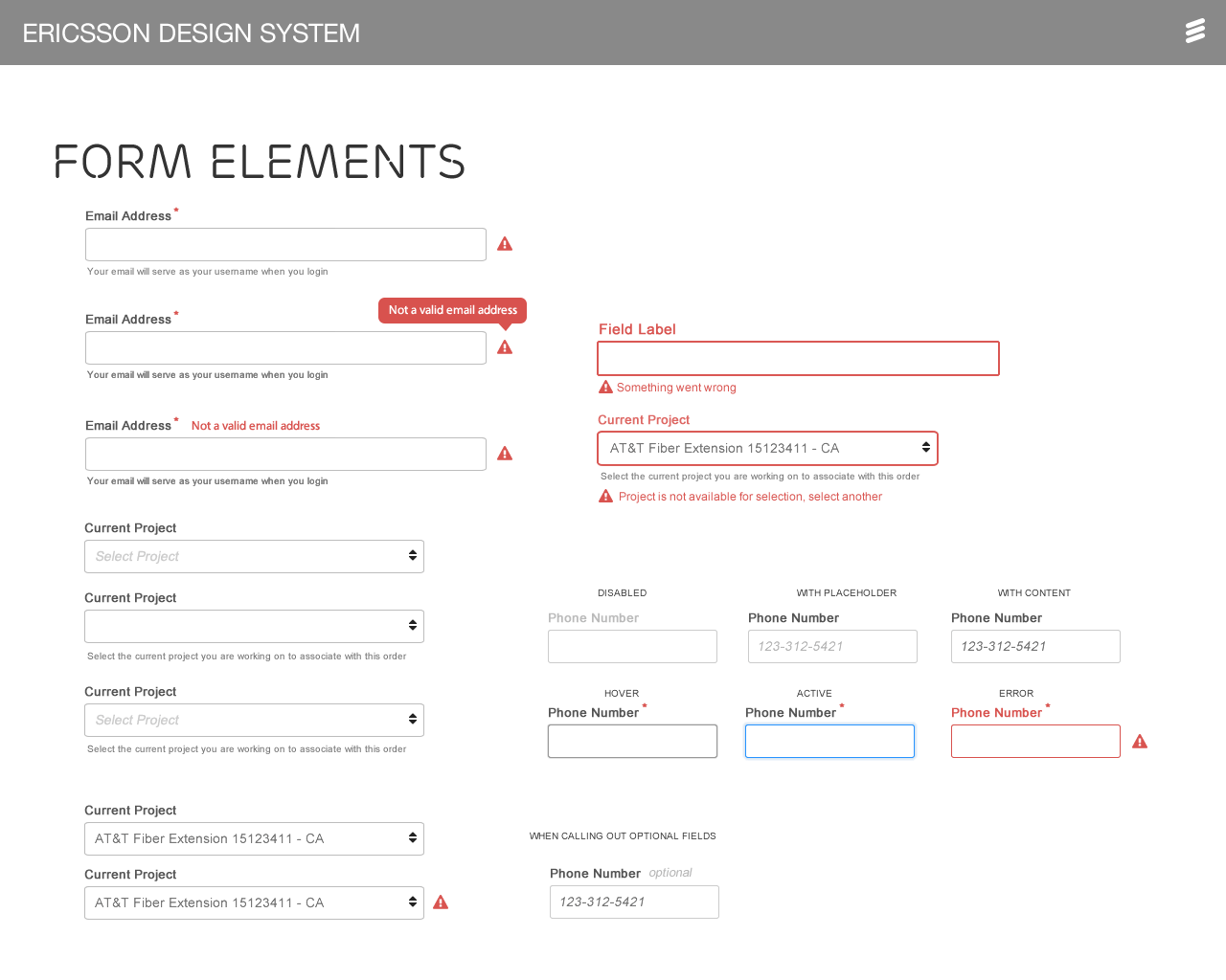
Basic components alongside a Bootstrap extended css library were created, alongside documentation, so that Ericsson North America product teams could reuse the most common components, reducing development time by 30% per sprint.
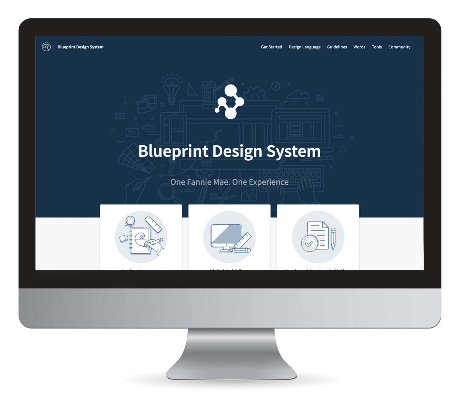

Blueprint Design System
Fannie Mae's first scalable enterprise-wide design system.
Mar 2018 - Sept 2024
Problem to solve
The state of the digital portfolio across Fannie Mae was one lacking consistency or adherence to brand, standardized components, UI Patterns or even general styling or visual design direction.
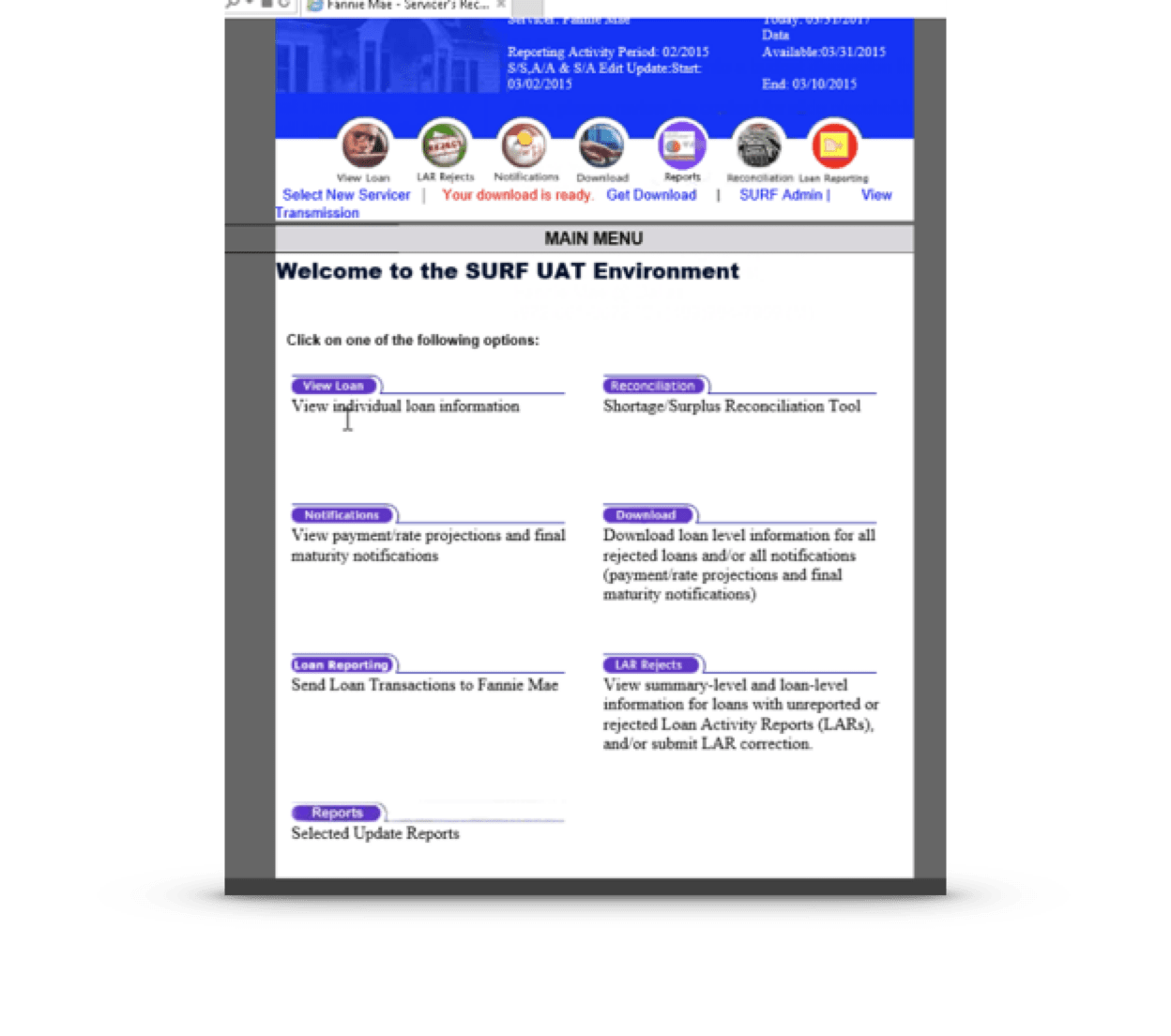
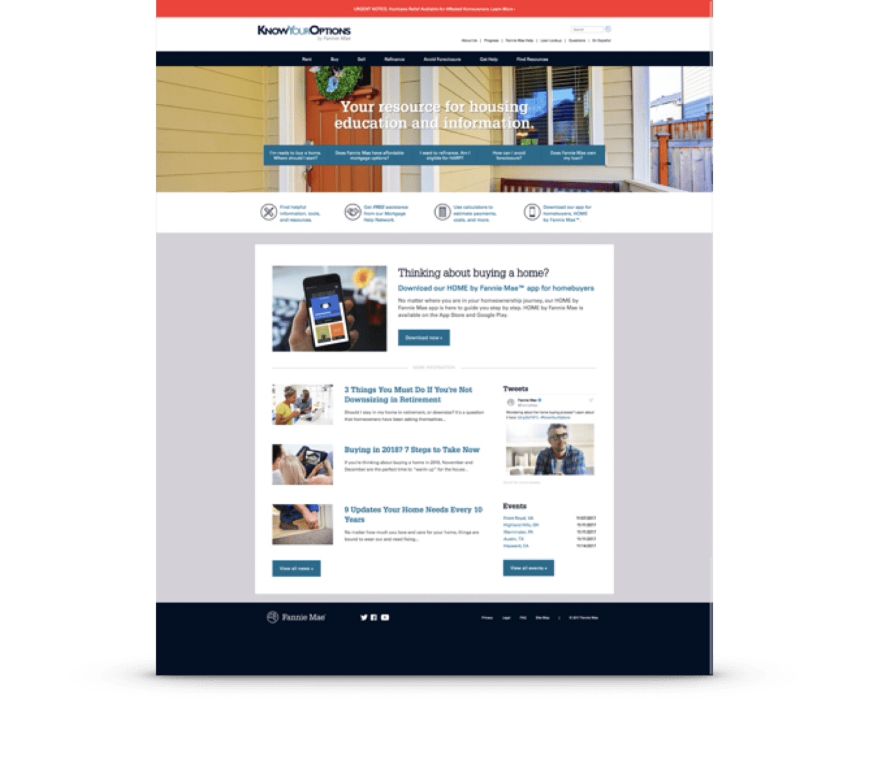
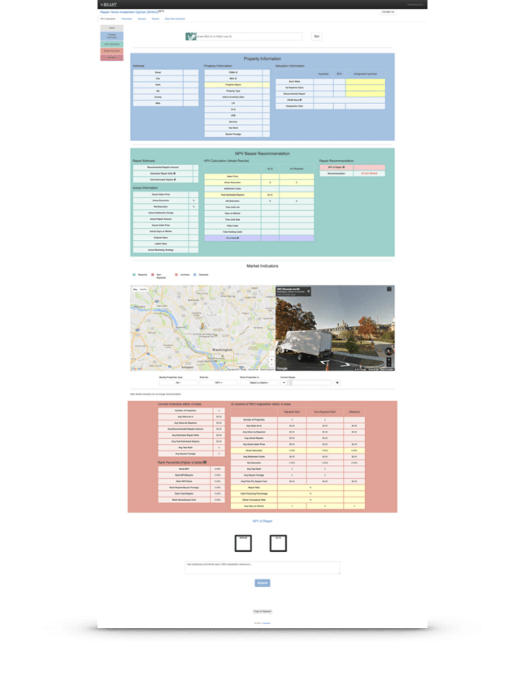
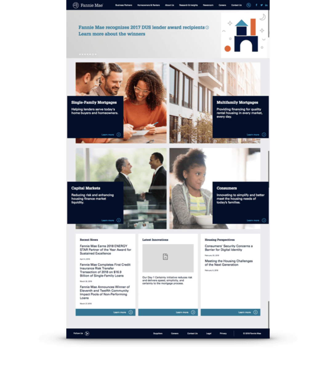
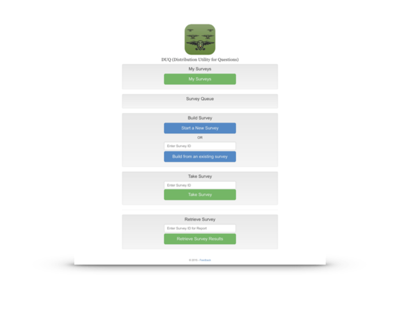
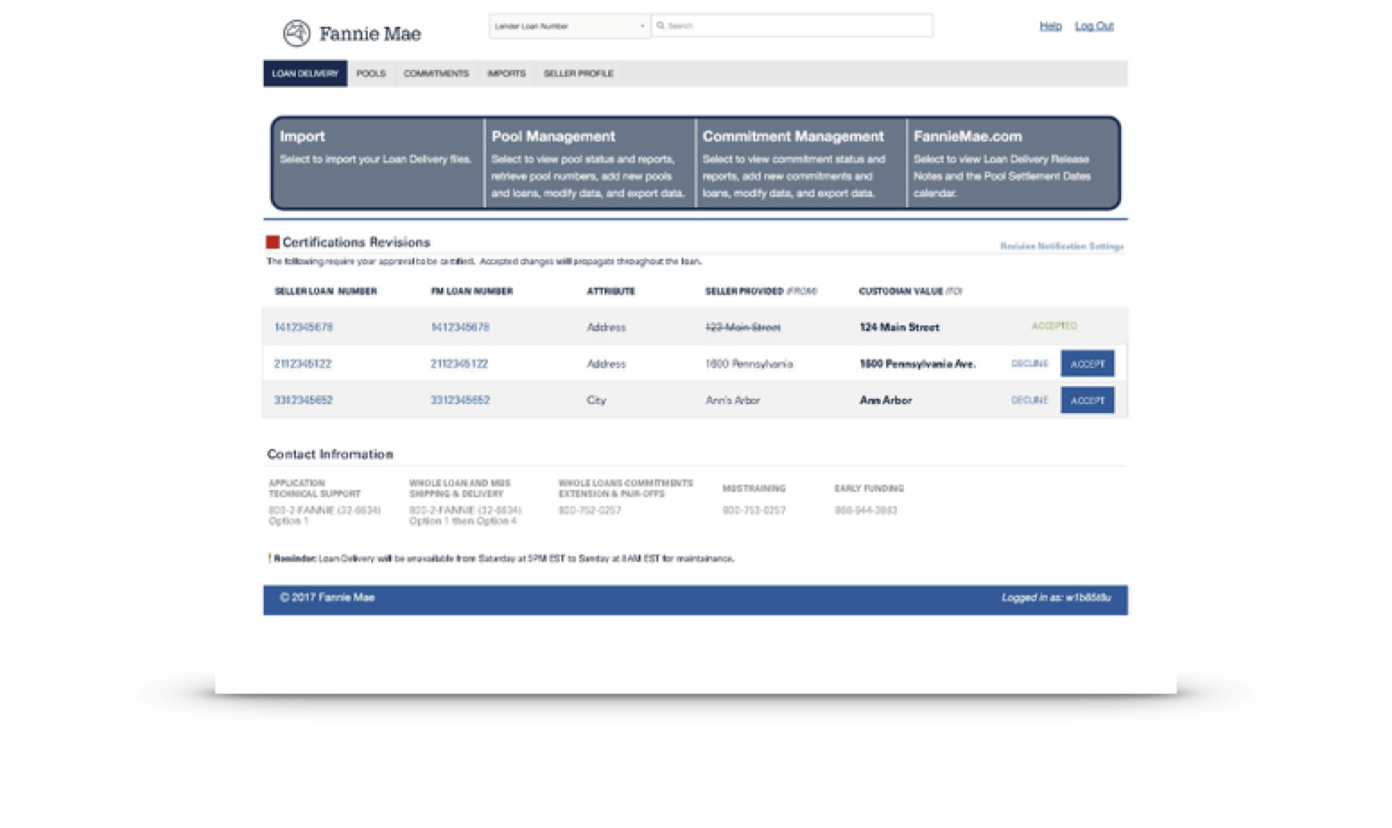


Inconsistent & disconnected experiences that lack cohesion and fail to align with brand standards.
Deeper drive to see problems identified to solve
Problems to solve
Problem: Designers worked in silos, recreating components instead of reusing existing ones.
Impact: Time and resources were wasted on redundant work, and the team struggled to maintain alignment.
Fragmented Design Process
Development Inefficiencies
Problem: Developers often implement similar UI components in different ways, causing technical debt and duplicative effort.
Impact: Increased development time and costs, and a slower time-to-market for features.
Problem: As the products were growing, maintaining a consistent and high-quality experience was coming exponentially harder.
Impact: Inconsistent updates, difficulty onboarding new team members, and challenges with scaling across teams and products.
Lack of Scalability
Accessibility Issues
Problem: Accessibility standards are not consistently applied across the product.
Impact: Non-compliance with accessibility laws and regulations, excluding users with disabilities, and damaging the brand’s reputation.
Problem: Communication gaps between designers, developers, and product managers lead to misaligned priorities and incomplete implementations.
Impact: Friction between teams, delays in project delivery, and reduced innovation.
Difficult Collaboration
Poor Brand Alignment
Problem: The product’s visual identity doesn’t align with the organization’s branding guidelines.
Impact: Incoherent branding, which diminishes brand recognition and credibility.
TLDR Solution: Program Scope
Supporting Team Members
Users and Adopters
5
Core Team Member
30+
Direct Contributors
80+
Product Adaptors
60
Design Users
100's
Developer Users
CSS Component
Library

CSS Utility
Library
Figma & Sketch
design libraries

Angular & React
app frameworks

Token repository
Key products included:
Storybook Documentation & testing
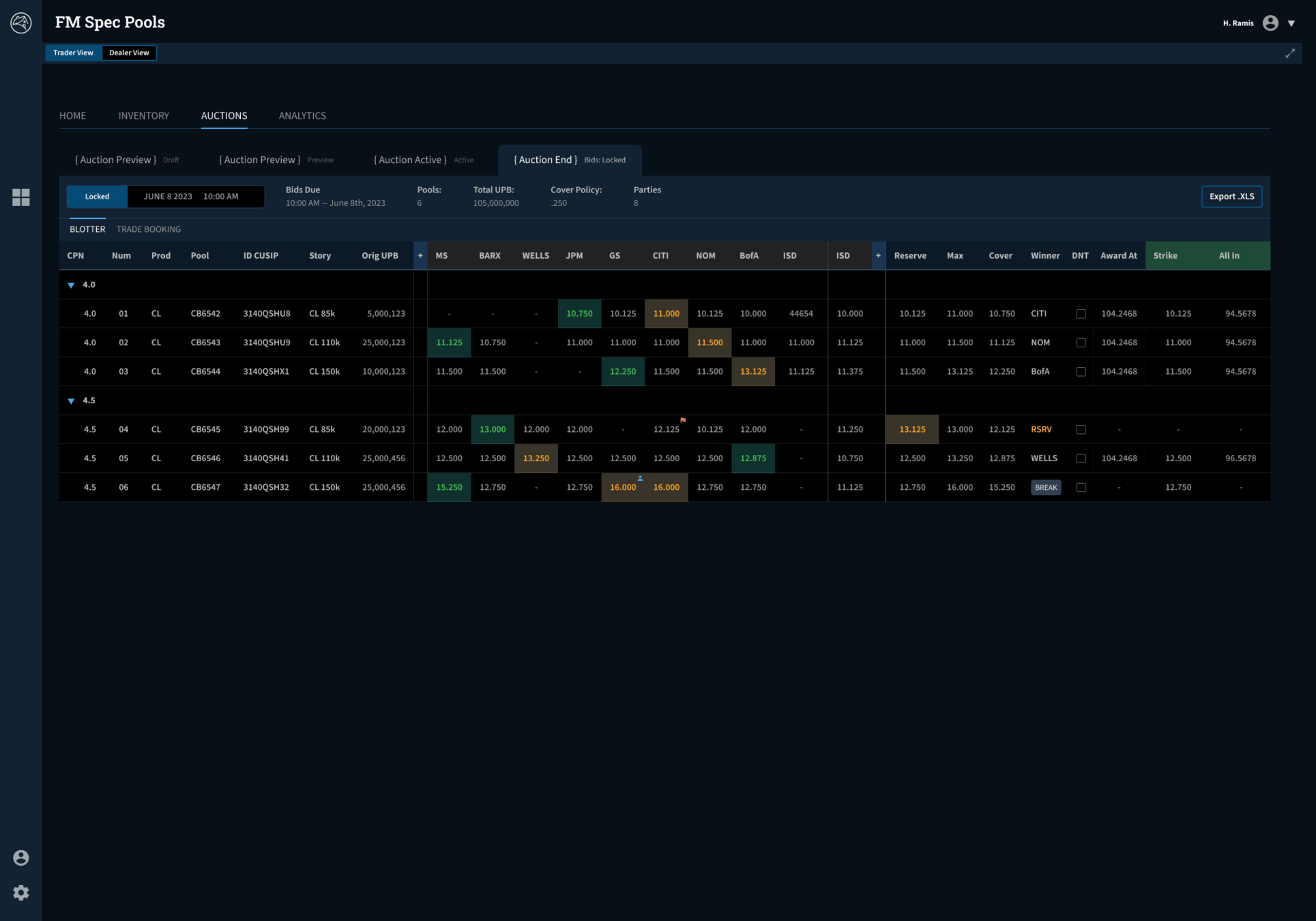
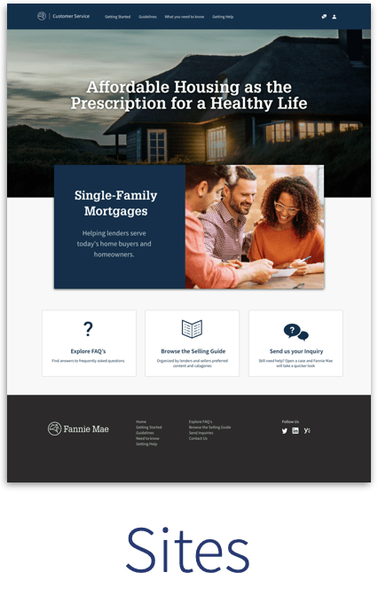
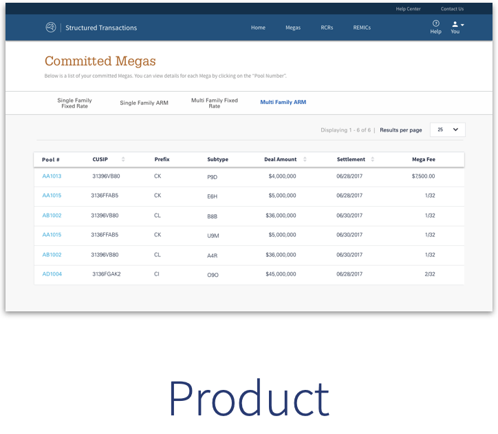
Websites
Light productivity
Dense task based productivity
TLDR Summary: Wide scope of product usage
TLDR: Solution
Standup a Core Design System Team
Create a core design system team under the centralized design team to
Create a solid atomic design language and foundation
Create a core design system team under the centralized design team to
Build designer and developer tooling
Create a culture of design , collaboration...
TLDR: Timeline
TLDR: Impact


Before
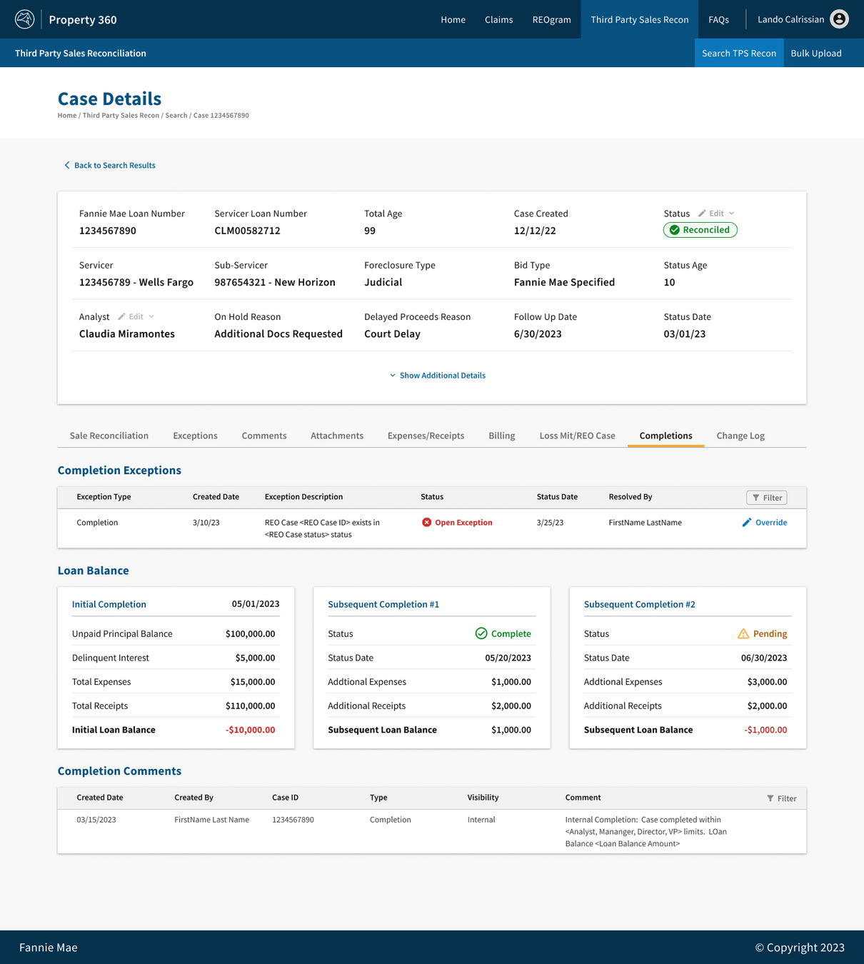
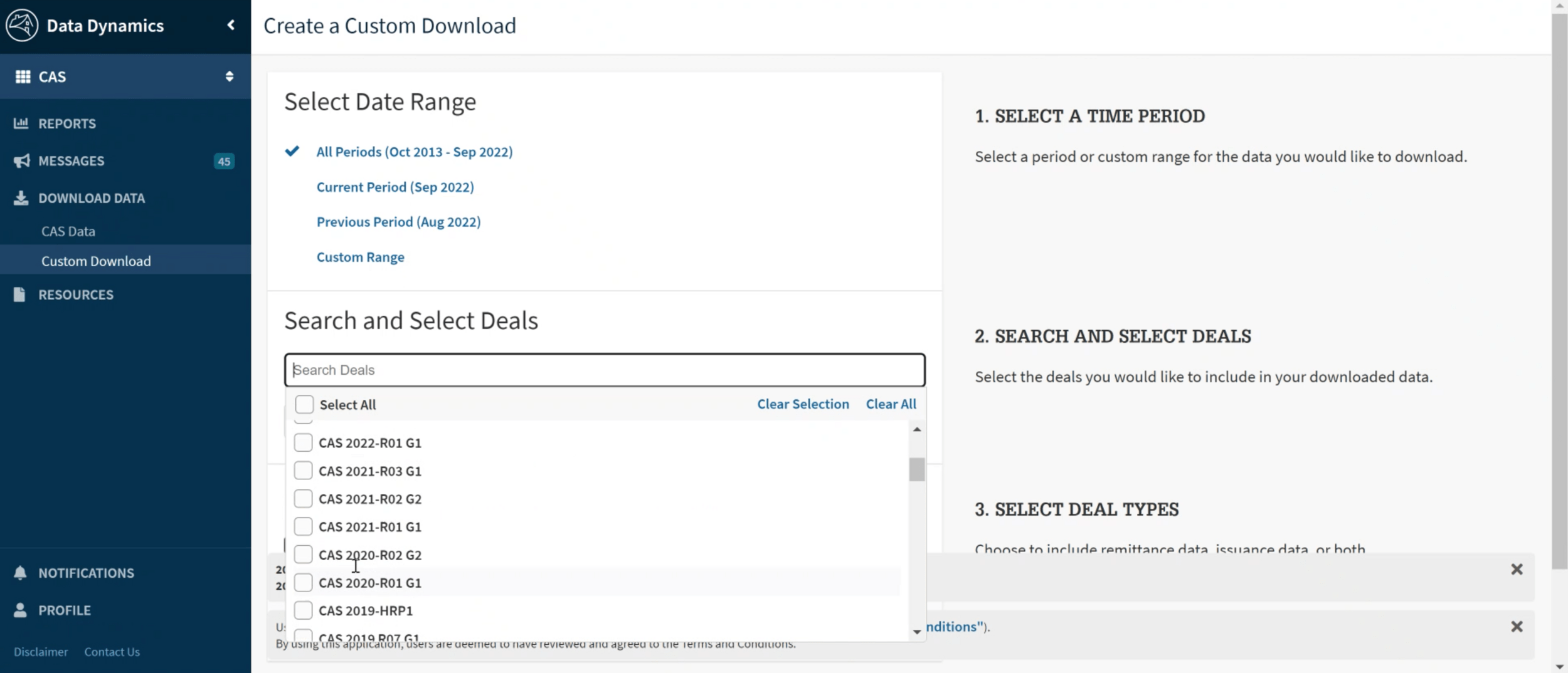
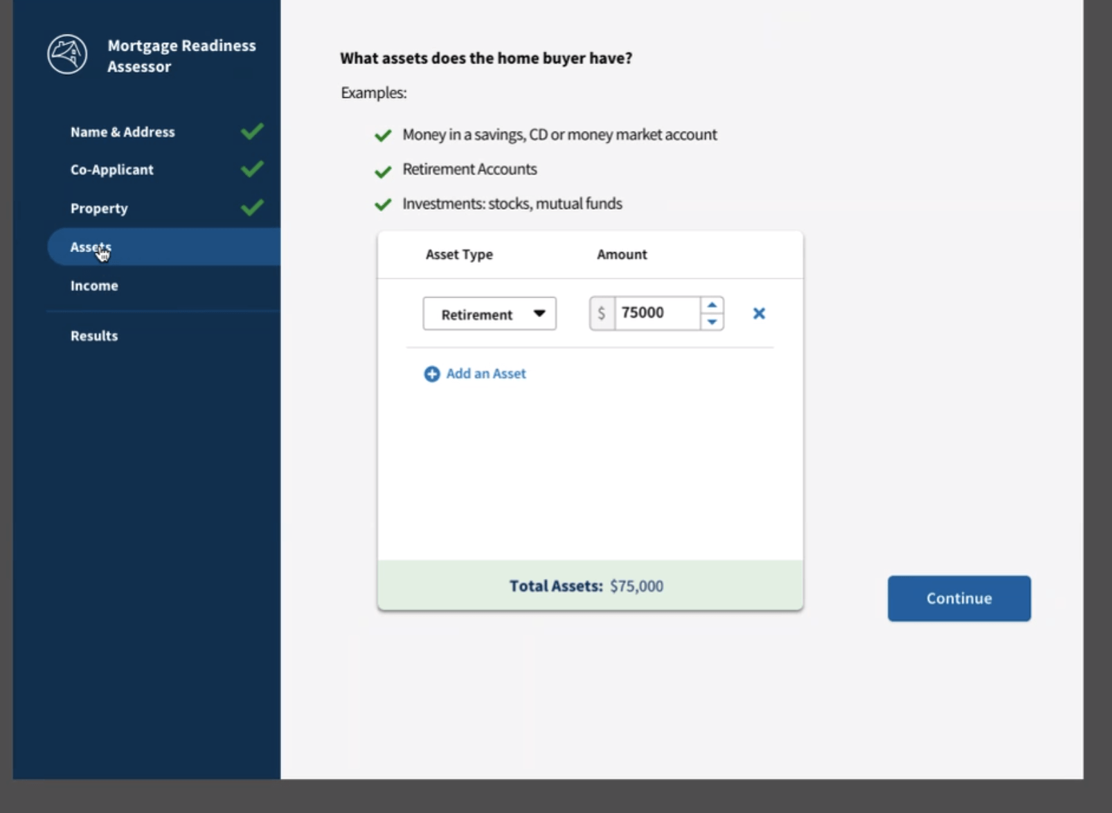
Sites and applications were disconnected experiences both in UI, information architecture, brand and style
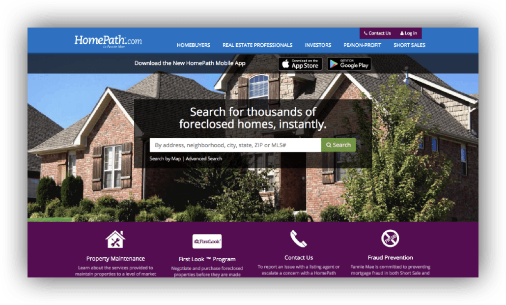
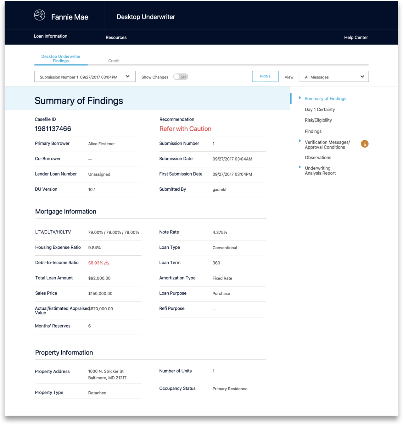

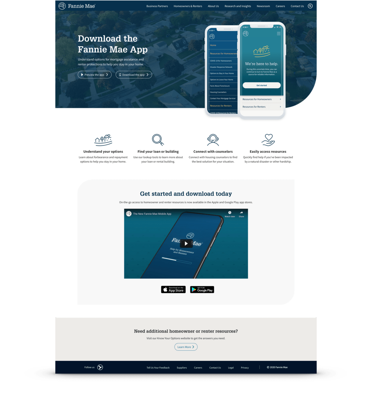
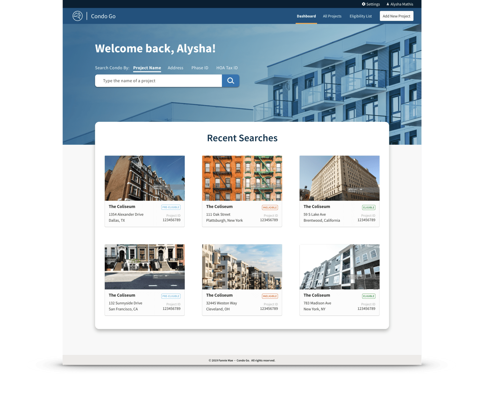
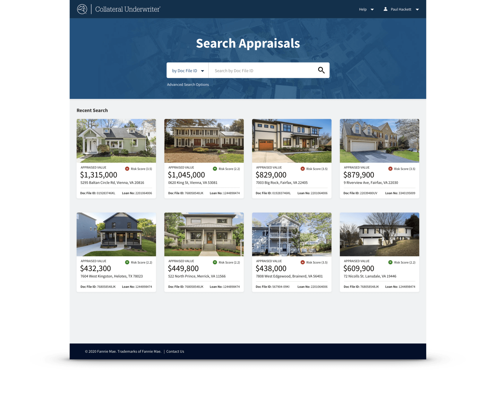
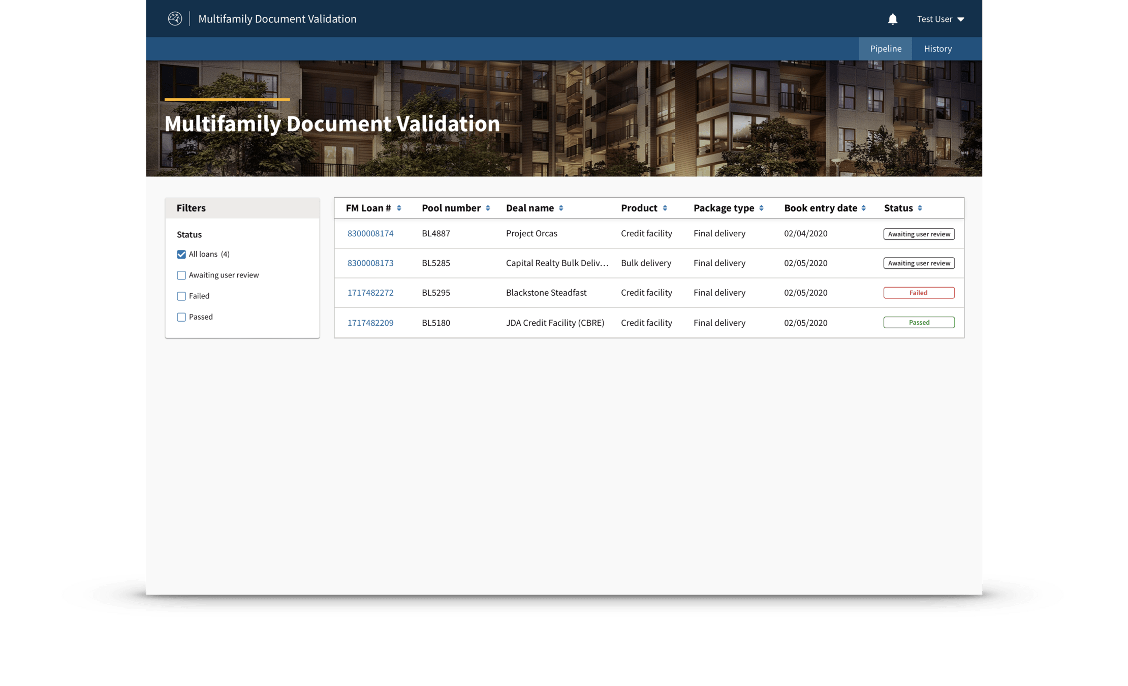
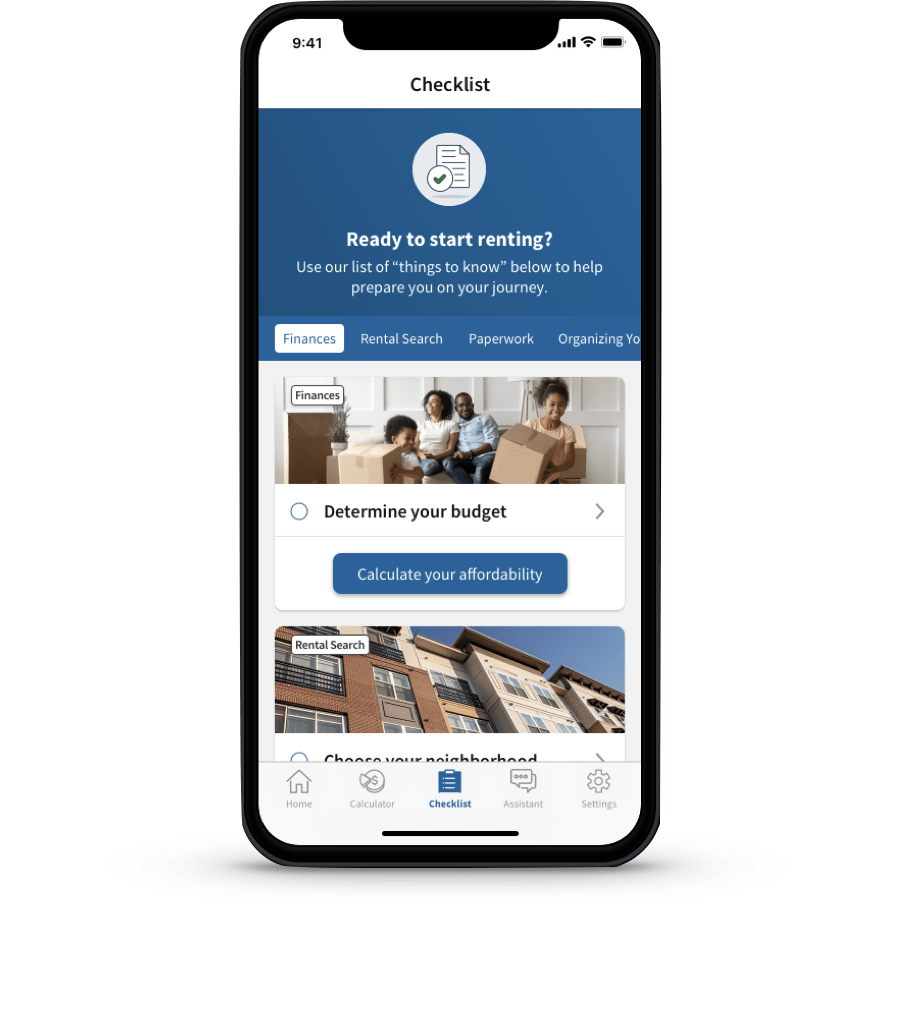
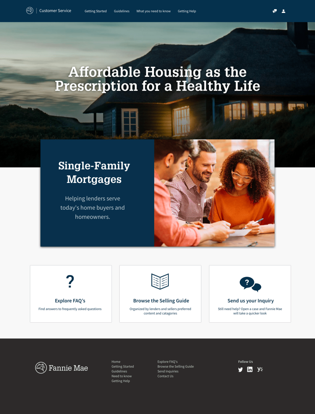
After
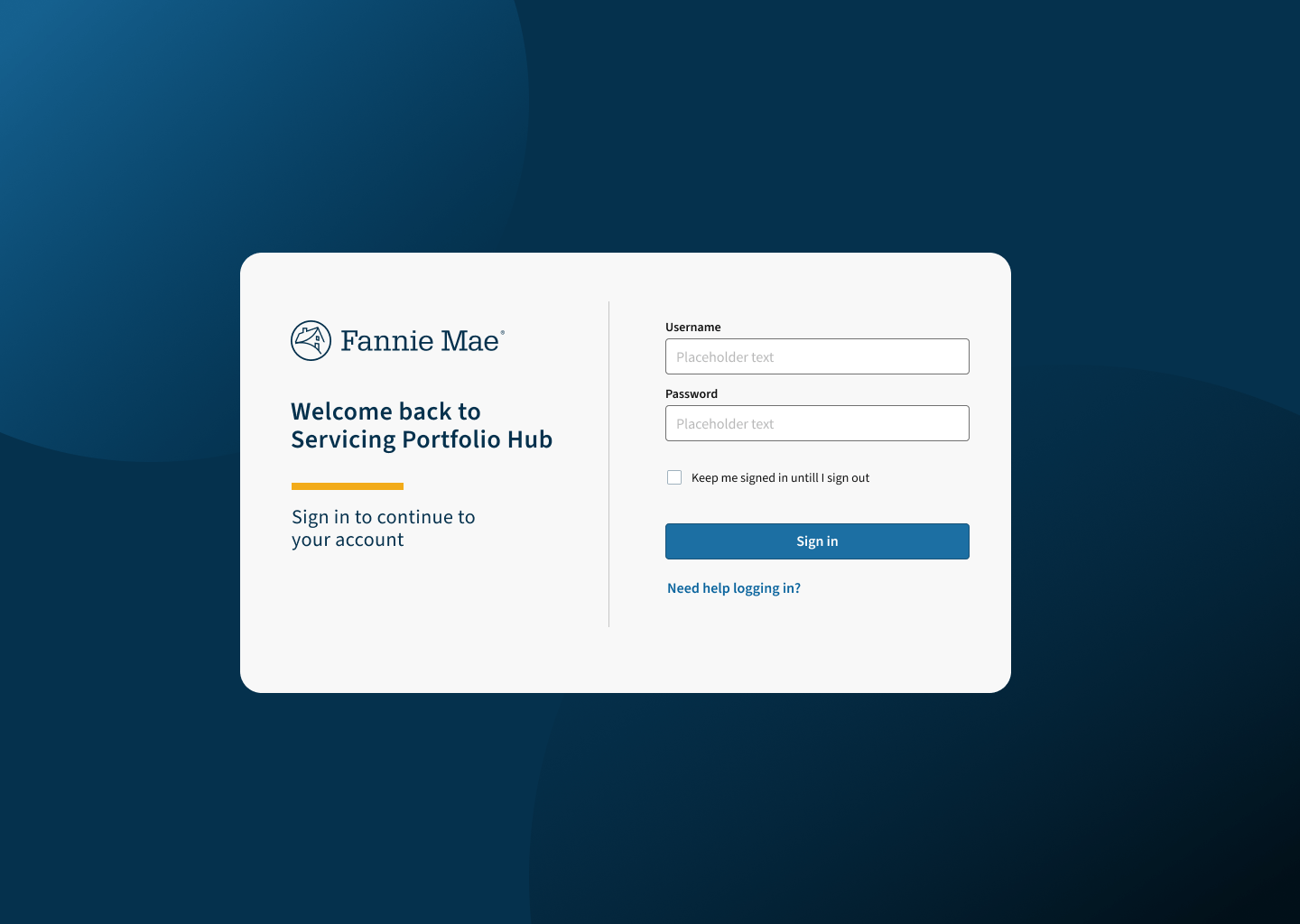
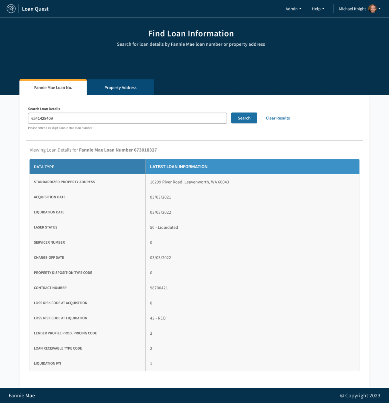
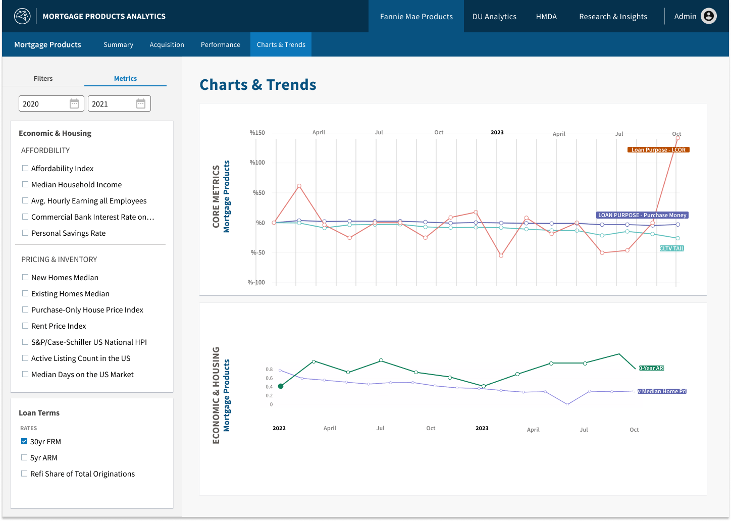
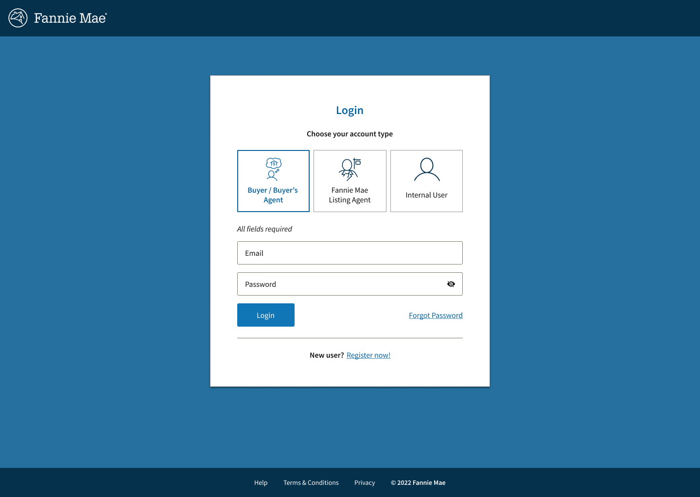
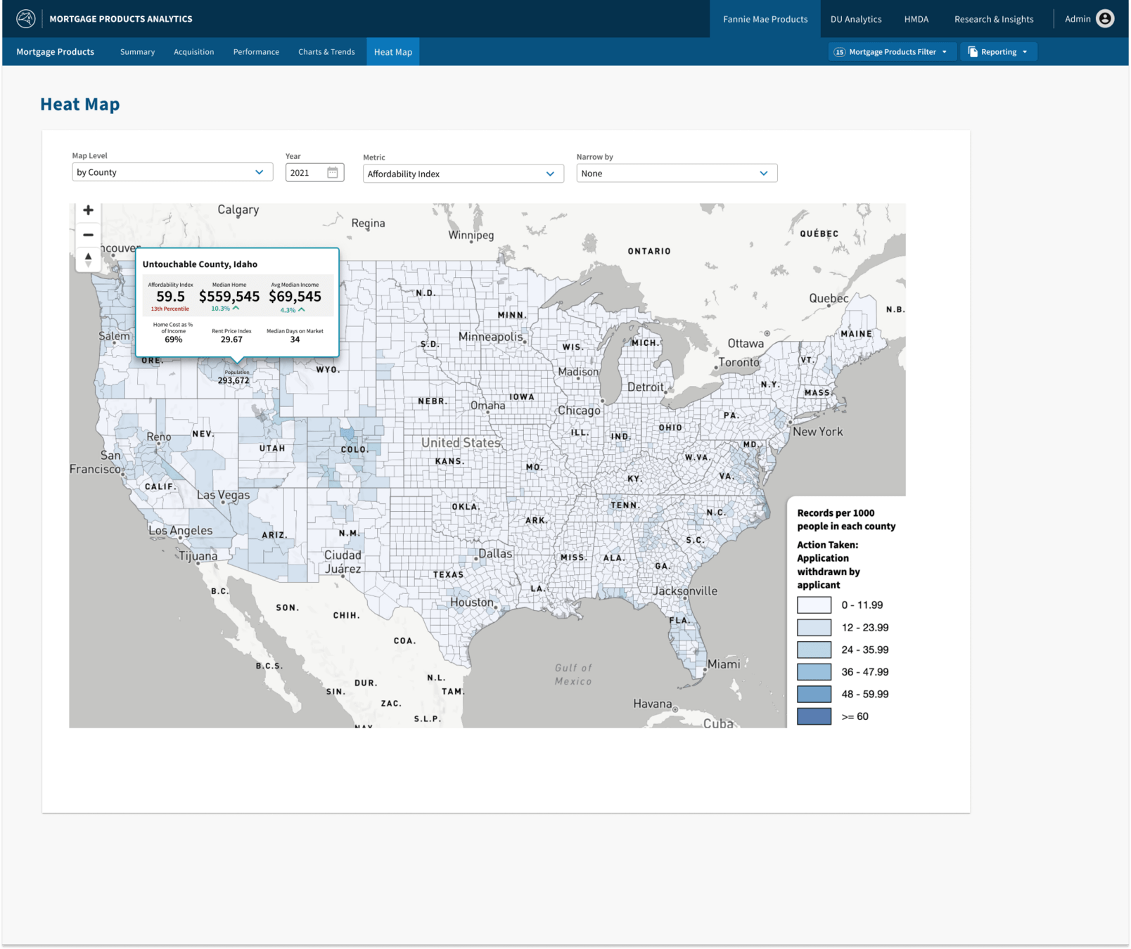
In just 3 years sites and products started looking like distant cousins, using various elements of the design system
TLDR: Impact
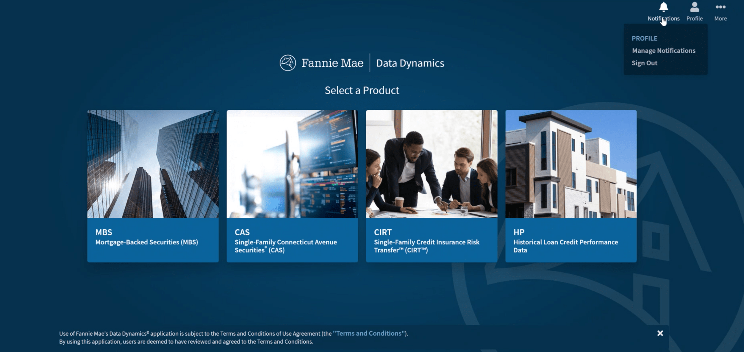
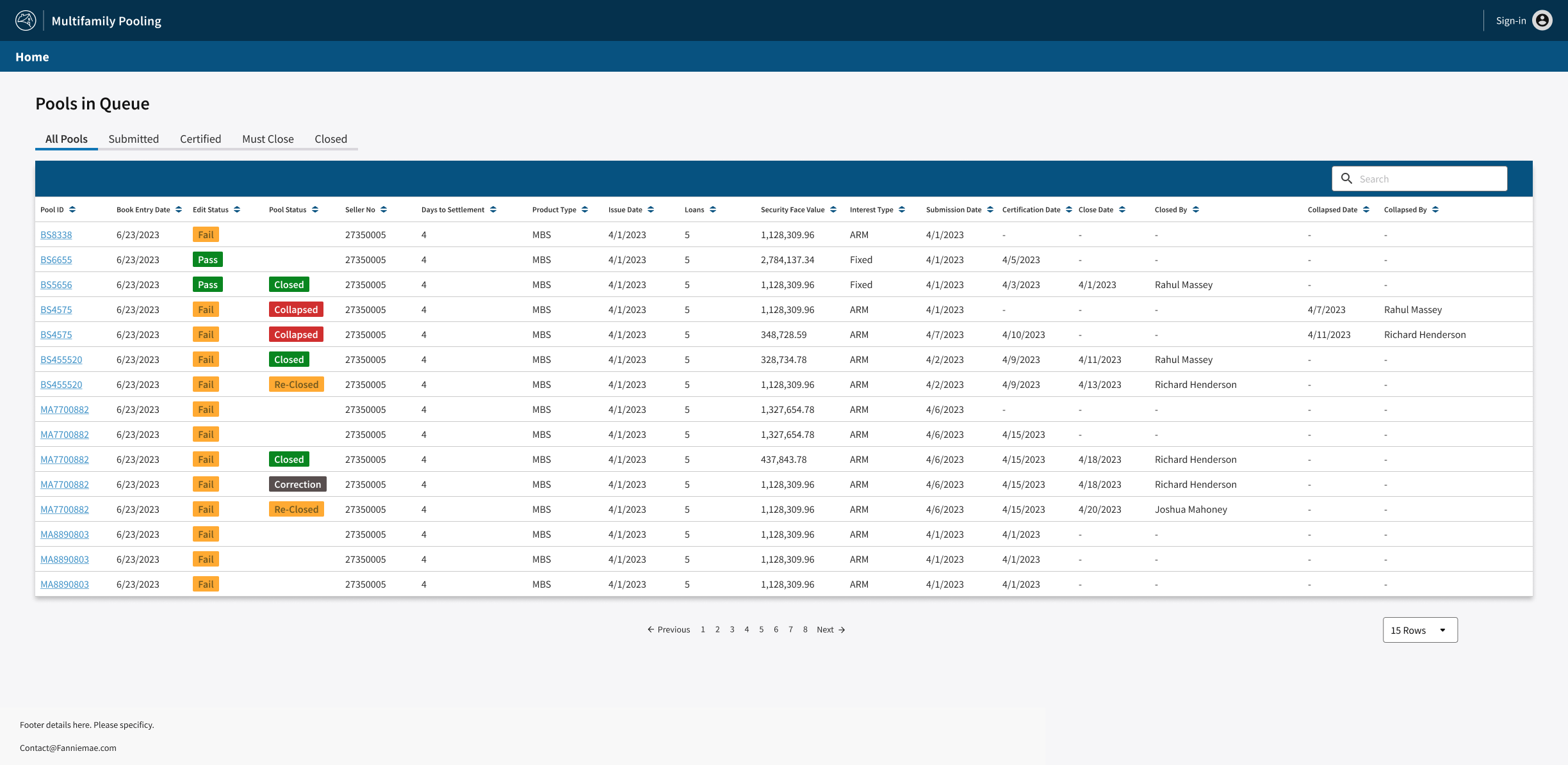
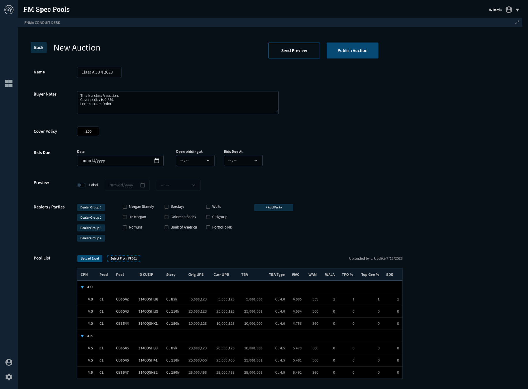
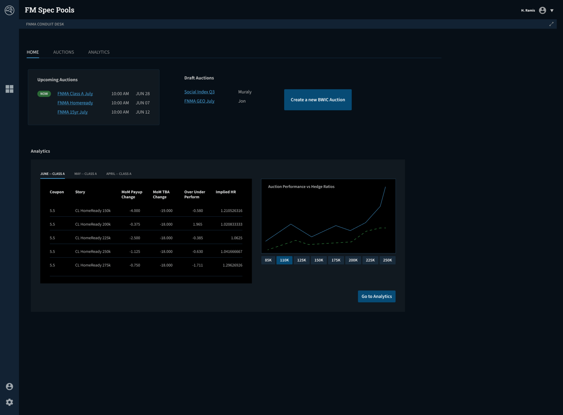
Deeper drive to see other applications using Blueprint
TLDR Summary: My Role
As Program & Project Manager
As Team Manager
As Individual Contributor
-
Hired and managed a multi-discipline design system core team of designers, developers and researcher.
-
Planned and oversaw work of the team
-
Mentored and provided performance feedback to ensure continuous growth
-
Setup and ran a multi-workstream dual-track agile program to facilitate a collaborative contribution model
-
Presented and articulated decisions
-
Facilitated design thinking sessions to generate new ideas
-
Partnered across multiple tech and design orgs to faster adoption, continued support and feedback loops
- Built foundational CSS with SASS to serve as core foundation to upstream application frameworks
- Built utilities CSS library (inspired by Tailwind CSS) to increase efficiencies of front-end development
- Setup documentation system using a JAMStack CMS (Eleventy)
- Created Token browser using HTML/CSS/JS
- Setup and maintained assigned components (as needed for velocity) in Sketch & Figma
diagram of me in the middle working with teams
TLDR Summary: My Role
As Team Manager
As Individual Contributor
-
Hired and managed a multi-discipline design system core team of designers, developers and researcher.
-
Planned and oversaw work of the team with performance reviews and weekly 1:1s
-
Mentored and provided performance feedback to ensure continuous growth
- Built foundational CSS with SASS to serve as core foundation to upstream application frameworks
- Built utilities CSS library (inspired by Tailwind CSS) to increase efficiencies of front-end development
- Setup documentation system using a JAMStack CMS (Eleventy)
- Created Token browser using HTML/CSS/JS
- Setup and maintained assigned components (as needed for velocity) in Sketch & Figma
- Facilitated sprint planning & Design Thinking sessions generate new ideas
- Roadmap Development: Created and maintained a comprehensive roadmap, ensuring alignment with organizational goals and project milestones.
- Stakeholder Management: Collaborated with executives, product managers, and engineering leads to prioritize features and secure buy-in for key initiatives.
- Risk Management: Identified project risks and implemented mitigation strategies to ensure timely delivery of key milestones.
- Cross-Functional Coordination: Led cross-departmental teams, including UX designers, developers, and QA engineers, to ensure cohesive and high-quality deliverables.
- Metrics & Reporting: Established success metrics and tracked project performance, presenting regular updates to stakeholders to maintain transparency and accountability.
- Change Management: Facilitated organizational adoption of the design system, including training programs, communication plans, and stakeholder engagement.
- Process Optimization: Streamlined workflows and processes to improve collaboration and efficiency across distributed teams.
As Program & Project Manager
Understanding my contribution on deliverables
Deliverable from team member(s) under my team leadership
Deliverable by a design system workstream member under my program leadership.
Program Team
My deliverable

Program Team

Team

Chris
With Blueprint, my involvement ranged from strategic leadership to program & project management, down to getting my hands dirty designing or coding.
Use the icon in the bottom left of a slide with deliverables to understand my involvement
Design Systems can be complex
And not everyone agrees what they are....
So what is a
Design System
to me?
A design system is the blueprint for consistency—it organizes chaos into clarity, but it’s not just design assets and code; it’s people, processes, and a shared culture.
Design Systems have a...
Solid Product Proposal and Vision
I created a comprehensive plan to fund, build, and maintain Fannie Mae’s first enterprise design system.
With a series of high quality pitch decks, I presented and articulated to various levels of leadership to get successfully get buy-in to standup the design system team.
Deeper drive to see examples
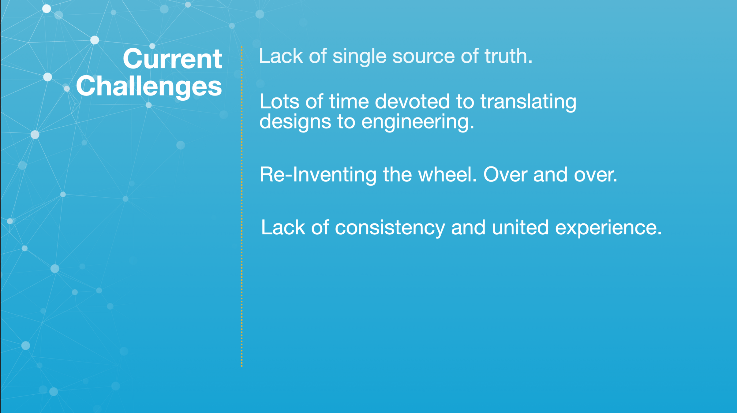
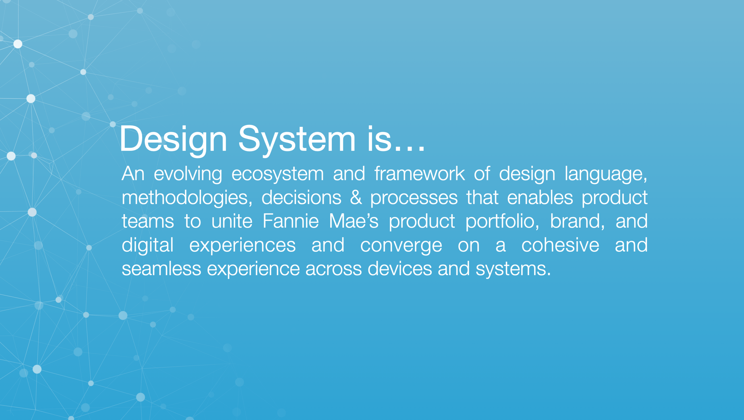
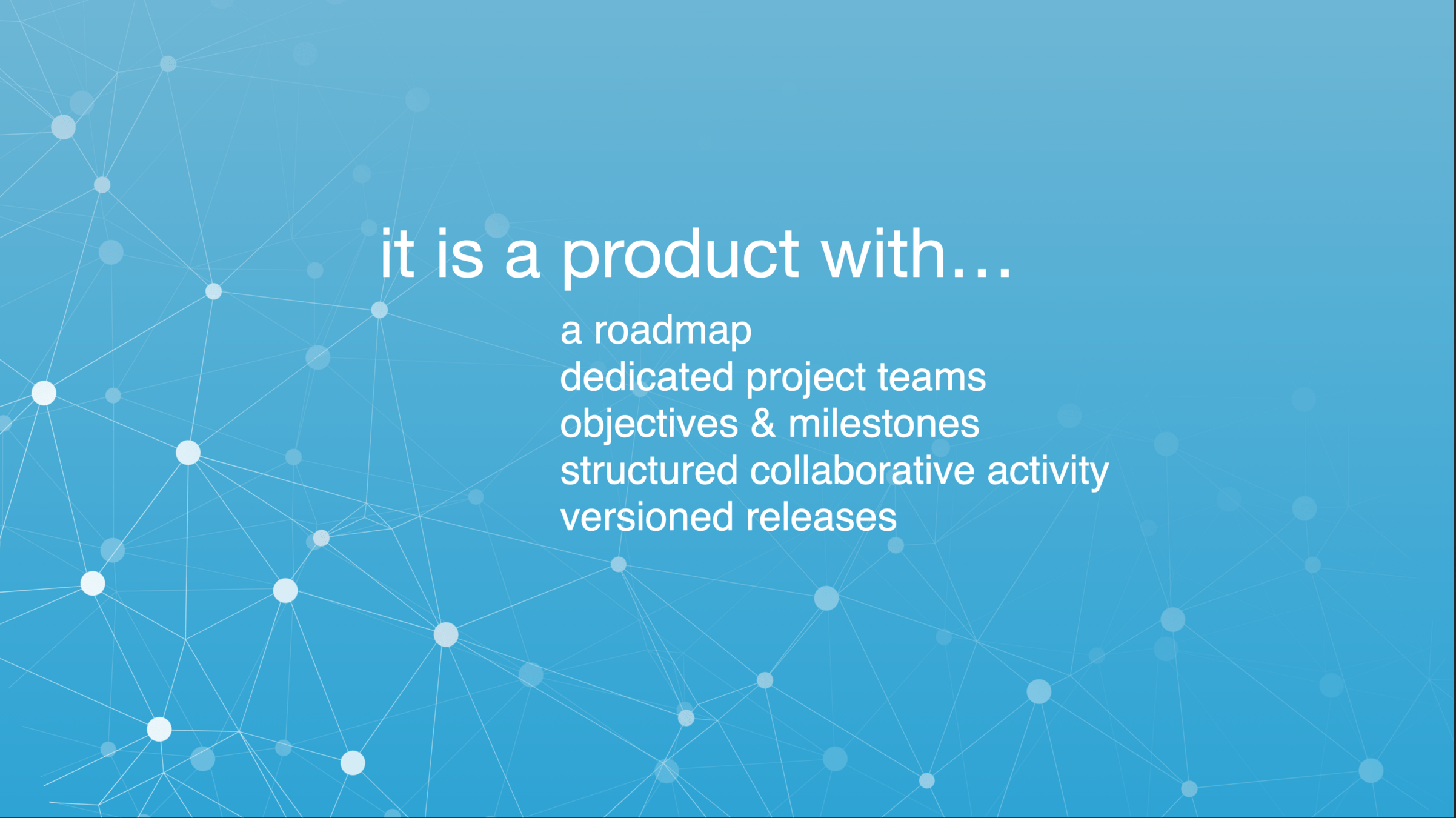
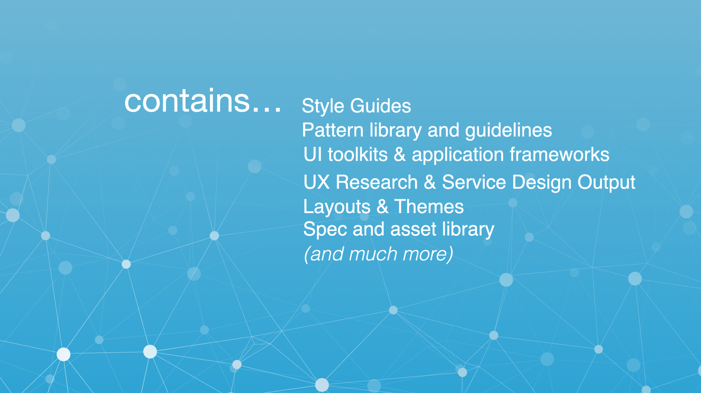
The first series of decks and materials outlined the benefits of a design system, what problems it solves (and those it doesn't), a general strategy and setup for a dedicated team to build and support it along with project management plan and release cadences.

Chris
Outlining purpose, benefits, challenges
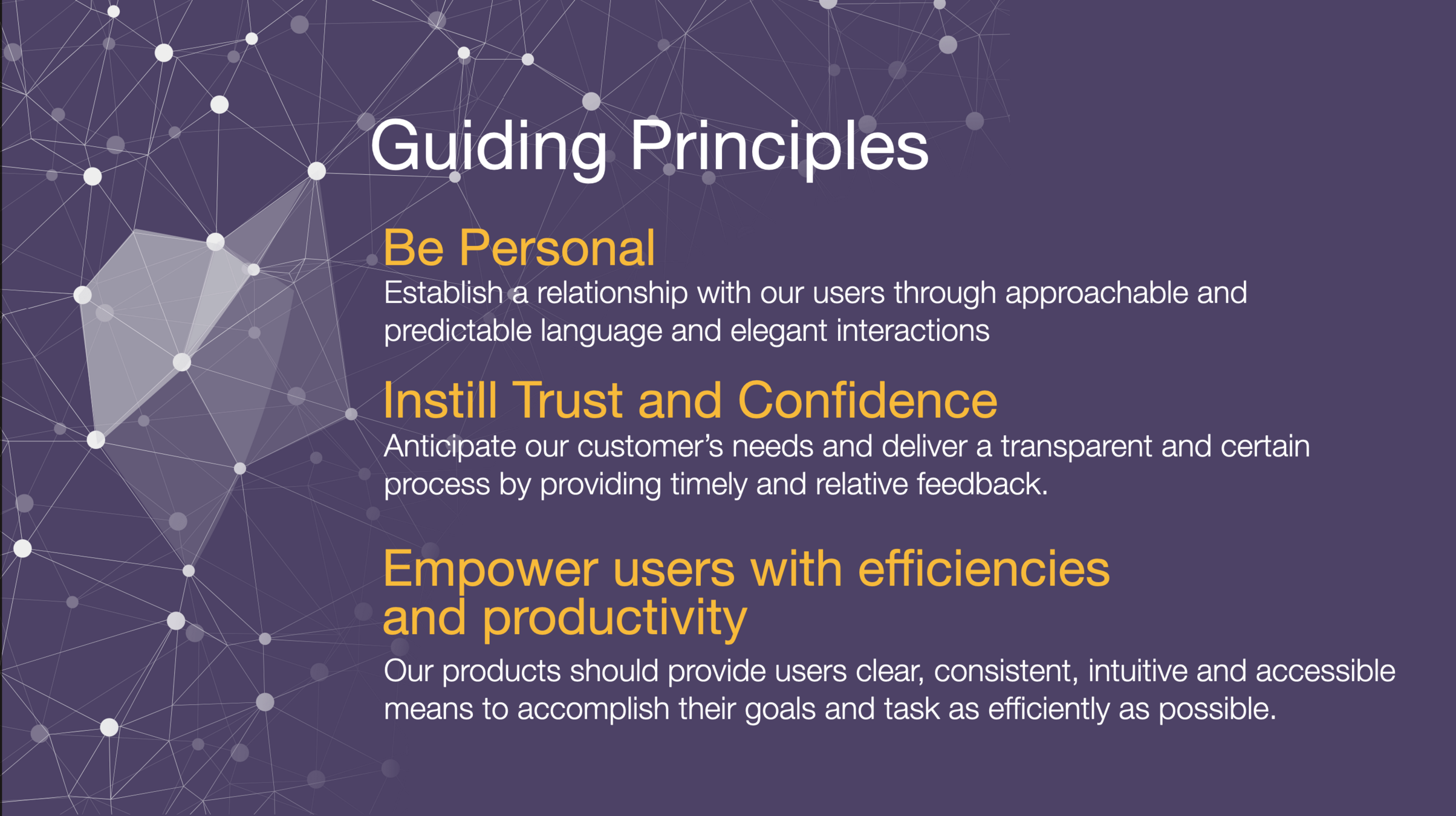
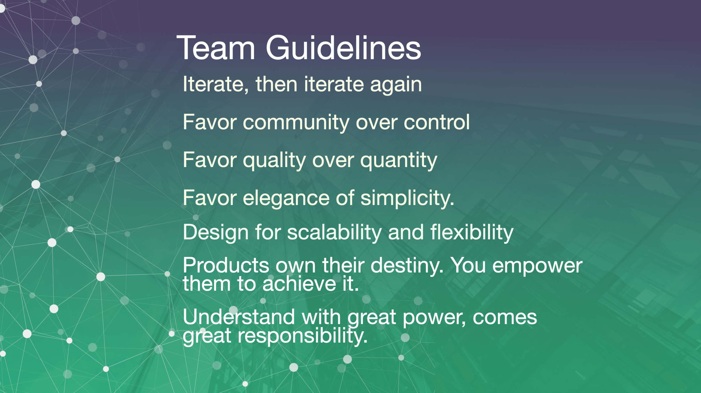
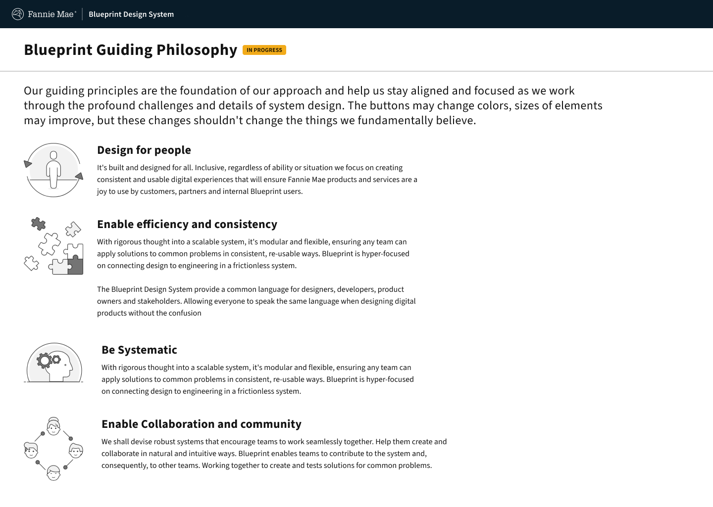
Team guidelines and guiding principles set the tone of how the design system team would approach problems and guide through challenges to deliver business value.
These guidelines and principles would be refined and improved under facilitated workshops and sessions with the team.

Chris
Setting up initial guardrails
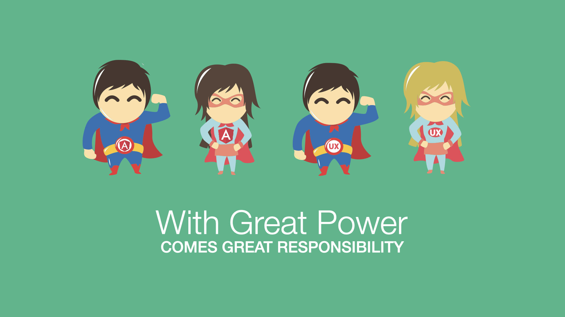
One of my favorite slides. It was important to communicate the responsibility the design system team inherits. Bad decisions can have big consequences down and upstream, especially in the corporate development cycle where update cycles are yearly.
Communicating the responsibility

Chris
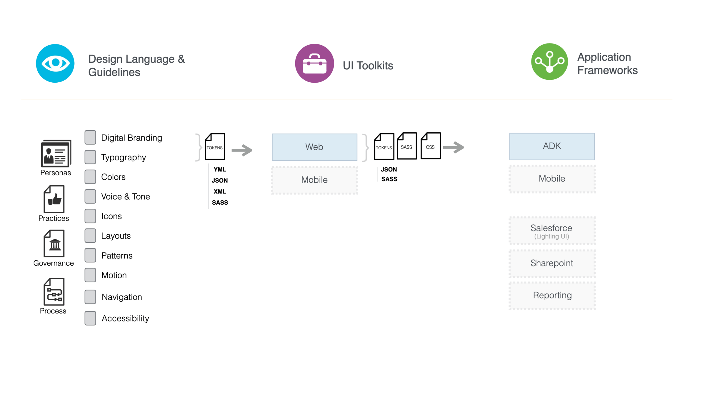
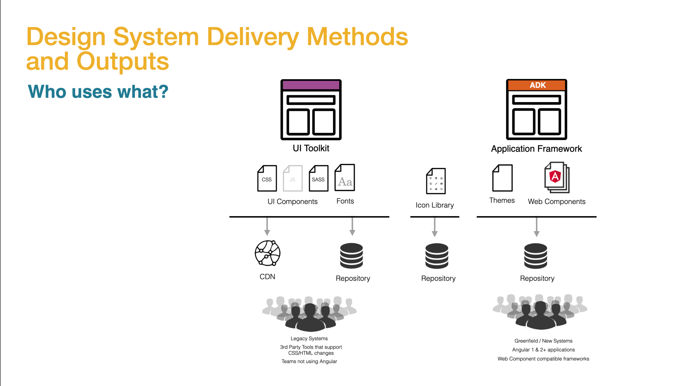
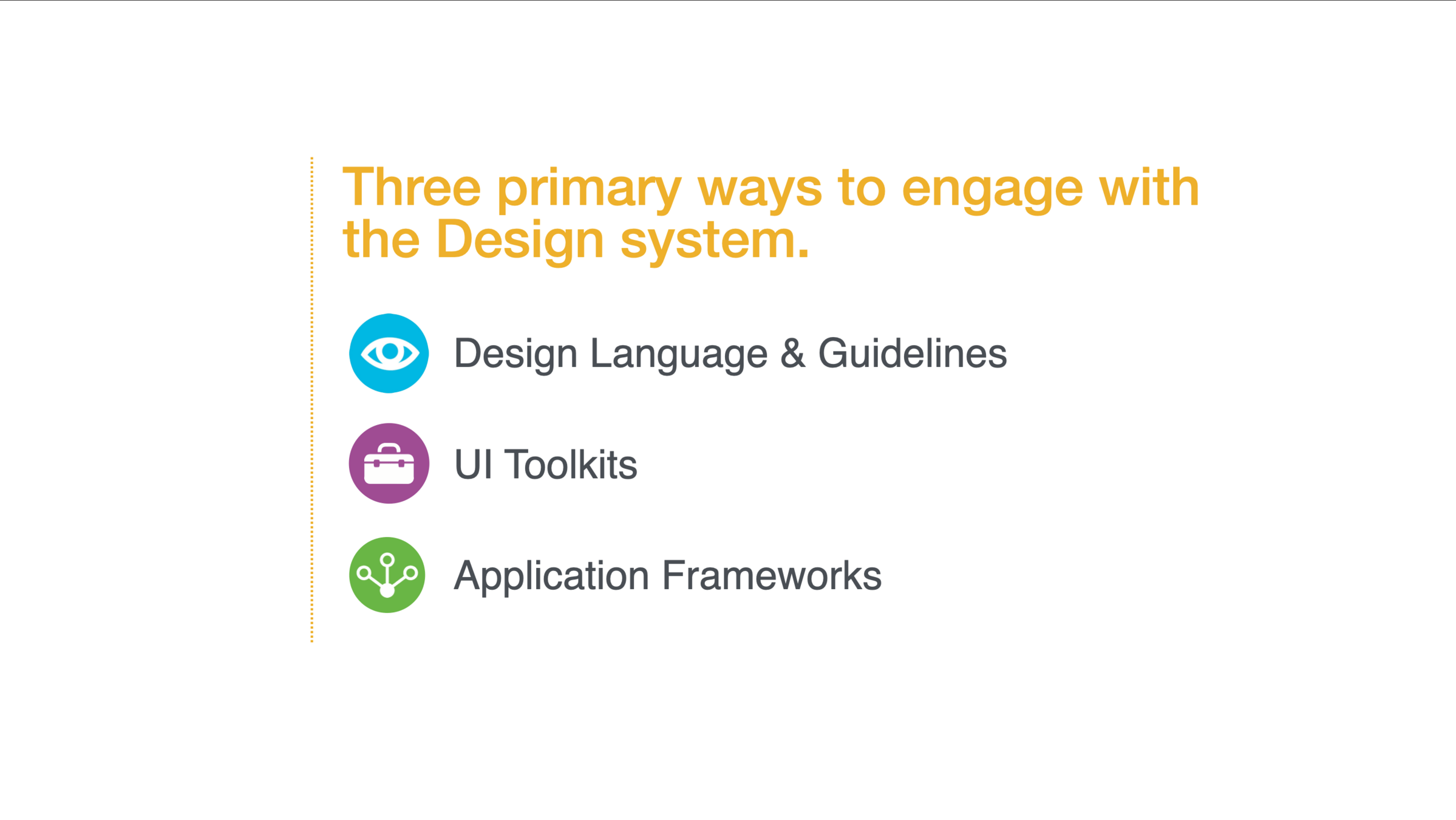
Design systems are often confused as systems only for designers, but I've found the greatest benefits actually come to the developers and greatly benefit from code tooling. I spent a lot of time communicating and selling a full tech stack of design system tooling that included A CSS framework that was powered by a modular SASS system that generates CSS that could then feed into any application framework technology.
This was before web component specs were as mature as they are now. If I was to do the pitch today, I would emphasis the use of web components as the cornerstone between all the downstream application frameworks and products.
Design Systems need code

Chris
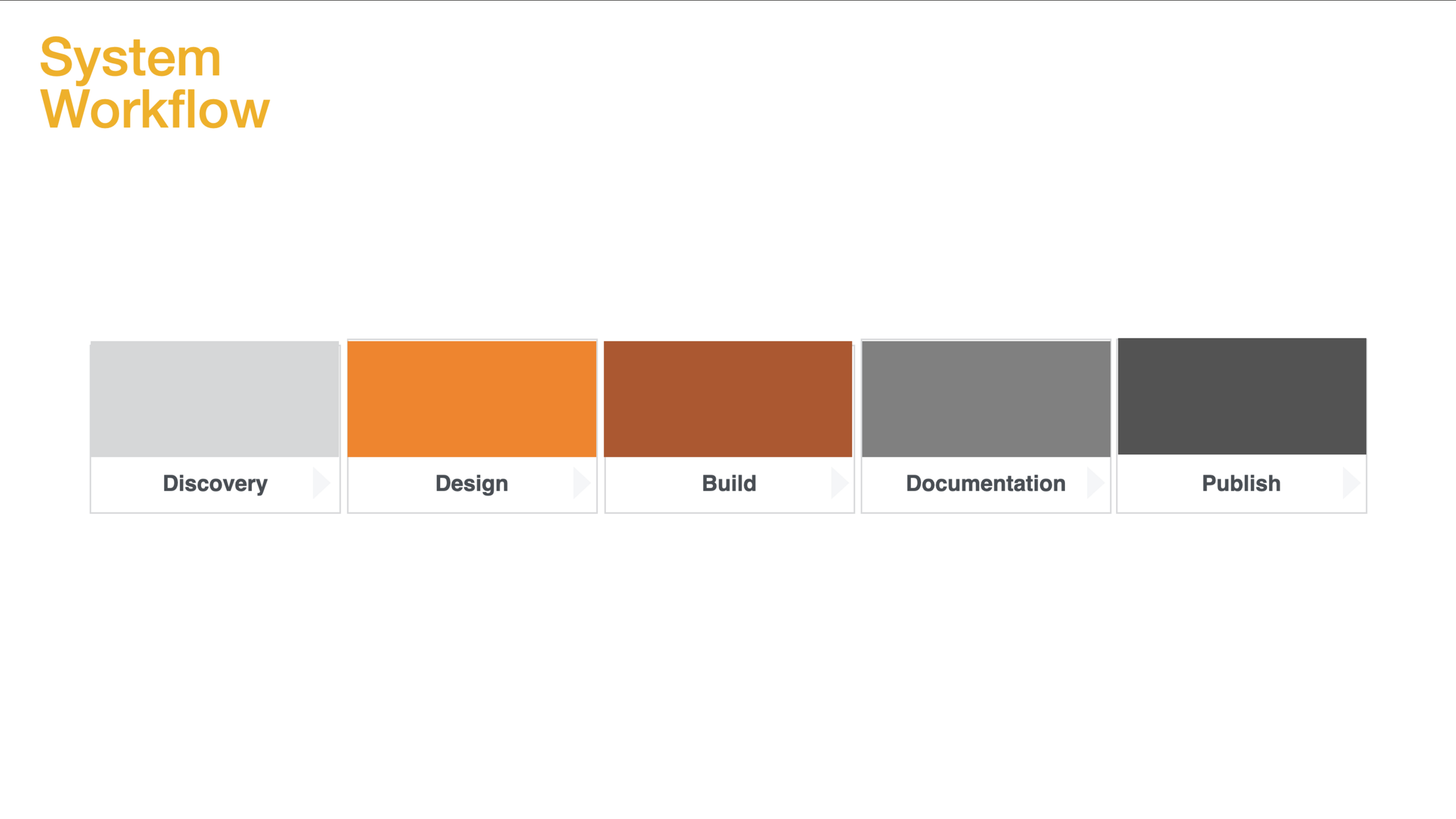
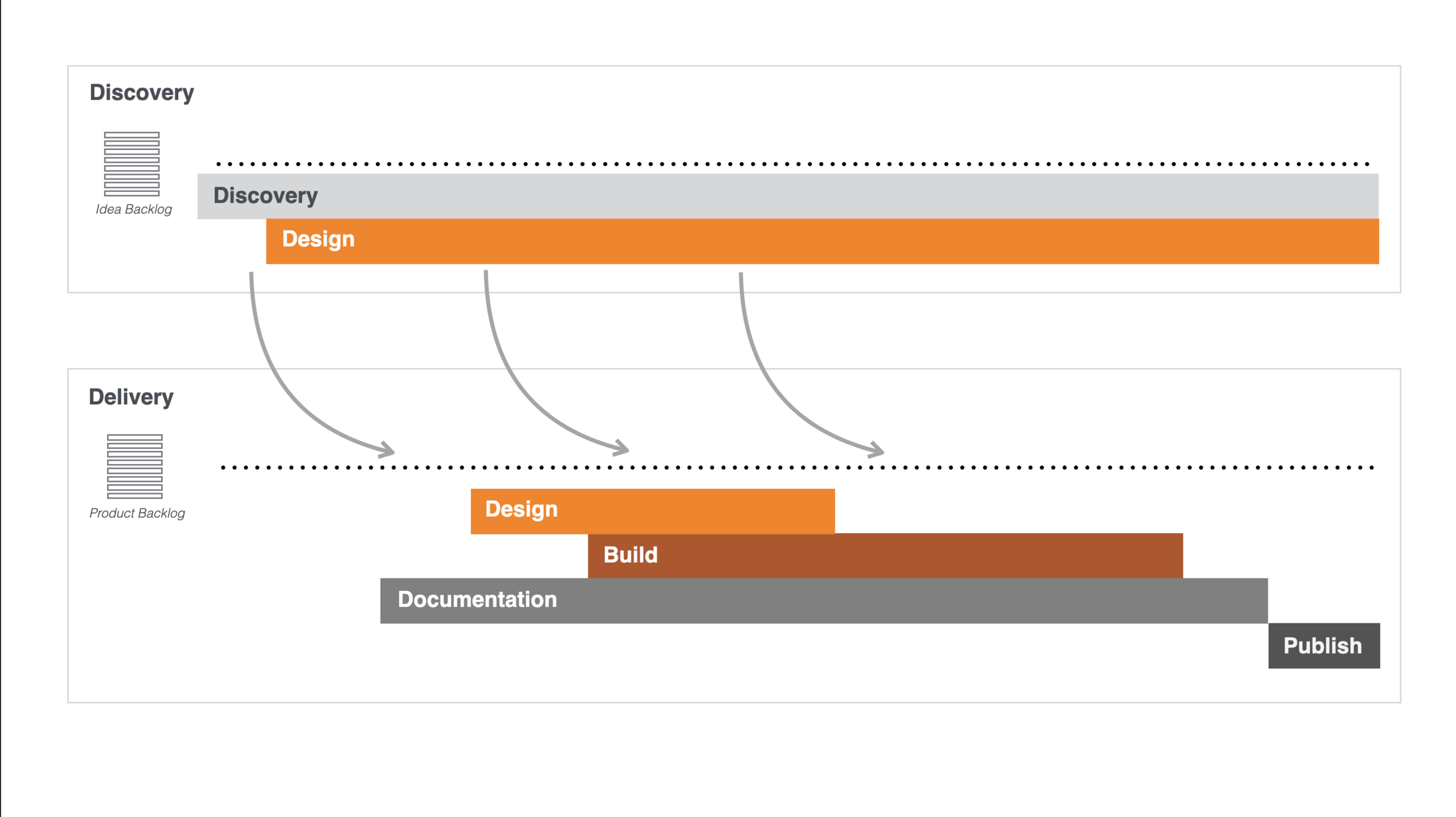
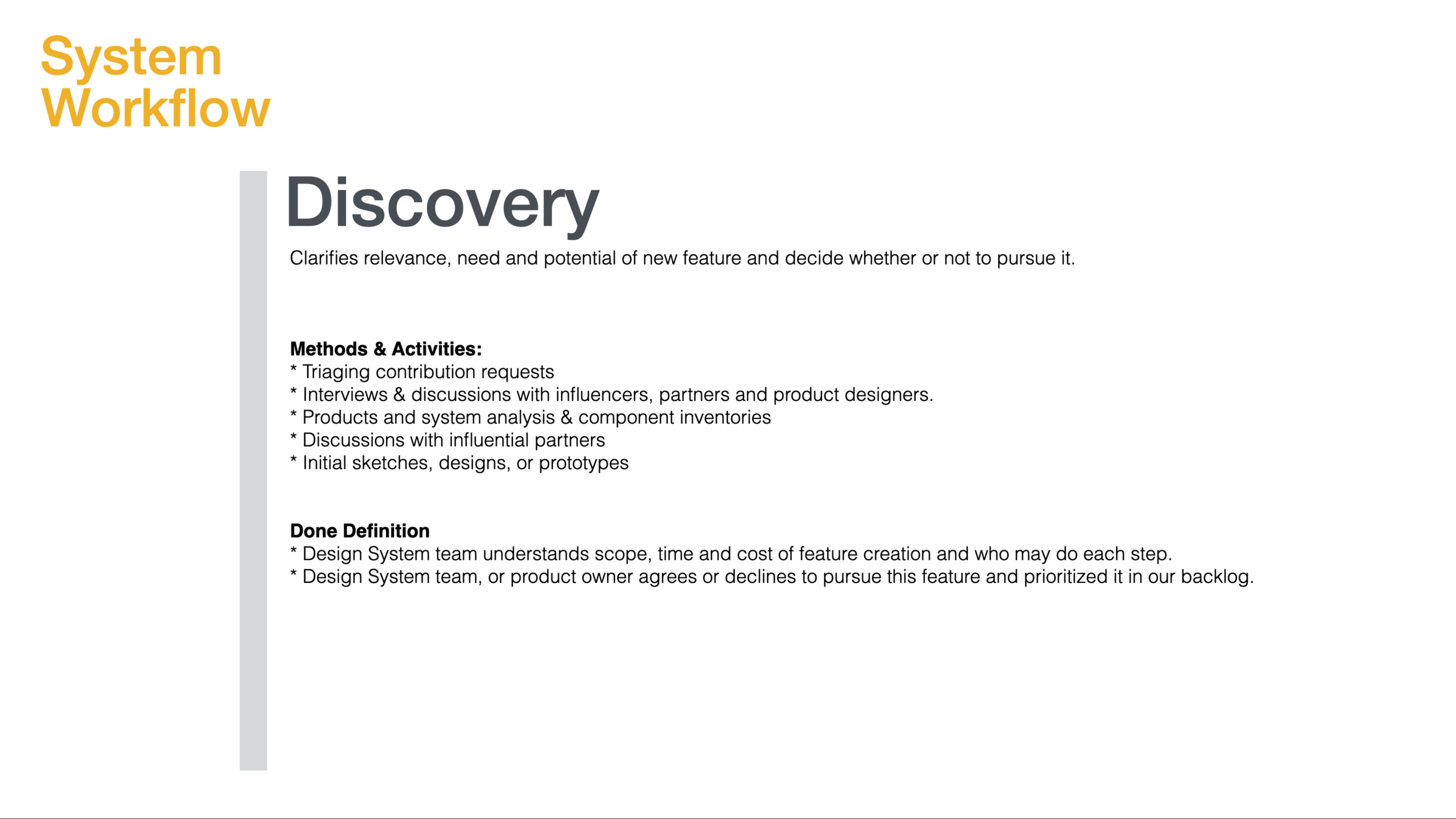
I knew a dual-track agile was the way to go with a complex program based design system and with design leadership not too familiar with product team concepts a lot of the proposal was focused on how I would run Pi's and Prints.
Design Systems need to be deliverable

Chris
Proposal was met with high energy excitement and was approved for funding a dedicated team of 5 members, which I later grew into a matrixed program of various workstreams, each with leads and teams of 5-10 designers.
Design Systems are...
Well Researched
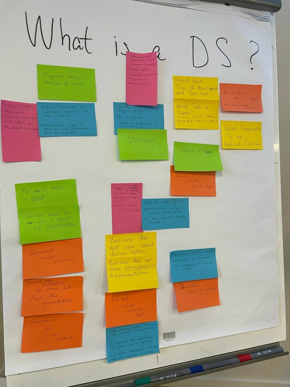
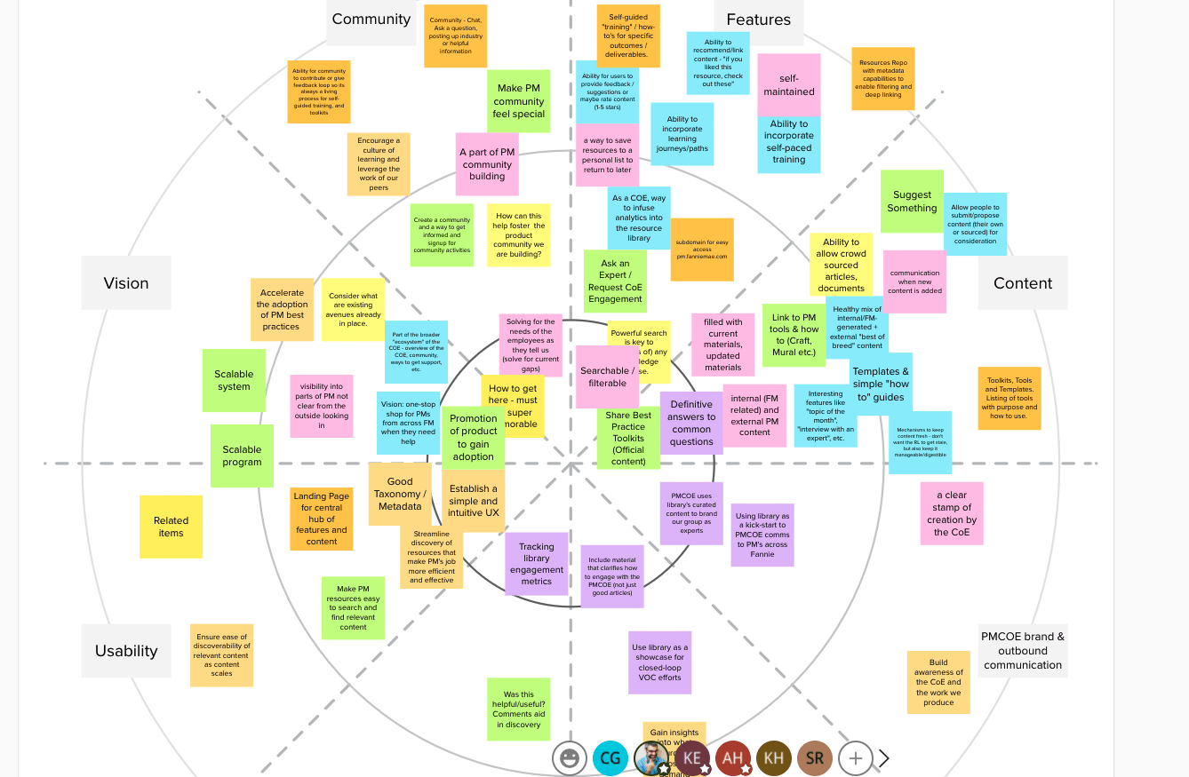
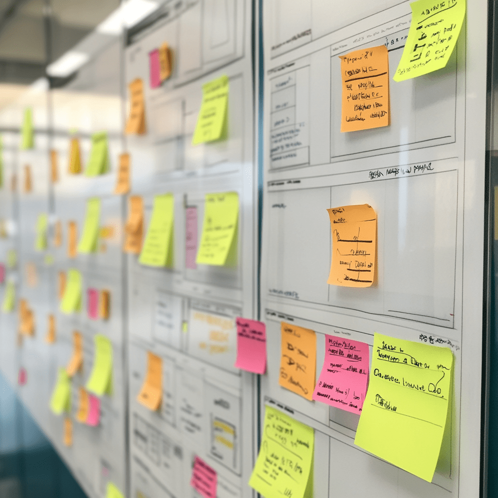
After getting buy-in for the formation of the Design System and as I started building the team, I lead a series of workshops and sessions that would set the foundation of all future work with the Design System program.
Deeper drive to see examples
- Initial design thinking sessions and product visioning for the design system
- Conducted deep Product and Component inventory. What components were heavily used and key components missing
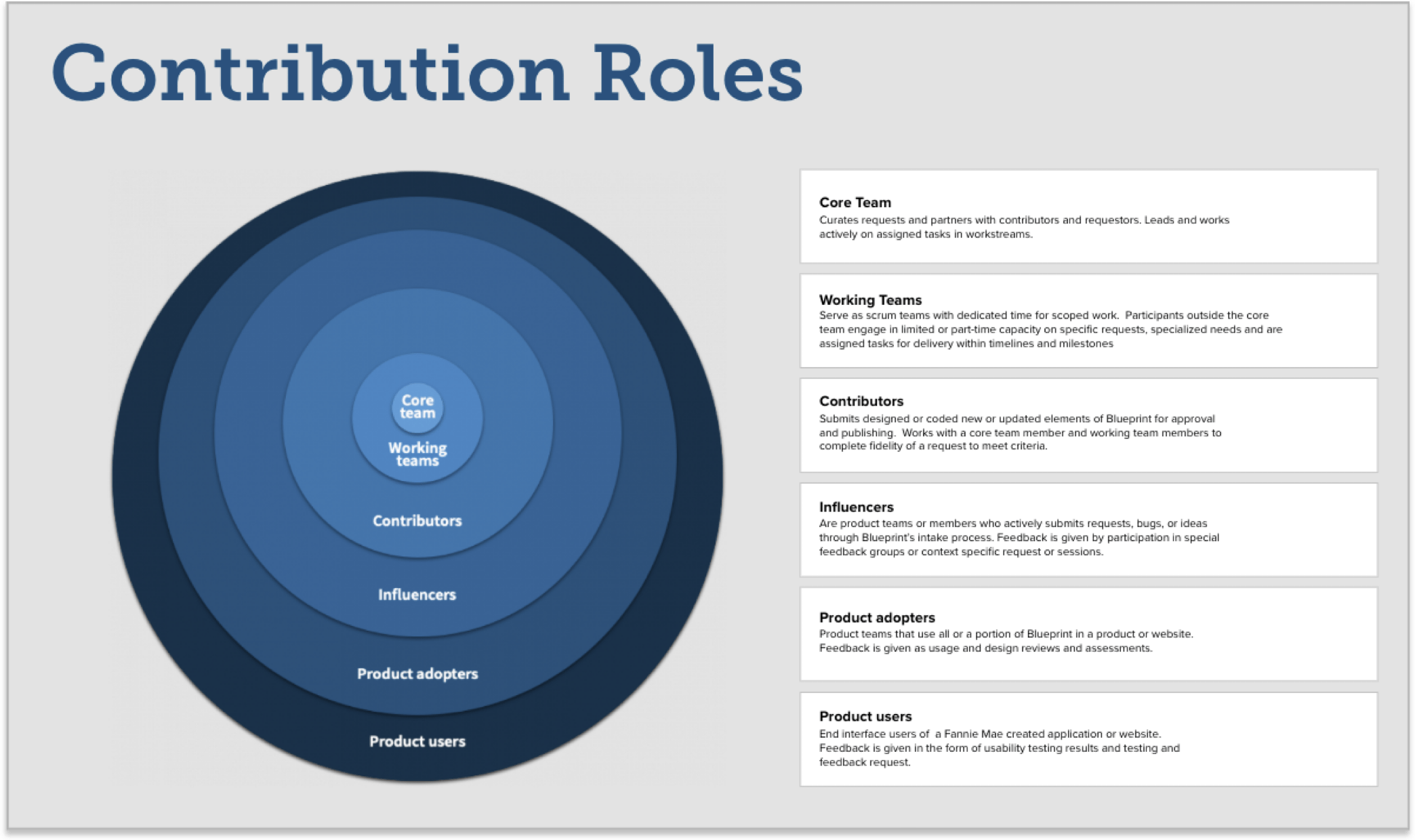
- Identifying and documenting stakeholders, contributors and influencers, and what are their current experiences with product development
- Collaborating on the general sense of what a design system is and how it fits into typical product development
- Gathering a branding and style audit to inform the Design System foundations
Key Activities


Team
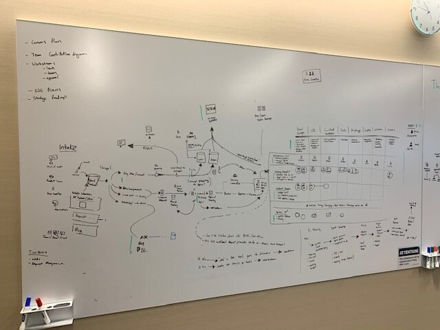
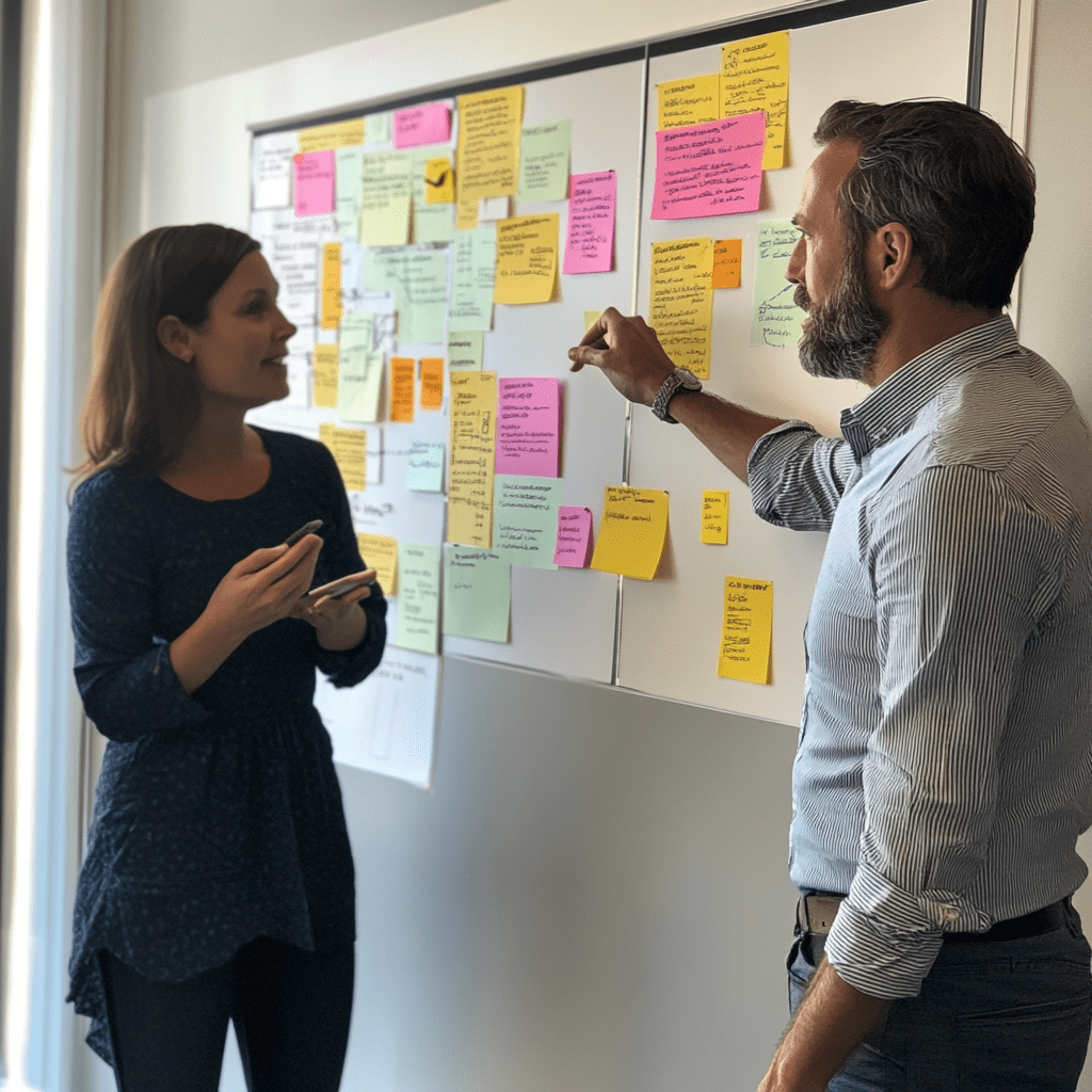
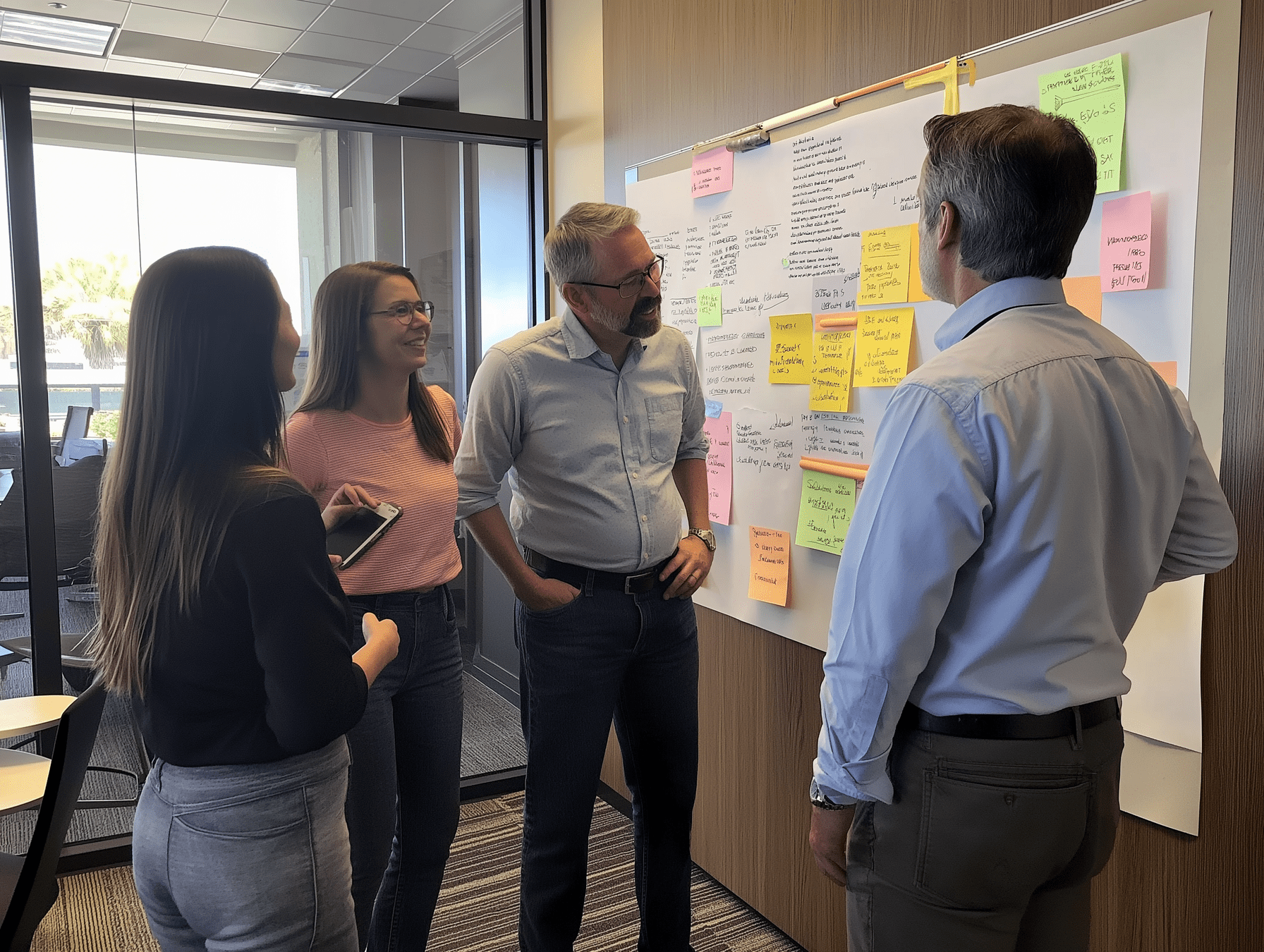
Visioning Workshops helped solidify purpose, value and direction
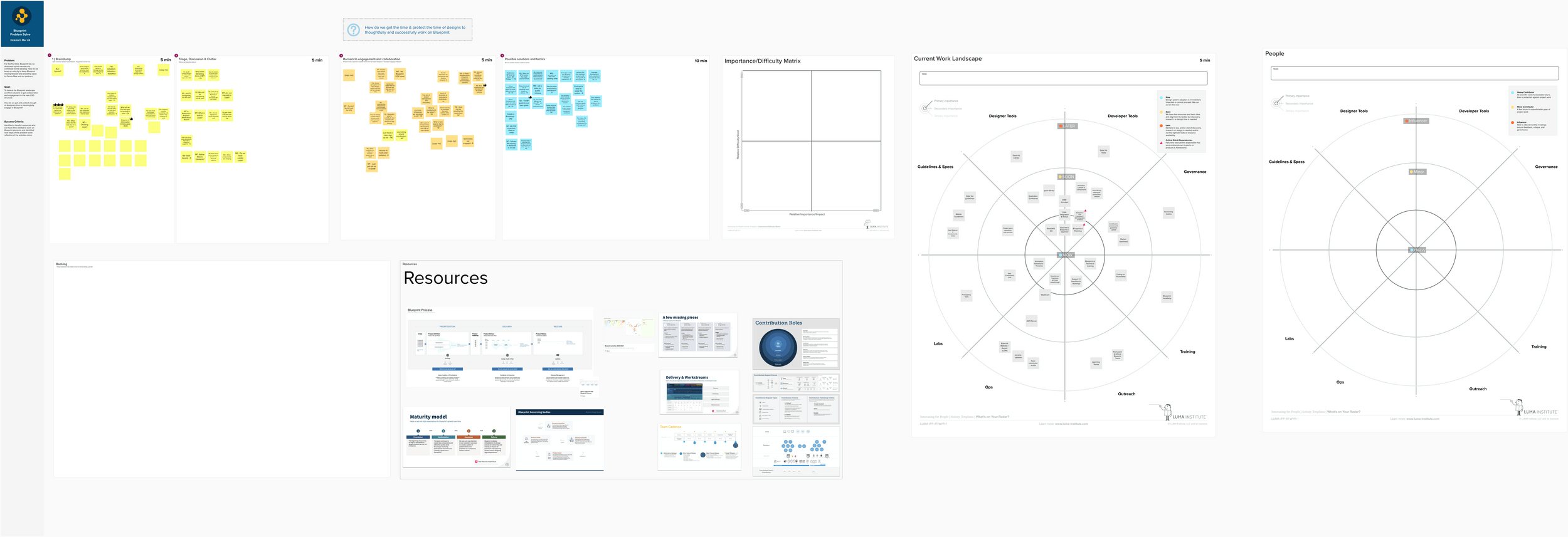
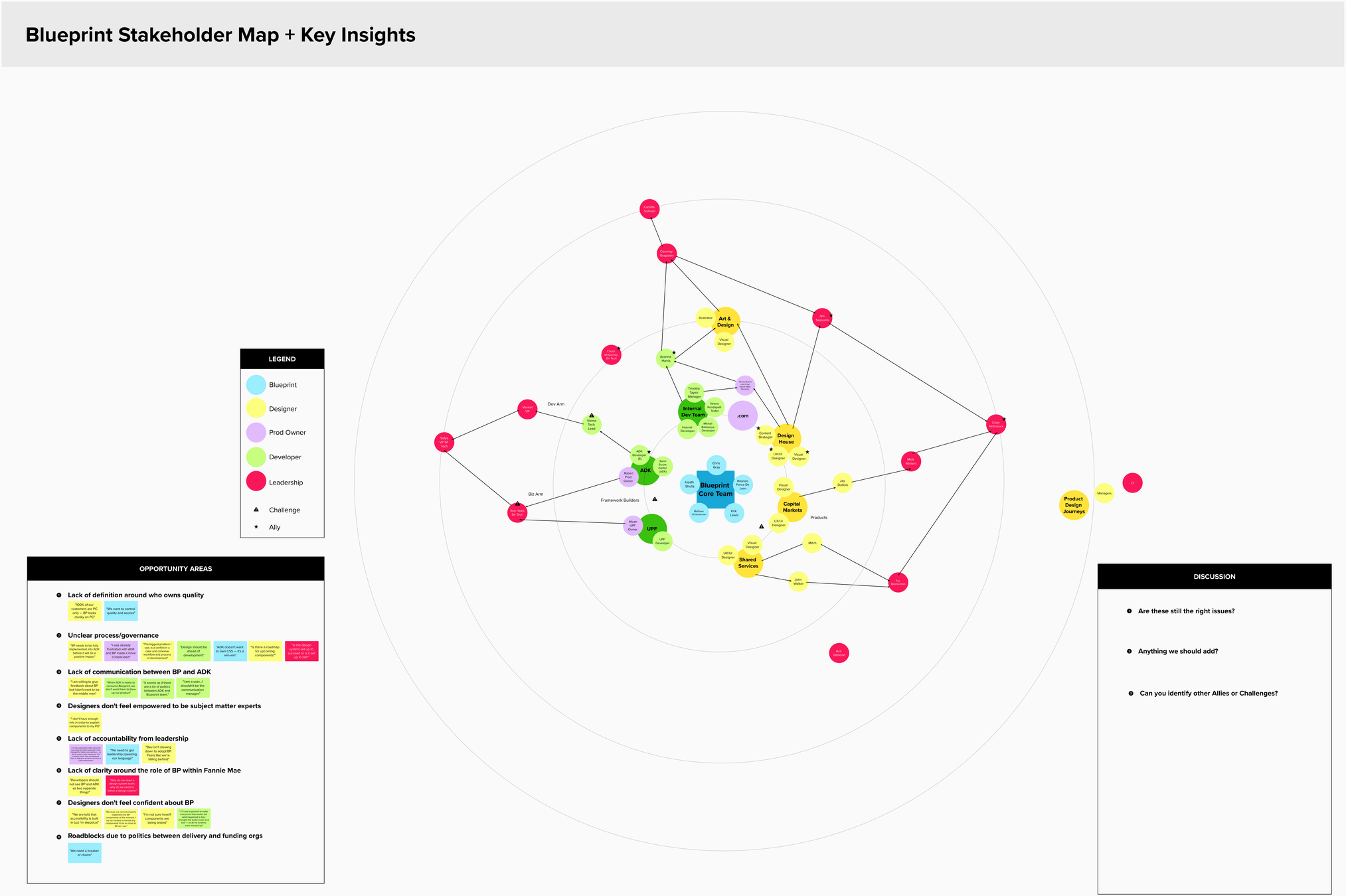
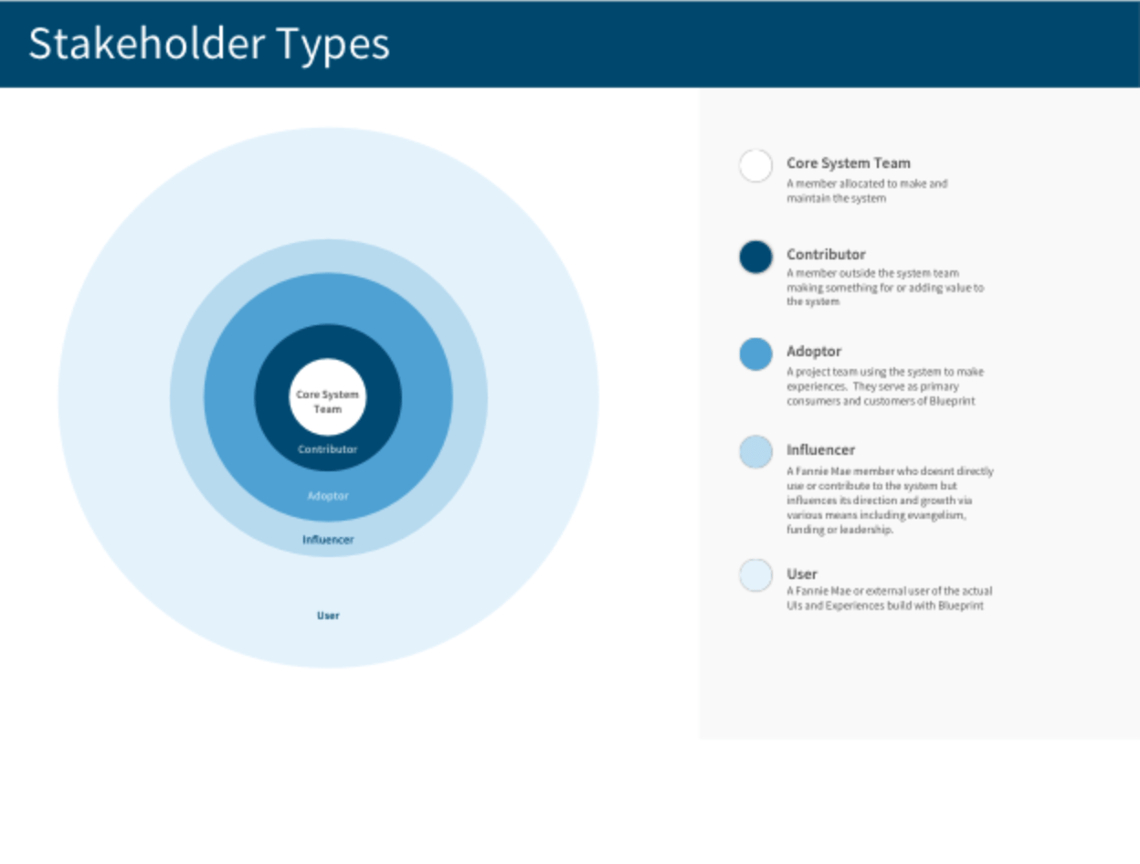
Stakeholder maps clarified who we are building this for and who's involved
It's important to map out who are the systems stakeholders. Who are the contributors, influencers, key leadership, and possible detractors. With facilitated workshops we were able to start capturing this key information.

Team
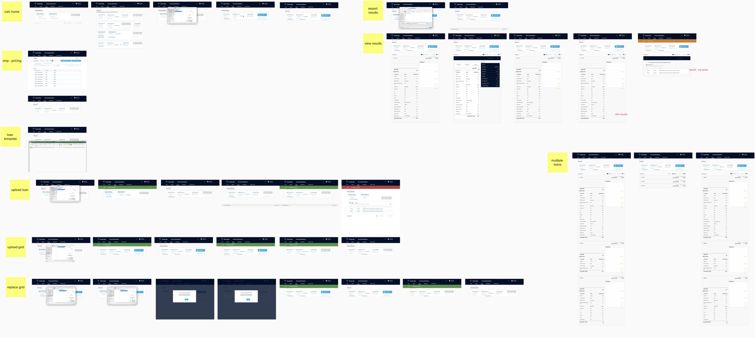
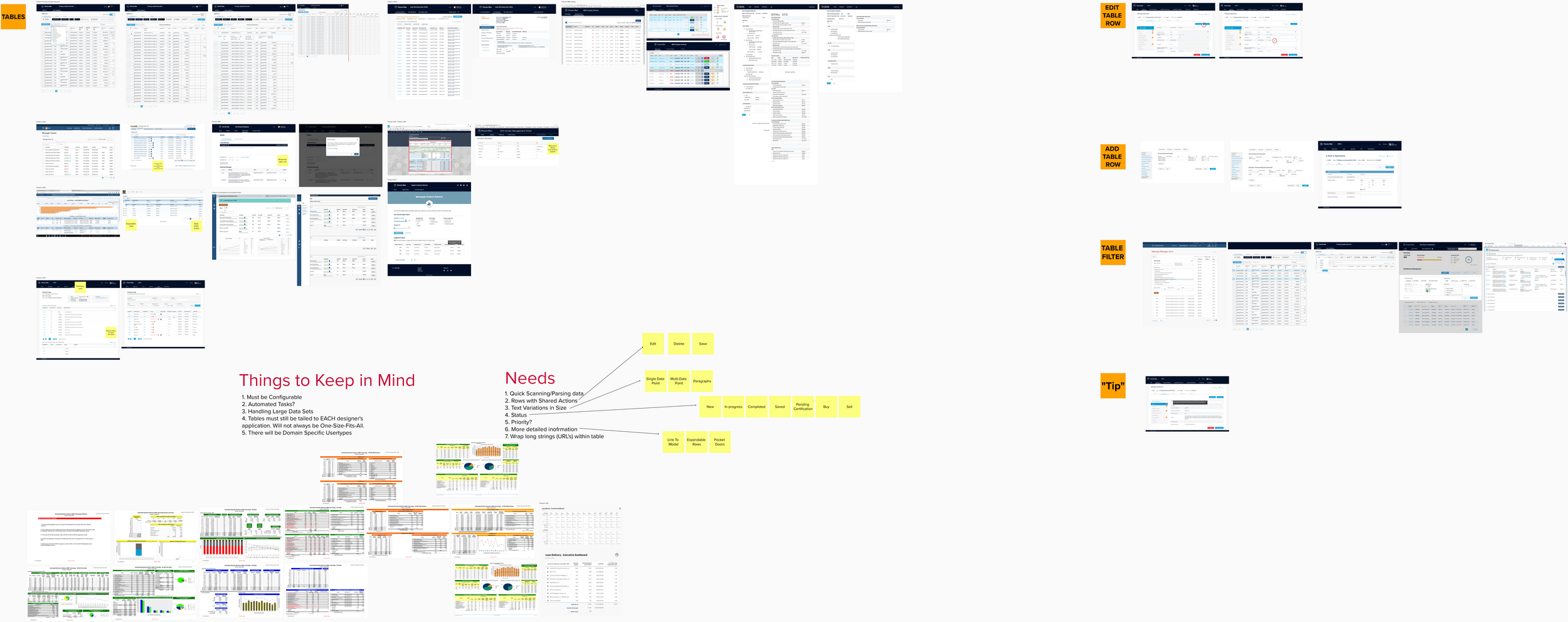
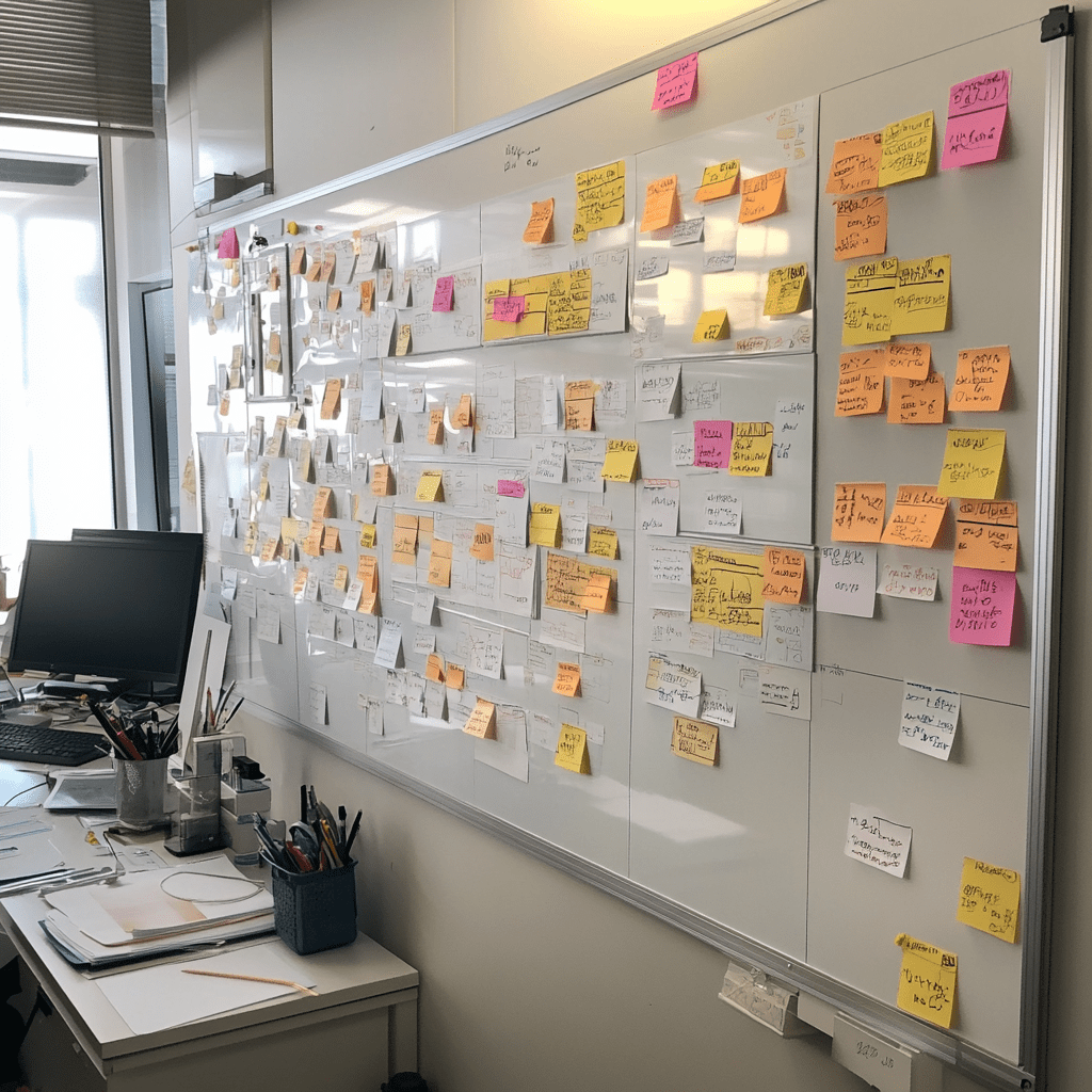
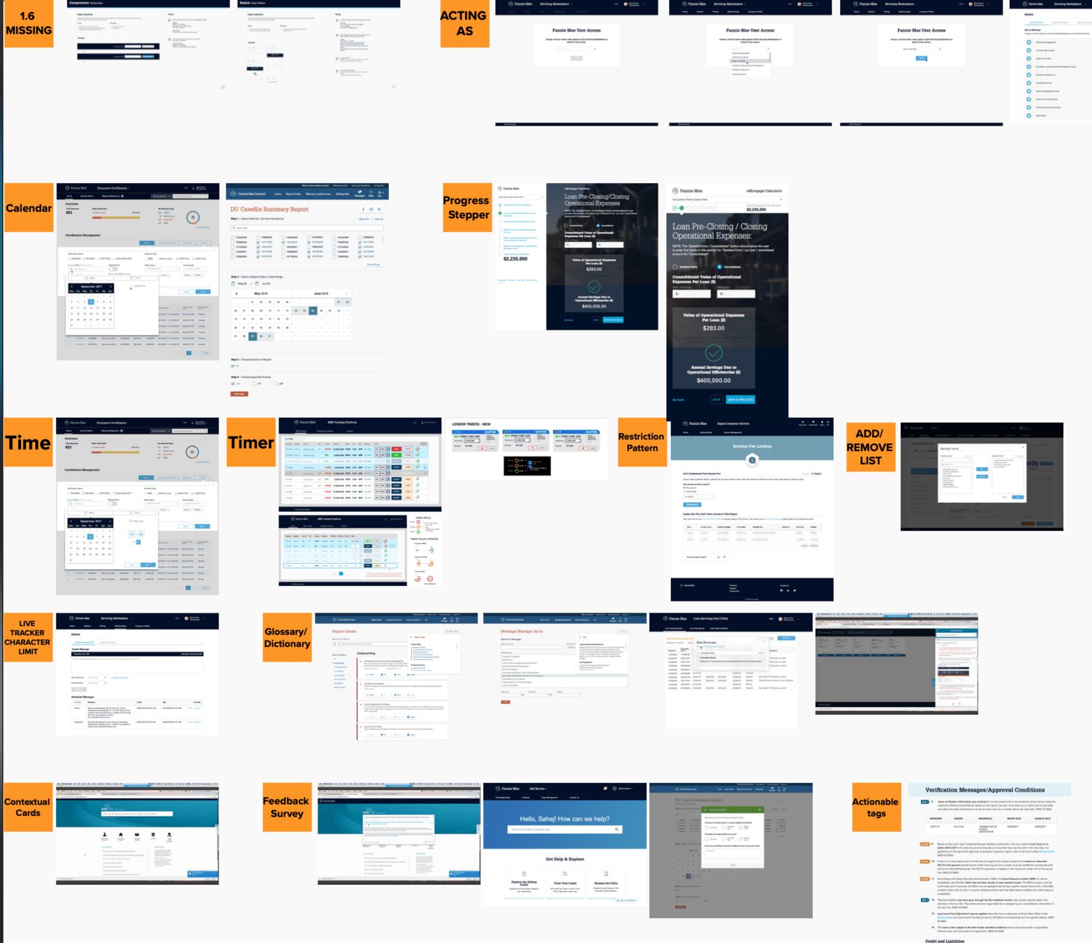
Component and UI pattern inventories helped us identify current state of applications
Its important to know the state in which UI design is being implemented right now. Using Mural as our main collaborative platform we started collecting screenshots of products and websites across the Fannie Mae digital portfolio.

Team

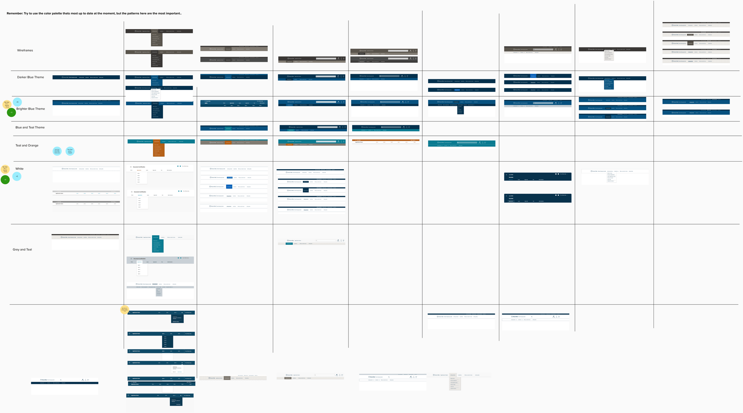
Brand and visual design assessment help form the backbone of the foundation
I also started collecting a visual inventory on how visual elements, colors, typography were all used across branding and marketing elements.
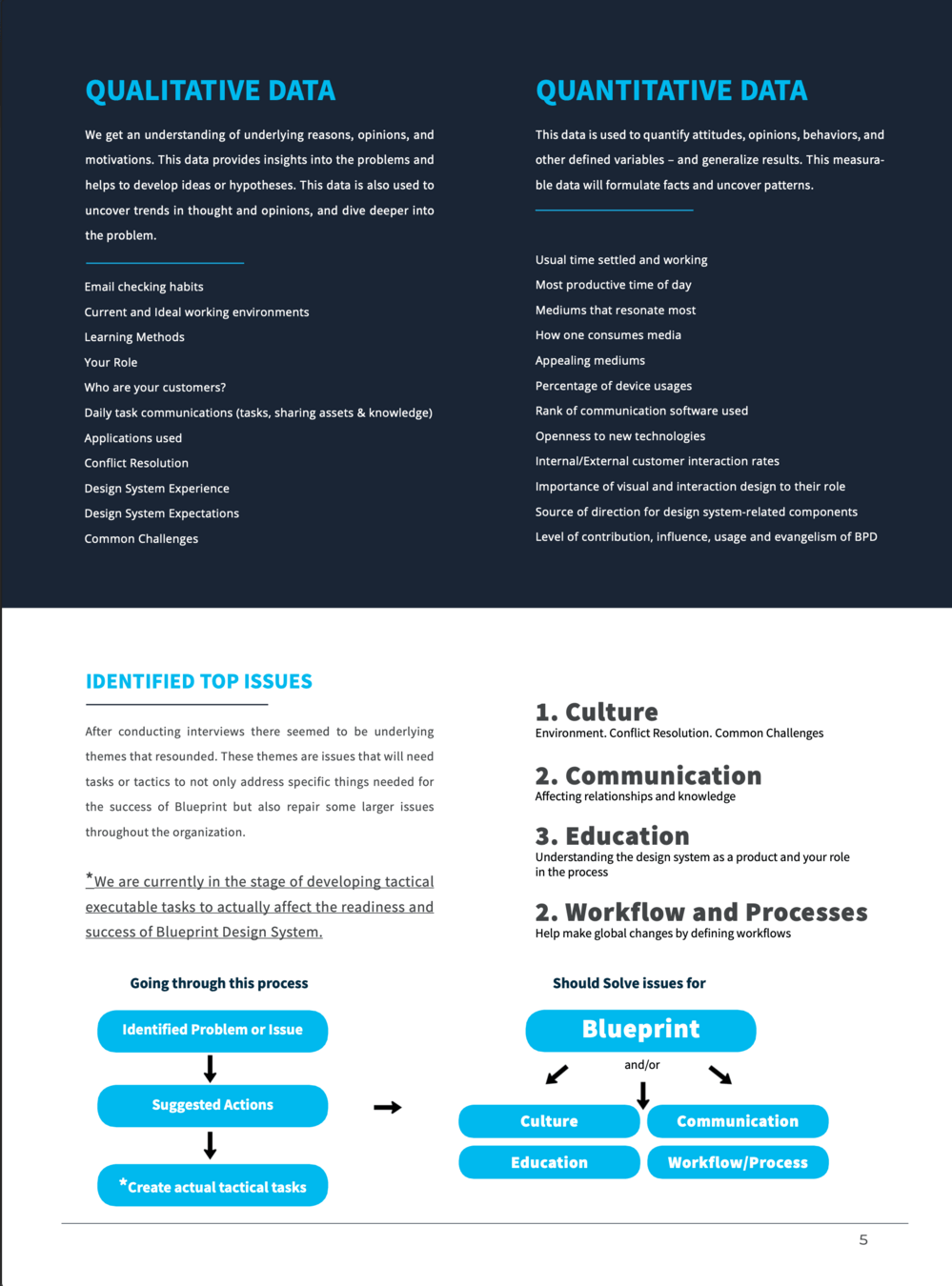
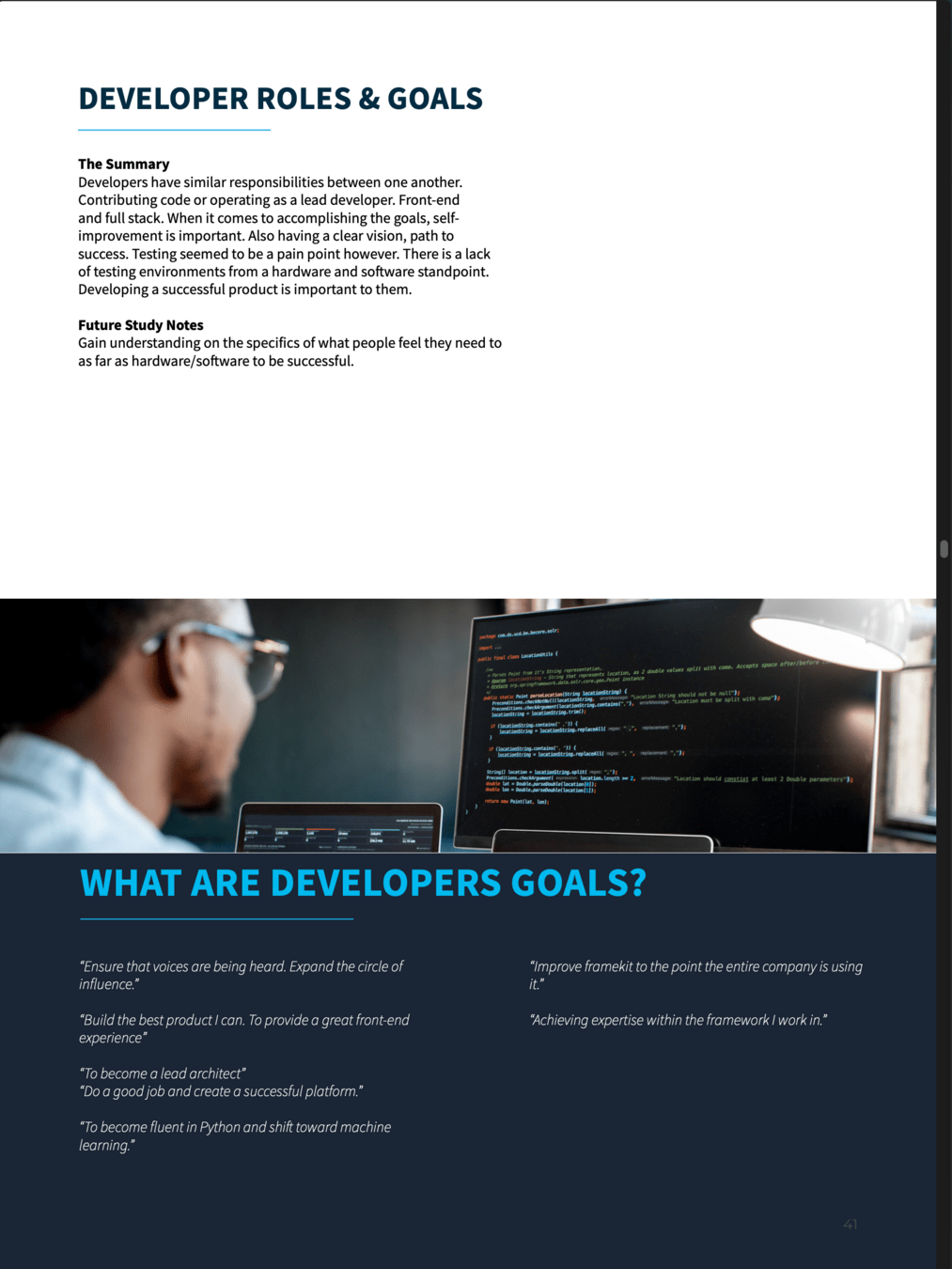
Ongoing checkpoint research initiatives ensured we were meeting our goals and providing real value to product teams
At various checkpoints, I assigned research to be conducted. This qualitative and quantitative research touched based with designers, developers and product team leaders on the effectiveness of the design system, missing pieces, etc

Team
Design System has a...
Solid Foundation
The key to a scalable and composable design system is an atomic driven foundation. These serve as the individual lego pieces for which all upstream decisions are made
Deeper drive to see examples
These pieces include:
- Color System
- Type Scale and Fonts
- Spacing and Dimensional scale
- Naming Conventions
- much more ...
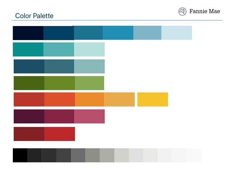
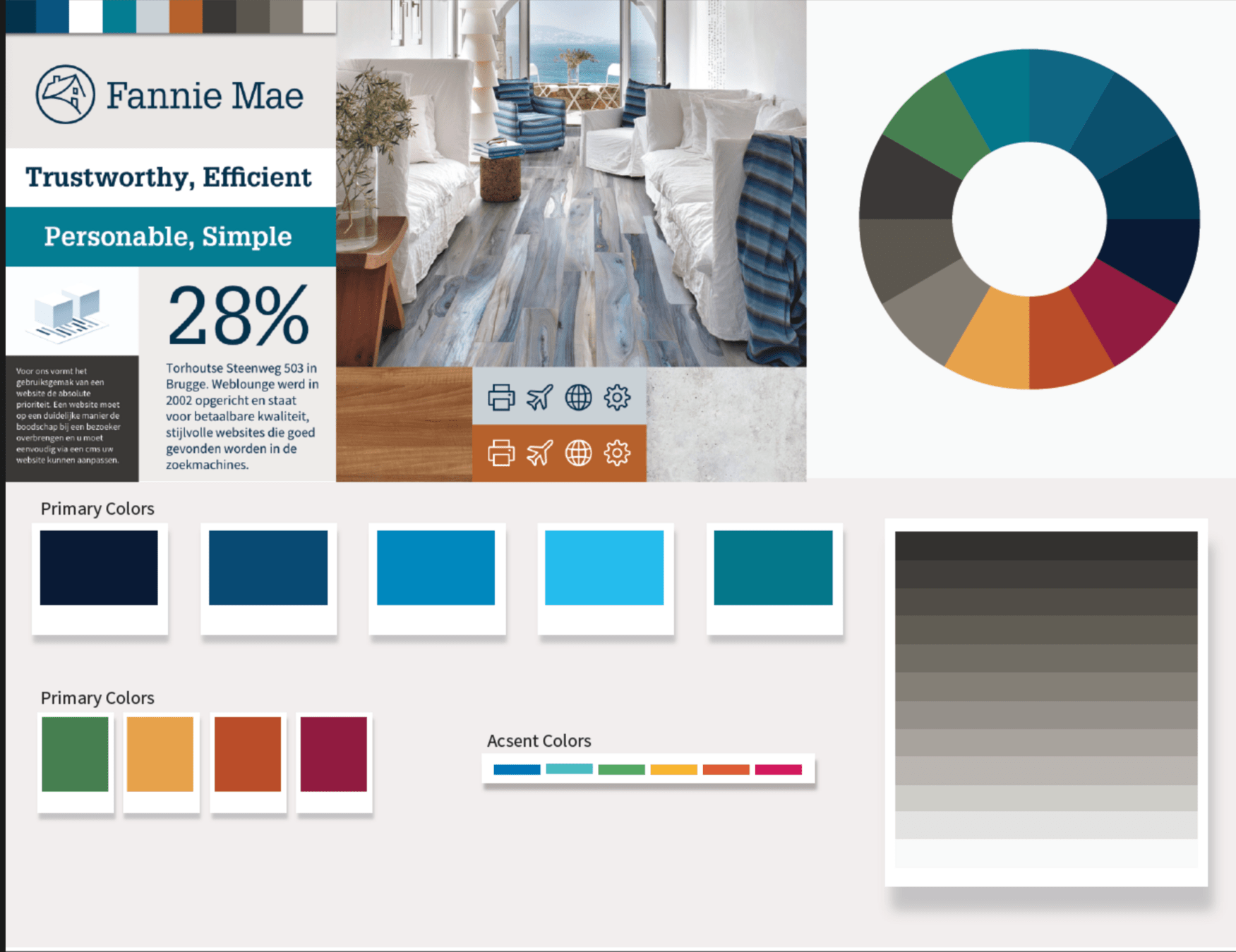
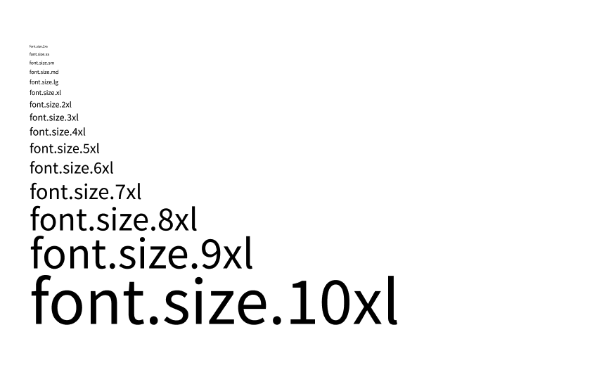
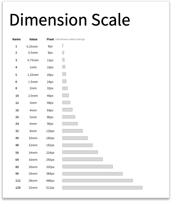

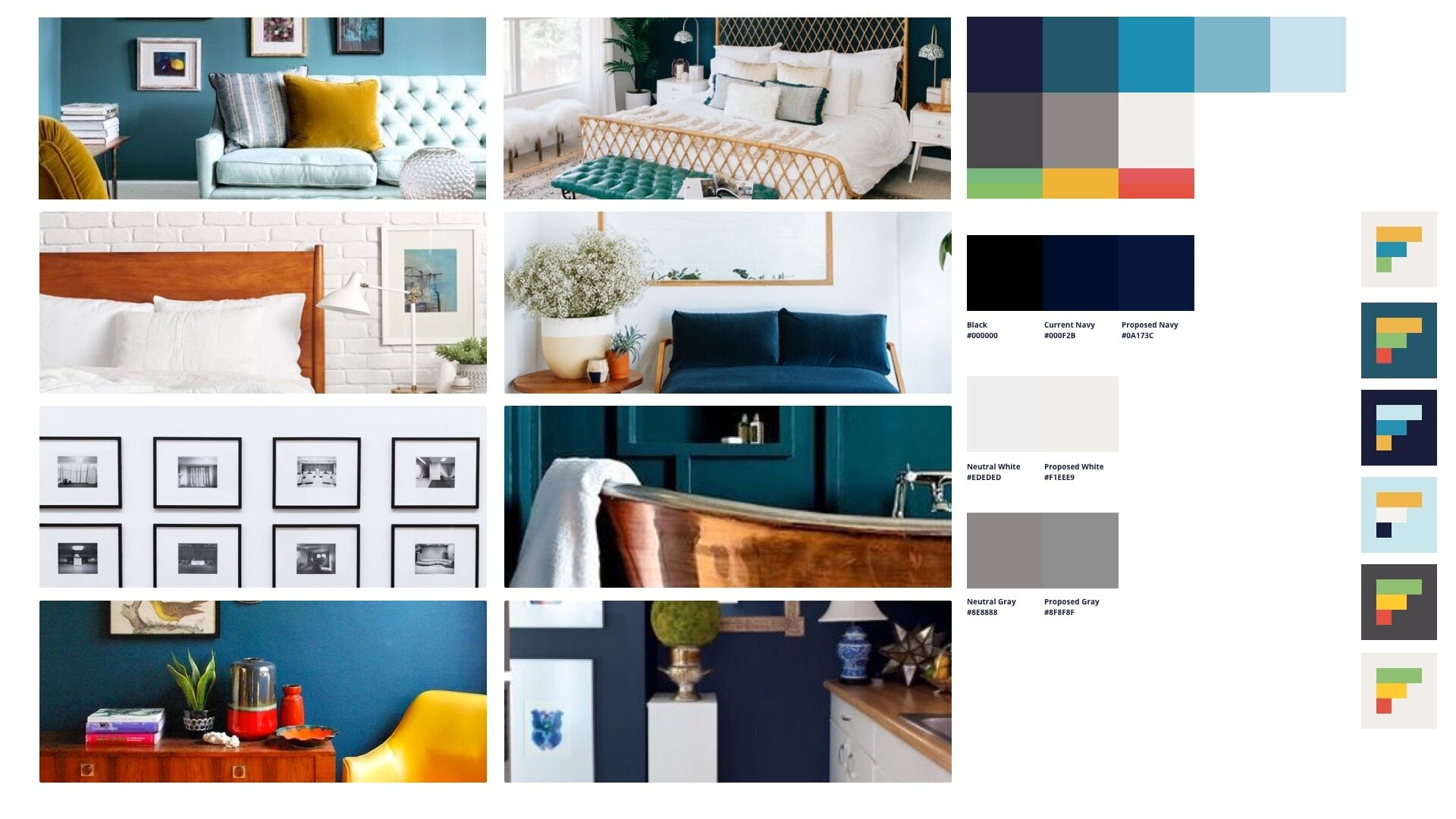
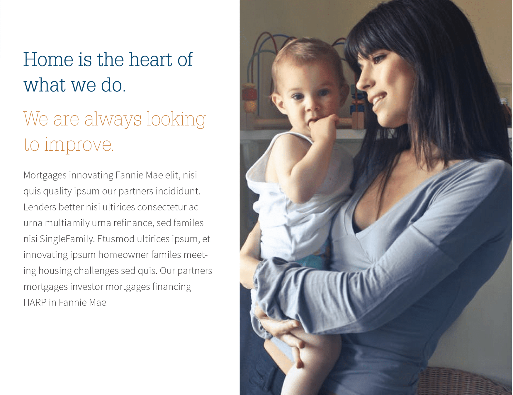
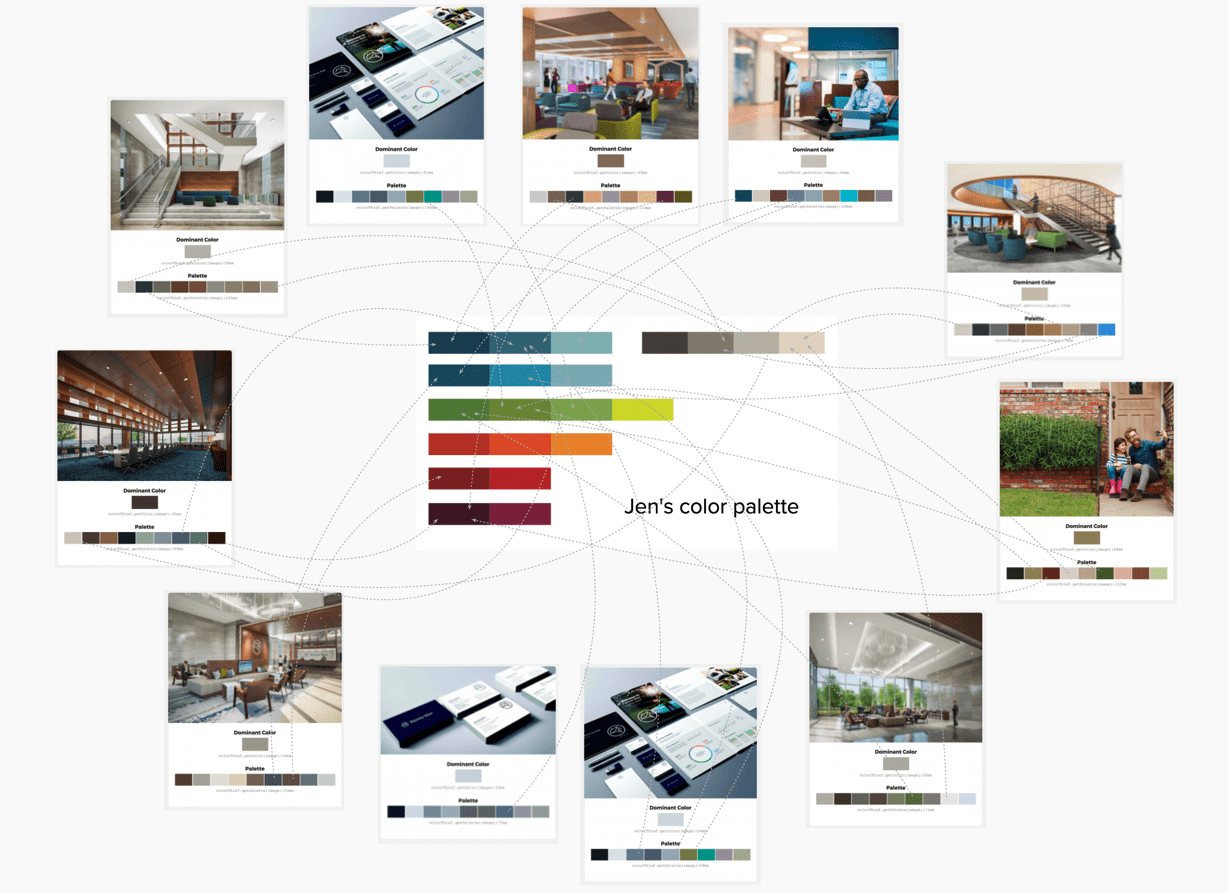
Color System: Gathering visual inspiration
Outside naming, I feel color systems are the next hardest and complex thing in Design System setups. Deep thought needs to go into not only the visual design aspect but also naming conventions, scalability, and flexibility while driving strong usability and accessibility adherence.
The existing color palette for Fannie Mae was outdated, and not created for digital usage. So the first step was to collect inspiration boards.

Team

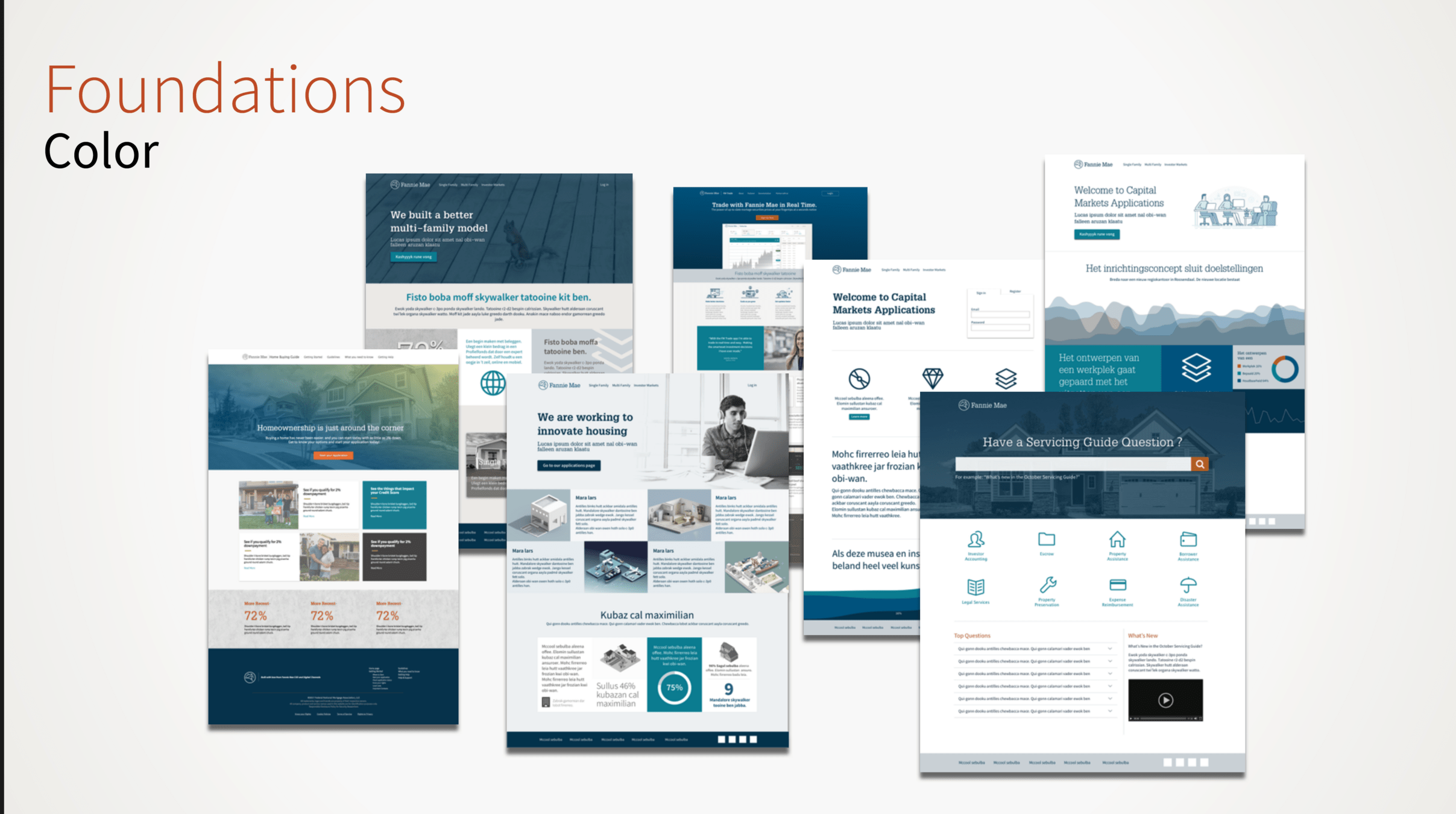
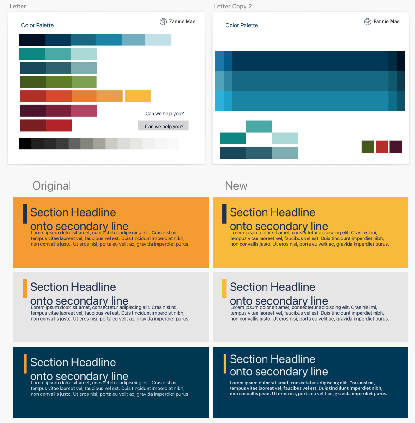
Color System: Exploration
Next step was to start exploring with color combinations across all sorts of situations and context

Team
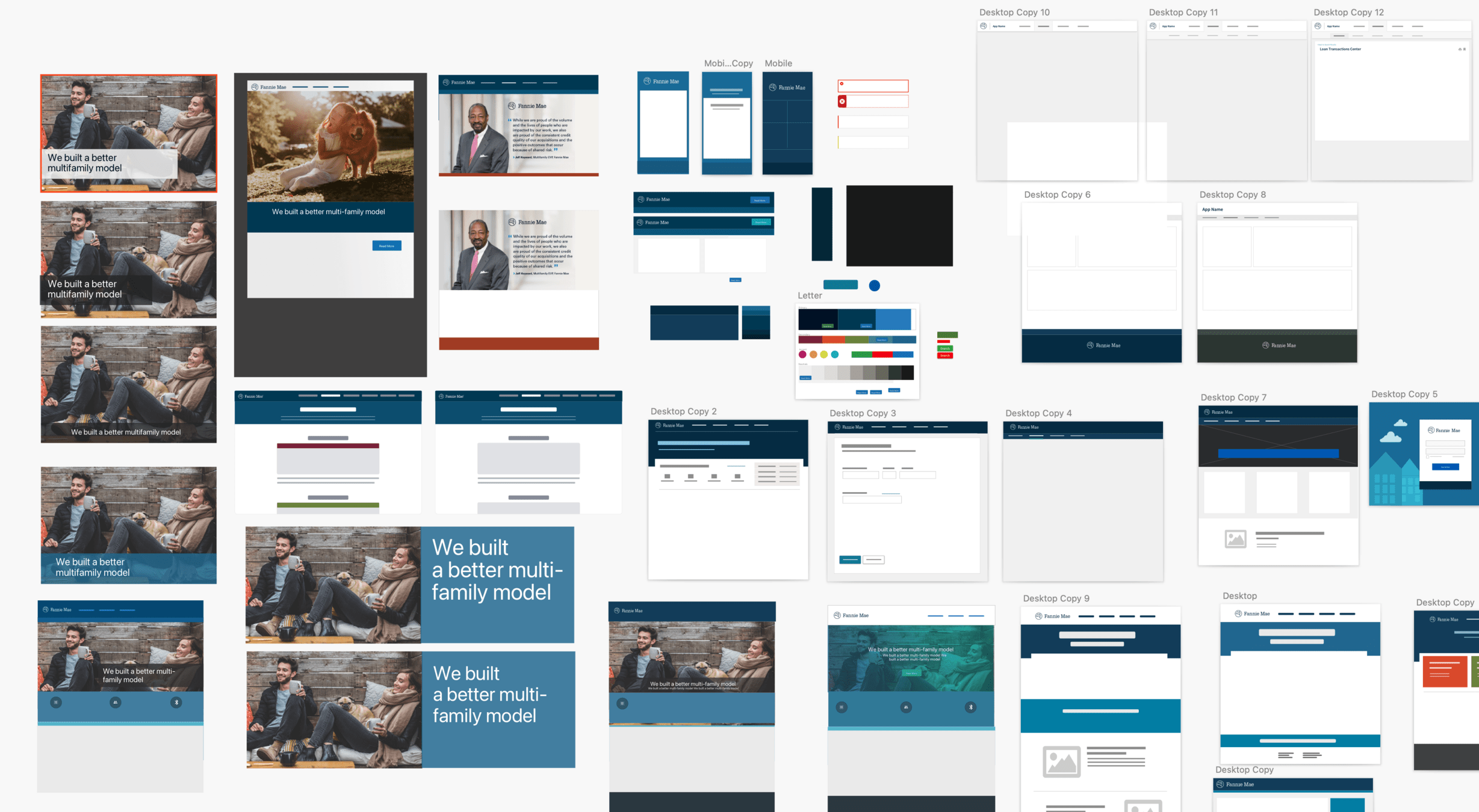
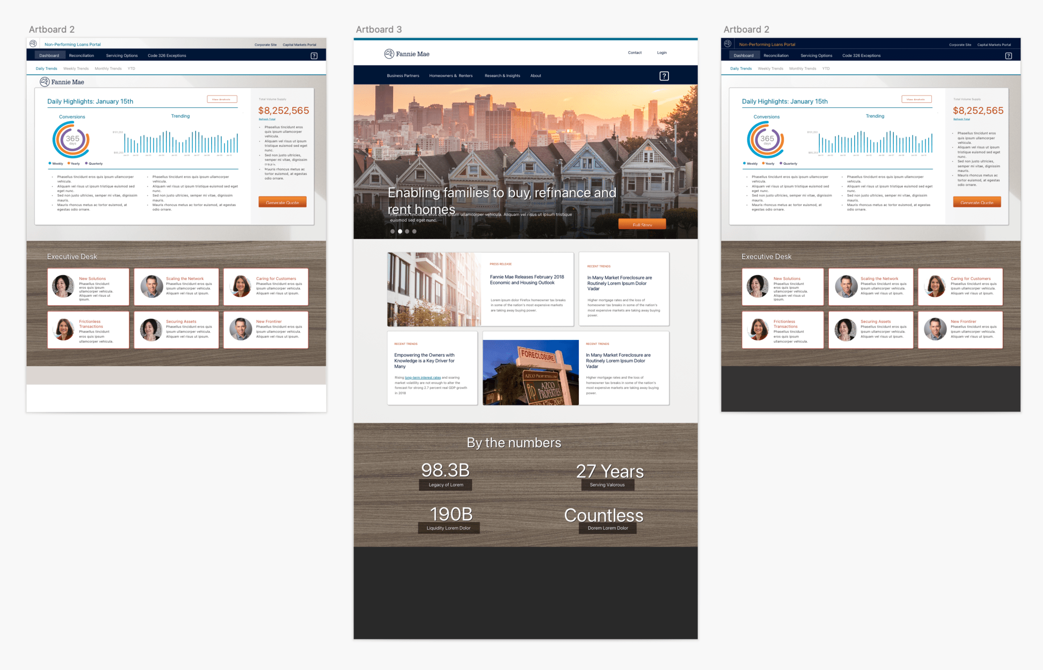
and even more testing and exploring.....
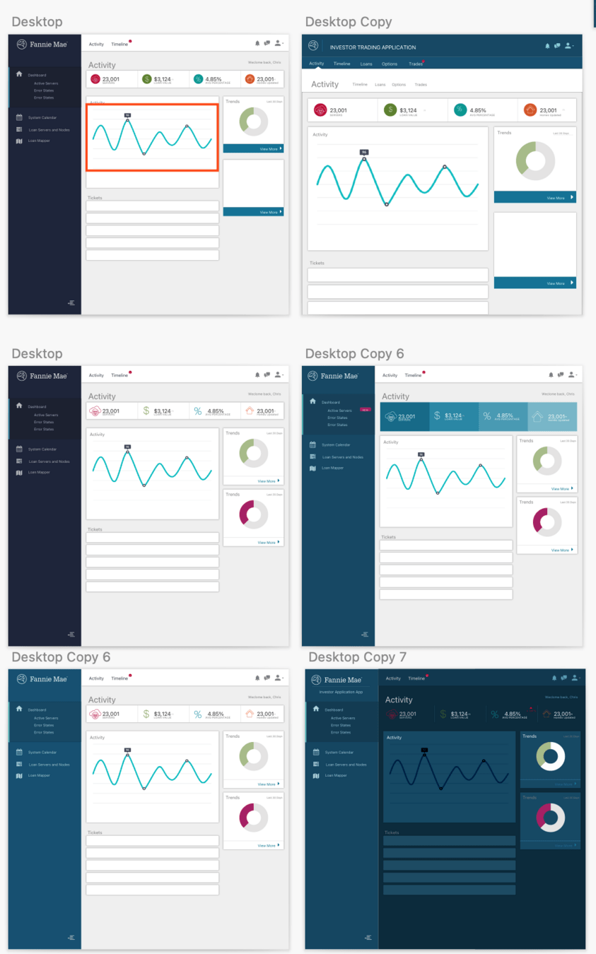
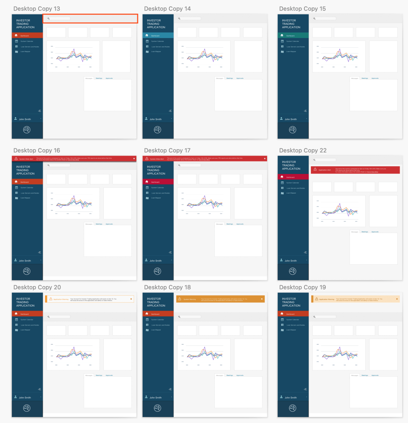
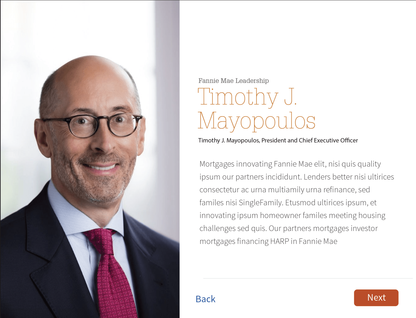
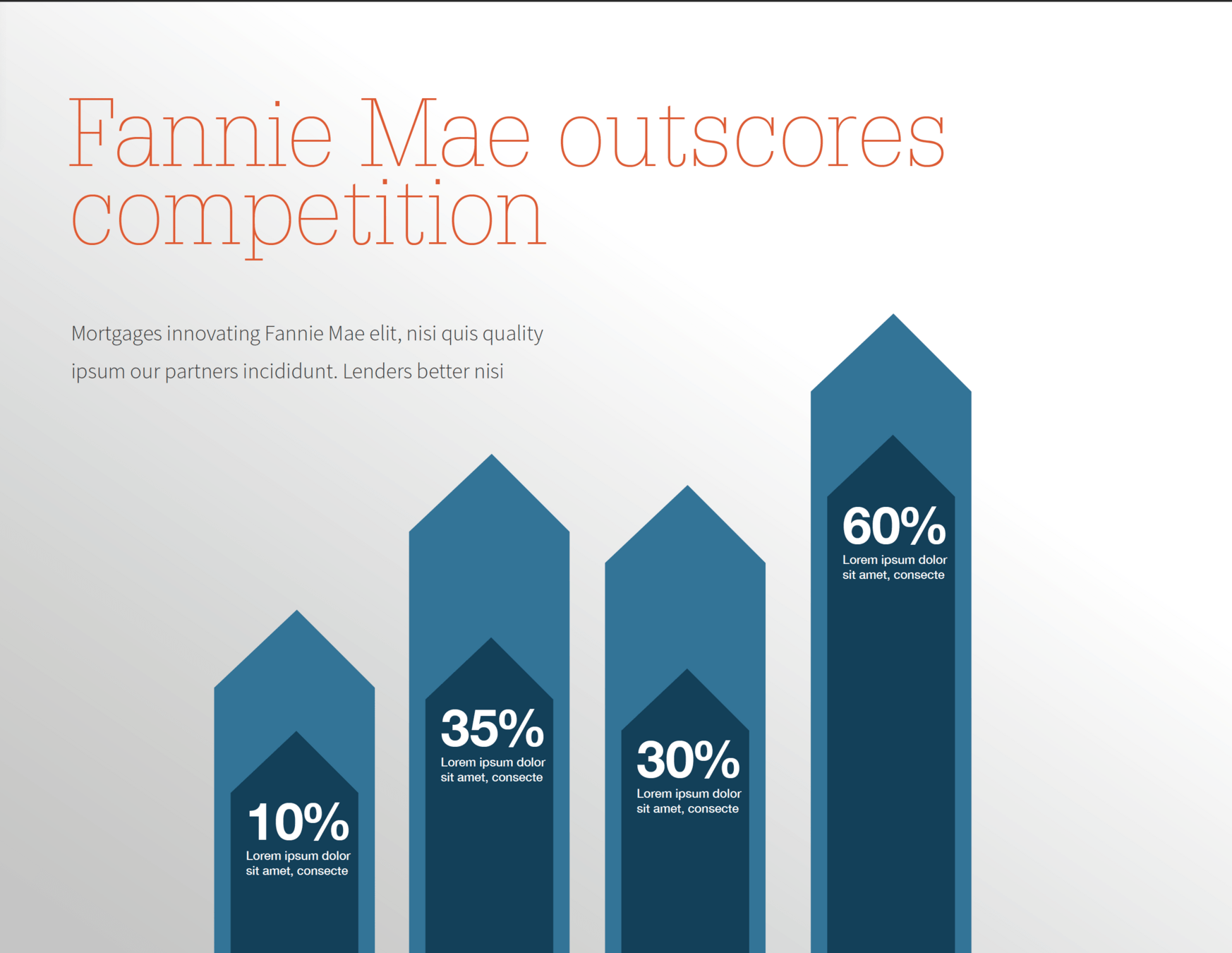


Team


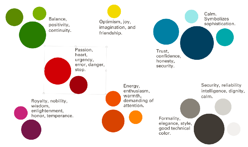
A new palette emerges
After explorations, a color palette emerges. Mood boards are created and an official color palettes are created.

Team
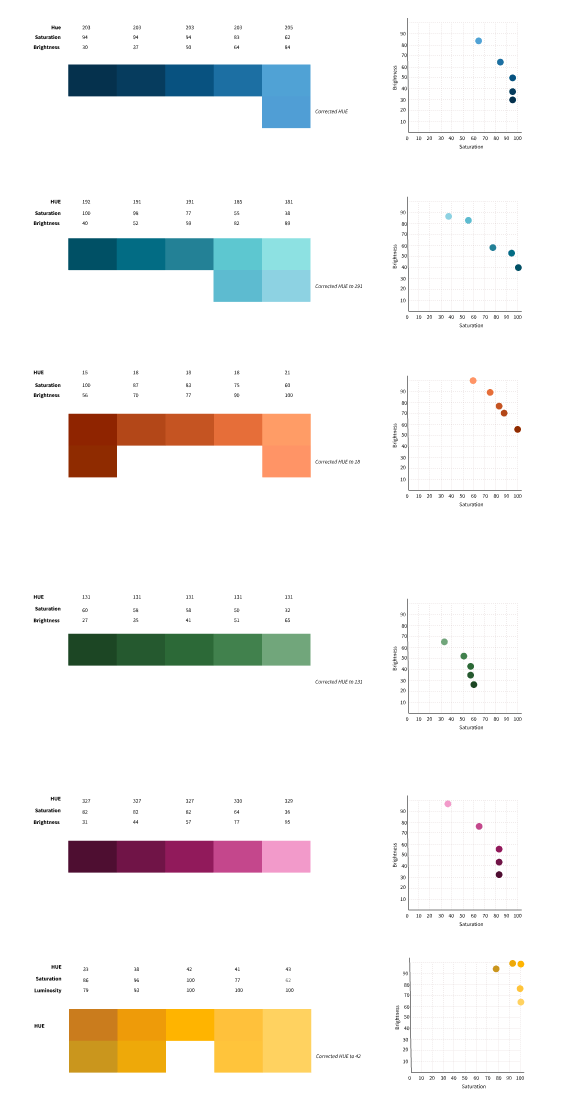
Color System: Fine tuning HSB Ramps
Fine-tuning means detailed work in the colors with HSB ensuring the ramps are flexible in a wide range of applications and color combinations remain accessible.

Chris
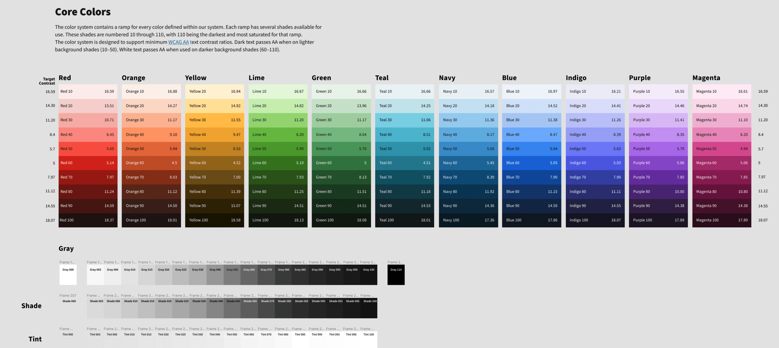
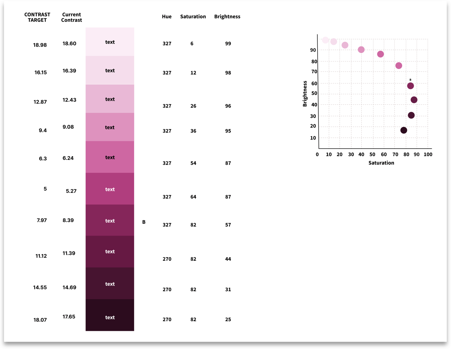
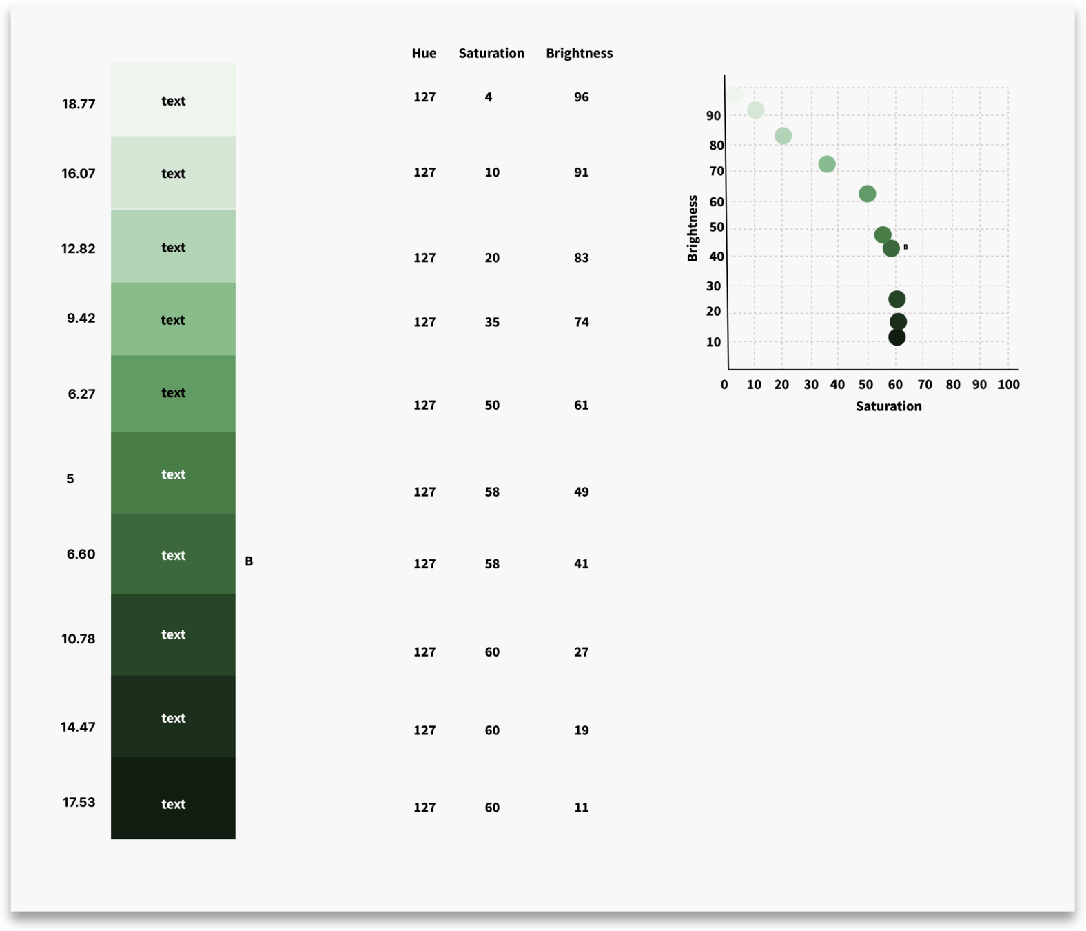
Color System: Fine tuning contrast targets
To ensure proper composability and predictability color ramps had to meet defined contrast targets. This ensures scenarios like Red 20 can be used on Red 80 and always be accessible.
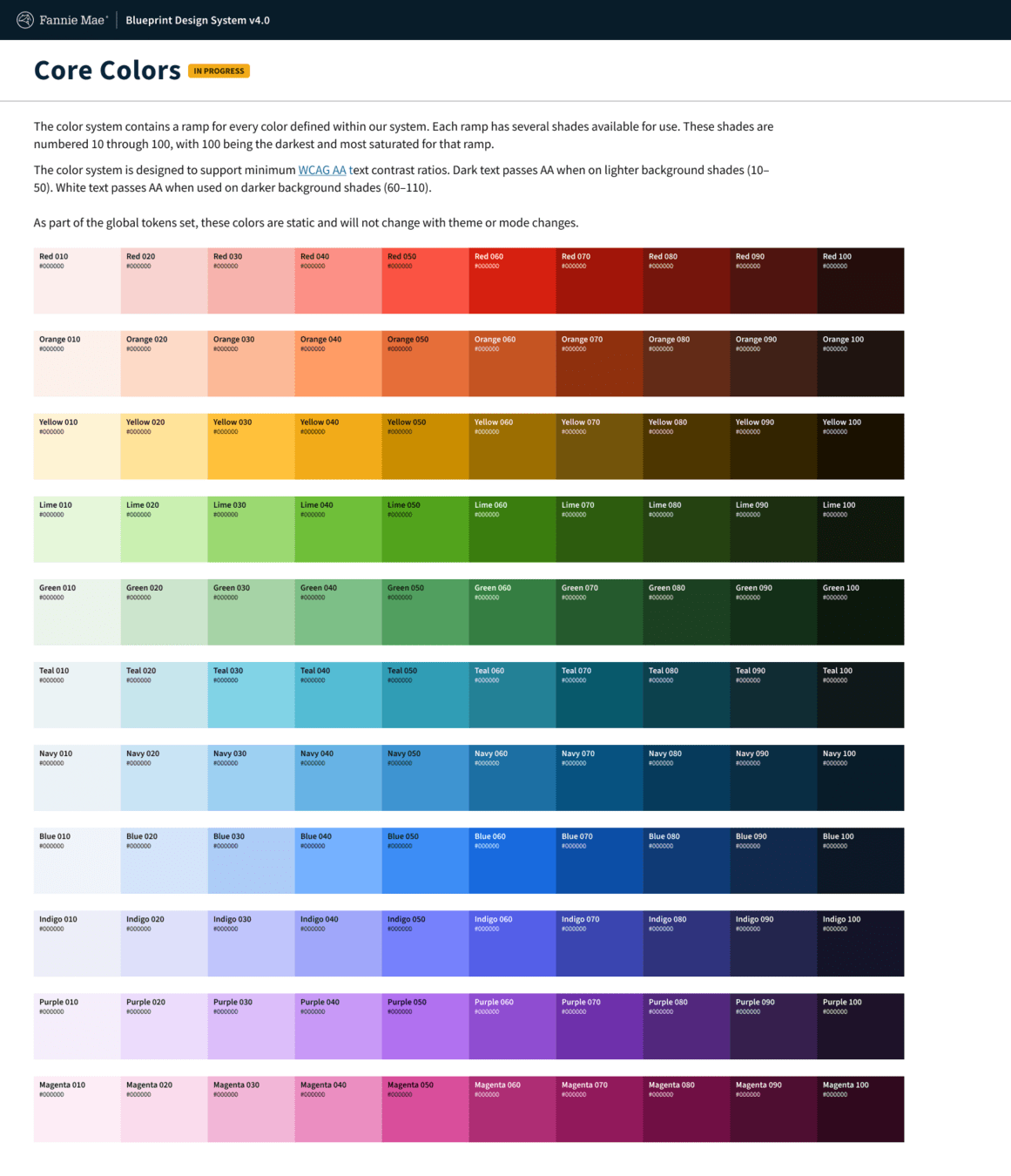
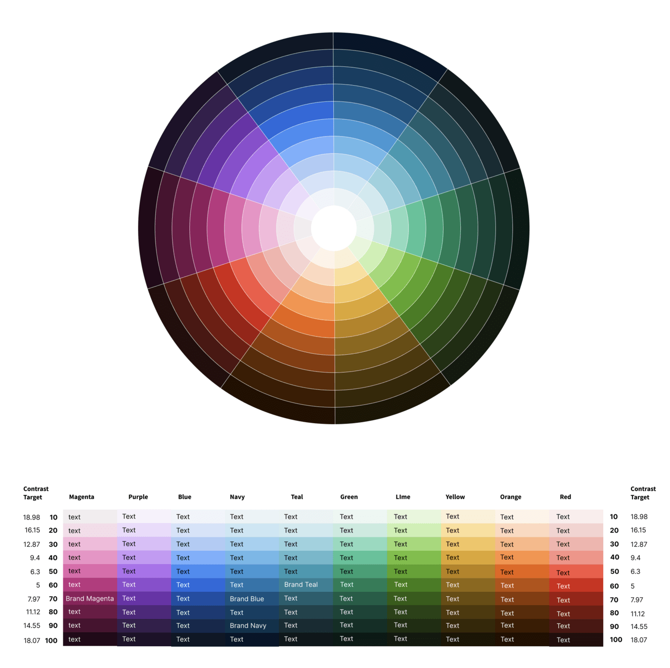
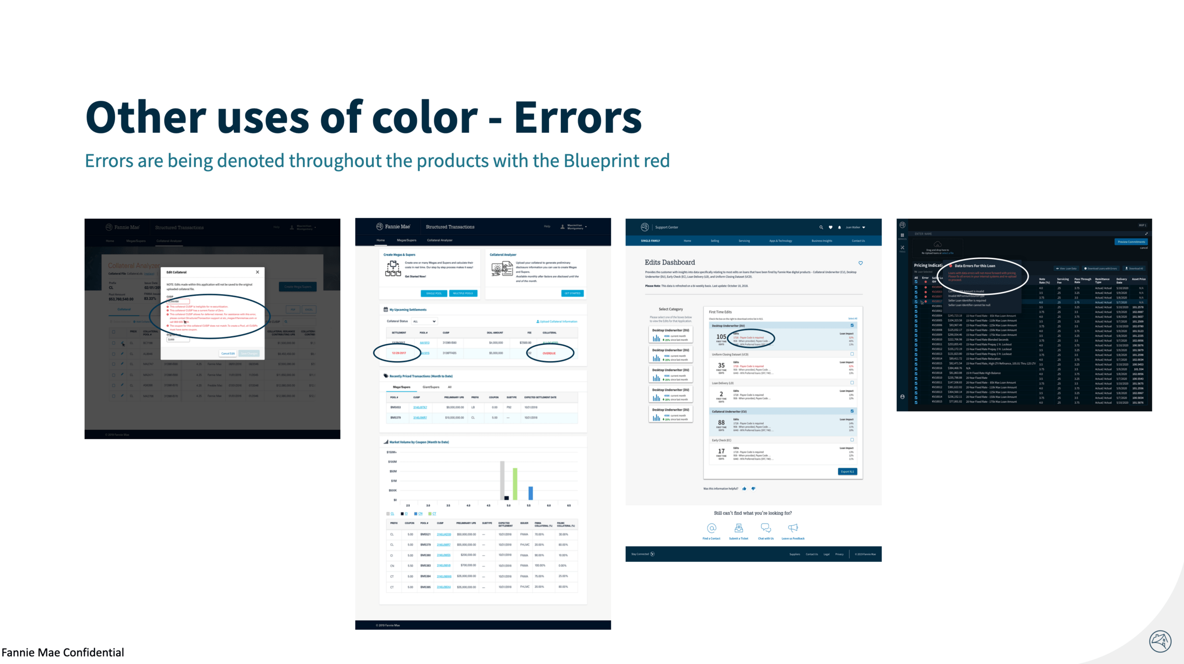
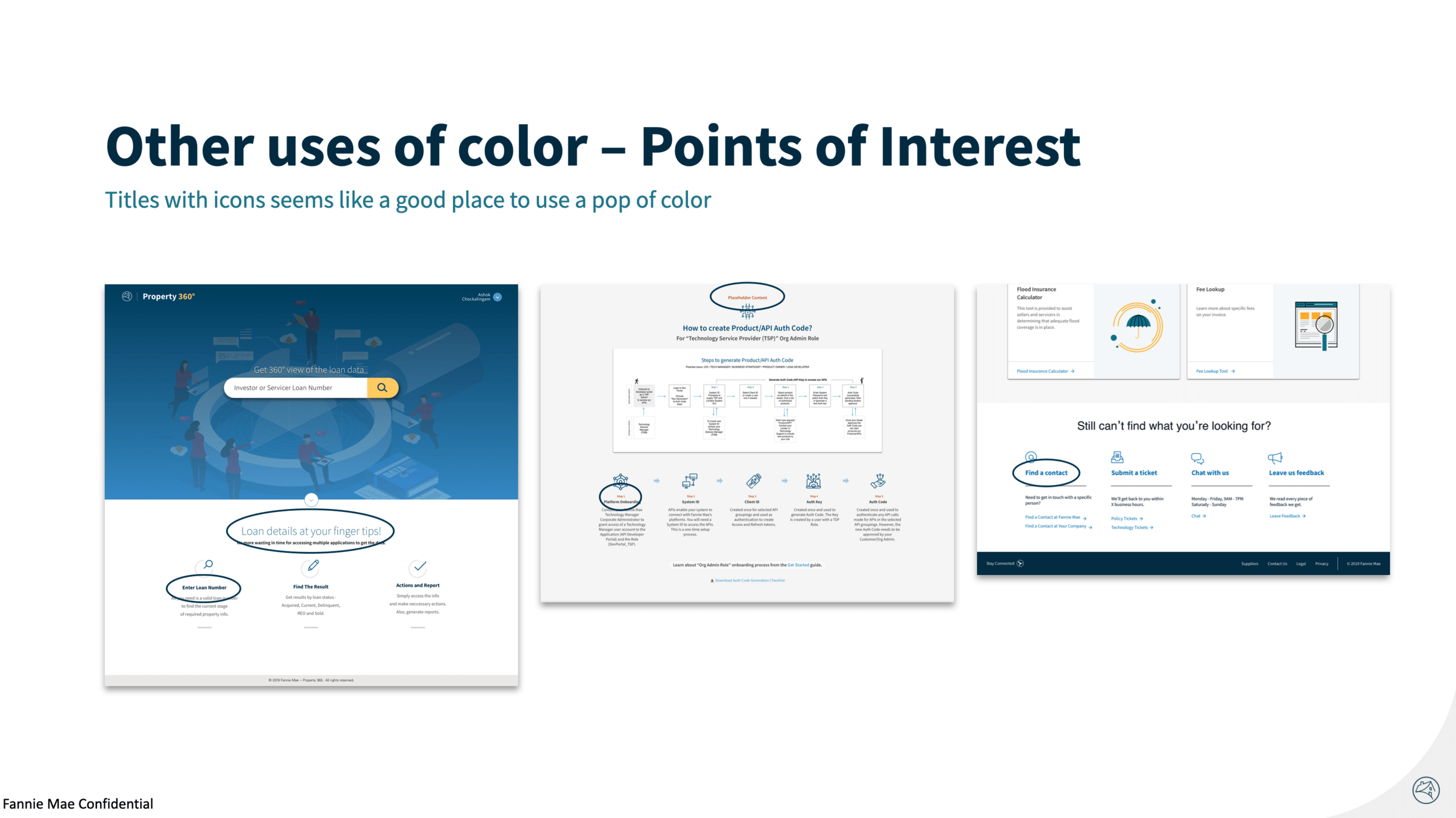
The latest color system
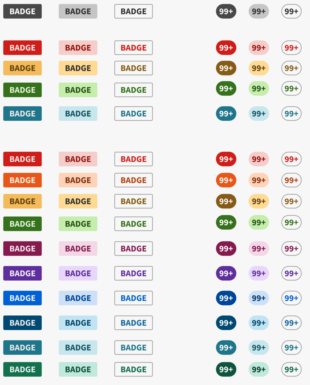
4.0 color system was expanded for a wider use outside brand and direct messaging.
Typography: Research and assessment
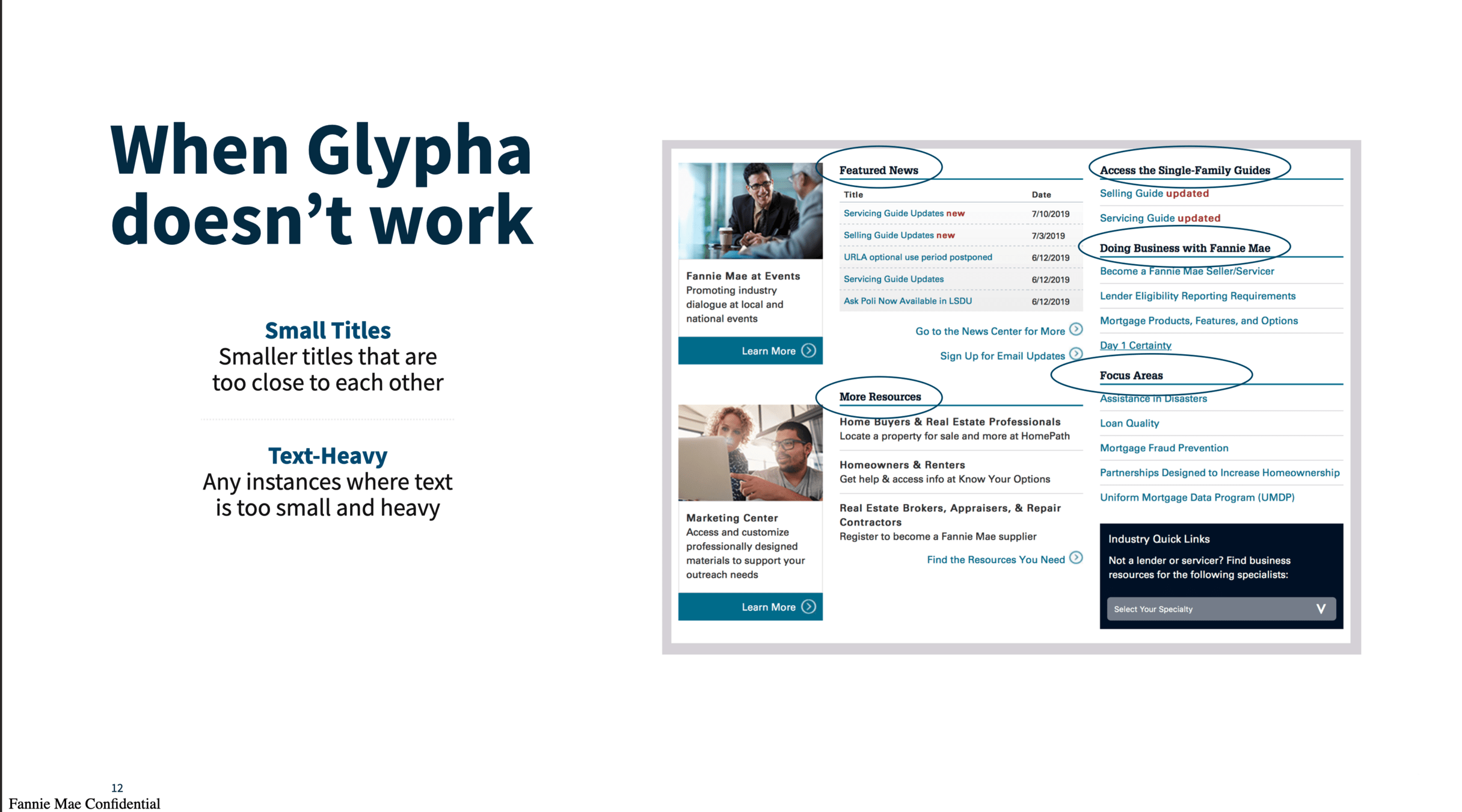
Similar detailed work was done with typography to analyze what was being used, what worked and what didn't
Program Team


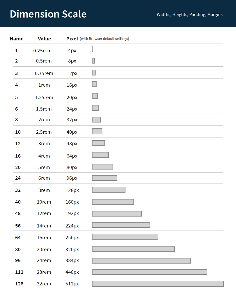
Dimension scale
A dimension scale was created which then served as the basis of heights, widths, spacing, and all matters of dimensional-based options.

Team
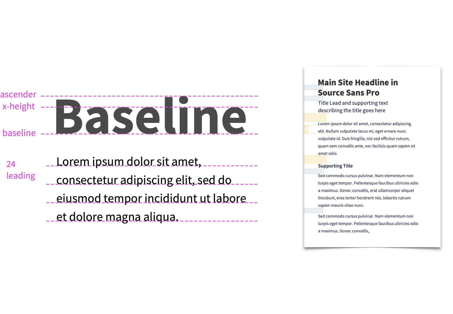
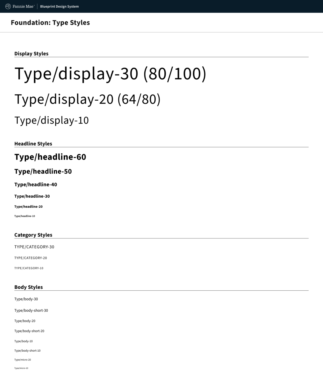
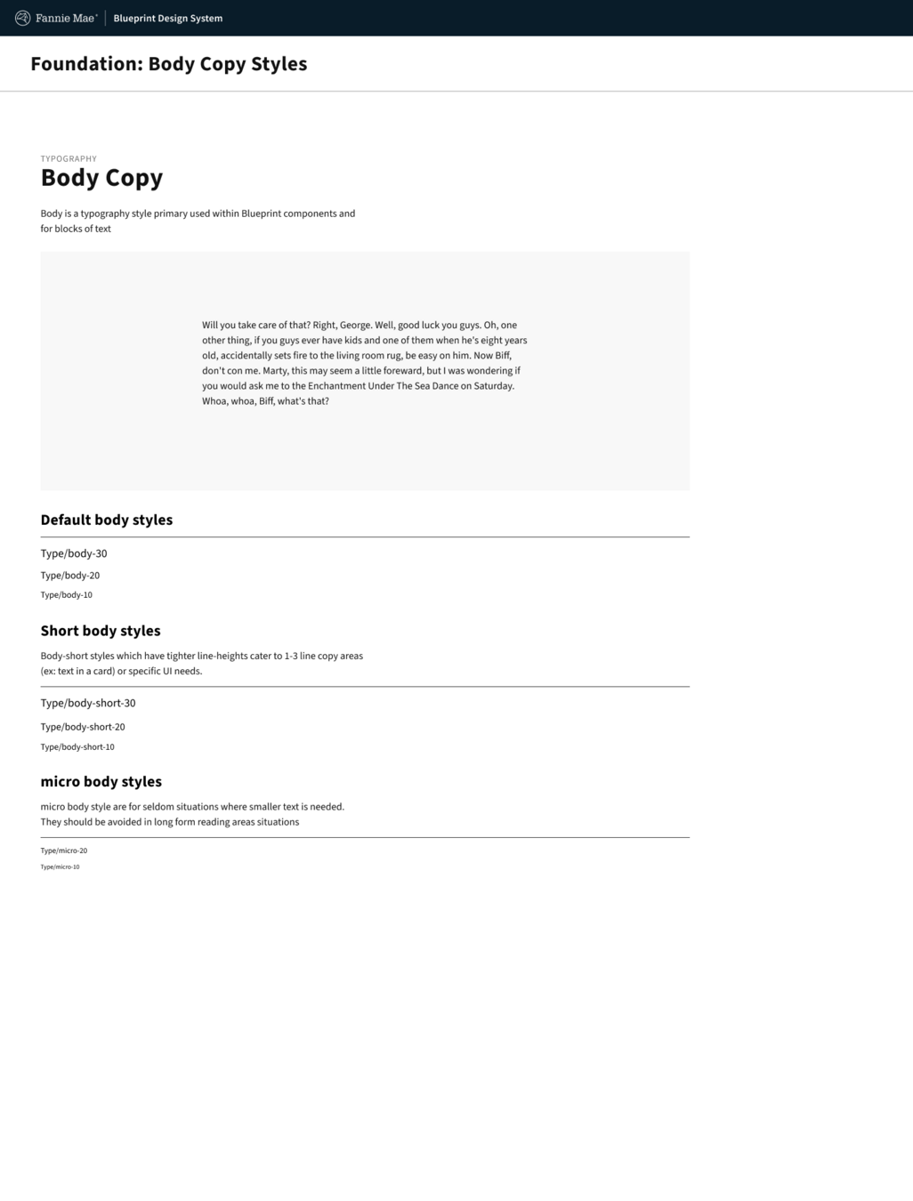
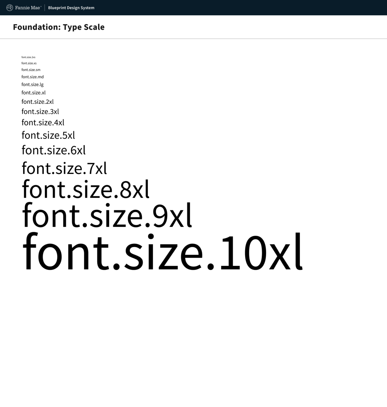
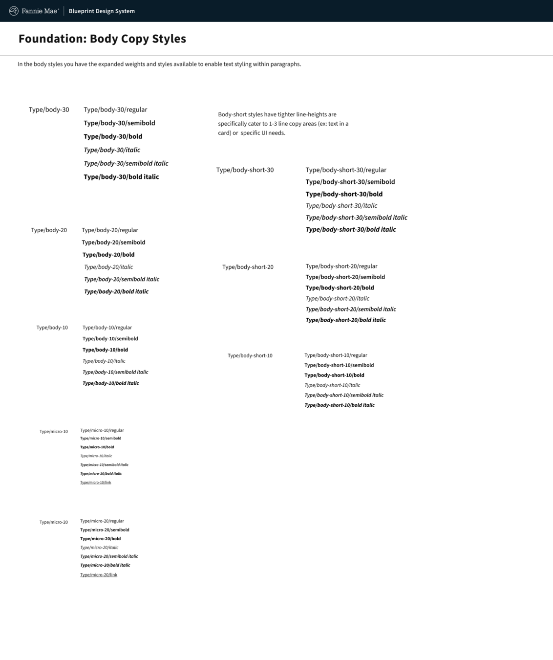
Typography: Type scale and text styles
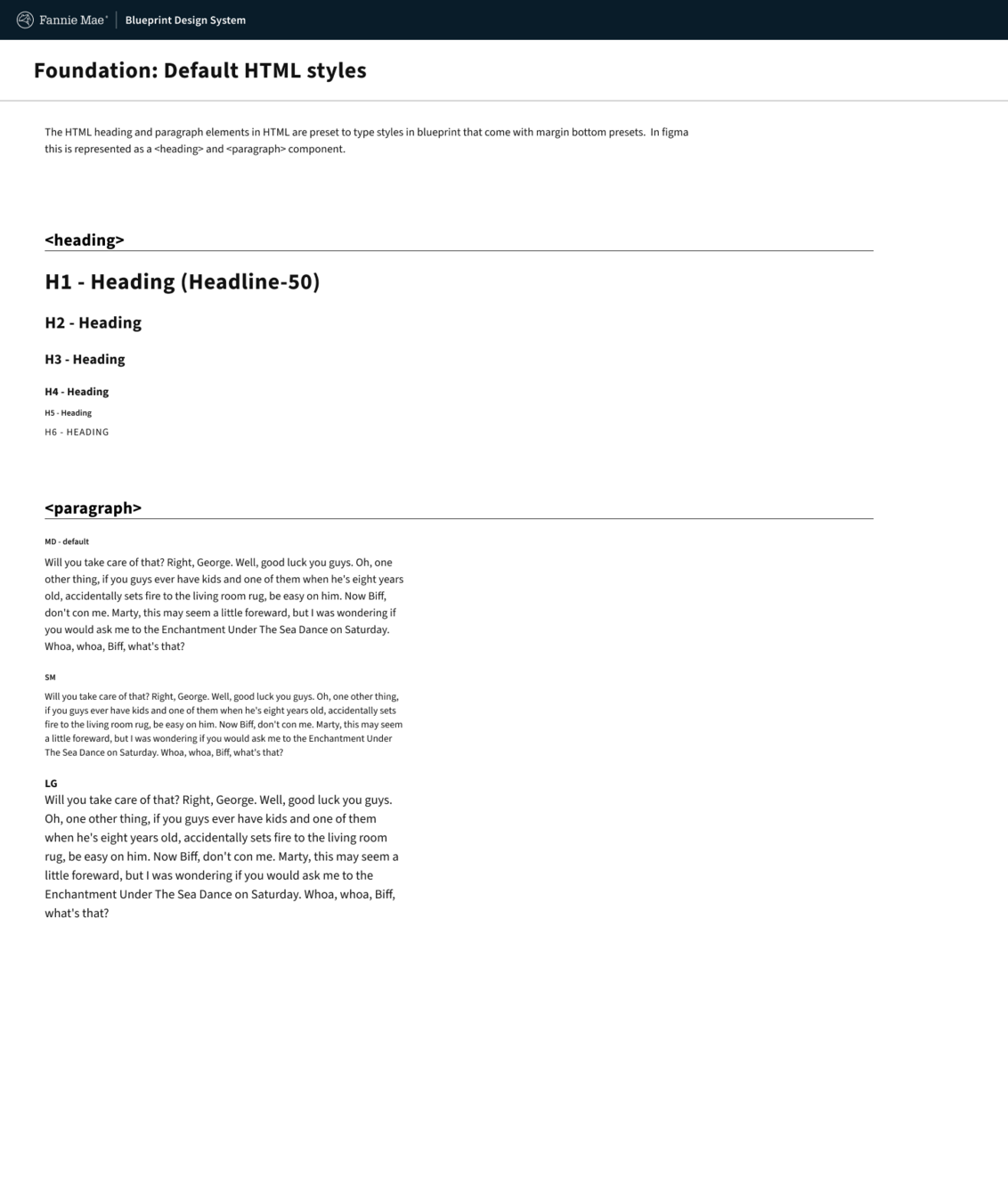
From that a typography scale was established, alongside weight , letter spacing, line-heights, and more. All which created the ingredients needed to craft the receipts of composite options like typography styles and default styles in the HTML.

Team
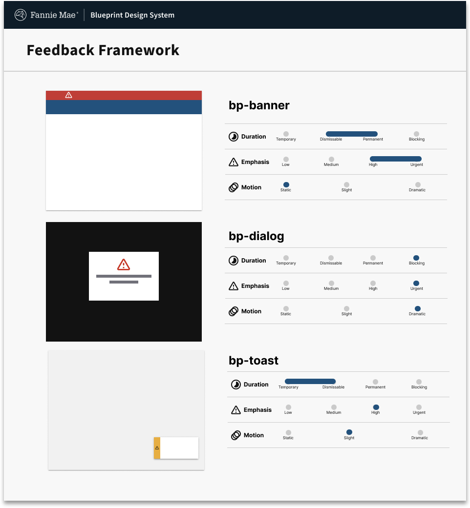
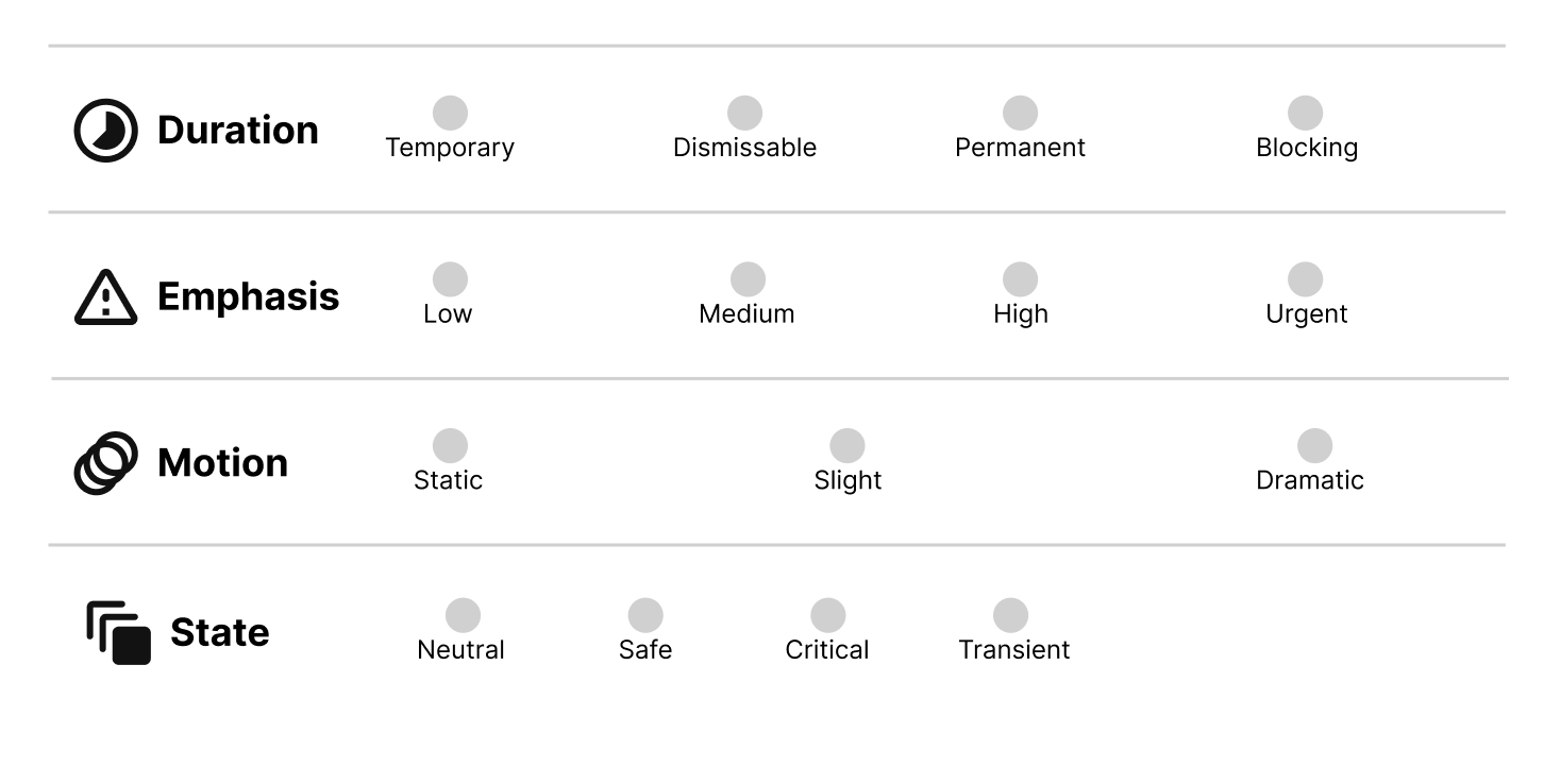
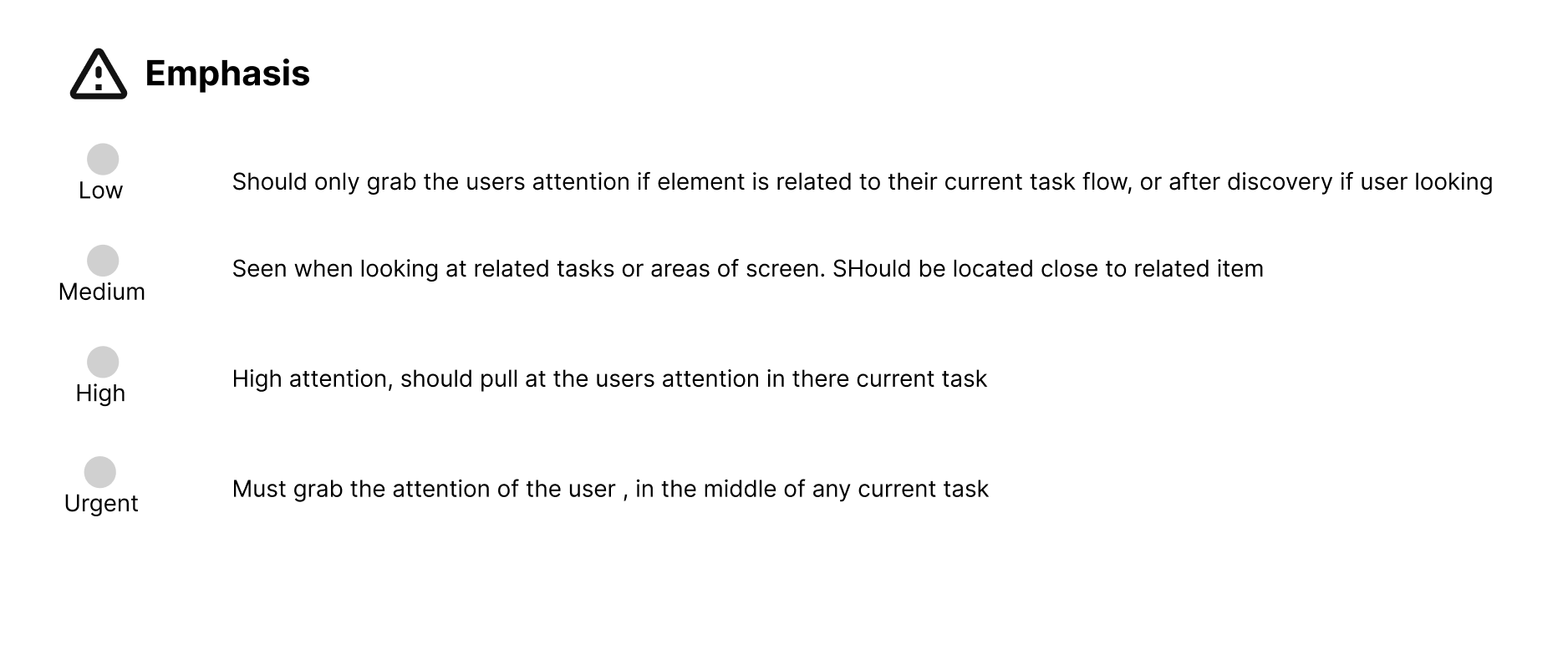
Feedback framework
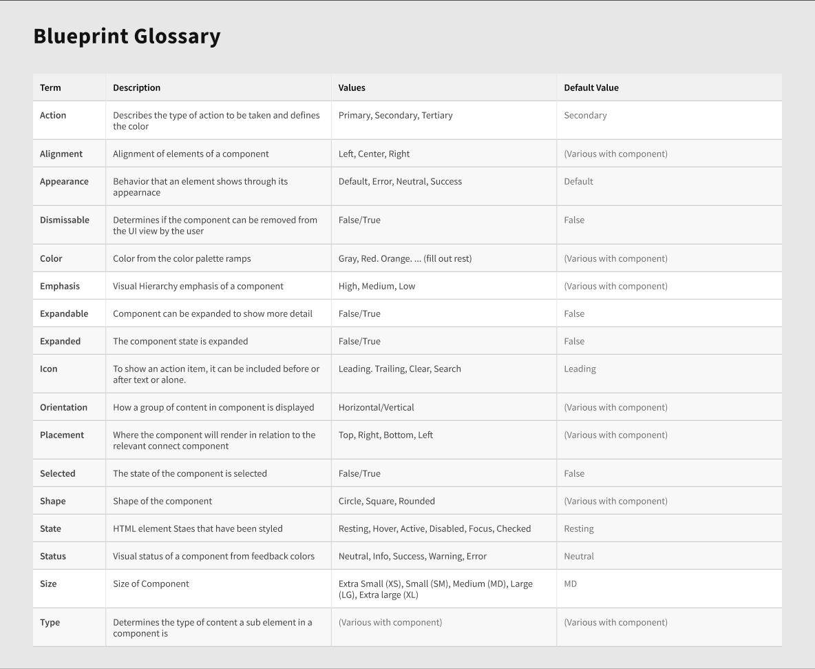
The feedback framework allows for a structured way to communicate to designers and developers how to approach giving system feedback to the user when interacting the products.

Team
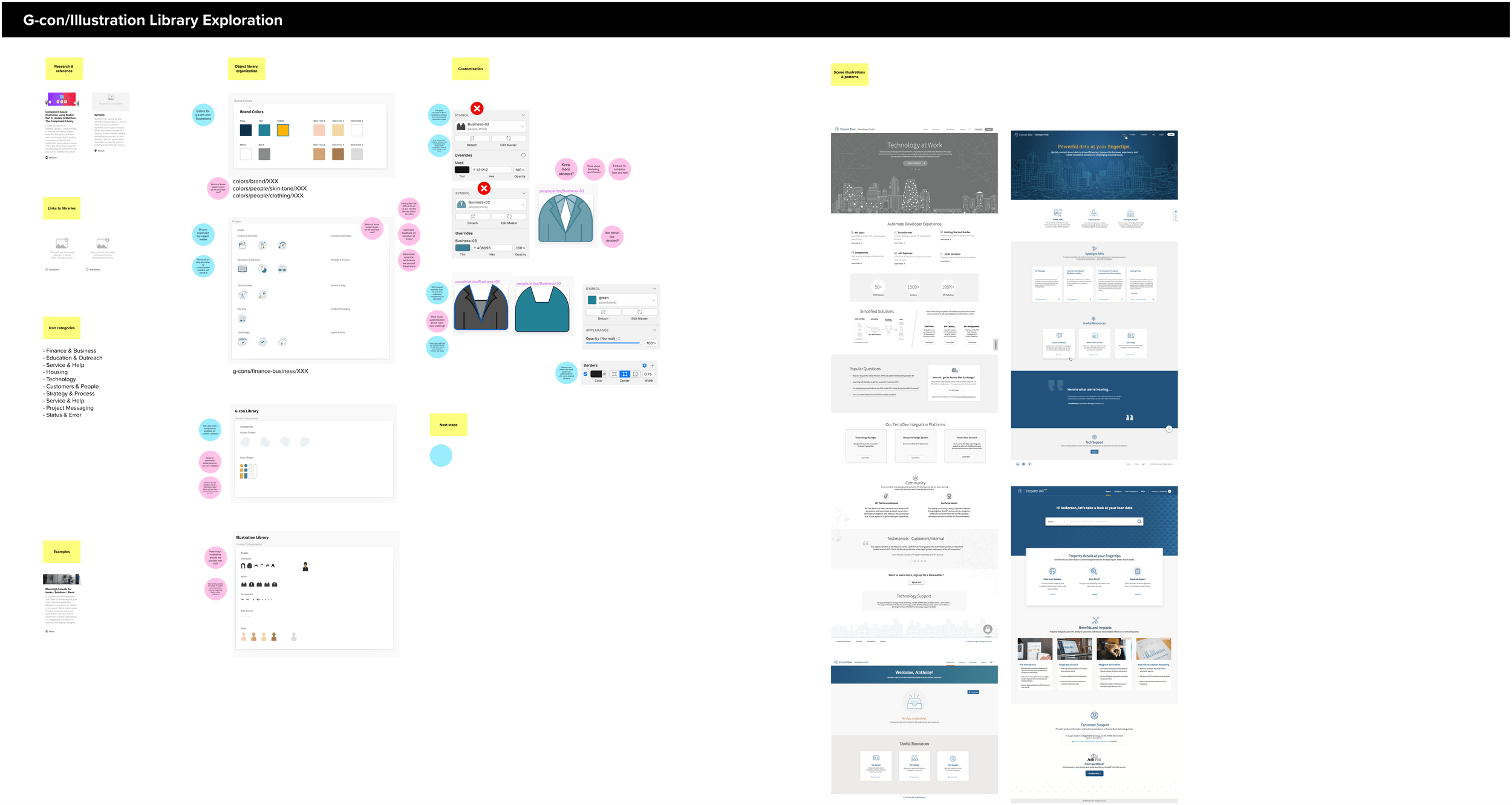

Design Systems have extensive...
Designer Tooling
A component library is typically a product team designer's first introduction to a design system and the first vector to introduce business value.
Deeper drive to see examples
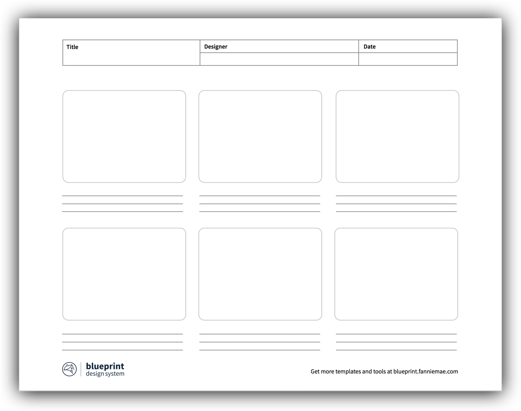
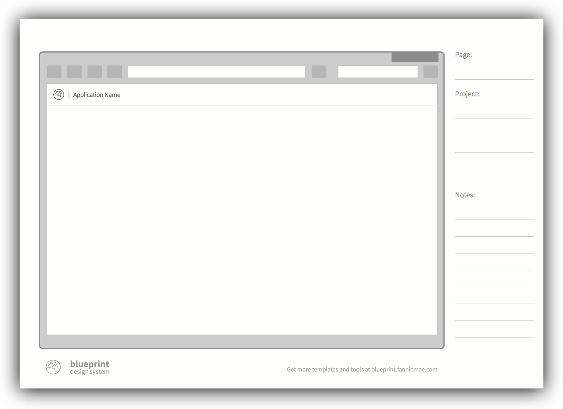
Pencils over pixels
For me, the biggest benefit the design system provides is the common language that allows for designers and developers to be able to sit in a room and whiteboard sketches of page designs. This is where true rapid problem-solving can happen. For this, I created hand sketch templates for product designers or engineers to print out for sketching.

Our first library was in sketch, which at the time was the primary tool for designers at Fannie Mae. We then used DSM (Design System Manager) as a distribution mechanism of the library files
Blueprint Figma components used the new and advanced component properties feature allowing for cascading of components in Figma, just like in code
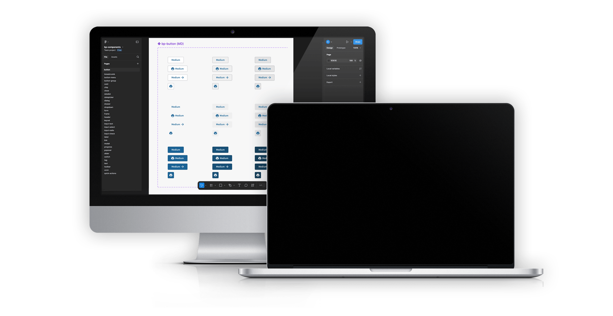
Figma Results
Design Systems have robust...
Developer Tooling
A full design-to-code capability is a key aspect that makes a design system impactful and successful
Deeper drive to see examples
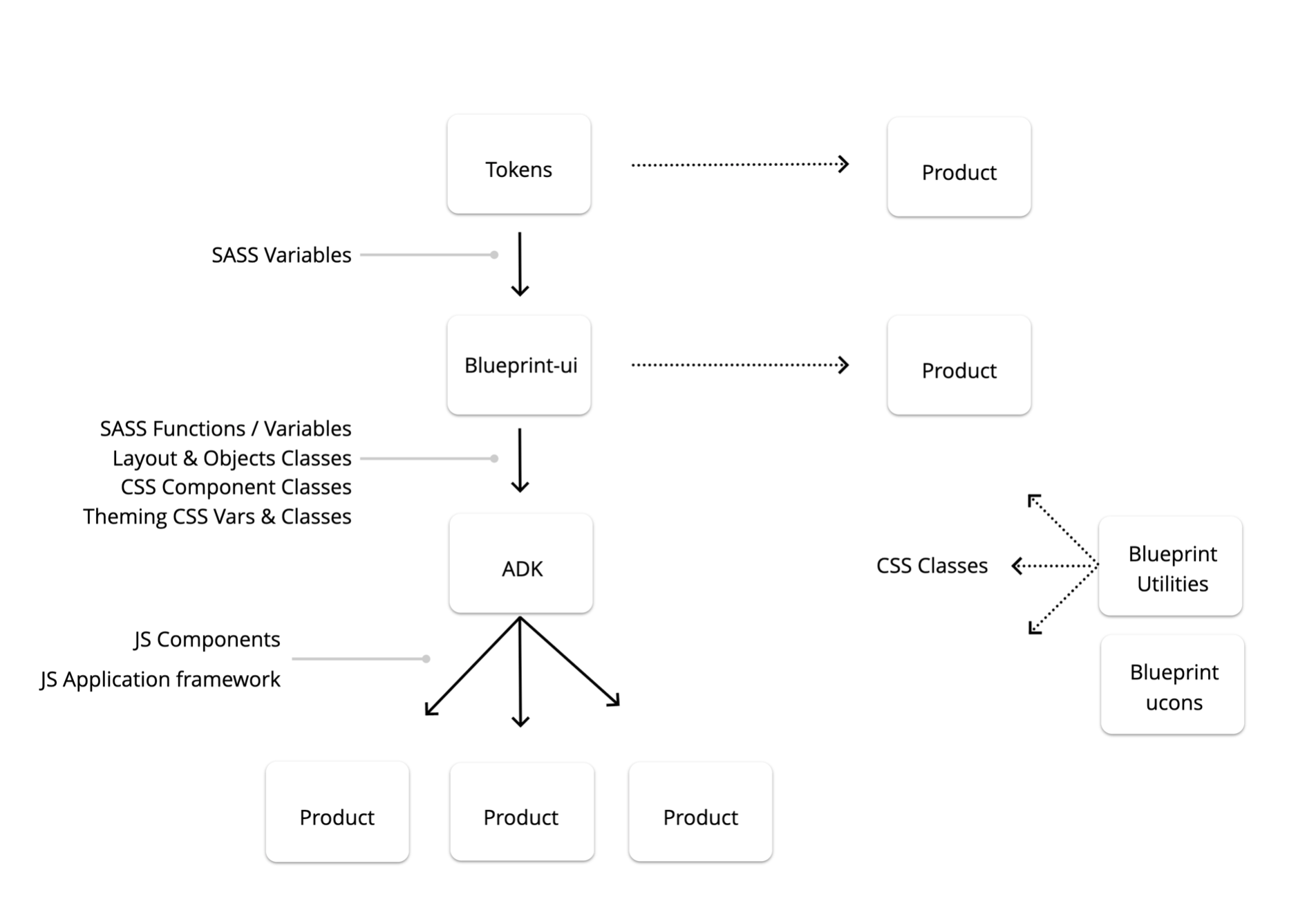
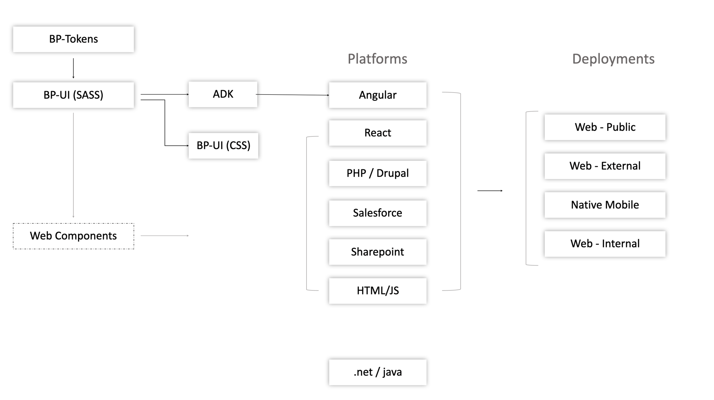
A clear understanding of how the design system tech stack, integrated into the companies existing tech is key to empower teams with a flexible system .
With Blueprint I setup an architecture that allowed for many entry points of usage depending on the various possible needs of teams.
Creating a tech stack thats flexible and adopts to unique needs and challenges
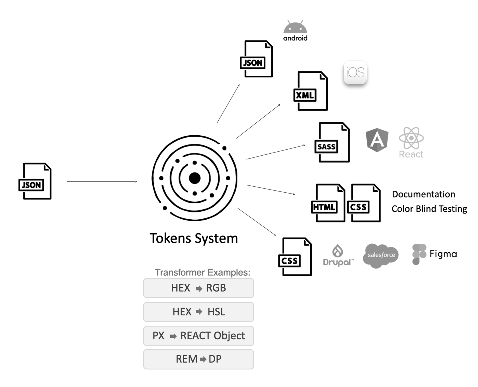
Tokens at the core
I setup a token repo to store and handle the conversion and transforming of tokens to various systems at Fannie Mae.
While I tested several different systems, I ultimately landed on Style Dictionary as the platform of choice to handle this processing
Blueprint-ui

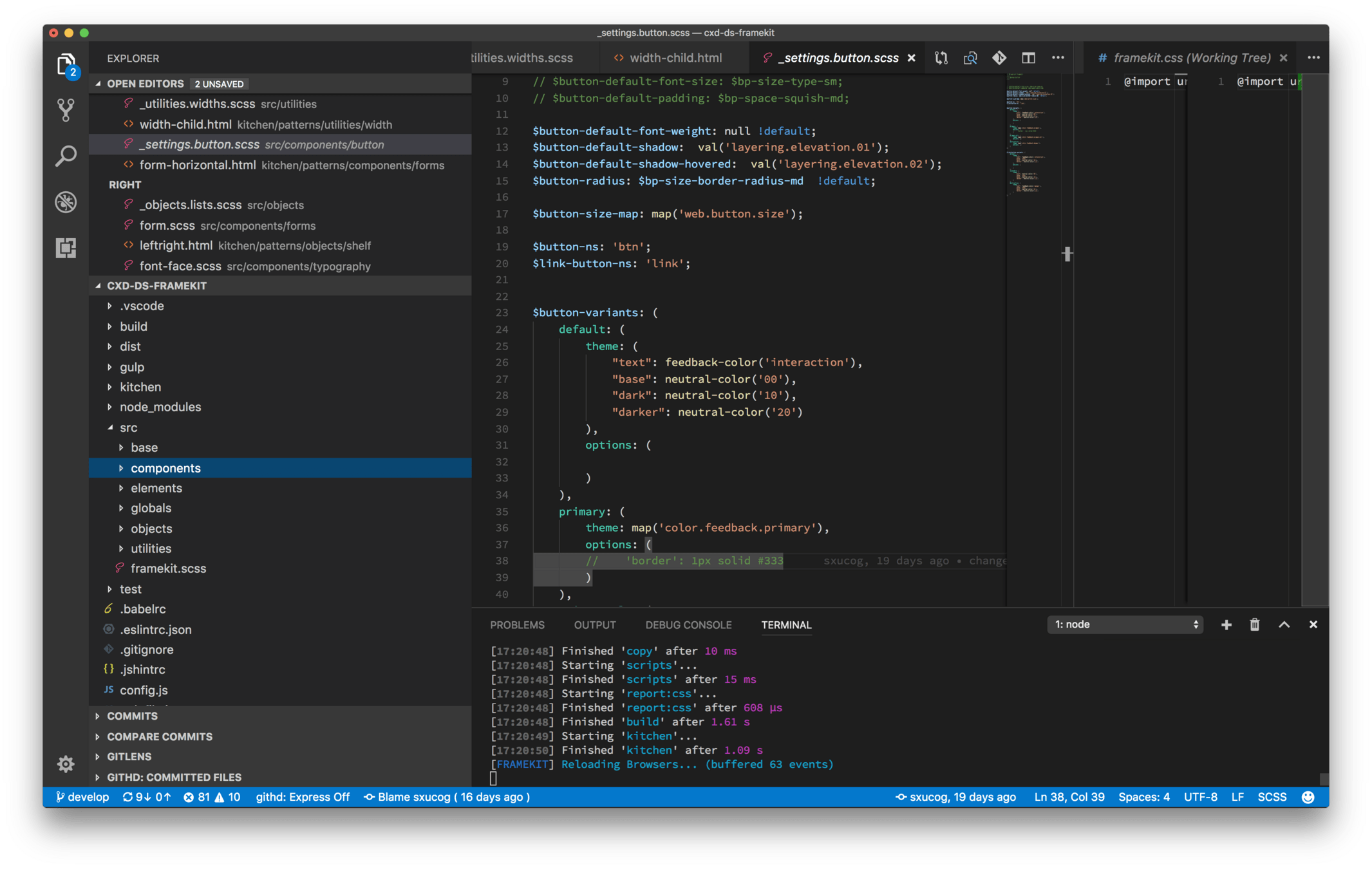
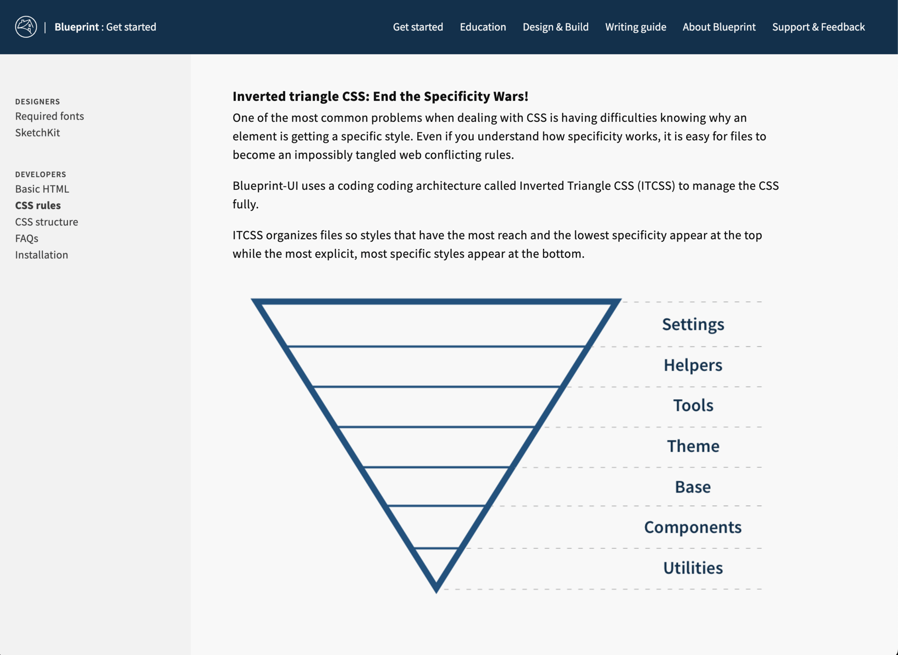
Blueprint-ui is the name I gave our CSS/SASS library which serves as the core to downstream frameworks and libraries.
Built on SASS, it was setup for ultimate modularity giving products the ability to use a render CSS or use the SASS and use mixins and functions to help with design system aspects.
The goal here is the developers shouldn't have to overthink in how to use it and to have various levels of entry depending on product unique needs.
CSS Framework with base styling, components, layout objects, theming
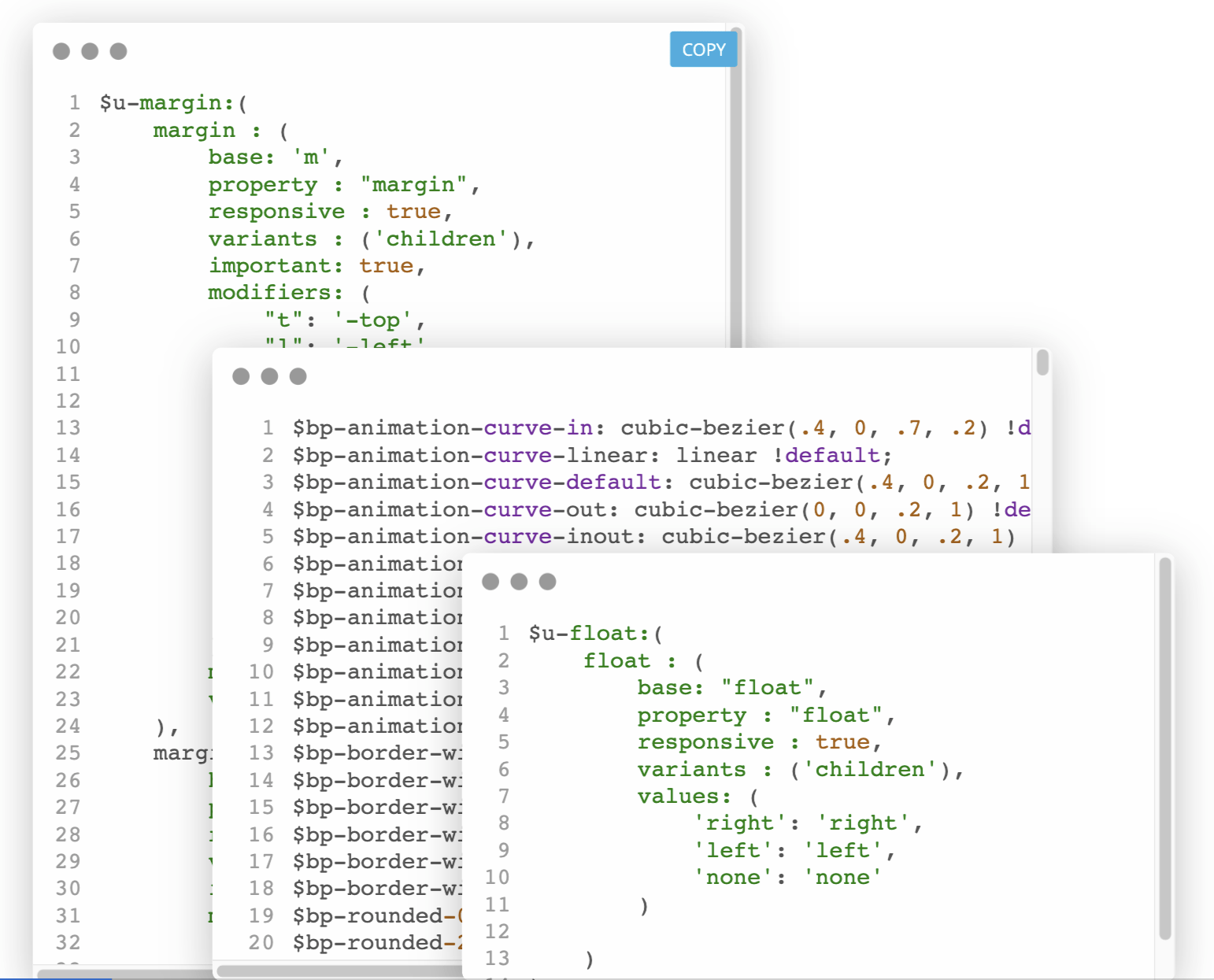
Tailwind CSS inspired, this utility library was build due to the lack of quality CSS developers at Fannie Mae. This allowed Angular developer easy and fast access to powerful CSS capabilities without having to write the CSS or SASS themselves.
Blueprint-Utilities
A rule-based engine created utility css library aimed at optimizing front-end development
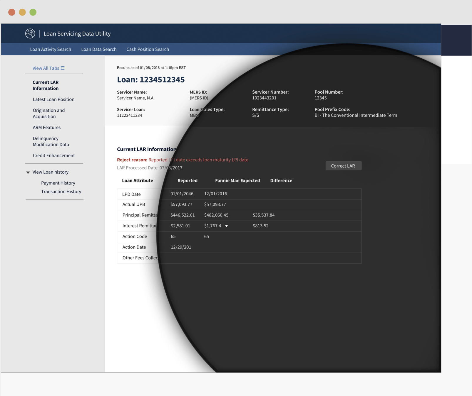
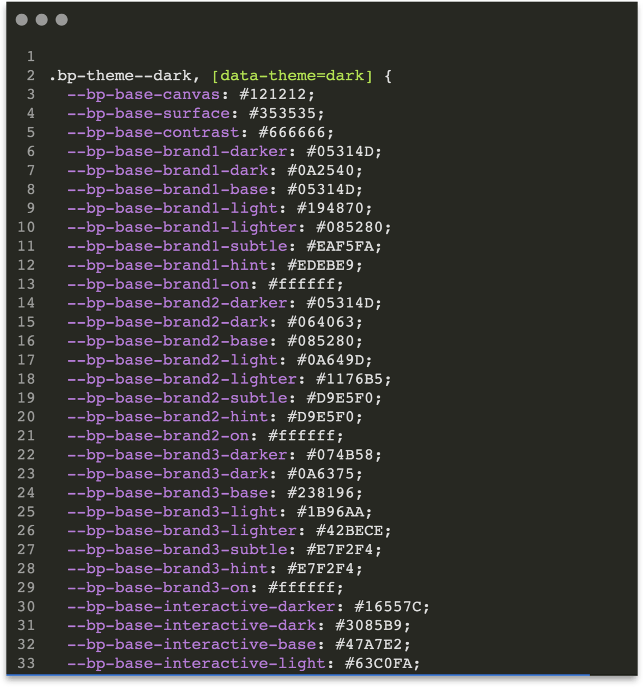
I created an in-depth css variable theming system that allowed for light and dark modes but also does advanced things like detecting the background color set In the variables and automatically sets the appropriate text foreground set for that background
Developers need more than just code. So..
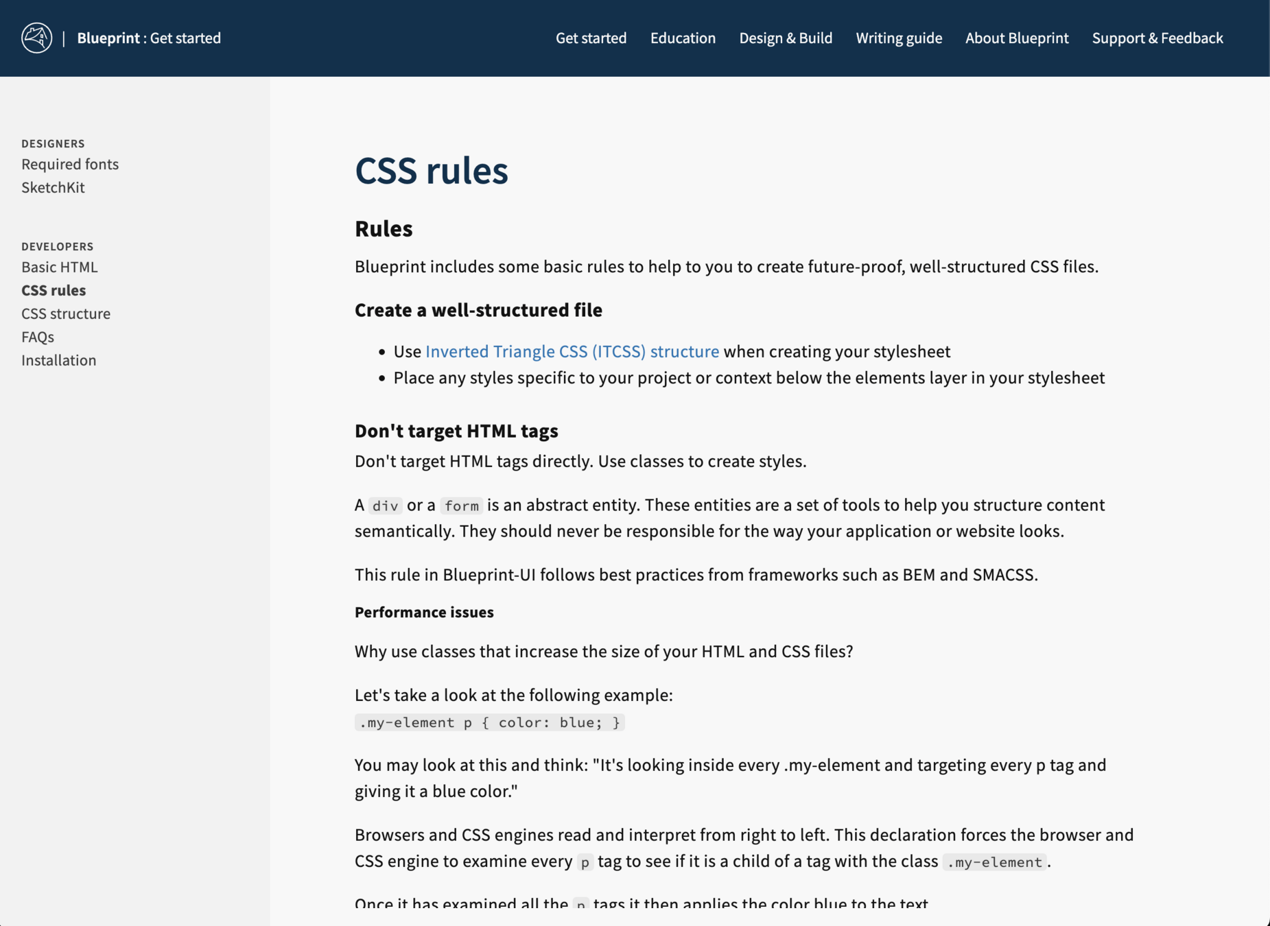
Design Systems have...
Developer Guidelines
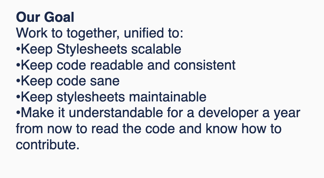
Many people think that design systems stop at just code libraries, but it's actually naming conventions, coding standards structuring guidelines.
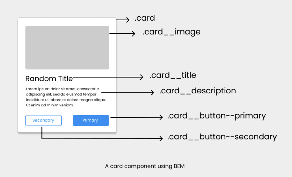
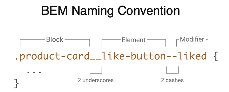
BEM Naming Convention
Deeper drive to see examples

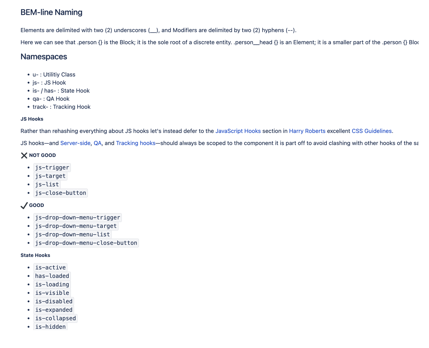


BEM Naming Convention
Naming conventions and coding prinicples
Just like with design principles, coding principles and naming conventions serve as the backbone of consistency, raising quality and increasing efficiency.

Design Systems have...
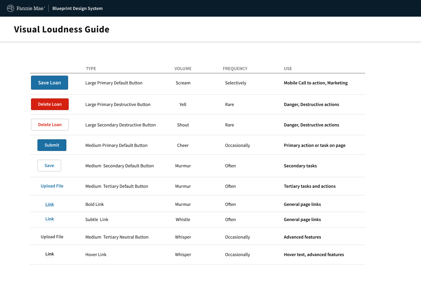
Cheat sheets, patterns & guides
Cheatsheets and guidelines were created to start guiding designers and developers in using elements of the system


Feedback framework
The feedback framework allows for a structured way to communicate to designers and developers how to approach giving system feedback to the user when interacting the products.
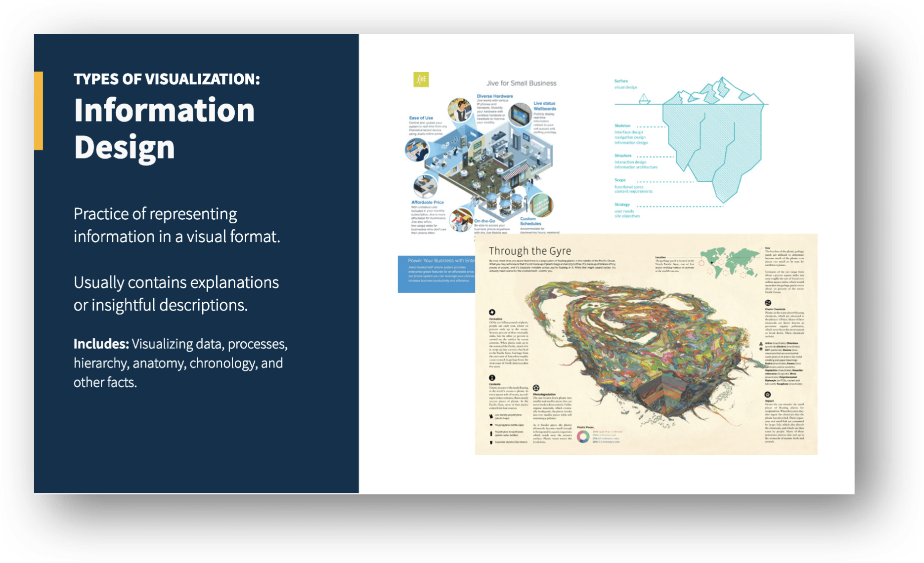
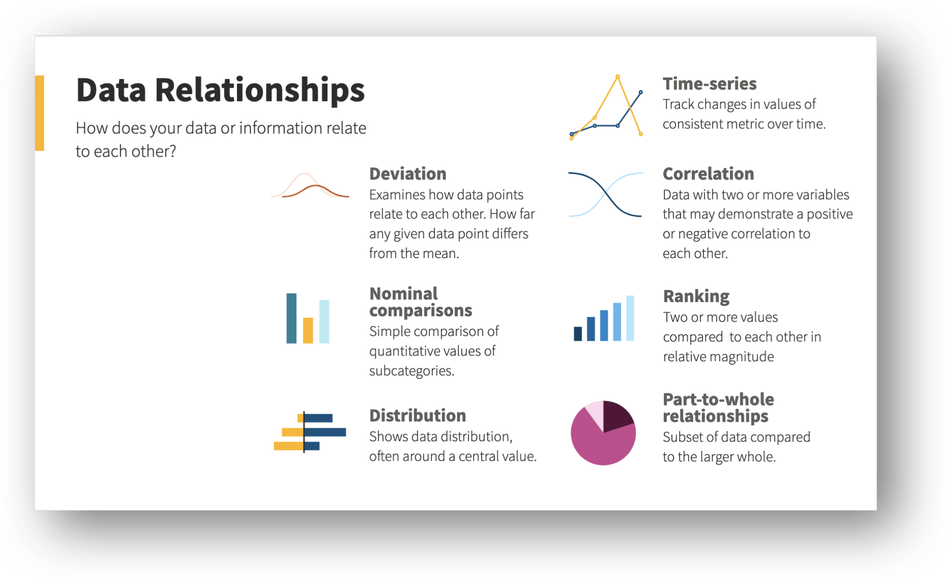
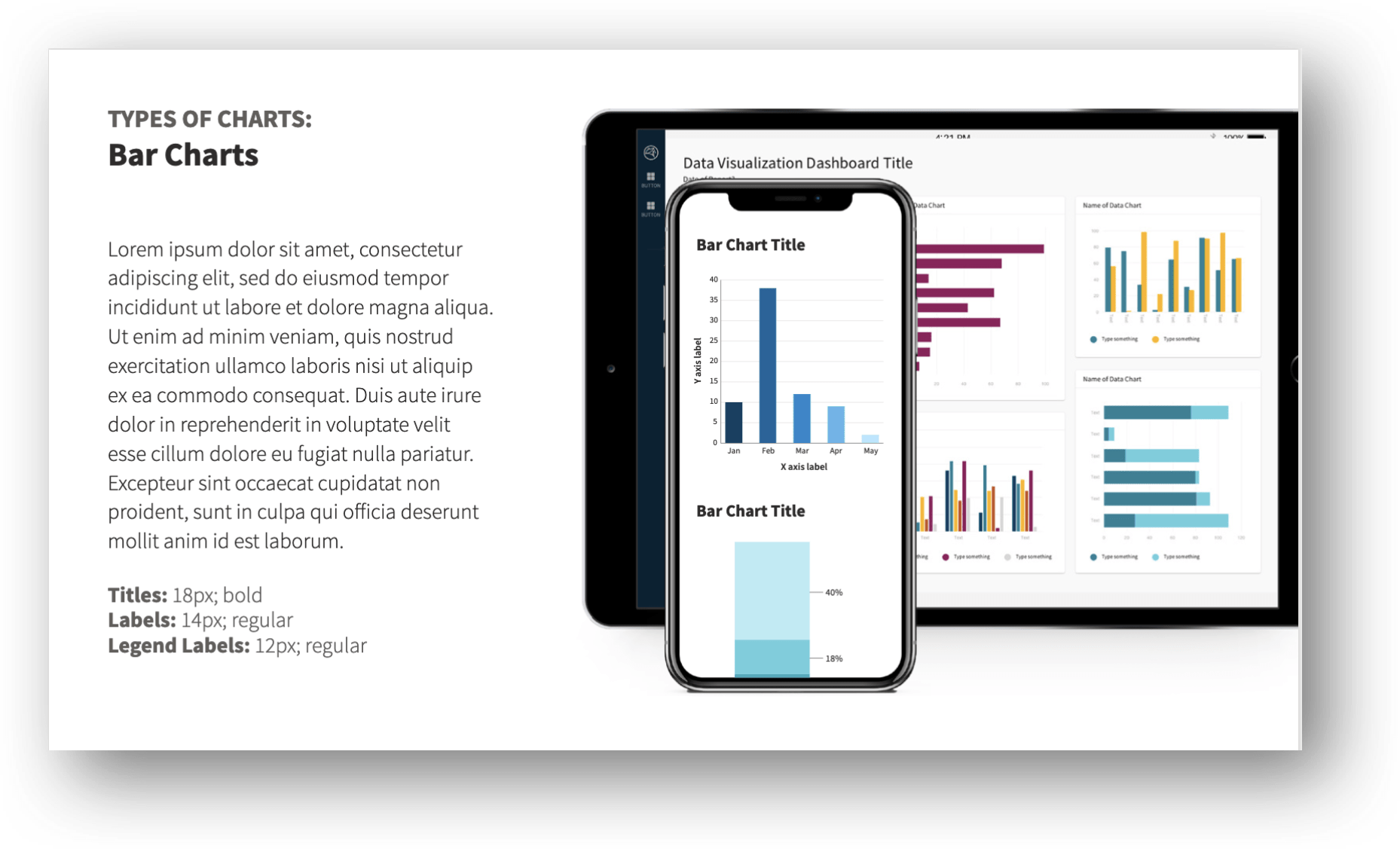
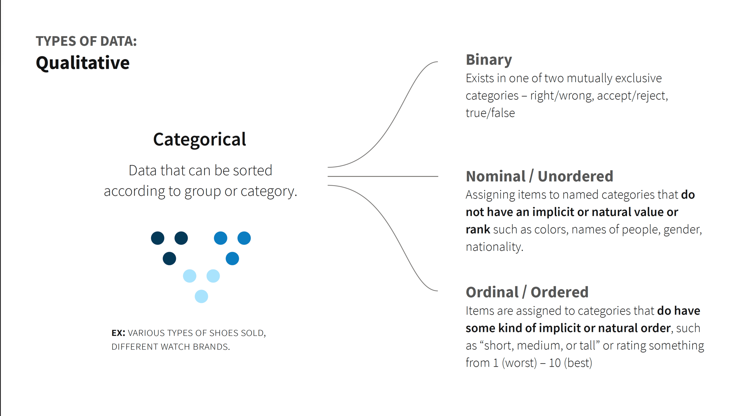
Data Visualization Guides
These guides helped developer and designers understand basic of data visualization to aid in getting consistency in usage and styling while ensuring best experience for our product users
Program Team

Design Systems are...
Well Managed
As Design System product owner and core team manager I was responsible for resource planning, interviewing and hiring and typical team managing tasks
Deeper drive to see examples
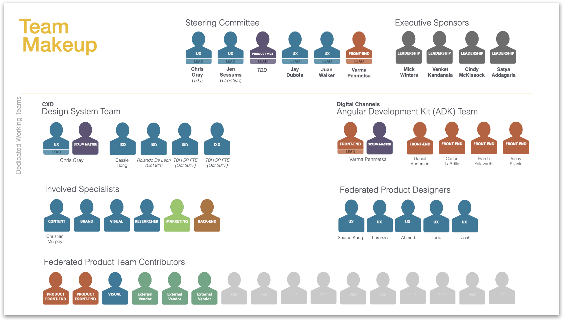
Having the right team with the right skills is key to a successful design system program delivery. I aimed for a team, heavy with generalists, ranging from UI & Interactive design to Front-end development.
Where possible, I was able to pull in designers already working in Fannie Mae's centralized design team where their current Fannie Mae domain knowledge enabled them to hit the ground running. Meanwhile, while I started and facilitated the hiring process.
Deeper team management and organization leadership deliverables are covered under confidentiality and I am unable to share.
Team Org design, planning, and hiring

Chris
It's not pretty nor fun, but sometimes managing resourcing, especially inside of matrixed organizations requires some clever Excel formula programming.
Resource management by the numbers
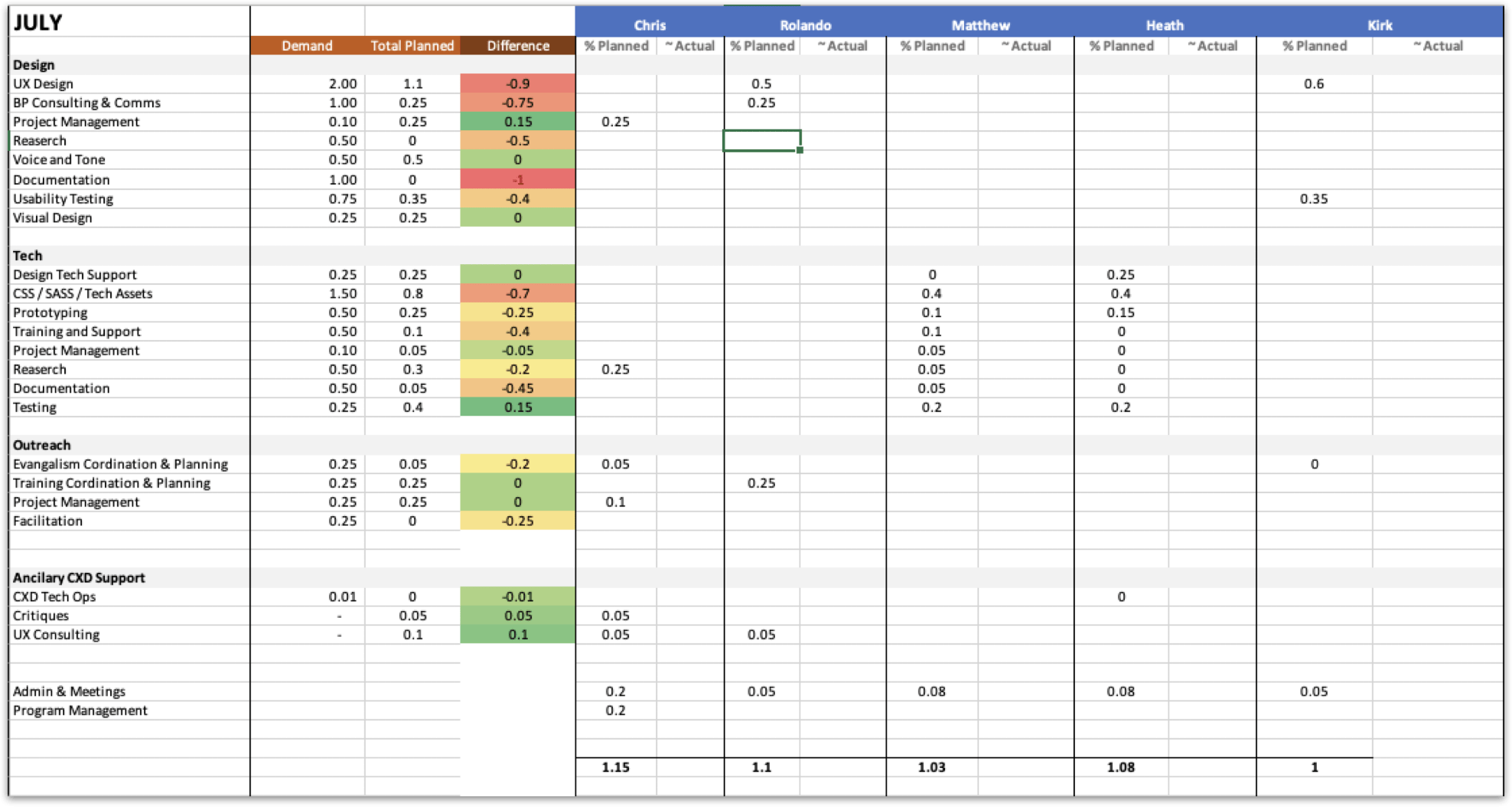

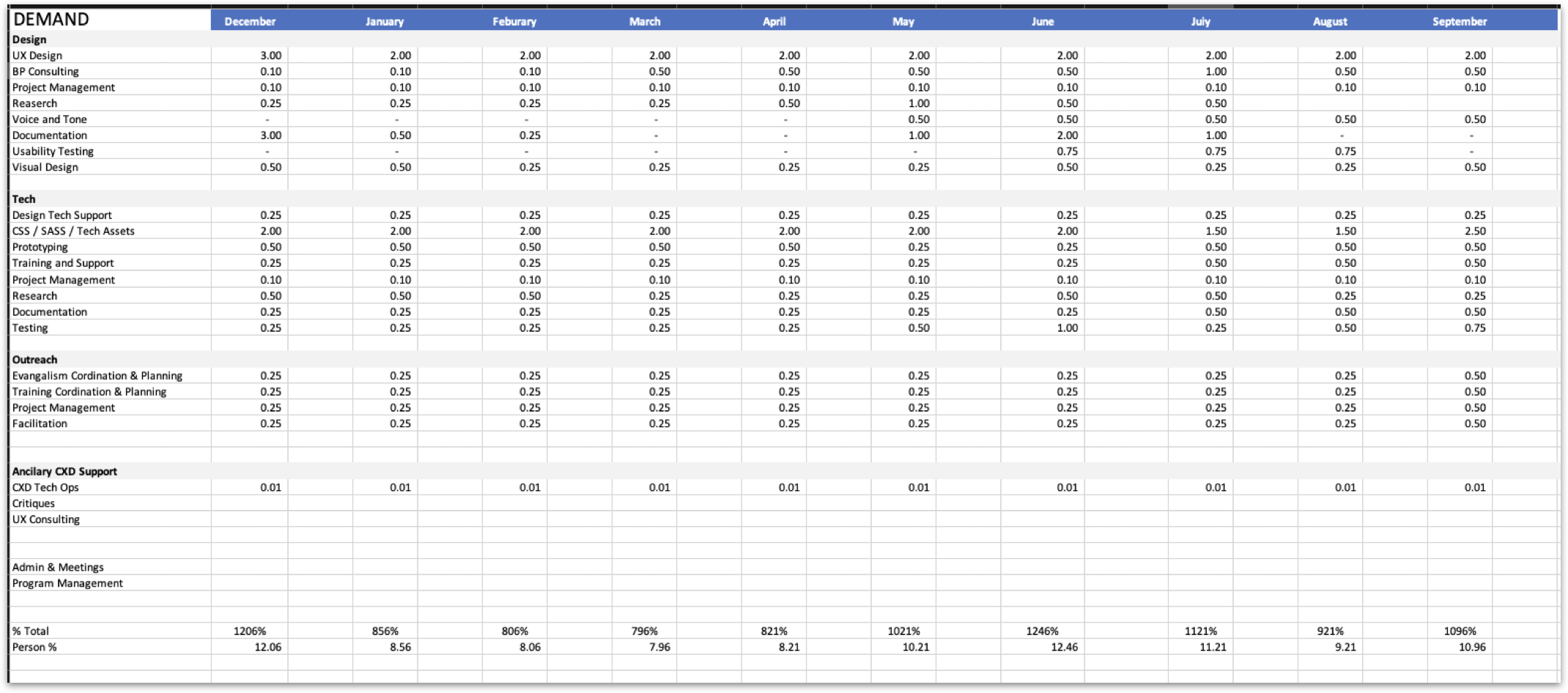

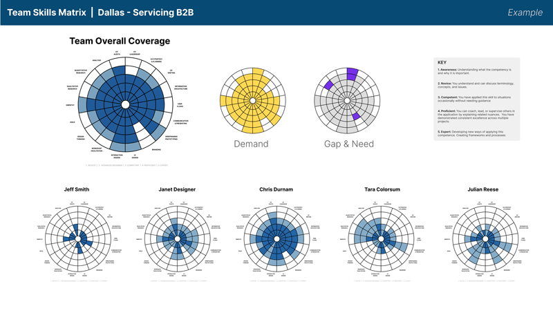
Tracking the skills matrix of individual designers along with how that rolled up to the team is key to aligning with demand or desired org structure goal.
This is then used during the hiring process to help prioritize which candidates helps fill in gaps
Skills matrix tracker

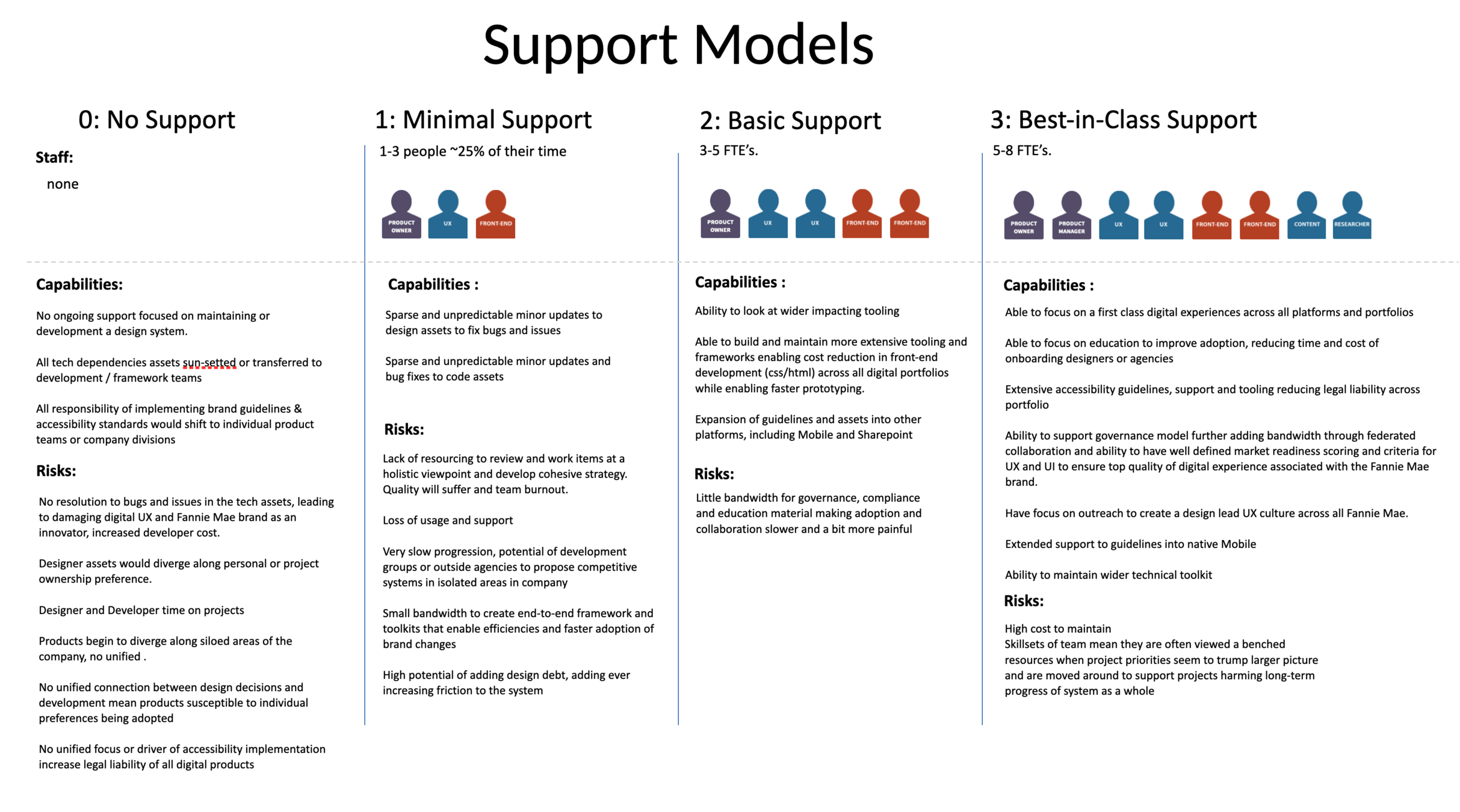
At various times in my blueprint oversight I was asked to provide varying levels of resourcing or support models. This would include the ask of people, capabilities that level would give and risks associated. Additionally, financial impact and budgetary concerns were calculated and articulated to leadership.
Support model options
Design Systems are...
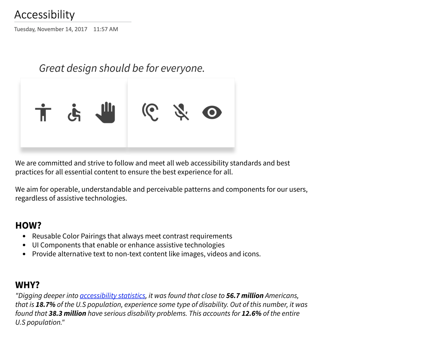
Accessibility focused
Accessibility needs to be at the core of the design system that way you can ensure at scale, accessibility is as automatic as possible when building products
Deeper drive to see examples

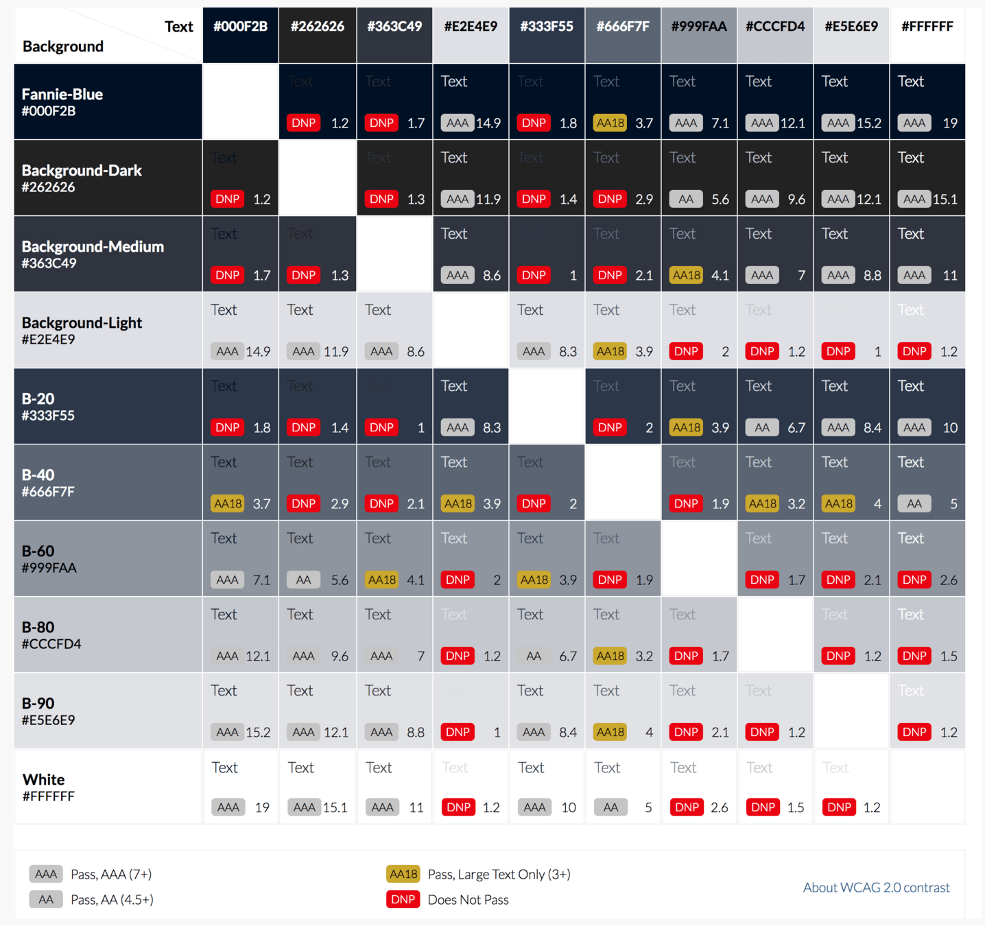
The first and prioritized area we focused on with Blueprint was with color contrast. We ensured that known color combinations met WCAG standards. Ensuring that failing combinations were noted and documented not to use.
Ensuring Color Contrast
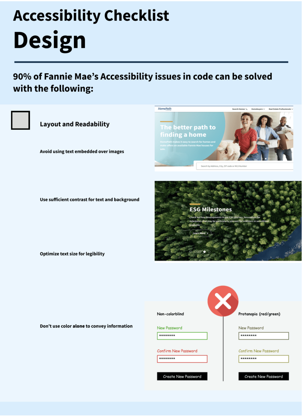
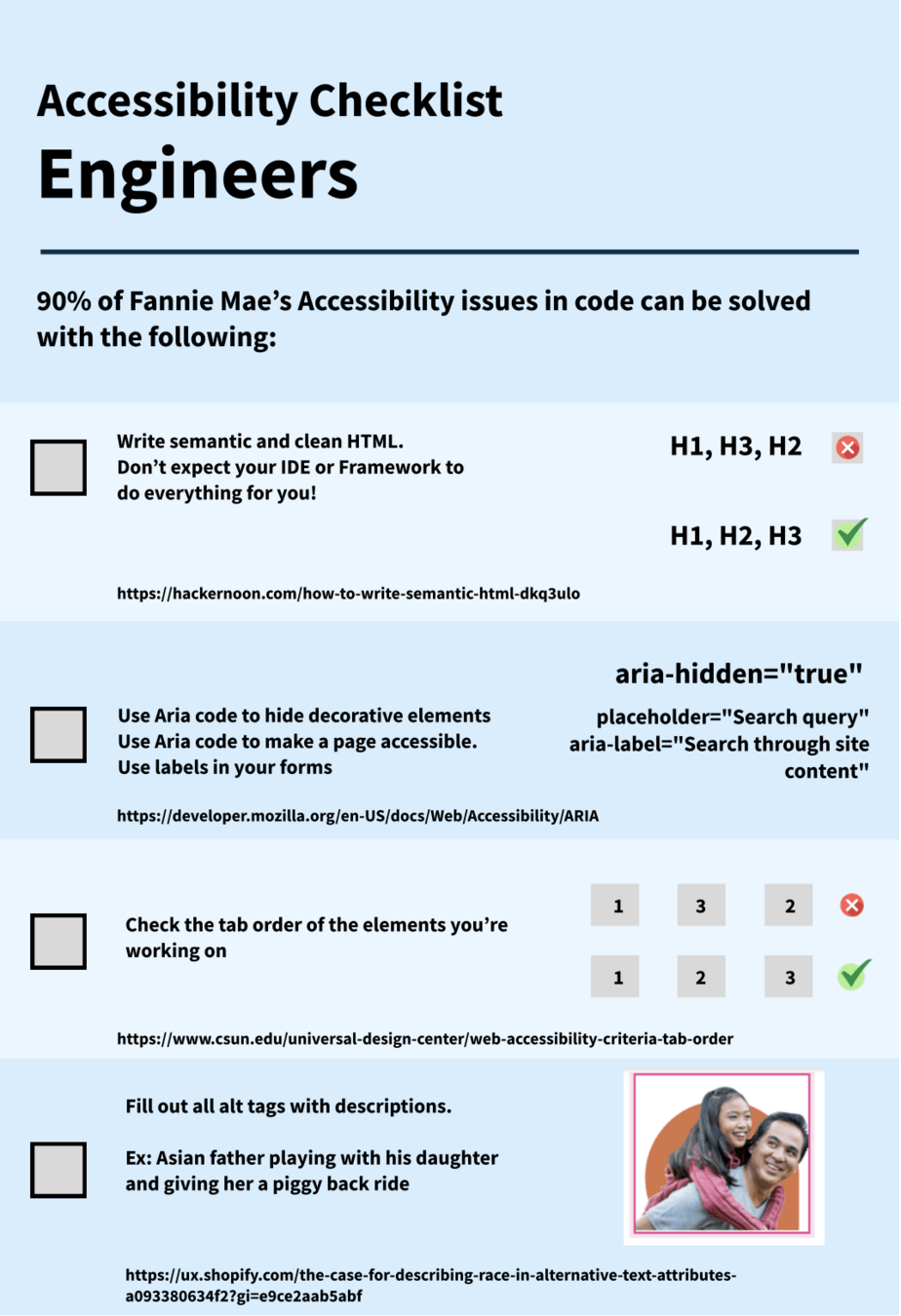
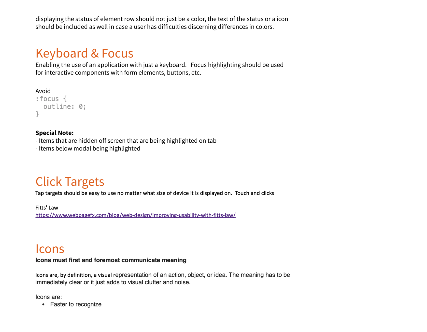
Simplified checklists/posters were created to help communicate basic accessibility standards to product teams. The goal here was to move the needle, slowly but steadily.
Designer & Engineering Checklist
Design Systems are...
adaptable to screens, platforms and audience
...
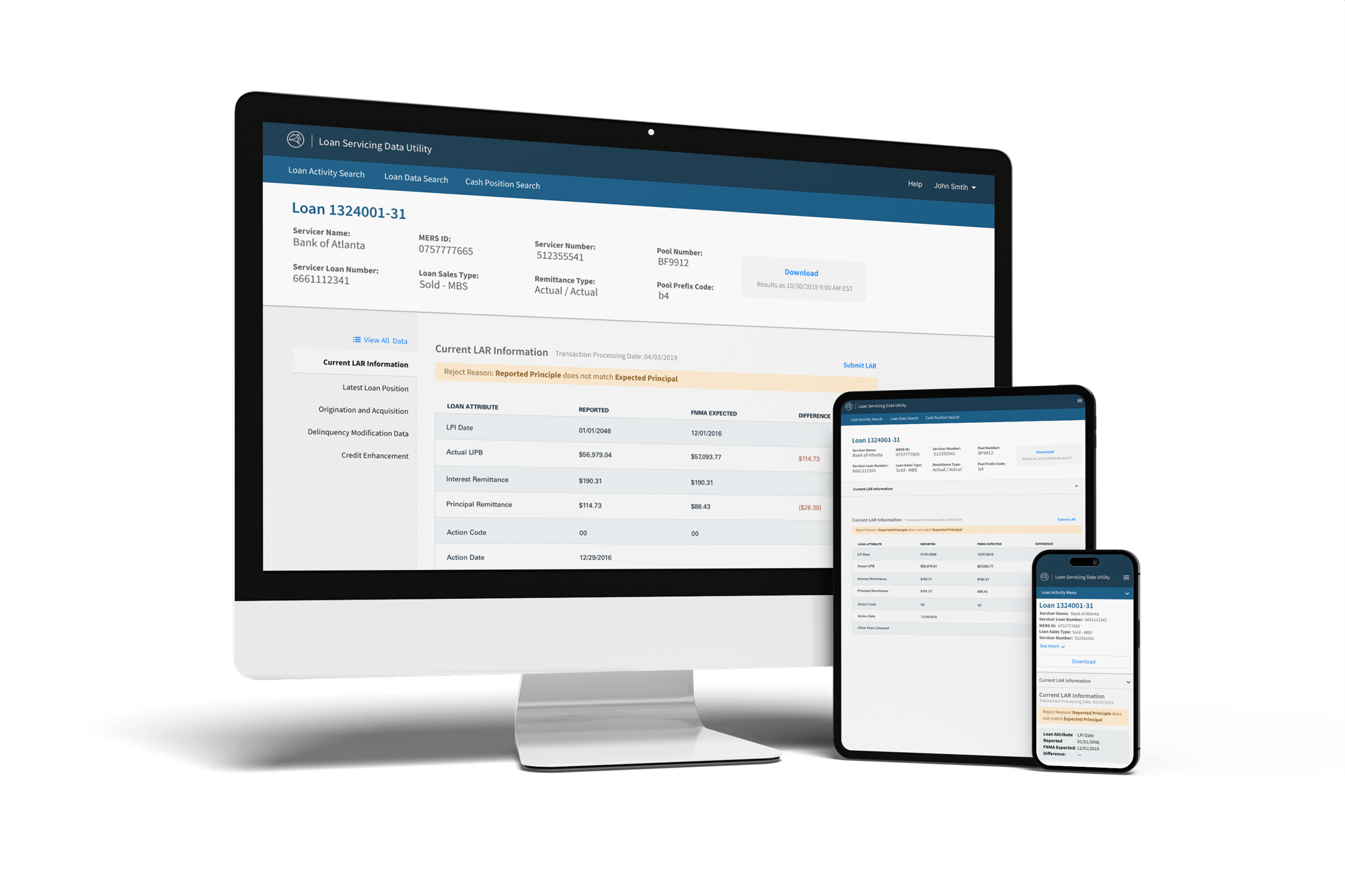
Guidelines and tooling were centered around the flexibility to power two flavors of implementation. Marketing sites vs productivity based products


Websites
Light productivity
Dense task based productivity
The need to constantly pitch and articulate the value, ROI, and benefits of design systems is ongoing. So...
Design Systems have solid...
Project and Program Management
In addition to my roles as Product Owner and Team Manager, I also served as Project Manager and Scrum Master, overseeing the day-to-day Agile processes for Blueprints work.”
Deeper drive to see examples
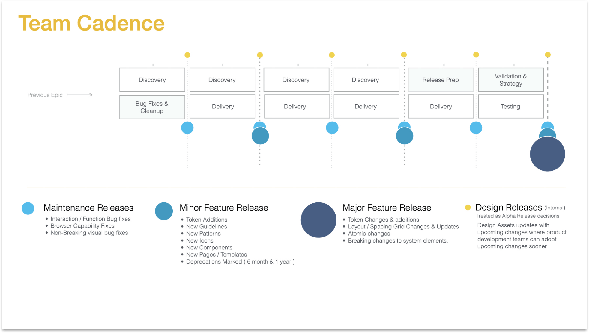
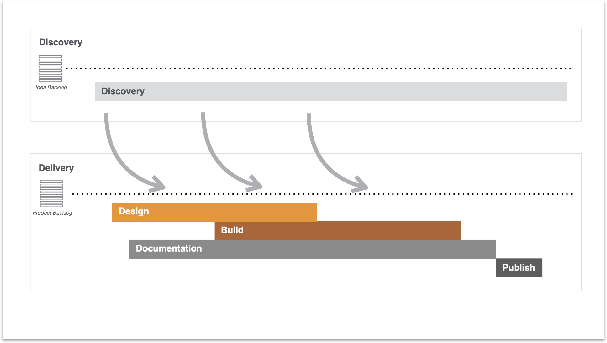
Agile delivery was key
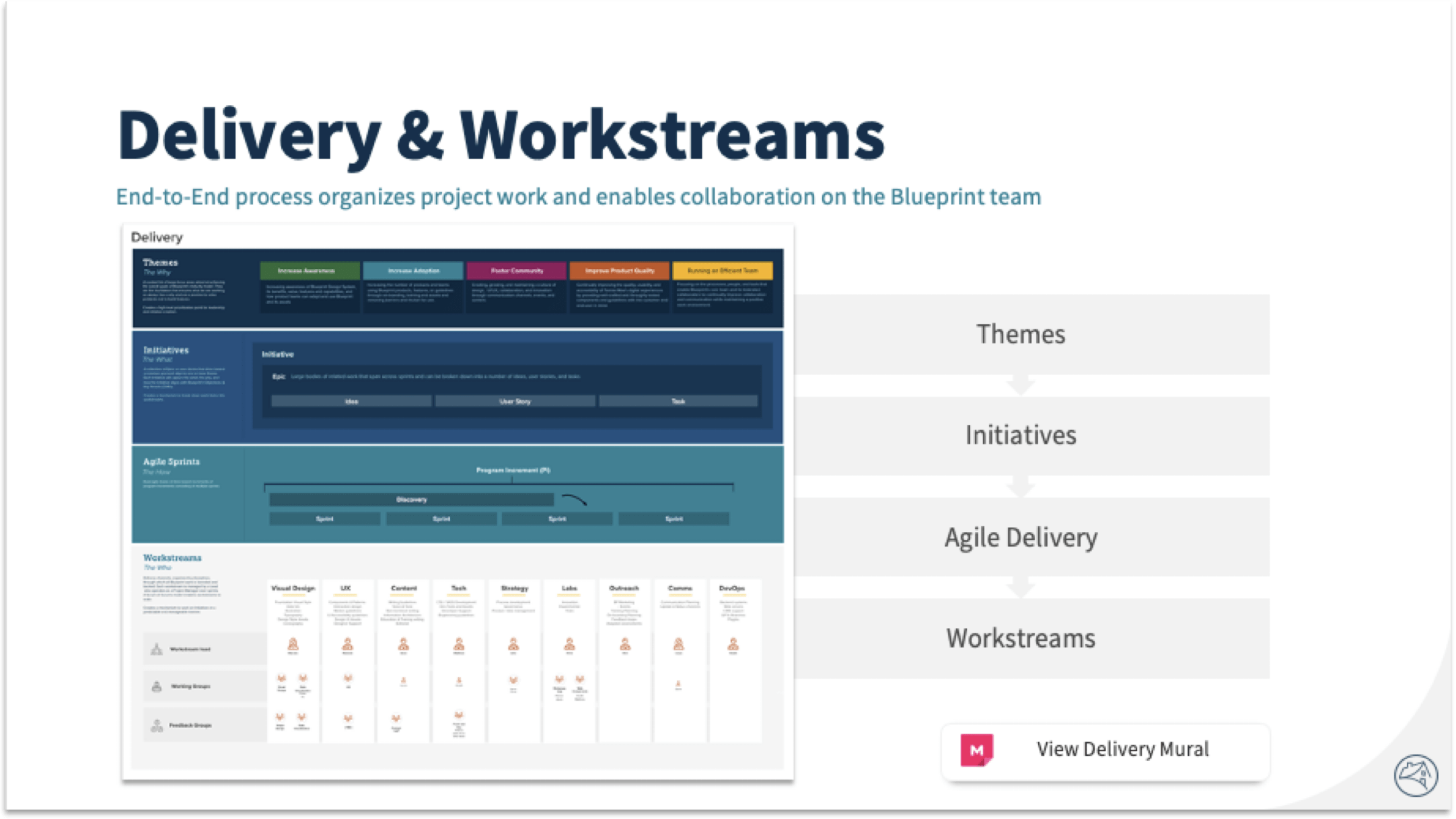
I moved our work into 3-week sprints and started focusing on staggered releases centered around Program Increments in a dual-tracked agile setup with both discovery and delivery backlogs.

Teams were setup to manage specific streams of work and work was organized around themes, which I then broke up into program incriments (Pi's) for more predictability of delivery and ensure progressive improvement and delivery of value.
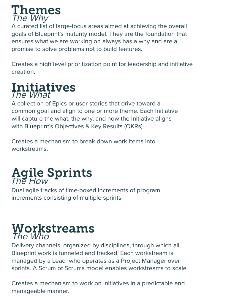
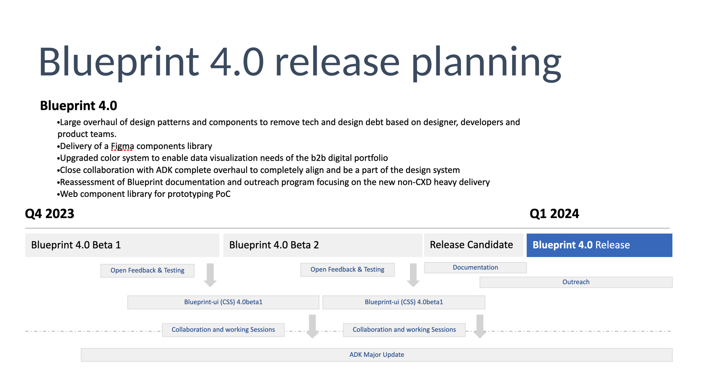
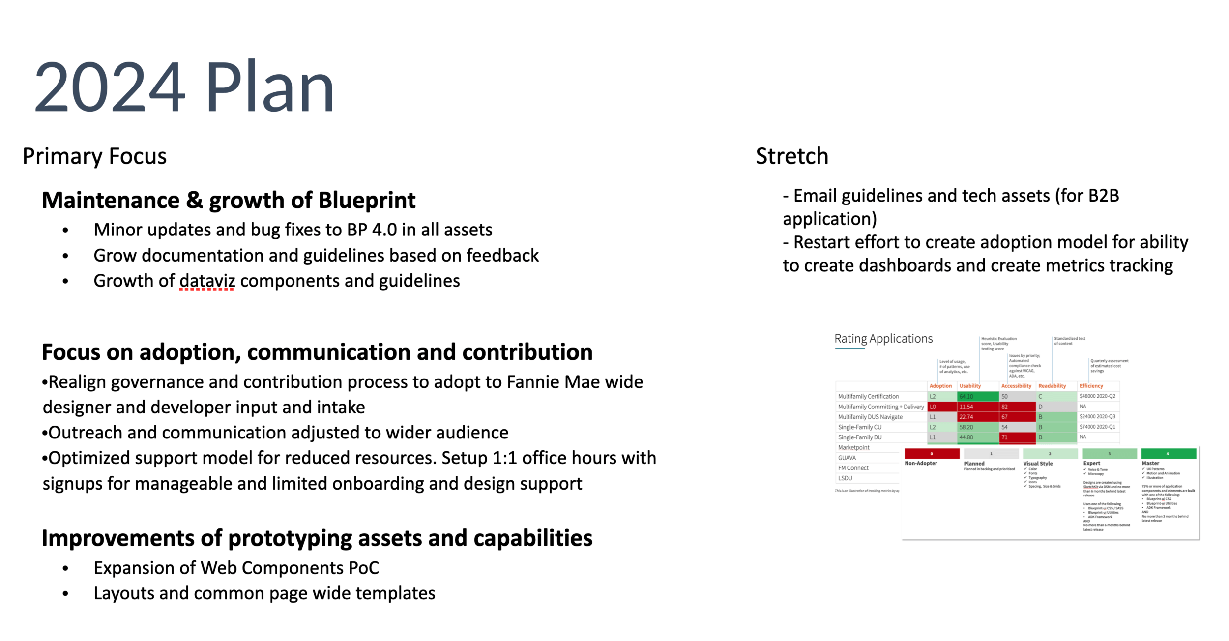
Release planning communicate to leadership was concise and clear
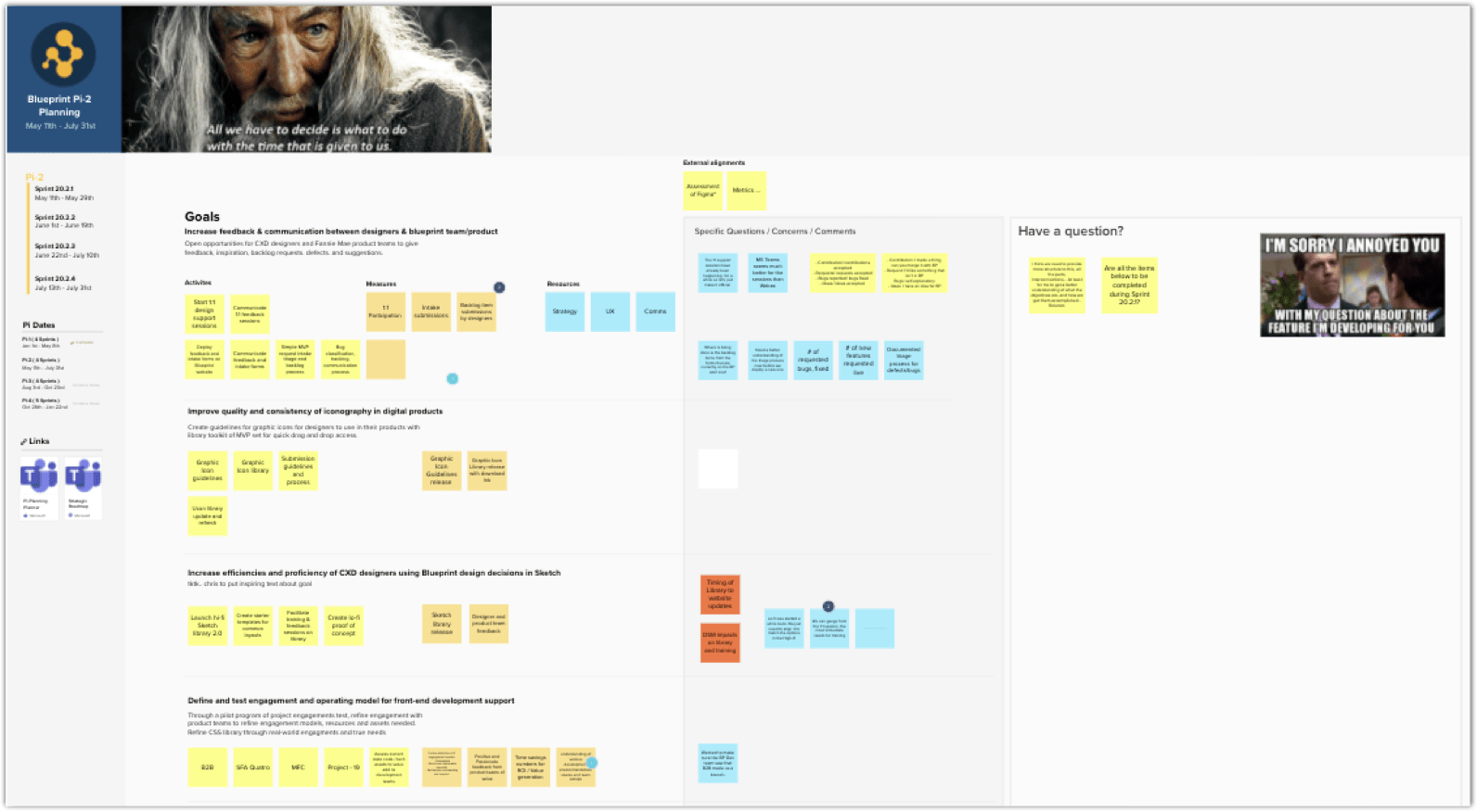
After Covid, exclusively conducted remotely through Mural. Pi's and Sprints were planned and faciliated with the entire Design System program
Pi and Sprint planning was a ongoing activity

End-to-end design system working process
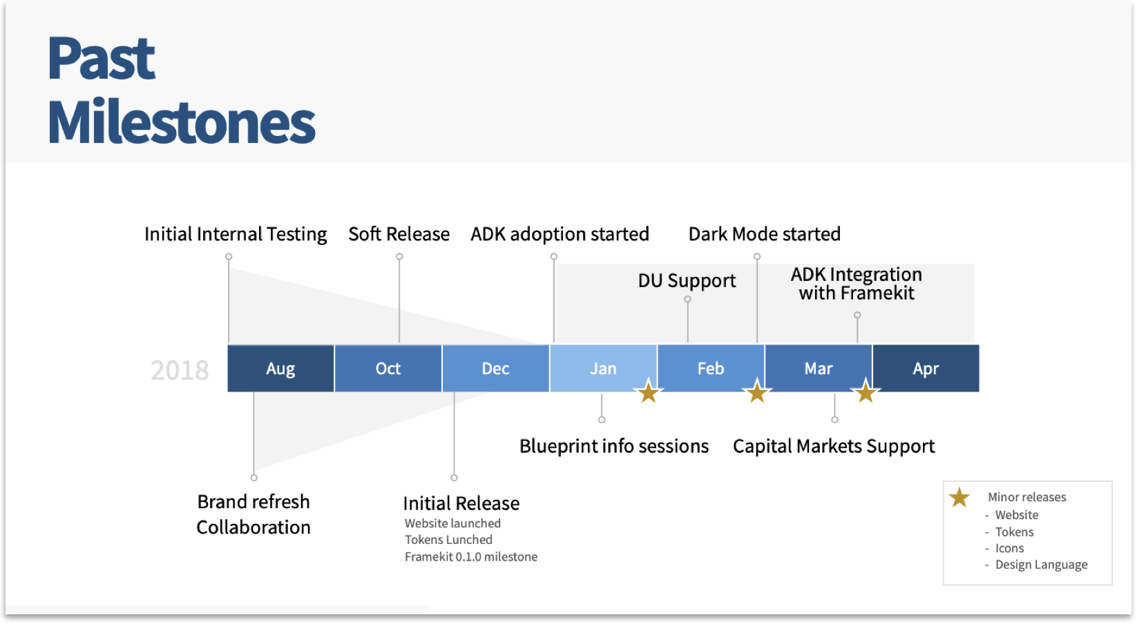
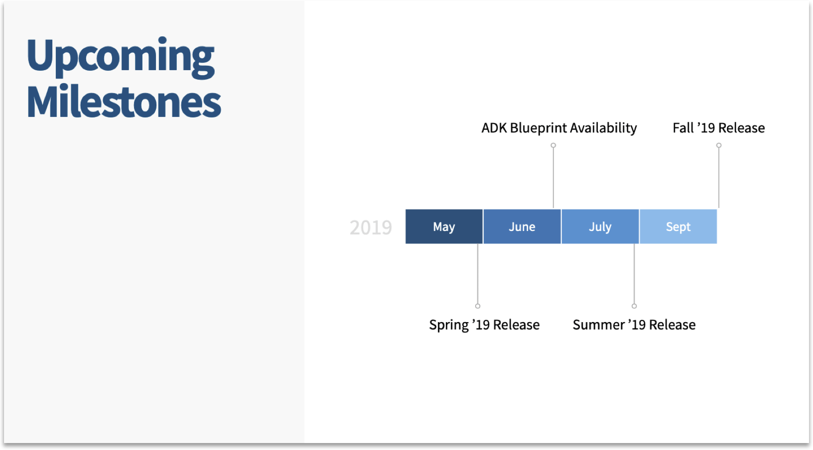
Communication of milestones should be simple and quick
I found keeping communications of milestones and releases simply and brief wildly successful after my initial attempt to communicate such complex and depth of products was overwhelming.
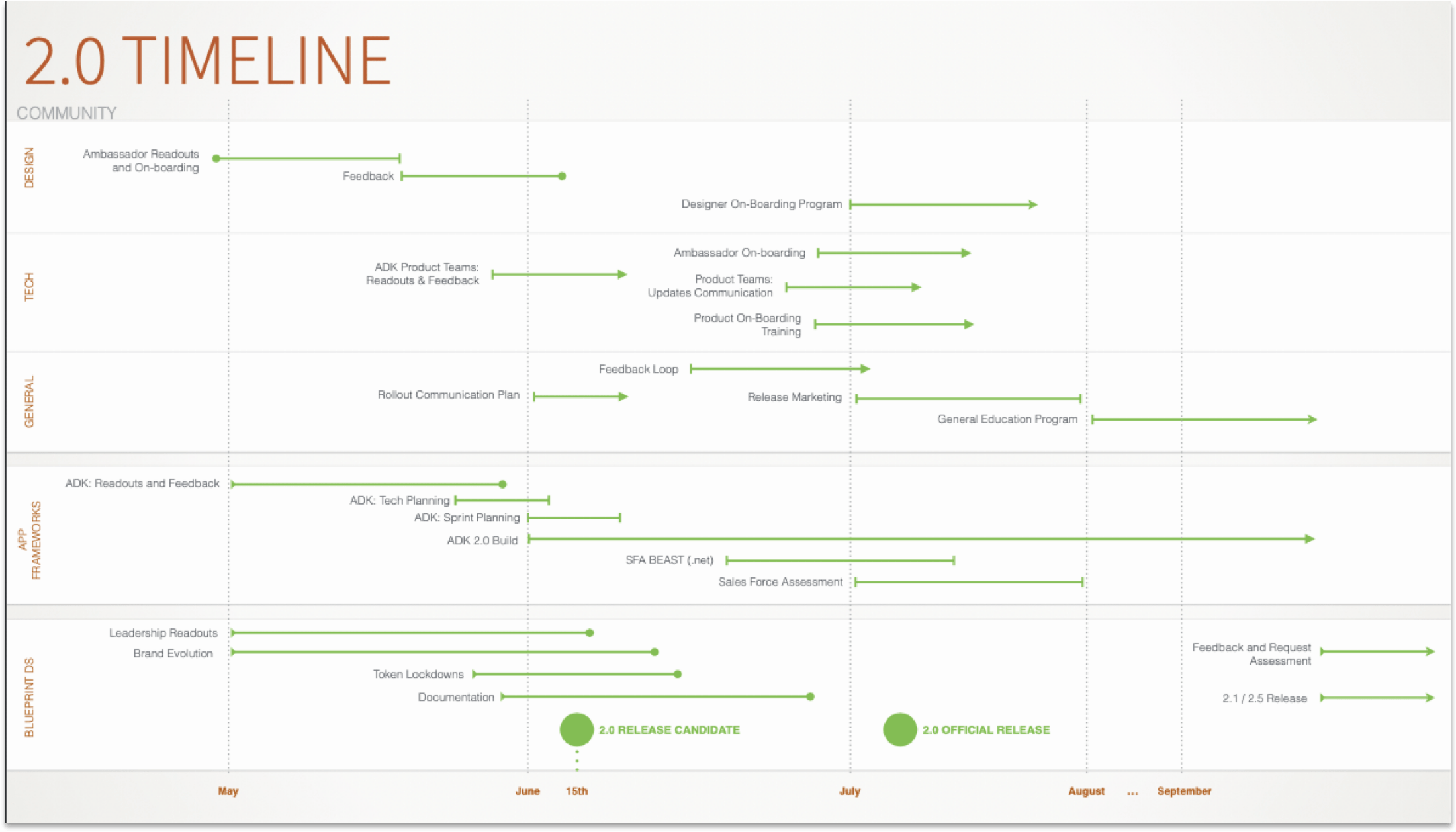
Delivery Timelines communicate milestones and dependencies
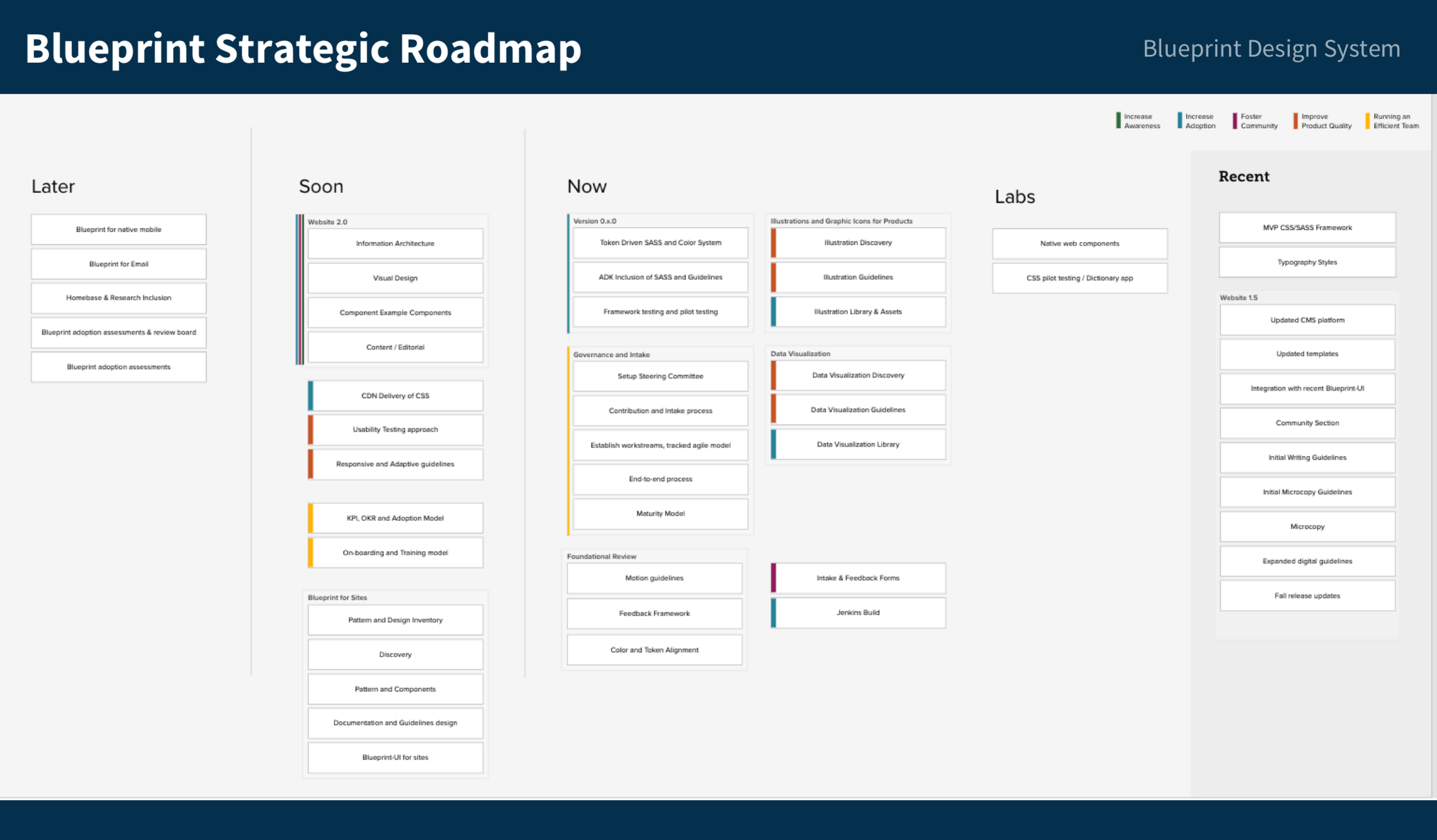
As Blueprint grew and multi streams of products were created a Strategic Roadmap was created to communicate the breakdown of the work in delivery versus various stages of backlogs
Design Systems are...
Versioned and incremental releases
...
show versions of design system
Design Systems have a...
Maturity plan & Strategy roadmap
Without aligning the agile process with a strategic plan, products can go off course, making it difficult to plan updates, set schedules, or justify ongoing investment.
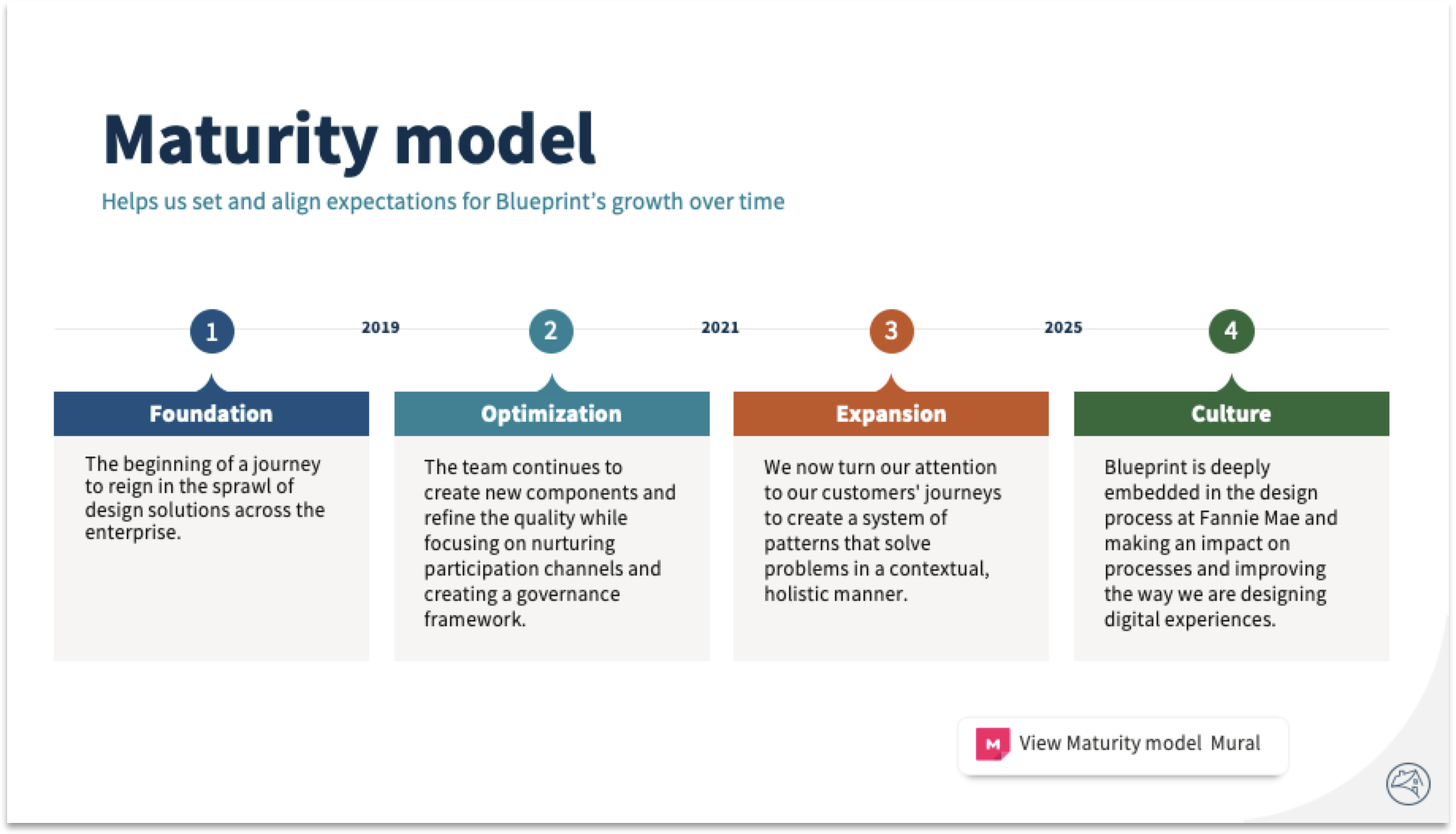
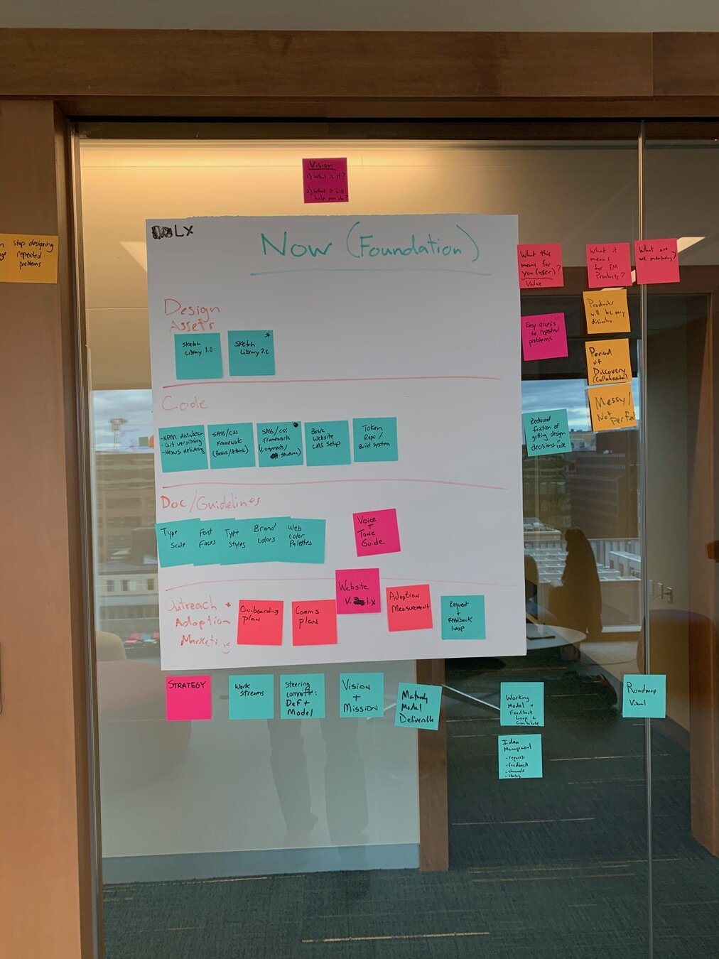
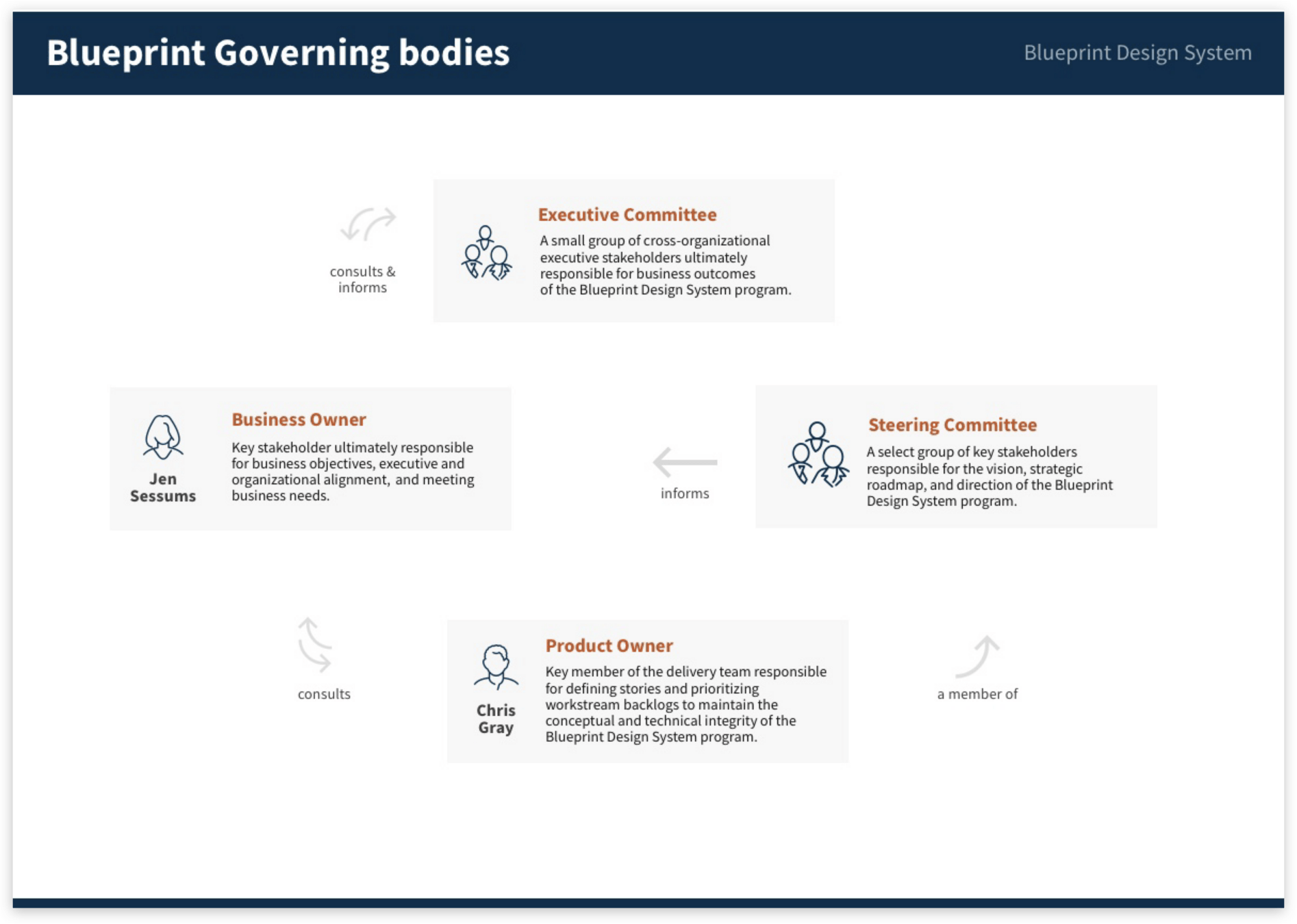
To address this, I organized a steering committee and led sessions to develop key deliverables, including a maturity model and strategic roadmap.
Deeper drive to see examples

Maturity model helped manage expectations
I created a maturity model to clearly communicate the current state of the design system and its long-term goals. This helped manage leadership and stakeholder expectations by addressing future ambitions while curbing unrealistic timelines.
As Blueprint expanded across multiple products, I created a strategic roadmap to manage and communicate work in delivery and different backlog stages, while aligning items with program themes.

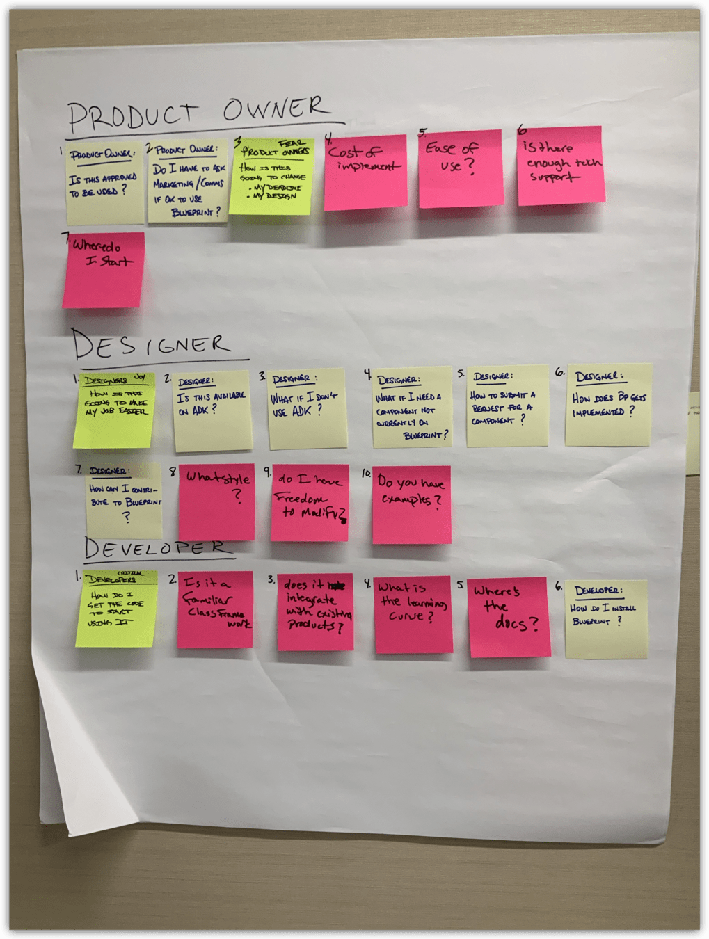
Behind the scenes

Design Systems have thought out..
Contribution and Governance processes
Even a well-funded core design system team depends on contributions from external design and engineering teams, inevitably raising the question of ‘Who makes the decisions?’
Blueprint operated in a politically charged environment, where demonstrating collaboration and shared ownership across organizations was crucial.
Deeper drive to see examples



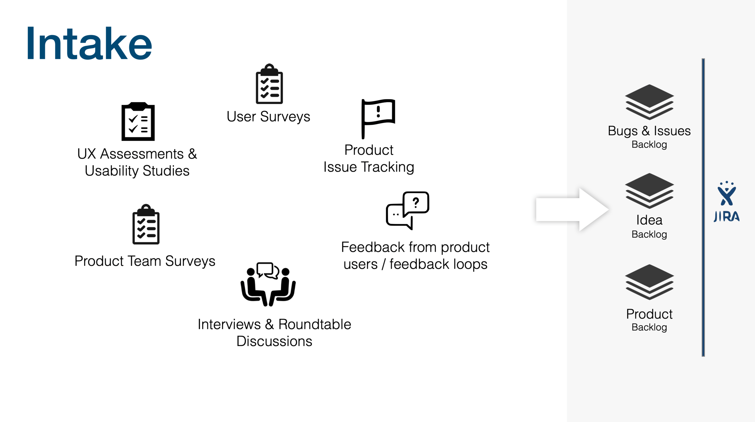
Contribution Requests
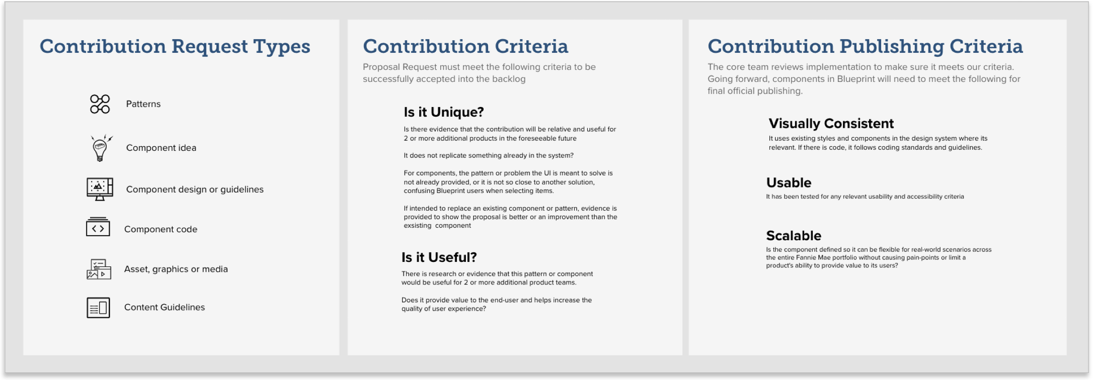
I mapped out the contribution request process, from intake and triage—splitting into idea, request, or default—through collaboration with team members to formalize the request for steering committee approval and backlog inclusion.

Chris


Chris
Not everything should be included in the Design System. For Blueprint, I established clear guardrails for decision-making and worked with the team to refine them.
Contribution Criteria


Chris


Team
Design Systems has great..
Documentation and Guidelines
As the team progressed on the component library and guidelines the need to start documenting decisions and making them available company-wide became necessary
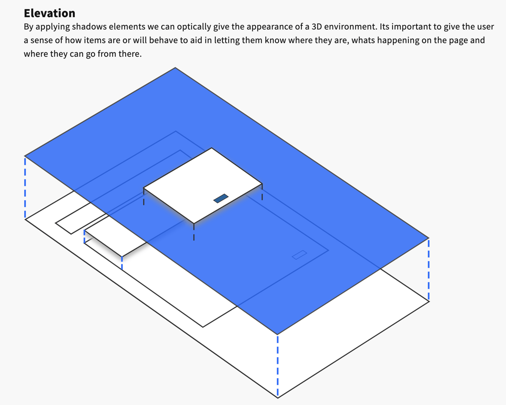
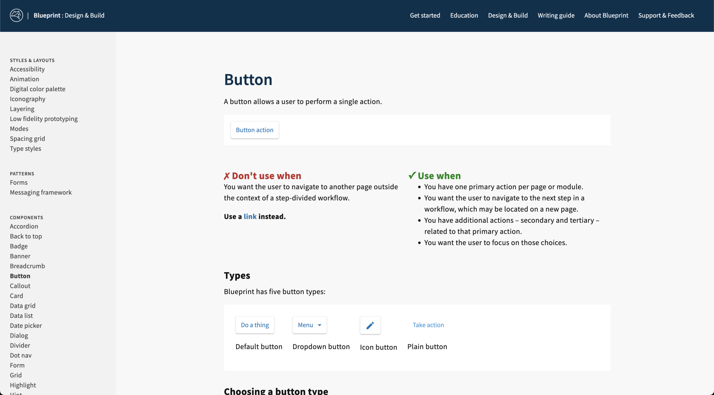
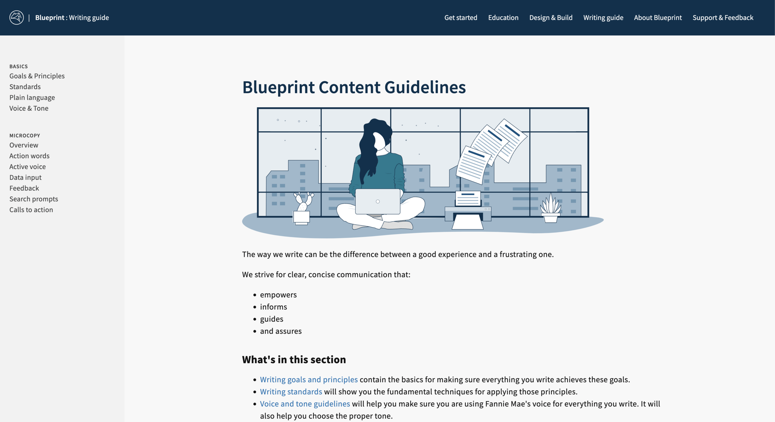
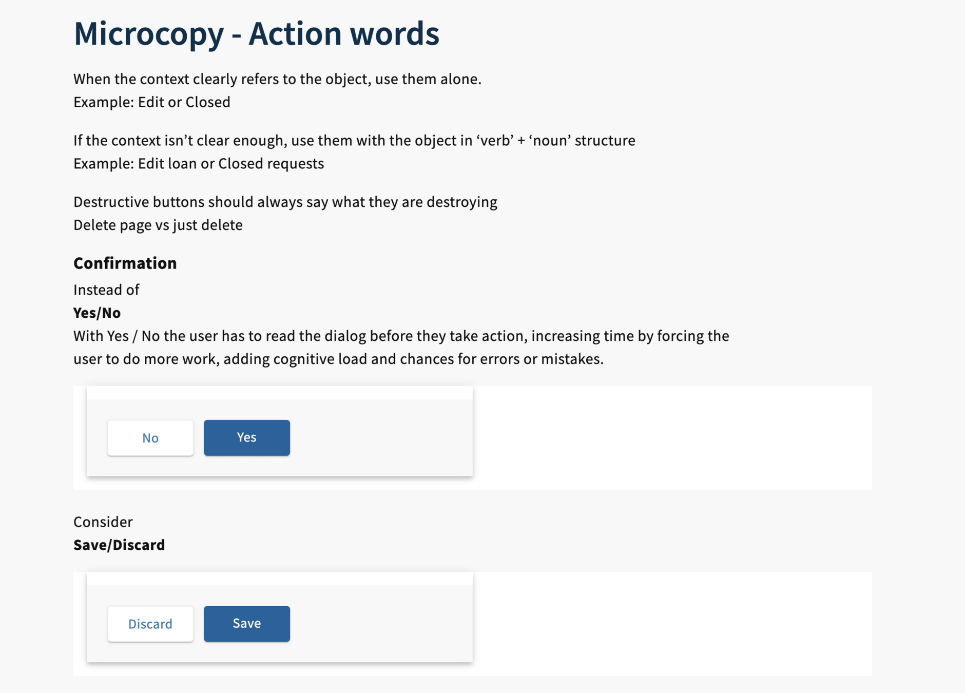
Using a flat-file documentation system we had full freedom in delivering content tailored to our audience
Deeper drive to see examples
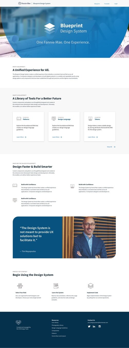
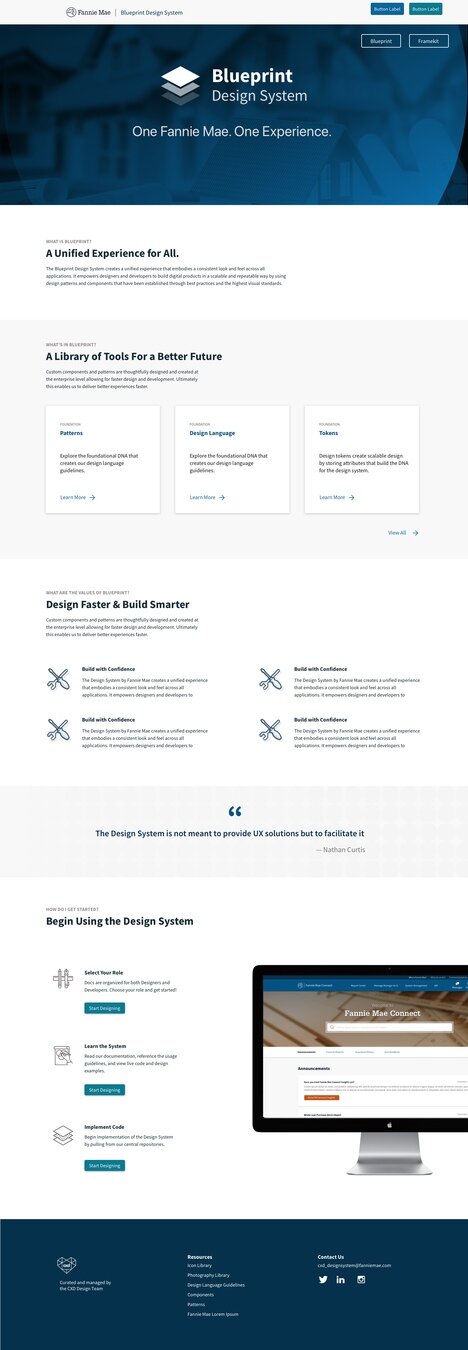
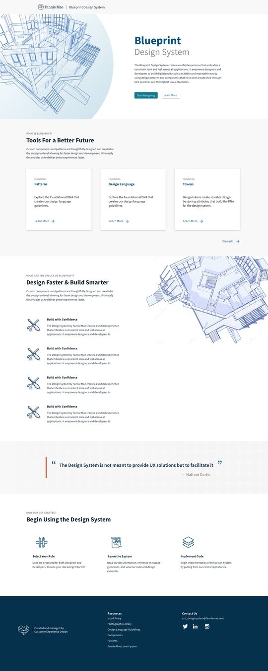
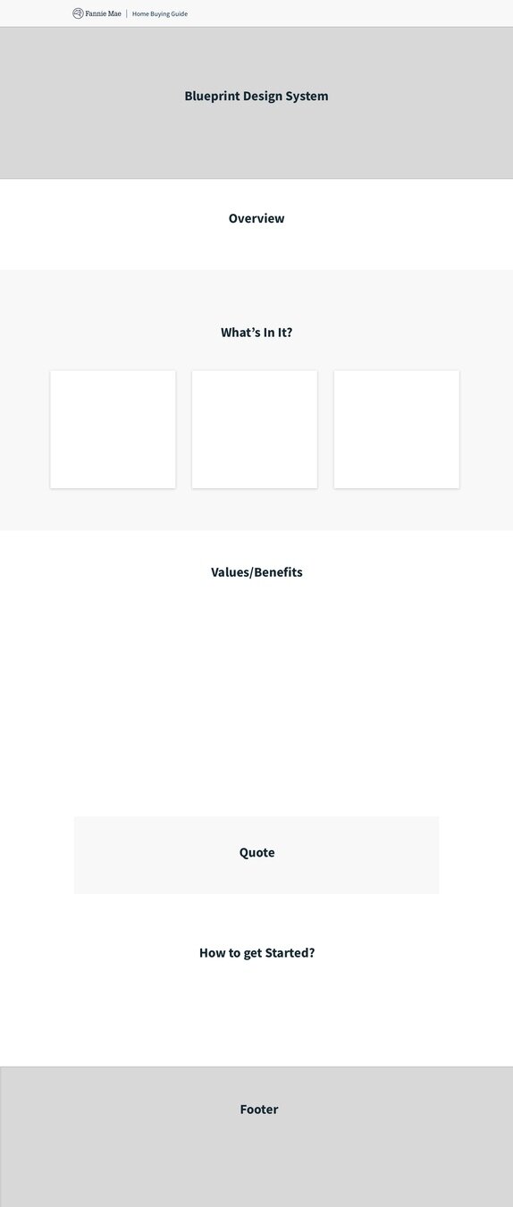
In the corporate world there's always pressure to use in-place systems (sharepoint, confluence, etc) for things like this. However, I wanted complete freedom in all aspects of the site so that we could ensure the site was easy to navigate, and properly showcased the code side of the system while looking good and presentable.
After trying a few other jamstack systems, I ended up choosing Eleventy CMS, which I did the initial setup to be later be handed off

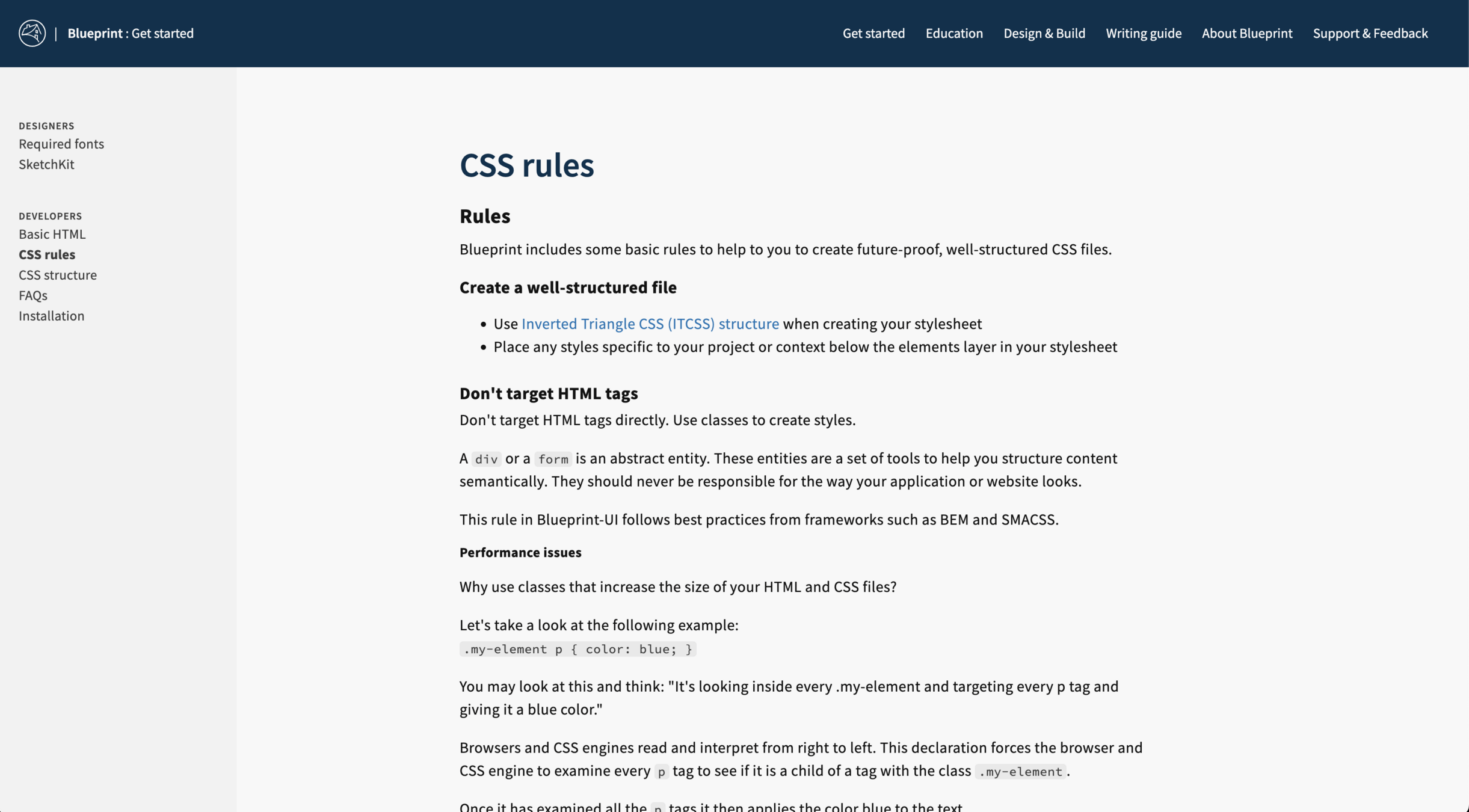
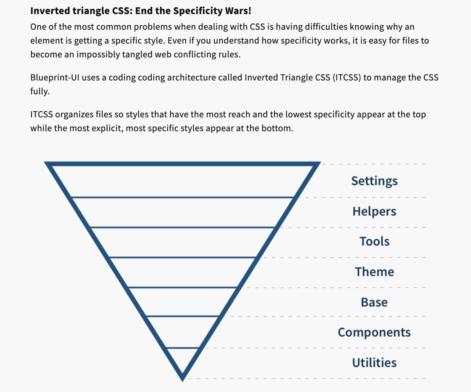
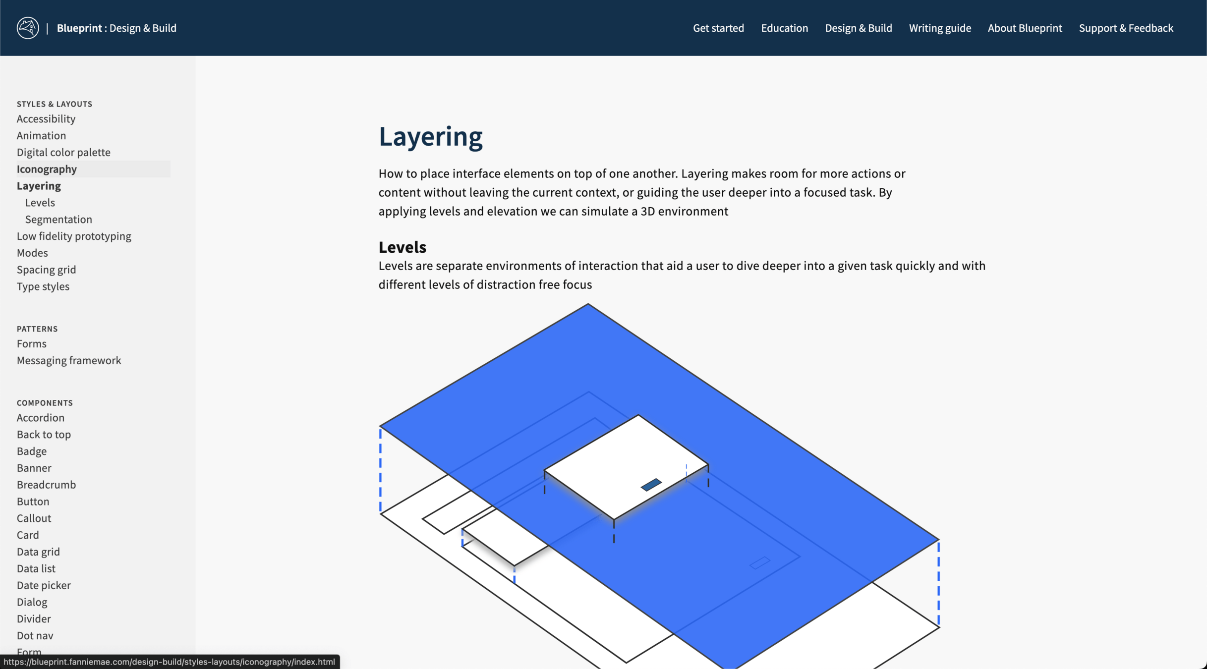

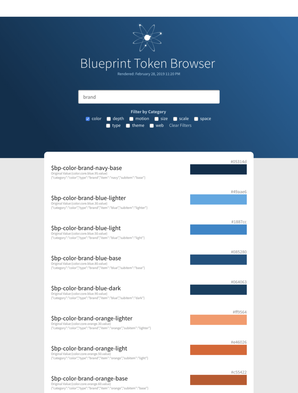
Design token browser
I developed a quick token filter and search browser out of HTML, CSS and plain Javascript as a quick tool to help the team when first starting to use the tokens. It was a quick way to see the choices of the token variables and the nesting assignments.
Storybook as dev documentation
I choose and setup Storybook to be our quick component-driven testing. For our CSS framework

Setting up Storybook controls feature provided a quick way to have adjustable and preview atomic level combinations with the ability to easily copy and paste.


Design Systems have an..
Identity & Brand
Design systems need to be marketed and promoted just like any other product, and to effectively do this you need a name that embodies.

Deeper drive to see examples
Giving the Blueprint a proper name
Giving the design system a fitting formal name was important to me. I guided the teams through several facilitated naming exercises to generate name ideas, do some guerilla-style market testing, and narrow down to a proposal that I was able to package, present, and ultimately received buy-in from leadership.
And thus Blueprint Design System was born.
Given Fannies Mae important role in the housing industry, Blueprint serves as an ideal choice to tie our roots and function with the core business.
Blueprint Design System

Introducing

It creates a helpful reference and shorthand that embodies the program’s essence. With a brand, it’s easier to market and drive adoption.
It also provides a distinct global namespace, improving clarity for developers, avoiding collisions, measuring adoption, and reducing confusion.
Why is giving your design system a proper name important?
With a name like Blueprint and being for a company that's deals with mortgages, the branding seemed pretty clear. Visuals and theming around architectural blueprints and color themes that aligned with corporate colors
Branding
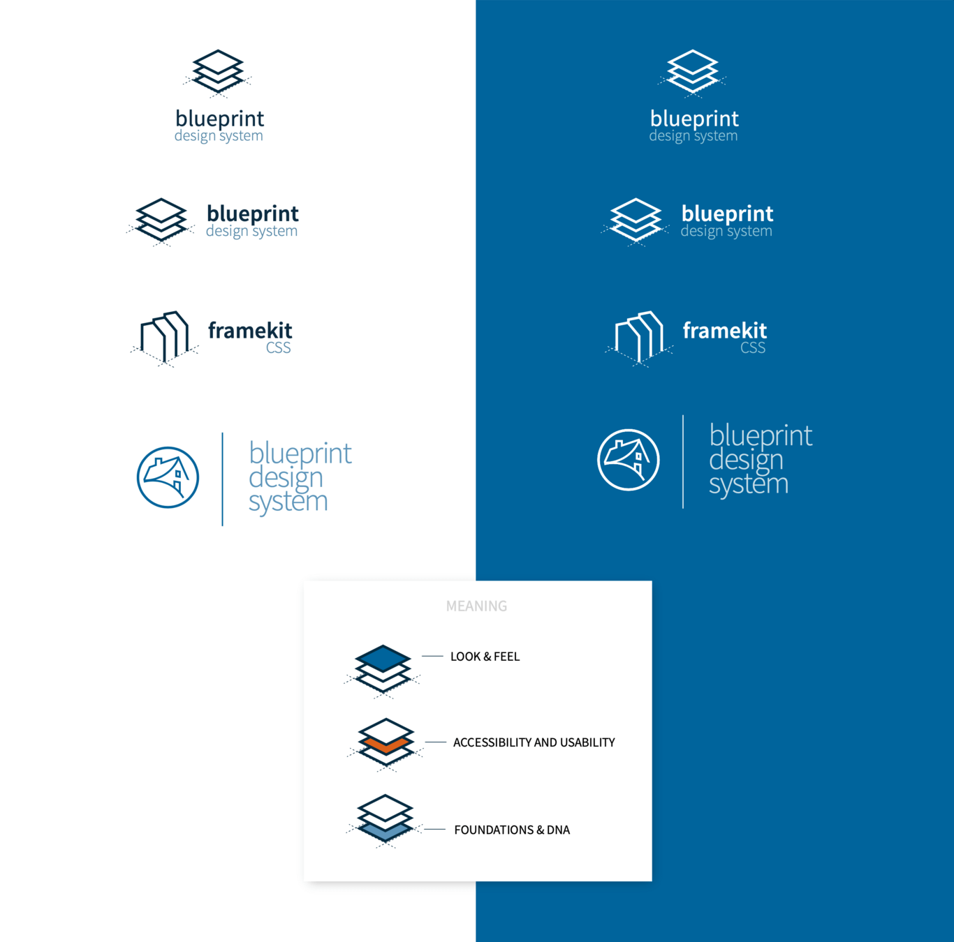
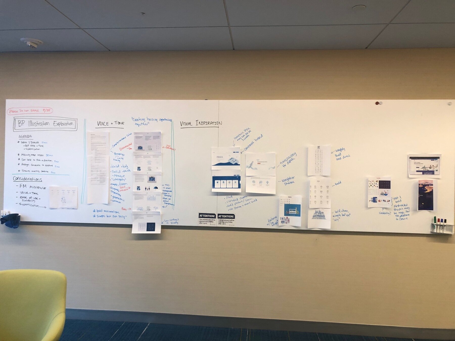
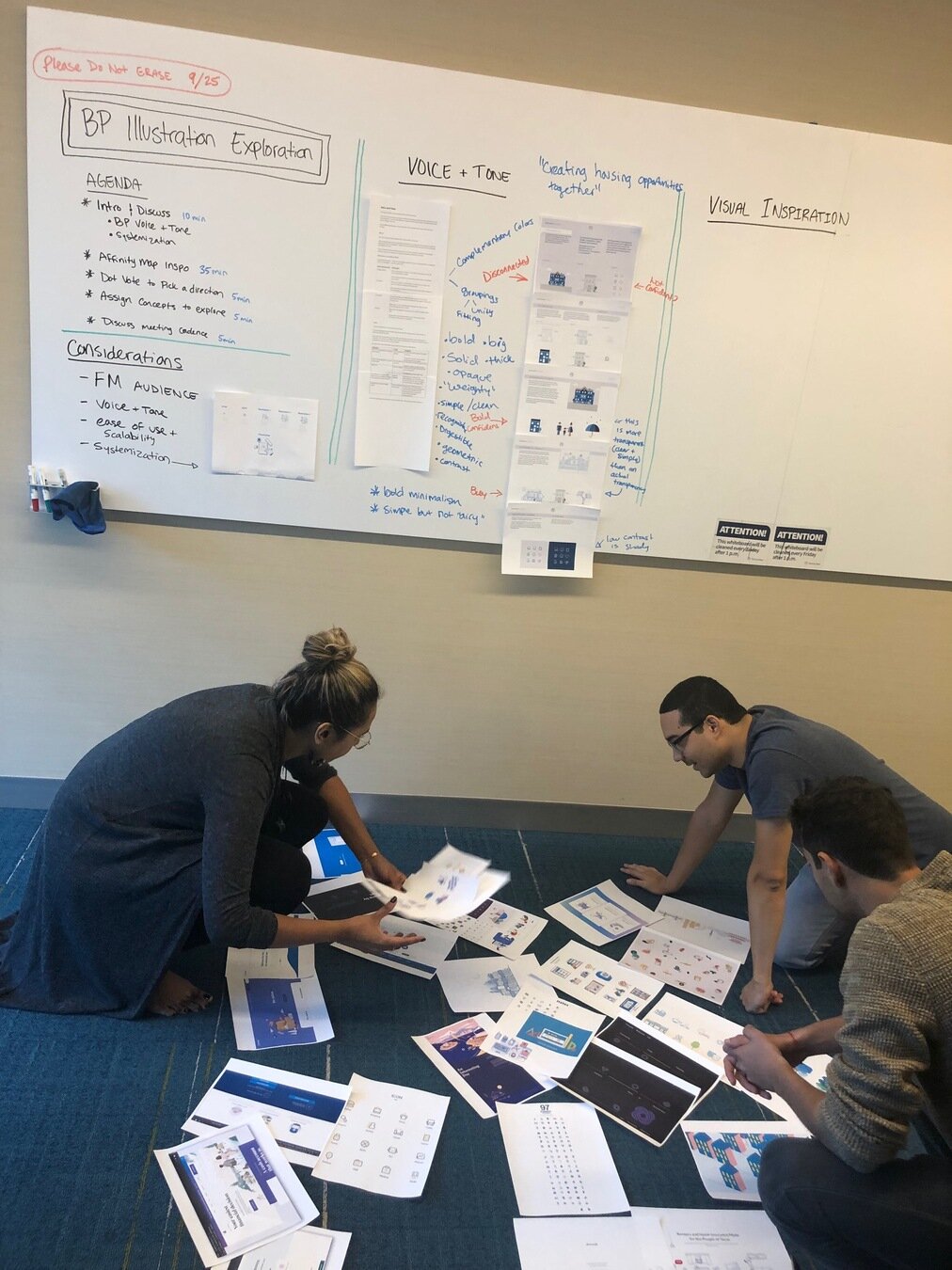
I guided the team and a group of excited outside designers through some design sprints of logo creation.
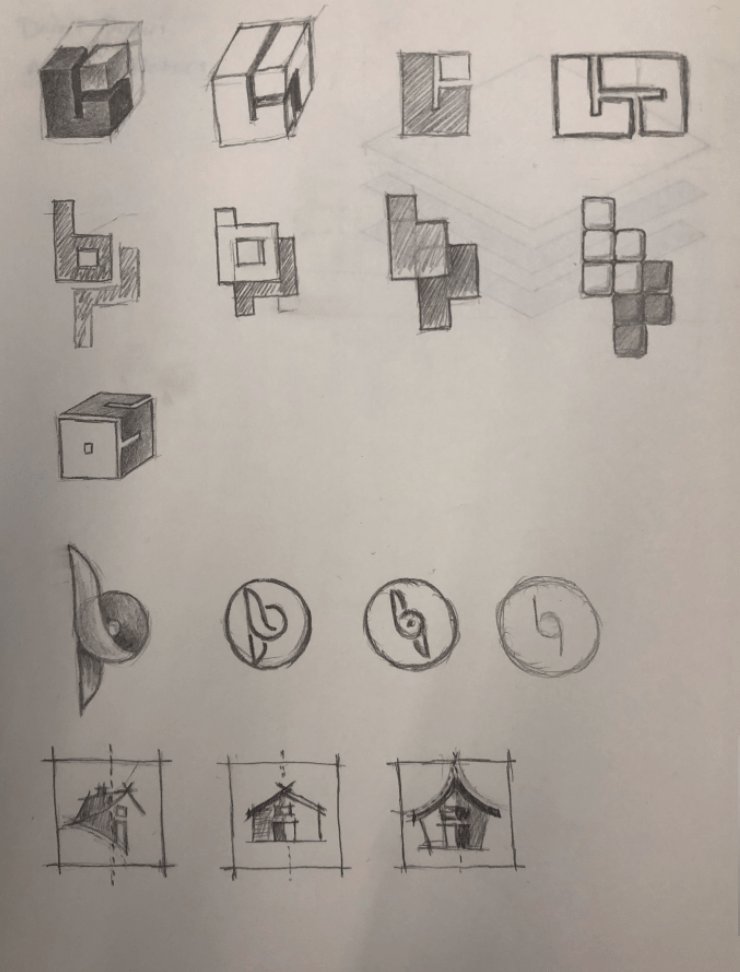
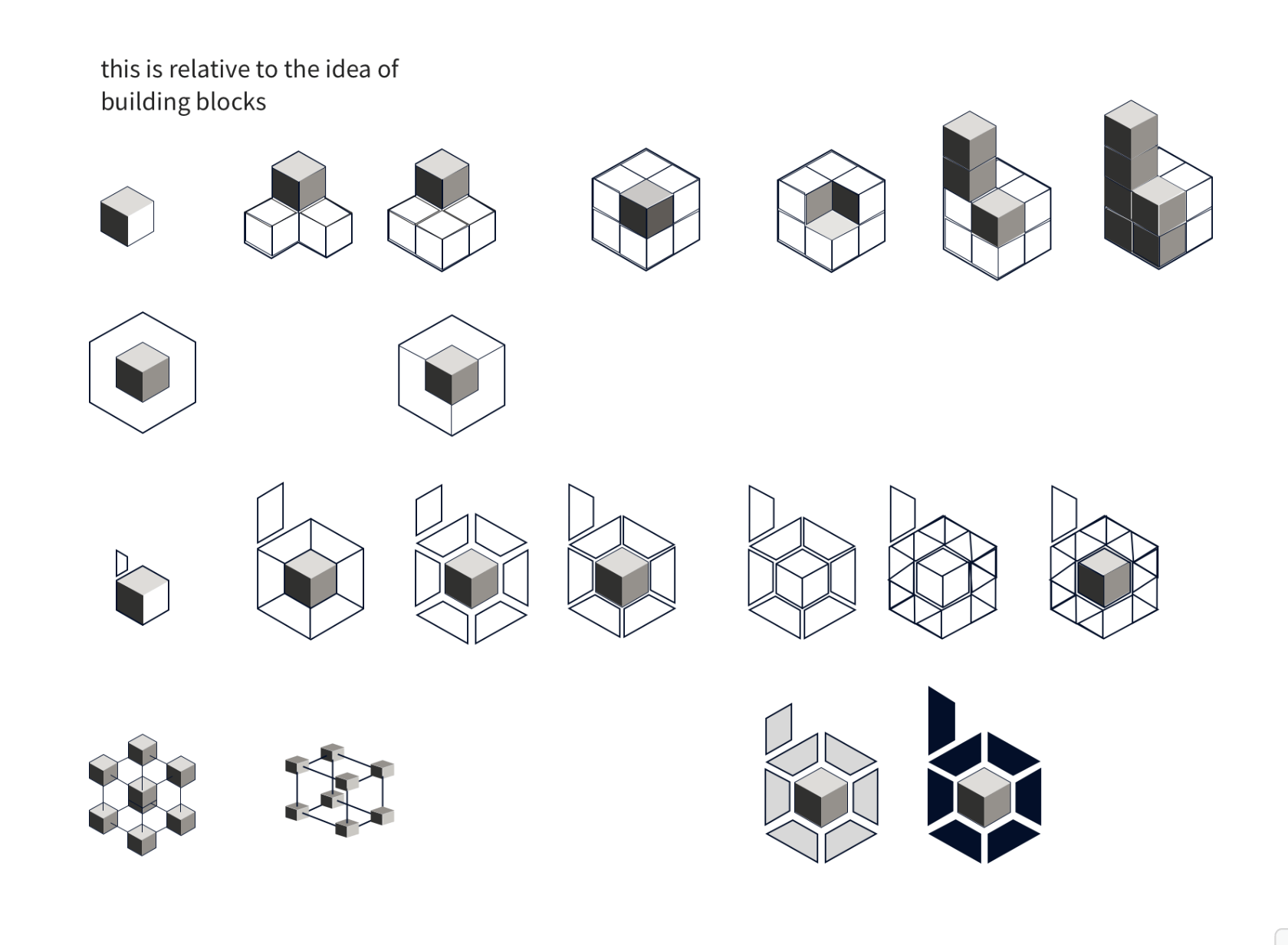
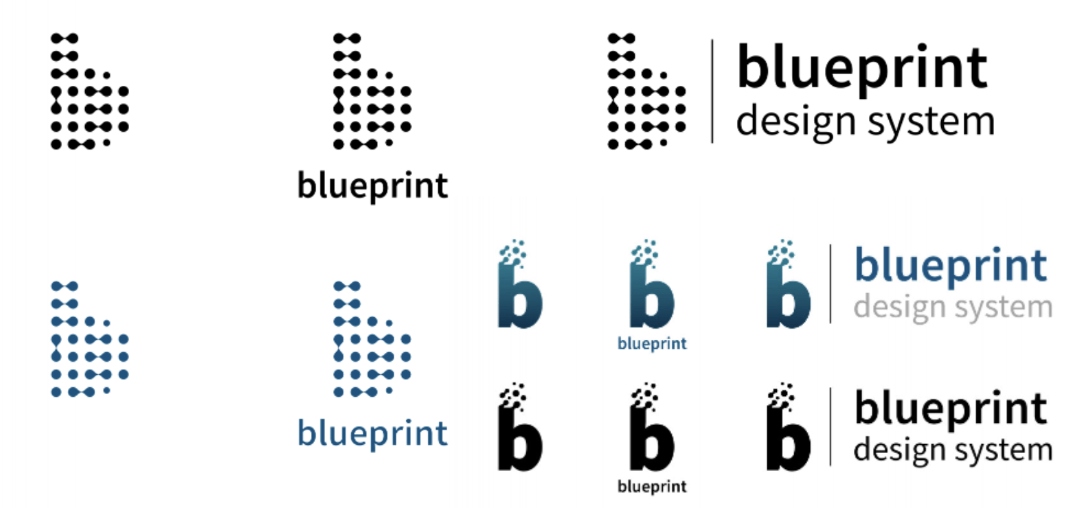
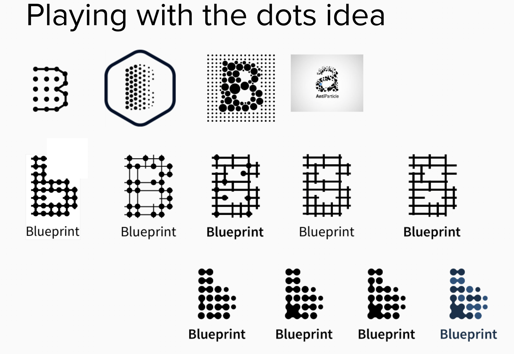
As product owner, I made the final selection on one designed by Kirk Lewis, that had the most flexibility, had hints of atomic and connected elements connected together to create a greater composite. It's structural but also organic at the same time.



Design Systems have standout..
Marketing & Promotional collateral
Design systems need to be marketed and promoted just like any other product.
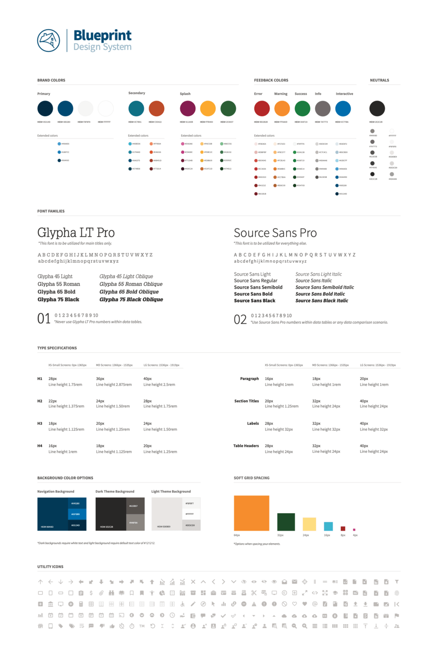
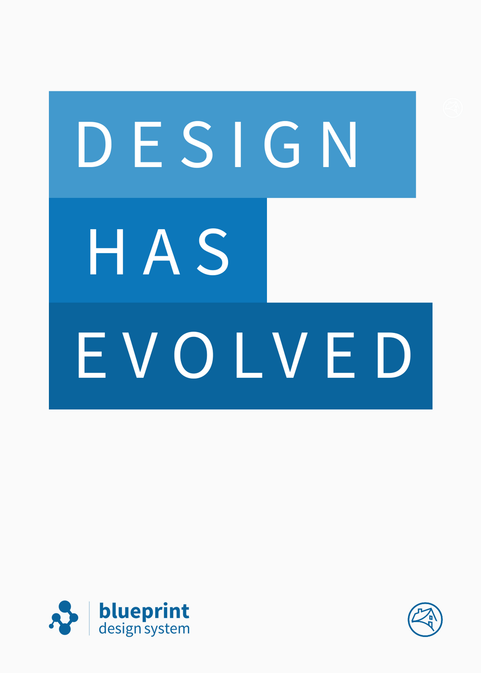
Posters around the office
Both functional and creative marketing posters were created and hung around the various offices to grow the awareness of Blueprint
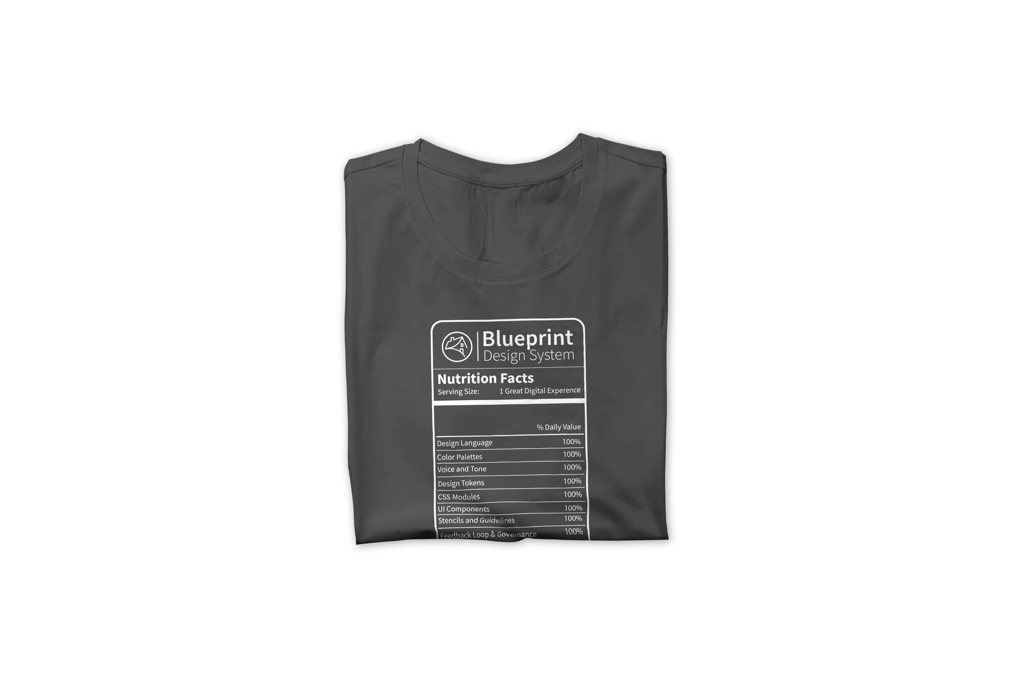

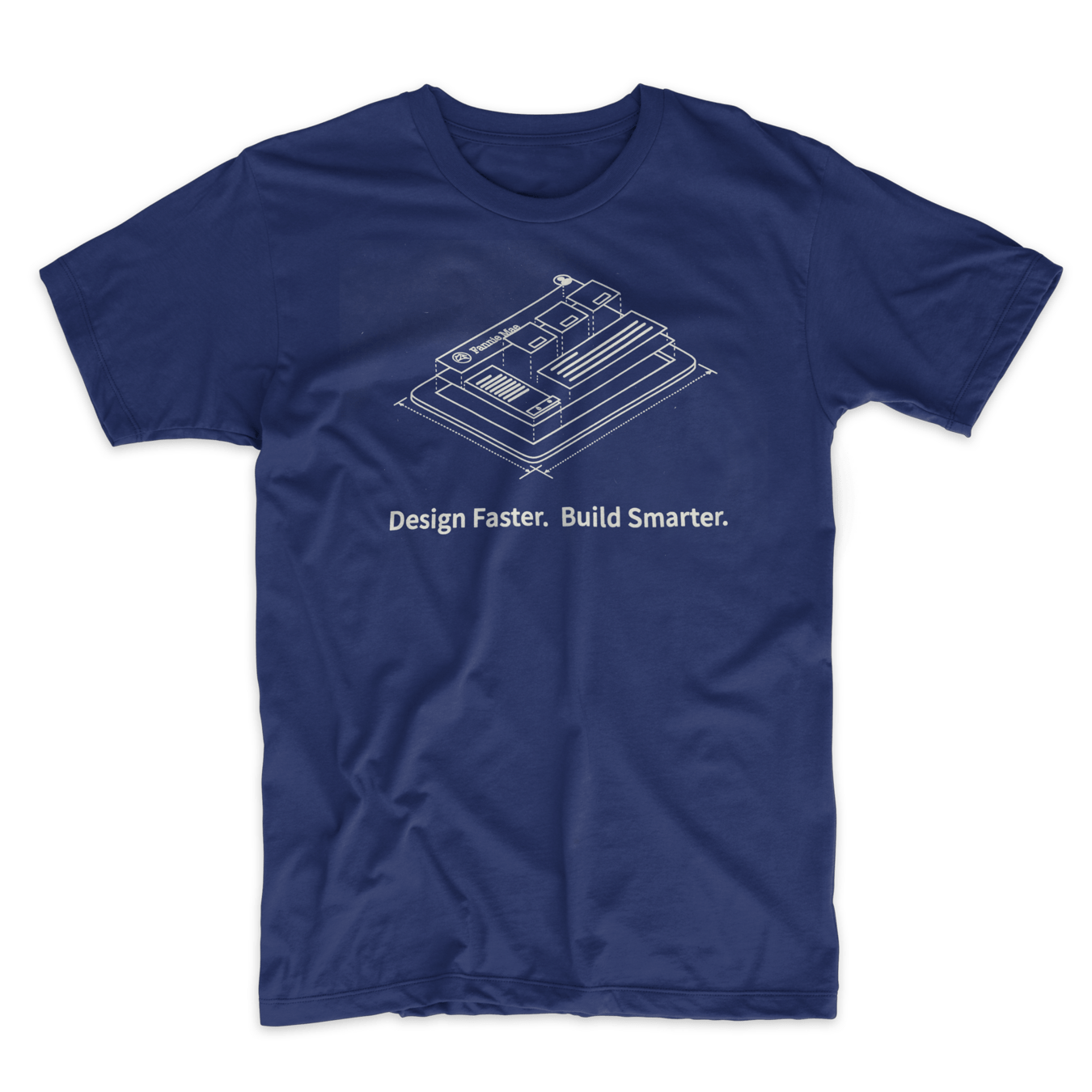
Blueprint T-shirts
I designed and printed shirts for the team to wear at company social and community events and also as giveaways / swags to designers and developers.

I worked with the internal design org's creative team to produce a promo video for Blueprint that really celebrated our full release as a scalable enterprise design system

Team member created video bumpers and other short promos for presentations, social gathering, etc

Quick promotion videos were created, highlight the efficiency designers can achieve using the system
Design Systems has great
Community, Training & Outreach

Central Communication hub
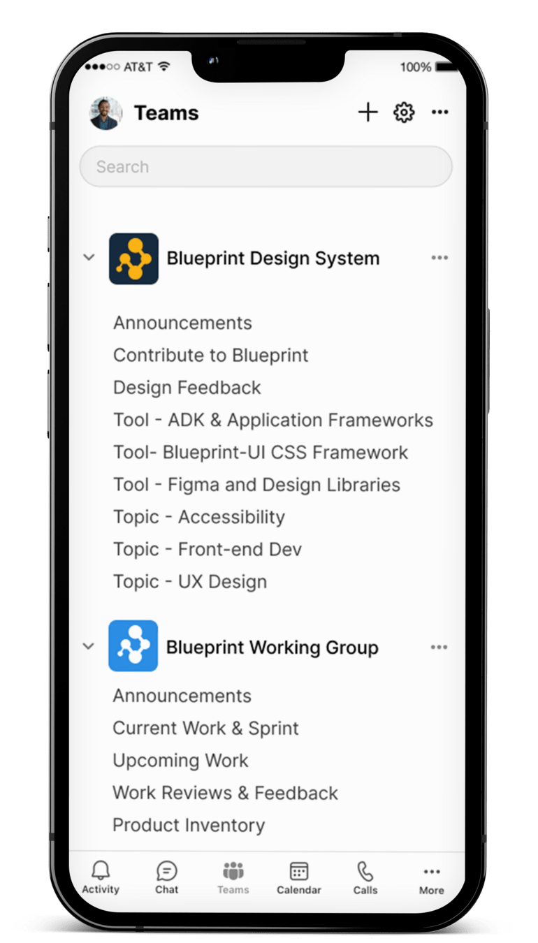
We centralized our community building and communication using SharePoint and Microsoft Teams. This provided an excellent, unified space for users and adopters of Blueprint to ask questions, receive updates, and discuss general topics related to improving digital products through design and development.
Additionally, we set up a dedicated Microsoft Teams workspace for the Working Team, complete with its own set of channels. This allowed contributors and the core team to focus on the development and continuous improvement of Blueprint.


Blueprint Theater
I started Blueprint theater as a way for the designer and developer community to get together, watch videos together and hang out.
Primarily during the covid shutdowns so done remotely
To amplify the movie theater atmospher, i made unique blueprint theater motion logos, gather funny or interesting movie trailers or short films leading up to whatever the feature film was. Almost always these were design or product design related videos but a few time they were just fun videos.4
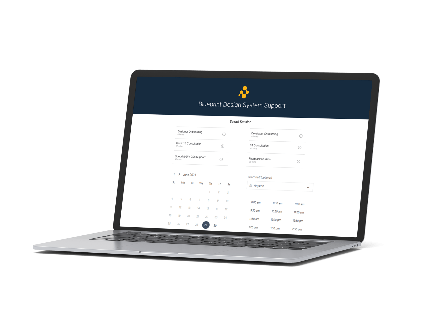
Support Network
Setup and maintained a series of streams of support to help teams adopt and get help with issues or bugs.
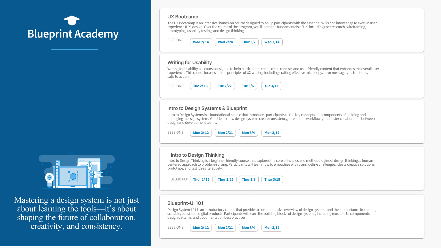
UX Bootcamp
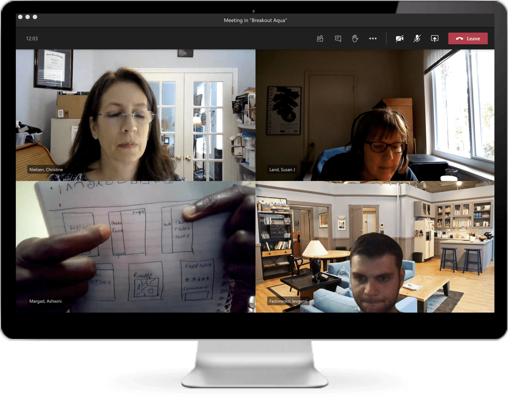
“I was impressed with how well you were able to do a ‘participatory’ training 100% online! It was also a nice overview of UX, starting at the very beginning with total user experience, user research, then letting us develop a real prototype with In-vision.
I think people got a lot out of it.”
– Susan Land (Product Owner, Multifamily Technology)
Design Systems have a extensive..
Support Network
Setup and maintained a series of streams of support to help teams adopt and get help with issues or bugs.
Design Systems track
Results & Impact

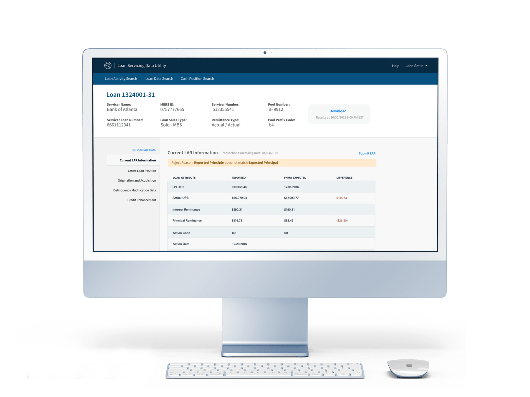
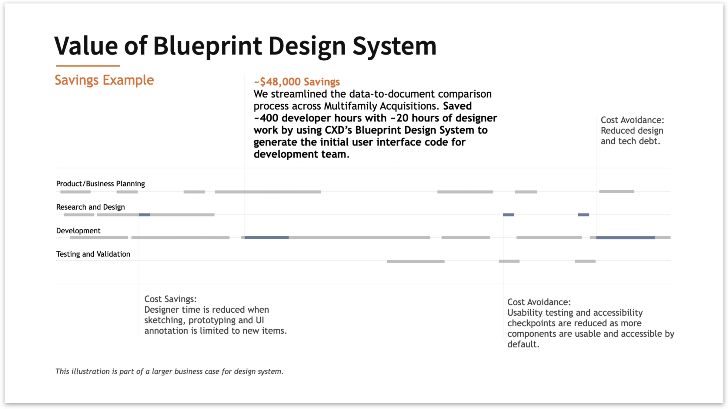
Working with development teams working with Blueprint (Specifically the css library) we were able to create an savings examples
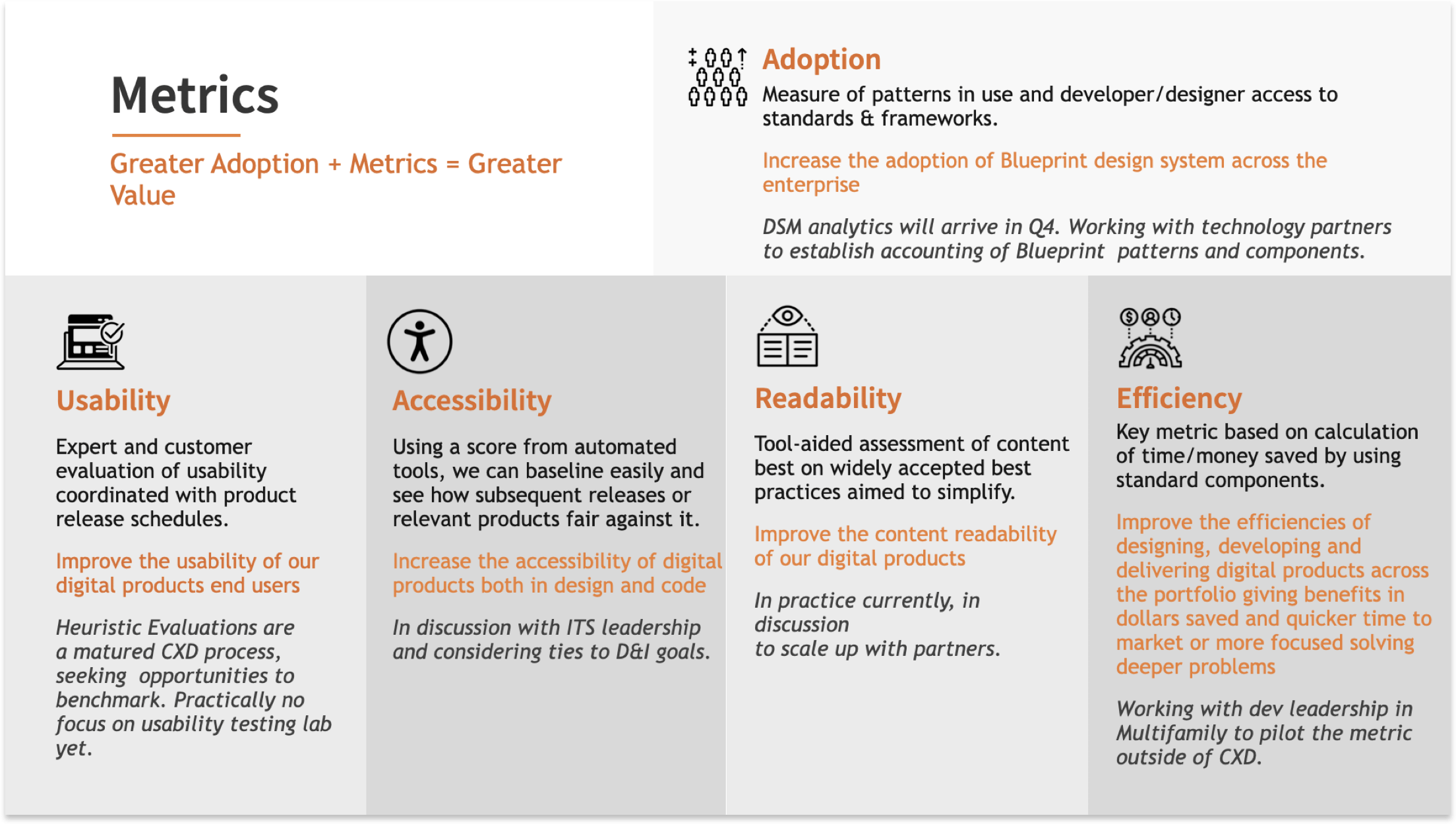
Created a plan for tracking the adoption of Blueprint as well as other design metrics to start creating a scoreboard as a baseline to track a products progress.
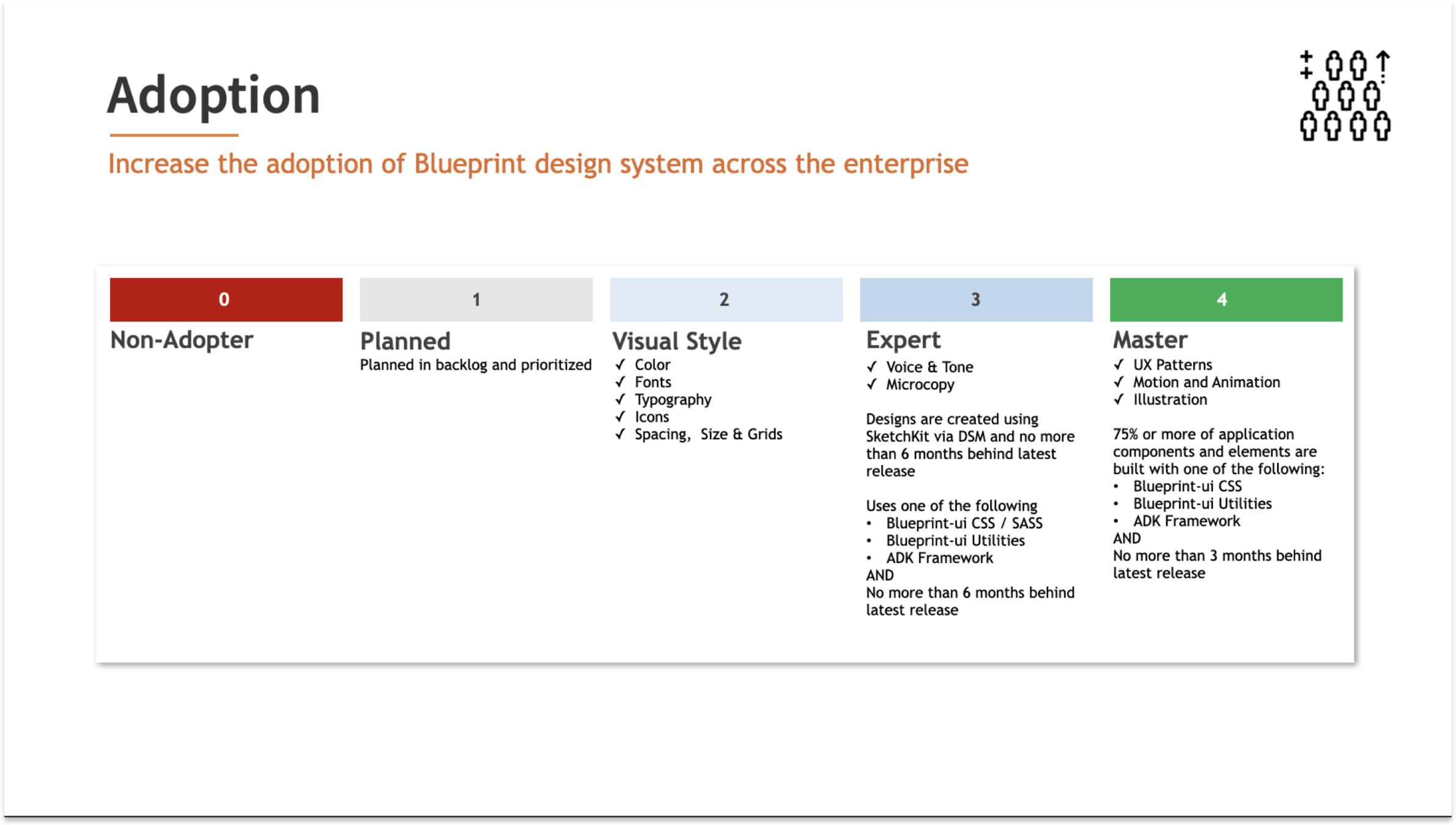
Adoption is a hard metric to track and a hard thing to communicate. My ultimate goal was for the design system to provide value and benefits with ease to downstream products.
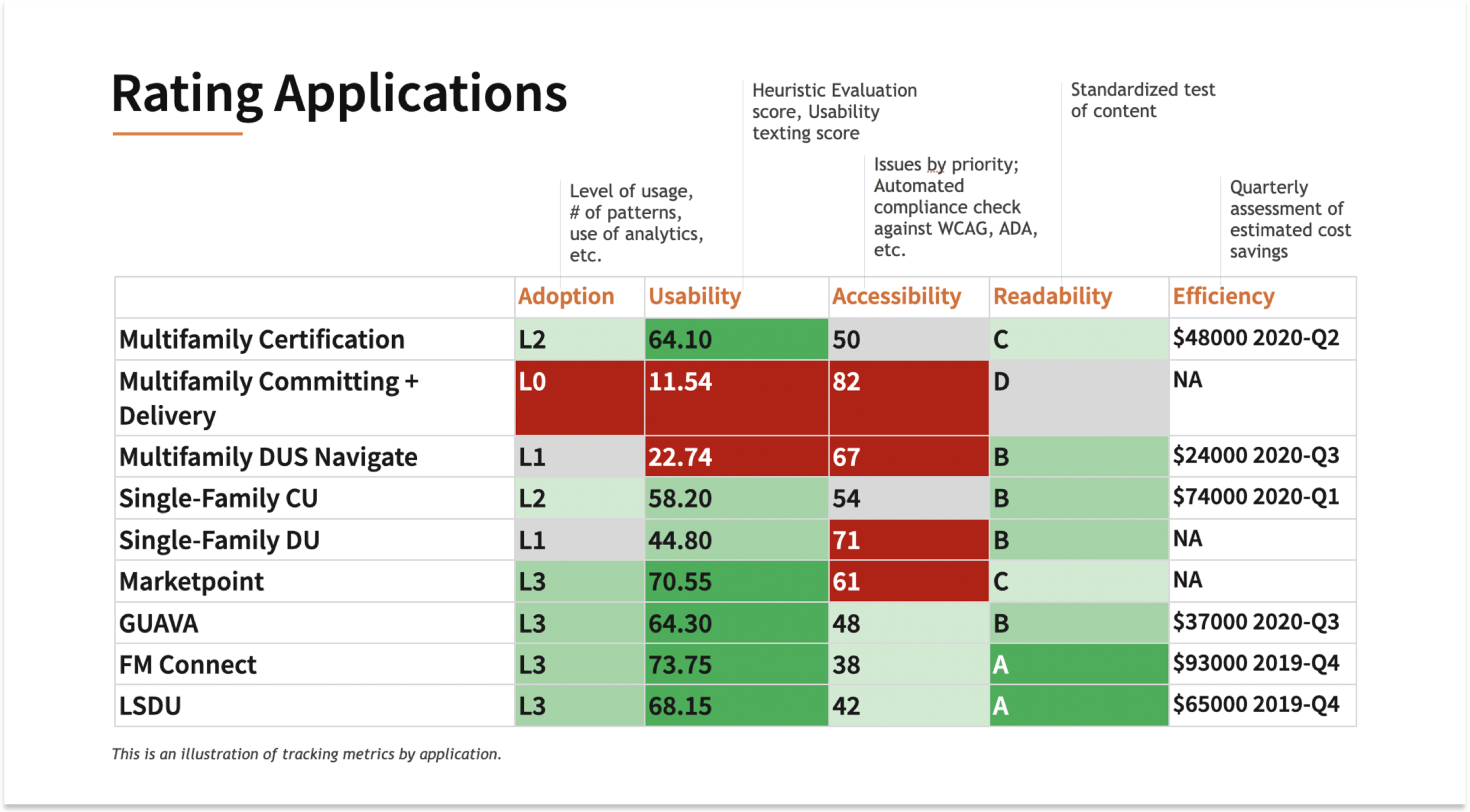
However, like any product, we have to be able to show the value to leadership. Inspired by Nathan Curtis, I created this proposal on how we can better rank adoption and communicate it.

This was an example dashboard of an application dashboard showing the latest measurements that would be shared in program level status meetings with leadership
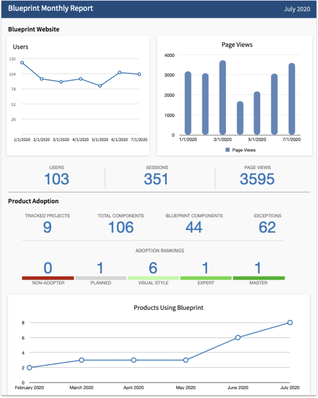
Tracking website traffic
Proposed a monthly report dashboard that combined website page views and visits, coded component usage, and products being tracked.
The metrics tracking proposal at large was not carried through due to huge resourcing impacts to the design team and design system during Covid shutdowns.
Figma library usage
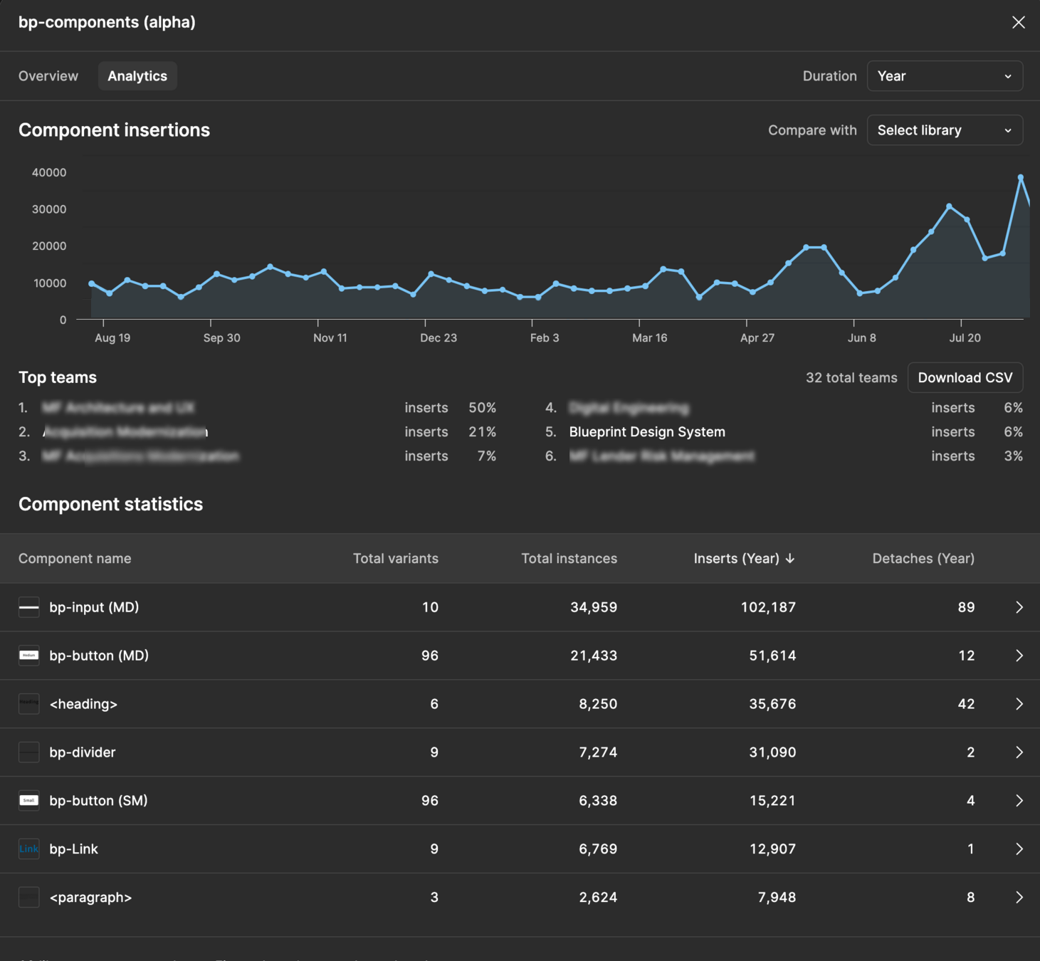
40+
Components
350k
Yearly Total Inserts
105k
Yearly Total Instances
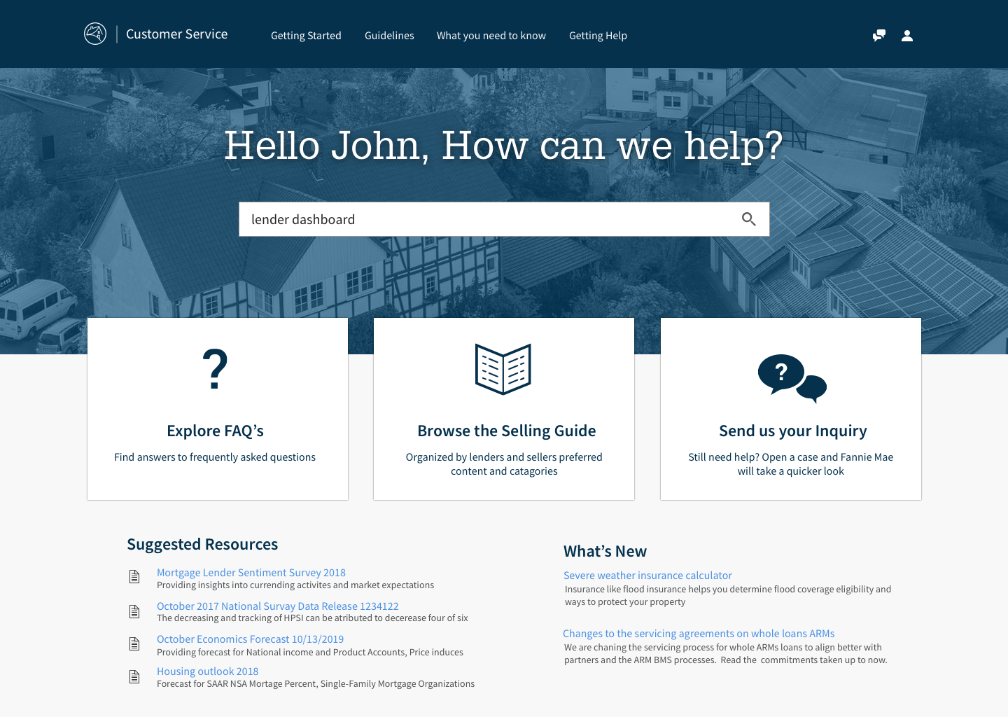
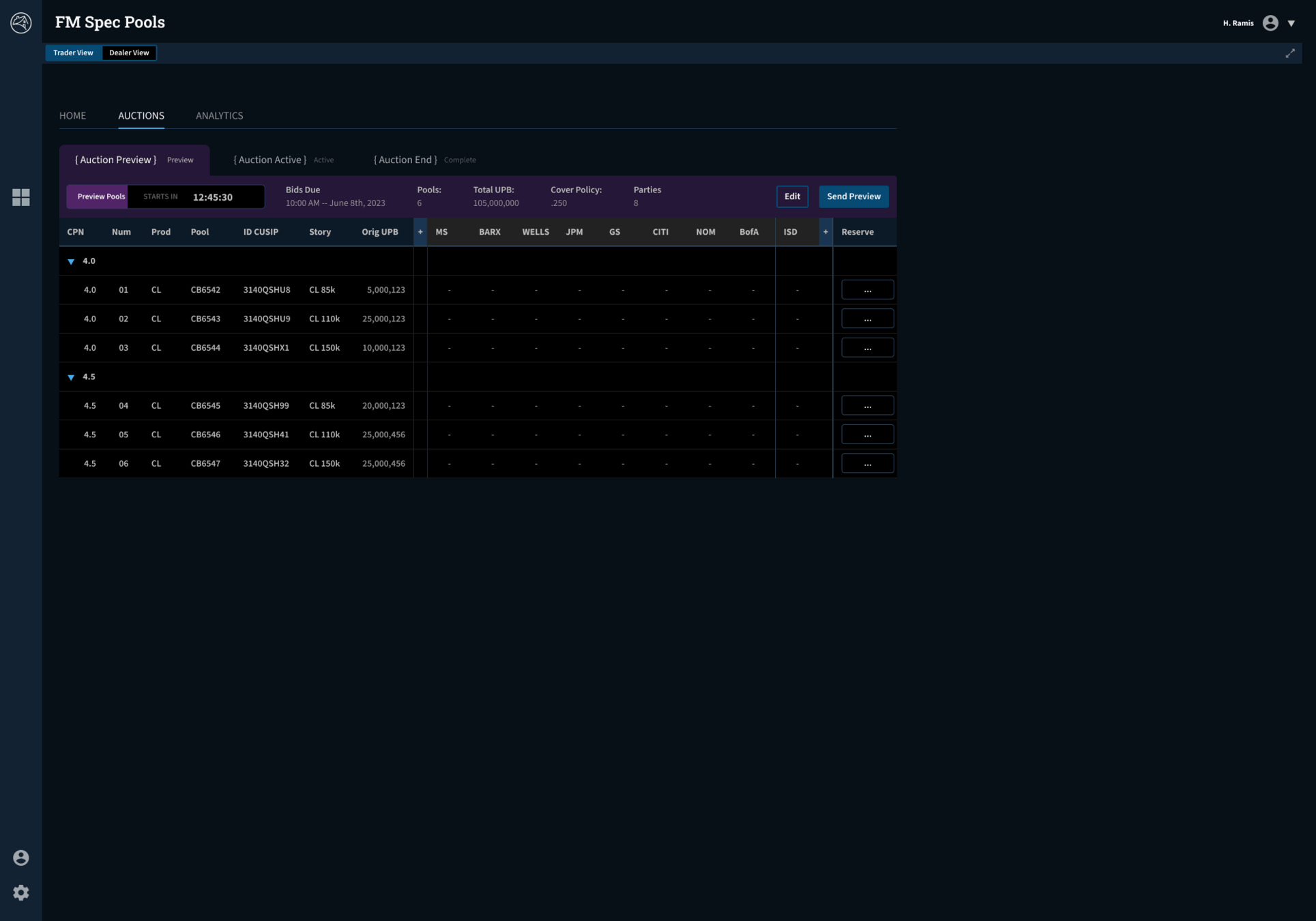
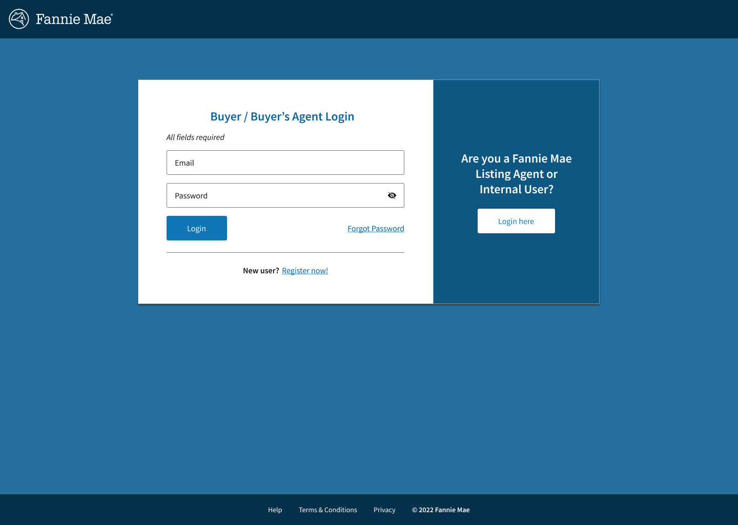
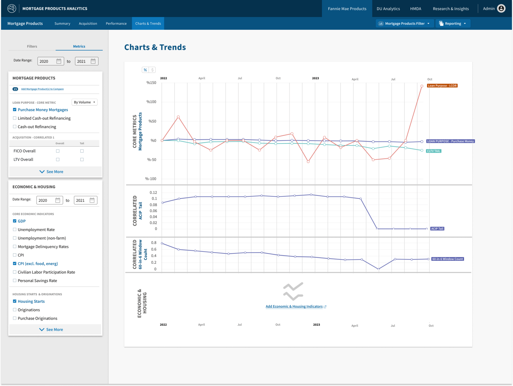
Application Usages








Thank you for your time in reviewing this case study
I'd love to share more, but its best to time-box me. I could talk about design systems for hours.
Lets chat!
(972)-265-9474
cgray24@gmail.com
