"Looking back at your preliminary task, what do you feel you have learnt in the progression from it to the full product?"
Included Strap line
Smaller and neater masthead
Cover lines in similar places
Same barcode placement
Out of place text
Similar direct modes of address
Advertisment
Main cover line is more prominent
Tag inclusion
Stand out subject
Footer included
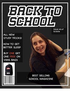
I feel like I have learnt lots since my preliminary task. My overall placement and structure of constructing and putting together images and shapes to create a final image has vastly improved, as you can tell the model in the preliminary task has been awkwardly placed, too small to look effective, it doesn't fit the real estate of the cover correctly and looks like there should be more to it, as well as this my placing of subheadings is off and way too small, this means that they don't stand out and are just to the side line. I also positioned the issue number and date in very visible part of the cover where as it should be somewhere more subtle.
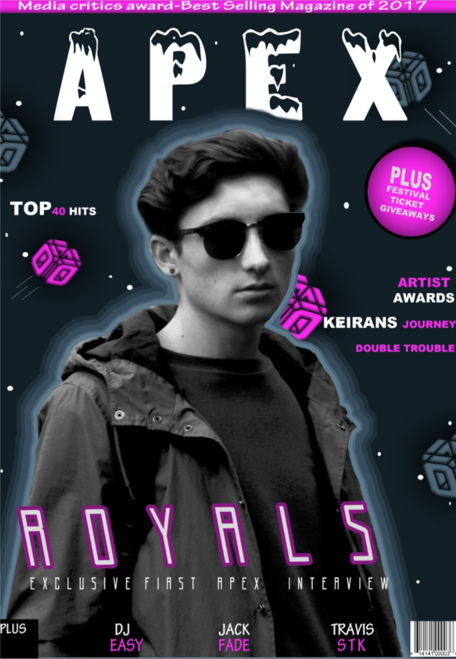
In my final piece I resolved these issues by placing the model in the centre to stand out more to engage consumers, I then placed and varied the sizes of my subheadings to make a bolder statement. Learning from my research I placed my sub headings over and around the subject instead of leaving the topics to the side, this means that my audience can quickly find out what the topics of the magazine are and gain a quicker interest. I Placed the cover line in the middle since it was the most important, it stands out but isn't so garish that it takes away from the title. I also included a tag to engage the consumer, "Exclusive" gives the magazine an important feel to it and makes the reader feel more special as if you won't find anything elsewhere in that magazine than In this. I was going to include a pull quote however I felt it would just over complicate the layout.
I also think that I improved on using fonts to stand out and engage audiences. On my preliminary the masthead did its job of standing out however it over powered the fonts of the subheadings making it seem that it wasn't important information. For my final product I chose fonts that didn't out weigh each other in order to gain a good balance, however I do feel like the fonts on both covers are very different because I was aiming at different audiences. I went for edgier fonts for more alternative older viewers compared to my school aimed magazine.
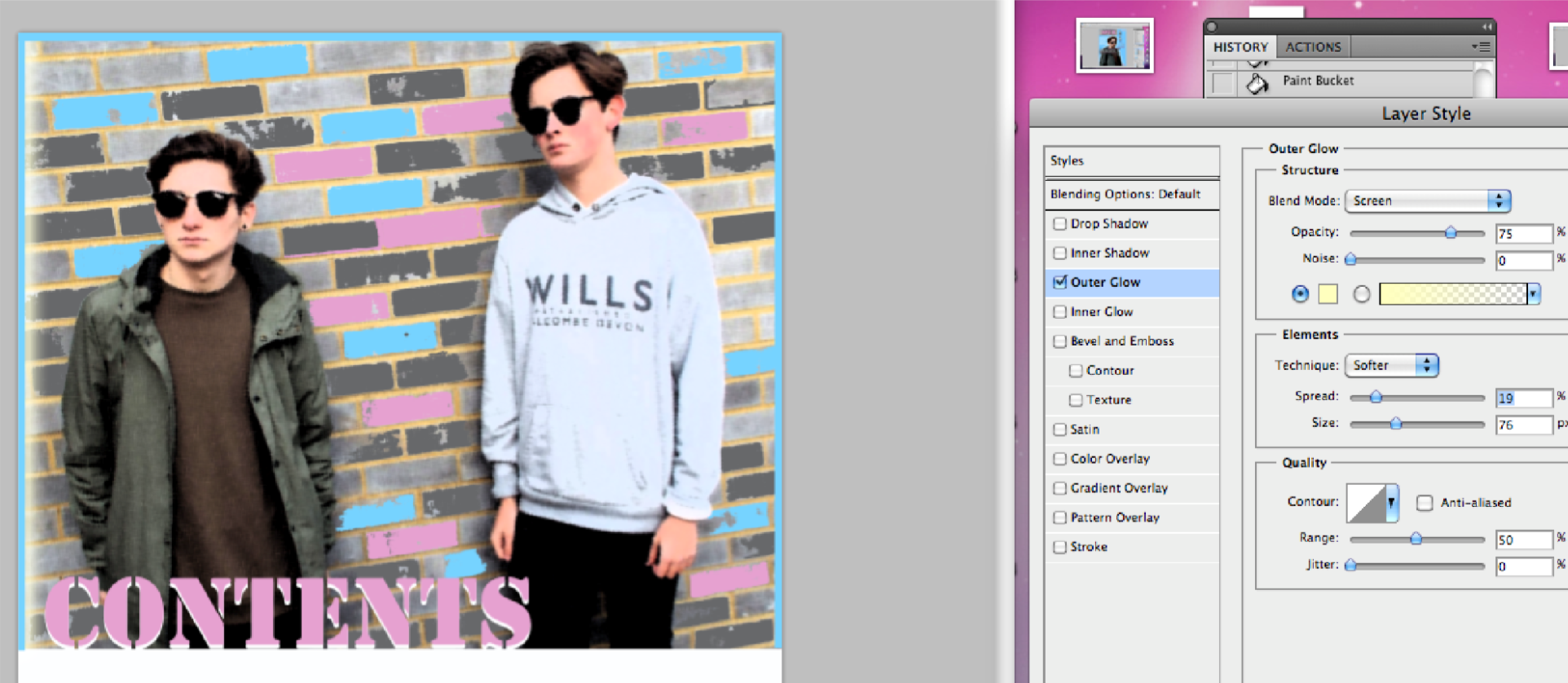
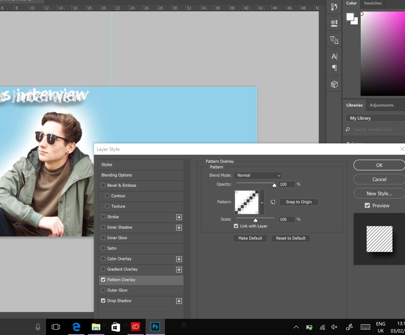
Throughout the process my development of photoshop skills grew as i learnt many different effects, as you can tell the cut out on the preliminary is very rough and unrefined, as I was unexperienced it took awhile to figure out how to paste and edit different layers, I should have dimmed the colour and saturation of the model to contrast with the dark background which also made her look out of place. I also didn't know that I could apply effects to stuff like text so the information on the cover doesn't stand out and is lost in the overall piece, on my final piece I learnt how to refine edges to make the hair look realistic and look better overall. I had help from a few teachers who demonstrated to me how to add layers of colour to my front cover which was inspired by the glow effect, we had to select the model, expand a colour bracket and make selections grow each time with slightly darker colours to create this glow effect which is more intense and blocky compared to the normal glow effect. I figured out how to drop shadows onto text to make it stand out, I spent a lot of time playing around with the gradient, spread and size to make it look punchy and bold. I learnt how to filter my work and posturize images to give a saturated and colourful effect which makes it different to normal magazines.
Layer merge
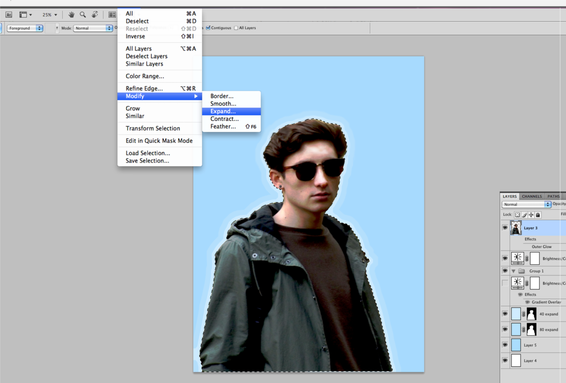
Expanding Layers
Glow effect
Texturising
I think that i also learnt how to manipulate the masthead to fit well together and look like one piece. The preliminary masthead is on two lines instead of one which doesn't make it stand out nor memorable, on my final piece I made sure that L.T.D would be on the same line as Apex so I used placement to make it vertical instead. I feel like this makes it more minimalistic and looks much better having it on a single line.
Overall I think that my development from my preliminary task to my final piece was major as i had learnt many techniques and had gained inspiration on how to position and construct my image from other media magazines. I feel like I have gained a much more minimalistic and professional image over the time I started this coursework.