Double page spread mock ups
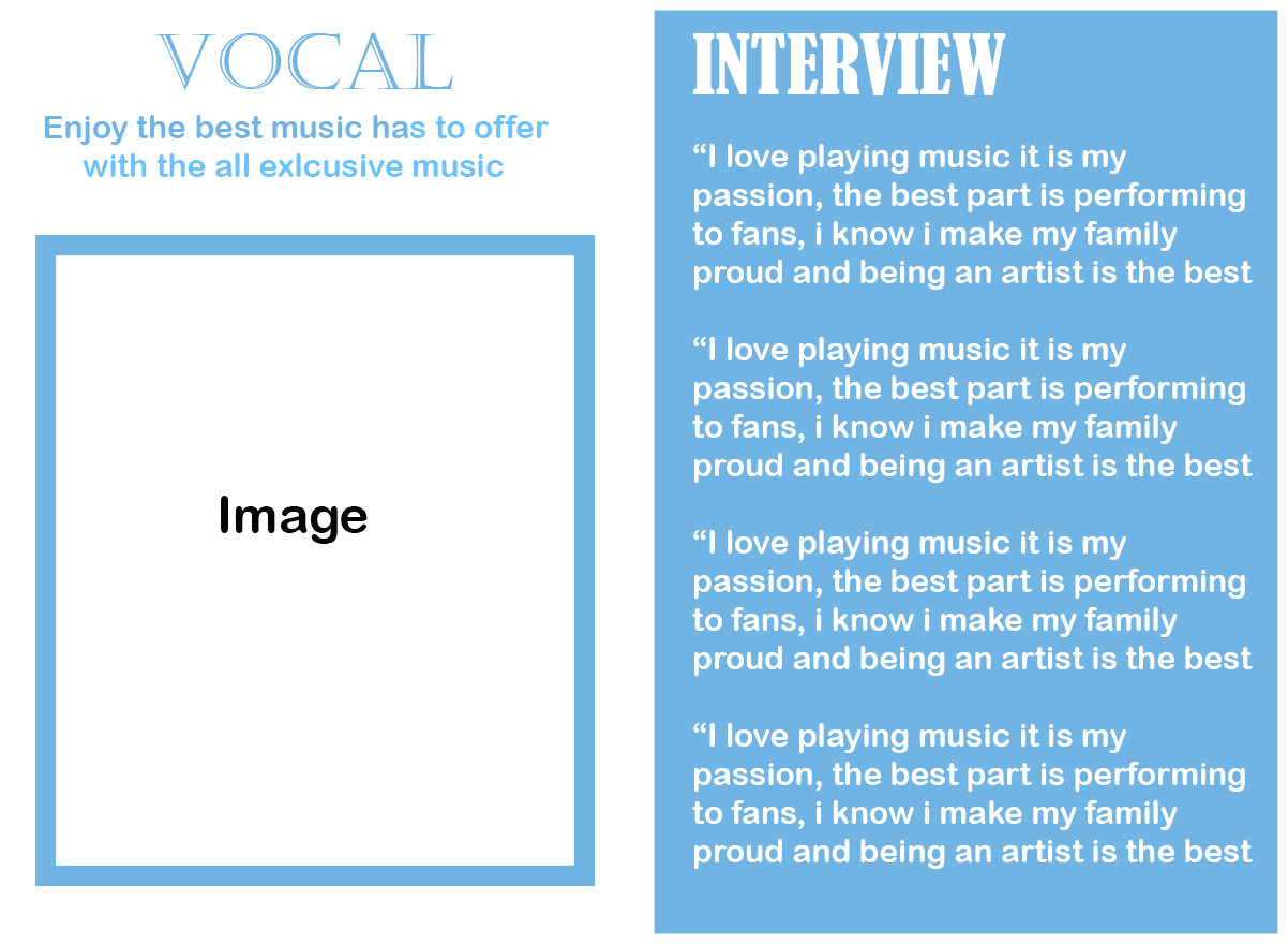
I like this basic layout because everything is positioned in a neat place, I feel like the image would also fit very well in the allocated area, the colour theme also compliments and contrast together nicely, it is very aesthetically appealing, the text layout also isn't overly complicated and doesn't get messy, however the fonts used on the title just isn't interesting and wouldn't engage my consumer, although this is an issue I can resolve it in my final piece, I may aim to create my double page spread in a layout like this.
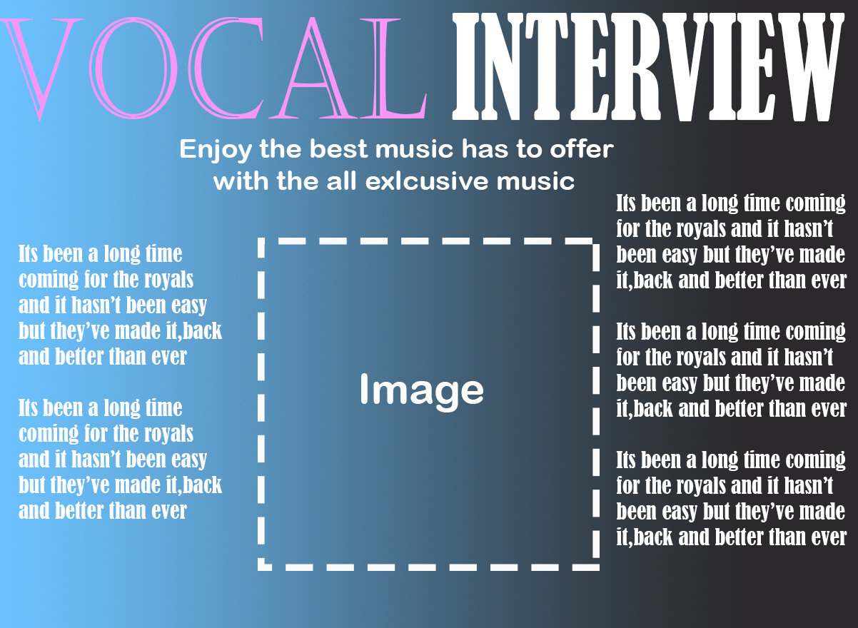
The colour gradient has been used to create this fading effect which I like, I have positioned the image in the centre of the page, this makes the subject instantly distinct and may engage my audience better, I have text running down either side of the side line which I feel looks quite good and means you can pack a lot of information onto the piece, I feel like on the title one font overpowers the other so it doesn't look very good, vocal has been lost and the word interview is very pronounced, I would need to change this for my final product
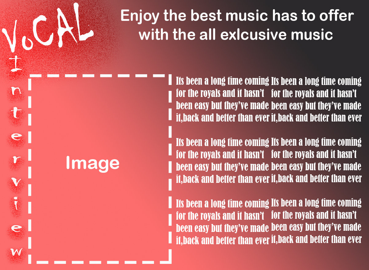
I like this mock up because of the layout, I like how I horizontally placed the title of the magazine at the top corner of the spread and then had the topic vertically going down, I also added this exposure effect to give it this burnt look, I used a gradient going towards the top corner which looks quite cool and may appeal to my audience, I like how the paragraphs of writing are presented as there is a good page for text, I like the font of the main title which I think my audience would like because it is quite edgy, however I think that it would be awkward placing and image into the area I allocated it.