Creating Visualizations in Tableau

Custom Visualization Types-I


Learning Outcome
5
Interpret insights from custom visualizations
4
Create heat maps, dual-axis charts, motion charts, lollipop charts, and donut charts
3
Understand how selected custom charts encode information
2
Identify when basic charts are insufficient
1
what are custom visualization types?
Bar, line, and pie charts


Dimensions and measures
Marks card options (Colour, Size, Label)
Dual-axis concept
Show Me panel usage
Learners should know :

Imagine you’re an analyst in a boardroom review....
Imagine you’re an analyst in a boardroom review....
“Where are we losing profit by region, product, or discount?”
“Is growth real, or just seasonal spikes?”
“Show me revenue and margin together right now.”

Questions arise such as :

You open the dashboard, but the standard charts feel too basic...
So the room gets curious:
“Can we see the truth in one view?”

“Can one chart answer multiple questions at once?”

That’s exactly where we use Custom Visualization Types
When basic charts stop answering questions, custom visualizations take over...
Business questions often require:
Density detection
Multi-measure comparison
Change over time
Clear emphasis on key values
We now explore the first group of such charts...


Introduction to Custom Visualizations
Custom visualizations combine standard chart components to highlight insight, often using colour intensity, motion, dual axes, and layered marks.
Why They Are Needed?

What are Custom Visualizations?

-
Standard charts may hide:
-
Change over time
-
Concentration zones
-
Priority gaps
-
- Custom charts reduce interpretation effort and improve decision clarity

Donut Charts
Conceptual Explanation
Enhanced pie charts with a hollow centre
Improve readability and allow KPI placement

Use Cases
Sales % by Category/Region
Profit share by Segment
Completed vs Pending tasks
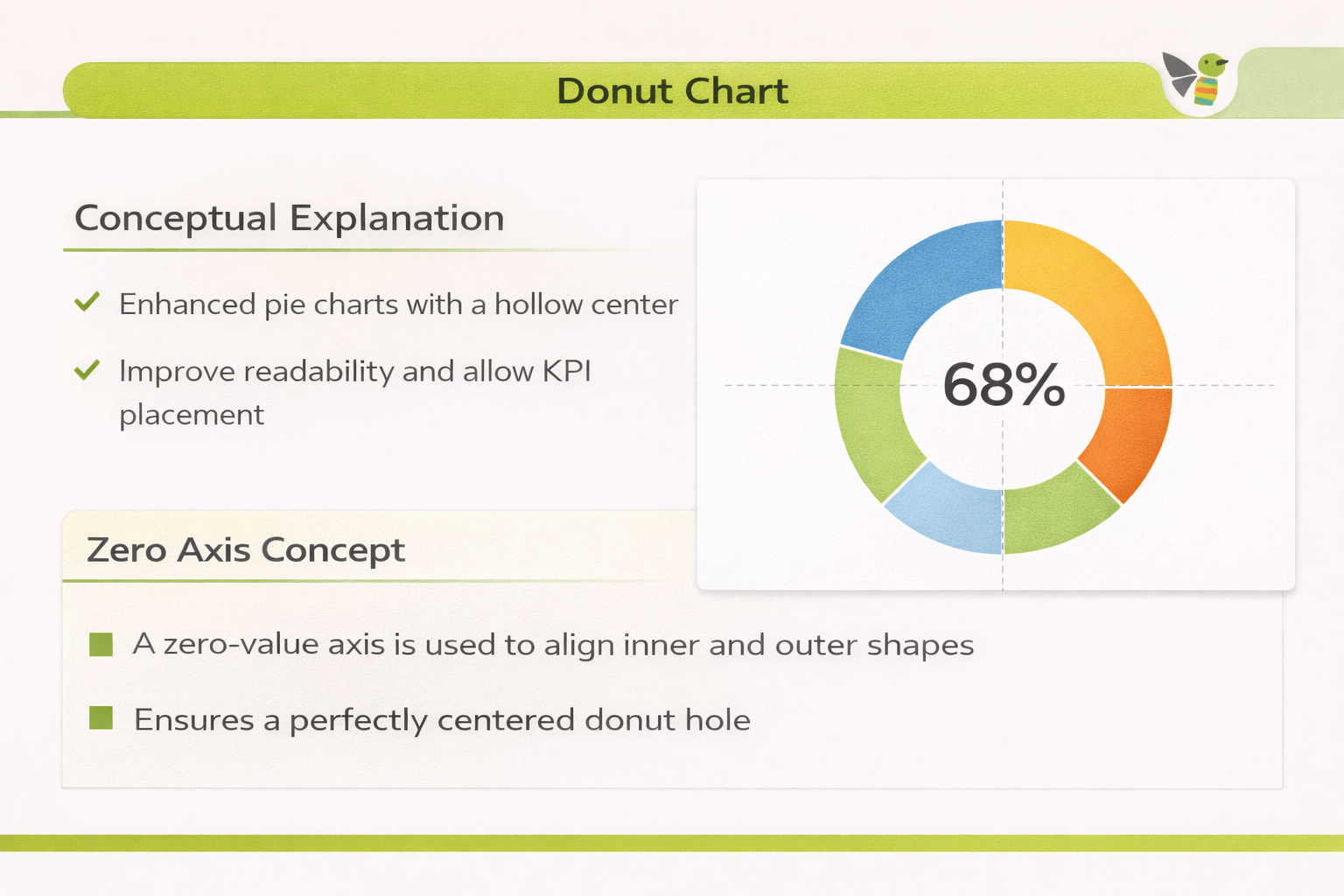
How to Read :
Slice size → proportion
Centre → total or key KPI
Create a Pie Chart
How to Create a Donut Chart
Step 1 :
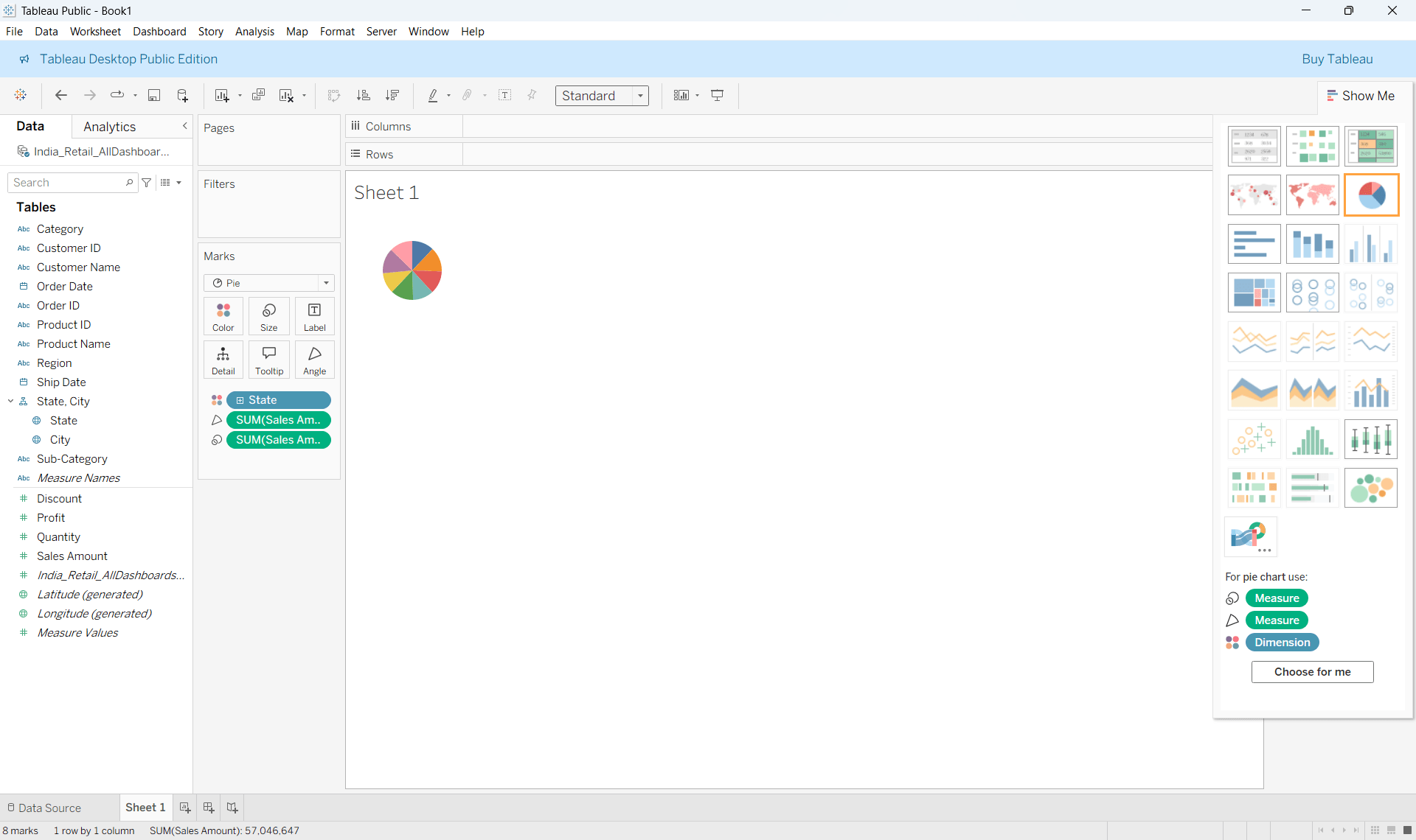
Step 2 :
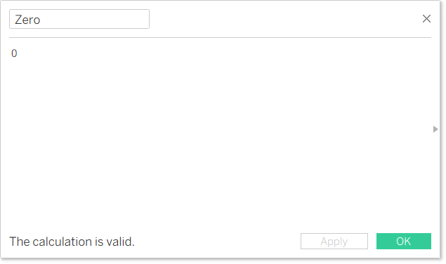
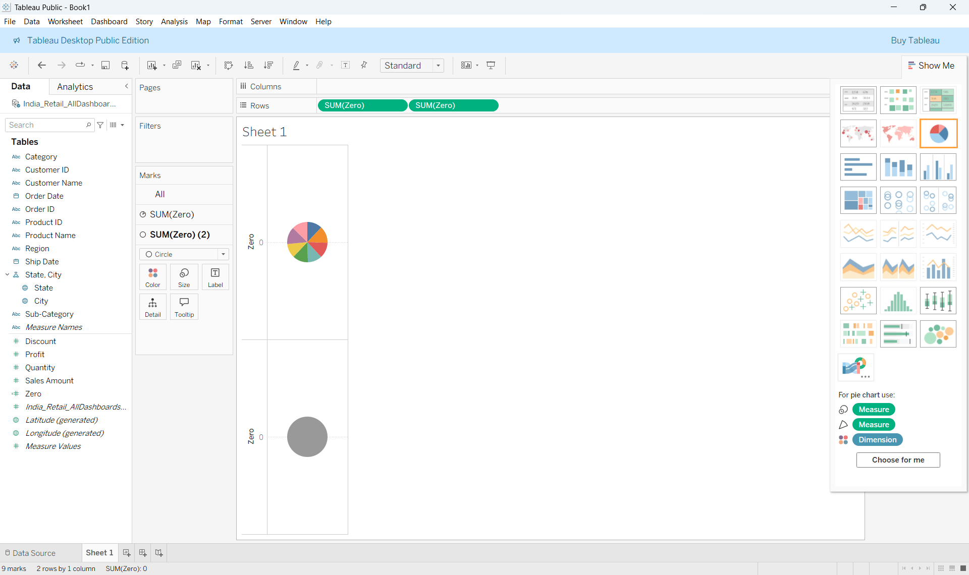
Create a calculated field with value 0

Drag Zero to rows and then do it once more
Step 3 :
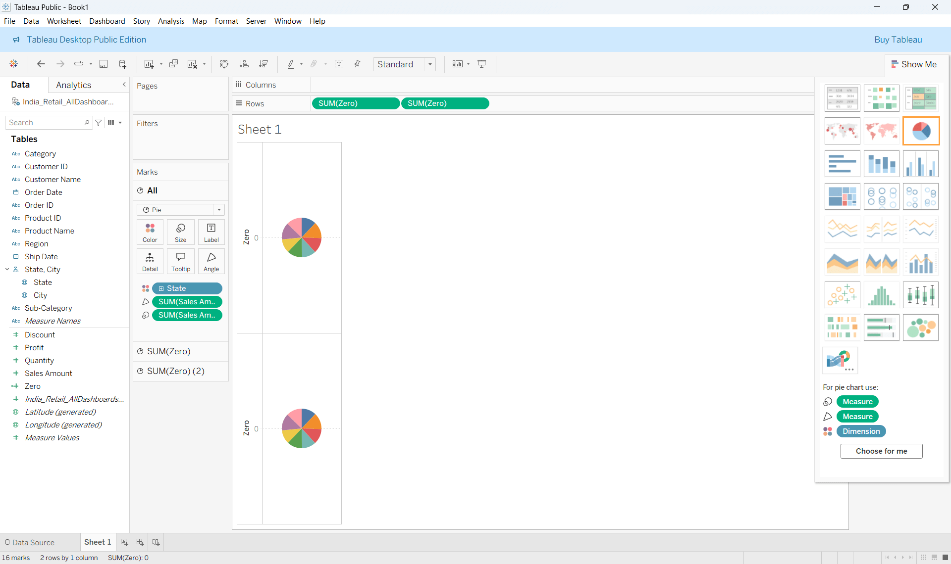
Second Marks to circle and remove the fields
Step 4 :
Step 5 :
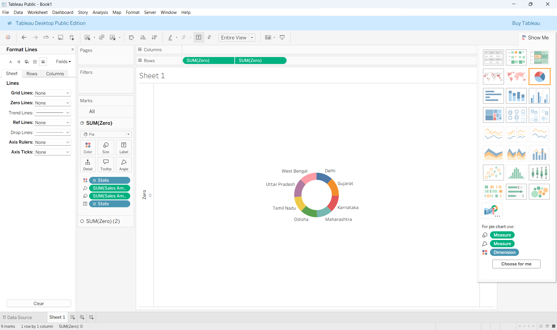
Reduce the size of the Circle
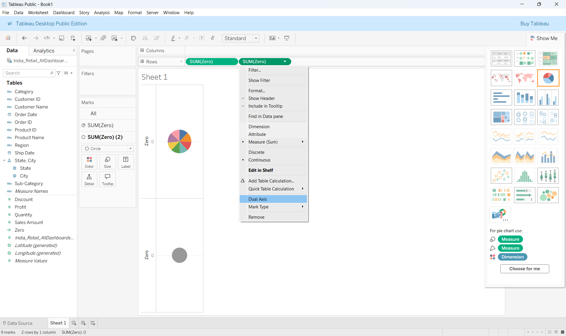
Right click on the calculated field in the row shelf and select Dual Axis
Step 6 :
Step 7 :
Remove zero lines ,add labels, tooltips etc.
Lollipop Charts
Conceptual Explanation
A minimalist variation of bar charts
Emphasizes endpoint values, not bar area
Use Cases
Ranking scenarios
Dashboards requiring visual cleanliness
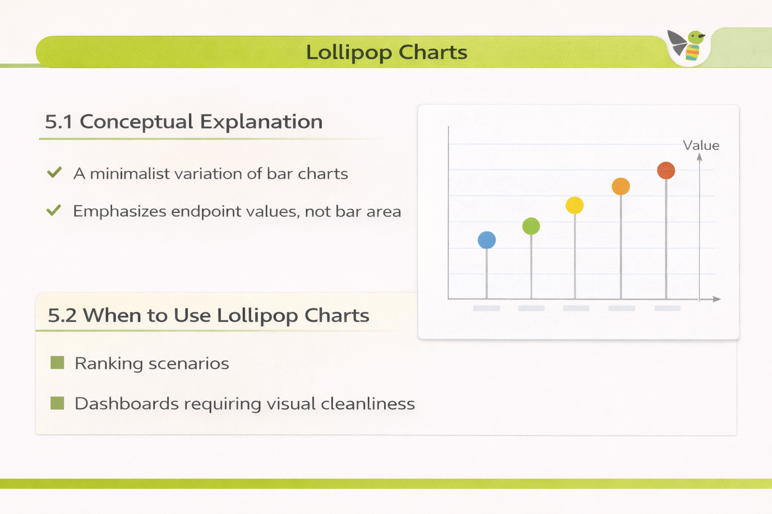
How to Read :
Line shows direction from baseline
Circle highlights actual value
How to Create a Lollipop Chart
Step 1 :
Create a standard Bar Chart
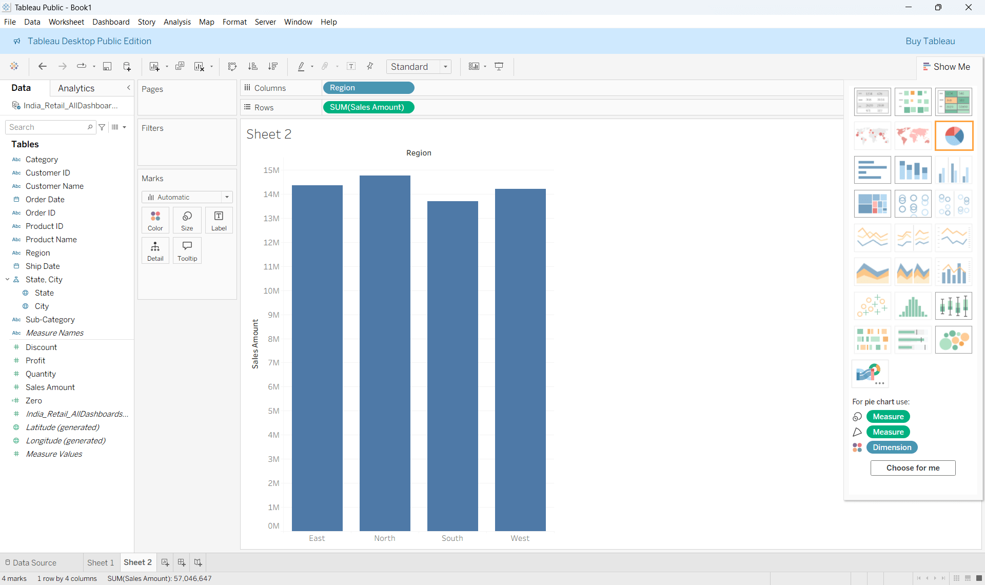
Step 2 :
Drag the same measure again to rows
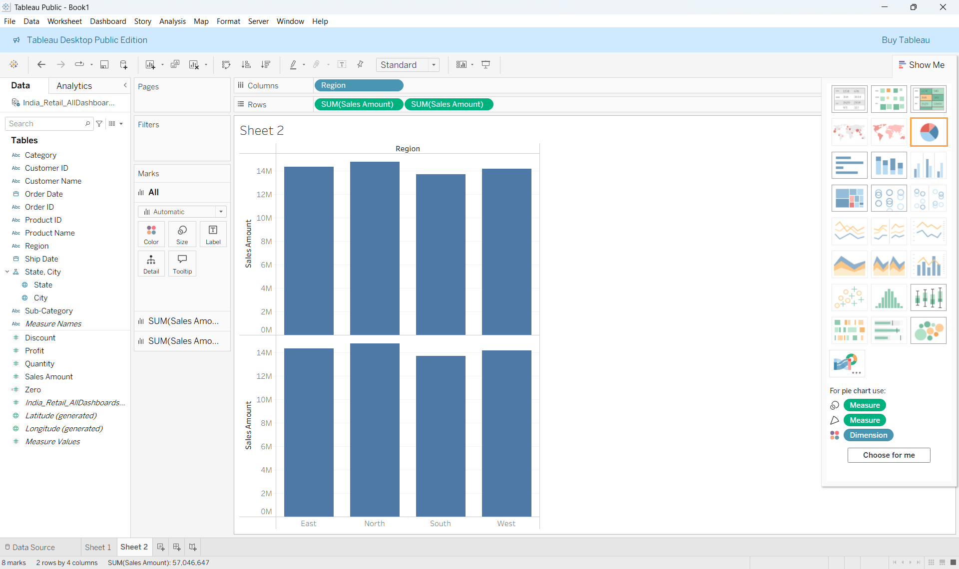
Step 3 :
Change one Marks type of the second chart to Circle
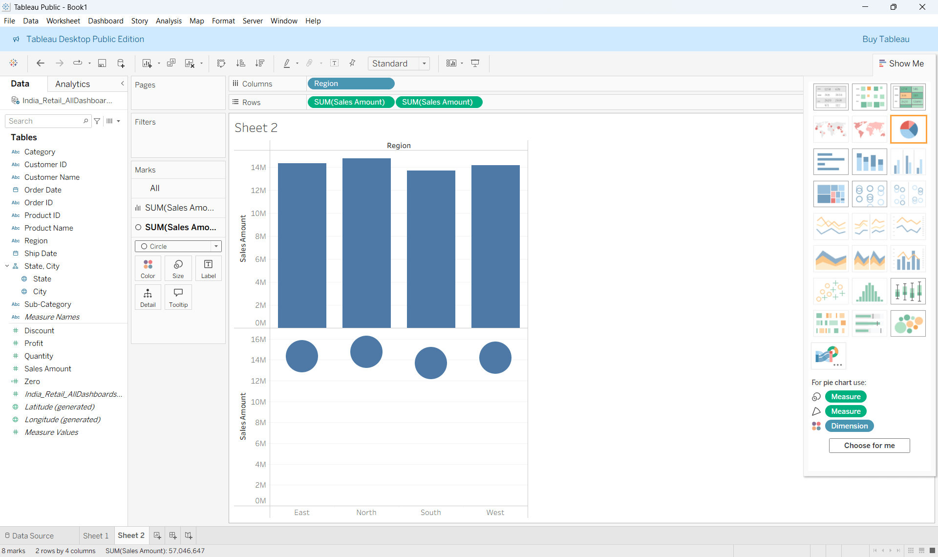
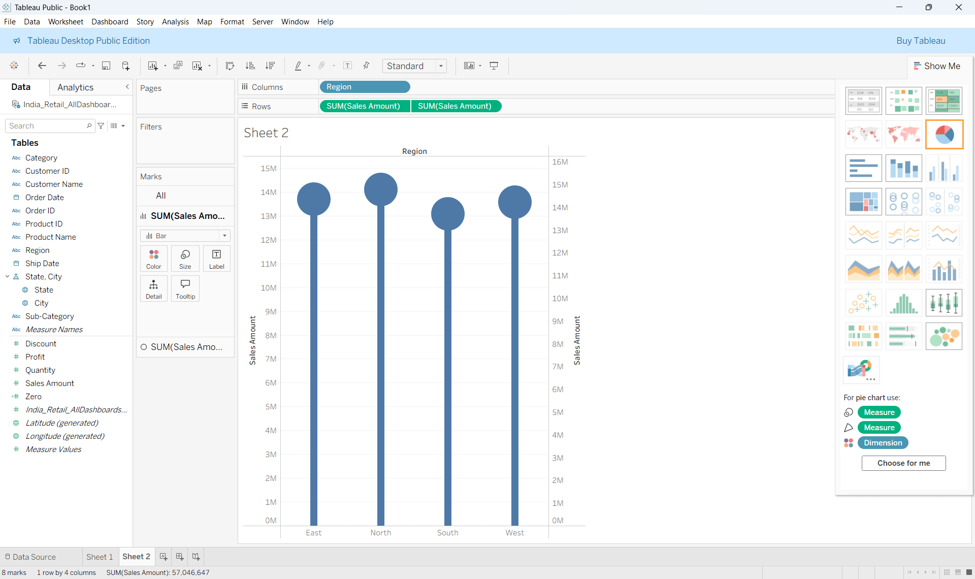
Step 4 :
Synchronize axes and adjust bar thickness and circle size
Motion Charts
Conceptual Explanation
Use Cases
Show multiple variables evolve simultaneously
Reveal trajectories, not just snapshots
Make growth, decline, and volatility visible
How to Read :
X-axis and Y-axis → two measures
Bubble size → third measure (optional)
Motion → change over time
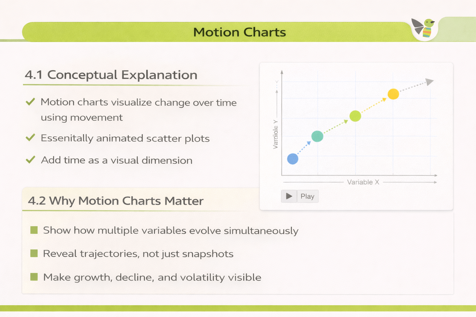
Motion charts visualize change over time using movement
Essentially animated scatter plots
Add time as a visual dimension
Creating Motion Charts
Drag a Time Dimension to Columns and another Measure to Rows
Step 1 :
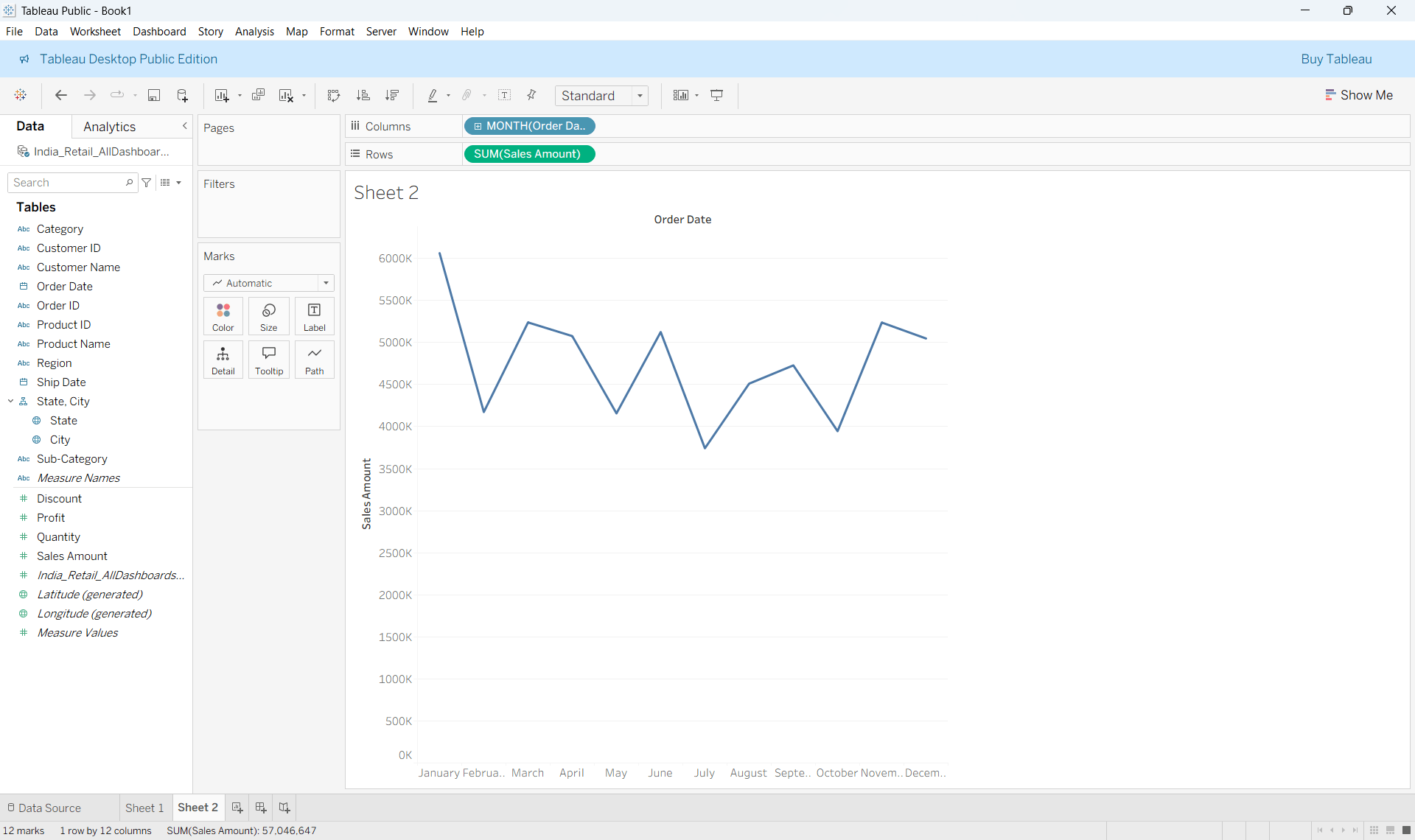
Step 2 :
Drag a Time Dimension to Pages and Change the marks type to circle
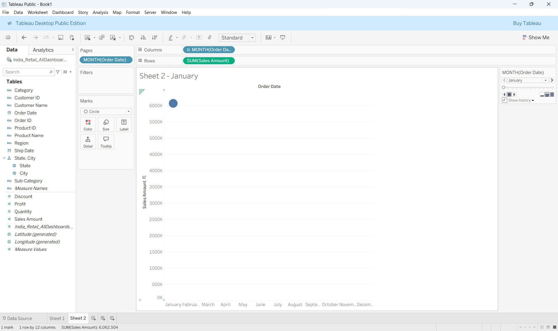
Step 3 :
On the right hand side make sure to select Show History and click on the drop down
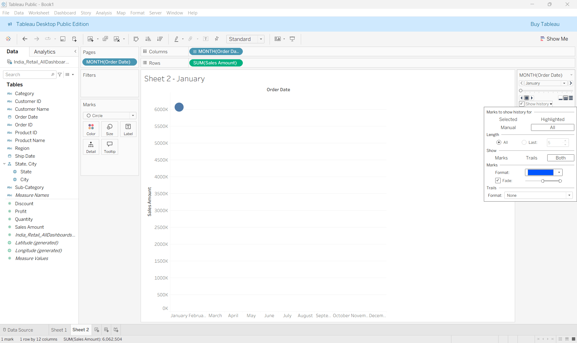
Step 4 :
Hit the forward button and you can see the chart moving
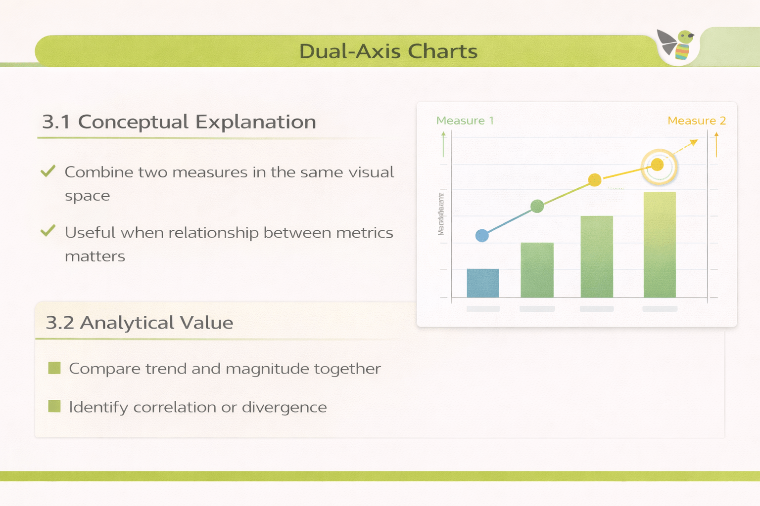
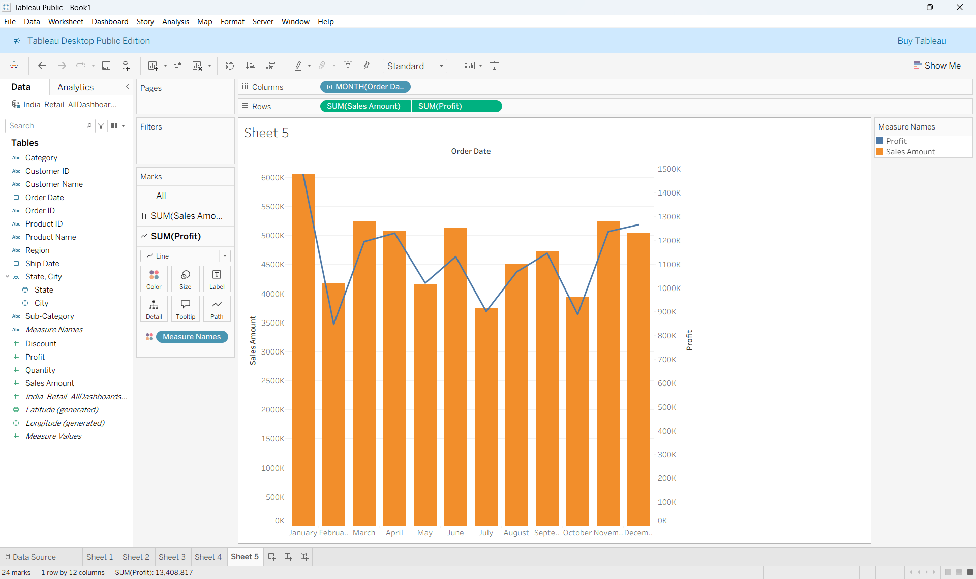
Dual Axis Charts
Conceptual Explanation
Combine two measures in the same visual space
Useful when relationship between metrics matters
Use Cases
Compare trend and magnitude together
Identify correlation or divergence
How to Read :
Each axis represents a different measure
Different mark types distinguish metrics
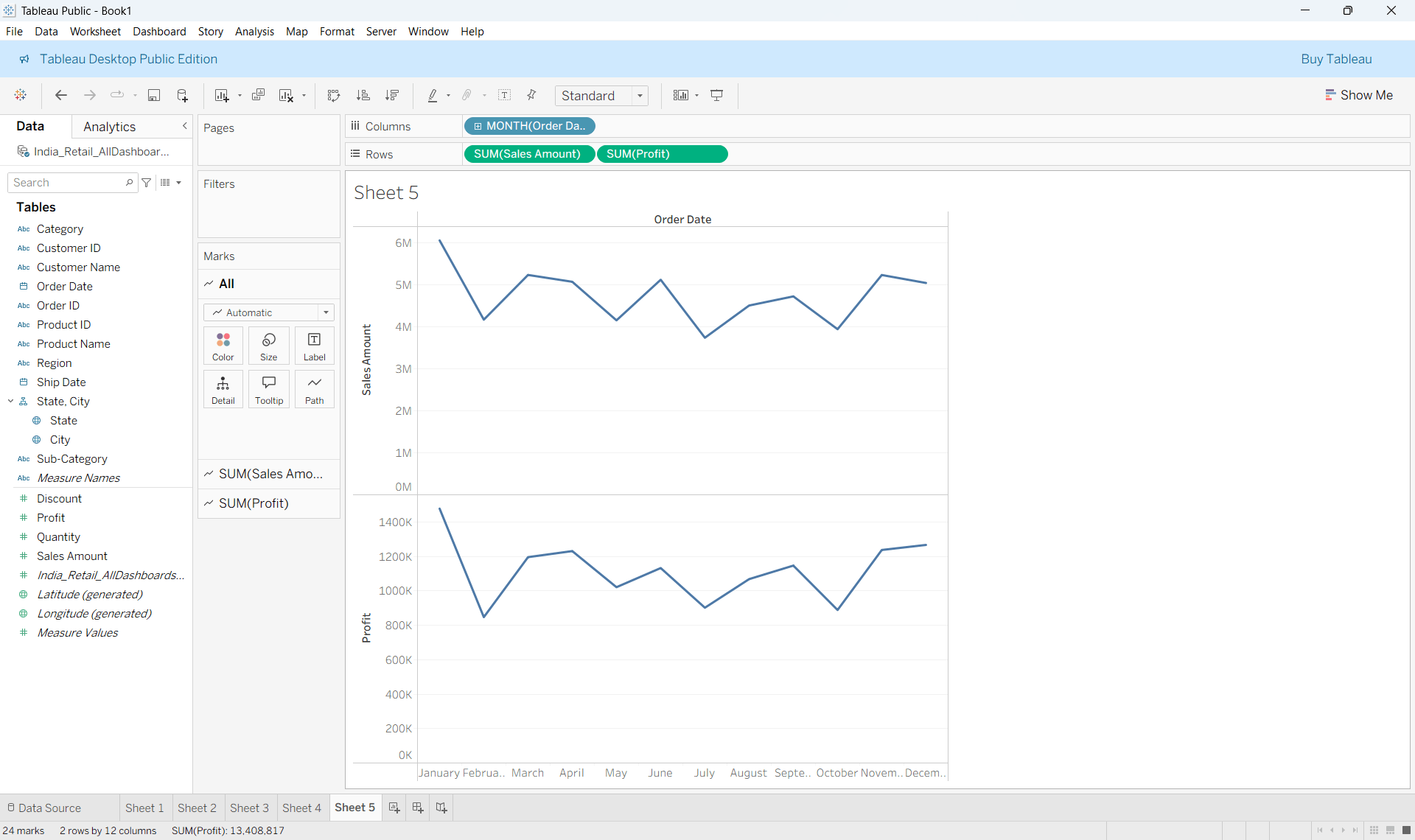
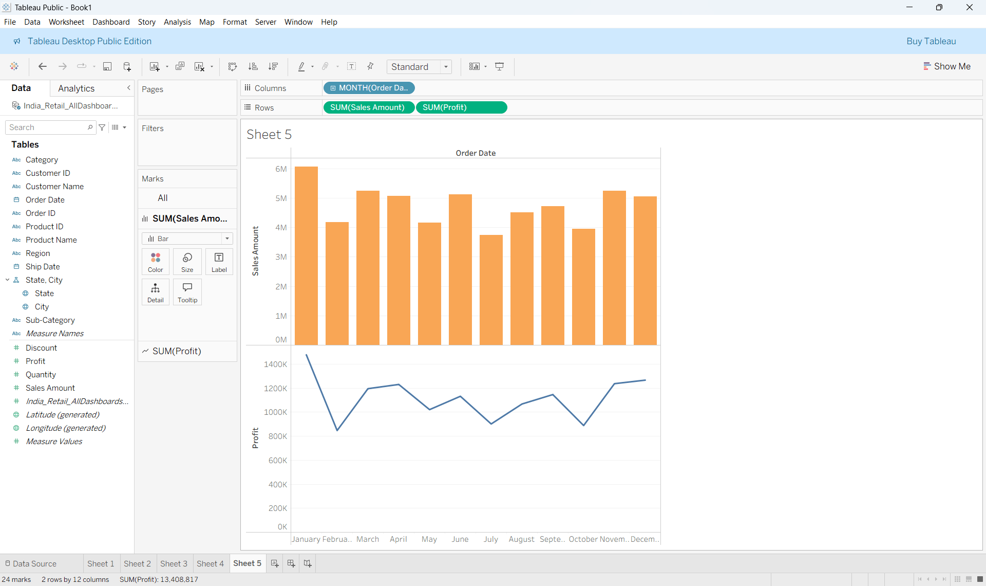
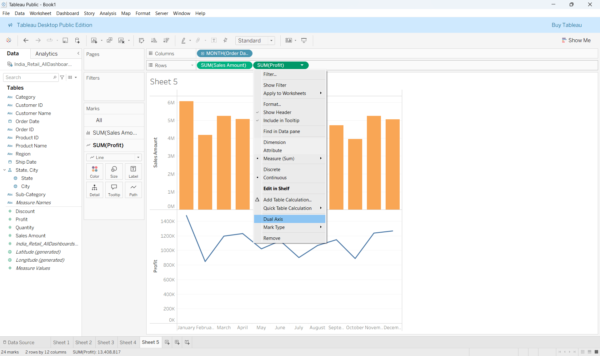
Creating Dual Axis Charts
Step 1 :
Drag Time dimension to columns and two different measures to rows
Step 2 :
In the marks card, Change the marks type of one chart to bar and another to line
Step 3 :
Right click on the measure in the row shelf and click Dual axis

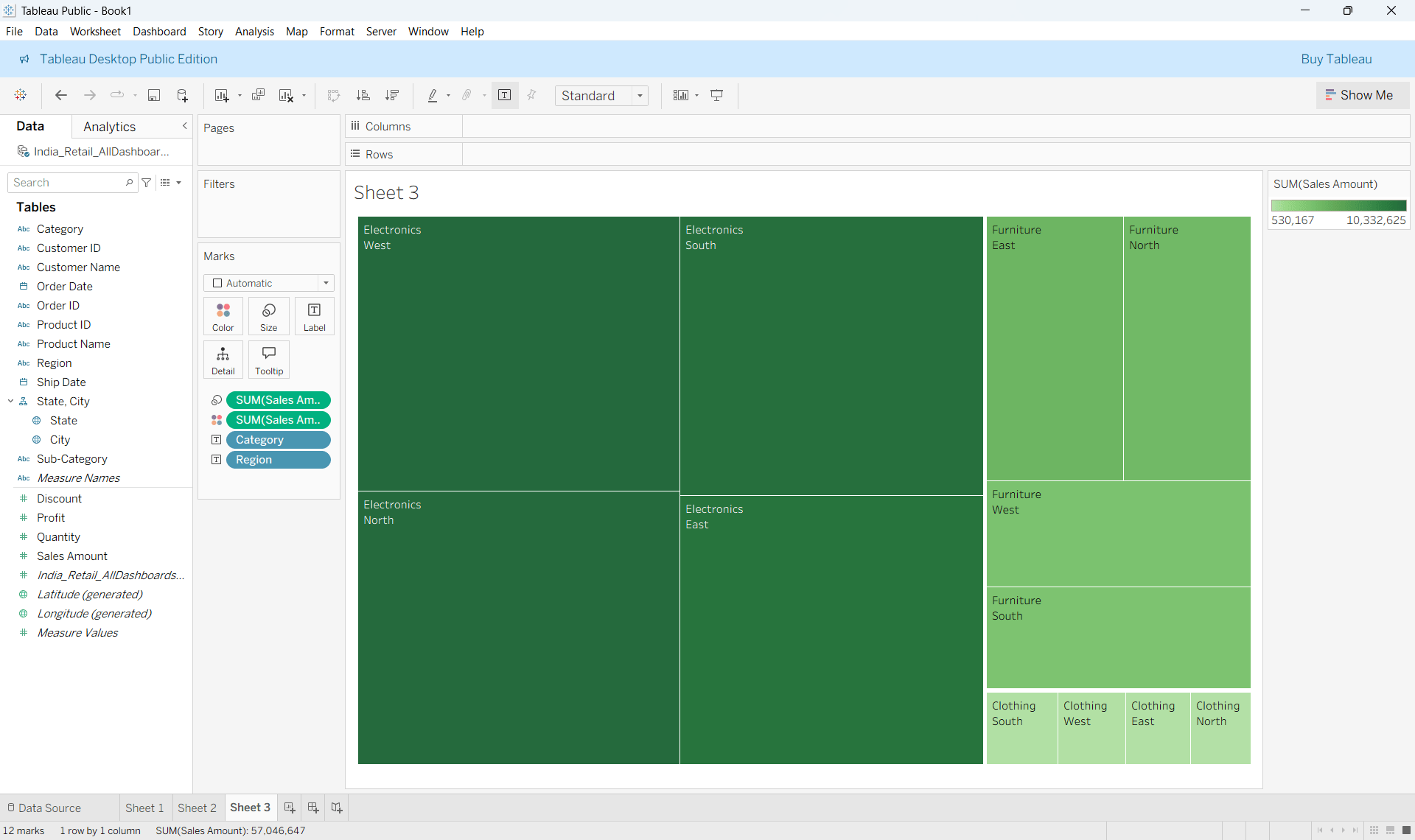
Heat maps
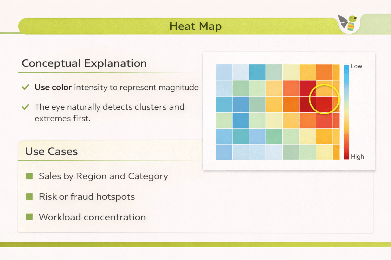
Conceptual Explanation
Use color intensity to represent magnitude
The eye naturally detects clusters and extremes first
Use Cases
Sales by Region and Category
Risk or fraud hotspots
Workload concentration
How to Read :
Rows/Columns → categories
Color scale → intensity
Stronger color → higher value
Creating Heat maps
Drag Region to Columns & Category to Rows
Step 1 :
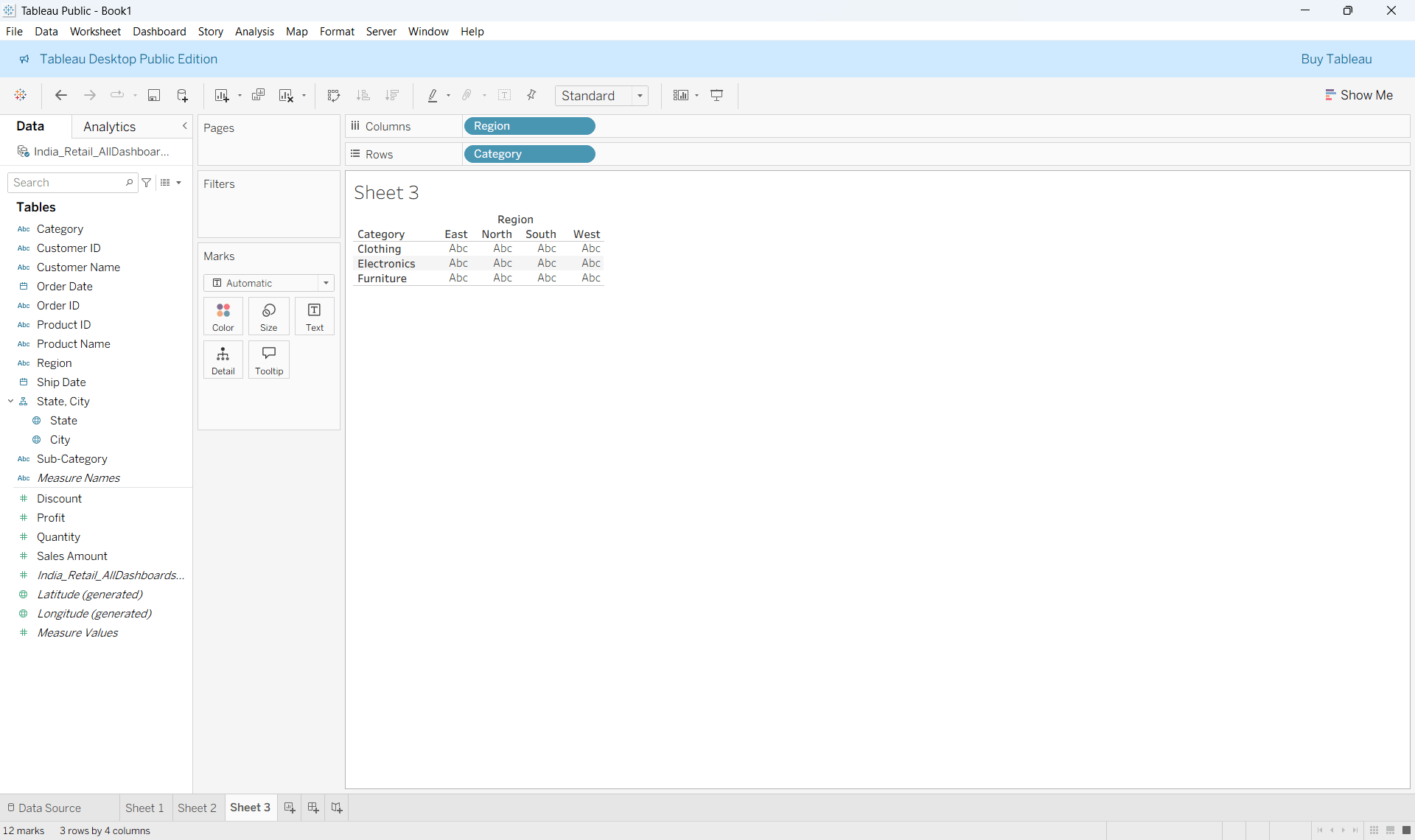
Step 2 :
Drag Sales to Colour
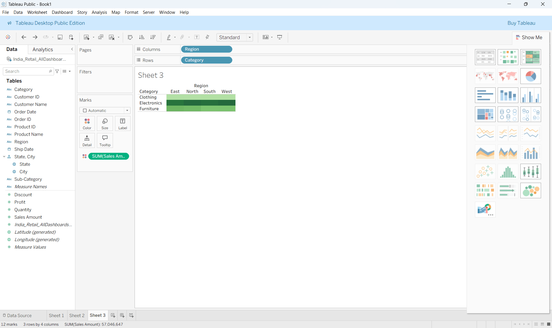
Step 3 :
Select Heat Map from Marks or Show Me and Adjust colour scale for contrast
5
Donut charts clarify proportions using a zero axis
4
Lollipop charts emphasize key values
3
Motion charts show change over time
2
Dual-axis charts compare related measures
1
Custom visualizations solve complex analytical questions
Summary
Quiz
Which chart emphasizes endpoint values?
A. Pareto Charts
B. Donut Charts
C. Lollipop Chart
D. Motion Charts

Quiz-Answer
Which chart emphasizes endpoint values?
A. Pareto Charts
B. Donut Charts
C. Lollipop Chart
D. Motion Charts