Data Interpretation


Graphs & Analytics
Visual Data Analysis and Decision Making


Learning Outcome
5
Develop analytical decision-making capabilities
4
Perform quick data calculations
3
Compare trends and patterns visually
2
Analyse bar graphs, line graphs, and pie charts
1
Read and interpret graphical data accurately
Recall
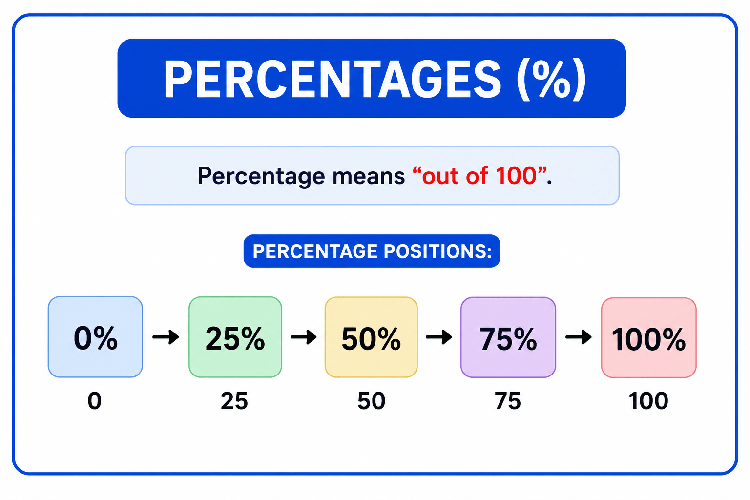
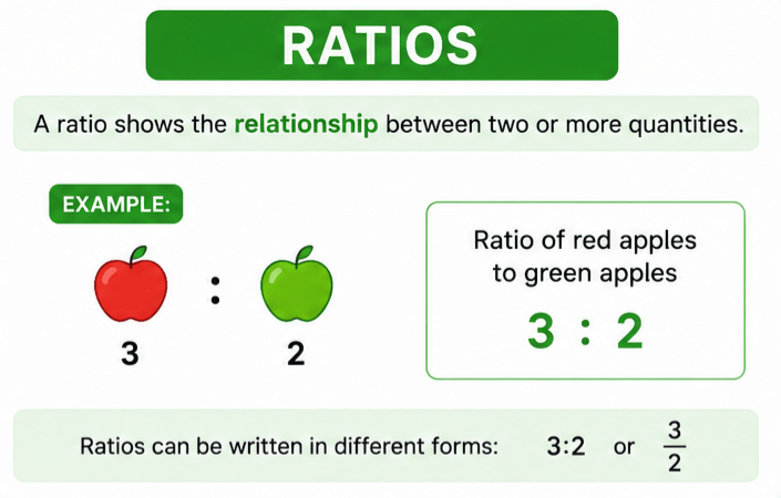
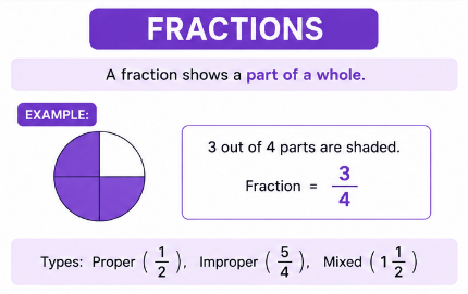
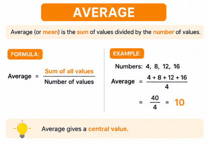
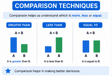
Why Use Graphs?
Graphs help:
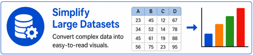
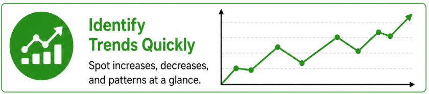
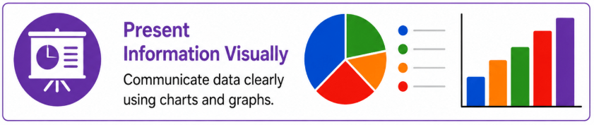
Introduction to Graphs & Analytics
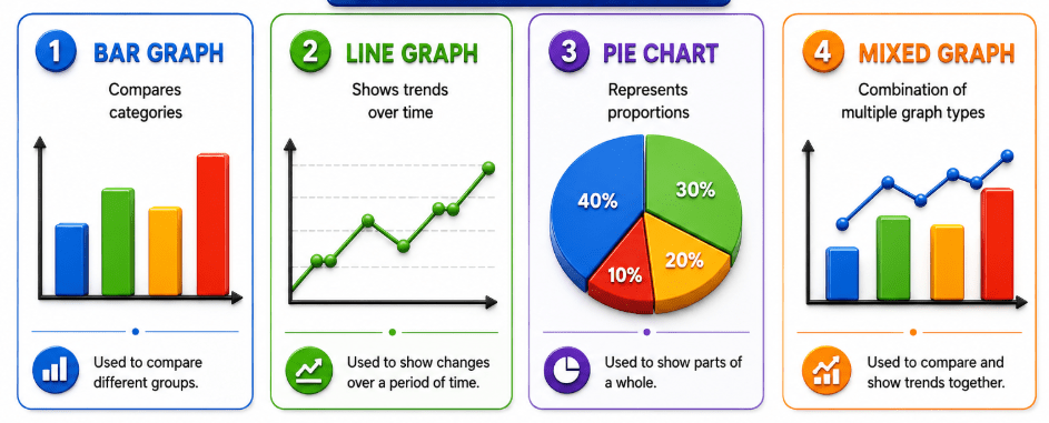

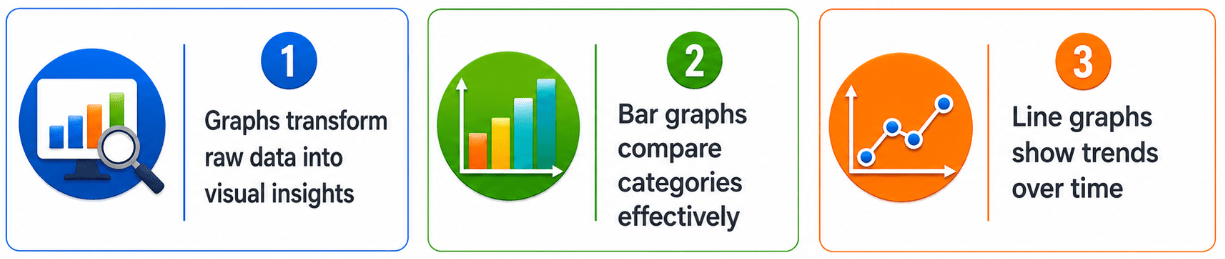
COMMON GRAPH TYPES
Bar Graph Interpretation
SALES DATA
Which product has the highest sales?
Question
Answer
Product B
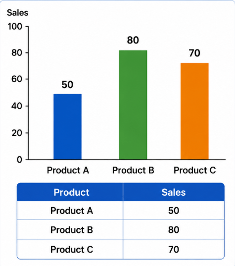
Solution
Compare values:
50, 80, 70
Highest = 80
Line Graph Interpretation
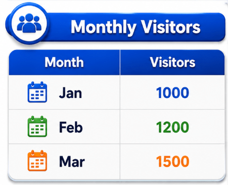
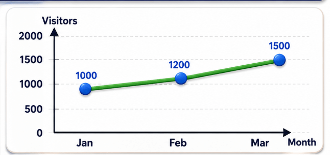
What trend is observed?
Question
Solution
1000 -> 1200 -> 1500
Consistent Increase
Answer
Upward Trend
Pie Chart Interpretation
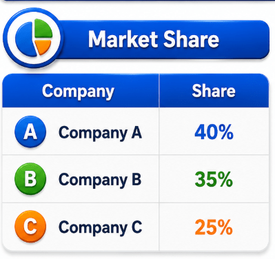
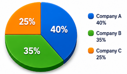
Which company has the largest market share?
Question
Solution
Compare the market share percentages
Answer
Company A
Has the largest market share(40%)
Largest Percantage = 40%
Analytical Comparison
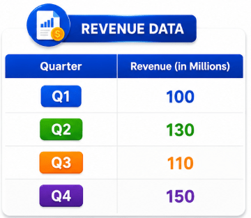
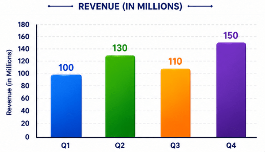
Which quarter performed best?
Question
Solution
Answer
Q4
Highest revenue = 150
Mixed Graph Analysis
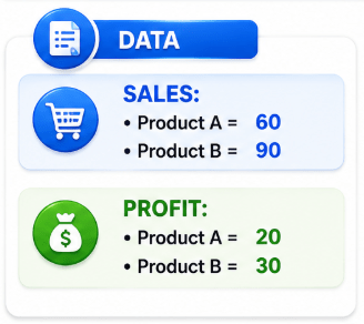
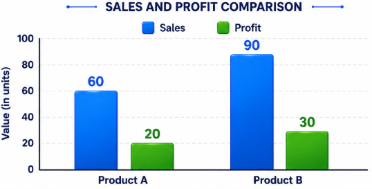
Which product generate more profit?
Question
Solution
Answer
Product B
Compare profit values:-
20 vs 30
Percentage Growth
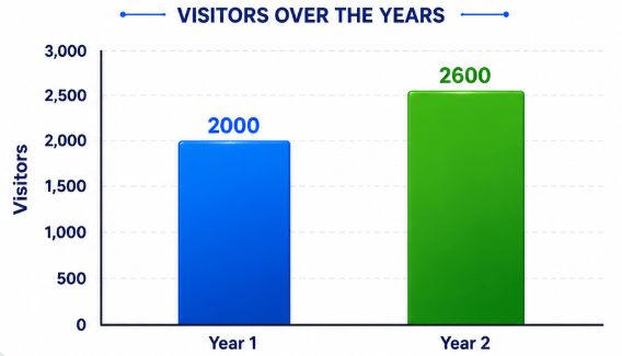
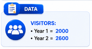
Calculate percentage growth
Question
Solution
Answer
30%
Increase = 600
Percentage Growth
= (600/2000)x 100
=30%
Practice Problems
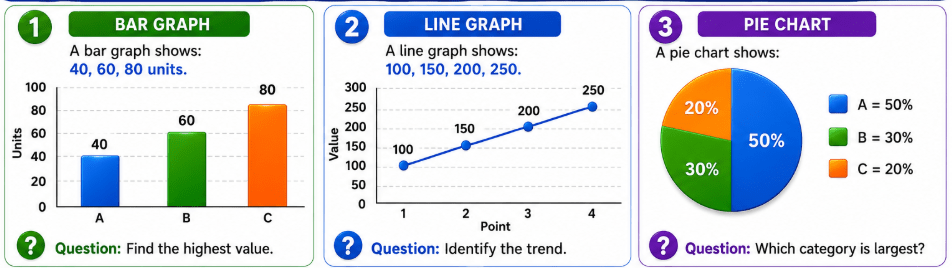
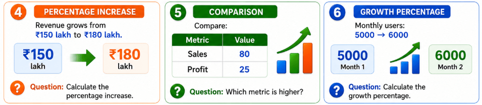
Data Calculation Shortcuts
Tips for Faster Graph Analysis
Key Takeaways
Summary
5
Developed analytical decision-making capabilities
4
Performed quick data calculations
3
Compared trends and patterns visually
2
Analysed bar graphs, line graphs, and pie charts
1
Read and interpreted graphical data accurately
Quiz
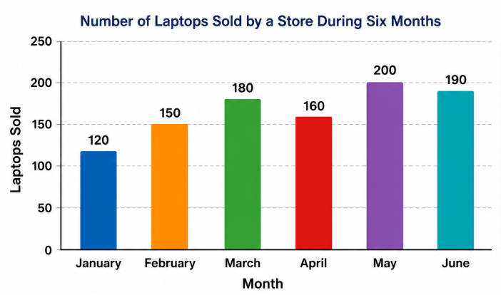
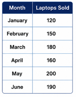
The following bar graph shows the number of laptops sold by a store during six months.
Quiz
In which month were the maximum laptops sold?
A. March
B. April
C. May
D. June

Quiz
In which month were the maximum laptops sold?
A. March
B. April
D. June
C. May