A Bootstrap Journey

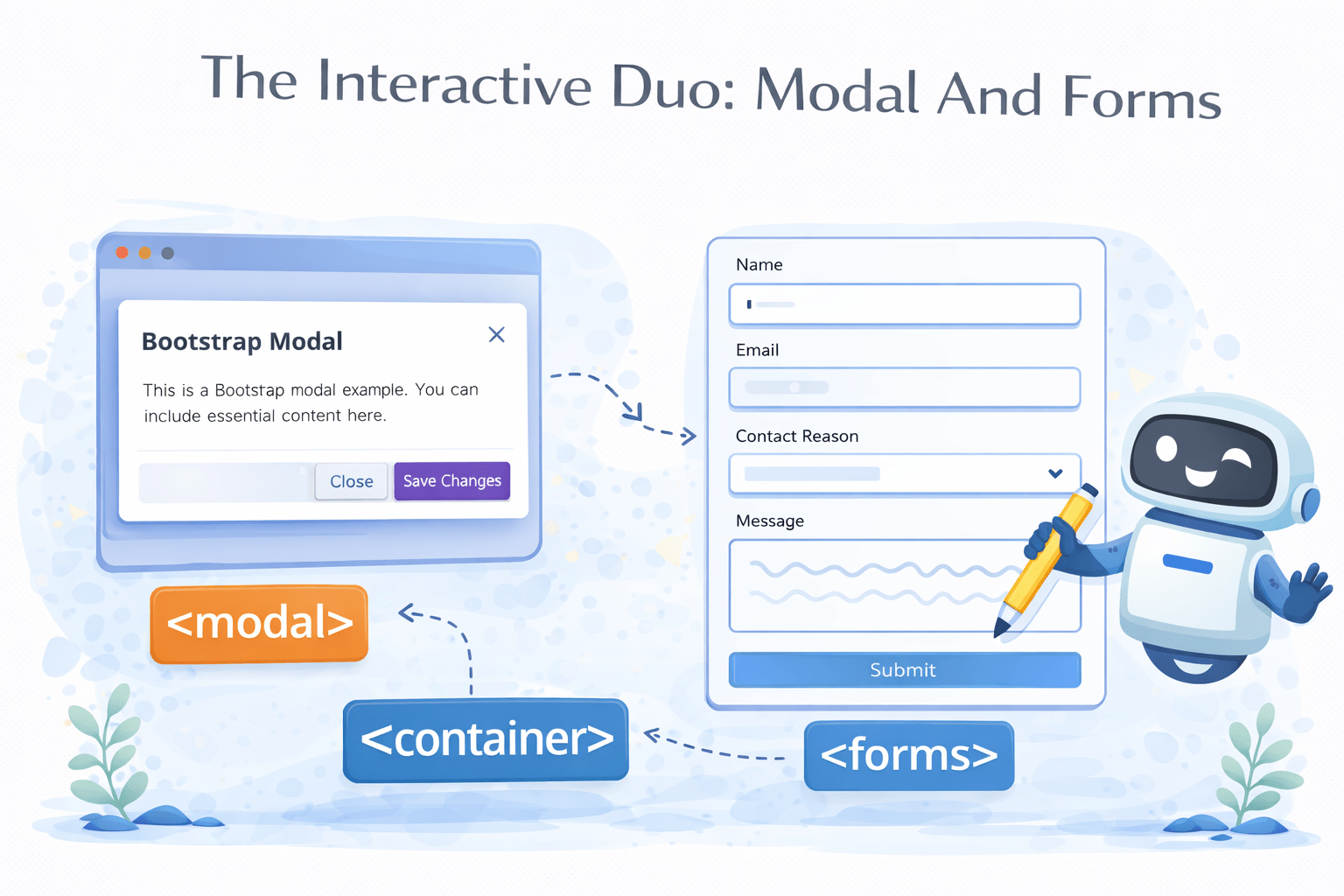
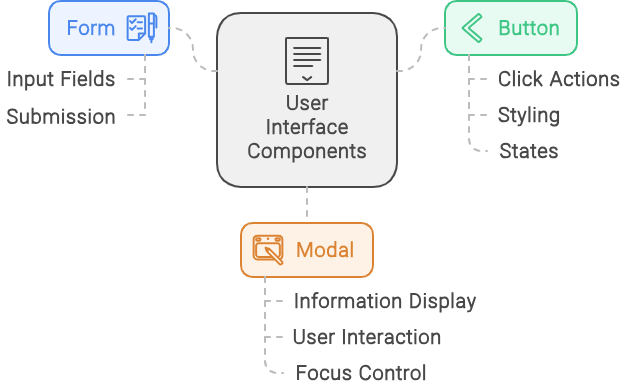
The Interactive Duo: Modal And Forms

Learning Outcome
A popup overlaying the current page for interactions
A structured input area for collecting user data
A clickable element for user interaction
Today's Agenda Includes Some Fascinating Things We're About To Learn
Form
Button
Modal
Before We Dive Into The Form, Let's Preview Its Appearance On The Bootstrap Website
Bootstrap Website
Bootstrap Website
Docs
Docs
Forms
Forms

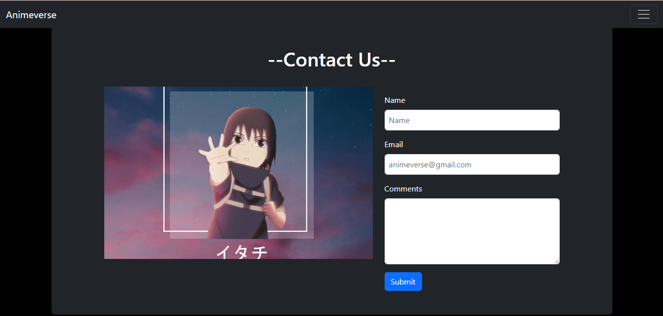
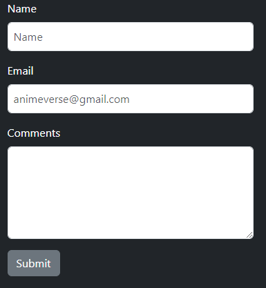
Let's Build An Interactive Form For Our Animeverse Website
We'll take the code specifically for the name and email from here
Bootstrap Website
Bootstrap Website
Docs
Docs
Forms
Forms
Overview
Overview
And for the textarea, we'll take the code from here and then customize it according to the requirements
<form>
</form>
Let's observe how this code performs...

Bootstrap Website
Bootstrap Website
Docs
Docs
Forms
Forms
Form Control
Form Control
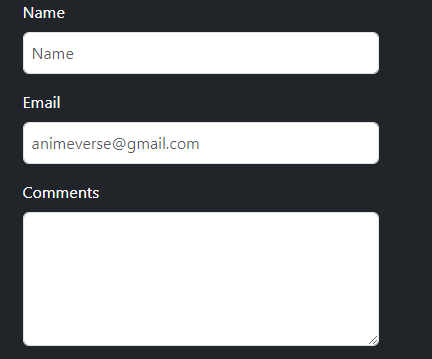
Let's Build An Interactive Form For Our Animeverse Website
<form>
</form>
<form>
<div class="mb-3">
<label for="exampleInputText1" class="form-label">Name</label>
<input type="text" class="form-control p-2" id="Name" placeholder="Name">
</div>
<!--  code for email  -->
<!--   code for comments -->
<!--  code for button -->
</form>
<form>
<div class="mb-3">
<label for="exampleInputText1" class="form-label">Name</label>
<input type="text" class="form-control p-2" id="Name" placeholder="Name">
</div>
<!--  code for email  -->
<!--   code for email -->
<!--  code for button -->
</form>
Margin-bottom of 1rem (16px) to the element
"form-label" is used to style labels within forms
"form-control" is used to style form elements such as <input>, <select>, and <textarea>
Padding of 0.5rem (8px) to all sides of an element
<form>
<!-- code for name -->
<div class="mb-3">
<label for="exampleInputEmail1" class="form-label">Email</label>
<input type="email" class="form-control p-2" id="anime@gmail.com"
placeholder="animeverse@gmail.com">
</div>
<!--   code for email -->
<!--  code for button -->
</form>
<form>
<!-- code for name -->
<!-- code for email -->
<div class="mb-3">
<label for="exampleFormControlTextarea1" class="form-label">Comments</label>
<textarea class="form-control" id="exampleFormControlTextarea1" rows="5"></textarea>
</div>
<!-- code for button -->
</form>
How Does Bootstrap Make It Easy To Create Stylish And Functional Buttons?
Now That Our Form Is Created, Let's Turn Our Attention To Styling The Buttons

Before We Dive Into Buttons, Let's See How They Appear On The Bootstrap Website
Bootstrap Website
Bootstrap Website
Docs
Docs
Buttons
Buttons
Components
Components
Unlocking The Power Of Stylish And Functional Buttons With Bootstrap
<form>
<!-- code for form elements -->
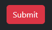
<button class="btn btn-primary" type="button">Submit</button>
</form>"btn-primary" in Bootstrap styles a button prominently with a primary color
We've utilized `btn-primary` in our form design


<form>
<!-- code for form elements -->
<button class="btn btn-secondary" type="button">Submit</button>
</form>`btn-secondary` in Bootstrap styles a button with a secondary color

`btn-success` used to indicate a positive or successful action
<form>
<!-- code for form elements -->
<button class="btn btn-success" type="button">Submit</button>
</form>
<form>
<!-- code for form elements -->
<button class="btn btn-danger" type="button">Submit</button>
</form>`btn-danger` button with a color indicating danger, alert or error
<form>
<!-- code for form elements -->
<button class="btn btn-warning" type="button">Submit</button>
</form>`btn-warning` highlighting actions that require caution or attention.

<form>
<!-- code for form elements -->
<button class="btn btn-info" type="button">Submit</button>
</form>`btn-info` used to indicate actions that provide additional information or details

<form>
<!-- code for form elements -->
<button class="btn btn-light" type="button">Submit</button>
</form>
`btn-light` button with a light-colored background
`btn-dark` button with a dark-colored background
<form>
<!-- code for form elements -->
<button class="btn btn-dark" type="button">Submit</button>
</form>

How Do Bootstrap Modals Enhance Web Interactivity And User Experience?
Before Moving To Modals, Let's Explore How They Appear On The Bootstrap Website
Bootstrap Website
Bootstrap Website
Docs
Docs
Modal
Modal
Components
Components
Before Moving To Modals, Let's Explore How They Appear On The Bootstrap Website
Bootstrap Website
Bootstrap Website
Docs
Docs
Modal
Modal
Components
Components
Understanding Bootstrap Modals Popup Dialogs For Enhanced User Interaction
A Bootstrap modal is a popup window that overlays the main content to display information or interact with the user

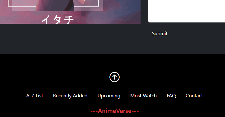
Let's Add A Captivating Popup To Enhance Our Animeverse Website!
<div class="modal fade text-black" id="exampleModal" tabindex="-1" aria-labelledby="exampleModalLabel"
aria-hidden="true">
<div class="modal-dialog modal-dialog-centered">
<div class="modal-content">
<div class="modal-header">
<h1 class="modal-title fs-5" id="exampleModalLabel">Coming soon..</h1>
<button type="button" class="btn-close" data-bs-dismiss="modal" aria-label="Close"></button>
</div>
<div class="modal-body text-primary">
 New features will unlock soon!
</div></div></div></div>
Code:
Output:

<div class="modal fade text-black" id="exampleModal" aria-labelledby="exampleModalLabel"
aria-hidden="true">
<div class="modal-dialog modal-dialog-centered">
<div class="modal-content">
<div class="modal-header">
<h1 class="modal-title fs-5" id="exampleModalLabel">Coming soon..</h1>
<button type="button" class="btn-close" data-bs-dismiss="modal" aria-label="Close"></button>
</div>
<div class="modal-body text-primary">
 New features will unlock soon!
</div></div></div></div>
The `modal-fade` class in Bootstrap provides a fade-in animation effect for modals
`aria-hidden="true"` indicates content is hidden for accessibility
`modal-dialog` in Bootstrap defines the layout and size of modal dialog boxes
`modal-dialog-centered` in Bootstrap centers the modal dialog vertically within the viewport
<div class="modal fade text-black" id="exampleModal" aria-labelledby="exampleModalLabel"
aria-hidden="true">
<div class="modal-dialog modal-dialog-centered">
<div class="modal-content">
<div class="modal-header">
<h1 class="modal-title fs-5" id="exampleModalLabel">Coming soon..</h1>
<button type="button" class="btn-close" data-bs-dismiss="modal" aria-label="Close"></button>
</div>
<div class="modal-body text-primary">
 New features will unlock soon!
</div></div></div></div>`modal-content` defines the main container within a modal dialog, housing its header
<div class="modal fade text-black" id="exampleModal" aria-labelledby="exampleModalLabel"
aria-hidden="true">
<div class="modal-dialog modal-dialog-centered">
<div class="modal-content">
<div class="modal-header">
<h1 class="modal-title fs-5" id="exampleModalLabel">Coming soon..</h1>
<button type="button" class="btn-close" data-bs-dismiss="modal" aria-label="Close"></button>
</div>
<div class="modal-body text-primary">
 New features will unlock soon!
</div></div></div></div>
`modal-header` in Bootstrap styles the header section of a modal dialog
<div class="modal fade text-black" id="exampleModal" aria-labelledby="exampleModalLabel"
aria-hidden="true">
<div class="modal-dialog modal-dialog-centered">
<div class="modal-content">
<div class="modal-header">
<h1 class="modal-title fs-5" id="exampleModalLabel">Coming soon..</h1>
<button type="button" class="btn-close" data-bs-dismiss="modal" aria-label="Close"></button>
</div>
<div class="modal-body text-primary">
 New features will unlock soon!
</div></div></div></div>`modal-title` in Bootstrap styles the title element within the header of a modal dialog
`fs-5` specifically, it sets the font size to 1.25rem or 20px
`btn-close` in Bootstrap styles a close button for modals and other components
<div class="modal fade text-black" id="exampleModal" aria-labelledby="exampleModalLabel"
aria-hidden="true">
<div class="modal-dialog modal-dialog-centered">
<div class="modal-content">
<div class="modal-header">
<h1 class="modal-title fs-5" id="exampleModalLabel">Coming soon..</h1>
<button type="button" class="btn-close" data-bs-dismiss="modal" aria-label="Close"></button>
</div>
<div class="modal-body text-primary">
 New features will unlock soon!
</div></div></div></div>`data-bs-dismiss="modal"` in Bootstrap closes the modal when applied to an element like a button
`modal-body` in Bootstrap styles the main content area within a modal dialog
`text-primary` in Bootstrap is a utility class used to apply the primary text color (blue) to an element.
How Can We Make The Modal Appear Exactly On That Menu?

Seamlessly Align Bootstrap Modals With Menu Elements
<li class="nav-item">
<a class="nav-link text-white hov" data-bs-toggle="modal" data-bs-target="#exampleModal" href="#">A-Z List</a>
</li>
We'll use the modal's ID to trigger it when the user clicks on the menu
Let's Set Our Code In Motion And Witness The Magic Unfold