Crafting Compelling Visuals

Customizing Your Visulas


Learning Outcome
6
Design clean layouts using alignment and layering
5
Use themes for branding and consistency
4
Customize colors, titles, labels, and legends
3
Apply customization principles for clarity and readability
2
Understand why customization is critical for reports
1
Explain what visual customization means in Power BI
Recall
Basic visualization types (bar, line, table, card)
How visuals display data fields and measures
How visuals display data fields and measures
Basic interaction between visuals on a report page

Hook/Story/Analogy(Slide 4)
Transition from Analogy to Technical Concept(Slide 5)
Visual Customization as Visual Thinking
It provides responses to three inquiries:
Visual customization is about controlling perception
What should the user notice first
What should be secondary
What can remain in the background


Effective customization:
Poor customization:
Forces users to work harder to understand insights
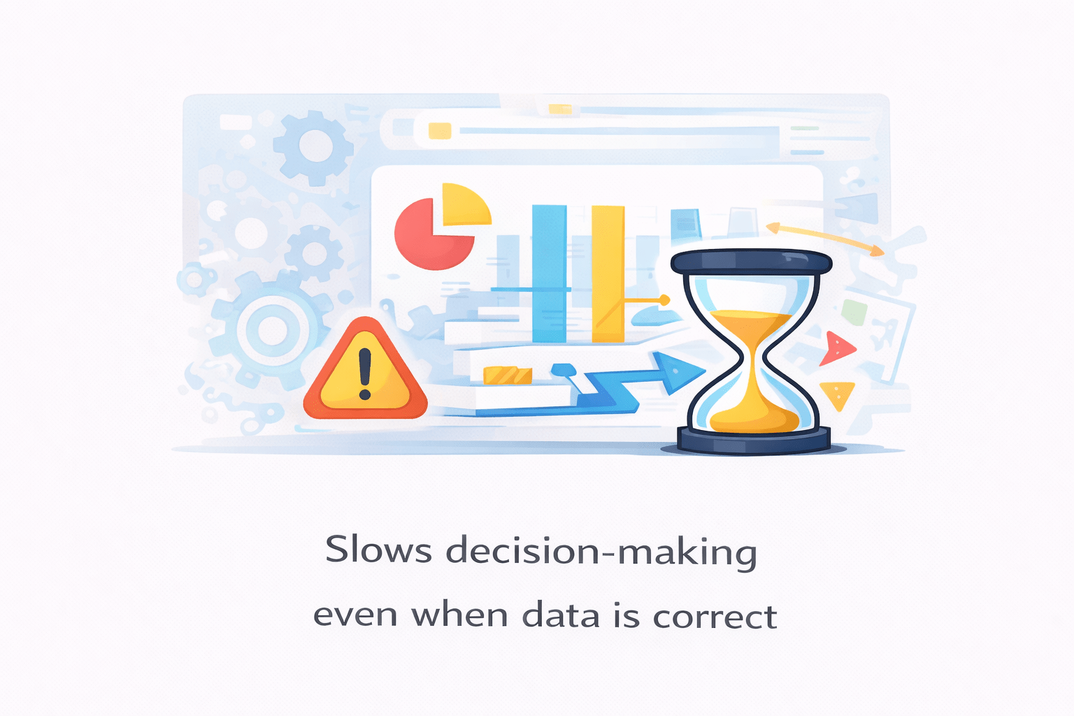
Slows decision-making even when data is correct

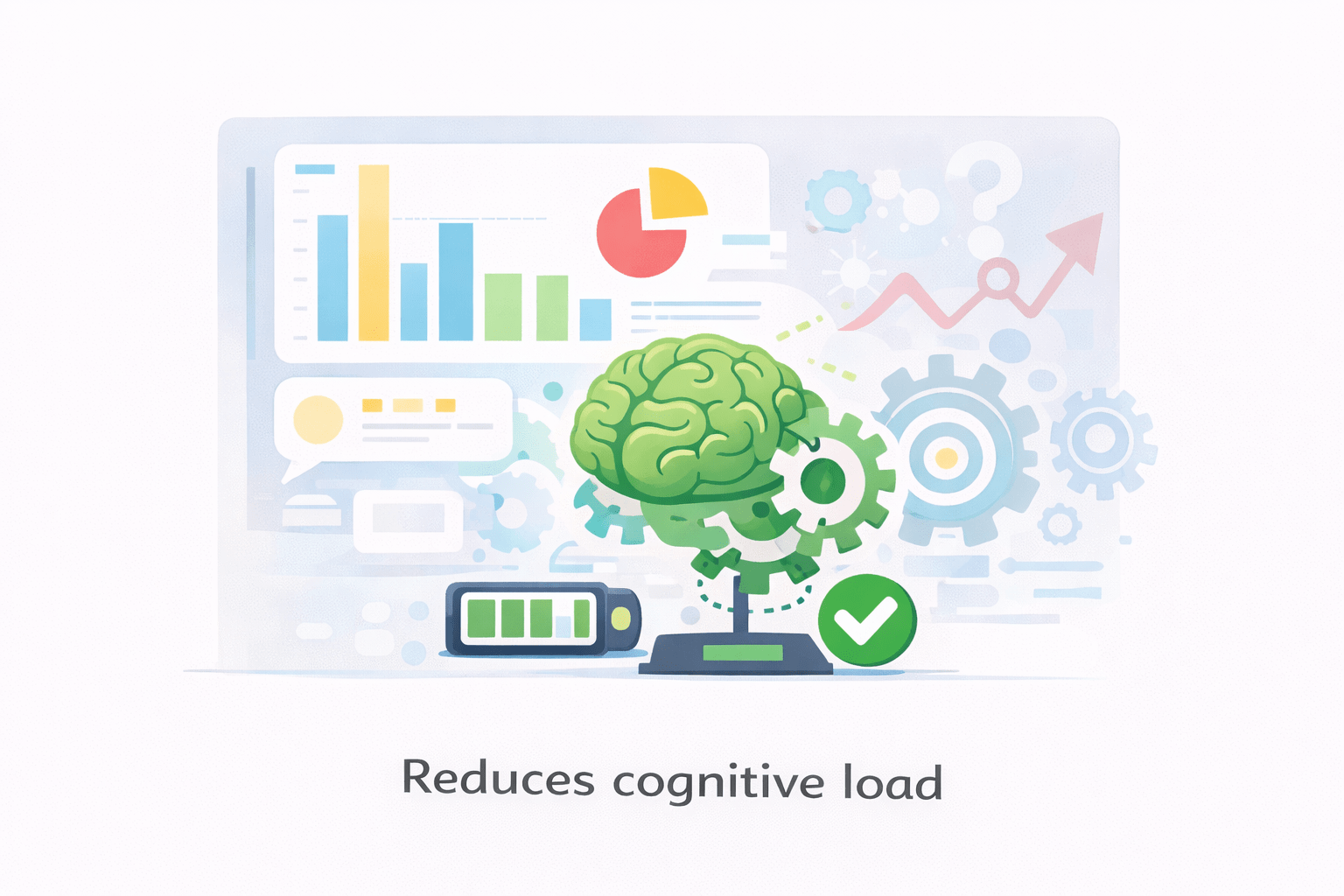
Reduces cognitive load

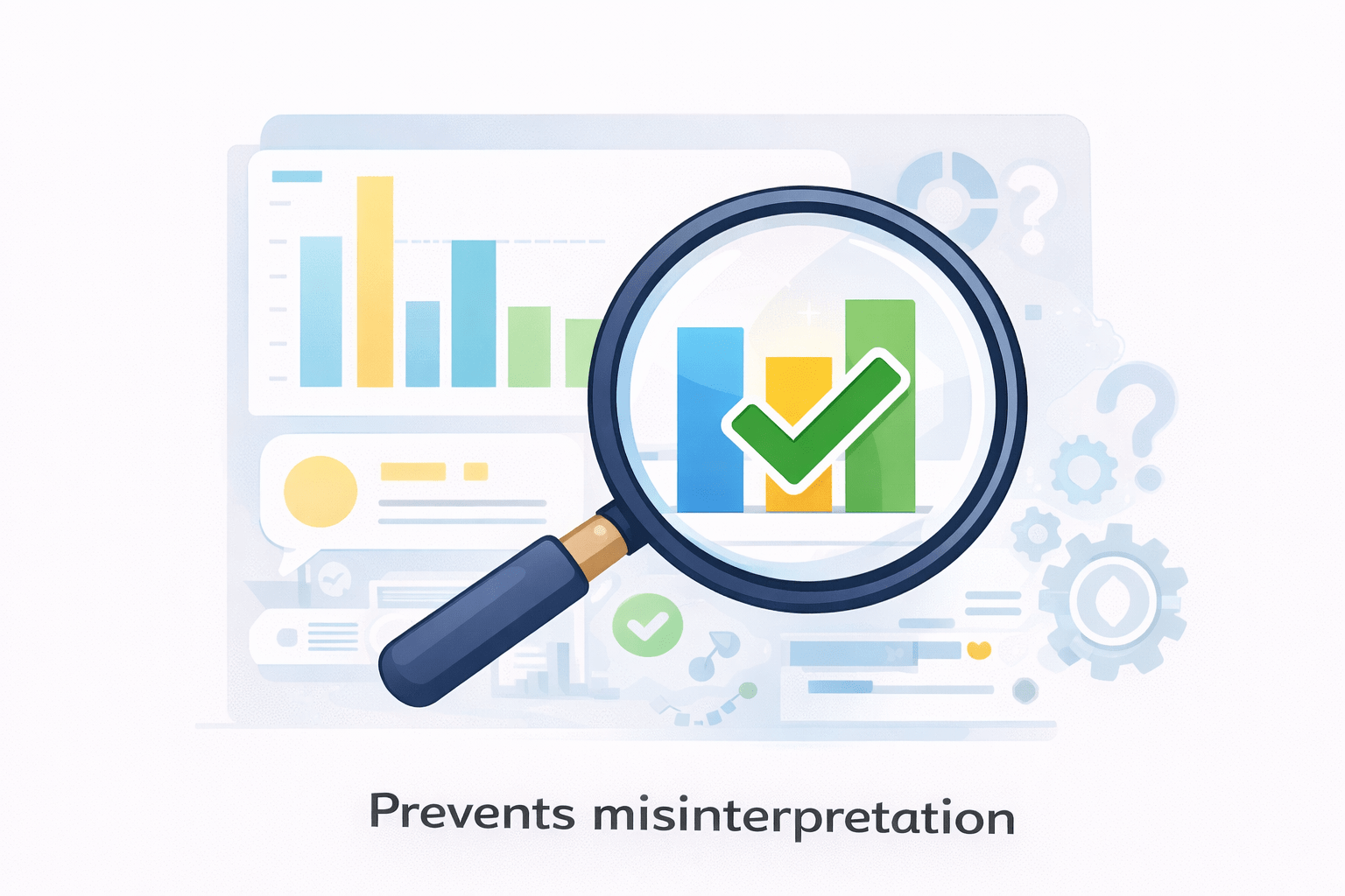
Prevents misinterpretation
Minimizes visual fatigue


Readability and Visual Hierarchy
Readability depends on:
Font size
Spacing
Contrast
Visual hierarchy defines:
Primary insights (largest, boldest)
Supporting details
Background information
Steps to Improve Readability
Increase font size for key metrics

Reduce unnecessary text

Use contrast to separate foreground and background

Ensure consistent spacing between visuals

A well-designed visual guides the eye naturally, without instruction.
Data Colors – Beyond Aesthetics
Colors communicate meaning instantly
They should be:
Consistent
Purposeful
Limited in number

Advanced Use
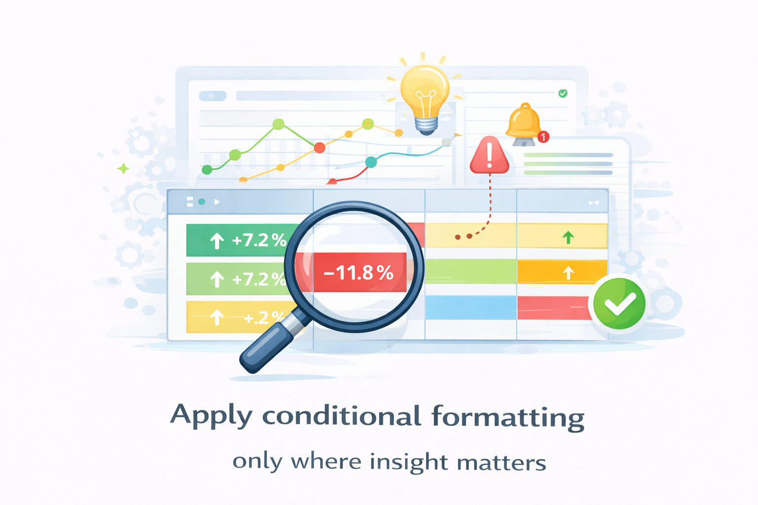
Conditional formatting to highlight:
Threshold breaches
Performance categories
Outliers


Steps to Apply Meaningful Colors


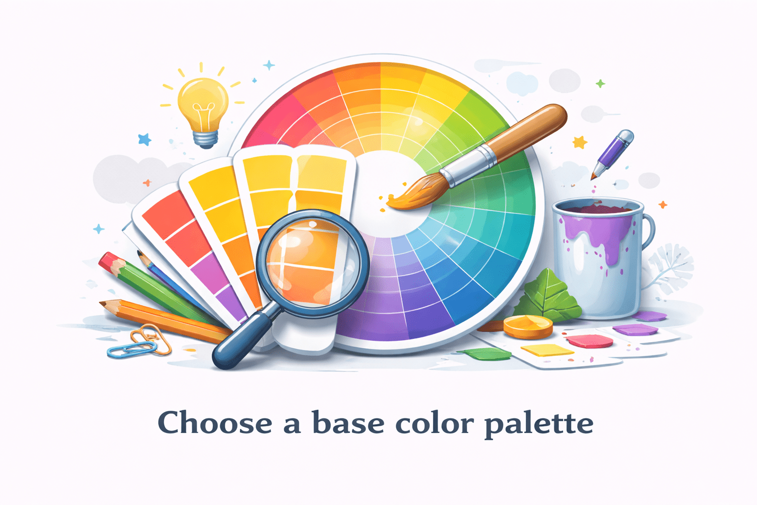
Choose a base color palette
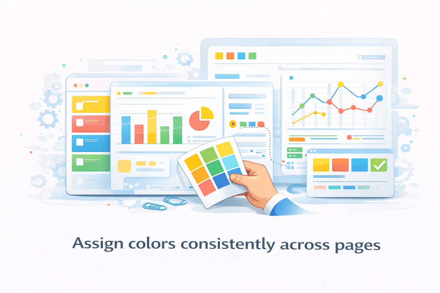
Assign colors consistently across pages
Apply conditional formatting only where insight matters
Avoid decorative or random colors


Design Principle
Color should explain, not decorate
Titles, Subtitles, and Context Awareness
Titles should answer:
- What am I looking at?
- Under what conditions?

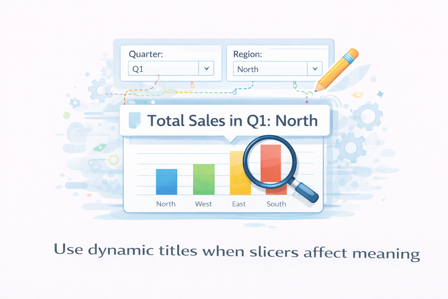
Dynamic titles improve clarity by reflecting:
- Filters
- Slicer selections

Subtitles can provide:
- Units
- Assumptions
- Time context


Steps to Apply Meaningful Colors
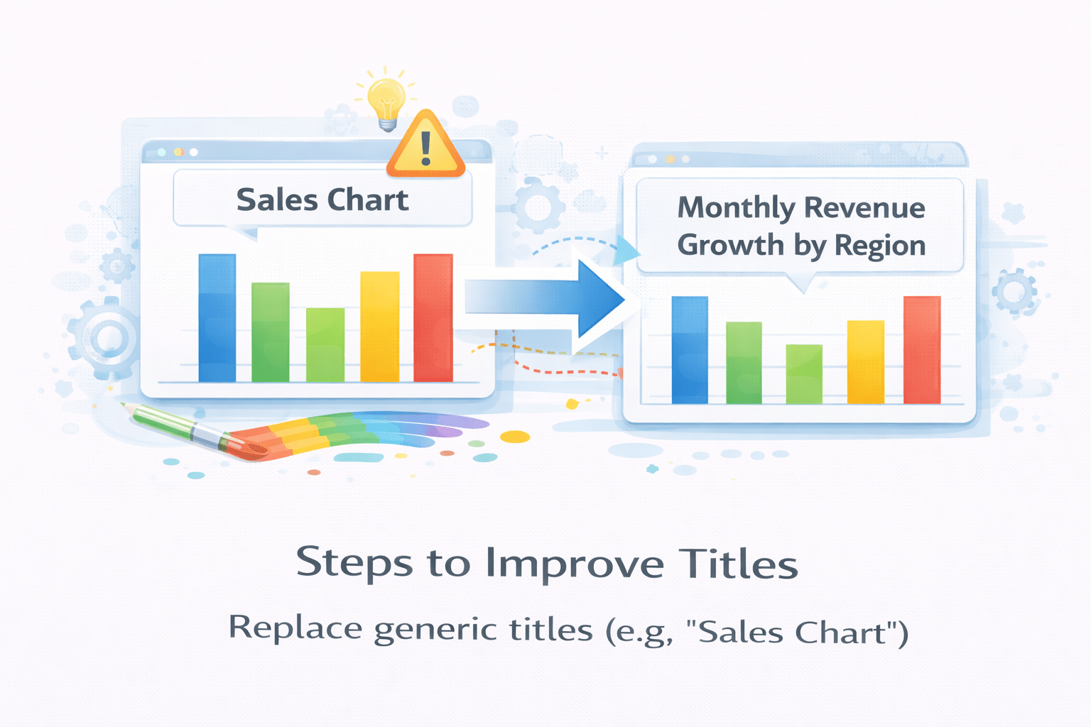
Replace generic titles (e.g., “Sales Chart”)
Include business meaning (e.g., “Total Sales by Region”)
Use dynamic titles when slicers affect meaning

Data Labels – Precision vs Clarity
Gridlines and Borders
Legends and Category Explanation
Themes and Branding as System Design
Layout (Page Structure)
Alignment (Visual Order)
Z-Order (Layering of Visuals)
Summary
5
Build strong branding
4
Use different marketing channels
3
Target the right audience
2
Create and communicate value
1
Understand customer needs
Choose cool, soft colors instead of vibrant colors
Max 5 Points for Summary & Min 2
Quiz
Which platform is mainly used for professional networking and B2B marketing ?
A. Facebook
B. Instagram
C. LinkedIn
D. Snapchat

Quiz-Answer
Which platform is mainly used for professional networking and B2B marketing ?
A. Facebook
B. Instagram
C. LinkedIn
D. Snapchat