Advanced Analytical Techniques
Statistical Spellcasting


Learning Outcome
5
Use statistical summaries to validate insights
4
Interpret box plots and clustering results
3
Apply reference lines, bands, and distributions correctly
2
Explain the purpose of each statistical tool
1
Identify key statistical tools in Tableau
Learners should know :
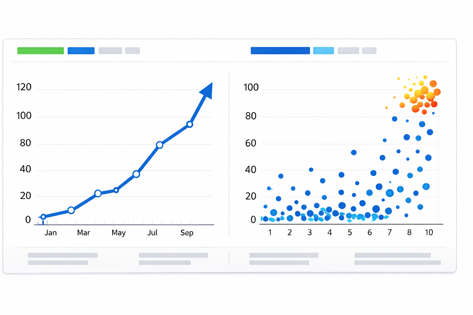
Imagine you’re looking at a chart....
The trend looks strong
The growth seems real


Then someone asks...
“Is this normal?”
“Is this unusually high?”
“Are these points similar or just close by chance?”

.....
.....
The chart hasn’t changed
But confidence has.....
Then something changes....
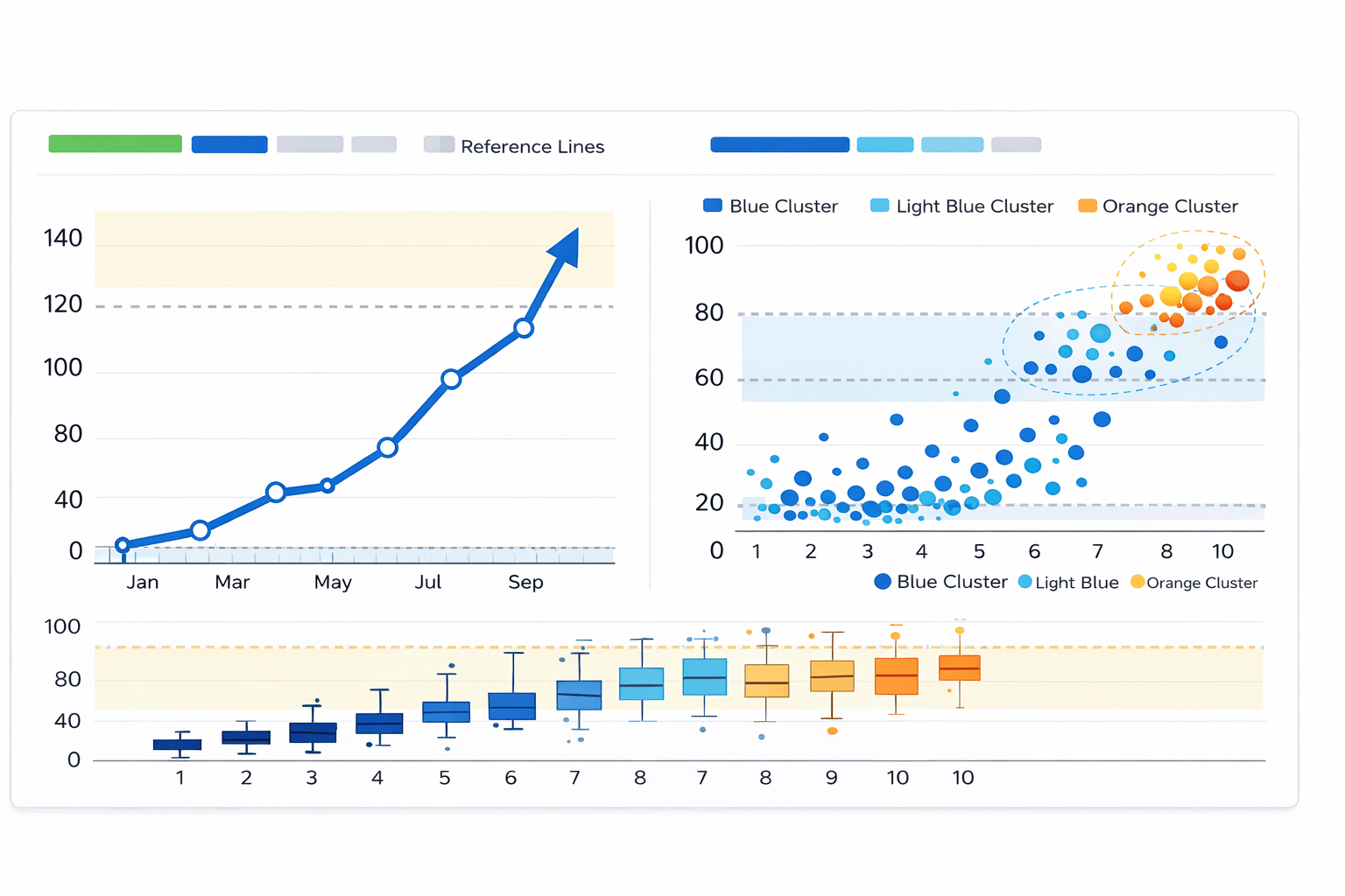
Lines appear
Bands form
Clusters separate
Boxes expose spread
Suddenly:
Patterns are questioned
Outliers are revealed
Assumptions are tested

The chart stayed the same, so why did the interpretation change?

This is how Statistics turn visuals from persuasion into proof
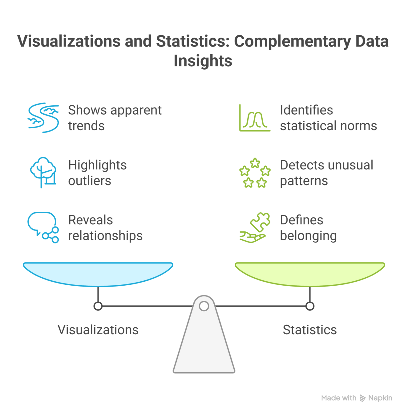
Tableau integrates statistical reasoning directly into charts
We now examine these tools in detail...
Statistical Tools in Tableau
Why Statistical Tools Matter in Visualization?

Human perception is biased toward patterns
Random variation can appear meaningful
Statistical tools introduce objectivity

What Statistical Tools Provide

Benchmarks
Ranges and variability
Distribution awareness
Grouping based on similarity
1
1
2
3
1
1
1
4
1
1
1
1
1
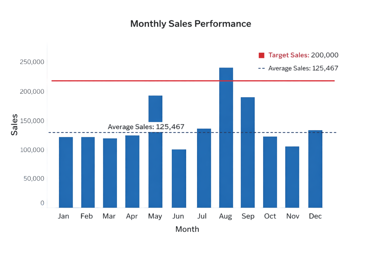
Reference Lines
Reference lines are benchmark lines (like average, target, or constant) added to a chart to compare your data against a specific value

Common reference values :
Mean
1
Median
2
Fixed targets
4
Percentile
3
Analytical Purpose :
-
Compare actual values against expected values
-
Identify overperformance or underperformance
- Provide immediate context to raw values
How to Add Reference Lines?

Open the Analytics pane
1
Drag Reference Line onto the view
2
Choose scope (Table / Pane / Cell)
3
Select value type and formatting
4
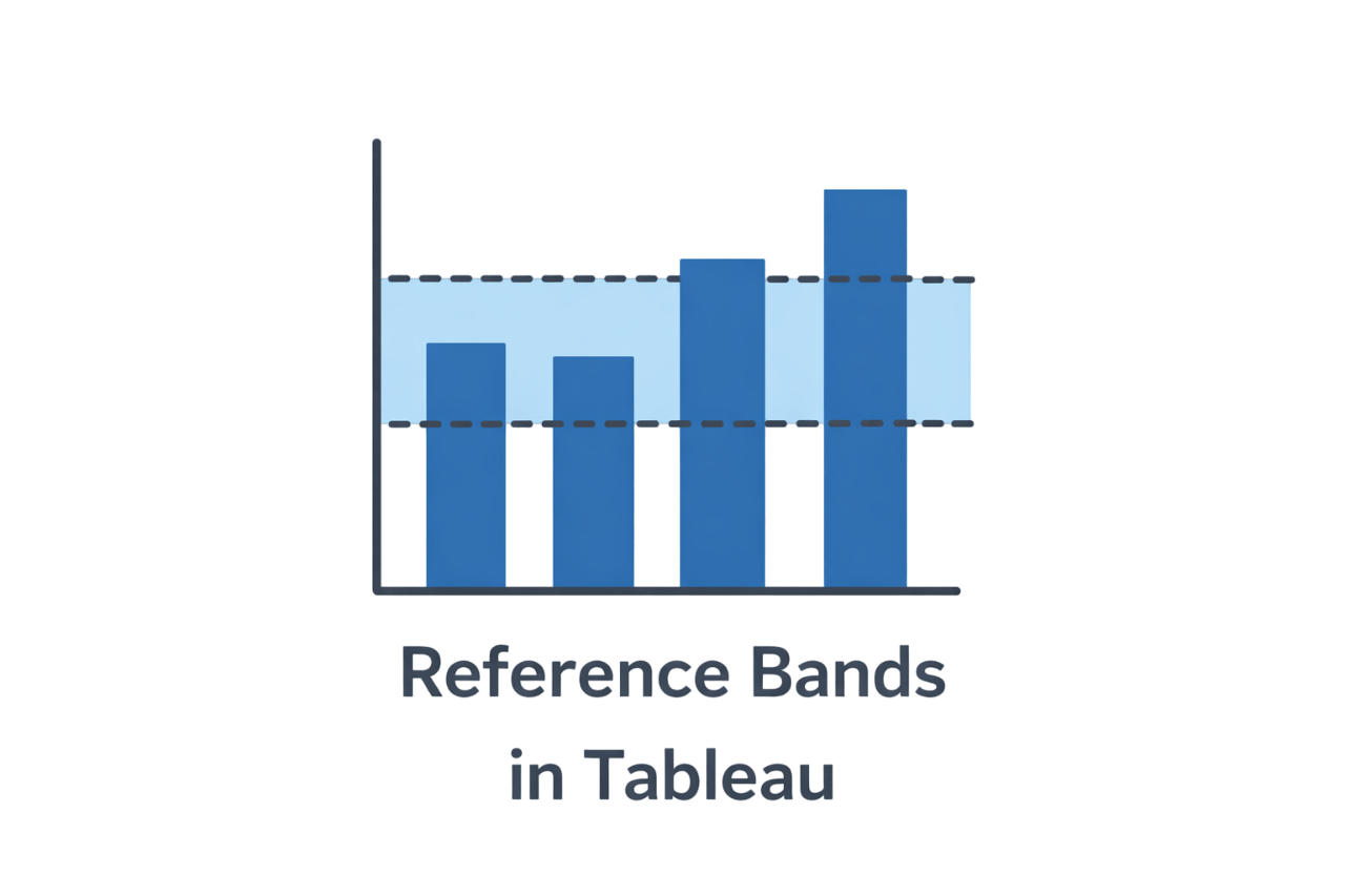
Reference Bands
What are Reference Bands?
Shaded areas between two reference values
Represent acceptable, warning, or critical ranges
Why Reference Bands are Useful?
-
Show variability instead of a single benchmark
-
Communicate tolerance ranges visually
-
Reduce overreaction to minor fluctuations
How to Add Reference Bands?
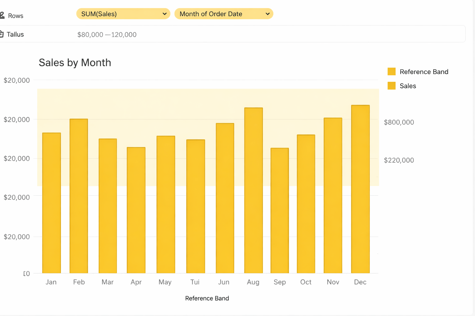
Open the Analytics pane
1
Drag Reference Band onto the view
2
Define start and end values
3
Customize color and transparency
4
Box Plots
A Box plot shows the distribution of data using the median, quartiles, range, and outliers
Analytical Use Cases :
Compare spread across categories
Detect abnormal values
Understand consistency vs volatility


How to create Box Plots?
Select a measure and a dimension
1
Open Show Me
2
Choose Box-and-Whisker Plot
3
Interpret quartiles and outliers
4
How to Read a Box Plot?

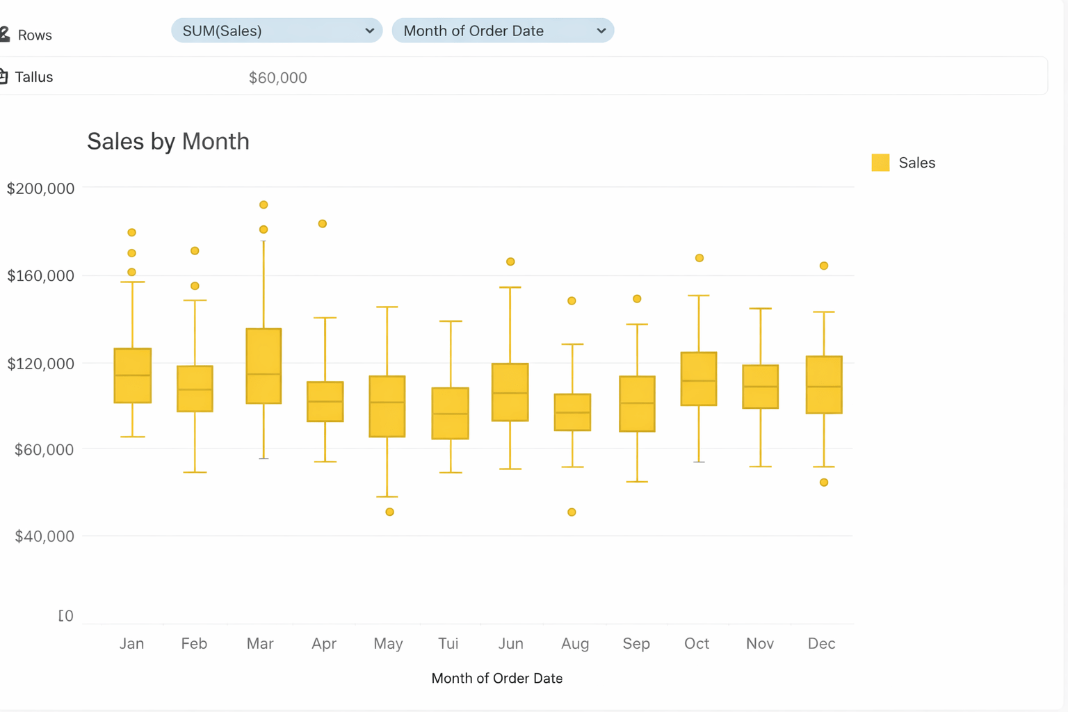
Box length shows variability
Median line shows central tendency
Points outside whiskers indicate outliers
Reference Distributions
Reference distribution is the expected or baseline spread of data used to compare and judge whether current values are normal or unusual.

Common reference values :
Normal distribution
1
Percentile-based distribution
2
Analytical Purpose :
-
Assess whether data follows expected behavior
-
Identify skewness and abnormal patterns
- Support anomaly detection
How to add Reference distribution ?
Open the Analytics pane
1
Drag Distribution or Distribution Band
2
Choose model and parameters
3
Evaluate fit and deviations
4
Clustering
Clustering in Tableau is a feature that automatically groups similar data points into clusters based on their values and patterns using built-in machine learning.
Analytical Use Cases :
Reveals hidden segments in data
Identifies natural groupings without predefined rules
Supports customer segmentation and pattern discovery
How to add Clustering ?
Create a scatter plot with two or more measures
1
Open the Analytics pane
2
Drag Cluster onto the view
3
Adjust number of clusters if needed
4
Analyse differences between clusters
5
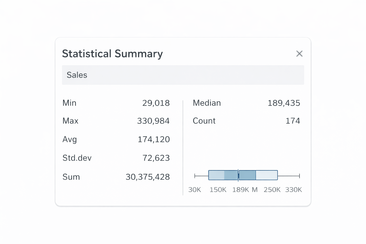
Statistical Summary Card
A Statistical Summary card is a quick panel that shows key stats for a measure like min, max, average, median, standard deviation, and distribution to help you understand the data fast.
Common reference values :
Mean
1
Median
2
4
Standard Deviation
3
Percentile
Analytical Purpose :
-
Enables quick validation of visual impressions
-
Supports exploratory data analysis
- Reduces dependency on external calculations
How to enable Statistical Summary Card ?
Click Analysis in the toolbar
1
Select Show Statistical Summary
2
Review metrics for the active visualization
3
5
Clustering uncovers hidden groupings
4
Reference distributions test expected behaviour
3
Box plots reveal distribution and outliers
2
Reference lines and bands provide benchmarks and ranges
1
Statistical tools validate visual insights
Summary
6
Statistical summary cards provide instant numerical context
Quiz
Which tool adds a benchmark line to a chart?
A. Filters
B. Trend lines
C. Reference lines
D. Reference Bands

Quiz-Answer
Which tool adds a benchmark line to a chart?
A. Filters
B. Trend lines
C. Reference lines
D. Reference Bands