Create Business Metrics and Data Structures

Business Scenario
Welcome Back!
Today is your second day as a Junior Data Visualization Analyst at the hospitality analytics company.
After reviewing the Tableau workbook created during Day 1, the analytics team identified missing values, inconsistent formats, and unorganized business categories in the Airbnb dataset.
Before dashboard development begins, the dataset must be cleaned, structured, and organized properly for business reporting.


Your responsibility today is to improve the existing Tableau workbook using professional data organization and reporting techniques.
Pre-Lab Preparation
Topic : Connecting to Data Sources & Advanced Data Sorting, Filtering, and Dynamic Visualization Techniques
1) Data Extracts vs. Live Connections
2) Basic Data Reading And Connecting to Excel and CSV Files (after datatypes in Tableau)
3) Connecting to Multiple Data Sources
4) Sorting Data and Using Filters
5) Creating Groups, Sets, and Hierarchies
git pull origin branchName
Git Pull
Task 1: Organize and Validate Business Data Sources
The data engineering team has shared updated Airbnb operational records from multiple systems. Before dashboard development continues, the analytics manager wants all business connections verified and organized.
In this task, you will connect additional business sources and review Tableau connection methods.
Click to download previous Lab file : Tableau Lab1.twd
Open the Existing Workbook
1
Open the Tableau workbook created during the previous lab.
a
b
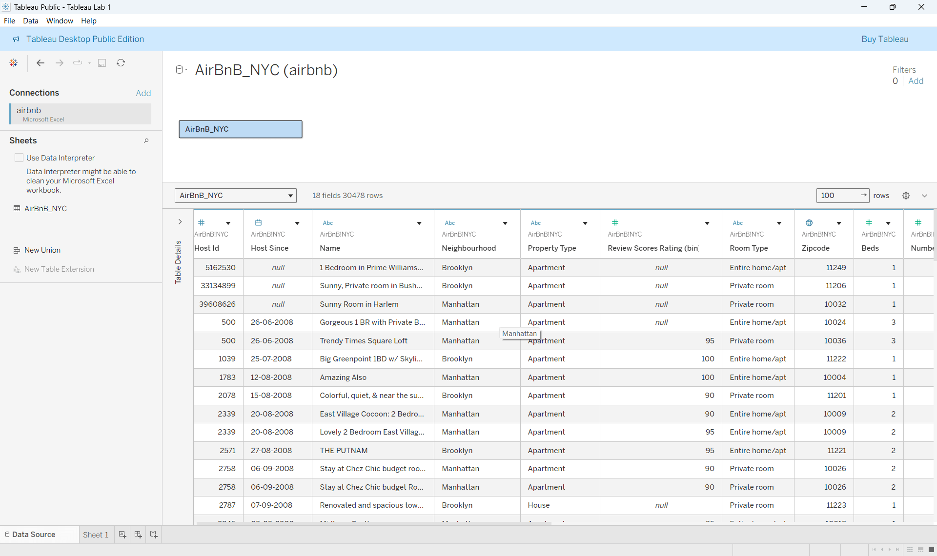
Verify Existing Dataset
Navigate to the Data Source tab.
Check whether fields such as
- Price
- Beds
- Room Type
- Neighbourhood
- Number Of Reviews
are loaded correctly.
Connect Additional Business Data
2
Click to download csv : Airbnb_listing.csv
Add Another Data Source
a
b
Compare Both Sources
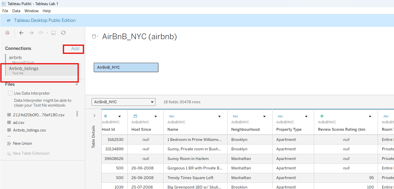
From the Data Source page:
- Click Add
- Select Text File
Observe:
- Matching columns
- Business categories
- Data consistency
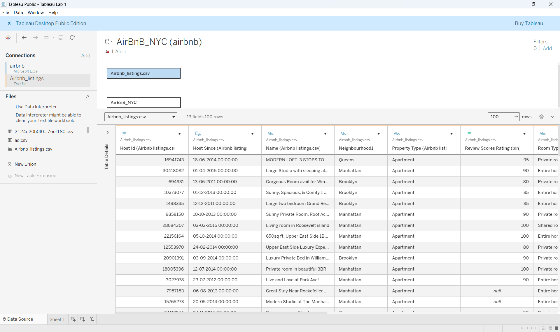
The workbook will now contain organized business connections using multiple operational data sources.
Task 2: Clean and Standardize Operational Business Records
The reporting team identified incomplete records and inconsistent business formatting inside the workbook. Before reporting begins, the dataset must be cleaned and standardized.
In this task, you will handle null values and correct business formats.
Identify Incomplete Business Records
1
Open Data Source View
a
Observe all available fields.
Detect Missing Information
b
Check for:
- Blank cells
- Null values
- Incorrect entries
- Inconsistent text formatting
Handle Null Values
2
The management team wants incomplete business information corrected for reporting accuracy.
Replace Missing Values
a
For fields containing null values:
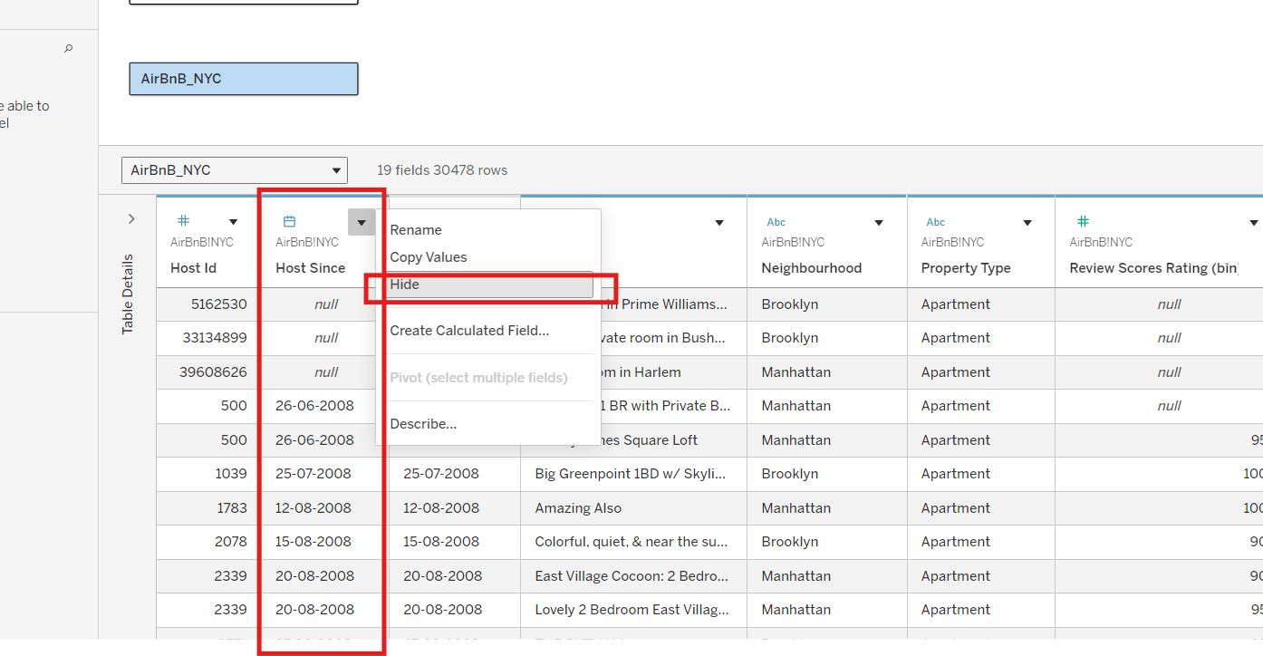
- Click the field dropdown
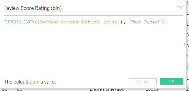
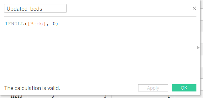
- Select appropriate replacement methods using calculated field
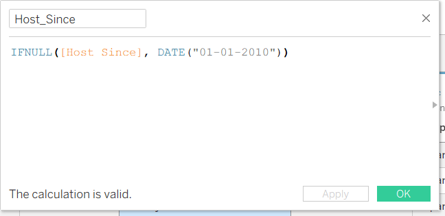
Column name : Host Since
Result: This creates a new updated column and after it is created, Hide the previous uncleaned column
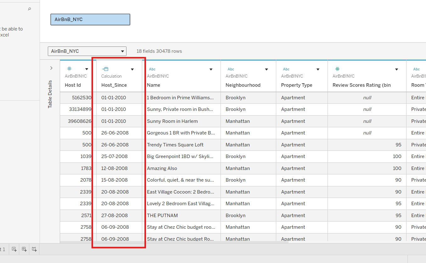
Similarly, check null values in the rest of the columns and fill it with correct values
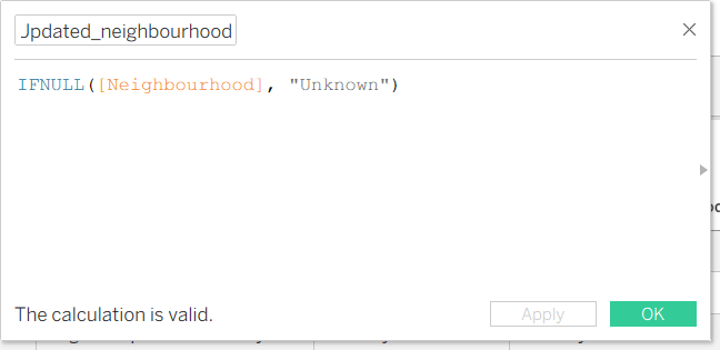
Column name: Neighbourhood
Column name: Review Score Rating (bin)
Column name: Beds
Correct Data Types and Formats
3
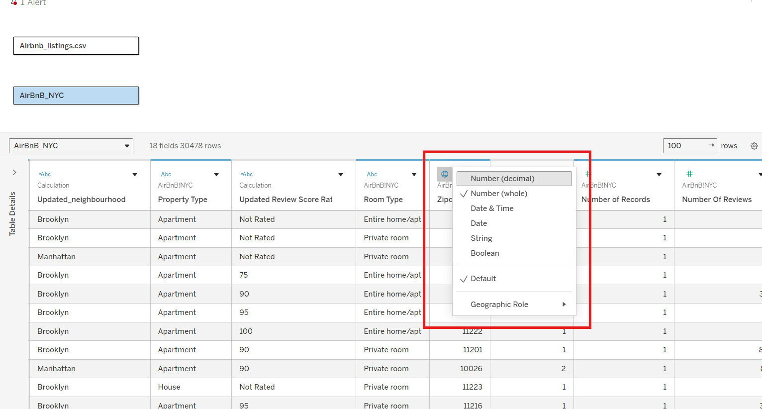
Observe Tableau icons beside field names.
Use:
- Change Data Type
- Convert to Dimension
- Convert to Measure
Result:
The workbook will now contain clean and standardized business records.
Task 3: Create Business Structures and Reporting Categories
The regional analytics team wants structured business categories created for operational reporting and dashboard preparation.
In this task, you will create hierarchies, groups, and sets.
Create Location Hierarchies
1
a
Open the Data Pane
Locate:
- Neighbourhood
- Zipcode
b
Create Hierarchy
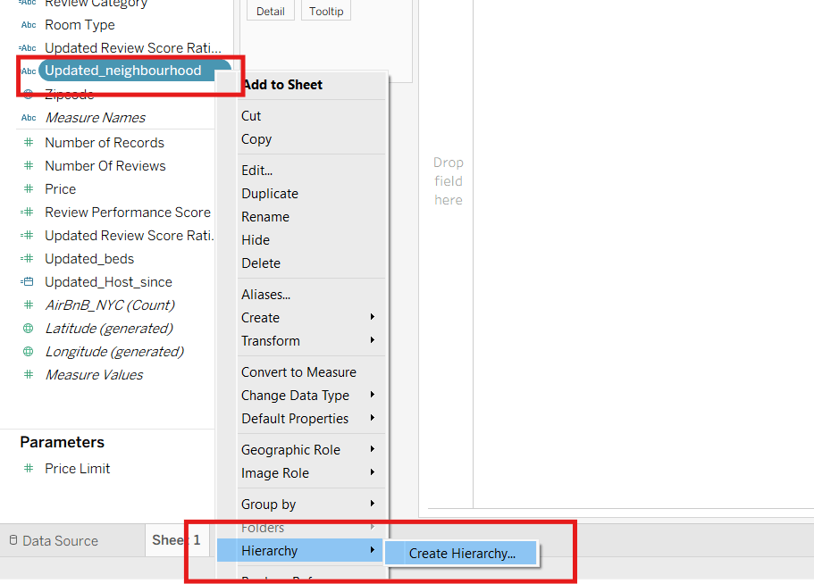
- Right-click Neighbourhood
- Select Hierarchy → Create Hierarchy
Name the hierarchy:
Location Structure
Add Related Fields
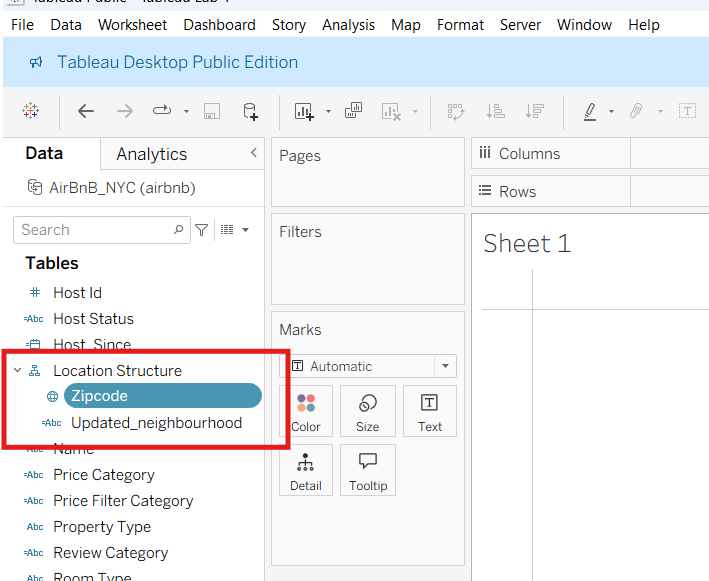
Drag Zipcode below Neighbourhood inside the hierarchy.
c
Create Business Groups
2
Review Room Categories
Observe values such as:
- Entire home/apt
- Private room
- Shared room
a
b
Create Groups
- Select related categories
- Right-click
- Choose Group
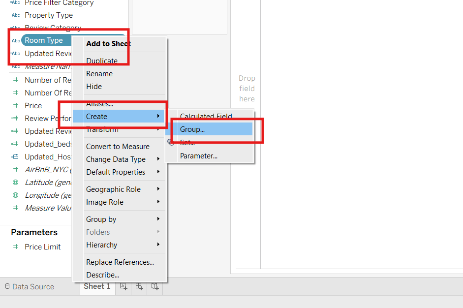
c
Create Groups & rename them
- Select related categories
- Right-click
- Choose Group
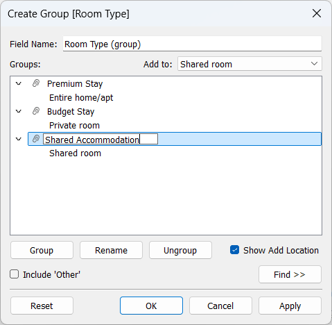
d
Click Apply and then Ok . The Groups are created successfully
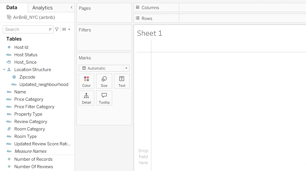
3
Create Business Sets
a
Create a Set
Right-click a listing-related field and select:
Create Set
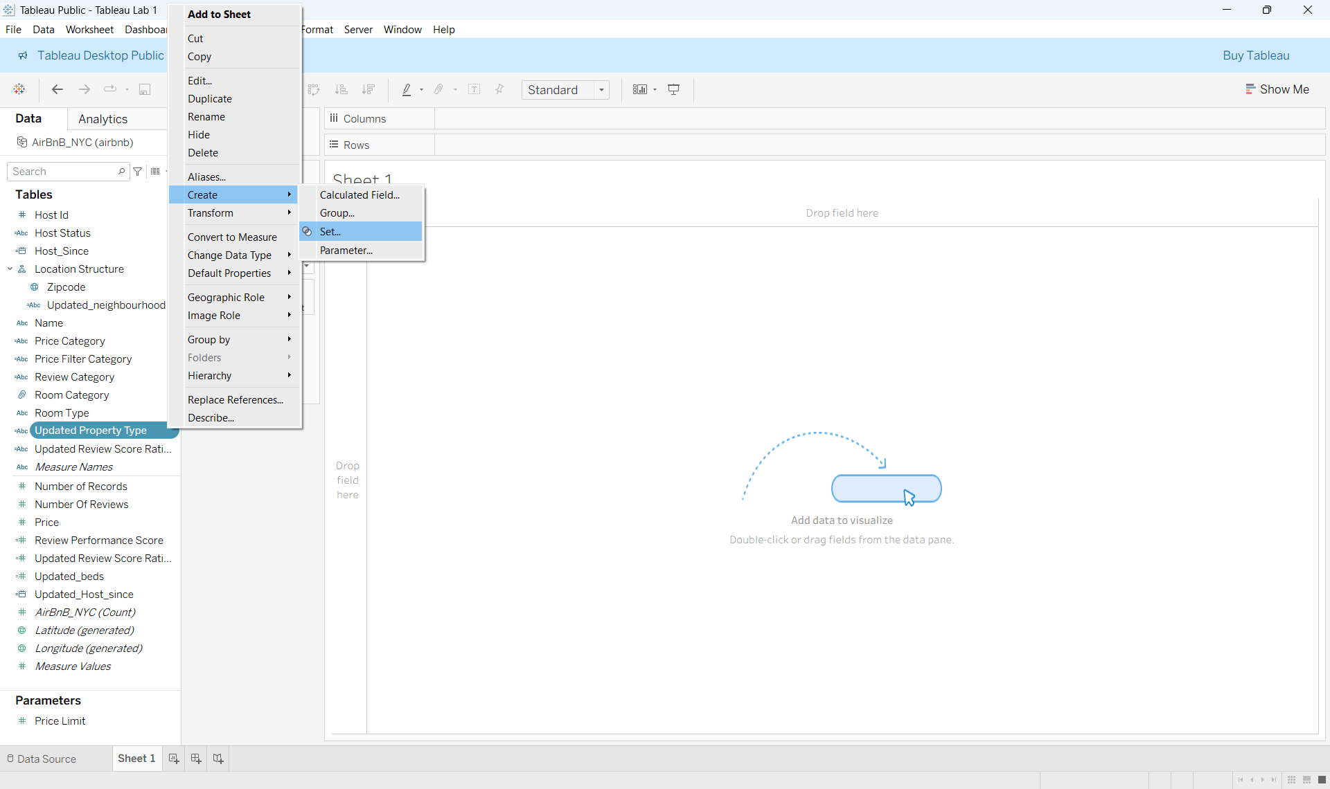
b
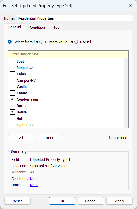
Select Property Types
Inside the General tab, select property types such as:
- Apartment
- House
- Condominium
- Loft
Result:
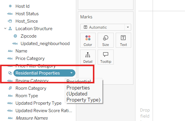
The workbook will now contain structured business hierarchies, groups, and sets for reporting.
Task 4: Organize Operational Insights Using Sorting and Filters
The reporting team wants analysts to organize Airbnb business insights dynamically for operational reporting.
In this task, you will apply sorting, filtering, and dynamic visualization techniques.
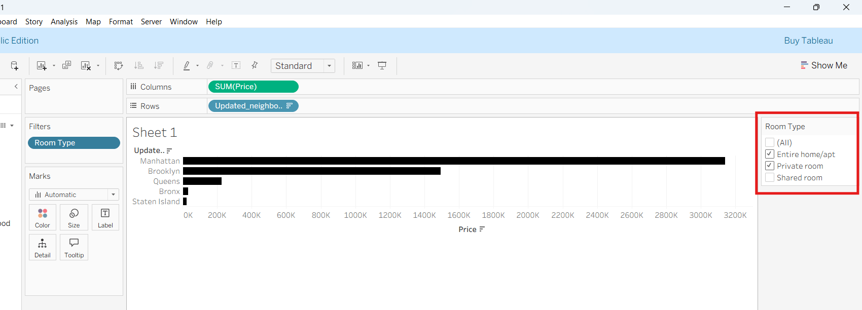
1
Create a Business Visualization
a
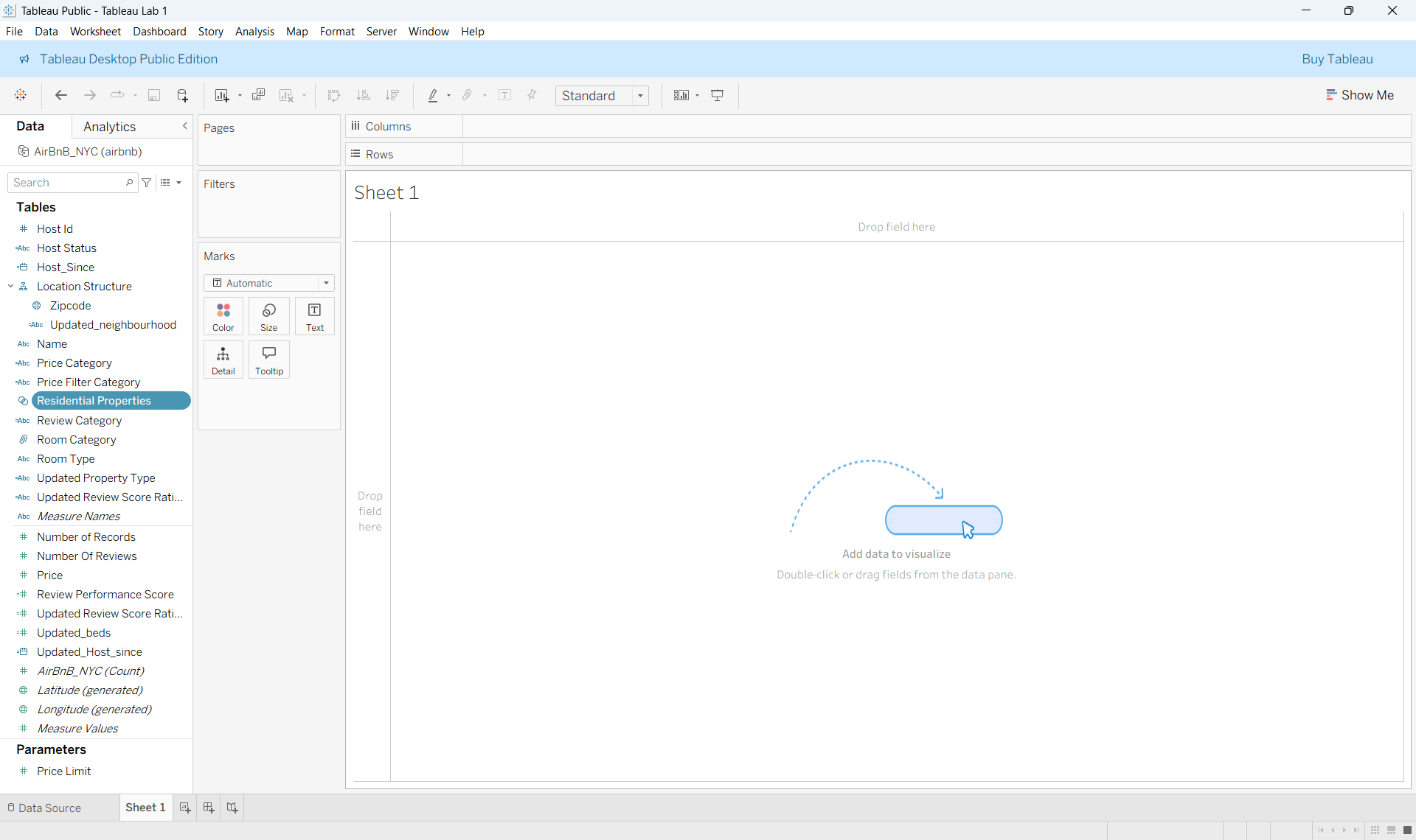
Navigate to Sheet 1.
b
Build the Visualization
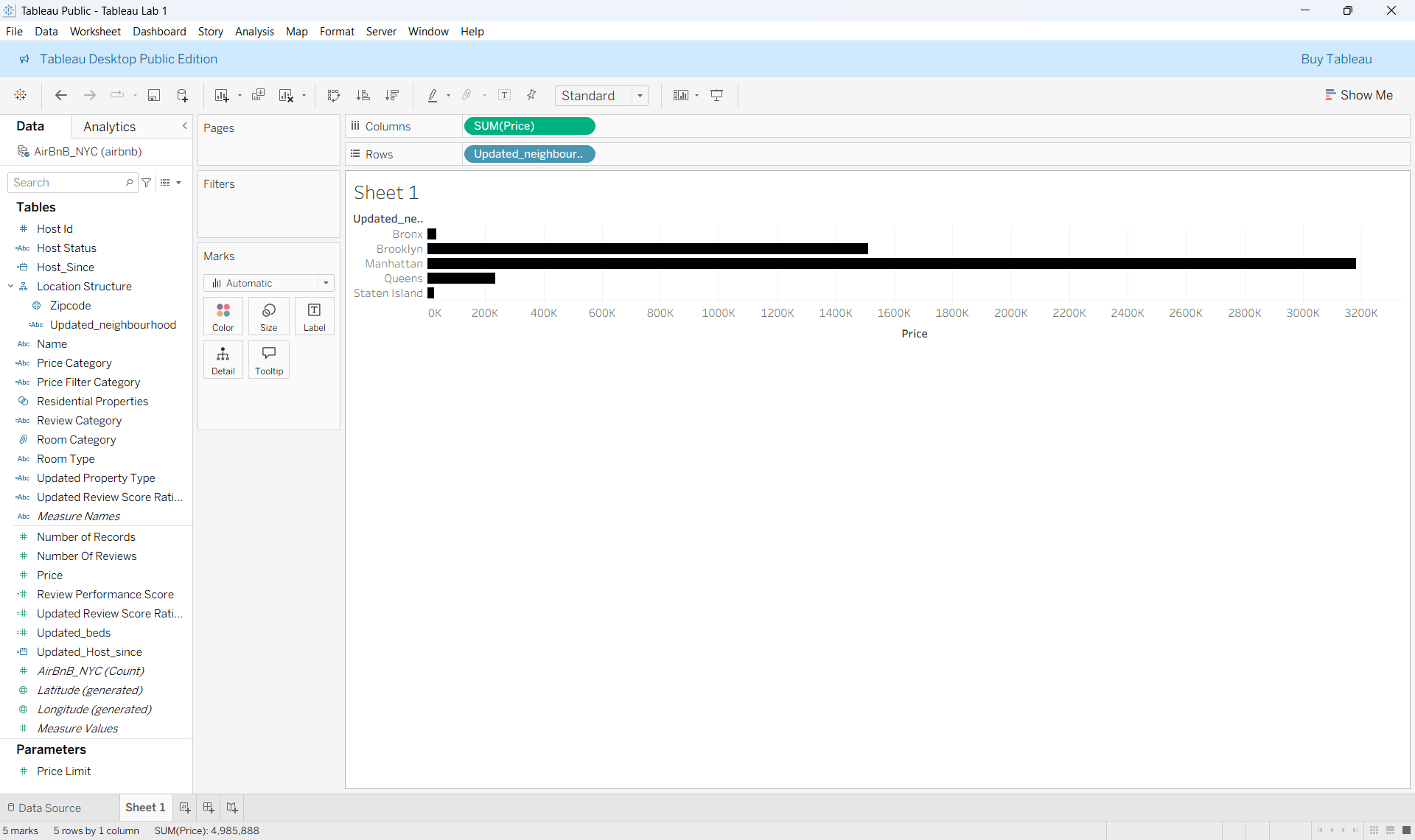
Drag:
- Neighbourhood into Rows
- Price into Columns
Observe the generated chart.
2
Sort Business Data
a
Apply Sorting
Sort pricing values:
- Highest to Lowest
- Lowest to Highest
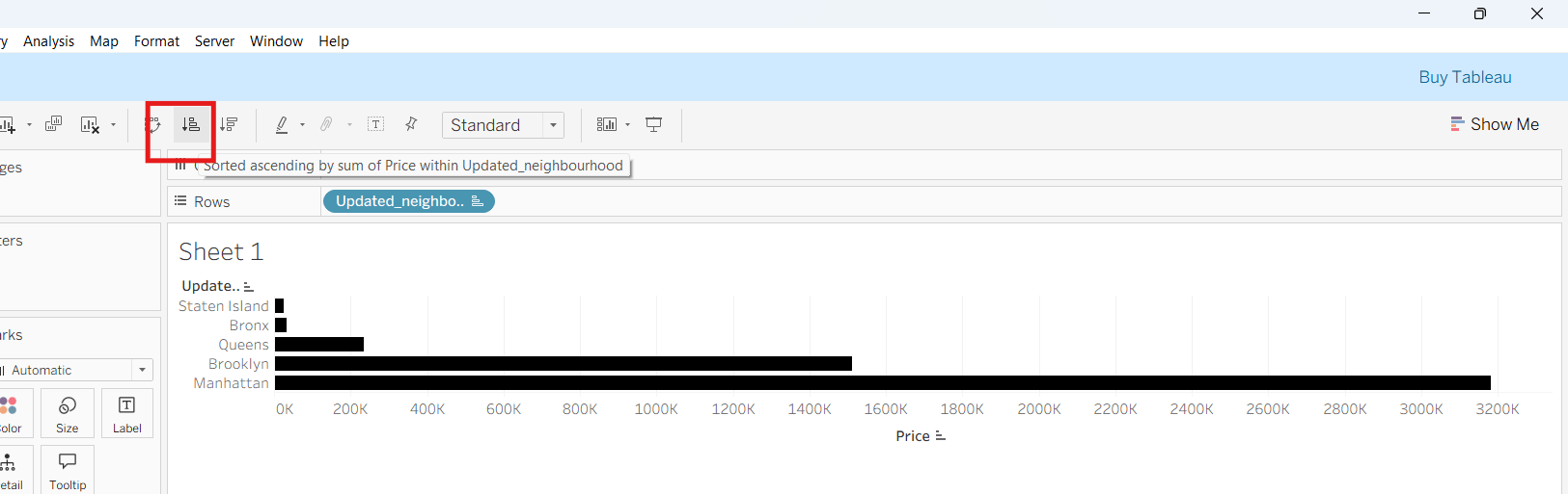
Ascending:
Descending:
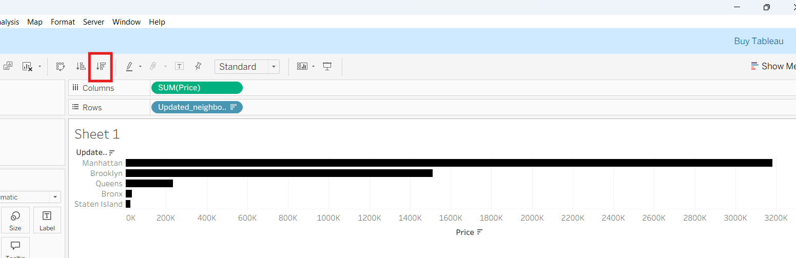
Notice how Tableau reorganizes rankings automatically.
3
Apply Business Filters
a
Add Filters
Apply filters for:
- Room Type
- Price
- Number Of Reviews
- Property Type
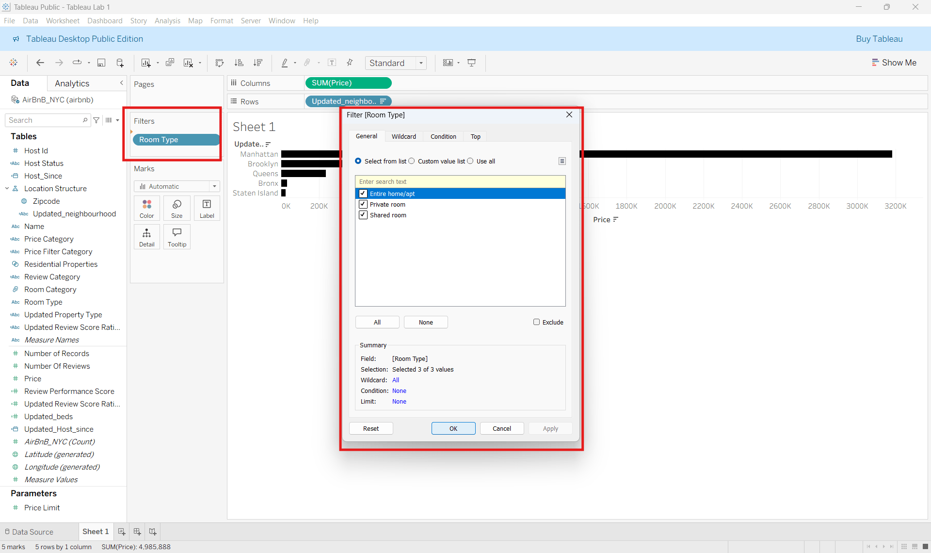
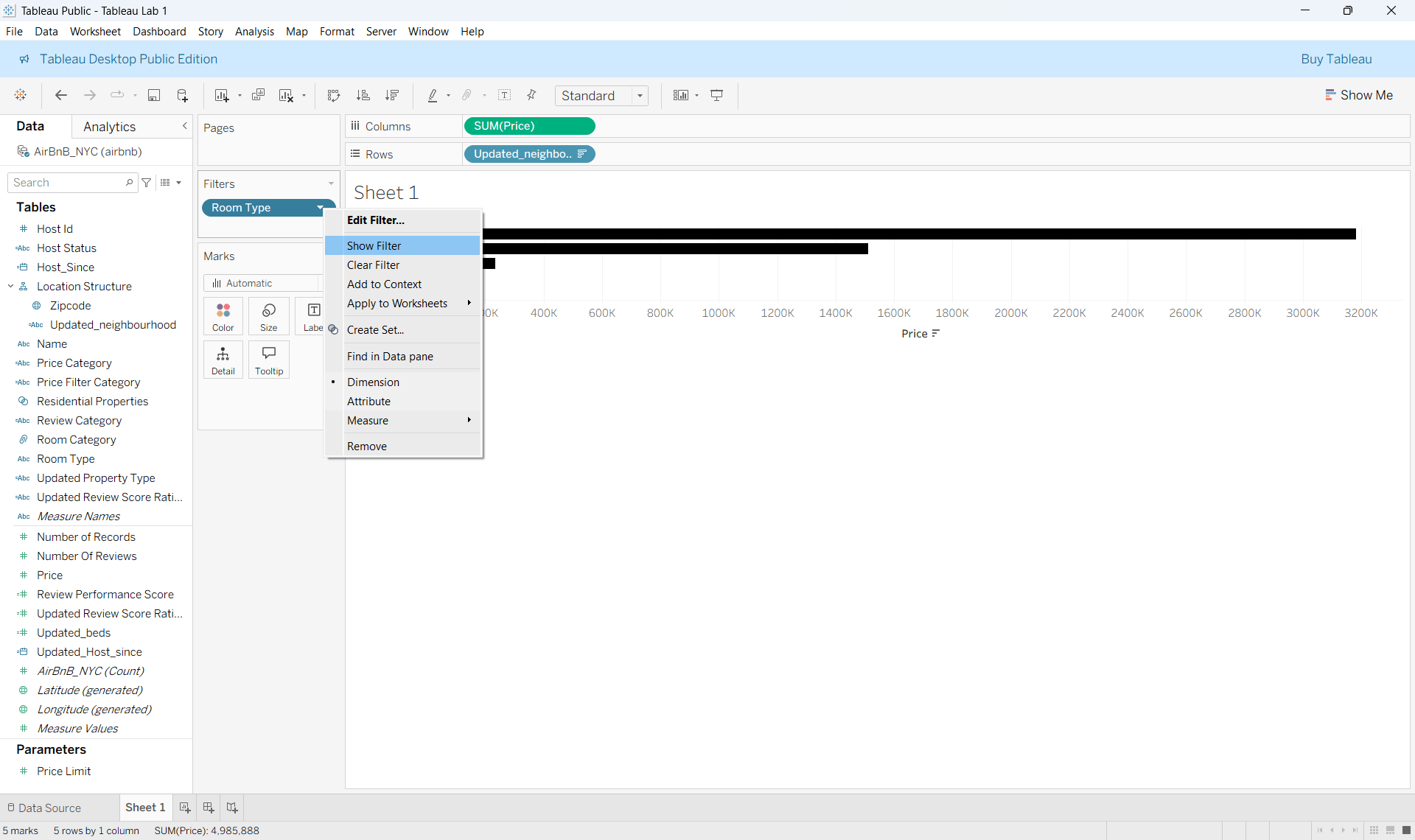
Result: Notice how visualizations update automatically based on selections.
Great Job!
You have successfully completed your lab on Create Business Metrics and Data Structures.
In this lab, you connected business datasets, handled null values, corrected data types, created hierarchies and groups, applied sorting and filtering, and prepared the workbook for dashboard reporting.
You are now ready to move to the next stage of Tableau dashboard creation and business visualization.
Checkpoint
Next-Lab Preparation
git push origin branchNameTopic : Creating Visualizations in Tableau & Advanced Analytical Techniques
1) Basic Visualization Types
2) Custom Visualization Types-I
3) Custom Visualization Types-III
4) Building KPIs
5) Forecasting and Trend Analysis
6) Statistical Spellcasting
Git Push