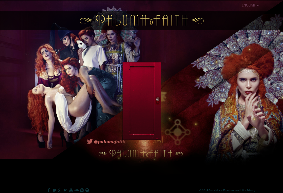
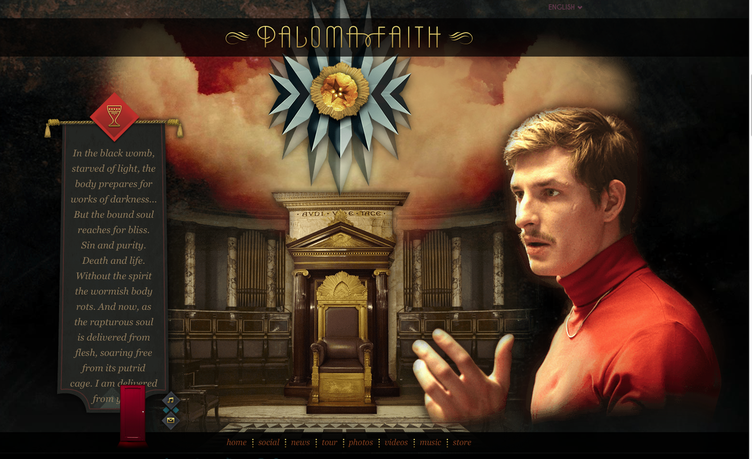
Paloma Faith's website is full of interactive buttons and full of information. The first thing you see is two main images of Faith which are from her most recent album which is a consistent theme throughout her site. Which highlights continuity and branding for the target audience. Faith is known to have a very Alice and Wonderland feel to her style and image which is unusually and unique to her. The Home page emphasises this through the dark red and black colour scheme, as well as the mysterious door in the centre which also links to Alice in Wonderland and seems enticing and tempting to click on.
Paloma Faith's Website Home Page
You can also see at the bottom of the screen that she has logos of all the social network sites that you can find her on, as well as the twitter address next to the door. Faith also has her name at the top of the page in the font that is associated with her brand. The images are very memorable and unconventional for an artist to use and can reflect Faiths unique style and music.
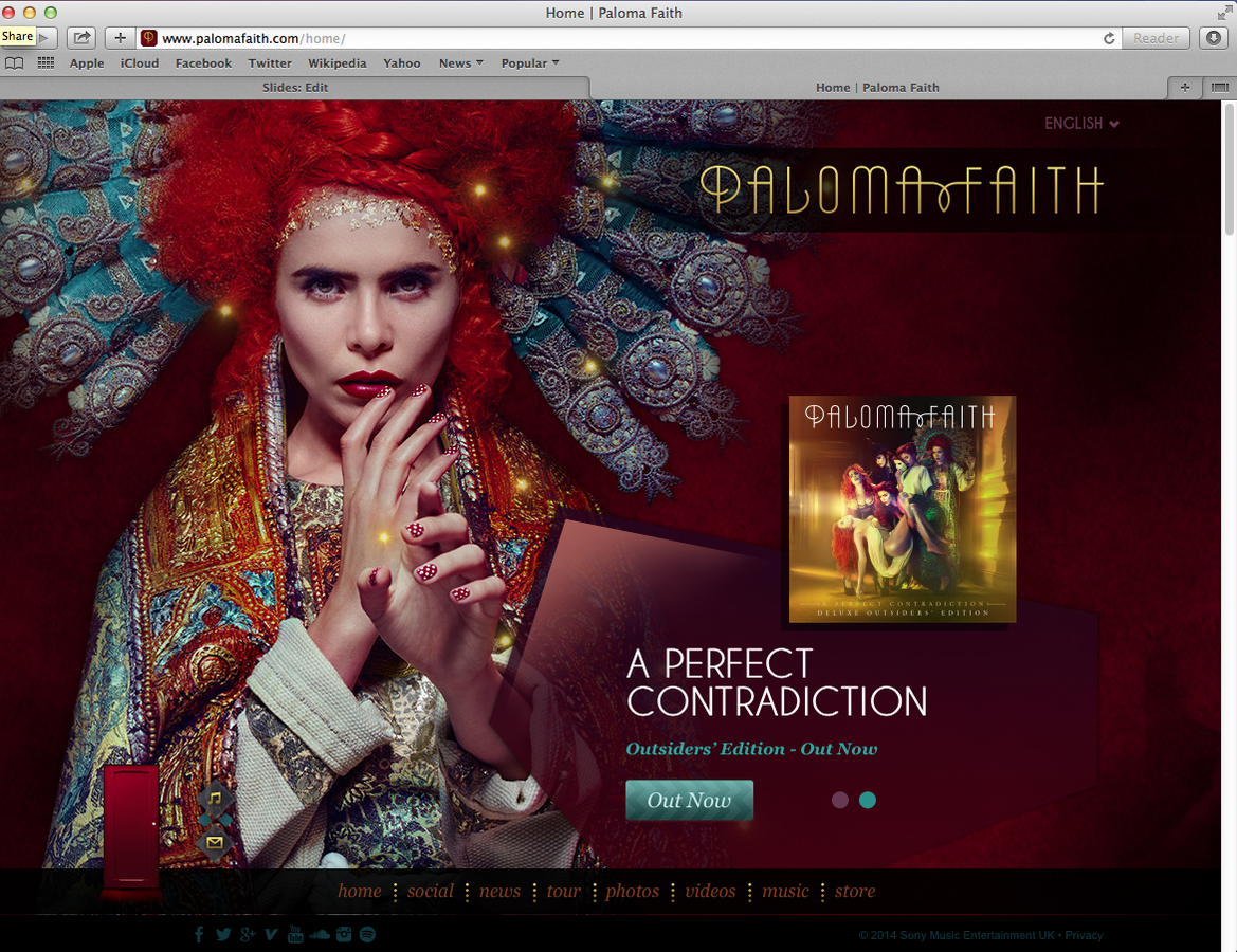
Once you enter through the red door you are brought to the page shown to the right. The two main features are the large image of Faith in the costume that she wore in her video Can't Rely on You. The second key feature is an advertisement of her new album A Perfect Contradiction with a button that sends you directly to iTunes, one of the largest download websites. The site is fully interactive and all links to Faiths new album. At the bottom of the screen you have links to social media, videos, tour information and her merchandise store. This all ties together for one late promotion for Faith and her music.
Through the red door
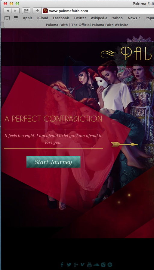
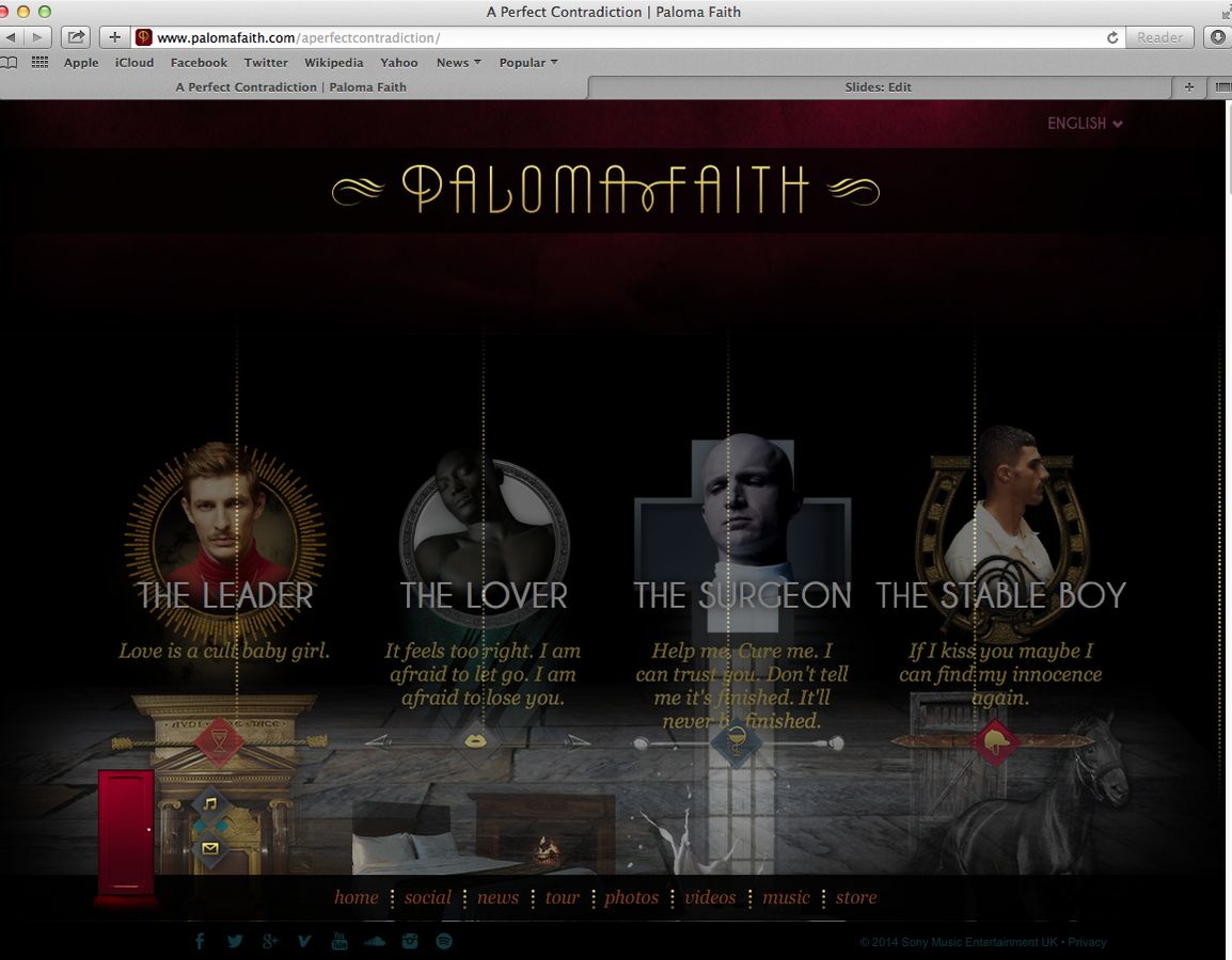
The other option is to click to the left, when at the home screen. This emphasises the story told throughout Faiths Can't Rely on you and also links to the characters in Trouble with My Baby. All four character buttons are interactive and it then moves you further down the page to more information about them. This helps to reenforce the story and gets the audience more involved into the video and the story they are telling.
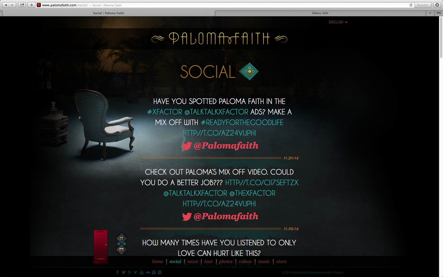
Social Media
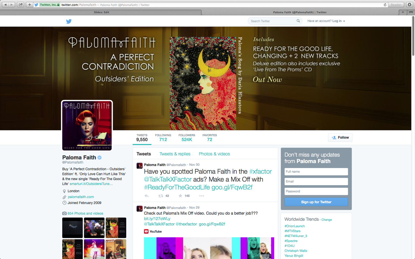
Paloma Faith's website is full of social media links and images promoting Faith as a brand. This is very stereotypical of an artists website as they are trying to promote their music as much as possible. At the bottom of the screen it also has links to video's, images, videos and a link to Faiths merchandise store.

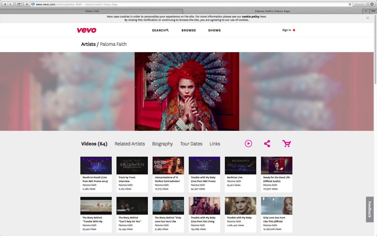
Vevo
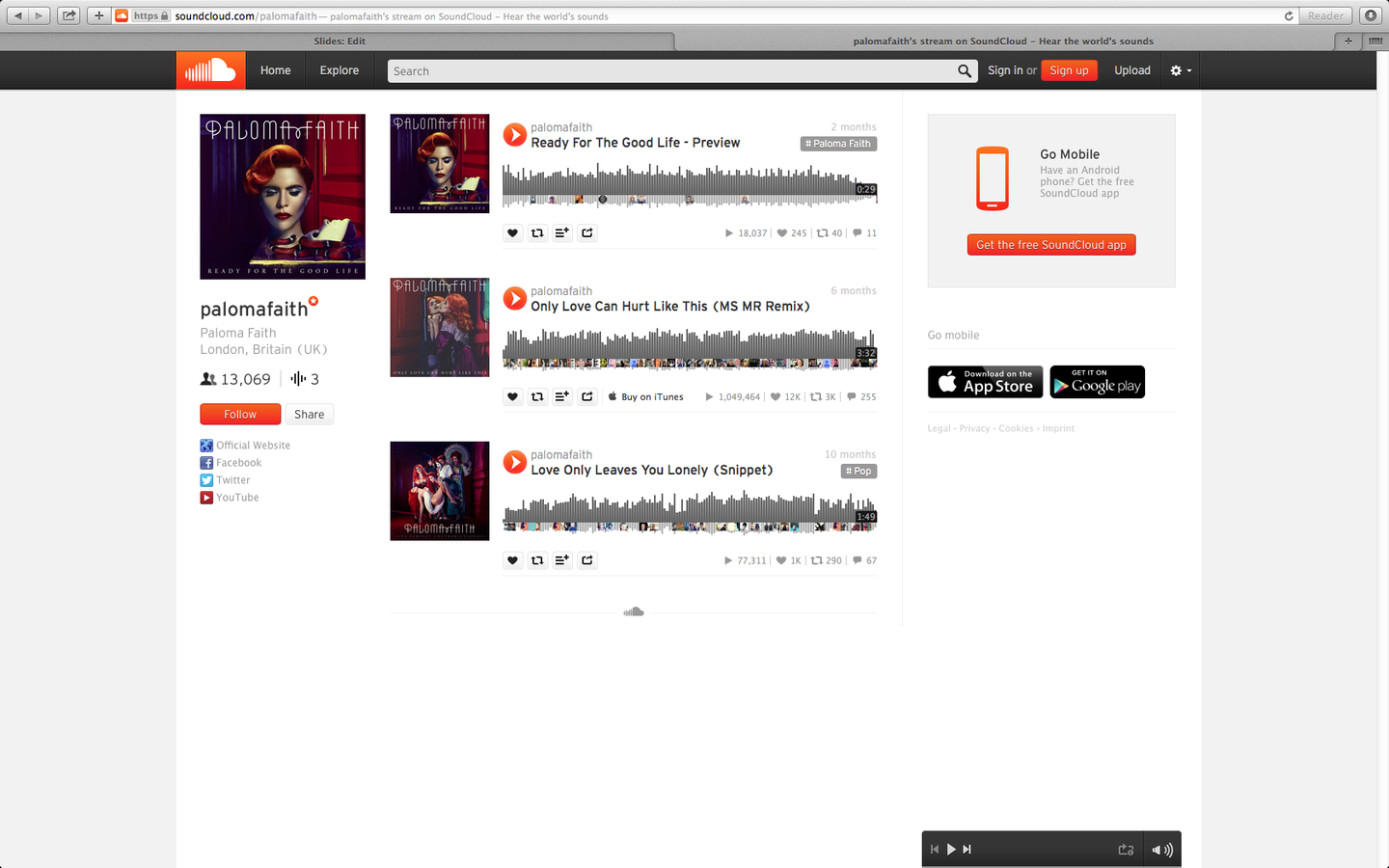
SoundCloud
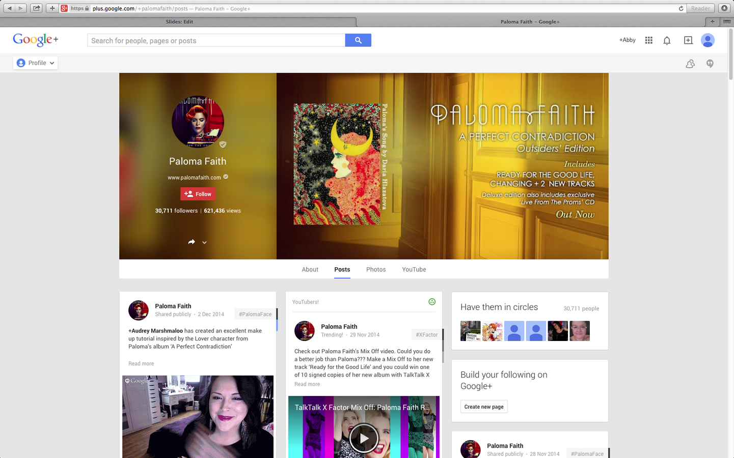
Google+
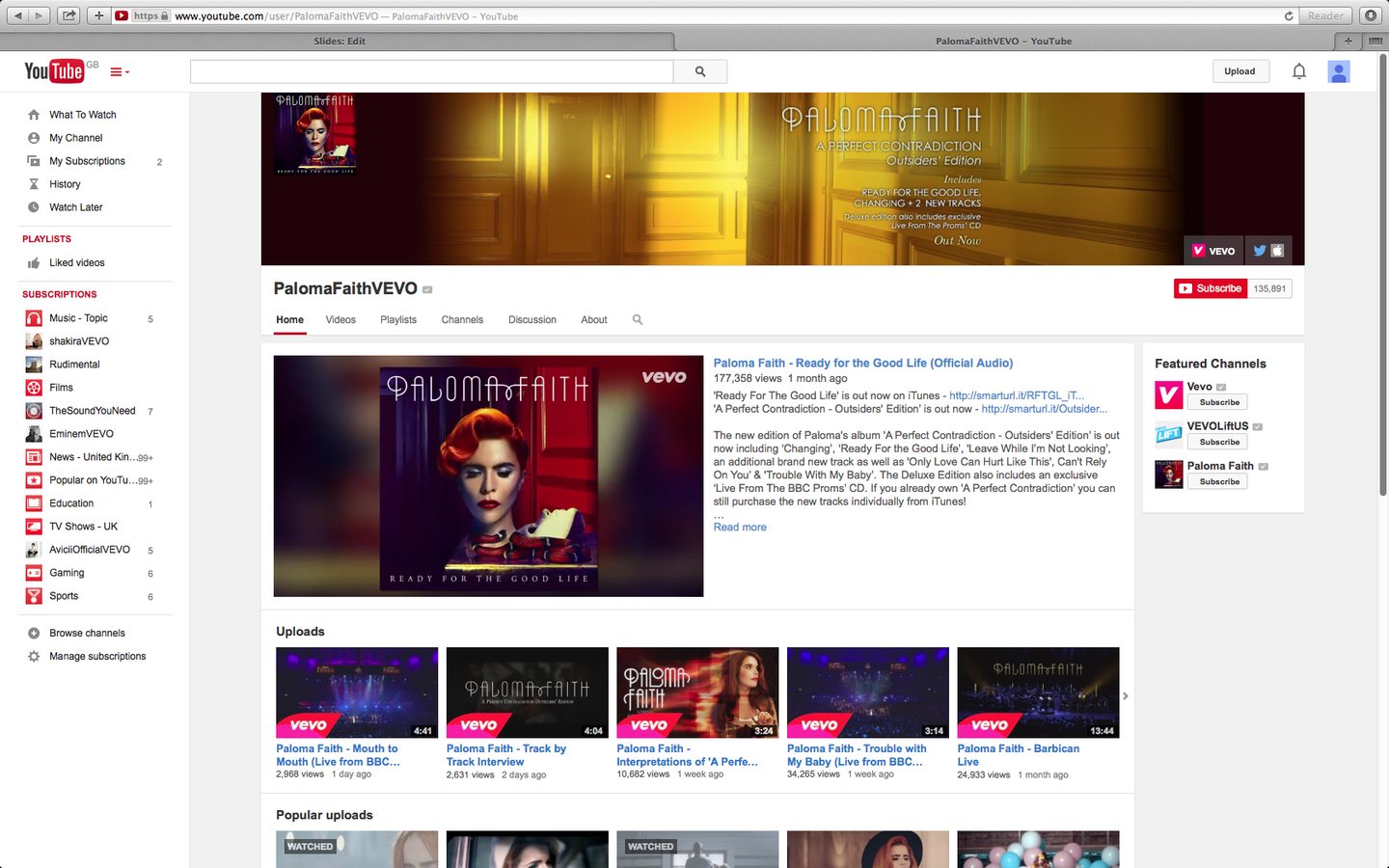
YouTube
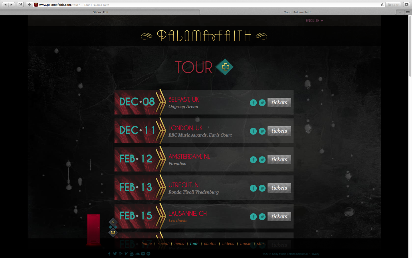
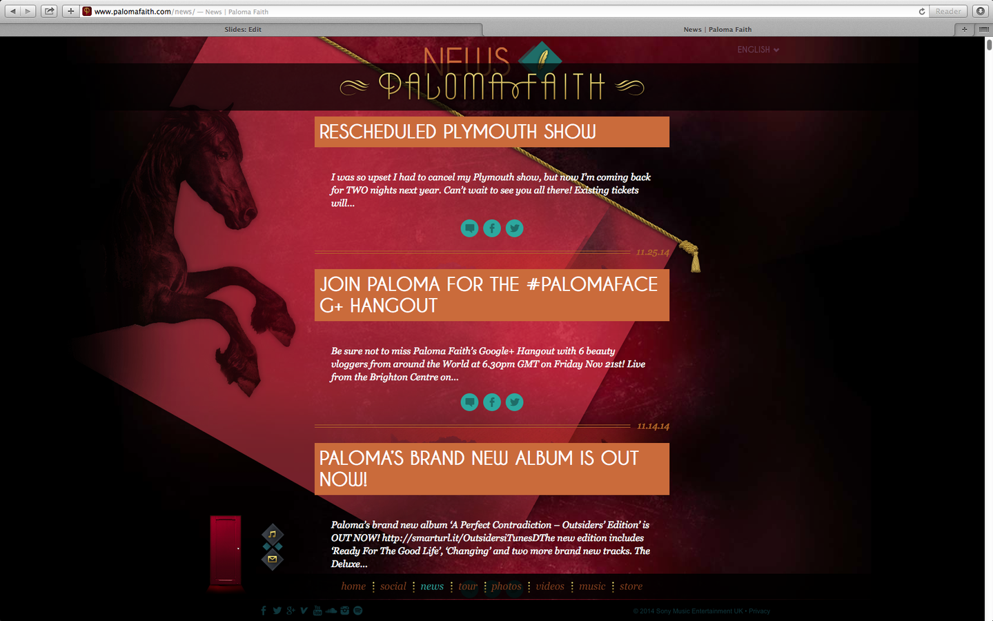
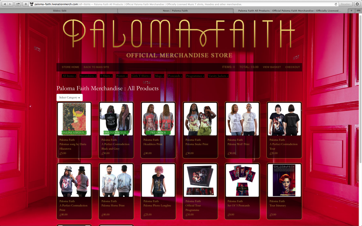
It is stereotypical for an artist to advertise their tours and merchandise on their website. Fans are also able to access latests news about Faith, such as a rescheduled show and a new album release. The colour scheme follows the codes and conventions for Paloma Faith as an artist, her genre could fall into alteritive however as her music is so popular she occasionally can be classed as a pop artist. She is very unique in her style and this is emphases throughout he colours and style of her site. It could also be seen as a reflection of her vibrant personality.
Information and Colours
Codes and Conventions
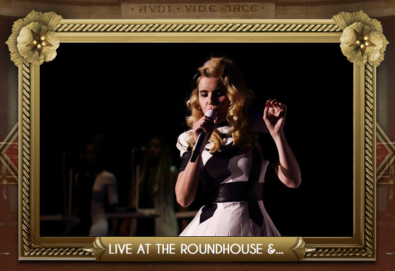
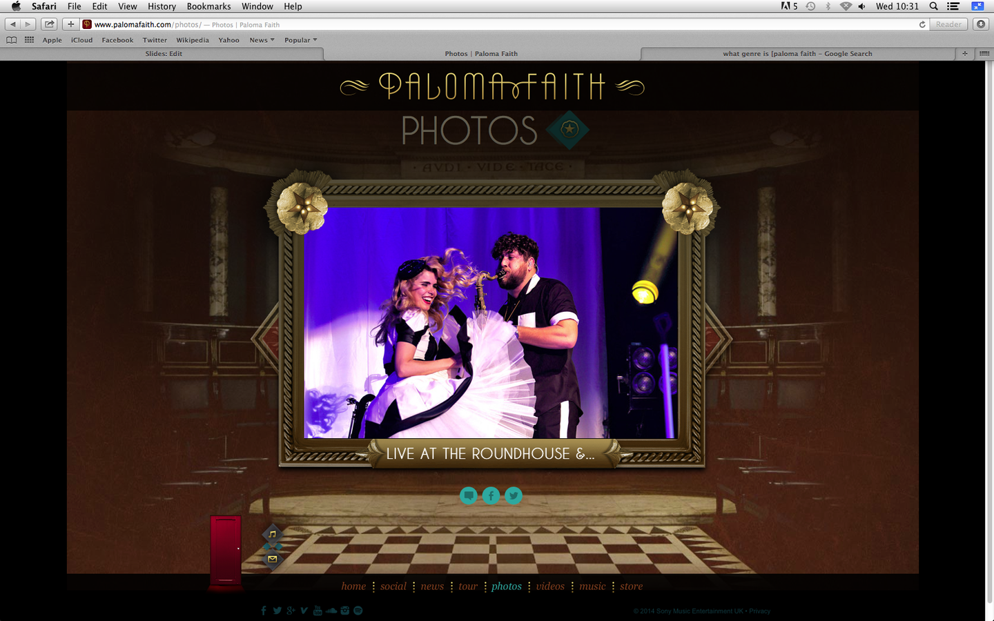
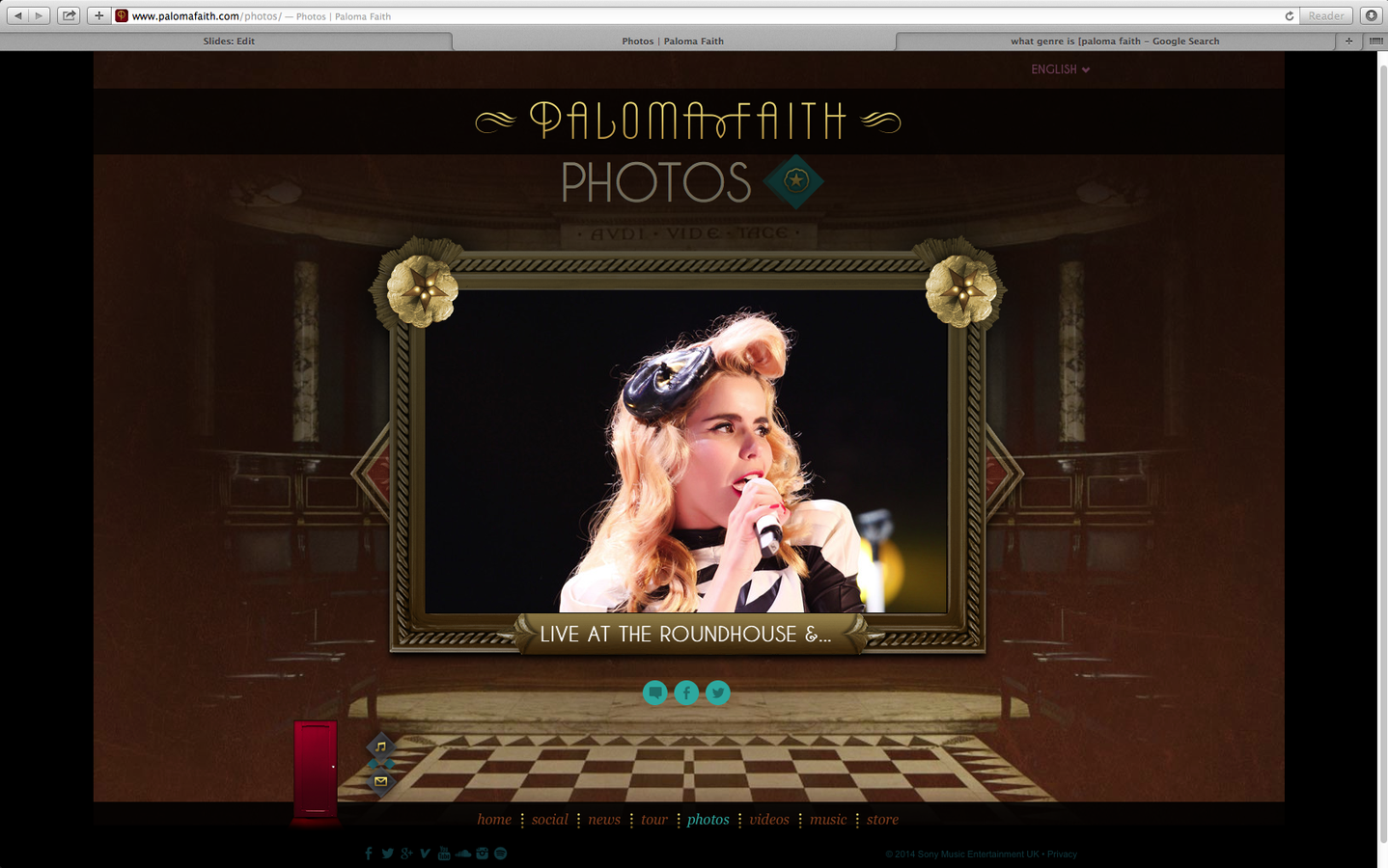
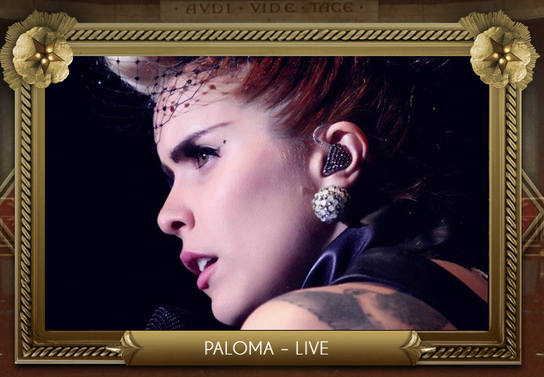
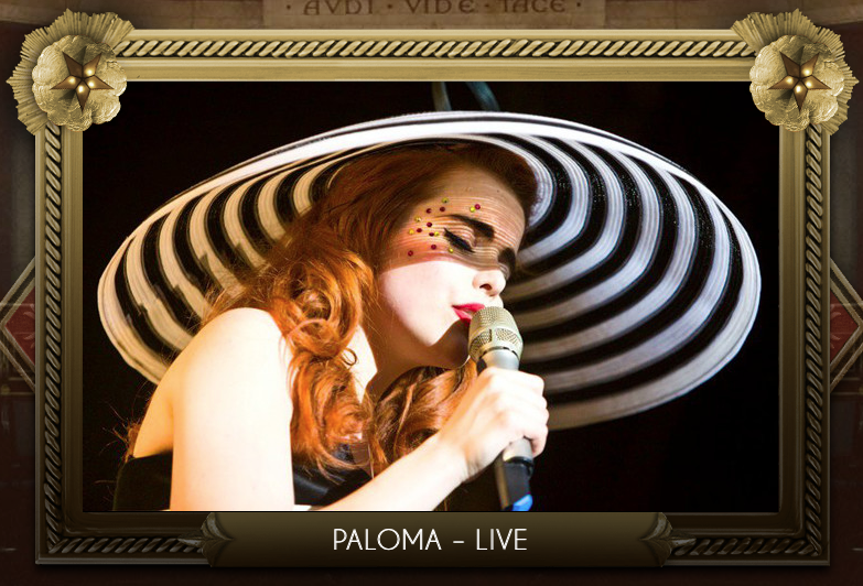
Overall Paloma Faith's website is very unique to her style of music and her fashion sense. The amount of interactive buttons is very different to any other artist website and makes it a lot more interesting for the fans, as their is more to explore. At the moment Faith's website links to her current album and videos, suggesting that when she realises a new album it will then change to suit that album thus further advertising her music and each time creating a unique and memorable site. This is a key aspect to successful advertising, this entices her fans to come back to her site and may even subscribe to updates. Paloma Faith as an artist is very different which works well as it makes all her performances memorable. Her site follows many stereotypical conventions such as images, videos and social media however, the way it has been presented is very different which makes it a lot more interesting compared to other sites.